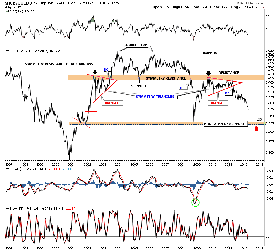
For those subscribers that don’t feel comfortable about going short, this HUI to Gold ratio should give us a good entry point for a counter trend rally in the precious metals stocks. Right now it looks like the .23 area should produce a good oversold bounce that will be worth a shot to the long side. Keep in mind this will not be a long term trade but a trade against the main downtrend. If the HUI keeps under preforming gold like it has been it won’t take that long to get there. This is a good time to get your shopping list together for when the time comes.
Category Archives: public
Wednesday Stock of the Week
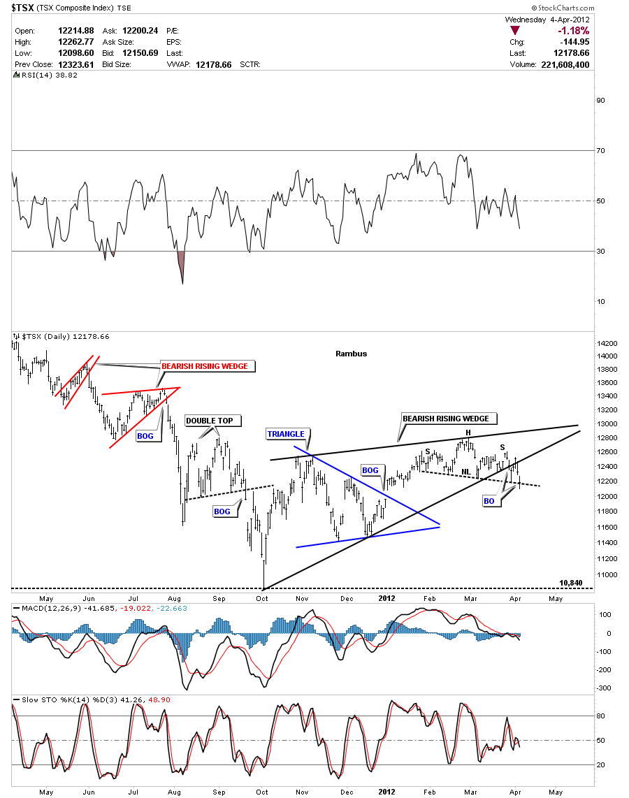
Subscriber DONZI says he watches the $TSX as a general guide for the metals markets. He wants to know if I see the same H&S top pattern he is seeing. This index is very similar looking to the CDNX which is a Canadian small cap resource exchange that has many junior precious metals and oil stocks.
The lets look at the daily chart that is showing a bearish rising wedge that broke down about 5 days ago. It had a strong backtest to the bottom black rail. There is also a H&S top out toward the apex of the bearish rising wedge that cracked the neckline today. This is not a bullish looking chart. There are two big negatives, the bearish rising wedge and the H&S top pattern. This daily chart is suggesting lower prices dead ahead.
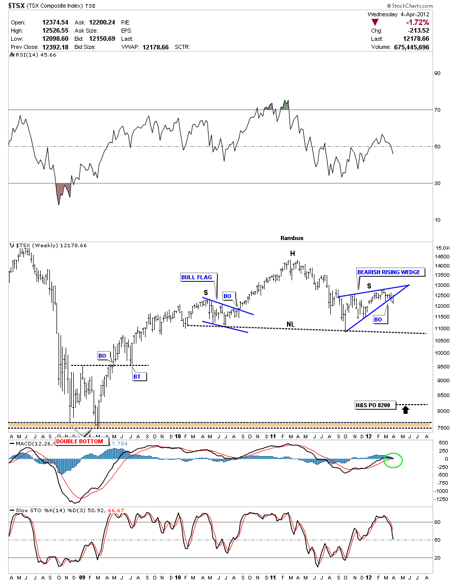
The weekly look at the TSX should make a junior stock investor step back and take notice. The symmetry is very nice with both shoulders having a 4 point consolidation pattern. The left shoulder made a nice bull flag on the way up and the right shoulder has made the bearish rising wedge on the way down. Like so many precious metals stocks I have shown over the last 3 weeks or so this is a big topping pattern that is going to take alot of time to play out to the downside. The H&S price objective measures down to the 8200 area. You can also see the big double bottom that formed at the 2008 crash low that might also come into play.
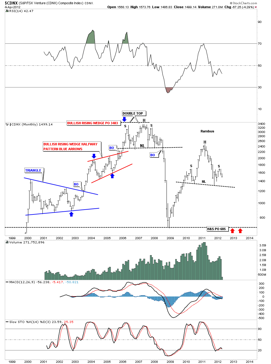
Lets take a long term look at the monthly chart to put the H&S into perspective. As the TSX and the CDNX are very similar looking indexes lets see how the CDNX stacks up. You can see the nice H&S top pattern that is still in the process of building out the right shoulder. What I find interesting about the H&S is the price objective down to the previous bottom made during the 2008 crash, red arrows. Note the previous topping pattern built in 2006 to 2008. I don’t think we will get a crash like we had in 2008 but it could be a more drawn out affair with the same consequences.
Bottom line is this junior small cap index has a very bearish look to it that needs to be monitored very closely. If the neckline gets taken out there will be much more pain to endure if you invest in the junior PM stocks. Thanks DONZI for suggesting this index to look at. I’m glad to see you noticed the big H&S top pattern and the potential it has for investors. These H&S top patterns are all over the place if one decides to look for them….All the best DONZI…..Rambus
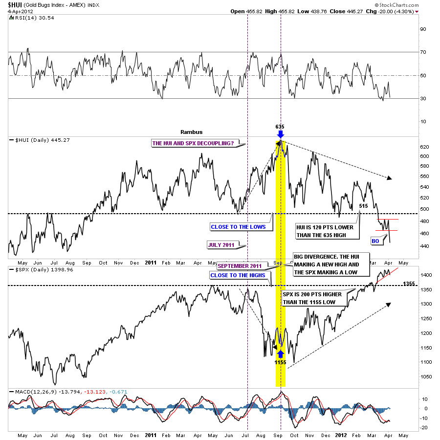
The next question I would like to tackle is from Sir rlscott63 who is wondering if the divergence is still in play between the precious metals stocks and the stock markets as he sees a correction taking place in the stock markets over the next 4 to 5 weeks or so. I think he wants to know if the precious metals stocks are going to go up while the stock markets correct. This first chart shows very clearly how the PM stocks have been diverging from the stock markets for sometime now. As the stock markets have been in rally mode the HUI has been declining. The divergence really started back in July of 2011 when the stock market started it’s big correction. At that time the HUI actually had a nice rally divergence against a falling stock market. That positive divergence to the stock market came to a screeching halt last September when the stock markets were putting in their intermediate term bottom and the HUI was putting in it’s intermediate term top at 635, yellow vertical area on chart below. The two have been negatively diverging with the stock markets making new highs and the HUI putting in new lows. Will this divergence continue is anybodies guess right now but I think if the stock markets do correct in here the HUI will also correct as today clearly showed.
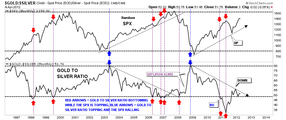
Lets take a look at the gold to silver ratio and compare it to the SPX and see if there is something we can take away to help show the direction of the stock markets vs the gold and silver ratio. The chart below shows the SPX on top and the gold to silver ratio on the bottom. The way this setup works is when the gold to silver ratio is rallying, meaning gold is outperforming silver the ratio rises. And when the ratio is falling silver is outperforming gold. This is an important concept to note. When silver is outperforming gold this is telling the stock markets the economy is improving as silver is still looked at as a commodity. So a strong economy is putting a higher demand on silver than gold causing the ratio to rise. As you can see on the chart below when the stock markets are putting in a major bottom the gold to silver ratio is putting in a major top, blue arrows. In 2011 the gold to silver ratio broke below a very long term support rail as silver was going parabolic and was really outperforming gold. This was the lowest the gold to silver ratio has been in many years. Since silver began it’s correction in April of last year the ratio has been rising along with the stock markets which normally isn’t what one would expect. This maybe just a short term blip as the ratio is still falling and the stock markets are still rising in general.
I hope this answers your question. With so many charts showing H&S top patterns in the pm complex the only way the pm stocks will outperform the stocks markets will be on a short covering rally that will only last a short period of time. I think when the stock markets are really ready to correct the pm stocks will be well on their way to their lows. Like during the 2008 crash low the precious metals stocks bottomed out in late 2008 while the stock markets didn’t find their bottom until March of 2009. I think a similar scenario will appear again when the time is right….All the best rlscott63…Rambus
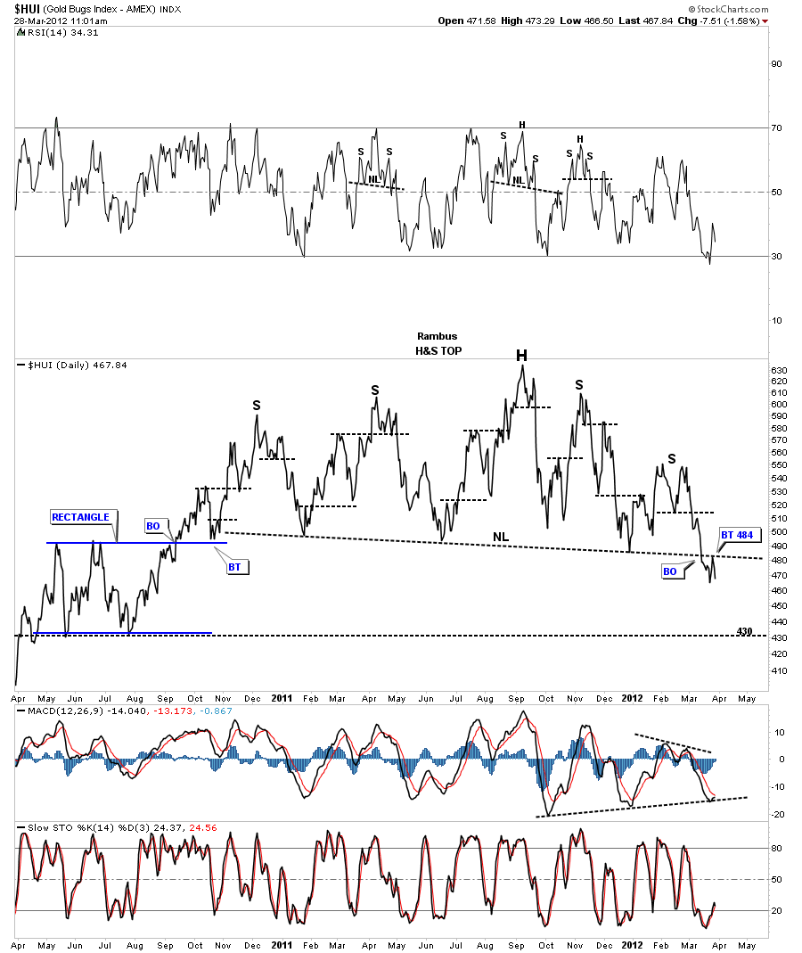
Another subscriber, eagle, is wondering if there will be a tradeable bounce off the 430 area on the HUI. As the 430 area is where the previous low came in when the HUI was in rally mode off the 2008 low its possible a bounce could take place from that low. First lets look at the most important chart that we have in are arsenal right now and that is the daily 2 1/2 year line chart that is showing the way lower. I’ve drawn a dashed black horizontal line that comes off the bottom of the blue rectangle made in 2010. This is a logical place to see a reversal to take place. Before we go any further I want to make it perfectly clear that this H&S top is a big, very large, huge, gigantic, monster looking reversal pattern. I don’t say this lightly. The implication of that chart will be felt for some time to come. The really baffling thing is that nobody sees it except for the Rambus Chartology subscribers. You have a front row seat to what is taking place right before our very eyes. Please don’t take this H&S top pattern lightly as it could be detrimental to your financial health. At any rate below is the daily line chart that show the 430 bottom off the blue rectangle. The HUI got as low as 439 today before rallying a few point before the close. When you look at the size of that H&S top and our current breakout below the neckline notice how small this move is relative to the top. We are just getting started with this move lower. I can guarantee you we are going to have some counter trend short covering rallies that will knock your socks off and you will think the bear market is over. Nothing will be further from the truth until we get much further along in time and price.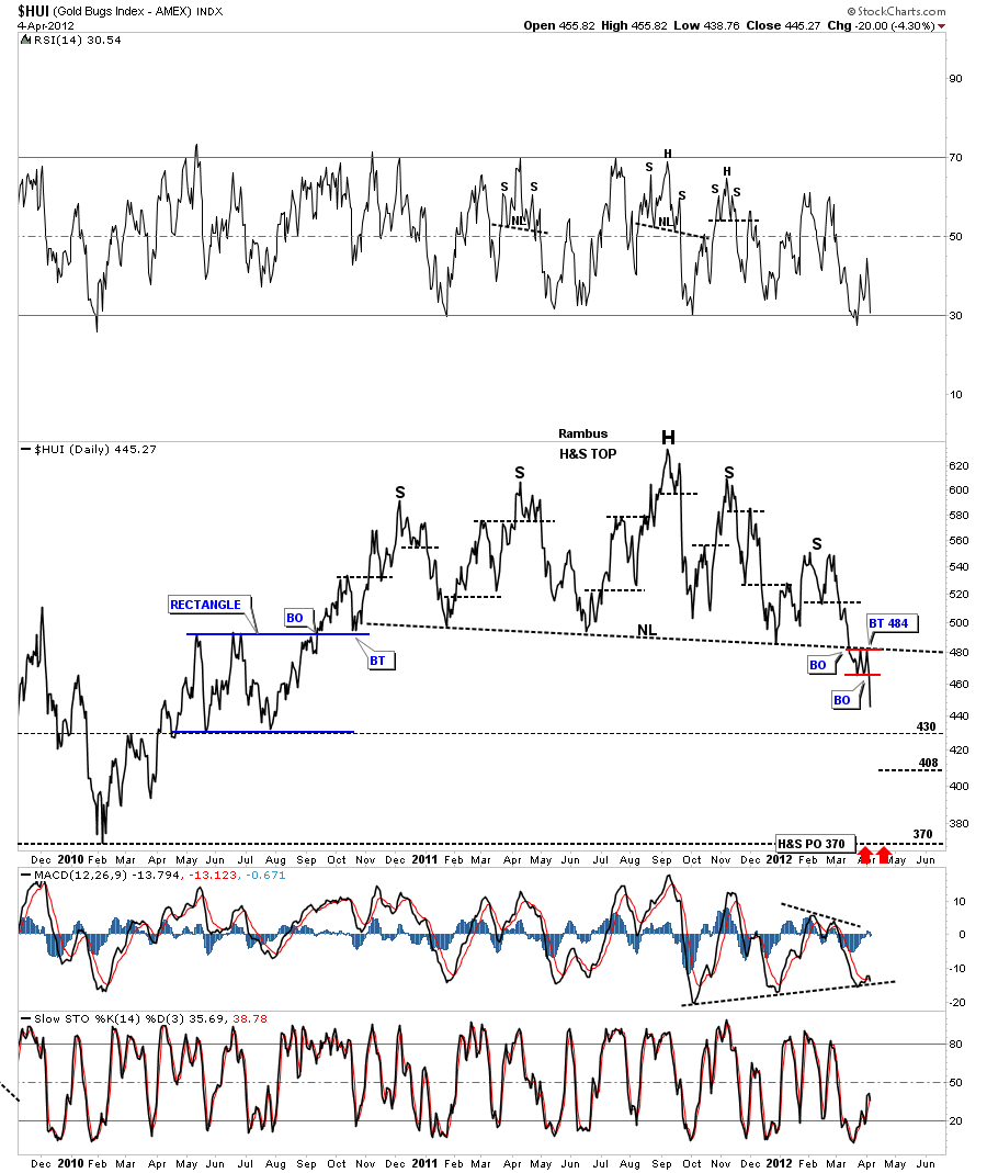
So the question we need to ask ourselves is do we want to trade the counter trend rallies which will be like a salmon swimming upstream? It is always much easier to trade with the major trend whatever direction that is because if you make a mistake the trend will come to your rescue eventually. With the break of the big neckline the new trend is now down compared to the sideways action like the last year and a half have been. I have calculated some price objectives on the HUI, XAU and the GDX that I will post tomorrow as its getting late. I hope I didn’t discourage you eagle but if we are going to trade the counter trend moves we will have to be lightening quick with no room for error. I hope we can do several trades against the trend. If the little red rectangle on the HUI plays out as a halfway pattern then we should be able to spot the low for a counter trend rally and take advantage of it. So lets see what tomorrow brings and let the market do the talking. All the best eagle….Rambus.
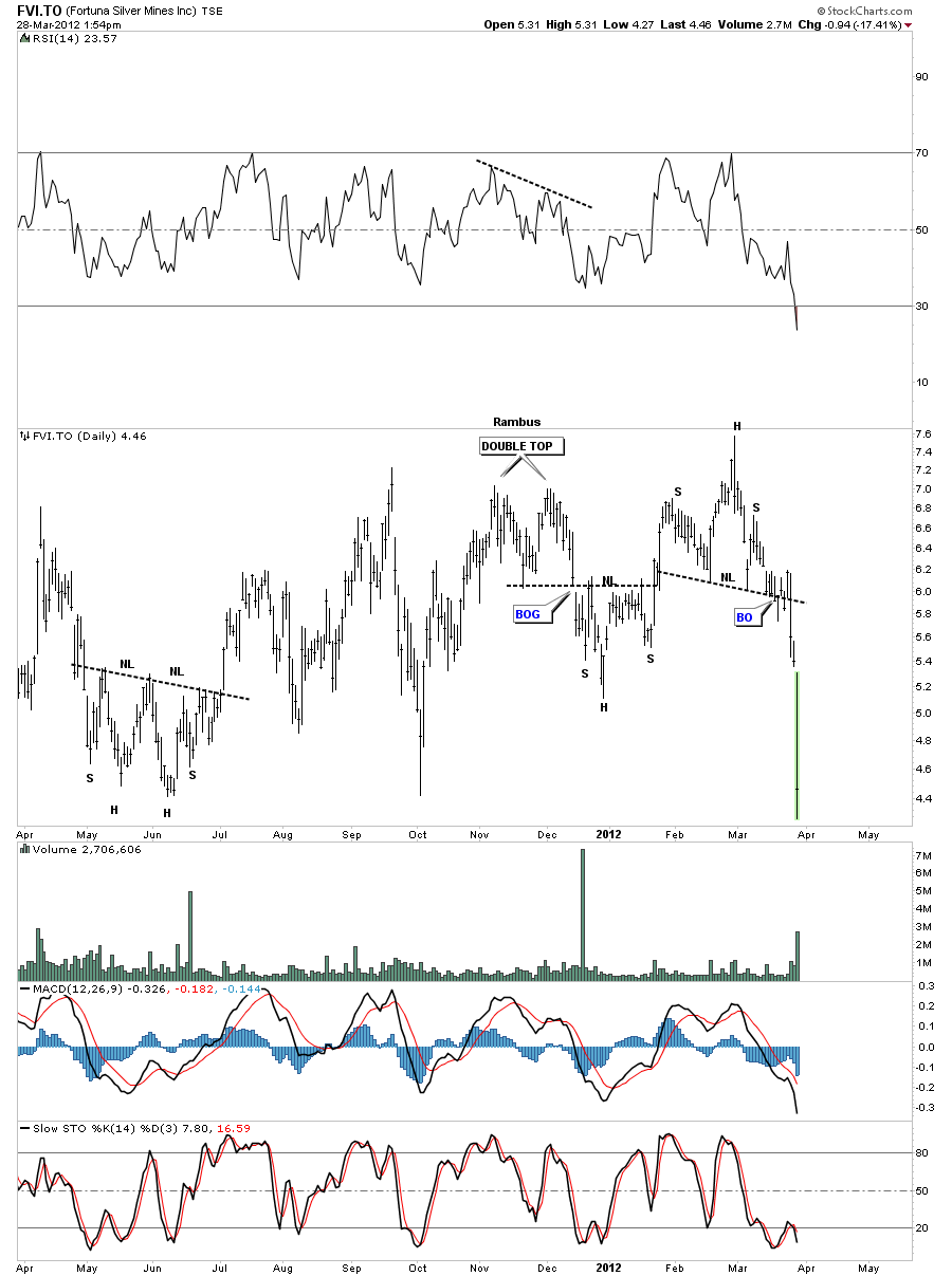
FVI.TO Update
HUI Update
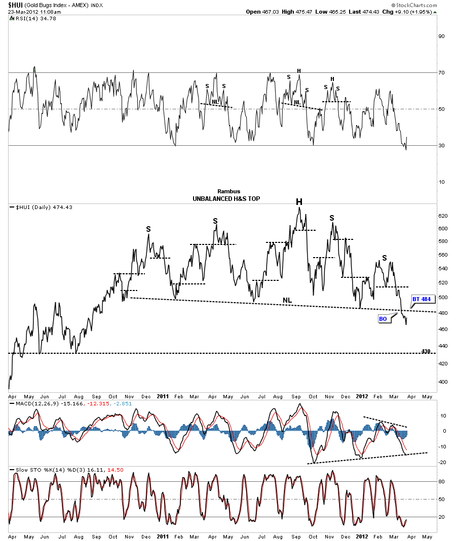
Below is the line chart that I’ve been showing that has the big H&S top in place. Remember a daily line chart takes the daily closing price only, added it to the previous days close, to build your chart. A line chart can takeout alot of noise that sometimes and can show a cleaner picture in some cases. As you can see on the chart below the HUI has had a clean backtest so far to the neckline at 484..I don’t want to sound like a broken record but that’s a very large H&S top that is complete. The further we fall below the neckline the big H&S top will start sticking out like a sore thumb. Its truly amazing to me that no one is seeing this massive topping pattern. I think everyone is so focused on the precious metals stocks, that have to go up, that they aren’t seeing the big picture. All I read is its time to buy because of all the bargains and how cheap the precious metals stocks are. As we all know they can get alot cheaper before the bottom is actually in. I have placed the next price objective down at 430 which was the bottom of the rectangle consolidation pattern made on the way up. It wouldn’t surprise me if we got a nice counter trend rally back up to the neckline and build out some symmetry on the right side of the chart equal to the left side once we reach 430.
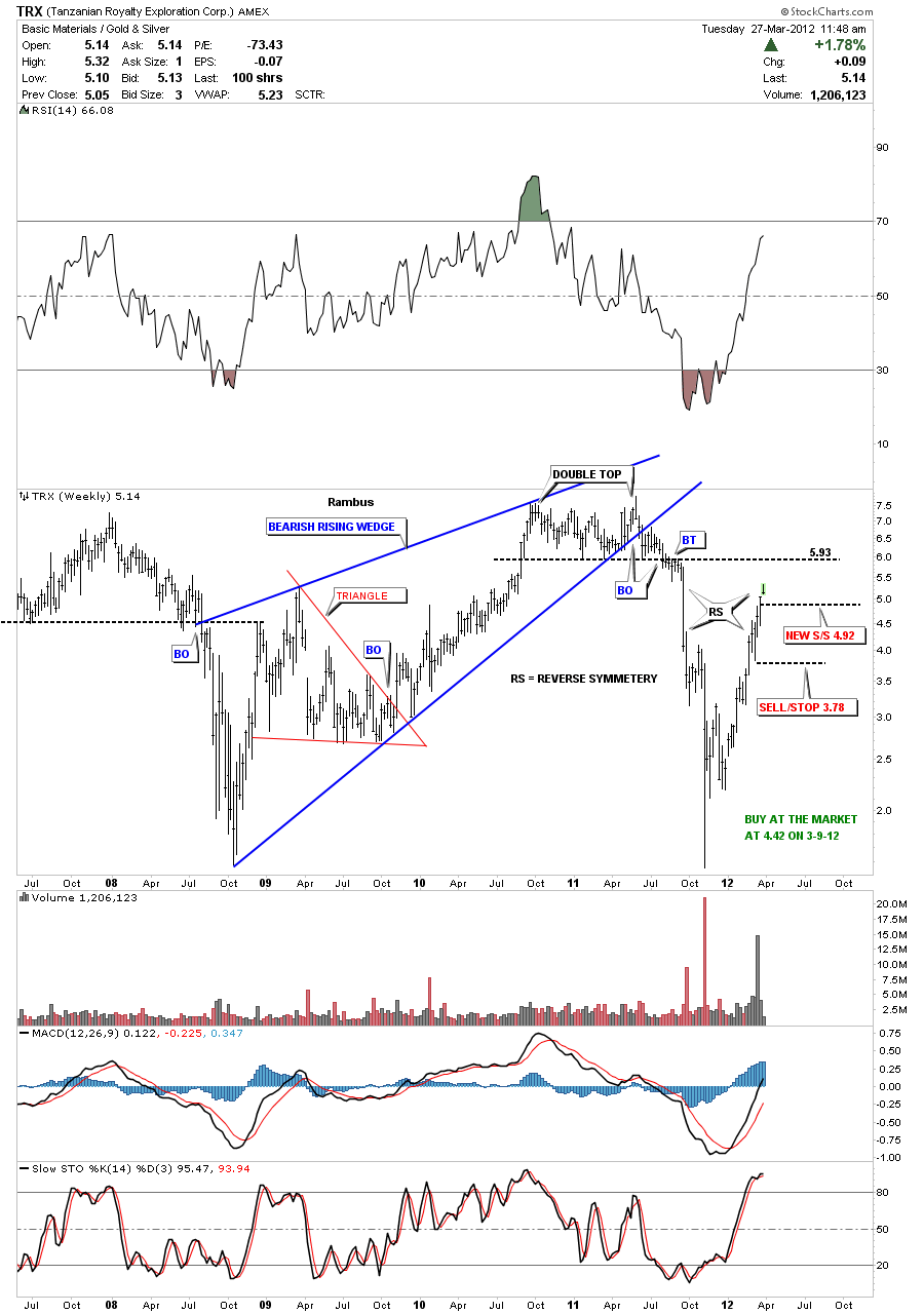
TRX Update
Weekend Report…HUI Inflection Point
Last week was one of those weeks that we can label as an inflection point. By that I mean we broke below some critical support rails on the daily bar and line charts of the HUI. The HUI hit an 18 month low that goes all the way back to August of 2010. Maybe it was just a false breakout or maybe not. Its going to take alittle more time to actually confirm that the top is in but its now in the bull’s camp to to show it’s in control. The bears have already moved the HUI to an 18 month low showing they are in charge for the time being. I still think last weeks action is a big deal and not to be overlooked lightly. I’ll will try and show some charts that may point to lower prices once the breakout and backtesting period is over.
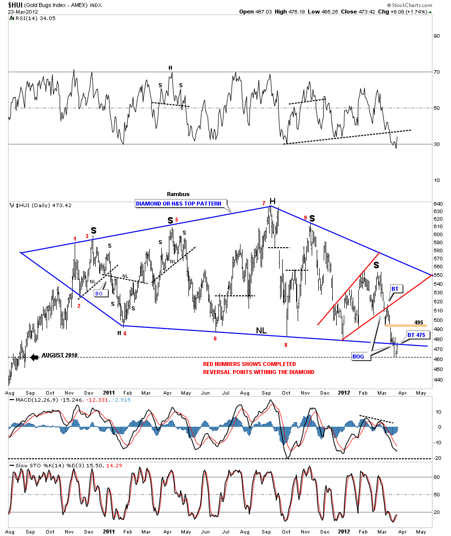
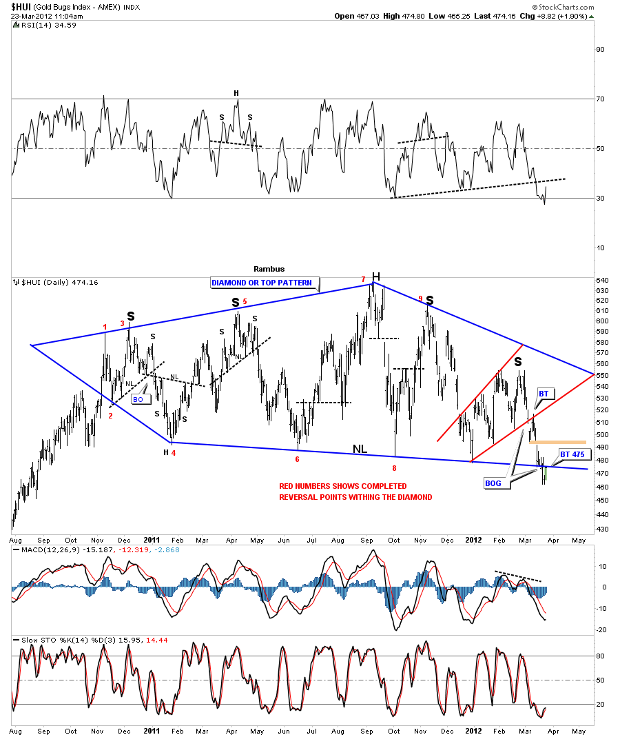
The first chart is the Diamond and H&S combo chart where both patterns are one of the same. You can also add the expanding triangle to that chart as well. Call it what you will but the bottom blue rail is the most critically important rail on that chart below. There is a gap around the 495 area that hasn’t been filled yet. That gap area would be my best case scenario for the bulls if they can achieve it. The first resistance point is the backtest to the bottom blue rail that we hit in last Friday’s rally at 475.
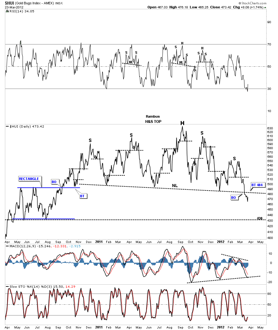
The next chart is a daily line chart that shows the H&S pattern pretty clearly. There are 2 left shoulders and 2 right shoulders with a nice head that is higher than both shoulders. A line chart generally shows the breakout alittle bit earlier than the bar chart will. As you can see the backtest to the neckline is at 484 which is about 10 points higher than the bar chart. If this H&S top patterns starts to play out to the downside, after the backtest takes place, the chart below shows where we may see our first counter trend rally off the 430 area that saw support back in 2010 at the bottom of the rectangle. The top of the rectangle is about 495 that I think has been offering support, allowing for the neckline to develop in a slightly declining manner. This weeks action finally broke through the top of the rectangle support and now the price action will target the bottom rail of the rectangle at 430 or so where we may get a counter trend rally all the way back up to the big neckline we are attempting to breakout of right now.
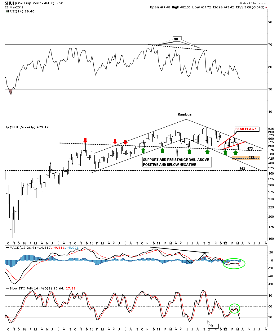
The next chart is a weekly bar chart that shows the HUI has been in a downtrend channel. Note the uptrend channel on the left side of the chart, higher highs and higher lows. Now look to the right side of the chart and the downtrend channel where the HUI has been making lower lows and lower highs. This is basic technical analysis.
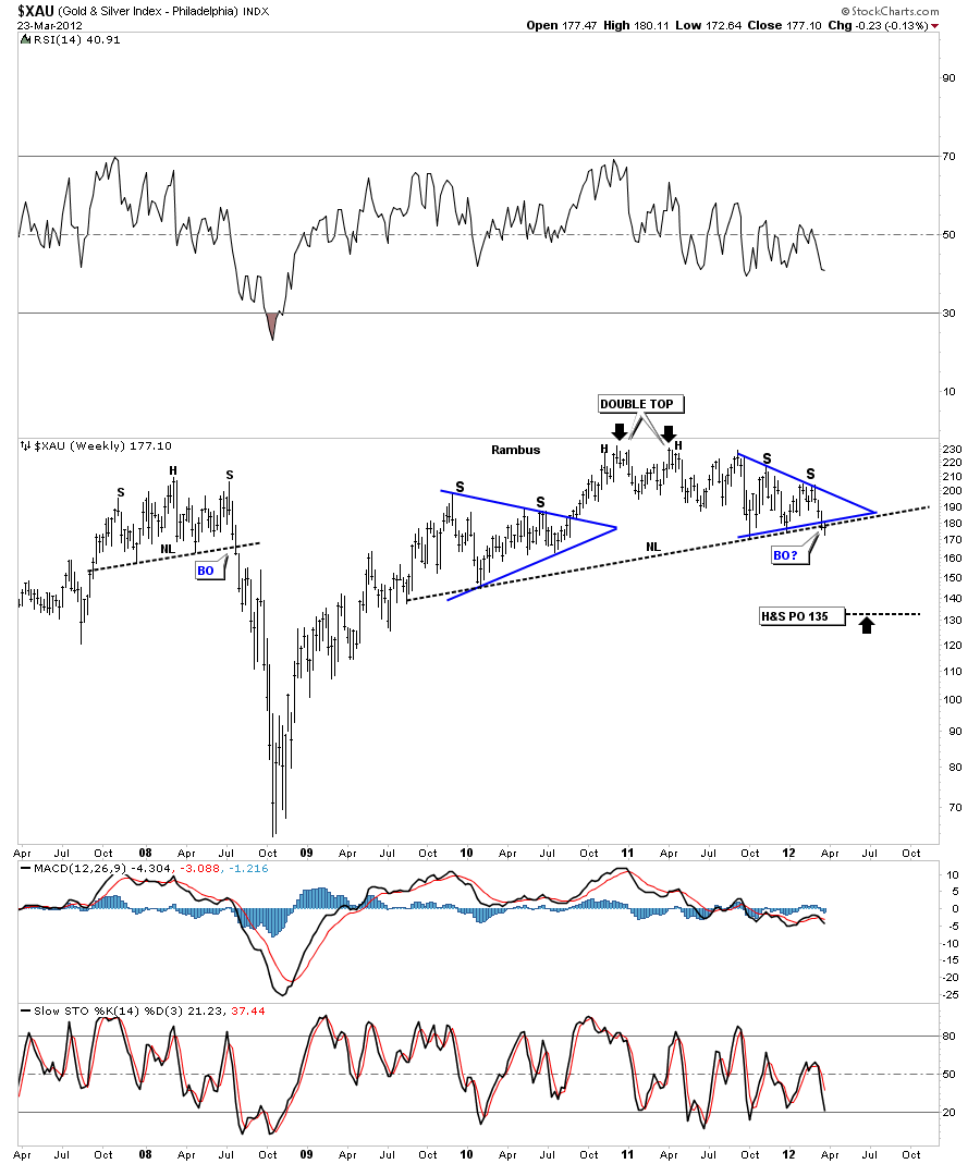
Lets see if the XAU has formed a H&S top. As you can see last weeks action took the XAU just below it’s neckline. We are still very early in the breakout process that may continue for several more weeks or so before we get total confirmation. Notice the H&S top on the left side of the chart. Some of you may remember the consequences of not believing that pattern when it took place. I have repeated several times in the past never ignore a potential H&S top. If it doesn’t workout you can always get back in but on the other hand if it does workout and you didn’t act accordingly then be prepared to suffer the consequences.
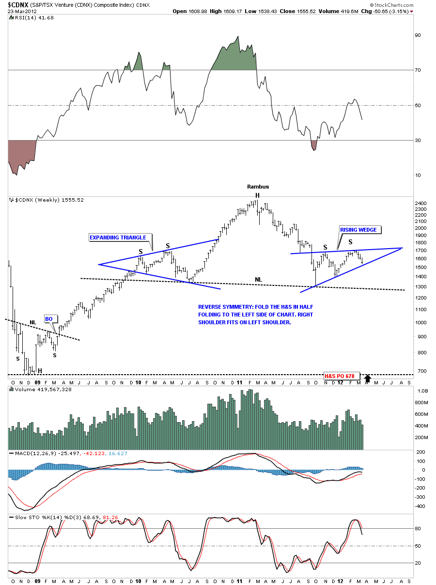
Lets look at another potential big H&S topping pattern that is still forming. The CDNX is a small cap Canadian index that has many small cap mining stocks along with some small cap oil stocks. Its a good proxy for the junior precious metals stocks. There is still some work to be done but the symmetry is pretty awesome.
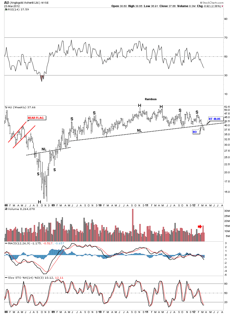
Lets look at some longer term H&S tops, in the precious metals stocks, that will show the same big neckline that is close to 18 months or so in the making. Some will already have broken the neckline, while some are still above their necklines.
AU has a very long neckline that broke to the downside two weeks ago. You can see there is a possible backtest to the 40 area to complete the breakout and backtest.
The monthly look really tightens up the H&S top pattern.
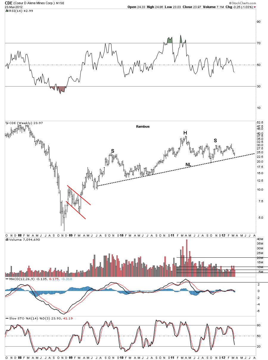
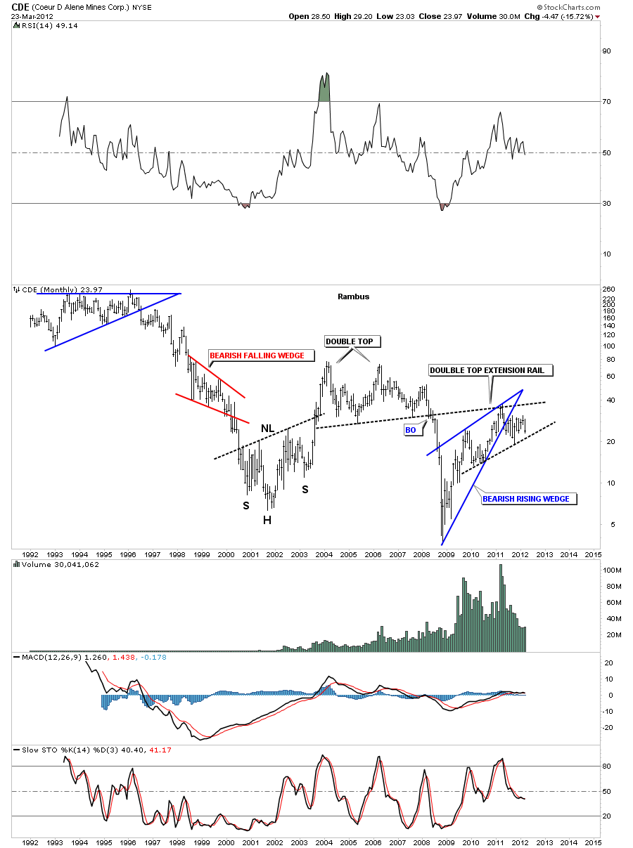
Next lets look at the potential H&S top for CDE which is still trading above the neckline.
The monthly look shows how the double top extension rail acted as resistance on the rally phase off the 2008 bottom. There is also a bearish rising wedge in play.
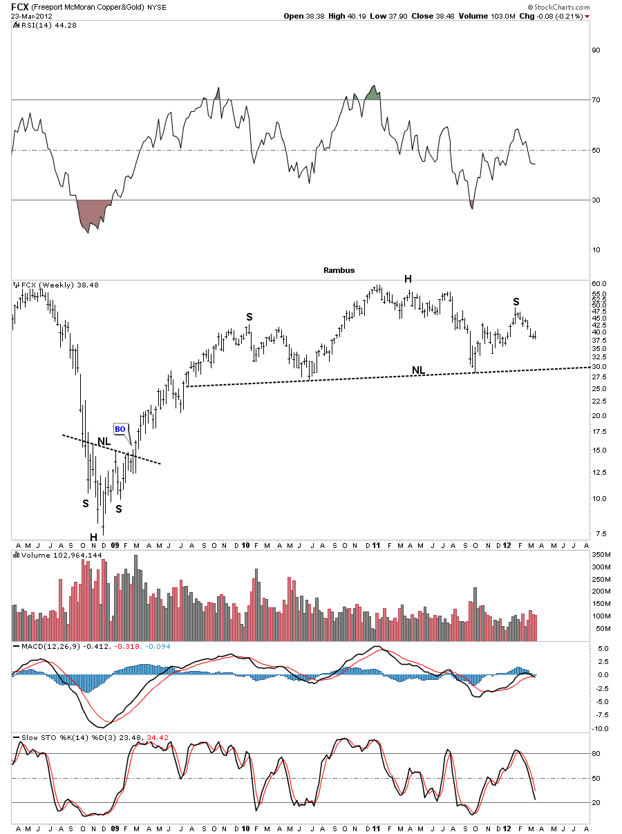
The next chart that has the big neckline is one of the star performers since the 2008 crash low. As you can see FCX is still quite a bit above it’s neckline but the symmetry is there to finish off the right shoulder.
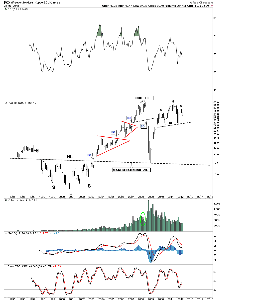
Lets tighten up that big H&S using the monthly chart. Note how the big H&S base, with the neckline extension rail that was made at the turn of the century, held support on the 2008 crash low.
SA shows the big neckline that it broke below 6 months ago and has just finished up another backtest.
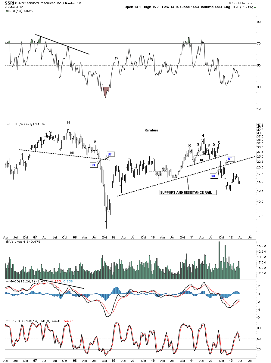
Lets look at one more chart with the big support and resistance rail. SSRI broke below it’s big S&R rail last year and had a nice backtest before it began to fall in earnest.
As you can see from the charts above that the big 18 month neckline is a key component in alot of precious metals stocks. Some have clearly broken below, some are getting close to breaking below and some are still above their neckline with a ways to go yet. As with any index most stocks don’t always break down at the same time. The weaker ones usually lead the way while the stronger ones will take their turn last. For alot of the precious metals stocks, that make up the indexes, there is still some work to do in regards to the breaking out and backtesting of their individual chart patterns. The bottom line is we can see the backtest taking place over the next several weeks before finally confirming the trend is now down instead of up or sideways as has been the case for the last 18 months or so with many of the big cap precious metals stocks. So we are at a major inflection point right here and now. Its up to the bulls to take the lead if the precious metals complex is going to rally to new highs. The burden of proof is now in their hands.
HUI Update
Today we are getting the backtest to the bottom rail on the diamond bar chart at 475. This is a very critical test taking place right now.
Below is the line chart of the H&S top formation. With the line chart the backtest can go as high as 485 or so. This is one of those critical points, when trading the markets, that one has to decided if this is the beginning of something or a stopping off point to lower prices. If you believe this is the beginning of a new bull move then you buy your favorite stocks or hold what you have. If you believe this is just a backtest to the breakout area then you either lighten up on your stock positions, go to cash or go short. There are many options right here and now to consider.
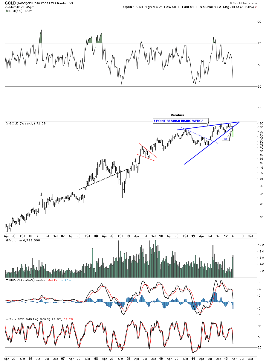
Randgold….
Weekend Report…Gold Correction
Gold and silver have been in corrections since they both had exceptional rally phases that topped out last year. Gold topped out with a double top, one high in August and the other high in September. Silver topped out much earlier as it’s rally phase started earlier than gold’s. Silver topped out in April of last year and the correction is now getting close to one year in the making. Both corrections are taking on the shape of a falling flag or downtrend channel with silver’s further along in it’s development. As you know I have turned cautious over the last several weeks as these consolidation patterns are still not suggesting that they are close to being completed. Just the opposites it true. Lets start with Gold as it has been forming a smaller consolidation pattern inside the bigger downtrend channel.
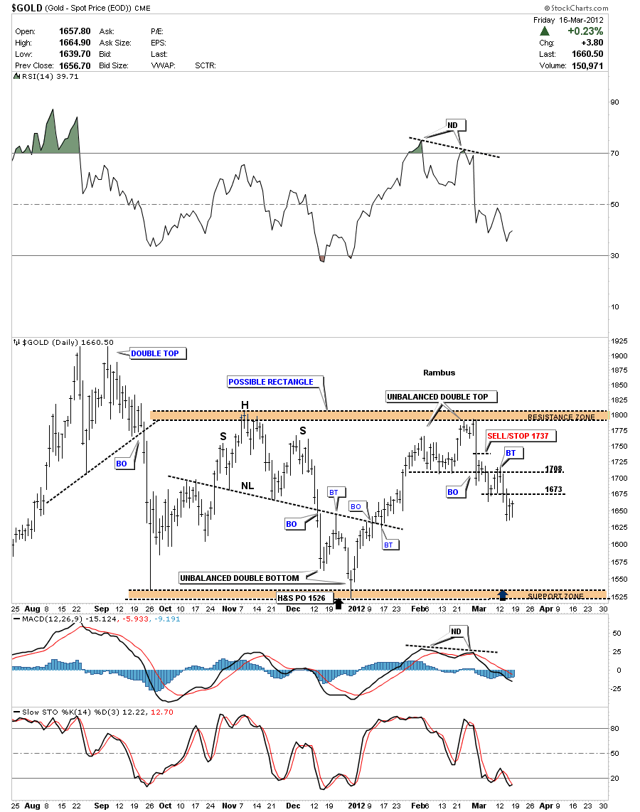
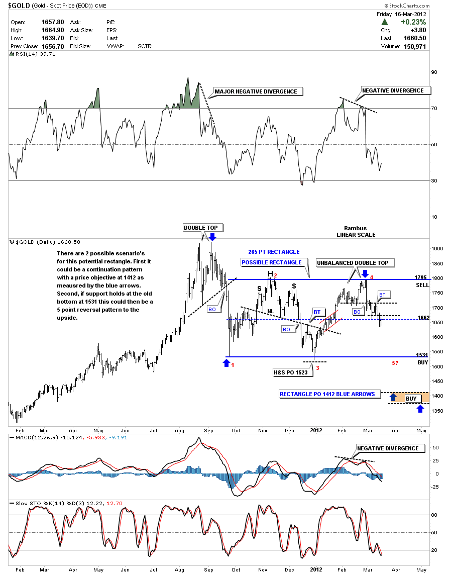
On the top left hand corner of the 8 month daily chart below you can see the double top that halted gold’s rally off the 2008 crash low. Once the double top gave way it only took 3 days to find the first bottom at the 1530 area. That first low is the beginning of our most recent consolidation pattern that is shaping up as a rectangle. Over the next 6 weeks or so gold found it’s first high at the 1800 area where it then went on to form a H&S top that signaled the next leg down would begin. That H&S top measured down to the 1526 area that was real close to the first leg down off the double top. That low at 1526 marked the 3rd reversal point in what now looks like a rectangle pattern. The next rally phase took prices up to the original high at 1800 where again gold ran out of steam as an unbalanced double top formed. Gold broke off that unbalanced double top with the flash crash signaling the top was in. As you can see we are presently trading below the double top hump making lower highs and lower lows.
The next chart shows a year and a half of trading that will give you a longer perspective so you can see how the possible rectangle fits into the bigger picture. We closed Friday right on the thin dashed blue rail that is the halfway point in the rectangle at 1660. This center rail usually acts as support or resistance depending on which way the price is moving. The rectangle will not be completed until we reach the bottom blue rail at 1530 or so at which point one of two things will occur. The first scenario is that the rectangle will be a consolidation pattern and gold will decline further down to the 1400 area as measured by the blue arrows. This is the preferred scenario. The second thing that could happen is that gold bounces off the bottom rail of the rectangle around the 1530 area and rallies back up leaving a fifth reversal point signaling the rectangle could then be a reversal pattern to the upside. At this point its still alittle too early to say which scenario will play out but looking at the longer term chart and the 6 month time cycle chart may give us some clues as to which pattern will eventually prevail.
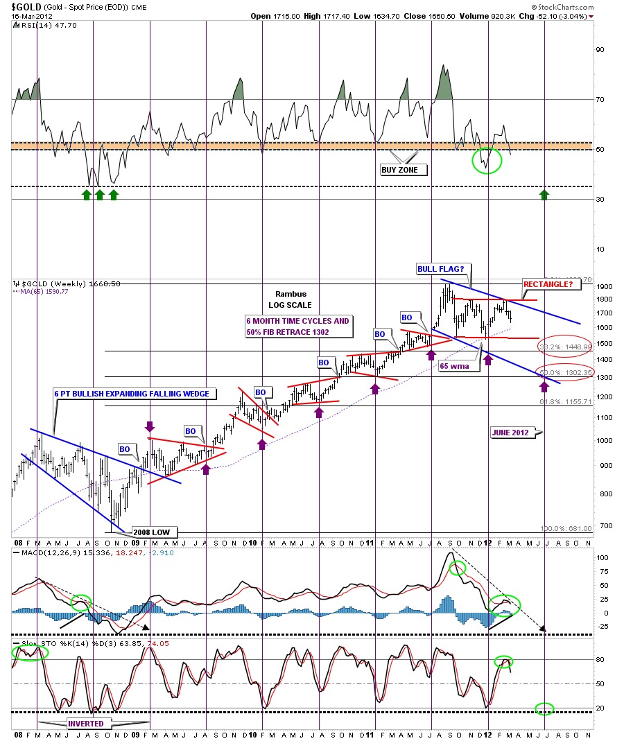
Next lets look at a weekly chart that shows the 6 month time cycle with Fibonacci retracements. Before we go to the 6 month time cycles we need to look at the 65 week moving average that has been one of the best moving averages for finding the bottoms in gold. After gold hit the 65 wma on the second leg off the double top, support was found which led to the rally back up to 1800 top blue rail of the rectangle. As you can see by looking back to just after the 2008 crash low the 65 week ma was never violated. That was also the case before the 2008 crash so this is a critically important moving average to keep a close eye. Now onto the 6 month time cycle that has been most accurate since the 2008 low calling every low except the very first one on the breakout of the 6 point expanding falling wedge which was inverted. As you can see the next cycle low is due in late June which is only 3 months away so there is still plenty of time for gold to chop around before putting in the next important bottom. I’ve added 2 Fibonacci retracements, one at 38% which comes in at 1449 and the 50% retrace that comes in at 1302 or so. When viewing this chart below notice the blue 6 point expanding falling wedge at the bottom left side of the chart that was the big correction of the first major advance of the bull market. Notice all the small red consolidation patterns that formed during the next major impulse leg up that ended with the top at 1920. Now to put our current blue consolidation pattern into perspective, think of all the action between the two big blue consolidation patterns as a major impulse leg, with the two bigger blue consolidation patterns as bookends. We are currently just correcting that big 3 year rally that came to an end at 1920 beginning of our current consolidation pattern.
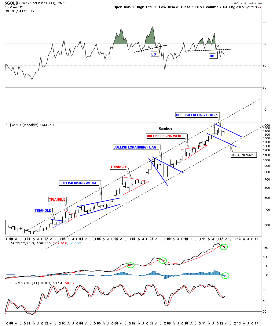
Just one more long term chart of the bull market for gold that goes all the way back to it’s beginning in 2001. The takeaway from this chart is the very nice clean uptrend channel and the bigger patterns that have formed at roughly the halfway point in each leg up. The top rail of the major uptrend channel has 3 major touches while the bottom rail only has one so far. Using the 6 month time cycle on the chart above I added a possible price objective for time and price that comes in around the 1325 area sometime in late June or July where the bottom rail of the major uptrend channel comes into play. Note the RSI at the top of the chart that has a topping pattern in place and also the MACD that has now crossed to the downside. The blue histogram is also below the zero line signaling weakness.
What these charts say to me is that gold is in a correction after rallying for almost 3 years off the 2008 crash low. This correction we currently find ourselves in is pretty normal when looking at the long term chart above. What is so painful is that the precious metals stocks have not participated in gold’s rally which makes this otherwise normal correction seem very extreme in nature and skews our emotions. July has produced some very good bottoms for the precious metals stocks in the past. This year July may very well provide the precious metals complex with a most excellent bottom to pick up some bargains that will surely materialize if these charts play out close to expectation.

