GDM bounced off the brown shaded S&R zone again this morning and is closing the big gap made on the previous decline. This morning it created another gap which will most likely be filled at some point. The 360 to 365 area on the GDM is setting up to be a very important line in the sand. As long as the GDM can stay above that S&R zone that’s positive but if it ever breaks below then the 360 to 365 will reverse it role from what is in now support to strong overhead resistance. Usually when you see a lot of gaps in a trading range they’re called area gaps and have little value compared to the other gaps like breakout or continuation gaps. The trading range continues to build out.
Yearly Archives: 2015
Wednesday Report…Deflation Signals Abound
It appears we maybe entering into another bout of deflation by the looks of some of the charts I’ve been looking at. The US dollar will be the key driver if this second leg down is going to take hold. Many of the commodities charts are looking pretty heavy right now along with some of the commodities based currencies.
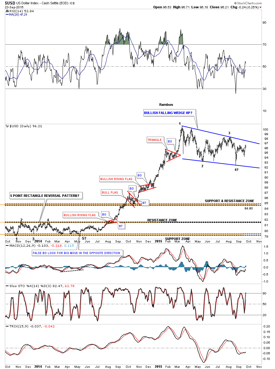
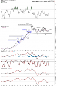
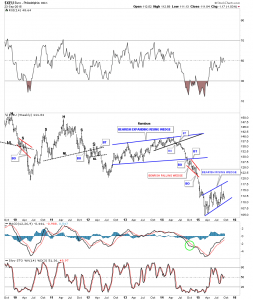
Lets start by looking at the most important currency in the world the US dollar. We’ll start with a two year daily chart for the US dollar that shows the big impulse move up that began last year in July and ended in March of this year. That big impulse move up was made up of four small red consolidation patterns two of which were bullish rising wedges which tells us the move is strong. Note how much bigger our blue bullish falling wedge consolidation pattern is vs the smaller red consolidation patterns that made up the impulse move. This is a perfect place for the US dollar to consolidate those big gains made last year. From a Chartology perspective this is exactly what you would like to see. The US dollar is working on its fourth reversal point that won’t be complete until it touches the top rail. At that point the pattern will be complete but we’ll still have to wait for the breakout to occur.
The daily line chart for the US dollar gives us a nice perspective on the development of the six month consolidation pattern which is showing up as a triangle. It’s currently testing the neckline made at reversal point #3 which is offering some short term resistance. A break above the little neckline will bring the top rail of the black triangle into focus. One step at a time.
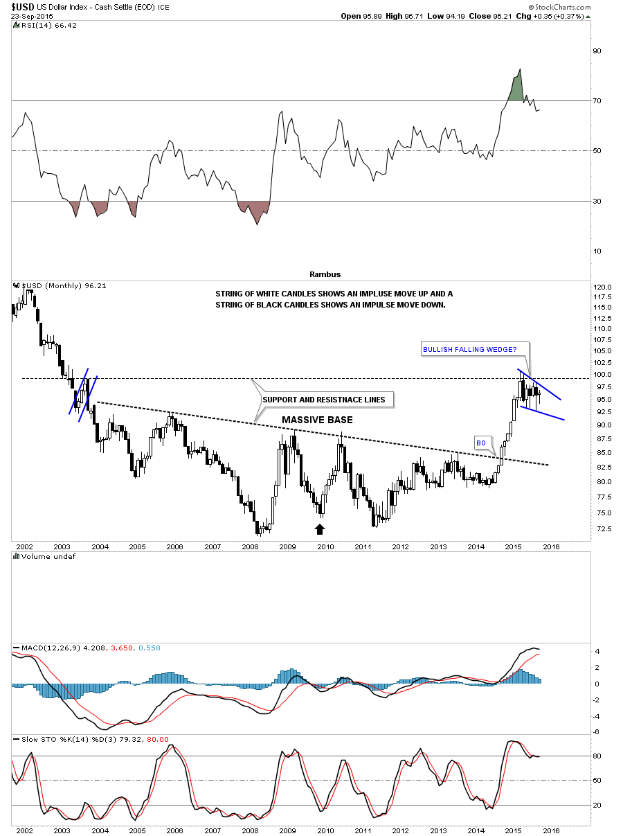
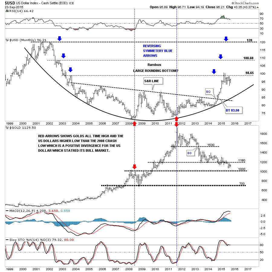
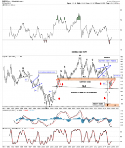
Lets now look at some long term monthly charts for the US dollar so you can see why I’m so bullish on the US dollar. This first monthly chart shows the big base that was built over a ten year period or so. Note the string of white candlesticks that shows us how strong that impulse move out of the big base was. The blue bullish falling wedge formed at the previous high made way back in 2003. This chart also shows you some nice reverse symmetry. How a stock comes down is often how it goes backup if the move down was very strong. I put a black arrow at the center of the chart just above 2010. Reverse symmetry is not a perfect science but it does give you a place to look for support or resistance when the trend changes. When you look at the chart below think of the black arrow as the center of a piece of paper. If you fold that piece of paper from the right side of the page to the left side you can see how similar the downtrend was to our current uptrend. Again the correlation isn’t perfect but you can see how the right side of the chart matches roughly the left side of the chart starting at the black arrow.
The next chart is a combo chart that has the US dollar on top and gold on the bottom. If the reverse symmetry keeps playing out we should expect the US dollar to breakout above the most recent high and rally up to the next area of resistance which was the high made back in 2002. This would most likely affect the PM complex and commodities in a negative way.
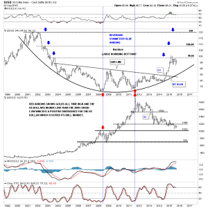
Lets look at one last long term chart of the US dollar which shows the massive bullish falling wedge that began to form back in 1984 or so. The big base we’ve been looking at on the charts above is labeled big base #2 on the chart below. That rally out of big base #2 was also strong enough to takeout the 30 year top rail of the bullish falling wedge. I’ve been showing this chart since the day the US dollar broke out above the top rail of that 30 year triangle. That breakout area just above the top rail of the falling wedge is our smaller bullish falling wedge we looked at on the daily chart above. Over the last six months or so that top rail has reversed its role to what had been resistance to now support. This chart shows why I think another down leg in the deflationary spiral maybe getting close at hand. The smaller daily falling wedge will show us the way when it finally breaks out.
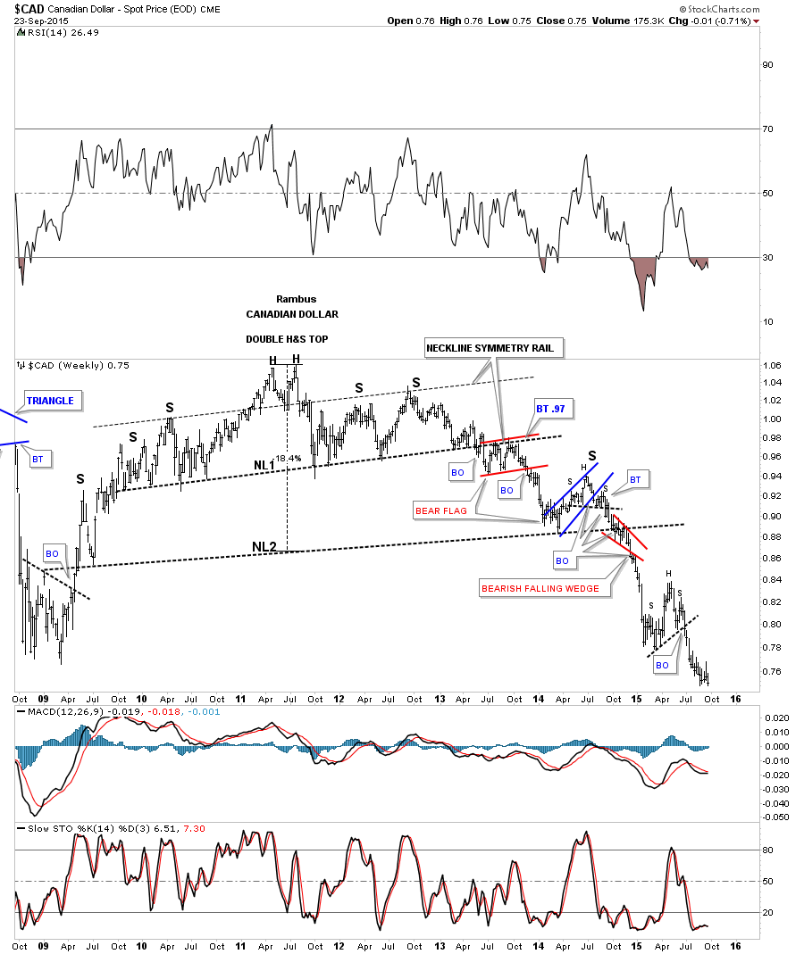
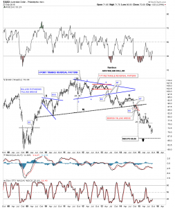
If the US dollar is going to rally to new highs it would make sense that most of the other important currencies of the world will look just the opposite to the US dollar by showing a bear market. The weekly chart for the Canadian dollar shows a huge topping pattern that took over five years to complete. It’s now trading at multi year lows.
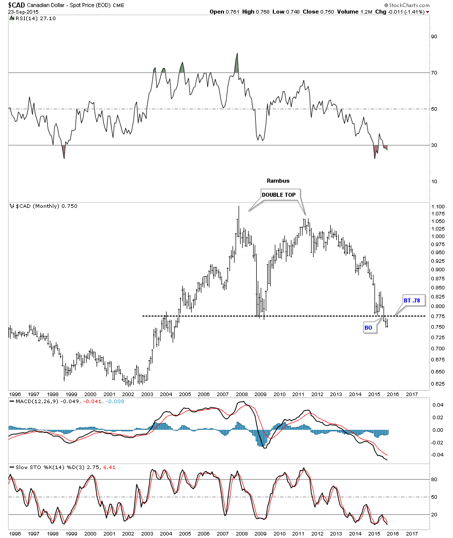
The 20 year monthly chart for the Canadian dollar shows it’s now just breaking below a double bottom trendline creating a huge 10 year double top. There is a lot of room for this currency to move lower.
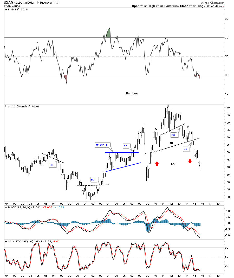
The Australian dollar is another commodities based economy that has put in a massive H&S top and is currently in its next impulse move down. Some of the longer term members may remember that little red bearish falling wedge that formed just below the neckline when the breakout occurred.
The long term monthly chart shows the Australian dollar forming a massive H&S top and is currently reversing symmetry to the downside as shown by the red arrows.
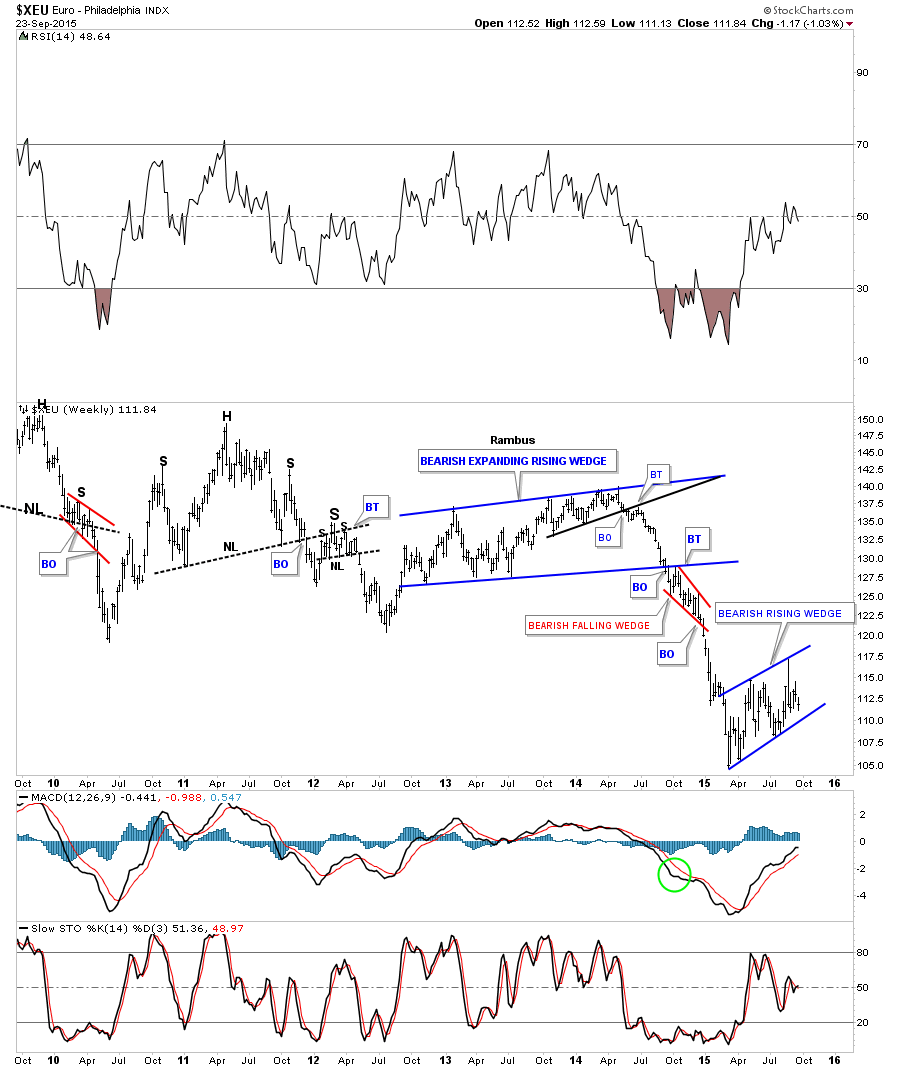
The euro is the most important currency to follow if you want to know what the US dollar is up to. In the first chart tonight I showed you the US dollar was in the process of building out a potential bullish falling wedge. If the US dollar is building out a bullish falling wedge then there is a good chance that the euro is building out a mirror image pattern of the US dollar which would be a bearish rising wedge. Like the US dollar the euro is also working on its fourth reversal point which won’t be complete until the bottom rail is hit.
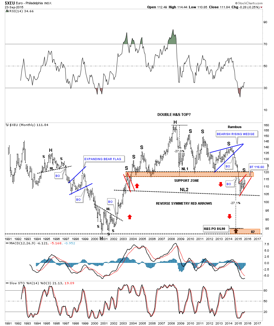
The monthly chart for the euro shows it has built out a massive double H&S top which would be an inverse look at the US dollars big base. During the last six months or so the euro has built out the little red bearish rising wedge just below the brown shaded S&R zone or neckline #1. Here again you can see the reverse symmetry is alive and well as shown by the red arrows. From a Chartology perspective this is a pretty but ugly looking chart for the euro.
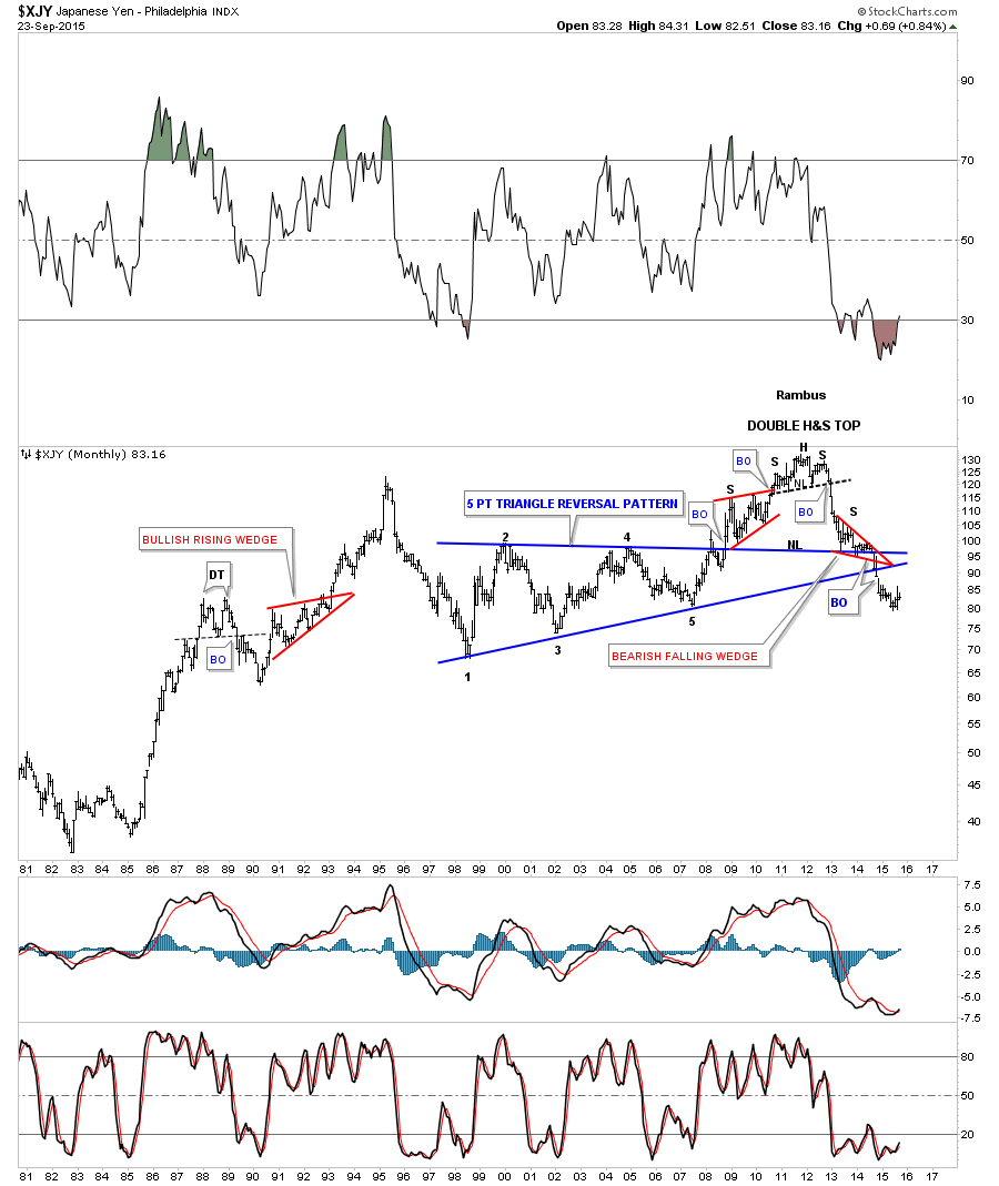
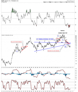
Lets look at one last important currency the $XJY, Japaneses yen. This long term monthly chart shows some nice Chartology. Note the H&S top that ended the yens bull market. The two smaller red consolidation patterns are forming the left and right shoulder of a much bigger H&S top. The little red bearish falling wedge led to an end around move of the apex of the large blue multi year triangle which is bearish.
The shape of most of the important currencies of the world are looking rather negative. Keep in mind these are long term charts so changes don’t come overnight. These charts above also tells us the story of the deflationary event that has gripped the worlds economies. Until these currencies find a bottom and the US dollar finds a long term top there is little hope that inflation will rise up to save the day.
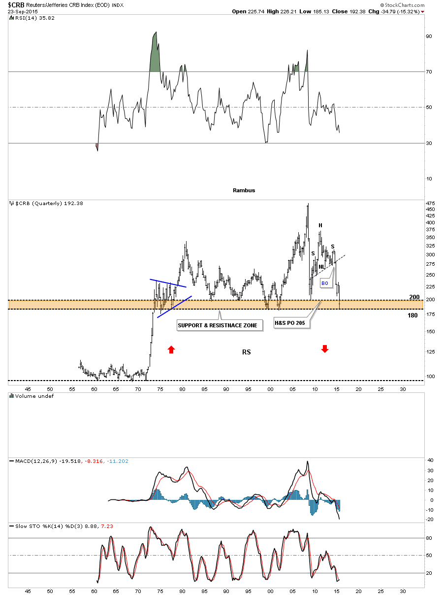
I would like to show you a 60 year quarterly chart for the CRB index that I’ve shown you several times before but it’s worth bring up again. We’ve been looking at some currencies that are showing some reverse symmetry. This quarterly chart for the CRB index is sitting right on a knifes edge as it’s testing the brown shaded Support and Resistance zone that goes all the way back to the early 1970’s. As you can see it got the initial bounce off of the bottom of the brown shaded S&R zone. This is one of those WHAT IF charts. What if the CRB index breaks below the brown shaded S&R zone. As you can see there was a vertical rally that happens back in the mid 1970’s that never paused to form an important consolidation pattern. That is the type of rally that reverse symmetry works the best in. Is it possible that the CRB index is going to crash all the way down to the mid 1970’s low to end this deflationary event that has been going on since the top in 2011? A break of the brown shaded S&R zone would leave all the price action above it as a massive top. All I can say is stay tuned as the next leg down may not be too far off. All the best…Rambus
SPX Update…
The stock markets are still in a dangerous area to try and get positioned for a move lower as many of the different stock markets have broken out from a bearish rising wedge formation since the August 24th low. This short term daily chart for the SPX shows a nice example of the rising wedge. Yesterday it broke below the bottom rail of its bearish rising wedge with today’s price action going nowhere. The top of the bearish rising wedge at reversal point #4 is the possible right shoulder high of a much bigger H&S top. A complete backtest would come in around the 1970 area.
The long term daily chart for the SPX is showing us a possible H&S top in play. The left shoulder was a bullish expanding falling wedge while the possible right shoulder is a bearish rising wedge. Breaking through the first brown shaded support and resistance zone at 2020 was a big clue that a potential H&S top maybe playing out. The reason being is that the top of the left shoulder should have held support under normal circumstances. As you can see the price action sliced right through the left shoulder high like a hot knife through butter. That was the very first thing we needed to see if a H&S pattern was going to form. Next we got the initial bounce that took the SPX backup to the lows that formed on the left side of the chart at the 1985 area. After bouncing off of the bottom rail of the blue rising wedge the SPX made another run higher but this time it found resistance at the 2020 area. This is a similar setup I was looking for on the oil chart where the tops of the left and right shoulders form at the exact same height even tho the neckline is slanted. Note how the brown shaded S&R zones held initial resistance at 1985 after the big selloff. The lower S&R zone was hit and the SPX fell lower followed by a second hit which this time broke through to find resistance at the next brown shaded S&R zone at 2020. The only S&R zone that hasn’t been tested is the one at 2045 which I’m viewing as the head portion of the big H&S top. Again getting positioned in this type of volatility can be very hard. You can be right but still wrong if the move is delayed or there is a whipsaw. If we get a backtest to the underside of the rising wedge at the 1970 area I will take a short position.
HUI Update
The long term daily chart below shows the massive bearish expanding falling wedge we’ve been following for well over a year now. You can see the big breakout gap that occurred in July and then the strong backtest to the bottom black trendline. I have pointed out many times when you see a smaller consolidation pattern form just above, just below, one above and one below or one right on an important trendline, which the bottom rail of the two year consolidation pattern is, is generally a bearish situation. A touch of the bottom rail of the possible red bearish falling wedge will complete the pattern. This would be a perfect setup as it would gives us a nice way to measure for a price objective. Using both measuring techniques I get a two price objectives one at 67.15 and the second just a little lower at 64.35. I don’t believe at this time that those two price objectives will mark the end of the bear market but it is a possibility that I’ll be watching very closely.
UNG & DGAZ Update…
Just before the site went down we were looking to take a last position in DGAZ which is a 3 X short natural gas etf when the bottom rail of the red expanding triangle was broken to the downside. The 2 hour chart shows the price action gapping below the bottom rail of the red expanding triangle on Monday of this week. If we get a backtest to the bottom red rail it should come in around the 12.30 area.
The daily chart for UNG shows the bigger Diamond consolidation pattern with the little red expanding triangle forming just below the bottom rail which is usually a bearish setup. Think of the blue Diamond as a halfway pattern to the downside. Note how the price action declined into the Diamond. We should see something similar when all the backtesting is finished and the next impulse move down begins in earnest which looks very close to beginning.
The 2 hour chart for DGAZ which is the 3 X short etf we’re trading shows its own expanding triangle with a breakout to the upside.
Below is the daily chart for DGAZ which shows the sideways trading range this etf has been in since the beginning of the year. I’m going to take my last position in DGAZ and buy another 2500 shares at the market at 7.00 using the sell/stop on the UNG if it hits 13.33 for now. KOLD is a 2 X short natural gas etf.
The monthly chart for DGAZ shows you why I’ve been accumulating short positions in natural gas. There is a potential very large inverse H&S bottom forming with the price action approaching the neckline. Keep in mind this is a monthly chart so things move very slowly from this perspective. With the deflationary theme in place this etf may offer some good returns.
LABU & UWTI Update…
I exited this trade when the sell/stop was hit at 31.25 on 9-21-15.
I’m going to exit the UWTI position as it’s not developing as it should since the breakout of the small triangle. I’m going sell 1000 shares at the market at 10.63 to close the position. The only position I have open now is the 3 X short natural gas etf DGAZ.
GDM Update…
First I would just like to thank everyone for their patience during this unfortunate situation we find ourselves in. Just know everything humanly possible is being done behind the scenes to get Rambus Chartology back up and running better than ever. Rambus
There is a potential pattern taking shape on the daily chart for the GDM that was virtually undetectable until yesterday. After slightly closing above the 50 dma the GDM has been declining back down to the bottom of the recent trading range that began at the August low. I have always viewed this little trading range, at the bottom of the chart, as a halfway point in the decline that began when the H&S / triangle broke down back in June of this year. Last Friday’s high may very well be the start of the 4th reversal point to the downside which won’t be complete until the bottom rail of the potential bearish falling wedge is hit. This is a perfect area for a small consolidation pattern to form. As you know there can be 2 or more individual chart patterns that form a bigger pattern. Originally I was looking at the possible H&S consolidation pattern as the halfway pattern and still is part of the nearly two month trading range.
Below is the 60 minute chart for the GDM we’ve been following very closely during the formation of the H&S consolidation pattern. You can see what looked like a breakout when the price action gapped below the brown shaded S&R zone or neckline. The markets have a way to shake the bush before the original move you were looking for actually gets a chance to take place. The GDM rallied back up to the area of the tops of the left and right shoulders and with one finally gasp it gapped above the right shoulder high putting in an exhaustion gap. Now we have an unbalanced H&S consolidation pattern with one left shoulder and two right shoulders. Keep in mind this small potential trading range is still developing. Also there was a big gap made yesterday that may get tested.
Rambus Chartology is Back
TO SEE RAMBUS NEW POSTS …SCROLL PAST THIS MESSAGE OR CLICK “RECENT POSTS” ON THE RIGHT….CLICK ON A CHART 2x TO ENLARGE
…………………………………………………
Welcome to this temporary site for Rambus Chartology .
It is open to all to view for the time being while we sort out all issues .
Only Rambus and Admins will be posting here .
…………………………………………………………..
Forum :
We encourage all Forum Posters and Lurkers to go to Goldtent http://goldtadise.com/ and use that excellent public forum to communicate and discuss issues while a new Chartology Forum is being recreated. If you do not have a registered user name and password there email Fullgoldcrown at gmag@live.ca and I will set you up as we have disabled the registration button there for now as a security precaution.
…………………………………………………………..
Here is a recap of what we know
1…Our site was destroyed by professional hackers .
2…There were 4 Paid members who joined the site for the purpose of taking it down .
3…Initially we thought our wordpress program was hacked due to a security breach in a wordpress update . And this may have been true initially BUT….
4…The destroyers actually hacked into the Server at our hosting site itself . Because of this we were helpless . For 2 weeks , Webmaster Audept fought the culprits tooth and nail. But he could not turn off their access because as it turns out they had acquired the super root password to the server . This is a serious breach at our webhosting company .They have finally confirmed this .
5…The perps had the audacity to contact us and offer their webhosting services for a fee !…We have reported this to the Authorities at Computer Fraud along with proof and some strong leads which will soon lead to their prosecution .
6…This temporary website was built on a new server with the utmost concern for security.
7..Paypal has assured us all credit card info is safe and secure at their site and NONE of that information existed on the Rambus Server. We have confirmed this independently .
8….We are researching all options for a new webhosting service with Support and Security a top priority…Anybody with a recommendation please contact us at the above email address . We expect to be back with fully functioning Rambus Chartology and Chartology Forum sites within a week or two , complete with a remote backup site .
9…We will be offering 1 month rebates to all members upon request once the site is back up .
10…A heartfelt thank you to all who expressed your goodwill and understanding and support during this confusing and difficult situation. We are truly a community here . We have been in operation for 4 years . We have heard from other commercial sites that hacking is a way of life and we have been fortunate that this is our first experience. What doesn’t kill you makes you stronger .
11…Rambus is itching to get back at his desk and will be posting here as soon as possible . This Temporary Site will be an open site so no log in necessary for the time being .
12..This Post will remain at the top of the page for now. Please Scroll Down to See Rambus Posts.
Questions …. gmag@live.ca
………………………………………………………
Thanks for your patience and Understanding..All For One and One for All…
Dave , Todd . Laveta and Gary