This gallery contains 7 photos.

This gallery contains 12 photos.
The following is an opinion piece assessing whether the gold mining stocks are in a primary bull or bear market. I form my conclusion by analyzing the charts, investor sentiment and applying the principles taught by the great published analysts … Continue reading
This gallery contains 6 photos.
I am making a market strategy adjustment and I thought I would pass it along. It’s actually consistent with the charts that Rambus has been presenting so I thought best I post it on the main page. Why the change? … Continue reading
This gallery contains 7 photos.
I would like to take a look at the recent action in the GDX and consider whether the gold stocks have now completed the correction which began in early August 2020. It appears to me that the internal action demonstrated … Continue reading
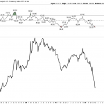
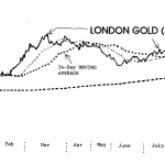
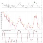
This gallery contains 18 photos.
Trivia Question-Who said this quote? “Gold gets dug out of the ground in Africa, or some place. Then we melt it down, dig another hole, bury it again and pay people to stand around guarding it. It has no utility. … Continue reading