Over the last several months or so I’ve been writing about the bond market throwing us a possible curveball. Instead of continuing rising interest rate we may see falling rates. Today the $TNX, 10 year treasury yield finally broke below the neckline we’ve been following that started to developing back in January of this year. I’ve labeled the H&S top as an unbalanced H&S top as the price action formed a second right shoulder that was a small H&S top. A backtest to the neckline would now come into play around the 28.65 area.
A longer term daily chart.
The weekly chart shows the $TNX has been rising for the last two years building out a possible bearish rising wedge with the H&S top forming at the top. That H&S top is strongly suggesting the bottom rail of the black rising wedge is going to give way to the downside. The curveball has almost reached home plate.
Below is a combo chart which has the $TYX, 30 year bond on top and the $TNX 10 year bond on the bottom.
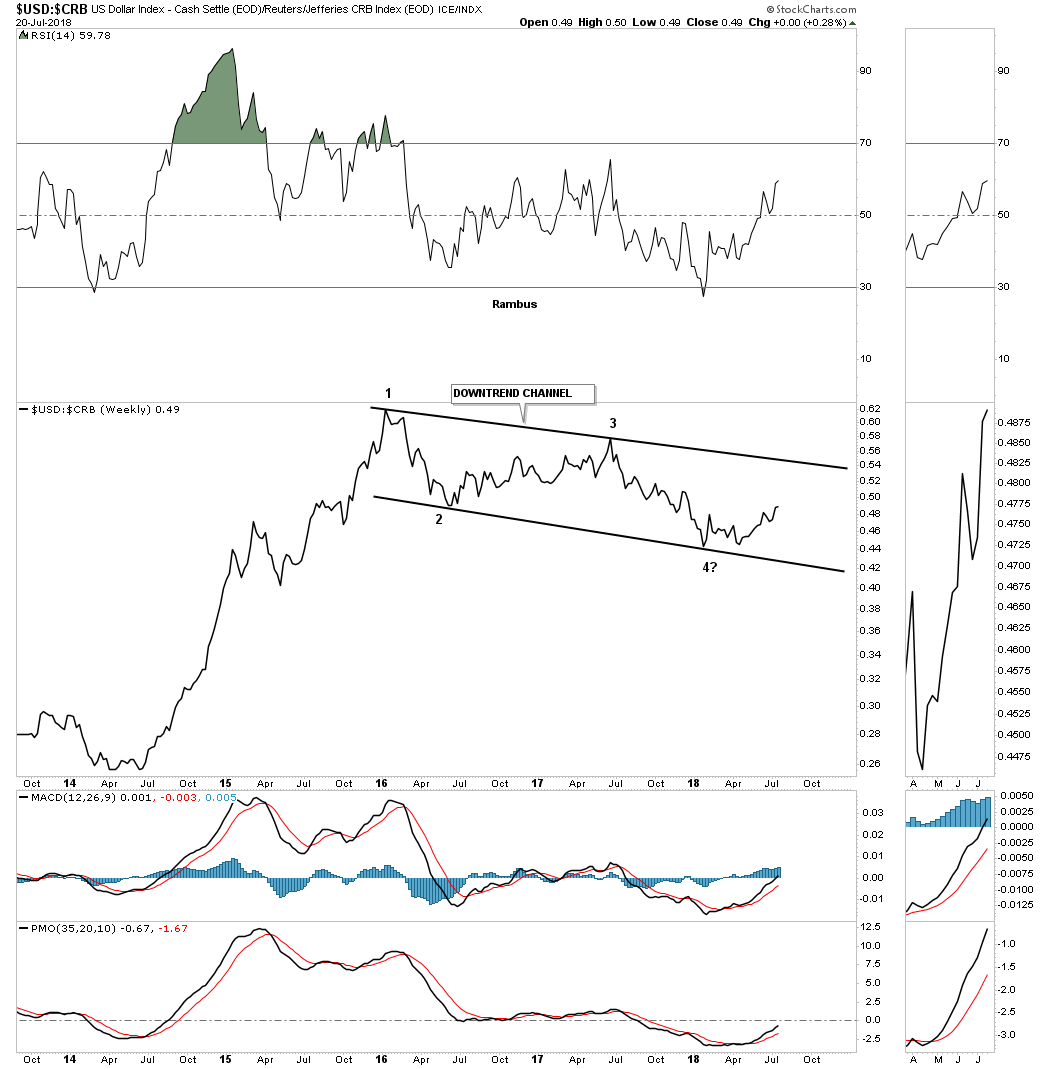
For the last several months or so I’ve been showing you that many of the important currencies that make up the US dollar have been breaking down from large 2 1/2 year trading ranges. If you want to know what the US dollar is going to do the first thing you need to do is look at the important currencies that make up the US dollar as the US dollar is just a derivative of those currencies. Most of the time a stock, or in this case the currencies that make up the US dollar are trading within a reversal pattern, consolidation pattern, or are in an impulse move. It’s that impulse move that you want to be aware of and the earlier the better.
Tonight I’m going to update most of the currencies we’ve been following over the last several months because I believe they’re in the process of beginning an important impulse leg down which can have a profound affect on the PM complex and commodities in general. These types of moves don’t come around all that often, but when you begin to see an important setup maturing it’s usually worth the risk to try and take advantage of what the market will give you and impulse moves are what I live for as an intermediate term trader.
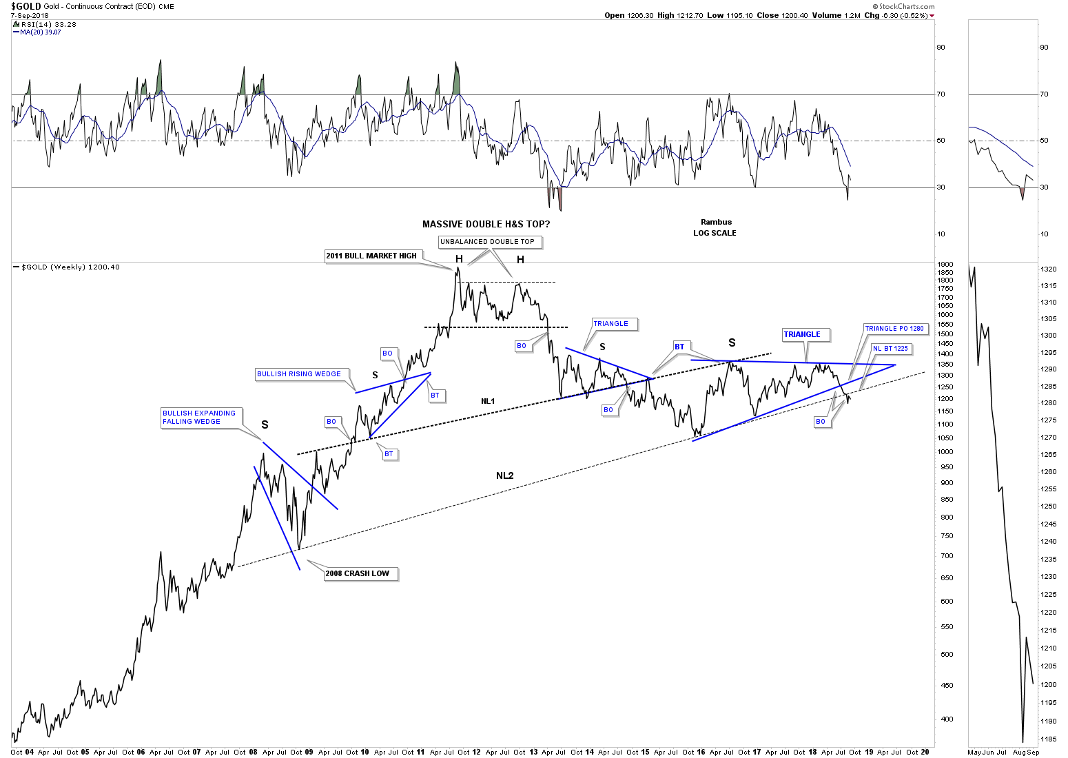
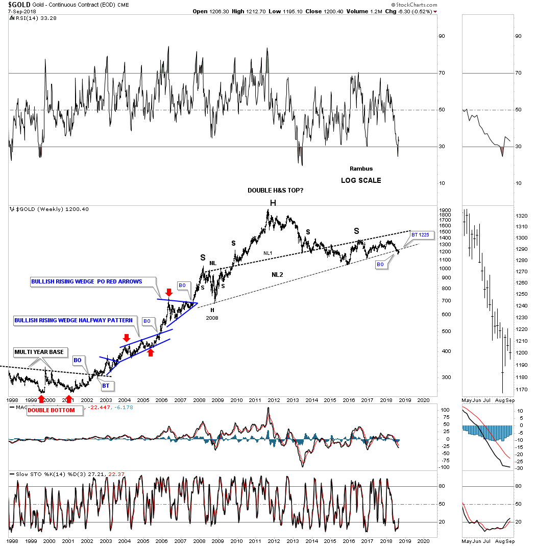
I’m not going to go into a lot of detail as we’ve been following these different currencies pretty closely for the last two or three months. It’s important to understand that most of the currencies we are going to look at have been in a bear market since the 2011 H&S top in most cases. From the initial breakdown below their respective necklines their impulse move really got underway even though it actually started at the previous high, which was the top of the right shoulder.
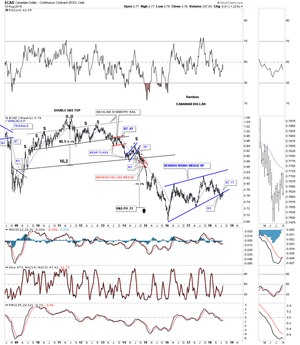
Lets start with the $CAD Canadian dollar, which formed a massive H&S top in 2011 with the first impulse leg down starting at the right shoulder high. Confirmation of that impulse leg is when the price action broke below the neckline. Like with so many things realated to the currencies, PM complex and commodities in general, 2016 marked an important low which finished up a very large impulse move down. As you can see it has taken the CAD dollar 2 1/2 years to consolidate that massive leg down. For the last several months the price action has been in breakout and backtesting mode to the bottom rail of that 2 1/2 year bearish rising wedge which I’m labeling as a halfway pattern. Also keep in mind that Canada is a natural resource country.
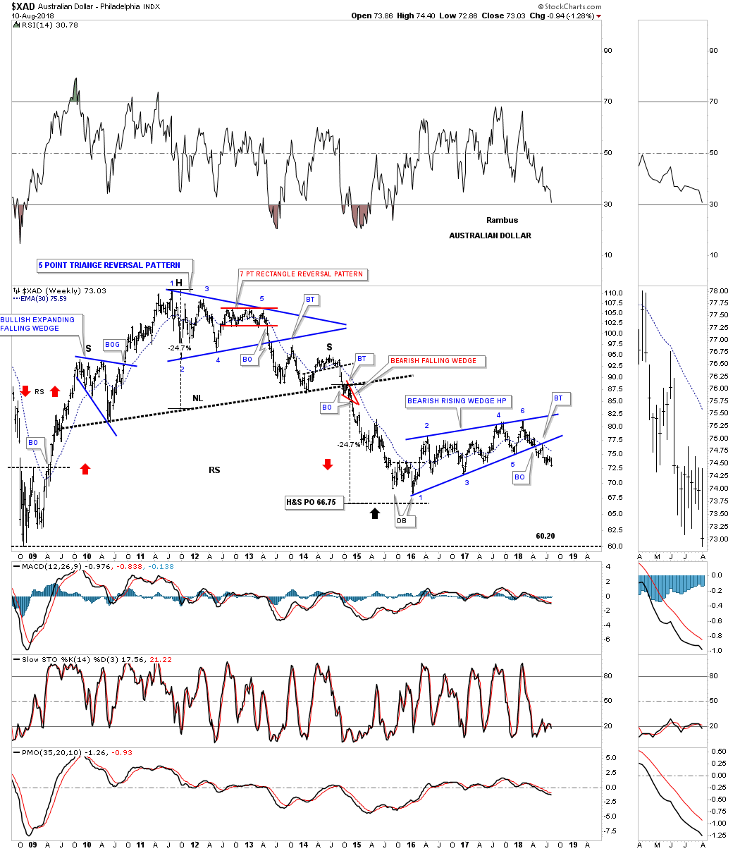
Another natural resource country is Australia with its currency looking very similar to the Canadian dollar, but is actually a little further along in its impulse move lower as it closed last week at a new low since the breakout from its bearish rising wedge. Again you can see the massive H&S top followed by the first impulse move down followed by the 2 1/2 bearish rising wedge consolidation pattern with the possible next impulse move down already underway.
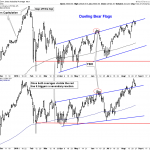
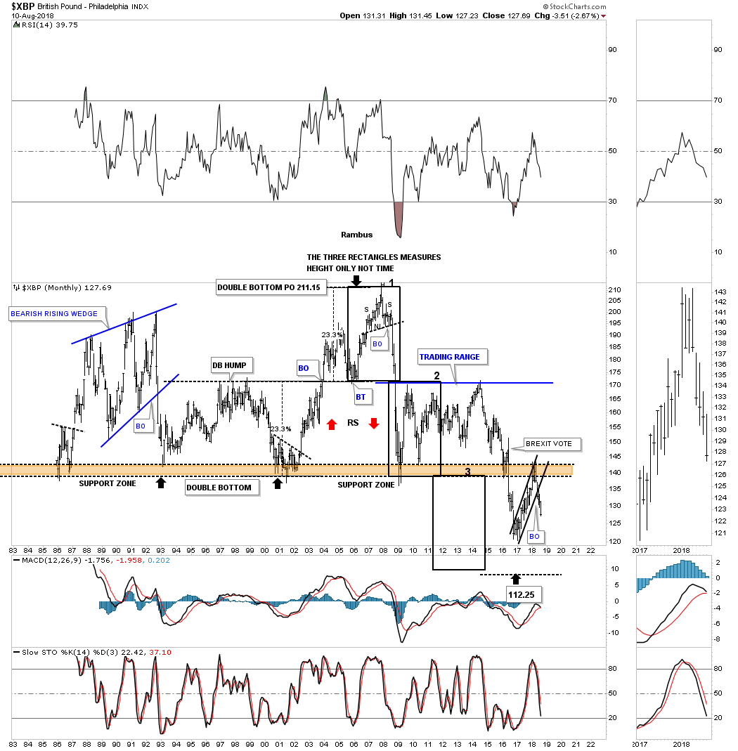
Next is the $XBP, British pound, that is setup a bit differently than the two currencies above as it built out a smaller, but just as effective as the one year H&S top in 2008. That impulse move ended in 2009 where the British pound began to consolidate that leg down by building out a massive six year morphing triangle consolidation pattern. In October of 2016 the XBP began to consolidate the impulse leg down forming a year and half rising flag formation. Early this year the rising flag formation broke out to the downside and made a new low for this move.
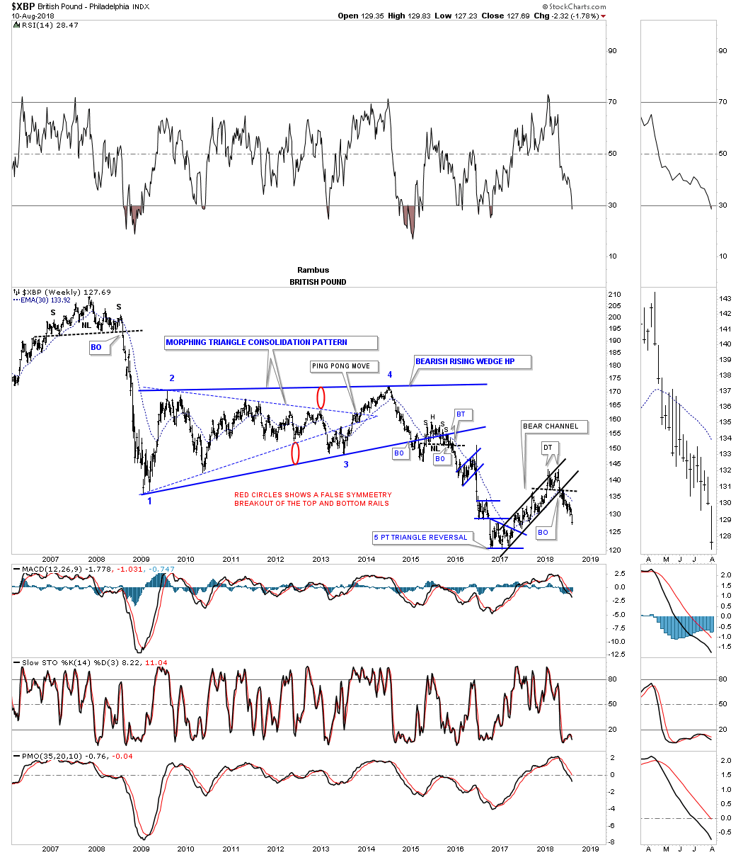
I’m going to show you the monthly chart for the British pound as it shows you a good example of how support, once broken to the downside, can turn into resistance when tested from below on a countertrend rally.
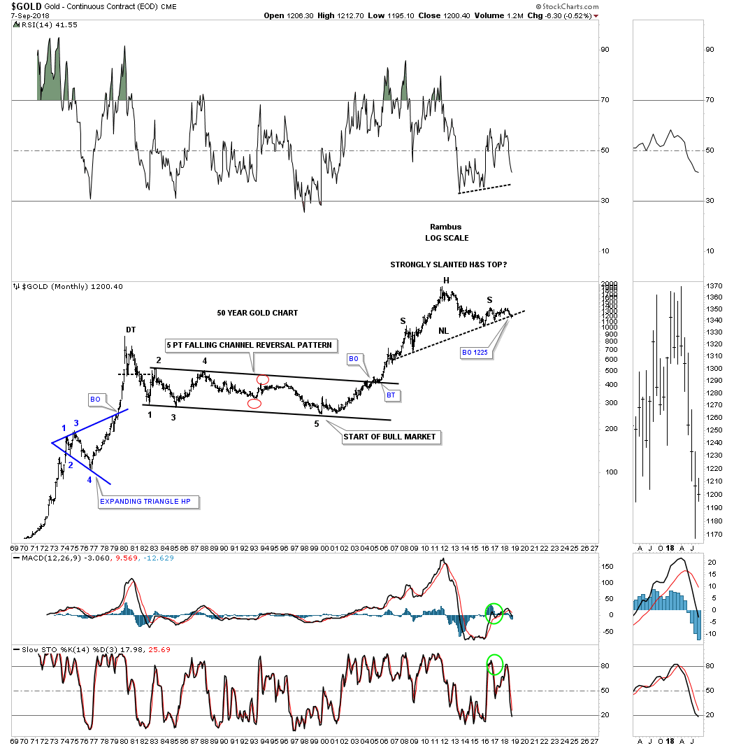
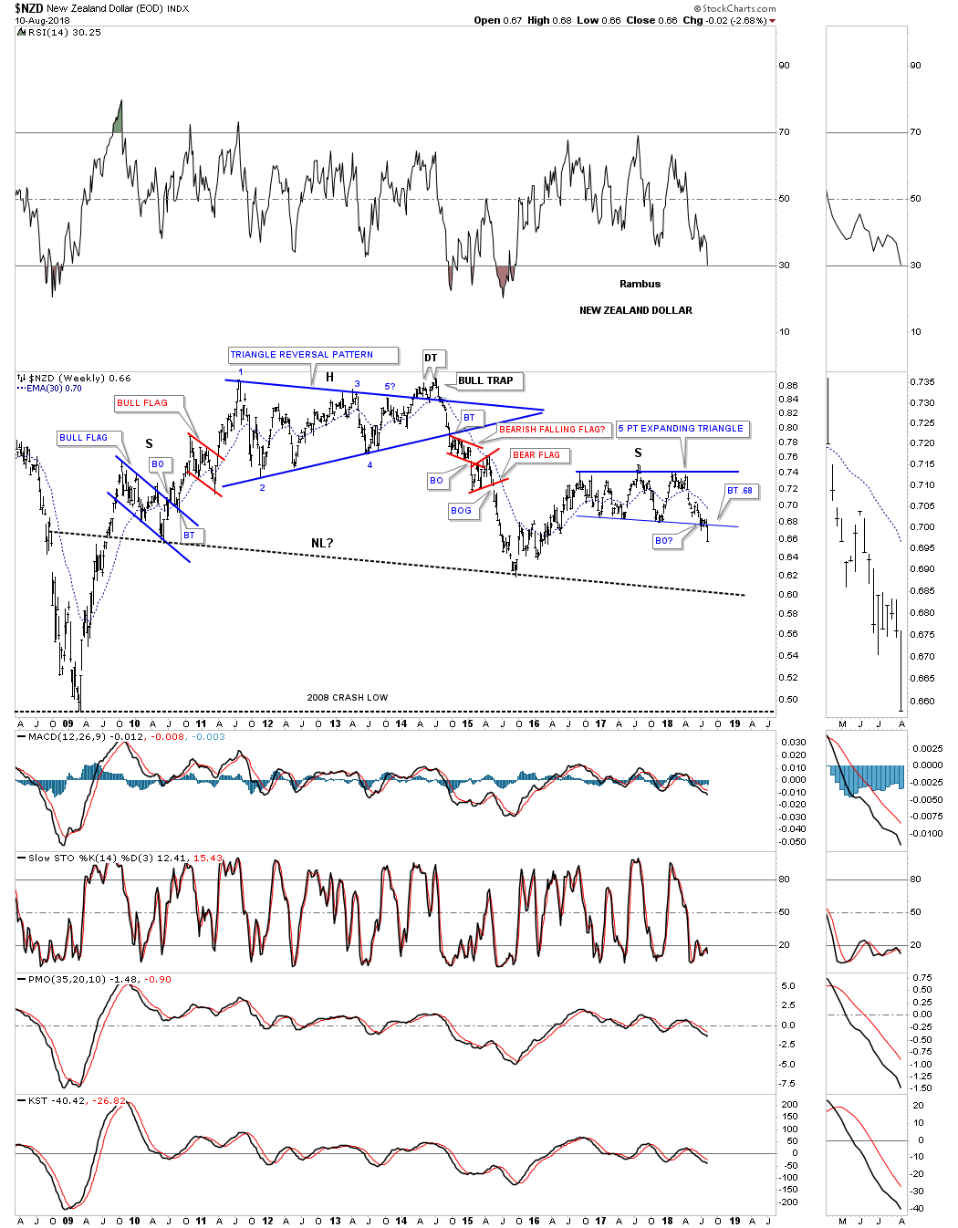
The $NZD, New Zealand dollar, topped out in 2011 but then went on to build out a large multi year triangle reversal pattern which led it its first bear market decline into the middle of 2015 low. Last week the price action broke down from the blue 5 point expanding triangle reversal pattern. It’s a reversal pattern because it formed above the 2016 low.
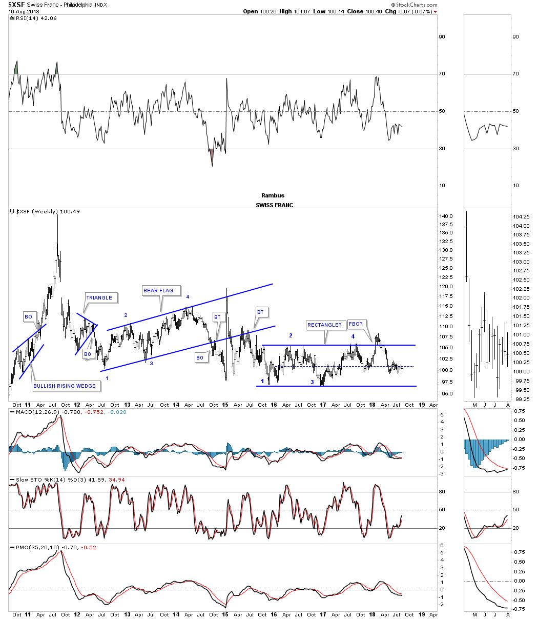
The $XSF, Swiss franc, had a parabolic spike into its 2011 all time high with the first impulse move down reversing symmetry into the January 2012 low. From that point it’s been on pretty much a sideways chop with a possible rectangle forming since the low in November of 2016 just over 2 1/2 years.
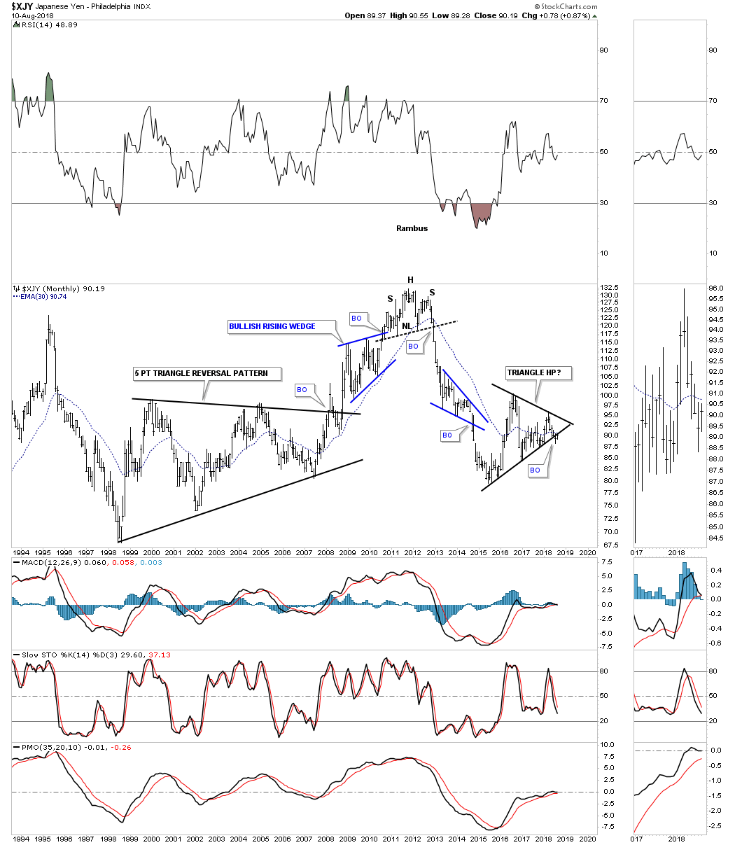
The monthly chart for the $XJY, Japanese yen, ended its bull market by building out a H&S top reversal pattern in 2011 followed by a strong impulse leg down which finally bottomed in January of 2015. From that January 2015 low the yen has been constructing a large triangle consolidation pattern with a breakout to the downside early in July of this year.
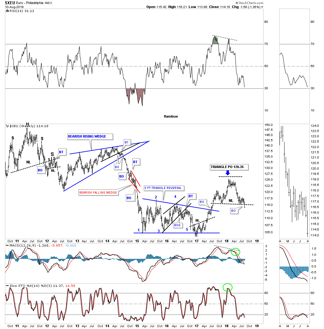
The $XEU euro, is the biggest component of the US dollar and actually topped out in 2008 building out a massive 12 year H&S top. Last week the euro broke below the neckline of its H&S top which was the backtest to that massive 12 year neckline.
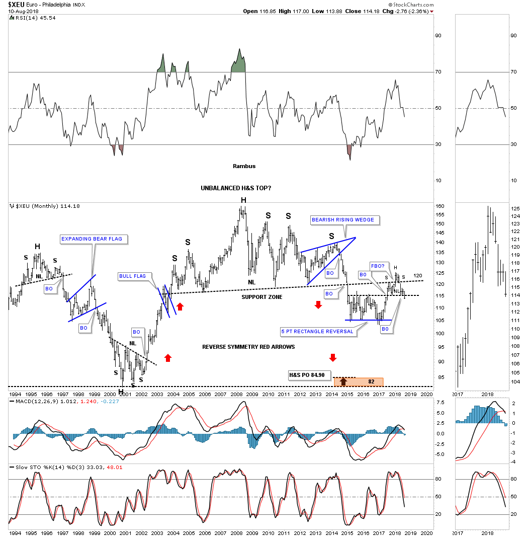
Since the XEU makes up the biggest part of the US dollar we can see a small H&S top on this weekly chart made over the last year. If the XEU is building out a H&S top, then the US dollar will have been building out a H&S bottom of that same timeframe.
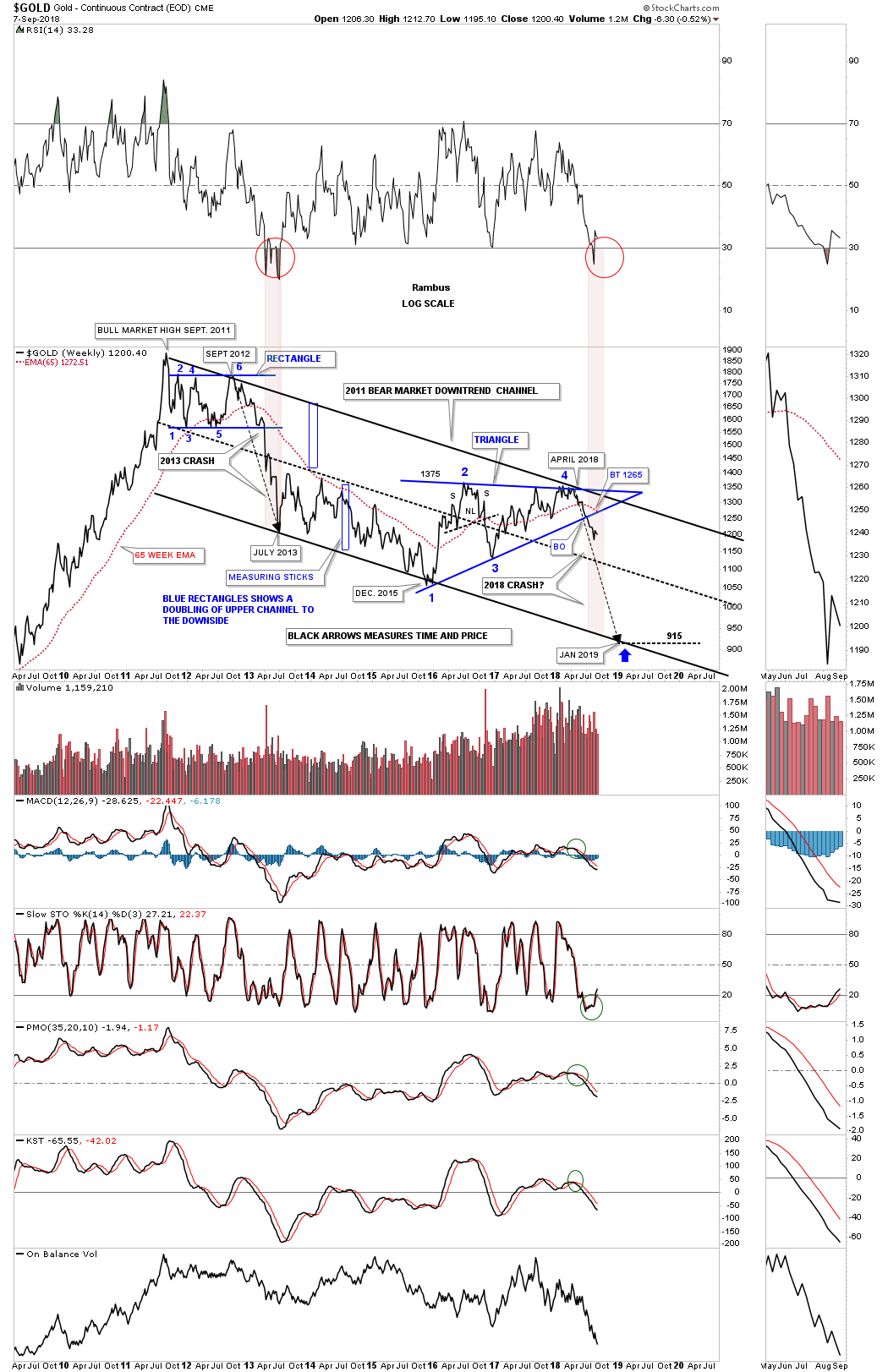
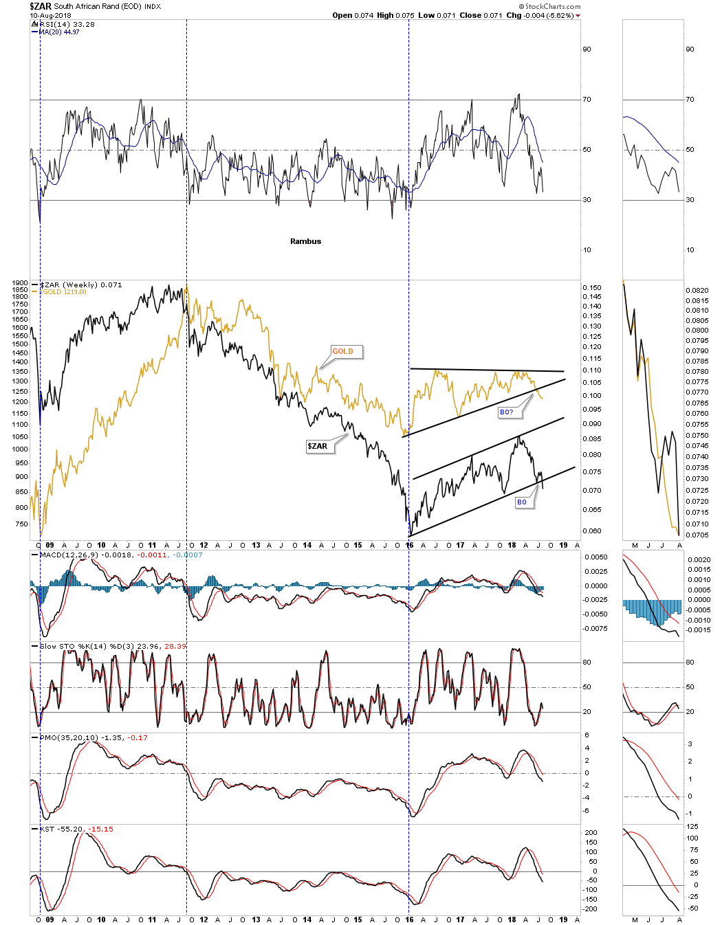
There is another currency that actually has a pretty close correlation to gold which is the $ZAR, South African Rand. Again the 2016 low marked the time when both gold and the $ZAR began their 2 1/2 year consolidation patterns.
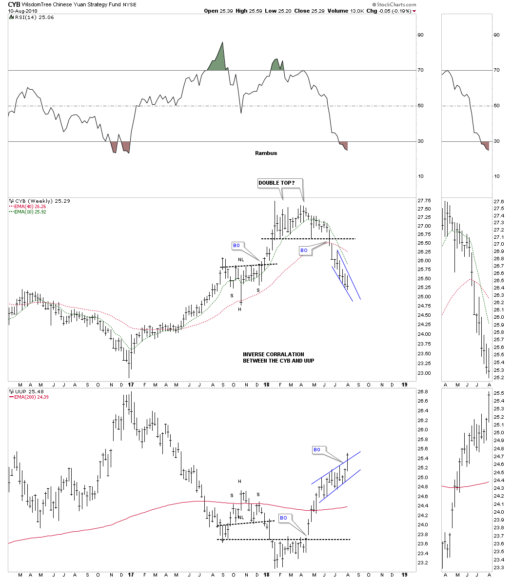
This last foreign currency we’ll look at is on a combo chart which has the CYB, Chinese yuan on top and the UUP on the bottom. There appears to be a pretty good inverse correlation between the two.
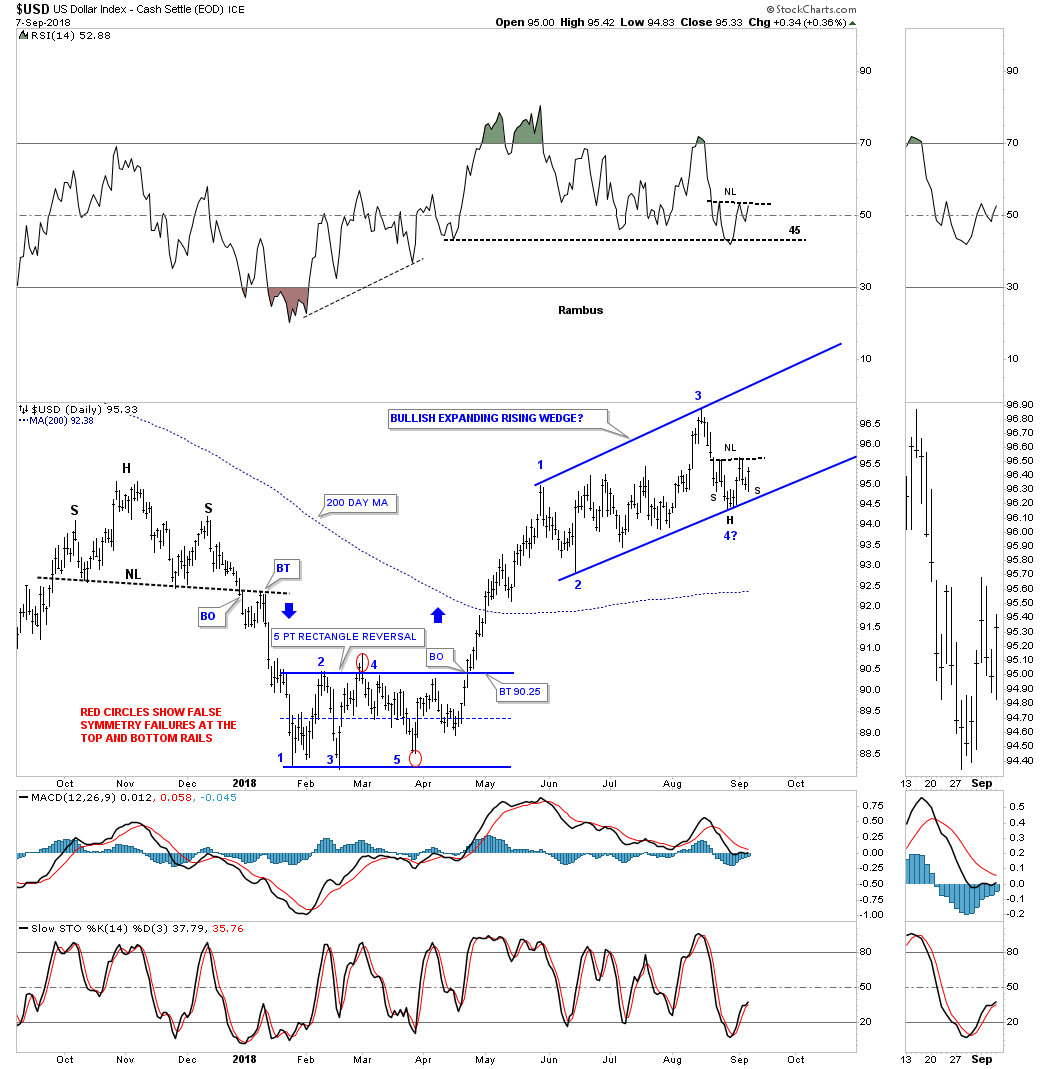
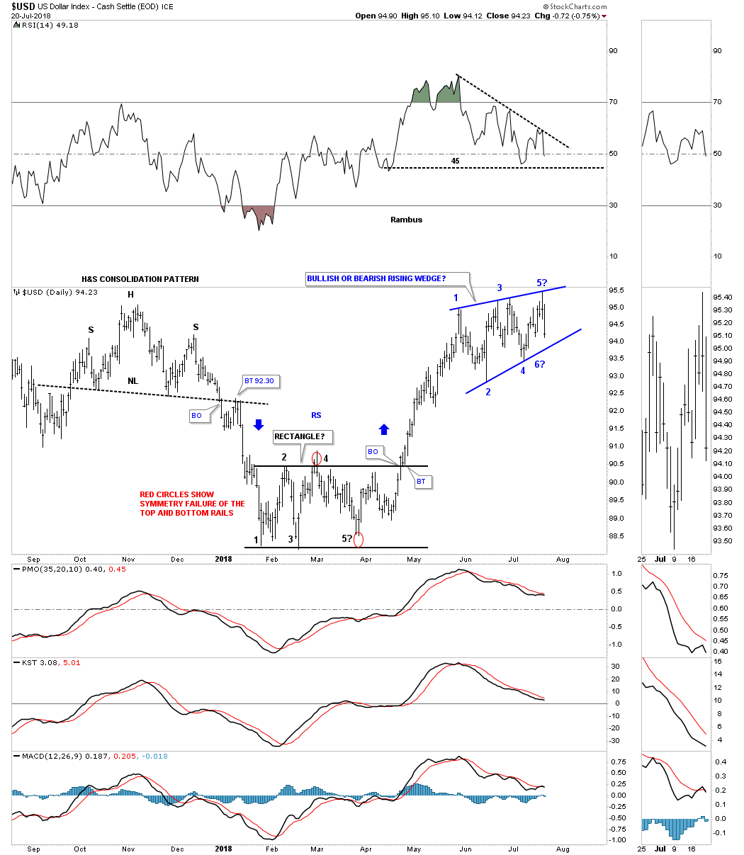
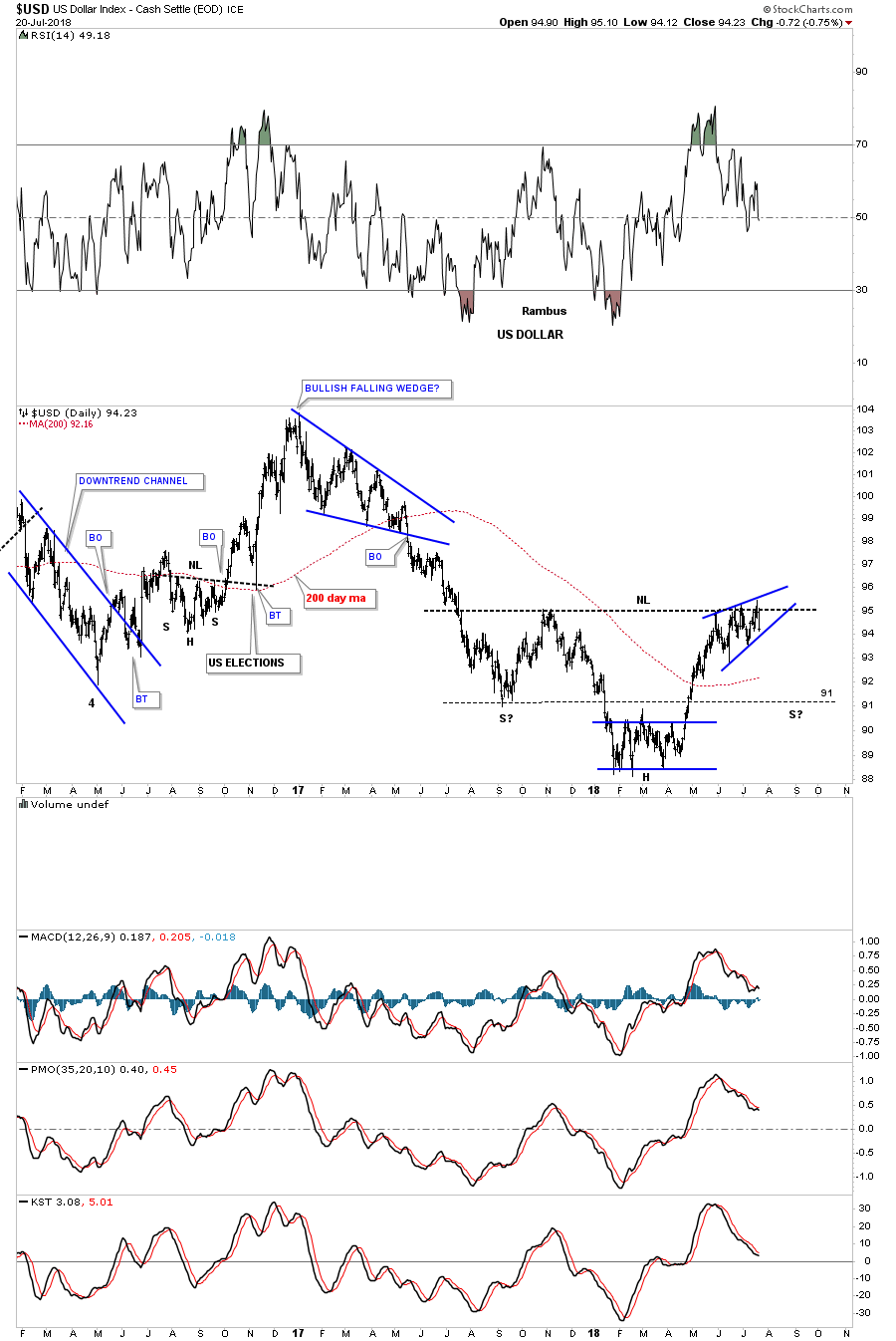
All the foreign currency charts above show there appears to be a race to the bottom which in turn should be bullish for the US dollar. Last Friday the US dollar finally broke out from its nearly three month bullish rising wedge. These types of consolidation patterns are no different than any other consolidation pattern other than they tell you the move will be strong. The price objective for this rising wedge should be in the neighborhood of 100 to 103. A backtest to the top rail would come into play around the 95.75 area.
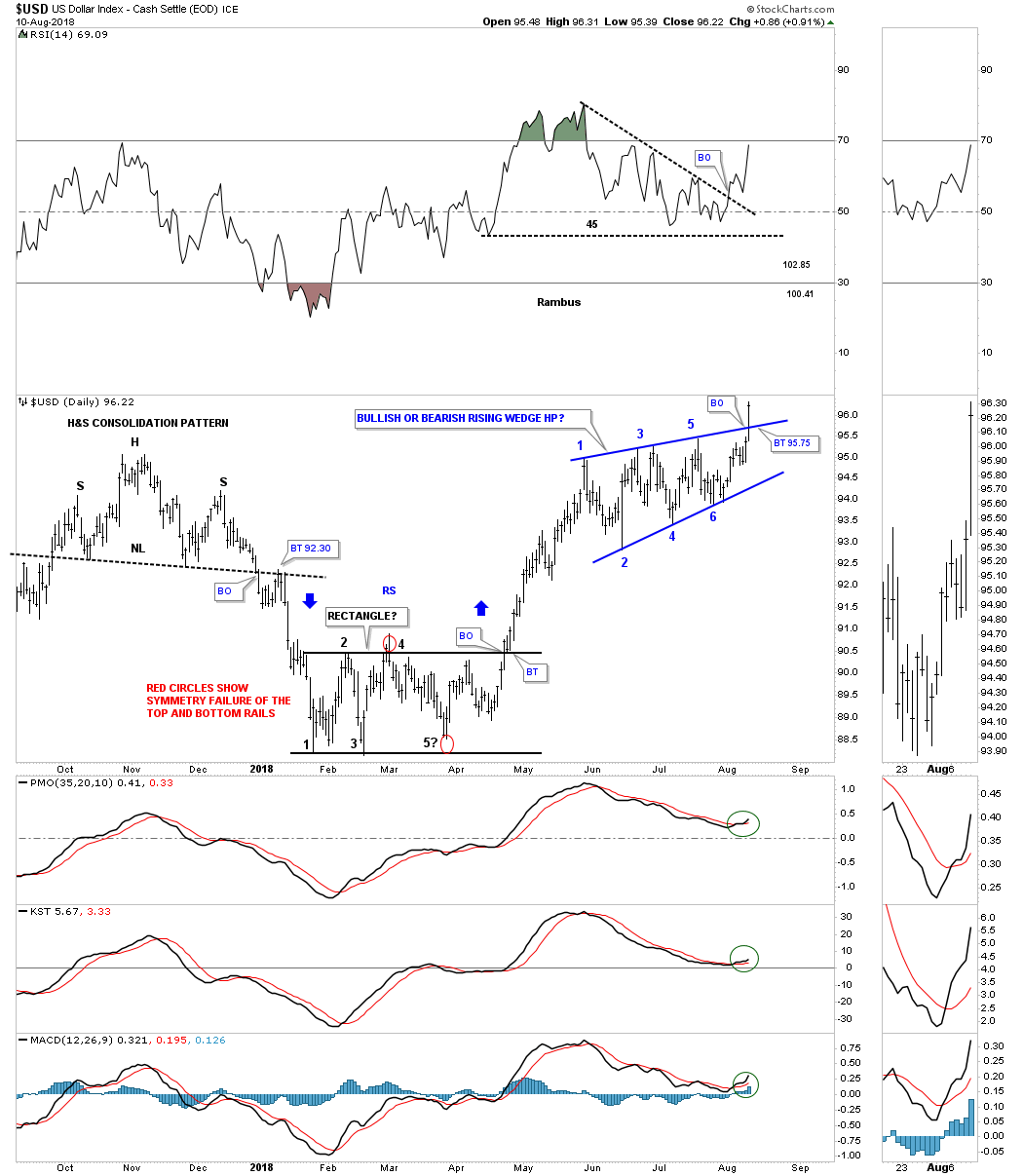
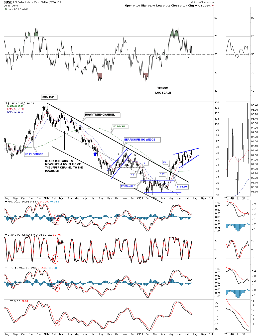
Below is a longer term daily chart for the US dollar which shows how the price action has been reversing back up after the 2017 decline.
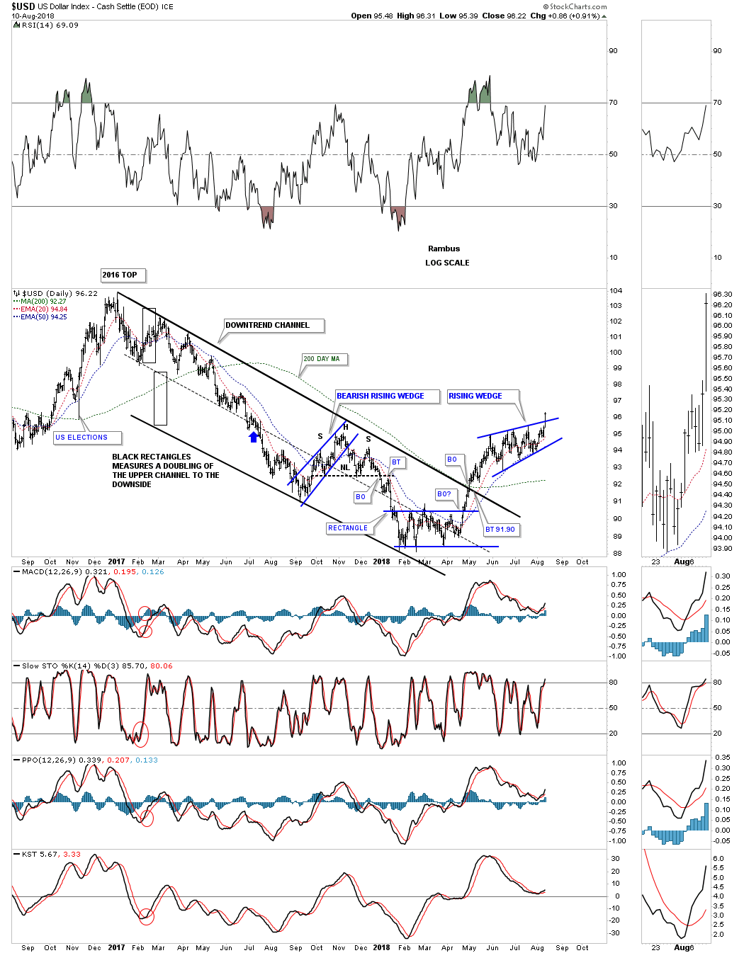
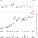
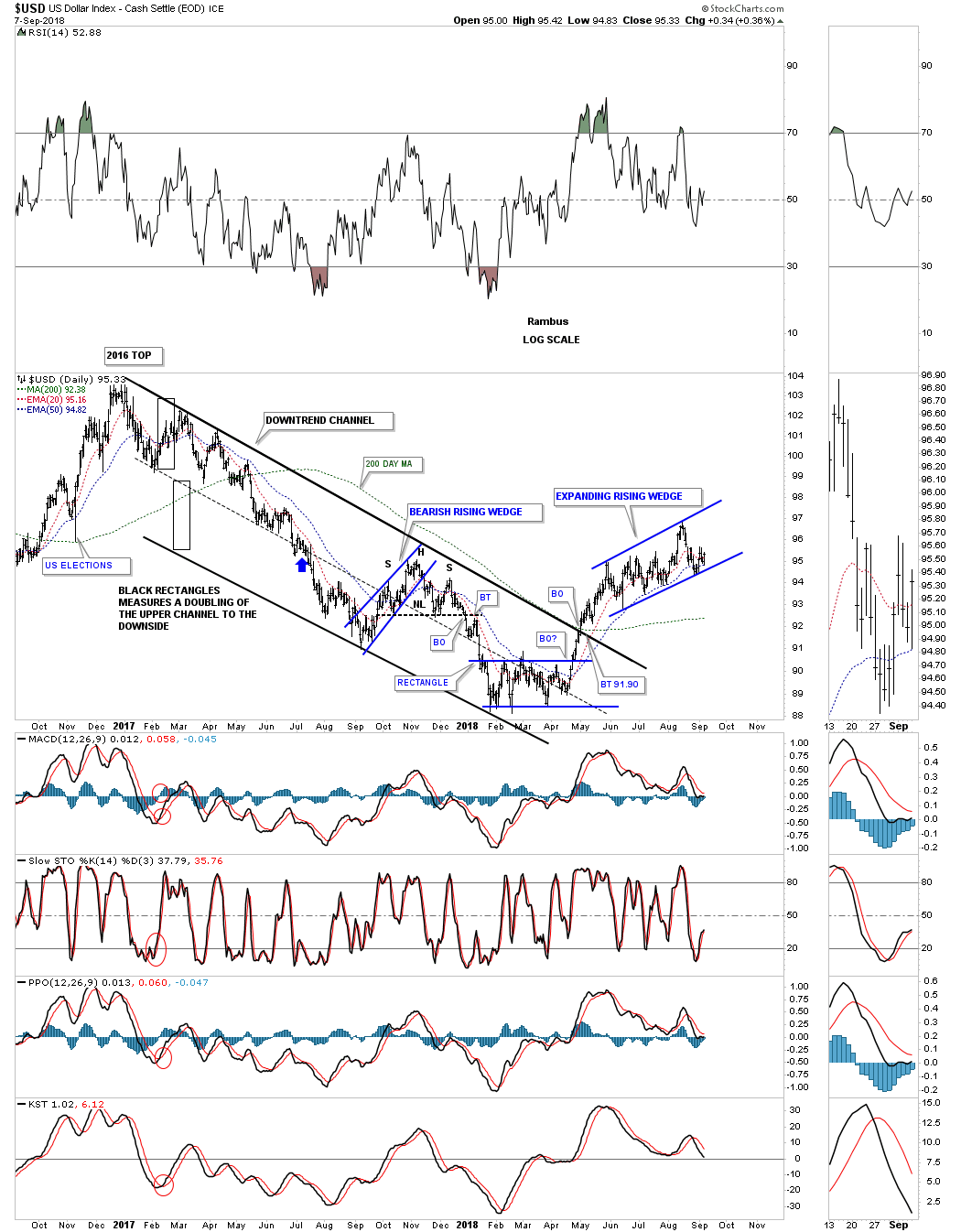
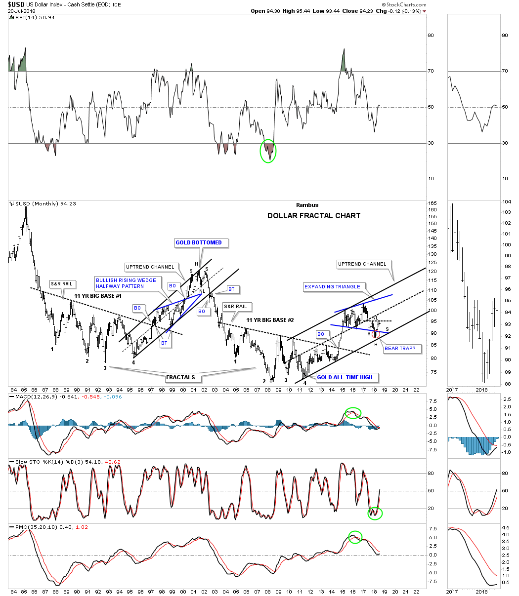
Below is a 35 year monthly chart for the USD which shows its 2011 uptrend channel with the blue expanding triangle and the red bear trap, red circle. If you look to the thumbnail on the sidebar you can see the H&S bottom a little more clearly with the bullish rising wedge being the right shoulder.
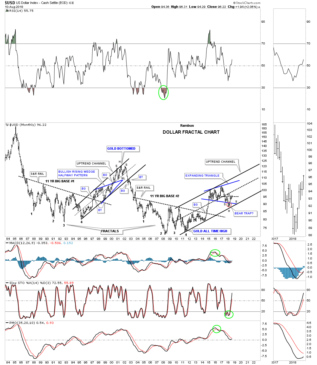
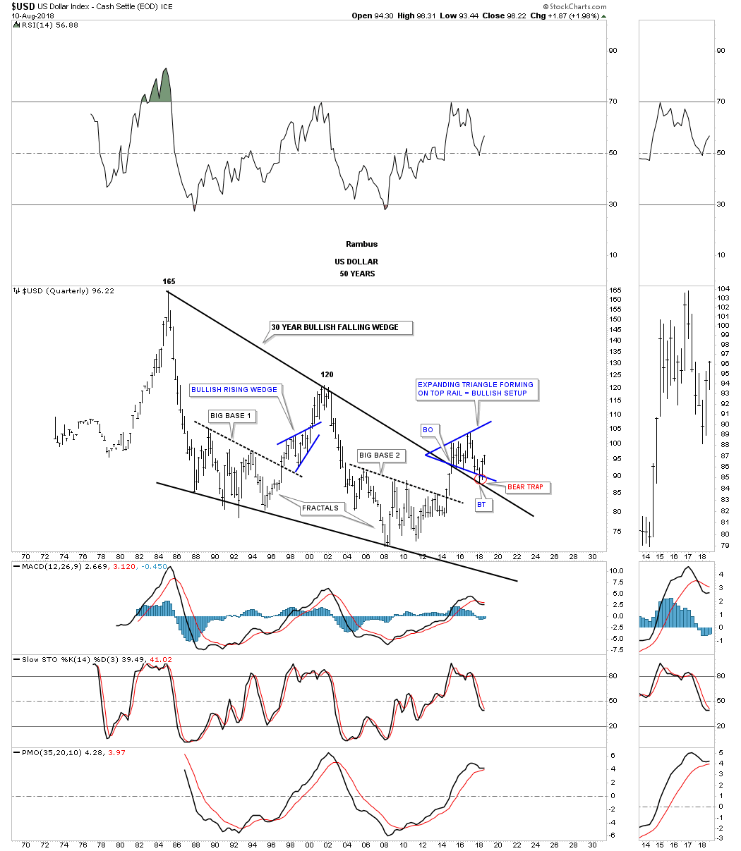
Will we ever see the 165 area again on the US dollar in our lifetime which would be the price objective of the 30 year falling wedge?
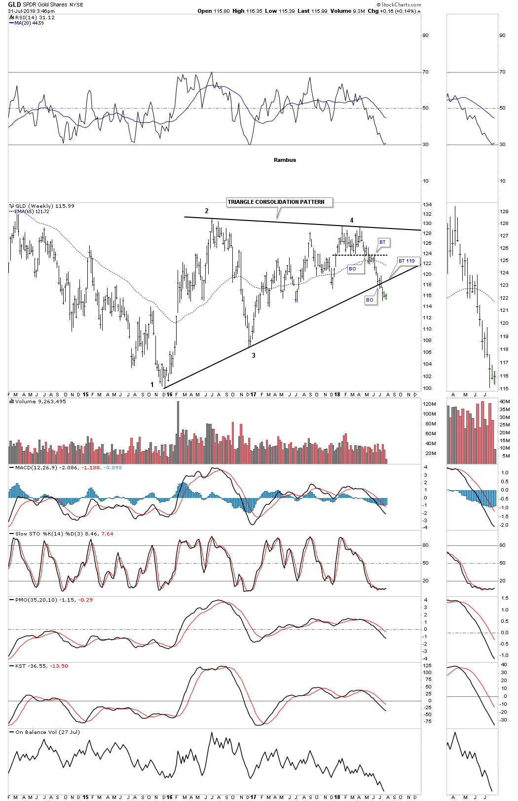
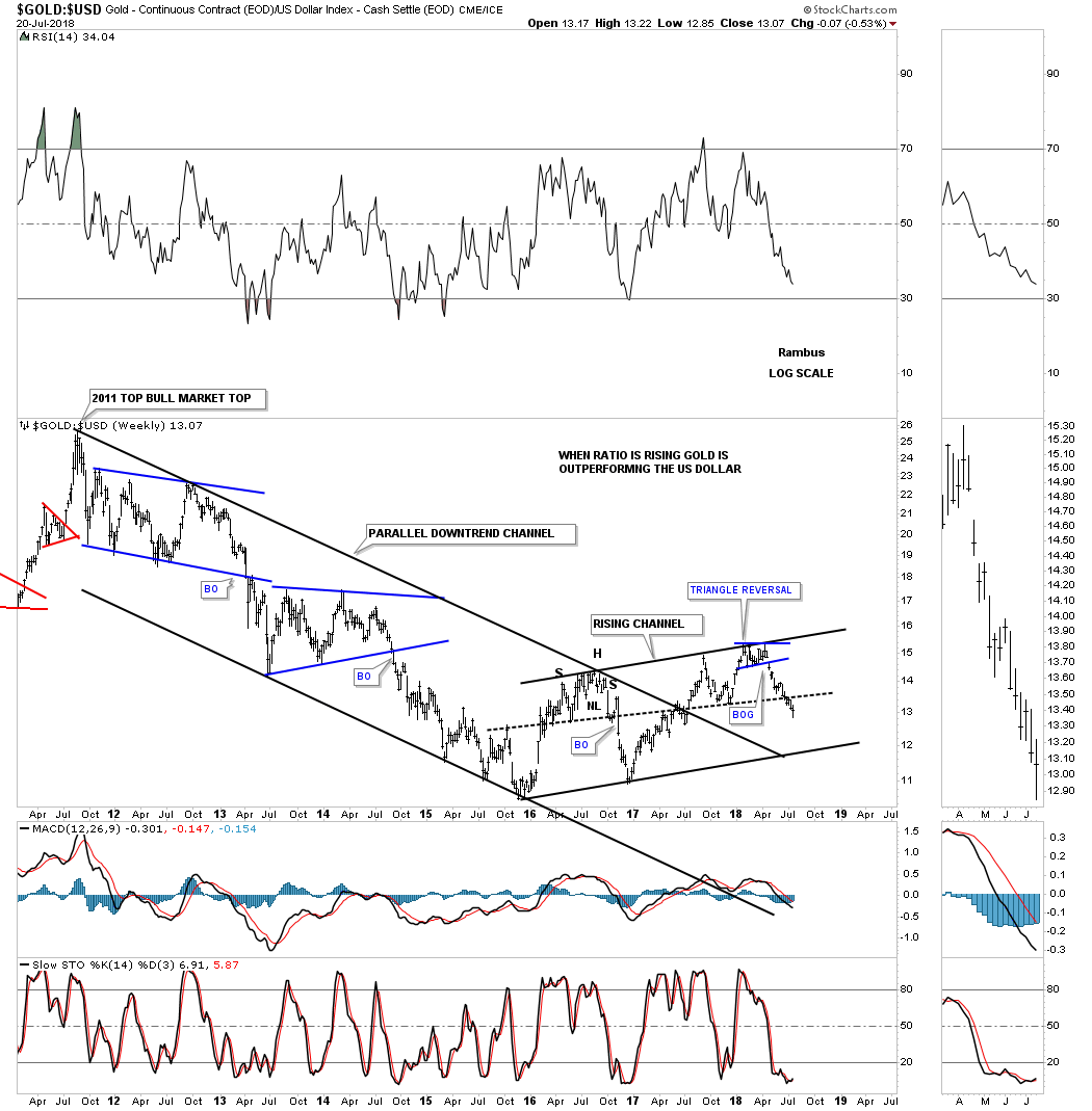
Below is a weekly combo chart which has the US dollar on top and gold on the bottom. From a short term perspective the inverse correlation can be a little ragged but on this longer term chart the big picture shows the inverse correlation to be pretty good over time.
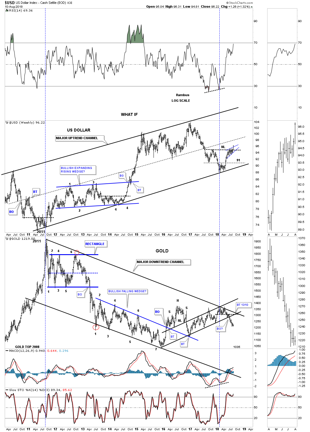
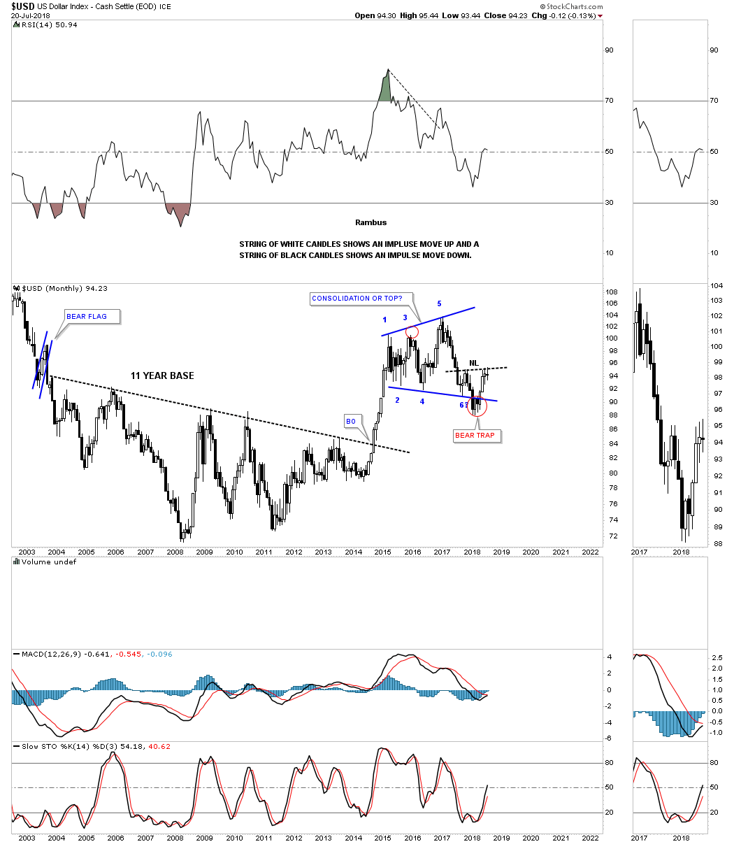
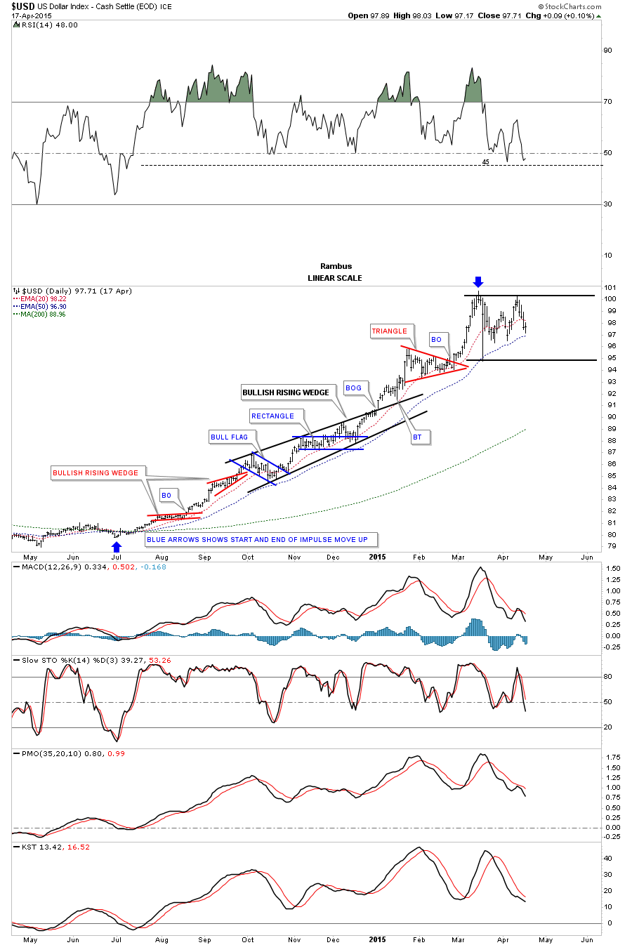
This next chart is a 2 year static chart which shows the 2014 to the 2015 impulse leg up for the US dollar had that we followed in real time back then. As you can see the first two small consolidation patterns were the two red rising wedges. Beginning in October of 2014 the US dollar began to buildout a much bigger black bullish rising wedge which was built with two smaller consideration patterns, the blue bull flag and rectangle. Note the breakout gap above the top rail of the black rising wedge and the clean backtest which confirmed for me the black rising wedge was indeed the correct pattern. After the breakout from the black bullish rising wedge the US dollar had one more consolidation pattern to build out which was the red triangle before that major impulse move finally ran its course.
With the breakout of the bullish rising wedge last Friday there is a chance that we could see an impulse move similar to the 2014 – 2015 leg as shown on the chart above. If we get something similar the combo chart below shows how many of the different asset classes performed during that time. Only the TLT kept pace with the US dollar as it made a series of higher highs and higher lows. The SPX followed the US dollar higher initially but then had a small correction, black arrow, before ralling again with the US dollar. GLD and GDX bottomed initially in November of 2014, experienced a decent counter trend rally while the US dollar was still building out the black bullish rising wedge. They both declined once more as the US dollar was approaching its 2015 high but managed to close just above their 2014 low, red arrows. The WTIC declined pretty strongly during the US dollar’s impulse move up but also created a double bottom between its two lows. The $XEU looked like it was the weakest area to be in during the US dollar’s rally leg while the Japanese yen fared slightly better by not making a new low.
BONDS
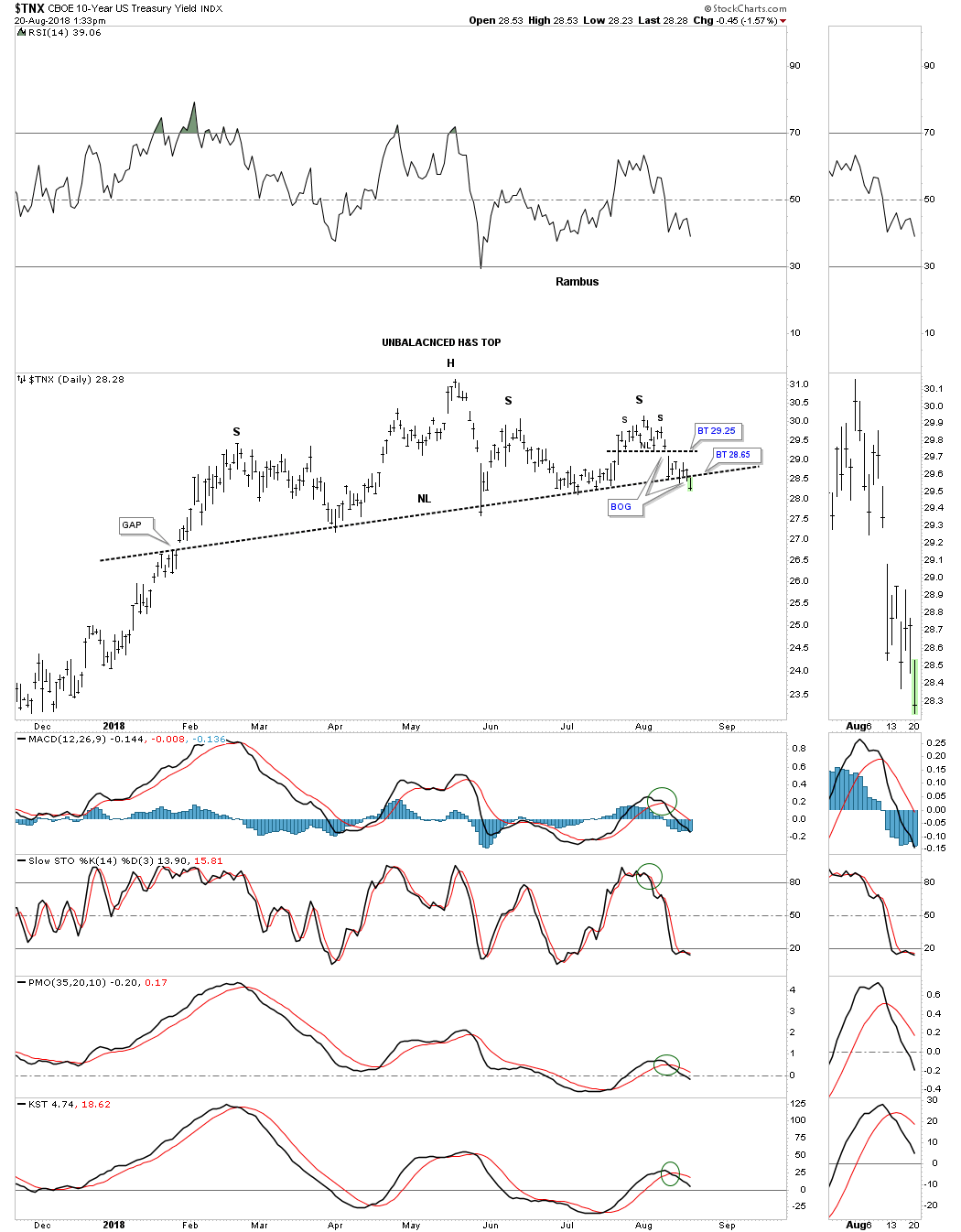
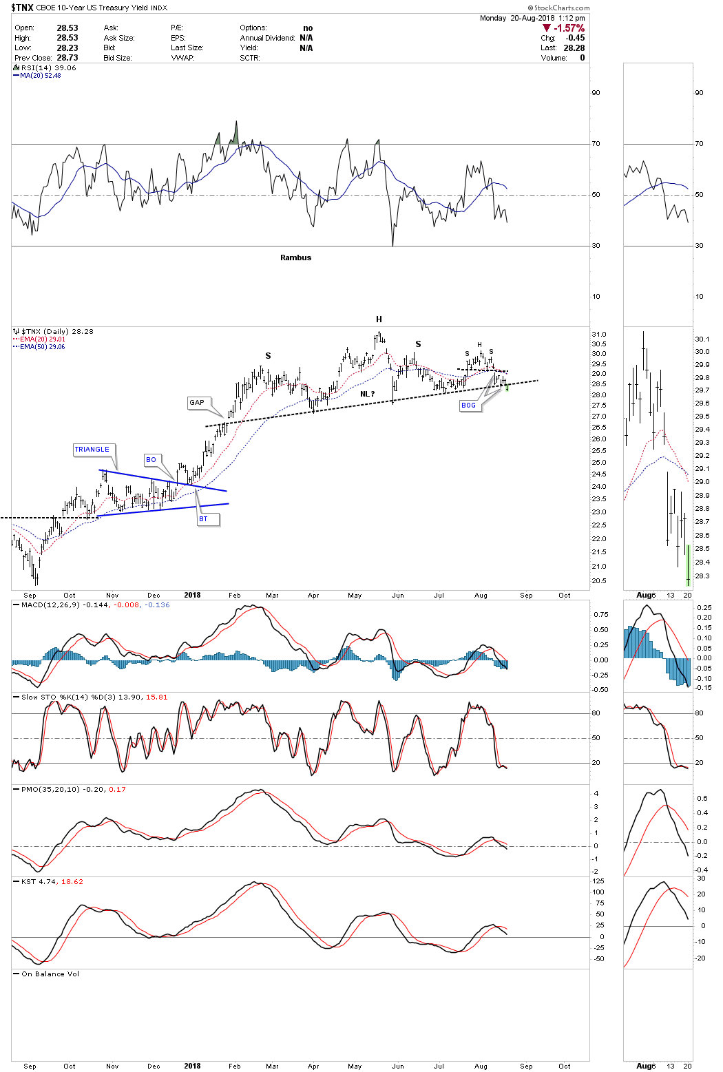
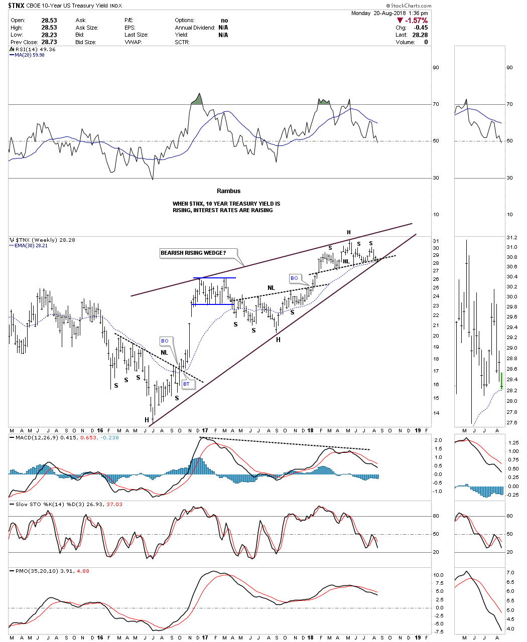
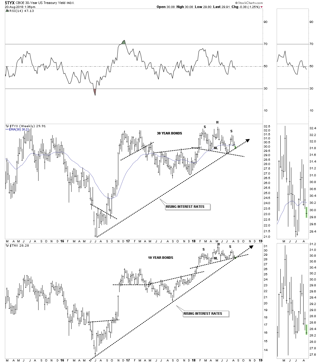
I’ve been writing about the bonds throwing us a possible curve ball which still hasn’t made it to the plate yet. There has been a lot of chopping action over the last several weeks which is failing to give us any confirmation one way or the other. After bouncing off the possible neckline back in July the $TNX, 20 year bond, produced a possible second right shoulder of a H&S top. Friday’s price action gapped below a small H&S top which formed the second right shoulder high. Now we are back down to the July lows once again. A breakout below the neckline will signal lower bond yields are coming which I think will catch a few investors off guard. In my last post on the bonds I said I would pay close attention to the price action because it’s such an important inflection point.
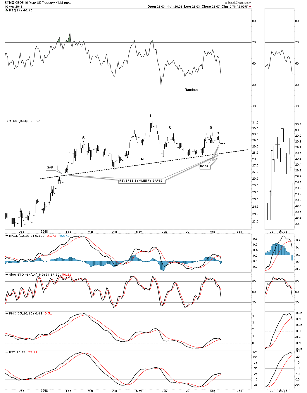
Below is a longer term daily chart for the $TNX.
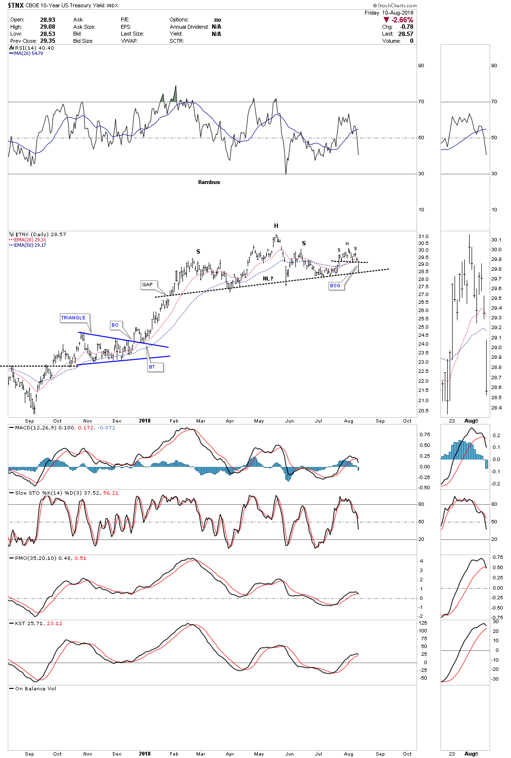
If this 2018 H&S top breaks to the downside it will complete an even bigger trading range a 2 1/2 year bearish rising wedge. Many times with a setup like this we can see the neckline and the bottom rail of the rising wedge broken at the same time with a big breakout move. This is some thing we need to keep a close eye on.
I’ve been speculating for the last couple of months that instead of seeing a strong inflationary environment over the intermediate term the charts are suggesting we could see a deflationary event sooner rather than later. At this point in time I would view it more like 2014 to 2015 time frame when the US dollar had its major impulse move up while currencies and commodities had large declines. This could also give the US stock markets time to correct back down to the bottom of their January 2018 consolidation zones. These types of setups don’t come around all that often, but I’m perpared if we see the US dollar keep advancing while the interest rates start to decline once again. Have a great weekend and all the best…Rambus
Just a quick update on GLD which has broken down from a 2 1/2 year triangle consolidation pattern. If we get a backtest to the bottom rail around the 119 area I will take a position in DGLD which is a 3 X short gold etf.
The big question I’ve been grappling with recently is the inflation or deflation theme. Last Friday’s price action felt like a counterpunch to the deflation scenario as the US dollar fell pretty hard and interest rate reversed. It was almost exactly a year ago around at this time that we started to take some positions related to the inflationary scenario by buying some of the different commodities stocks like BHP, COPX, KOL, UWT, SCCO, SCHN and STLD. Many had broken out of large trading ranges and H&S bottoms. In January of this year when the US stock markets began our recent correction I went to 100% cash as I wanted to be safe than sorry. That was also about the time the US dollar began to find a possible bottom which had pretty much been in a free fall.
Lets start by looking at some US dollar charts as it will most likely be our guide in the inflation or deflation theme going forward. This first daily chart shows the US dollar initially bottoming in late January and then building out the five point rectangle reversal pattern that reversed the downtrend. After a strong impulse move up the US dollar began to correct that impulse leg by building out a rising wedge formation seven weeks ago. IMHO that seven week rising wedge is probably the most important chart pattern on the planet right now. Whichever way it breaks out will affect a lot of markets.
One of the hallmarks of a bullish rising wedge or flag is that they almost always have a negative divergence on the RSI. If you think about it a consolidation pattern that slopes up in the direction of the trend is like a running correction. Even though the price action is still going higher the RSI has a chance to correct its overbought condition. In strong moves the RSI often finds support around the 45 area before reversing back up. With the move up last week the US dollar completed its fourth reversal point which puts it into the consolidation pattern category. Since the top rail held resistance the price action is now declining in a possible fifth reversal point which won’t be complete until the bottom rail is reached. Even if the bottom rail is touched we could still see a sixth reversal point back to the upside. The bottom line is, whatever direction this rising wedge breaks a pretty big move should follow.
Below is a two year daily chart which shows the year and a half downtrend channel with the rising wedge forming just above the top rail. It’s easy to see how the rising wedge will most likely be a consolation pattern to the upside or a top. The thin black rectangles at the top of the chart show how the original downtrend channel doubled in size when the center dashed midline was broken to the downside. Before the break to the downside the center dashed midline was the bottom of the downtrend channel.
There was a possible bigger reversal pattern we discussed shortly after the breakout above the year and a half downtrend channel which was a possible inverse H&S bottom. We were looking at the 95 area for a possible neckline and symmetry would suggest the low for the right should could come at the left shoulder low around the 91 area. The 200 day simple moving average comes in at 92.16.
This next chart is a long term monthly look which shows the US dollar’s uptrend channel that actually began in 2011 at reversal point #4 in the fractal big base #2. Until the bottom rail of the nearly seven year bull market uptrend channel is broken to the downside I have to remain a bull regardless of all the reasons the US dollar should crash and burn.
Below is another monthly chart which uses candlesticks. When the US dollar is in a strong impulse move up you will see a string of white candlesticks all in a row and when the US dollar is in a strong impulse leg down you will see a string of black candlesticks all in a row. Up until last week the US dollar had made four white candlesticks all in a row. We still have seven more days of trading so it will be important to see what the monthly bar will look like. In a strong impulse leg up we may see one black candlestick that will generally show up as a small consolidation pattern between all the white candlesticks. You can see that the 2014 – 2105 impulse leg up didn’t have one black candlestick. It’s just something we can watch.
When that strong impulse move out of big base #2 broke out that impulse leg was strong enough to take out that 30 year top rail of the falling wedge. As you can see the price action initially backtested the top rail right after the breakout which is what we would expect but the markets never make it easy on you. The breakout above the top rail of the 30 year trendline took place in January of 2015, that same trendline was backtested three years later in January of 2018, which held once more so we know it’s important.
Lets now look at several ratio charts to see how the US dollar is behaving vs gold. This first ratio chart compares gold to the US dollar. The last time we looked at this chart the price action was just starting to breakdown from that small blue 5 point triangle reversal pattern. When this ratio is rising that means that gold is outperforming the US dollar. As you can see the ratio has been falling since January of this year which means the US dollar has been outperforming gold.
This next ratio chart compares the US dollar to the CRB index. Since 2016 the US dollar has been under performing the CRB commodities index forming a falling channel. Since January of this year the ratio has been rising which means the US dollar has been outperforming the CRB index. Note that strong impulse move up that started in mid 2014 and how the US dollar really outperformed the CRB commodities index. It still has a way to go yet, but if the price action breaks out above the top rail that 2 1/2 falling channel will most likely be a halfway pattern to the upside with the impulse leg showing similar characteristics to the 2014 – 2015 impulse leg. Again we can’t get too excited until the top rail is broken, but the possibility exists.
This last chart for tonight is a ratio combo chart which has the TIP:TLT ratio on top with the TLT overlaid in red with the CRB and GDX on the bottom. When the ratio in black is rising it shows inflation and deflation when it’s falling. This chart really sums up the debate on whether we are going to see some inflation or deflation. For three and a half years now the price action has been building out what appears to be a H&S top on the TLT in red and a H&S bottom on the ratio in black. The last time we looked at this chart I drew in the thin black dashed trendline which is showing a possible triangle. As you can see the TLT in red bounced off the top dashed trendline last week while the ratio in black bounced off of its bottom trendline last week as well. Even though the ratio in black rose a little bit last week the CRB and the GDX indexes both declined. If you like drama and suspense then this ratio combo chart is for you. All the best…Rambus
The economies of the world are at an inflection point. Enough data points have now presented themselves to be able to see the outlines of a major shift in the markets of the world. We are at a pay attention moment. There comes a time when a successful investor must make some hard decisions to position himself to be able to take advantage of opportunities down the road. The markets are telling us now is such a moment.
It’s time to sit up and pay attention to what Mr. Market is trying to tell us.
It appears we are at the top of the cycle, anecdotal evidence is now pouring in. But that is just a cyclical story. The bigger story is that major market forces that have been brewing in the system for 25-40 years are now coming to a head. They are now dovetailing with the cyclical turn and together they may cause a massive shift in the world’s economic structure which has been erected over these 25-40 years. Few can even imagine these changes let alone prepare themselves for them.
China’s Bubble Economy- Ripe for Bursting
The main driver of this process is China’s bubble economy. If it bursts, the world goes into a depression. I am going to ask you to keep an open mind about this issue. Phrases like bursting bubbles, and world depression, likely sound like hyperbole, simply too far out there to really get serious about. No, its a real possibility and you need to consider it as such. In fact, the US and China have now been in a trade “Cold War” for 18 years now, since China entered into the WTO. But here is the thing…the USA hasn’t realized this until just recently. What is going on right now is the trade-cold war just broke out into a trade-hot war and the U.S. finally realizes it is one of the main combatants. The two sides are so far apart that there is no mutually agreeable solution. Both sides have launched the first round of weapons at each other (tariffs) and their effect has the potential to burst each others credit bubbles.
I highly recommend reading the book Death by China by Peter Navarro. Peter is Trump’s lead trade advisor. Trump is executing Peter’s strategy. If you don’t have the time to read the book you can watch the documentary for free if you have 70 min of spare time. Again if you want to sit up and pay attention, you will do it, make it your weekends education.
This documentary delivers the message of how the US has been gutted of its manufacturing base. You may not have realized how complete it has been, watch it and you will know the extent of it. This documentary provides a good understanding of what has happened, however what is more important for investors to know is how it happened from a macroeconomic understanding. Once you understand the macro story you begin to see that any attempt to resolve it leads directly to the bursting the bubbles on both sides of the Pacific. Yes, this is how unstable the world economy has become.
The China Story in condensed bullet point form.
It would take a book to properly explain how all of this happened, but I am going to try my best to the weave the story into condensed form.
The huge bubble on both sides of the Pacific was enabled by the ending of the Bretton Woods monetary system. This was because since dollars could no longer be exchanged into gold, huge imbalances could now be accumulated and held as the result of trade surpluses. As the Chinese accumulated massive trade surpluses they bought US Treasury debt and held it on their balance sheet. This had many effects: first off by purchasing $4T in US Treasury debt with their trade surpluses it stoked the financial bubble in the USA. Secondly the Chinese printed Yuan and bought US Treasuries which was a form of currency manipulation. It kept the Yuan from rising thus keeping their goods competitive. Otherwise running such huge trade surpluses would have made their currency rise and prevented them from being able to sell cheap goods.
Deficits Pile Up
Then over the next 25 years China ran increasingly larger trade surpluses. Again, only having a fiat currency allowed this huge asymmetry since the imbalance never cleared as the surplus was converted into U.S. treasury debt and held on China’s balance sheet:
In a word it came from a fractional reserve banking system. China received $4 T of foreign capital inflows and they used it as base money to loan off of. They created over $25 T of credit collateralized by the $4 T of foreign inflows. Essentially money out of thin air.
You should now start to see why a trade war is an impossibility for China, If foreign inflows reduce it shrinks their highly leveraged and unstable credit bubble. The nature of credit bubbles is they must keep expanding. The second it shrinks the entire structure has the risk of unraveling. This is why the dance between the US and China is a high wire act.
Through massive credit creation China has built out its export industry to where they now produce 59% of the world’s cement production, and 50% of world steel production. The world now only needs 65% of this capacity therefore a steel tariff on Chinese steel could result in China holding 35% of world steel production as idled capacity. This would blow a hole through the Chinese economy. The average daily wage of Chinese workers is $9/day so there is insufficient domestic demand to sustain these industries.
Bottom line: to survive China must export its extreme excess capacity in the face of lack of world demand. This is an unsustainable model which has now run out of time. China is now set-up for a hard landing and when China has a hard landing the world goes into a depression because since 2008 it has been their growth that has driven the world.
Trade War-Tit for Tat
Recently the Trump trade negotiators slapped on a $50 B tariff as a negotiating tool. China responded with a similar counter response. The US then upped the ante with a $200 B additional tariff. This is a nuclear option as one can see in the below import-export numbers:
US to China- $130 B
China to US- $506 B
So the Chinese are already out of bullets, they cannot match the tariffs thrown up by the US since their exports are 4X greater than the US and they only import $130 B. Understanding the nature of the Chinese model which they have built out over the past 30 years one can see they cannot possibly comply with any of the US demands because they must maintain a trade surplus. Without this surplus their economy implodes.
The Ugly Truth of the Matter
What Trump trade policy is attempting to do is to reverse the 35 year structural configuration of the world economy without triggering a collapse. The key element of this structure is the ongoing trade deficit between China and the world. The seemingly impossible task is to eliminate the trade deficit without popping the bubble.
Government propaganda would have one think that our current recovery is an organic growth story and the US engine is pulling the world out of the 2008 GFC. This of course is delusion as the truth is that since the 2008 GFC China has been the driver of world economic growth. This growth has been fueled by rapid credit growth within China. Ending growth in China would be the catalyst for the world slipping into a depression with massive idled capacity to reconcile.
So with a hot trade war breaking out its easy to see that if this gets out of hand it could have immediate and dire consequences for all the world’s economies.
The Post Bubble Contraction- (PBC)
All of this of course is custom designed as the ingredients to the post bubble contraction which it appears we are now entering into.
Question: What happens to the senior currency during a PBC?
Answer:- Simple, it goes up. Because credit contracts and debts must be paid off in the senior currency. Also money from around the world flows towards the senior currency and the most liquid financial instruments in that currency: short term treasury paper.
Below: Rising USD.
The Gathering Storm- Data Points start to coalesce.
We should all know our current market is only months away from being the longest bull market in US History if we go on to new highs. Also the current economic expansion is just months short of being the longest in US history. Yes, the cycle is very long in the tooth. Therefore we should be on the look out for ending action and there is plenty out there.
The Yield Curve:
You have heard a lot about this. Contrary to what you may have heard it doesn’t have to invert to trigger a recession plus the current curve is just as flat as when the last two market peaks occurred.
Flattening Yield Curve at the market peak in the year 2000:
Today’s Yield Curve in Blue- Just as Flat as previous market tops. The scale may make the slope look steeper, but it’s essentially the same as the two above with only a 1% difference between short and long duration:
I have chronicled before the sequence of events we have been witnessing as the market stepped through the topping process of the past year. Throwover top, buyers capitulation, bitcoin as the the main object of speculation at the top, and once the top was in the immediate the slaughter of the volatility traders. Since then the market has been going through the motions of a Dow Theory confirmation process while the market has put in divergences of the NASDAQ and Russell going onto new highs. We have covered this before, but now we have new elements of a topping process which have surfaced recently, principally in the commodity sector. Commodities have had a rough time over the past month and look to have put in its top as well.
The above charts are pretty eye popping once one looks beneath the surface. Overall the commodities index shows a minor turndown, but that’s mainly due to the energy complex holding the overall index up. Keep in mind energy typically holds up until the last second. In 2008 oil reached its peak in early July well after everything had already begun to turn down.
Copper: Broke in a catastrophic failure. More on this below
Industrial Metals– Broke with 30 EMA turned down.
Precious Metals- Broke 30 EMA down
Agricultural Index– Dead, just waiting for confirmation
Energy/Oil – Still in an uptrend, however possibly putting in a top currently…see below.
Commodities getting crushed is part and parcel of a PBC taking hold of the market.
So above we see another major piece of the puzzle falling in place with commodities topping. A few weeks back it was the emerging markets and now the latest is commodities themselves.
So why aren’t stocks themselves headed down?
I suspect they are simply marching along on borrowed time. We are in peak summer La La Land. In my view the key tell to the market is Tesla. As long as Tesla can remain elevated it means psychology remains positive and risk on. Here is a stock that is so clearly a fraud yet, it continues to hover and brutalize the shorts. As long as investors chose not to see the obvious frauds that are out in plain site such as Tesla, it tells us the public desires to keep their blinders on and whistle past the graveyard.
Recall what a glorious summer in Paris it was in July 1914, as people took in the sun and enjoyed themselves in the cafes throughout the city, oblivious to the forces of disaster coalescing throughout Europe.
Could that be where we are today… metaphorically?
DOW/Transports-Non Confirmation developing:
Below we see the transports going the opposite direction as the DOW over the past three days.
Drilling Down on Copper
One thing is clear…copper is now in a bear market. It spent the past year putting in a flat distribution top with momentum waning the whole time. When it finally finished the job of passing the bag to those staying too long at the party, it let go with with no uncertainly. This is the type of signal that one must pay attention to…it’s meaningful.
The economic implications of this copper move are profound. It dovetails with the chart I posted a few months ago which signaled China was in trouble. The jump across the creek of the 200 & 150 EMA on a single day back in February was unmistakably announcing to the world China had a problem:
The Shanghai exchange is now set-up for a recovery bounce as it has put in a DeMark 13 exhaustion low. But it comes off of a V-bottom, I wouldn’t go near this market.
The copper signal taken in context with the Shanghai chart indicates that the problem is coming out of China.
Bonds Follow Copper
After a breakdown signal from copper we could expect bonds to follow and that’s what seems to be setting up. Rambus has pointed out how the bond market looks ready for yields to put in a top. This is of course what Lacy Hunt has made clear for sometime that yields will not stay at these levels with an economic downturn in a PBC.
TLT resuming its uptrend above its 30 EMA:
Below we see yields looking ripe for a fall:
Energy Stocks
The XLE is still near its highs, however momentum has been waning and is in a position where a top could be put in.
Weekly XLE in an uptrend with waning momentum: RSI, MACD, PPO nearing crossover…Could it be last call?
Daily: Note the last two candlesticks putting in shooting star tops.
OIL- Could the oil price be setting up for a cyclical top?
RSI indicates failing momentum… Volume unable to make a new high.
Precious Metals:
The script for a PBC is for the gold and silver stocks to initially get hammered since they are still stocks and for gold to dip initially. Gold serves as a liquidity bank so it gets tapped when markets get sold. But it is also the first to bottom then start an uptrend that develops into a bull market. That’s the script I am following so I raised a lot of cash this week and plan on waiting until the fall to deploy it. Rambus has stated that the last 2 years in the gold market was just a consolidation in an ongoing secular bear market. I am not willing to cede this, however within the context of the Jan 2016 lows we are likely headed for a hard shakeout over the next 3 months.
Below: Hopes dashed again?
Gold-Now in a down turn in all currencies:
Novo: The Market Losing Patience
Novo has a problem. It has a huge market cap valuation with nothing yet proven. Not saying the gold is not there, but the company has not yet proven anything after one year. I think the market is losing patience and appears ready to breakdown. Novo’s communication strategy has failed.
Could the triangle below be a halfway pattern? If so a sub $3 price seems imminent.
The Weekly: 10 EMA crossing over the now declining 30 EMA
The Great Yellow Hope- Uranium
This is about the only sector I still feel good about as it remains undervalued, oversold and in an uptrend. It is still coming off of its bottom, but positive fundamentals are fast catching up with this group. Utilities are going to have to start buying long term contracts within one year. Commodities are in a down trend and even possibly in a bear market, but I am holding onto my uranium positions. Once the string gets pulled tight on supply one wont be able to get into this sector at anywhere near today’s prices… it will be instant.
I will be at the Sprott conference next week. Anyone else attending drop me a line.
Editor’s Note : Plunger is resident Market Historian at Rambus Chartology. To follow his work on the Post Bubble Contraction and Rambus’ Charts
The HUI along with most of the other PM stock indexes are at a critical point right here and now. Below is a combo chart we’ve following which has the UUP (The US Dollar Index ETF) on top and the HUI on the bottom. The UUP is building out a potential morphing bullish rising wedge consolidation pattern which would most likely give the PM complex some headwind if the price action breaks out top side. On the other hand if the rising wedge breaks down then the PM complex should have a strong tailwind at their backs. If the HUI can breakout above the top rail of its descending triangle that would be very bullish for the PM complex. As you can see the HUI and the UUP are trading at a critical inflection point right here.
This next chart for the HUI is a long term daily look. If the HUI is putting in a long term bottom the perfect scenario would be to see the HUI breakout above the S&R line which is the top rail on the triangle above. Then maybe a ping pong move between the S&R line and the top rail of the 2 year triangle followed by a big breakout gap above the two year triangle which would then complete the fourth reversal point. From a Chartology perspective that would be the most bullish outcome we could expect. Let the games continue.
First off, I would like to thank Rambus for allowing me the intellectual freedom to deliver to you the straight story as I see it. Our views are not always in sync but I will tell you he has not ever tried to spin my views. I understand I write here as a privilege and am presenting my honest opinion, with no ulterior motives. We just want to get these markets right and make money…Thanks Rambus.
This weekend I would like to review the main features characterizing the markets which I have chronicled over the past 6 months. Often times “less is more” so I will keep my remarks condensed and focus on the overall stock market and the precious metals.
This past week I have emphasized that the stock market is in a state of high risk. This is because valuations are sky high in all asset classes and I see the elements of a broad top in the market which will likely prove to be the end of this 9 year bull market. That’s not saying the market falls hard anytime soon, but the process of a top has begun and is ongoing. Stated differently, we are likely in Phase I of a bear market and once Phase II arrives it may prove to be devastating and adversely impact an entire nation of investors.
Systemic Collapse
That’s what we actually had in 2008 with the derivative implosion which led to the deep plunge of that year. So what is required to have a systemic collapse? What are the prerequisites?
To have a systemic collapse there must be a large, broad error right out in plain sight which the masses don’t see. It must be a deeply held belief that is wrong. It must be big enough that it causes the misprizing of assets. We had this in 2007. What was the myth then? What was the deeply held belief that allowed the misprizing of assets? It was the firmly held belief that housing prices could never fall on a nationwide basis. Even Ben Bernanke stated this myth specifically.
Trouble is the man is a crank. Once prices fell derivatives transmitted the shock into the core of the system. The myth was false.
Today’s Myth
So could we possibly have a similar myth, deeply held throughout the population causing asset prices to be misprized today? A myth in plain sight, yet few care to even see it? Making them so blind to the reality that it causes a total misprizing of assets. I believe that myth today is the belief that central banks are infallible. The belief that markets can be rescued and undergirded by the words and policies of central banks. It explains why young couples in Seattle are willing to commit millions of dollars that they don’t have into the purchase of an inflated home. This despite a collapse in these assets less than 10 years ago. This very act is a manifestation of this myth.
But here is the fundamental flaw of QE: by keeping rates submerged for 7 years, markets were not allowed to price risk. Therefore, investment decisions could be made without reference to RISK. The depth of this mistake is much larger than the housing bubble ever was, so when the myth is revealed to be false the correction of the myth will play out as a profoundly deep bear market.
Transition from Bull to Bear
Let’s review some of the bullet points of the process we have been witnessing over the past year.
Three complete phases of a bull market from 2009-2018. This market was driven by QE, but it nevertheless underwent three well delineated phases. It is very typical that phase I & III do not have any secondary reactions. This indeed did not occur in phase I & III. Phase II however underwent 3-4 SRs, typical of major bull markets.
Phase III unfolded according to script. It underwent a relentless advance without any significant pullbacks in its 15 month duration. Its last 2 months were characterized by a buyers capitulation where all caution was abandoned as buyers pilled in and the market blew out to the upside.
The Throwover: As in most mania bull markets it experienced a throwover above the upside trend channel in its terminal phase. Note the extreme reading in RSI of 92. This incidentally was the highest RSI in the 120 year history of the averages…simply breathtaking.
4. End of year top. This market saw a top in the end of year period, typical of many other famous bull markets.
5. Bitcoin Blowout. Bitcoin served as the object of fancy or the cherry on top of the everything bubble. This fits the bill for a speculative object at the top often seen at the peak of a mania bull.
Slaughter of the Vols
The initial takedown in late January-early February was focused on the most egregious area of speculation which was the volatility traders. This entailed short term total annihilation. Since then, the market has been attempting to recover its old highs. I have detailed this process on many occasions, we still sit in no mans land. According to DOW Theory we are inside a Secondary Reaction. A bear market signal only comes if both averages violate the SR lows indicated by the red line, but the bull is only revalidated when both averages go onto new highs.
My interpretation of the above chart is the blue channel is a bear flag containing the consolidation of the drop from the highs in JAN/FEB. In order for the bull market to be revalidated BOTH averages must go onto new highs. In the mean time we have seen the RUT and QQQ (small caps & tech) go on to new highs. For now I interpret this as non-confirmation of the bull’s recovery. In Mr. Markets sick way it also serves to keep investors in the market as the internal action deteriorates. I emphasize, I don’t “know” what’s going to happen. If the averages all go on to new highs this analysis will have been proven wrong, I am simply describing the process in real time as I see it.
The “Right” Strategy according to Plunger
As mentioned, I believe we are in the early stage of a bear market that cannot yet be officially categorized as such. So what’s the right strategy? Let’s go back and look at the past 2 cycles. If you suspected this to be occurring back in 1999 (I did, it drove me nuts) the best thing to have done would have been to move to the sidelines. If you shorted it you got killed for the next year. Same thing occurred in 2007 and the best strategy would be to go to the sidelines and wait for the bear signal. In the movie, The Big Short, we see how the eventual winners suffered greatly waiting to finally be right. You don’t want to do this.
So my advice is to start moving large chunks to the sidelines and build cash. I am not selling my long term holds such as Altius because they are antifragile companies (read the book Antifragile, N. Taleb) I am selling fringe resource stocks, but keeping most of the portfolio.
Question: Plunger, if this is a bear market, the FED has our back right? It may take them a while to formulate a policy response, but eventually they will turn it around like they did in 2008/9. Within a year we will be back on track and back in the game…right?
Answer: I see you have not been listening, go back and re-read the section above about the FEDs powers being a myth. I think once the myth is revealed as false the FED will be unable to conduct its serial bubble operation to reinflate the economy. They have done it two times now intentionally creating a bubble in order to jack the economy up. It worked in a sense that they were able to create another bubble, however this one goes to the heart of money and credit. When the myth is gone their tools will be broken.
Question: That sounds scary, how bad could it get?
Answer: So you really want to know? OK then, gird yourself. First off it was Sir Issac Newton who said for every action there is an equal and opposite reaction. So the extent of the excess is proportionate to the ultimate correction. That’s what the 89% decline from 1929-1932 was all about. I understand we had a sound money system back then and not a fiat money system, but you should stop thinking in only nominal terms. We could have those kinds of numbers, but maybe not in nominal terms, in real terms instead. The excesses in this cycle are so huge it’s hard to get your head around them.
If you want to try getting your head around it I suggest reading the book “The Everything Bubble” by Graham Summers. It is written for the average guy and is an easy read in simple terms. Graham really grasps what has gone on over the past 40 years to the extent of how the bubble has been blown to vast excess.
In the next bear market, I would not count on the FED being able to just blow another bubble and use it to come to the rescue like they have in the past 2 exercises.
Question: So then what comes next?
Answer: The Post Bubble Contraction (PBC)
Post Bubble Contraction-Breeding Ground for the Gold Stock Bull Market
It shouldn’t be necessary to explain the PBC, as it has been chronicled extensively before. We have seen a few cyclical gold stock bull markets, but we haven’t seen a PBC driven bull market in the gold stocks since the 1930’s. They only come around every 50-70 years, but that’s the time you want to be “all in”.
Take a walking tour of San Francisco’s Knob Hill
If you want to see the remnants of a PBC bull market in gold and silver, when in San Francisco take a walk up to the top of Knob Hill where you will see the Pacific-Union Club building. Trust me you are not going to be invited in as it is reserved for the most exclusive innermost of circles of industrial America. The Mansion sits on top of the hill and was not destroyed by the 1906 fire.
This mansion was built by James Clair Flood. Who was he? A stock broker who became a silver baron. That’s right the most prominent home in all of San Francisco owned by a precious metals guy. Let this sink in for a while as it shows the prominent role the metals can play in a post bubble contraction. Enough wealth was created to rise to the literal top of San Francisco society.
In the past the PM stocks have initially declined in sympathy with the stock market. Once this process is over the bull market has unfolded. In 2008 this period only lasted 2 months. One can only speculate if this occurs this time around. But the PBC typically lasts 15 years or so. Within that time window expect several cyclical bull and bear markets within the context of a secular bull market.
State of The Gold Market
It was a rough week for gold. It got blasted down $40 over the past 2 weeks. No doubt investors are rattled and profoundly discouraged.
I would like to make the case that viewed from longer duration charts it’s really not that bad. Many juniors have taken good sized hits, however overall the stocks have held up fairly well. The chart above argues for a bottom.
Below the Silver buy signal indicator continues to look positive. Keep in mind these are broad turn indicators:
HUI:GOLD:
My prime gold stock indicator the HUI:Gold continues to make progress and is at least primed for a turn upward:
Silver: Gold
Another positive indicator:
Global Gold Stock Index-
Again things look like they are grinding out a bottom and a turn… the weekly:
Close-Up on the daily:
Gold- Hanging by its fingernails:
Gold vs HUI
It sure hasn’t felt good, but no reason to panic. Perhaps gold is just resolving its divergence with the stocks, but its still intact.
Bottom Line Gold
If you need to know why gold got splattered over the past 2 weeks I defer to Fred Hickey’s twitter comment:
Now we know why gold dropped $40oz in just a little over a week -the biggest one-week increase in large speculator futures short contracts (from 72.5K to 106.4K up 47%) that I can ever remember. Good news is they’ll have to buy them back as the seasonal strong period gets started
The gold decline was 100%+ due to the shorts – there was actually a (smaller) increase in spec long positions
So I myself am trimming around the edges of my gold stock holdings in case the initial wave down in the PBC takes the gold stocks with it, but I am not selling my core holdings.
A Big move is Coming
Take a look at the monthly Bollinger Band Pinch. This is telling us a big move is coming. I suggest that since volume is bombed out sellers have already exited so the move is most likely to be to the upside.
Below are some bullish charts of various metals stocks. It’s why I am not selling:
Orezone: get ready for the takeover:
Novo– I am holding. QH is getting increasingly bullish.
Riverside– Recent trenching results:
MAG- Gathering Steam:
Fortuna- Powerful BT
Pan American– Primed
UEC– USA based uranium production
Short Selling
I mentioned the best strategy is to go to the sidelines with the cash you want to hold outside of your core positions. But one should start compiling his short list. You could even start testing the waters to hone your skills, just just don’t get carried away since we don’t know its a bear market yet. Here are some shorts I have taken on.
Hertz:
The rental car industry is sick. Their stocks are reflecting this. Hertz has a very large short interest as its no secret they are in trouble. This is likely the reason behind the recent rally in the stock. It’s a short squeeze, but looks like its ending now. Same story with Tesla. The squeeze killed the shorts.
Homebulders
Interest rates, labor and material costs have put the squeeze on homebuilders profitability. Also they have started to write down land purchases. This sector is early stages bear market IMO
ITB Homebuilders Index
TOL– I mentioned recently this looked like the perfect short tucked up under its 30 EMA. So far so good:
DHI– Nations Largest Homebuilder:
IBM- Industrial Giant
World Wide Look
We don’t have time to take a trip around the world, but let me say this it’s getting ugly out there. Last week I mentioned that the periphery of the world is starting to blow up due to the rising USD, a PBC phenomenon by the way. Let’s look at just a few:
The World… Vanguard All World ex-USA
This has short sale written all over it;
Emerging markets… it get’s worse:
EEM
The MS World Ex-USA… Not good:
China-Believe in yourself and the charts
A few months back I posted the below charts on China and mentioned how profoundly bearish they were and they were announcing a deflation. I wasn’t hearing this from other analysts. In fact quite the opposite. Stansberry writer Steve Sjuggerud has been pounding the table all year to buy China and buy in big. Long term no doubt he is right, but this year… I don’t think so. I read his stuff and then look at the chart and I say sorry …no way. One must believe the chart and believe in ones own analysis.
The gap above was the announcement made around the world.. Deflation is coming. I posted this in March… believe the chart!
China…OMG
Not the end of the world, but do you think a 40% bear market will do some damage?
Summary
I am working on tons of short sale candidates… they are everywhere. But let’s take our time for now and play defense. If the DOW and Trannies go to a new high together all of this analysis will have been wrong. But what I see here is a process unfolding. You are not going to hear this on CNBC.
Editor’s Note:
Plunger is Rambus Chartology’s Resident Market Historian and an associate writer. For a complete compilation of his work members can check the “Plunger” Tab .
The COMPQ has had a good run since the February low, although it was quite choppy. There are two reasons I exited the TQQQ yesterday and today. The first reason is the price action has reached the top of the rising channel which at a minimum is good place to see a stock take a rest even if it’s going to eventually breakout. The second reason, the price objective was reached using the small blue triangle that formed in the middle of the trading range.
The daily line chart shows the touch of the top rail more clearly which is often the case using a line chart.
The original trading range for the INDU is getting bigger as there are now two patterns building out. Four days ago the INDU broke out from a small bearish rising wedge and may now be attempting to backtest the bottom rail again.
A potential bigger picture setting up.
On the positive side the INDU is still climbing the bottom rail of its 2016 uptrend channel with the 200 day moving average just below it.
When we first began this correction I showed this long term chart which shows how a possible consolidation pattern may build out based on the 2016 impulse leg being so strong and long. I mentioned I was going to try to trade this trading range but it wouldn’t be easy vs a strong impulse move. So here we sit right in the middle of the now six month consolidation phase.