The backtest to the neckline comes in around the 16.50 area. The 200 day ma so far is holding resistance.
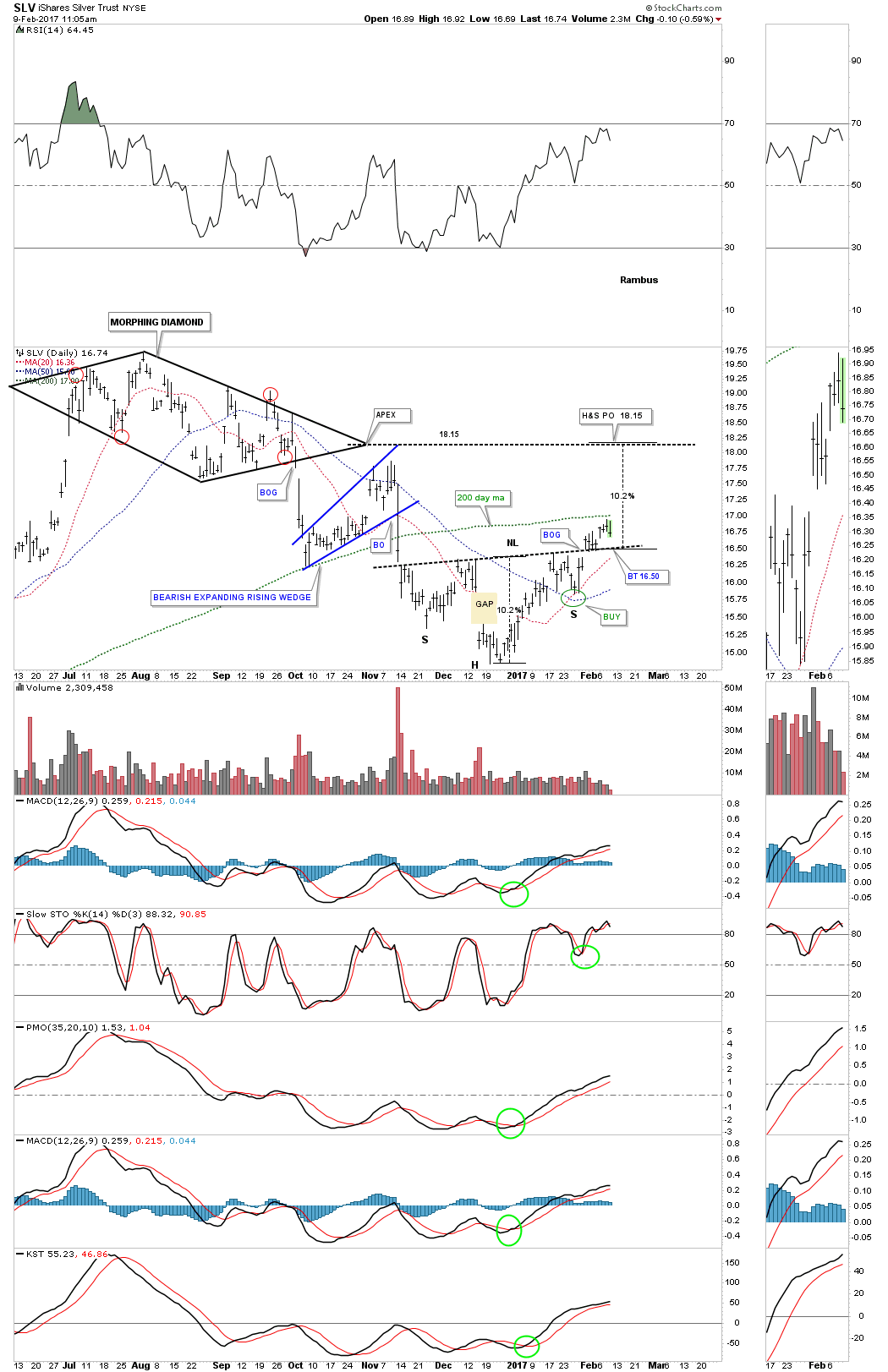

The backtest to the neckline comes in around the 16.50 area. The 200 day ma so far is holding resistance.
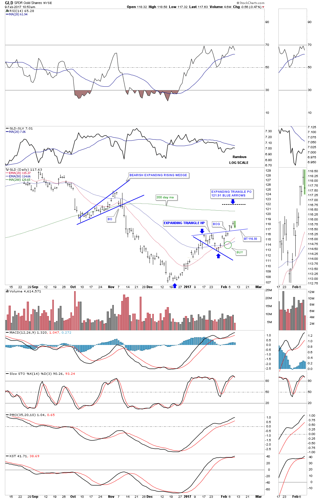
Just a quick update on GLD which shows the possible backtest to the top rail of the blue expanding triangle at the 116.50 area. I wouldn’t like to see the price action breaking below the top rail.
The US dollar has now closed lower for 6 weeks in a row which is testing the patience of the bulls. This week the price action cracked the top rail of the horizontal trading range which is a negative, but not confirmation yet the trend has reversed down. There are several more layers of support that will need to be hit before I throw up the white flag and surrender to the bears.
This first chart is just a simple daily line chart which shows the US dollar closed just below the top rail today at 99.84.
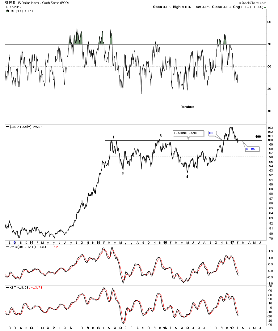
Below is the daily bar chart which shows the price action closing below the top rail of the horizontal trading range matching the low set back in December.
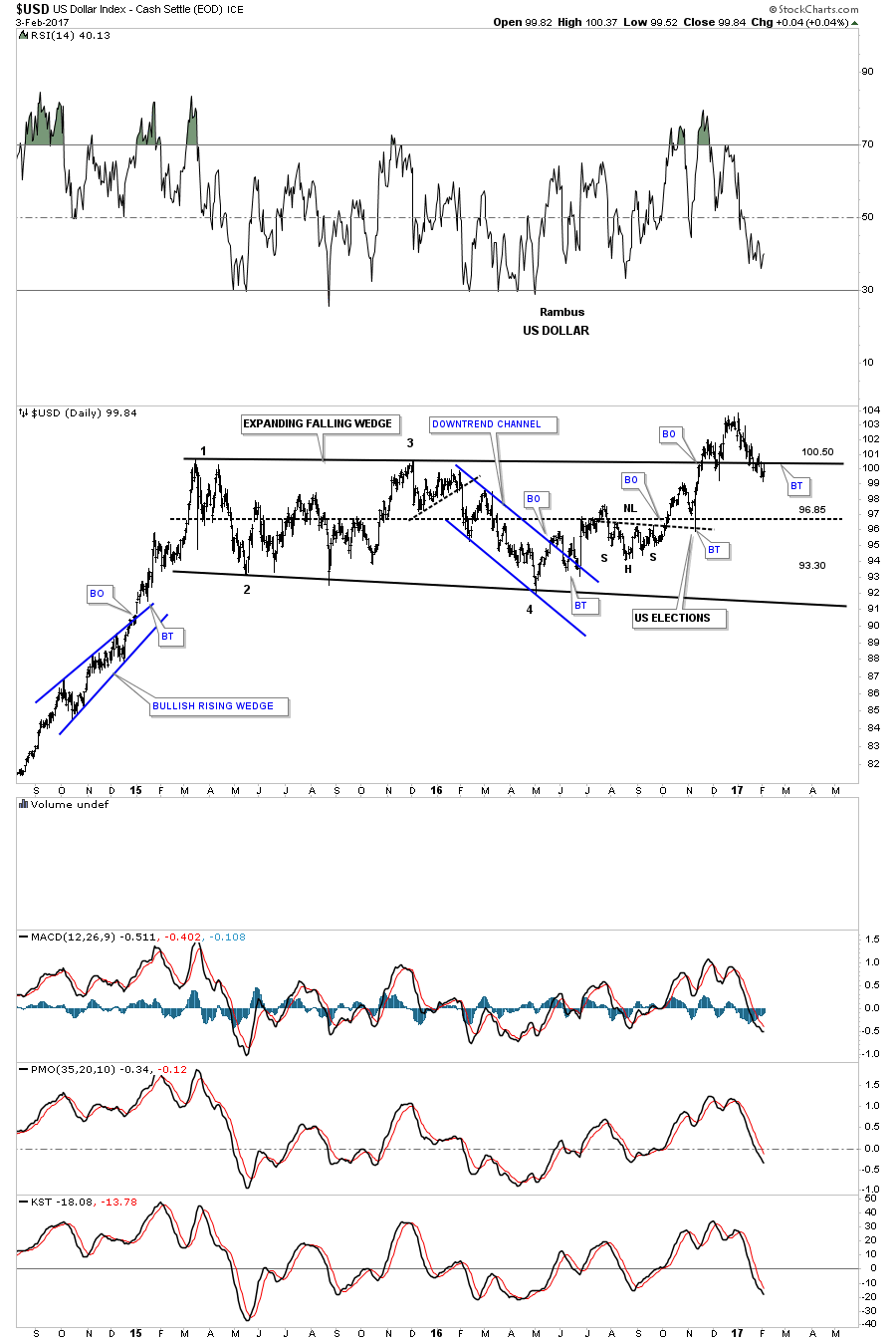
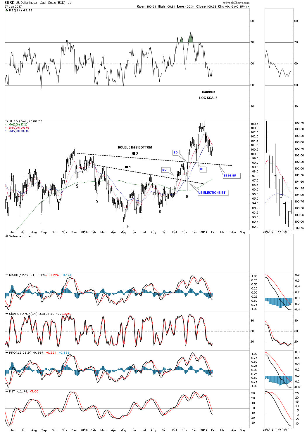
There is another pattern we’ve been following which is the double inverse H&S bottom that took about one year to build out. A complete backtest to neckline #2 would come in about a point lower than this weeks low at 98.85.

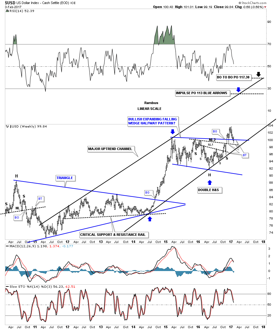
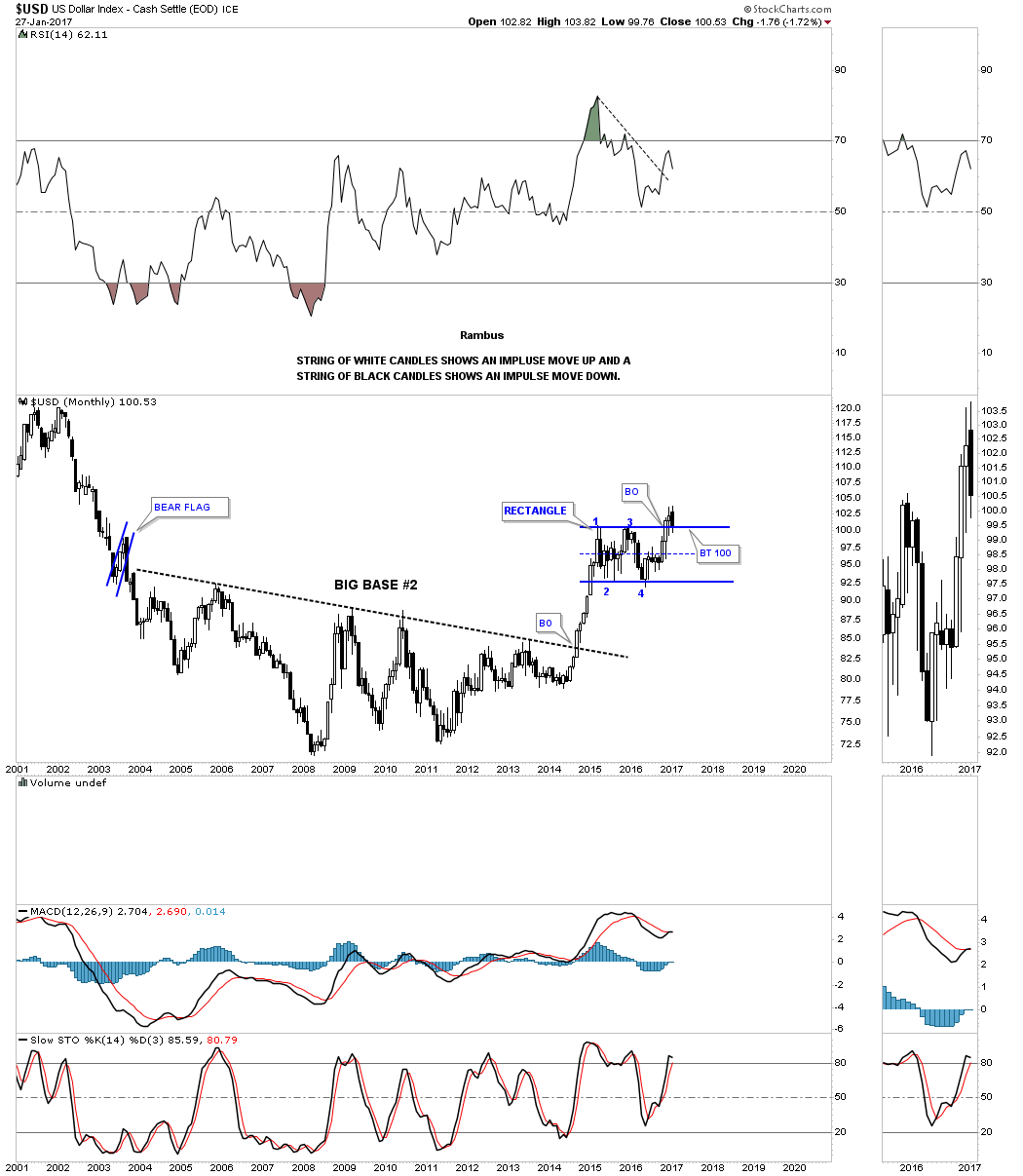
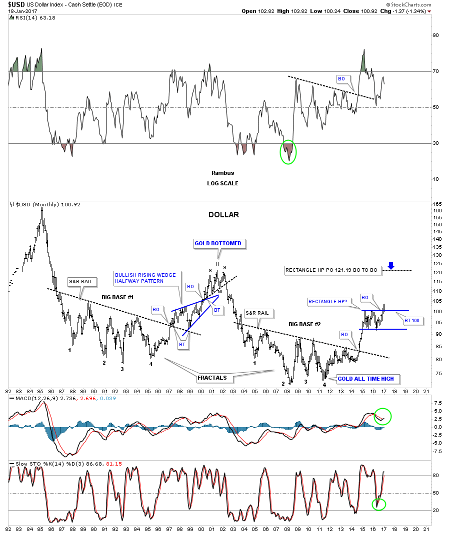
Below is the 35 year monthly chart which shows the two massive bases labeled big base #1 and big base #2 which are fractals of each other. Big base #1 launched the US dollar up to it bull market high in 2000 at the 120 area. The US dollar also formed a beautiful bullish rising wedge as a halfway pattern.
If big base #2 is just about equal in time and price to big base #1 then there should be enough energy to propel the US dollar at least up to the 120 area which would be the measured move from the blue rectangle trading range. That would also equal the high of the 2000 top where the US dollar built out a H&S top to reverse that bull market. At this point in time I don’t see a topping pattern building out yet. It’s possible that this trading range could morph in to some type of top but it should show itself at some point.

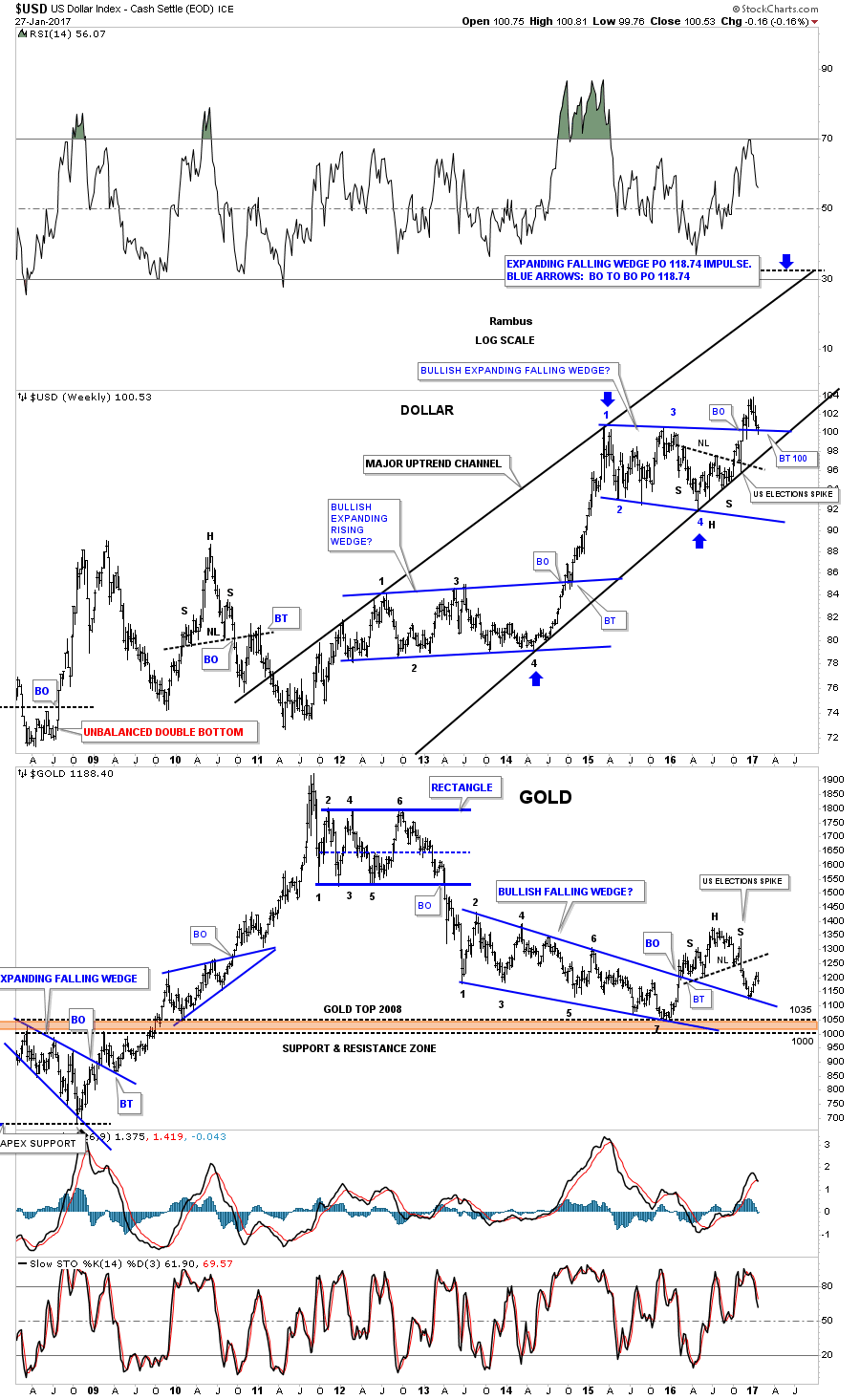
This next weekly chart for the US dollar puts all the pieces of the puzzle together. This chart shows the blue trading range with the double H&S bottom with neckline #2 almost being backtested this week. The major uptrend channel began in 2011 at the same time gold topped out. If the bottom rail of the major uptrend channel gives way that’s where I wave the white flag and surrender to the bears.
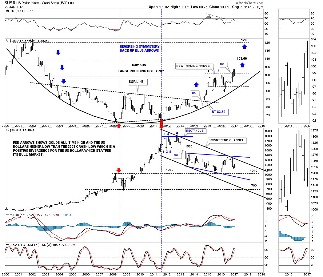
This next chart is a combo chart which has the US dollar on top and gold on the bottom. Looking to the right hand side of the chart you can see a long brown rectangle. That long brown rectangle shows you the inverse correlation between the US dollar and gold at least over the last year or so. If the US dollar is building out a H&S bottom then there is a good chance the gold is building out a H&S top which the brown rectangle shows.
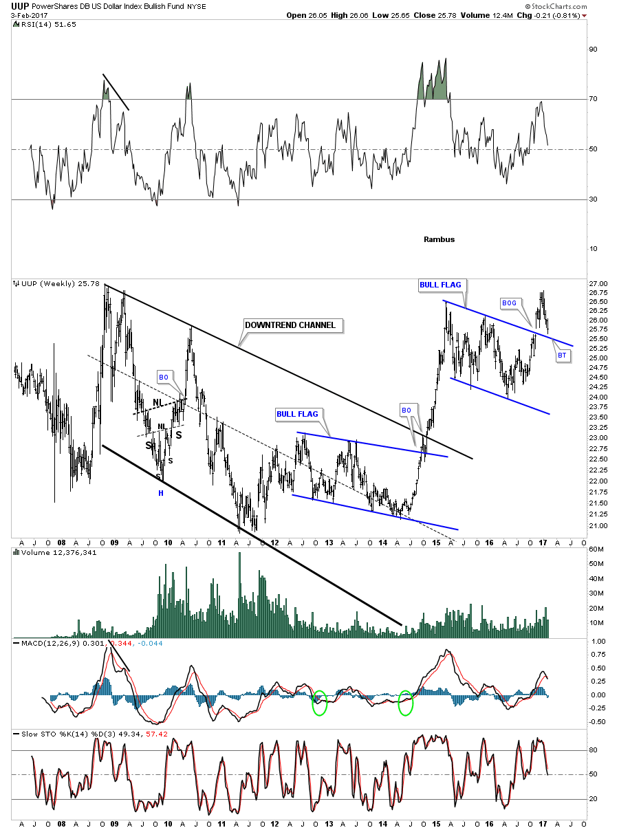
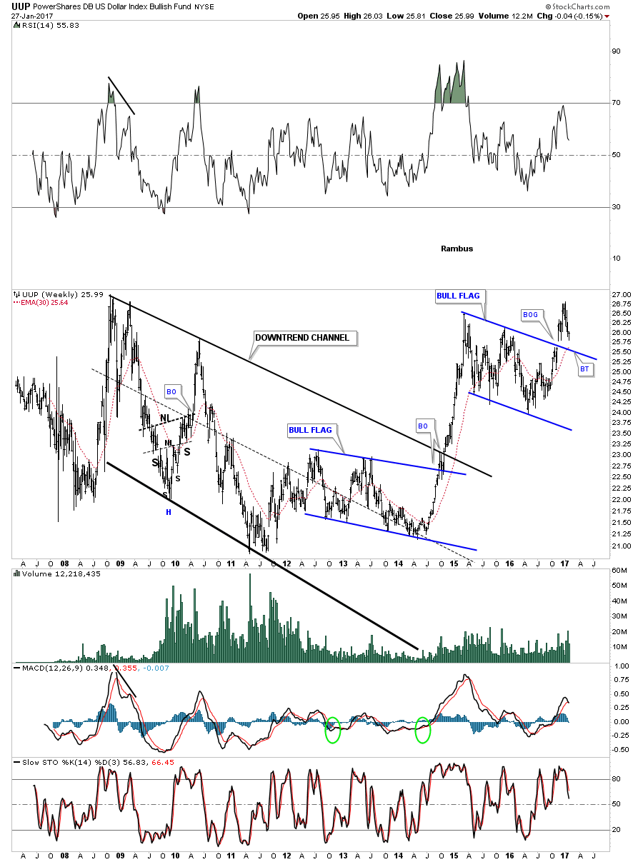
Instead of having a horizontal trading range the UUP has built out a bull flag as its consolidation pattern. A backtest to the top rail would come in around the 25.50 area which was almost hit this week with neckline #2 just below.

After putting in its bear market low in 2011 the UUP ( US Dollar ETF) has been in a strong bull market creating its first consolidation pattern just below the top rail of the downtrend channel. After completing that first impulse leg up, that started in the summer of 2014, the UUP went on a vertical move up to the first reversal point in the upper blue flag where it need to rest.
Sometimes backtests can be quick and clean while other times they can try your patience and makes you question whether you are right or wrong. As long as support continues to hold I have to remain a bull, but if I see support being broken in a serious way I will have no problem reversing my stance from bullish to bearish on the US dollar.
Have a great weekend and enjoy the Super Bowl. All the best…Rambus
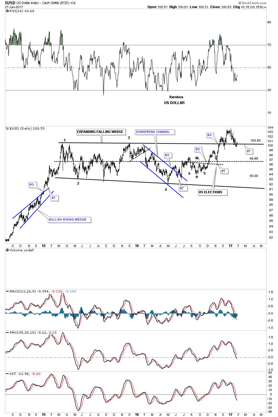
In this Weekend Report I’m going to show you some updated charts on the US dollar which has been in a bull market since the low in 2011. It’s hard for a lot of investors to admit, but until the charts change the bull market continues. A bull market is characterized by a series of consolidation patterns forming one top of the next, until the last pattern is a reversal pattern which reverses the bull trend. The old expression, the trend is your friend, also applies to the US dollar as well. Until the US dollar negates the series of higher highs and higher lows on an intermediate term basis, we have to assume the bull market is in tact.
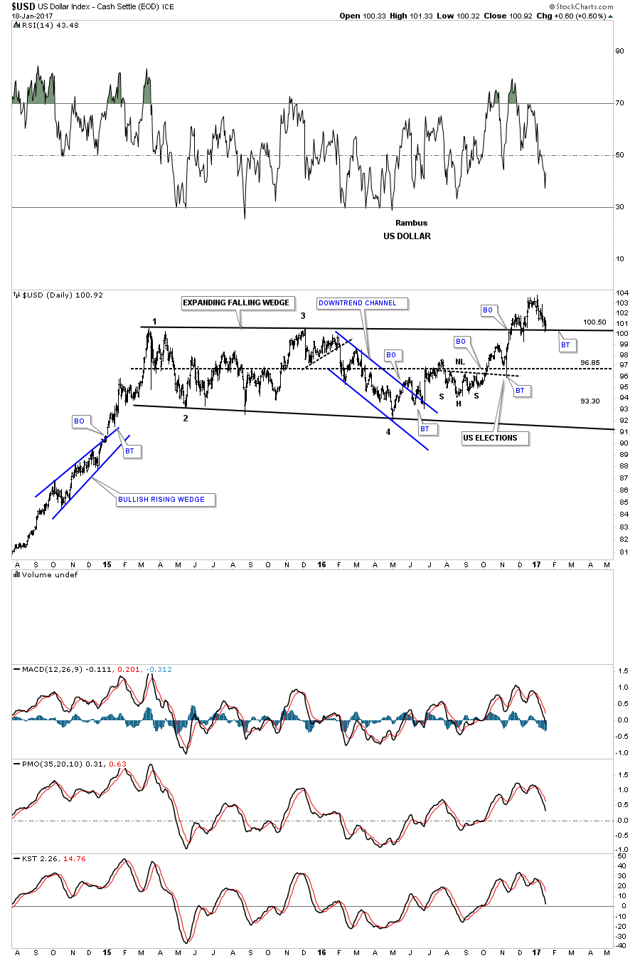
Lets start by looking at a daily line chart for the US dollar which shows the horizontal trading range beginning back in March of 2015. The breakout topside of the horizontal trading range took place a little over 2 months ago in November of last year. After the initial breakout there was the initial backtest which could have been the beginning of the next impulse move up, but the US dollar stalled out a month later and is currently backtesting the top rail around the 100 area again.
This is getting a lot of investors bearish on the US dollar, but nothing is broken yet. So far the top rail of the rectangle consolidation pattern is still holding support and until it’s broken this is still just a backtest before the next impulse move up begins in earnest. It’s all about playing the odds.
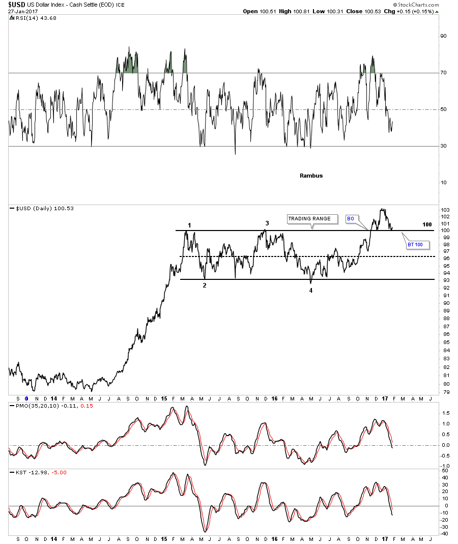
Below is a daily bar chart for the US dollar which shows the price action backtesting the top rail of the sideways trading range. Last Friday the US dollar closed right on the top rail. A worst case bullish scenario for the US dollar would be if the price action declined down to the center dashed mid line, that can happen in sideways trading ranges before the move you were looking for finally takes place. A close below the center dashed mid line would negate the bullish breakout that is currently underway.
There is another consolidation pattern that has formed during the last year of trading inside the horizontal trading range which is a double H&S bottom. Neckline #1 was broken to the upside in October of last year with the backtest to the neckline being the US election spike. From that backtest the US dollar rallied strongly and broke out above neckline #2, which was also backtested from above with the 50 day ema giving support at the neckline. Neckline #2 support now comes in at the 98.85 area.
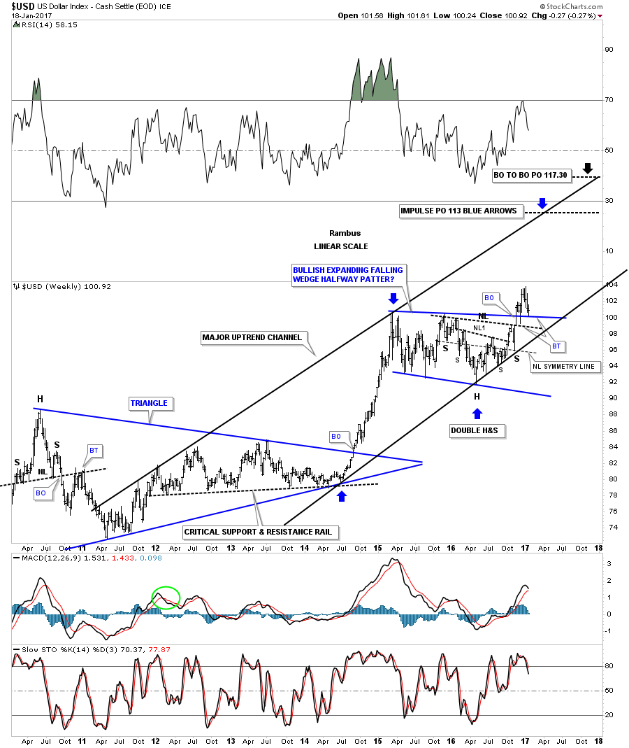
This next chart is a weekly look which puts our year and a half horizontal trading range in perspective. In a bull market there is an impulse leg up followed by a consolidation pattern that leads to the next impulse leg up, so on and so fourth, until the bull market exhausts itself and a reversal pattern builds out.
There are 3 important trendlines which should offer support. The first one is the top rail of the blue trading range which is now being tested. The second important trendline is neckline #2. If neckline #2 fails, then the last bit of support will come in at the bottom rail of the major uptrend channel.

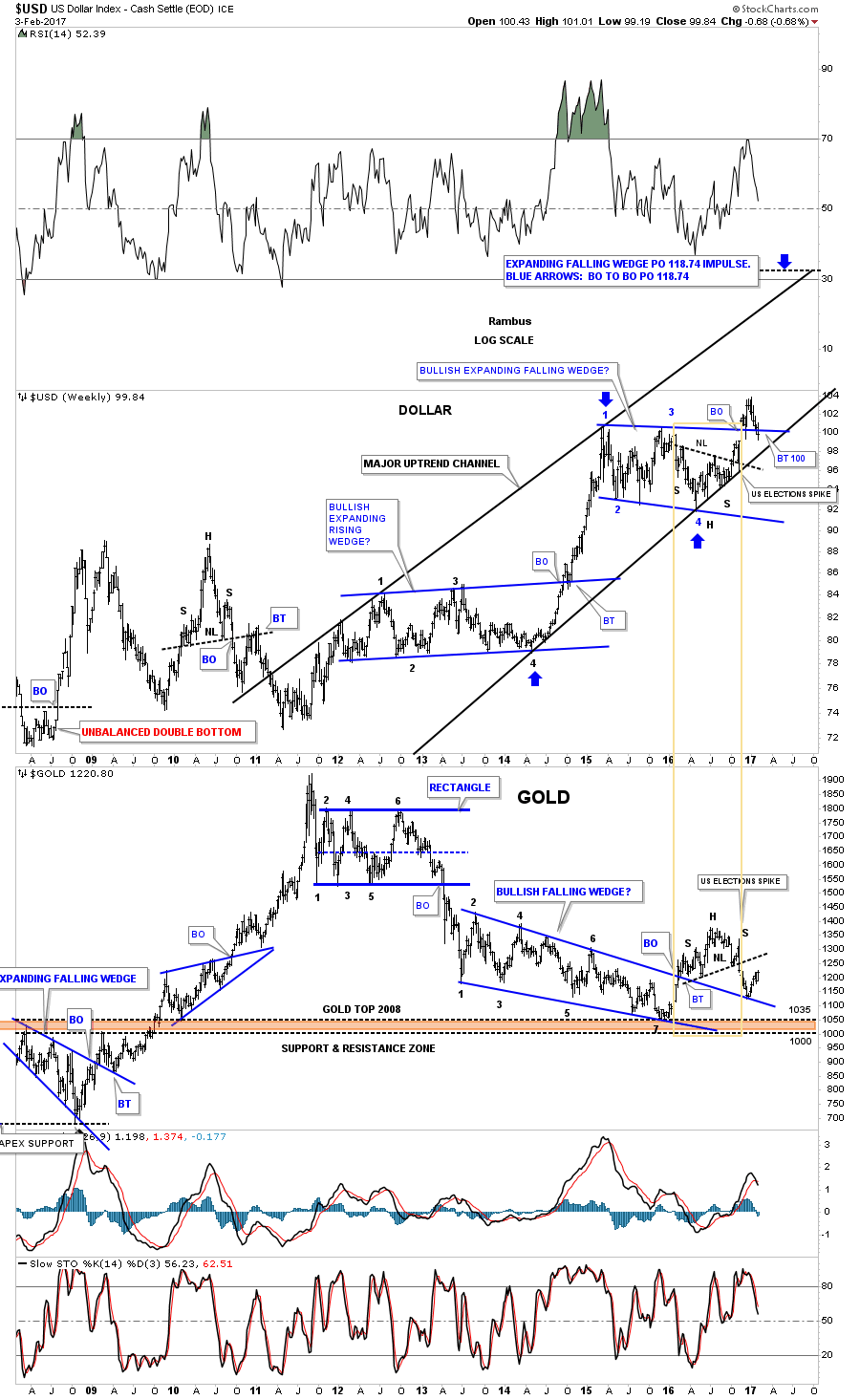
This next chart is a weekly combo chart which has the US dollar on top and gold on the bottom. On the right hand side of this combo chart you can see the 2 H&S patterns that formed on both the US dollar on top, and gold on the bottom, that have formed inversely to each other complete with the US elections spikes. There is also a short term inverse correlation taking place at the December 2016 low on gold that corresponds with the high made on the US dollar, which has now fallen back to the top of the trading range. The bottom line is,, whatever direction the US dollar goes, gold will most likely go in the opposite direction until proven otherwise.
This next chart for the US dollar is a long term monthly look which shows a massive 10 year base which launched the US dollar’s bull market. From a Chartology perspective the bigger the base the bigger the bull market. I would expect that at a bare minimum we should see at least one more impulse leg up before the bull market exhausts itself, with the possibility of several more consolidation patterns forming before the bull market ends.
Below is another combo chart which has the US dollar on top and gold on the bottom. The most important aspect of this chart is shown by the two sets of red arrows. The red arrows on the left side of the chart shows where the US dollar bottomed out in 2008 and gold topped out just before the crash. The two red arrows in the center of the chart shows the positive divergence the US dollar had to gold in 2011. Note that massive rally gold had out of the 2008 crash low which led to the bull market peak at 1920 in 2011. While gold was going parabolic the US dollar should have been declining in a significant way taking out the 2008 low, but it didn’t. As you can see the US dollar actually made a higher low vs the 2008 low, creating the positive divergence for the US dollar to gold. That is the point where I mark the beginning of the US dollar’s bull market. Since that 2011 low the US dollar has been in a bull market while gold has been in a bear market.
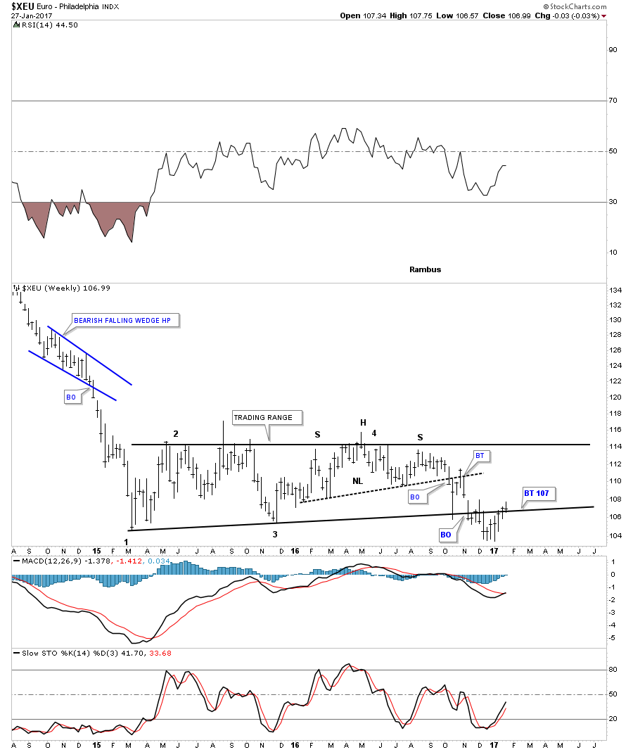
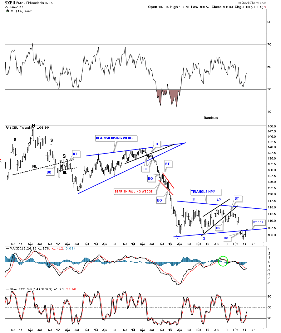
Now lets look at a couple of charts for the XEU. If the US dollar is backtesting an important trendline then the odds are high that the euro is also backtesting an important trendline. Note the H&S top that formed within the sideways trading range that matches the inverse H&S bottom on the US dollar chart we looked at earlier.
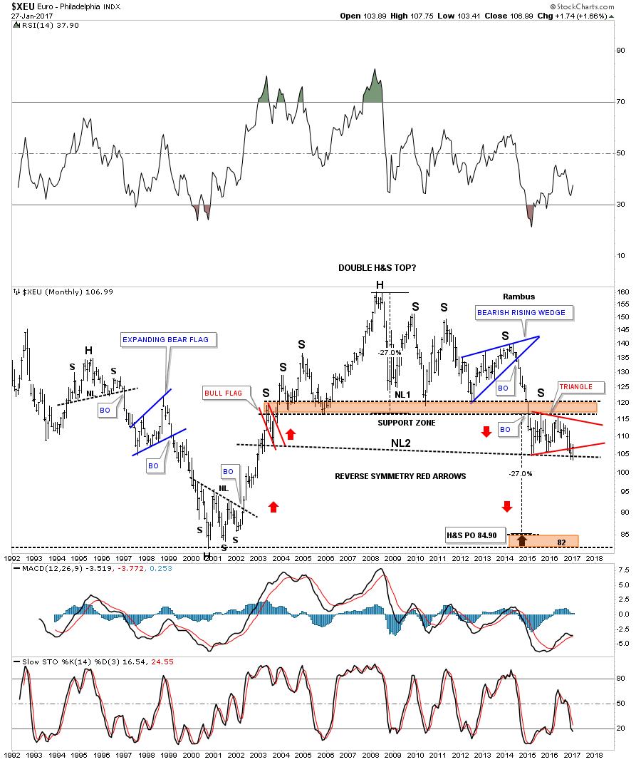
This long term monthly chart for the XEU shows a massive H&S top in place. The impulse move down out of the blue bearish rising wedge is the same impulse move up in the US dollar, which started in 2014. After slicing through the brown shaded support and resistance zone the euro began to consolidate that big move down by building out the red triangle consolidation pattern just below the S&R zone. If the next impulse move down takes hold, there is a good chance that we will see a move similar to the one when the price action broke below the blue bearish rising wedge, right shoulder.
The weekly chart for the XEU shows a close up view of the 2014 impulse move down and the current blue triangle consolidation pattern building out. I have been looking for a backtest to the bottom rail to come in around the 107 area, which was hit this past week.
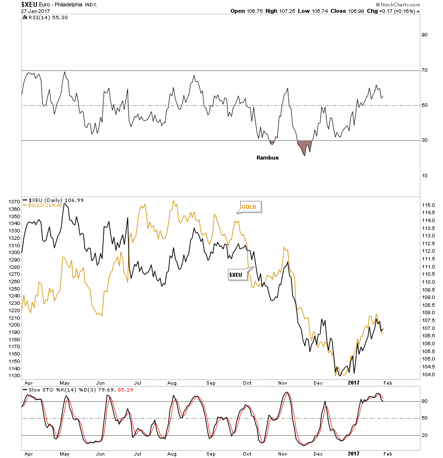
The last chart for the XEU shows why we need to pay attention to what this currency does as gold tends to trade in tandem. It’s not a perfect correlation but close enough.
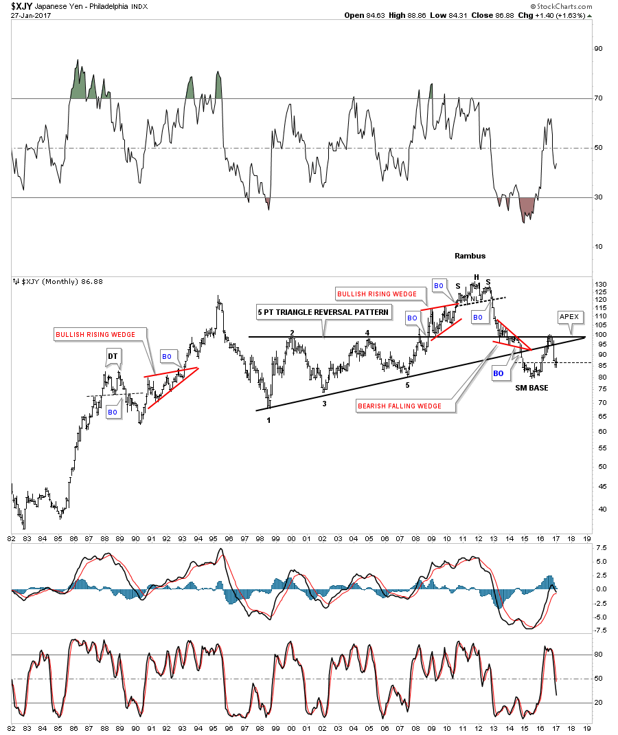
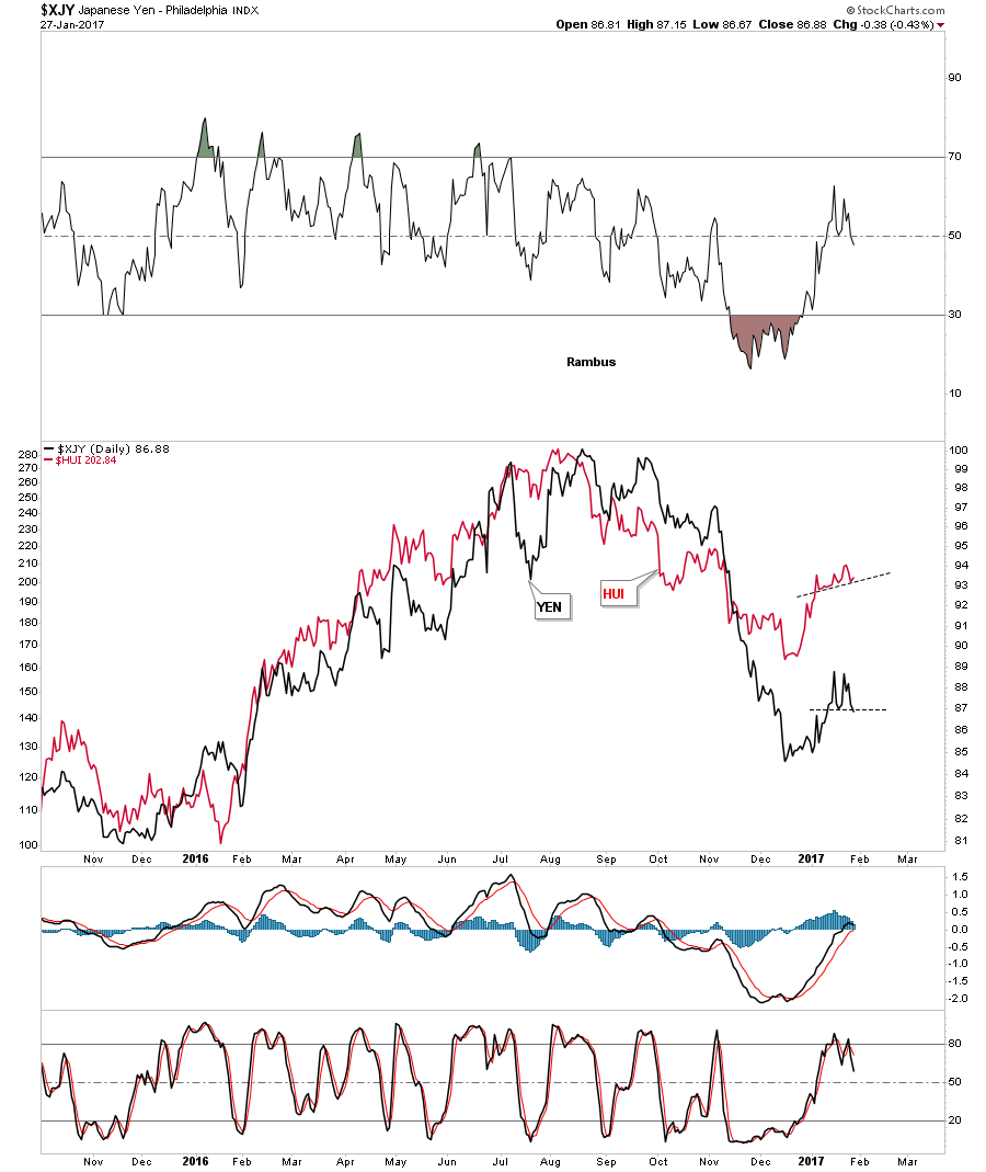
The XJY, Japanese yen, is another important currency to follow if you want to know what the PM complex is up to. In 2011 the yen built out a H&S top about the same time gold topped out. Just like gold, the yen has also been in a bear market, forming a small base in 2015, which gave the yen its first counter trend rally. This counter trend rally took the price action back up to the top rail of the black 5 point triangle pattern which now became the apex. The apex of a triangle is where all the energy is located between the bulls and the bears. Normally they will hold support or resistance depending on the direction of the move. If the apex of a triangle fails to hold support or resistance then you have an end around move, which can be bullish if the move is up, or bearish if the move is down. This chart shows the apex holding resistance.
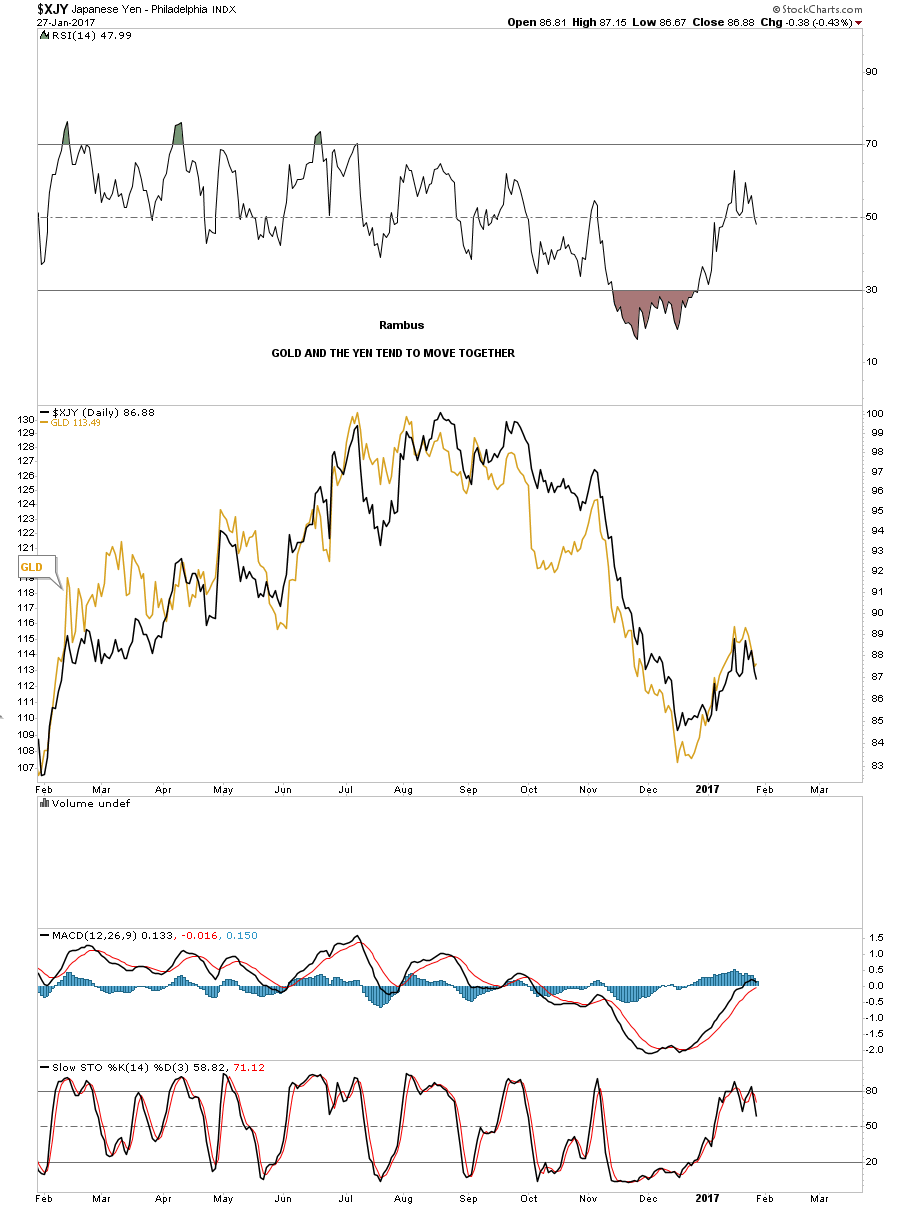
This next chart I overlaid GLD on top of the XJY which shows it has an even closer correlation than gold and the XEU. So how the yen moves, so will GLD.
This last chart for the yen I overlaid the HUI on top so you can see the correlation which is pretty strong. You can see there is some interesting price action on the right hand side of the chart as shown by the thin black dashed trendlines. If the yen bounces then the HUI should bounce too. If the yen puts in a double top then there is a good chance the HUI will breakdown below its dashed trendline. It looks like this week is going to be very interesting in regards to these two.
The UUP is a proxy for the US dollar which shows its trading range was a black bull flag. A backtest to the top rail would come in around the 25.50 area where the 34 week ema would also come into play.

The 10 year weekly chart for the UUP shows its entire history. Note the year and a half blue bullish falling flag that formed at the end of the major downtrend channel which gave the UUP the energy it needed to finally take out that top rail of the downtrend channel. After breaking out of that major downtrend channel the UUP has been consolidating in another blue flag which broke out late last year, and is deciding if it wants to do a complete backtest to the top rail and the 30 week ema.
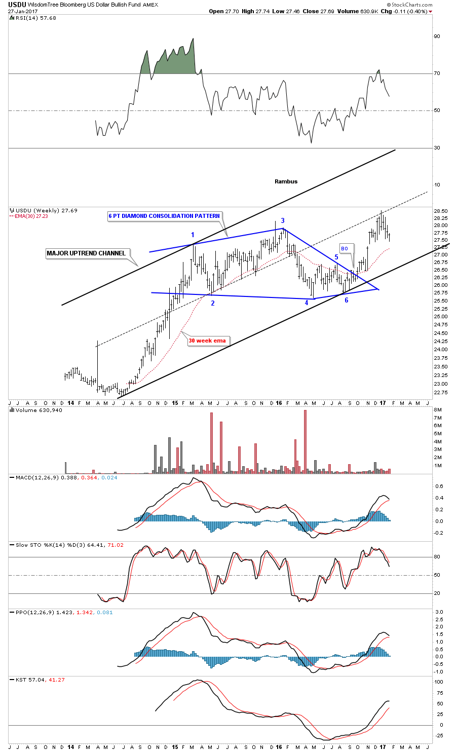
This last chart for tonight is a weekly look at the USDU which has a more equal weighting for the US dollar. We’ve been following the breakout from the blue diamond for three months or longer which is still in play. The 30 week ema does a good job of showing you where support and resistance lies.
The bottom line is, how the US dollar trades will have a direct impact on currencies and the PM complex. They can move together for short periods of time, but in the long run they tend to move inversely to each other. The US dollar is doing a critical backtest that is going to give us some important clues by how it interacts with the top rail of its nearly 2 year trading range. If the US dollar fails to follow through to the upside then the PM complex will enjoy another very strong bull market. Right now the US dollar is at an inflection point in regards to the big picture, which will come to an end at some point. All the best…Rambus
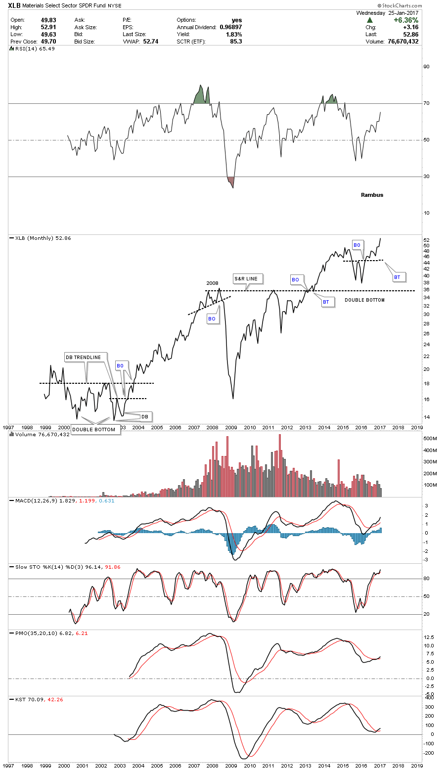
Tonight I would like to update the Basic Materials sector as this area now looks like it’s ready to resume its bull market. Also with the stock markets breaking out today, especially the INDU, this adds another layer of confirmation that the breakout is the real deal. As we’ve discussed previously there are many big cap Dow stocks that make up the XLB, Basic Materials fund, and with the INDU making a new all time high today there will be some individual components making new all time highs as well.
Lets start by looking at a weekly chart for the XLB, Basic Materials fund, that is breaking out of a bullish rising flag this week. This bull flag has been building out since last spring and now the price action is trading into new all time highs. There was a conventional bull flag that formed between 2015 and 2016 that sloped down. That down sloping black flag started to form after the 7 point bearish rising wedge completed.

This 20 year monthly line chart shows the entire history for the XLB. In 2015 this basic materials fund built out a double bottom which launched the recent impulse move up. That double bottom formed right on top of the multi year support and resistance line.There was a bigger double bottom that formed back in the early 2000’s which launched the bull market.
There is one last point I would like to make on this monthly line chart which compares the 2008 top to the current price action. As you can see the XLB is considerably higher than the 2008 top. If you compare this chart to the HUI, the HUI is still a long ways off from breaking out to a new all time high.
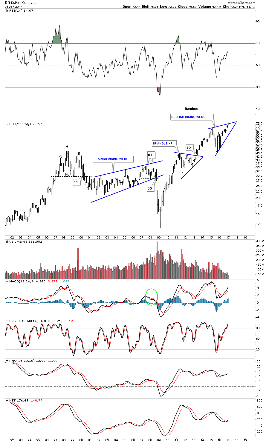
Now lets look at some big cap basic materials stocks that help make up the INDU. This first chart is a monthly look at DD, DuPont, which is trading at a new all time high but still hasn’t broken out above the top rail of it blue expanding triangle. When it does this stock will add a lot of fuel to the INDU’s bull market.
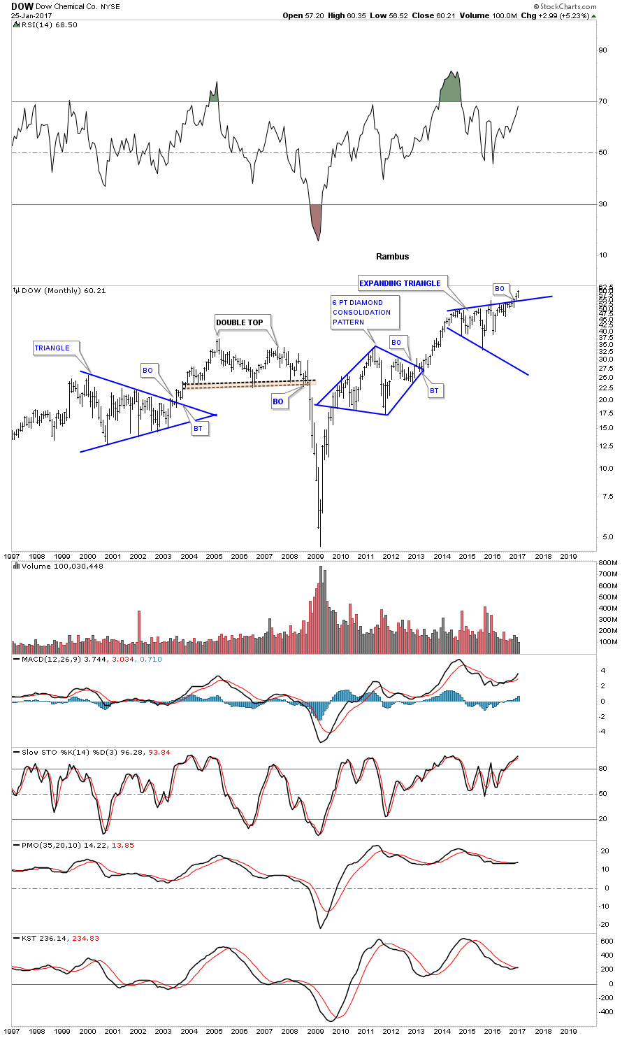
Below is a 20 year chart for DOW, Dow Chemical, which broke out topside of its blue expanding triangle consolidation pattern and is hitting new all time highs.
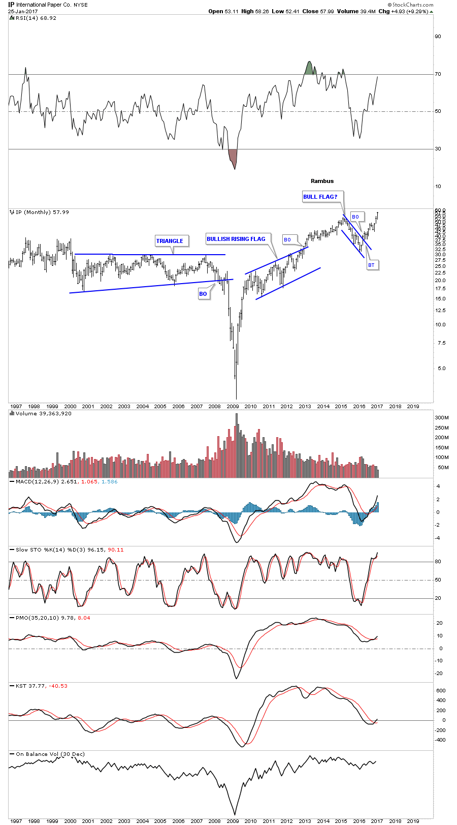
This next chart is a monthly look at IP, International Paper, which is also trading into new all time highs.
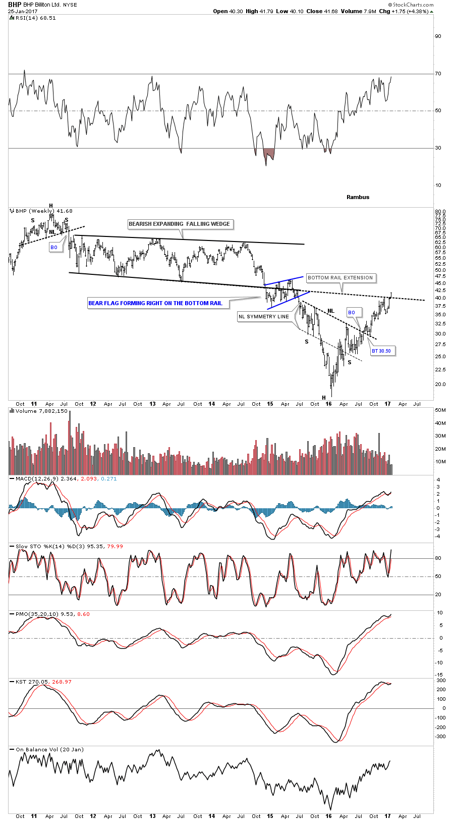
Lets look at some other basic materials stocks that have been showing some strength recently. Last fall I posted this chart for BHP, which was starting to breakout above the neckline of a strongly slanted inverse H&S bottom. This week the price action is trading above the bottom rail extension line taken from the bearish expanding falling wedge.
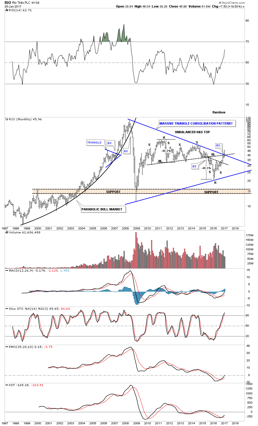
Another big mining company is RIO which is taking out some overhead resistance this month. Note the breakout from the nearly 9 year blue triangle consolidation pattern and the the old neckline from the unbalanced H&S top. The bulls are starting to take control.
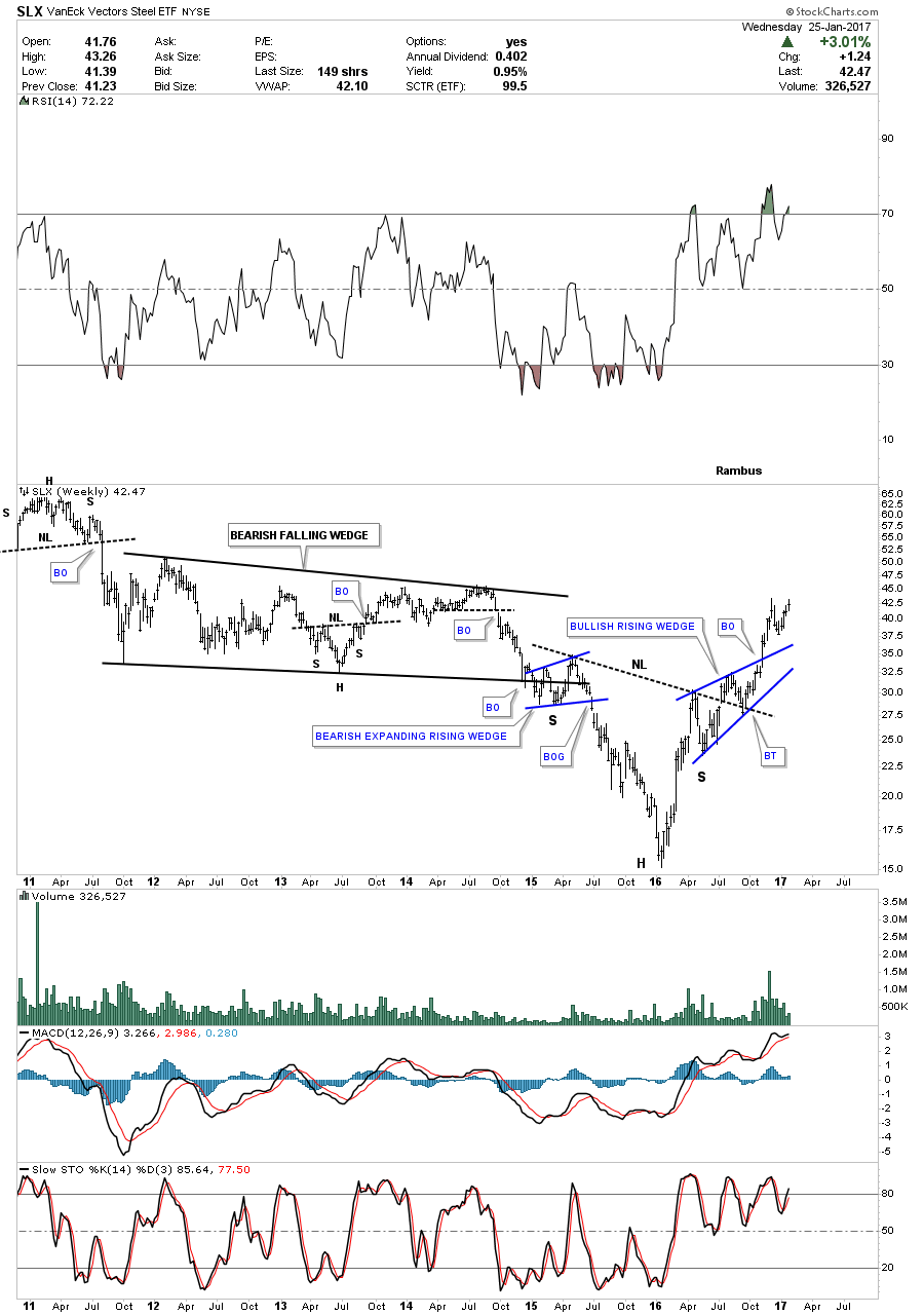
The steel stocks have been doing very well over the last year or so and have been one of the stronger areas in the basic materials sector. Below is the SLX, steel etf, which built out an inverse H&S bottom. Note the two smaller blue consolidation patterns that make up the blue bullish rising wedge separated by the neckline which is usually a bullish setup.
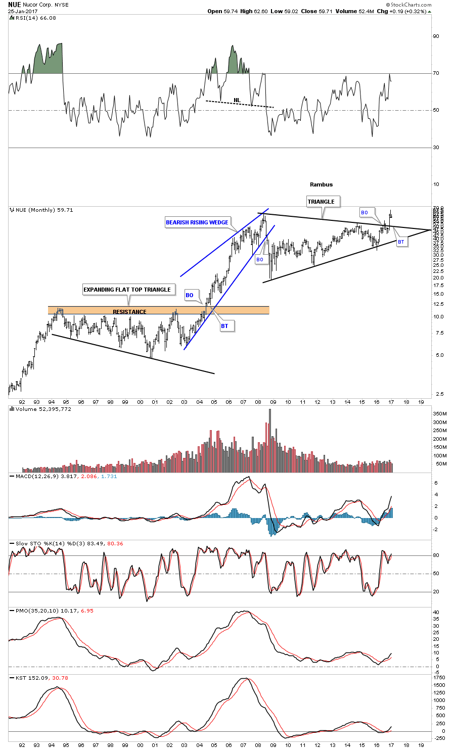
In November of last year NUE, steel company, broke out of a massive triangle consolidation pattern and is currently in backtest mode.
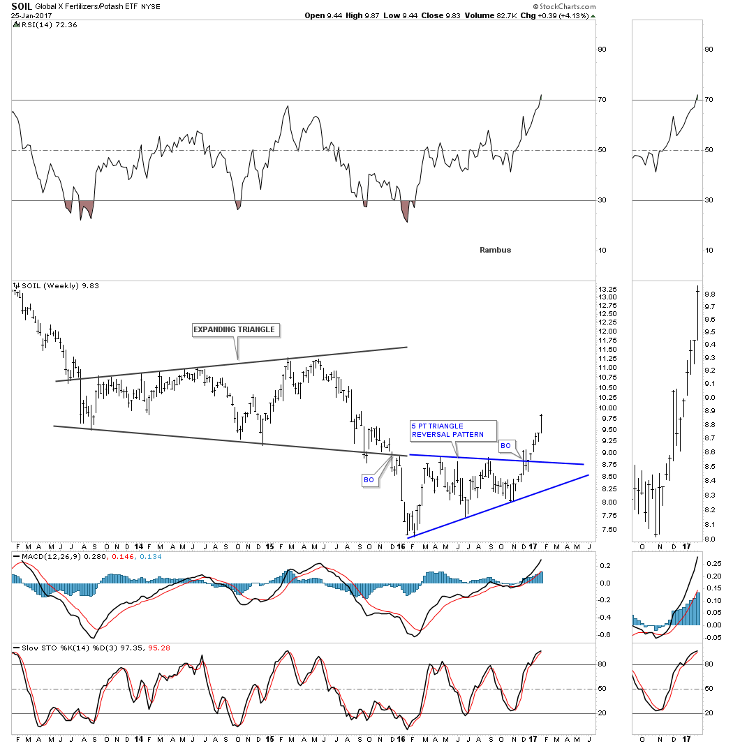
SOIL is a fertilizer company that just broke out from a blue 5 point triangle reversal pattern.
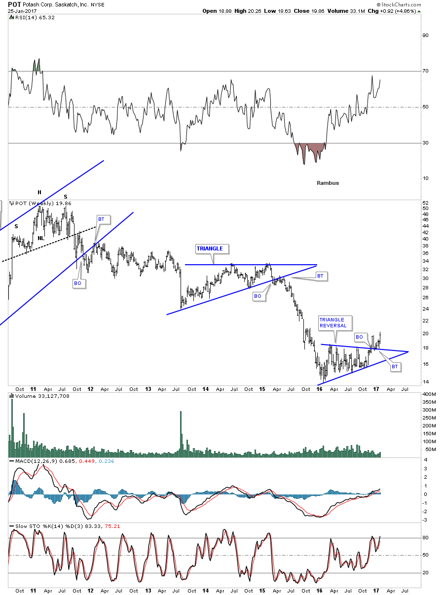
POT is another fertilizer company that is also breaking out from a 5 point triangle reversal pattern.
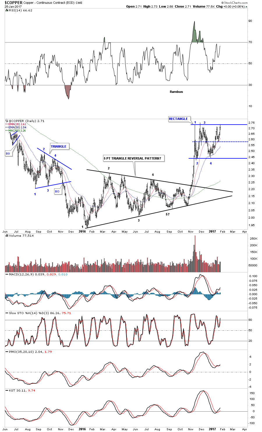
After breaking out of an almost 1 year black triangle reversal pattern Copper has been chopping out a blue rectangle trading range. Many times during the formation of a rectangle consolidation pattern, after the 4th reversal point is in place, there can be one more small decline which will take the price action down only to the center mid dashed line before the breakout occurs. That just happened over the last week or so.
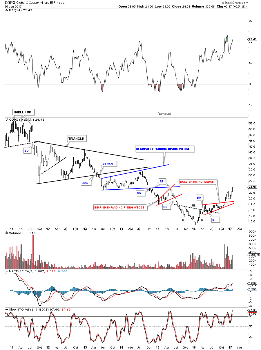
COPX is a Copper Miners etf which formed an inverse H&S bottom with the red bullish rising wedge as the backtest. It’s currently making a new 2 year high.
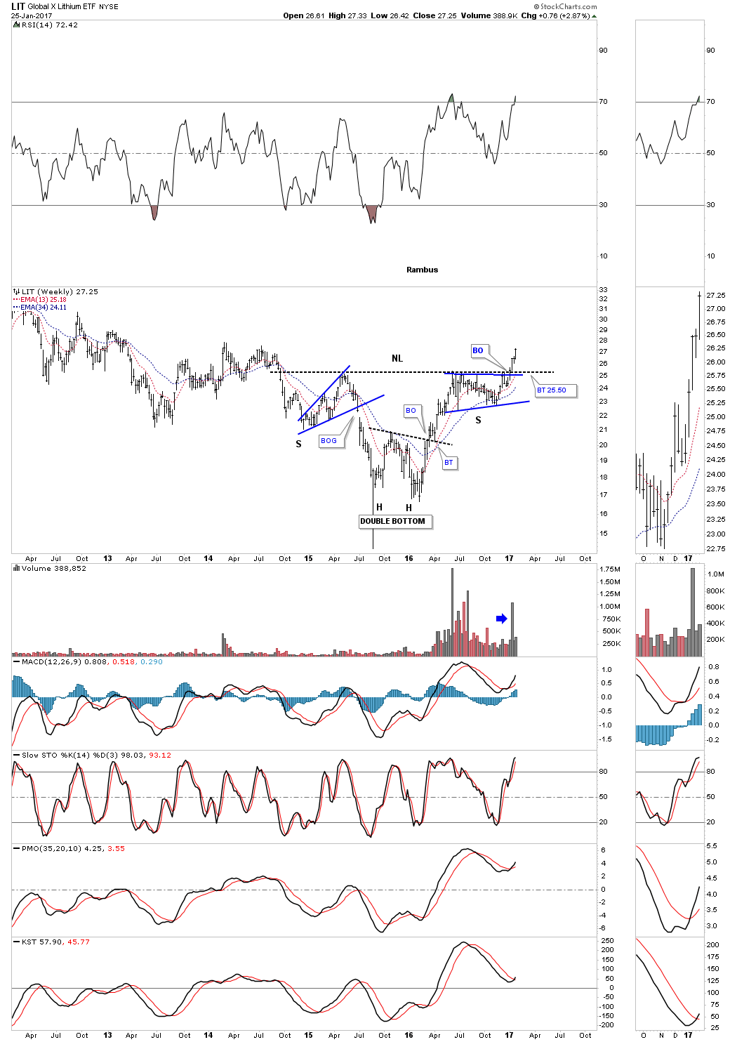
These next three stock aren’t in the Basic Materials sector, but are in the natural resource area. Below is a weekly chart for LIT, Lithium etf, which broke out of an inverse H&S bottom 3 weeks ago.
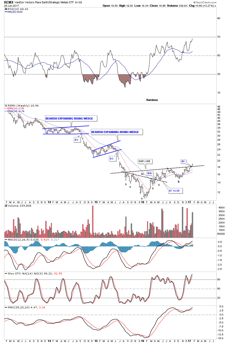
The weekly chart for REMX, Rare Earth etf, is breaking out from a complex H&S bottom this week.
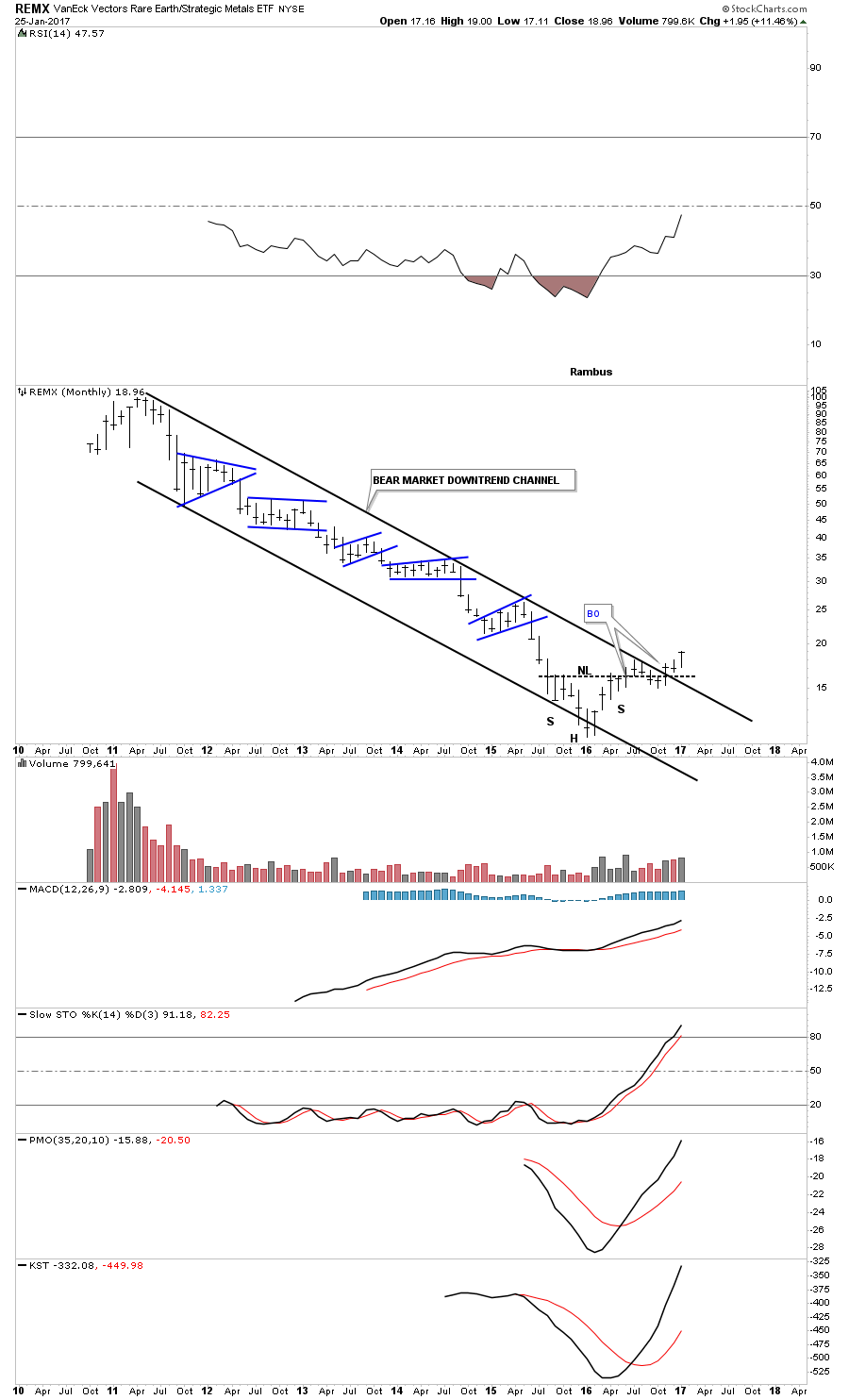
The long term monthly chart for REMX shows its entire history which is comprised of the massive downtrend channel. It’s currently in breakout mode above the top rail.
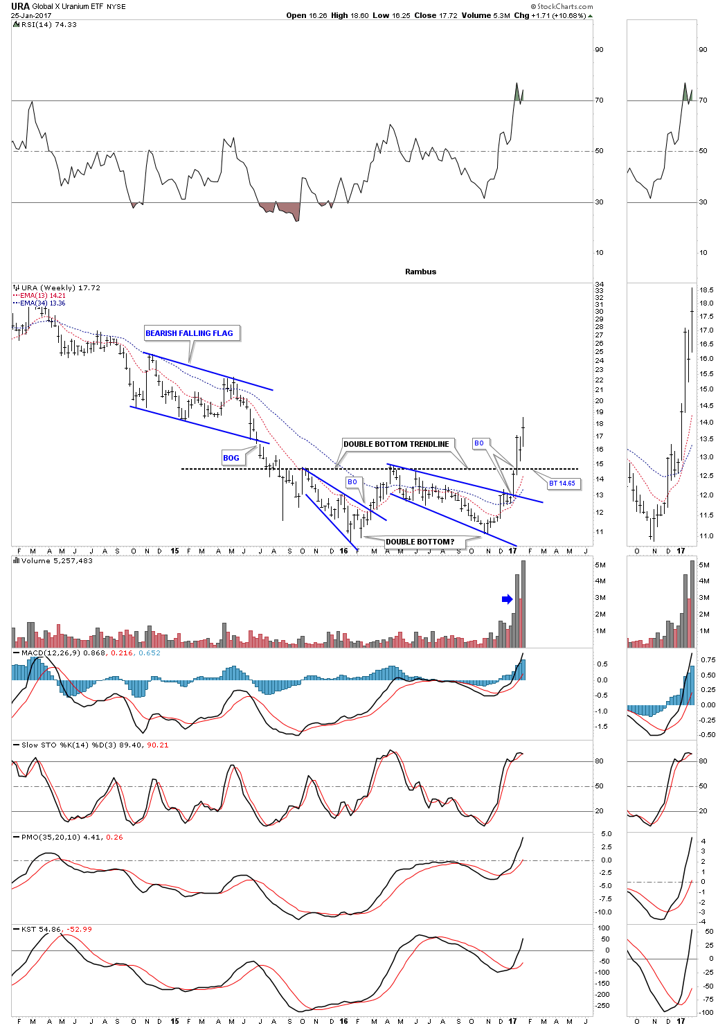
This last chart for tonight is a weekly look at the URA, uranium etf, which broke out above its double bottom trendline 3 weeks ago on heavy volume.
All these charts tonight show that something of a bullish nature is happening in the basic materials/commodities sectors, that has been a long time coming. These charts also bode well for the INDU which has a lot of these basic materials stocks in its makeup. So as long as the XLB, basic materials index, is making new all time highs then the INDU shouldn’t be to far behind. All the best…Rambus
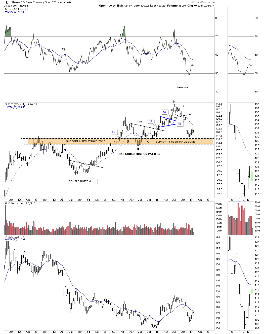
Lets start by looking at a weekly chart for TLT, 20 year bond etf, which shows it built out a H&S top last summer. That H&S top is a reversal pattern that showed up at the end of its bull market which has been ongoing for many years. There is a big brown shaded support and resistance zone that has been offering support.
This next chart is a 15 year monthly look at the TLT which shows it has built out a four year 5 point bearish rising wedge which broke to the downside in November of last year. If there is a backtest it would come in around the 129.75 area.
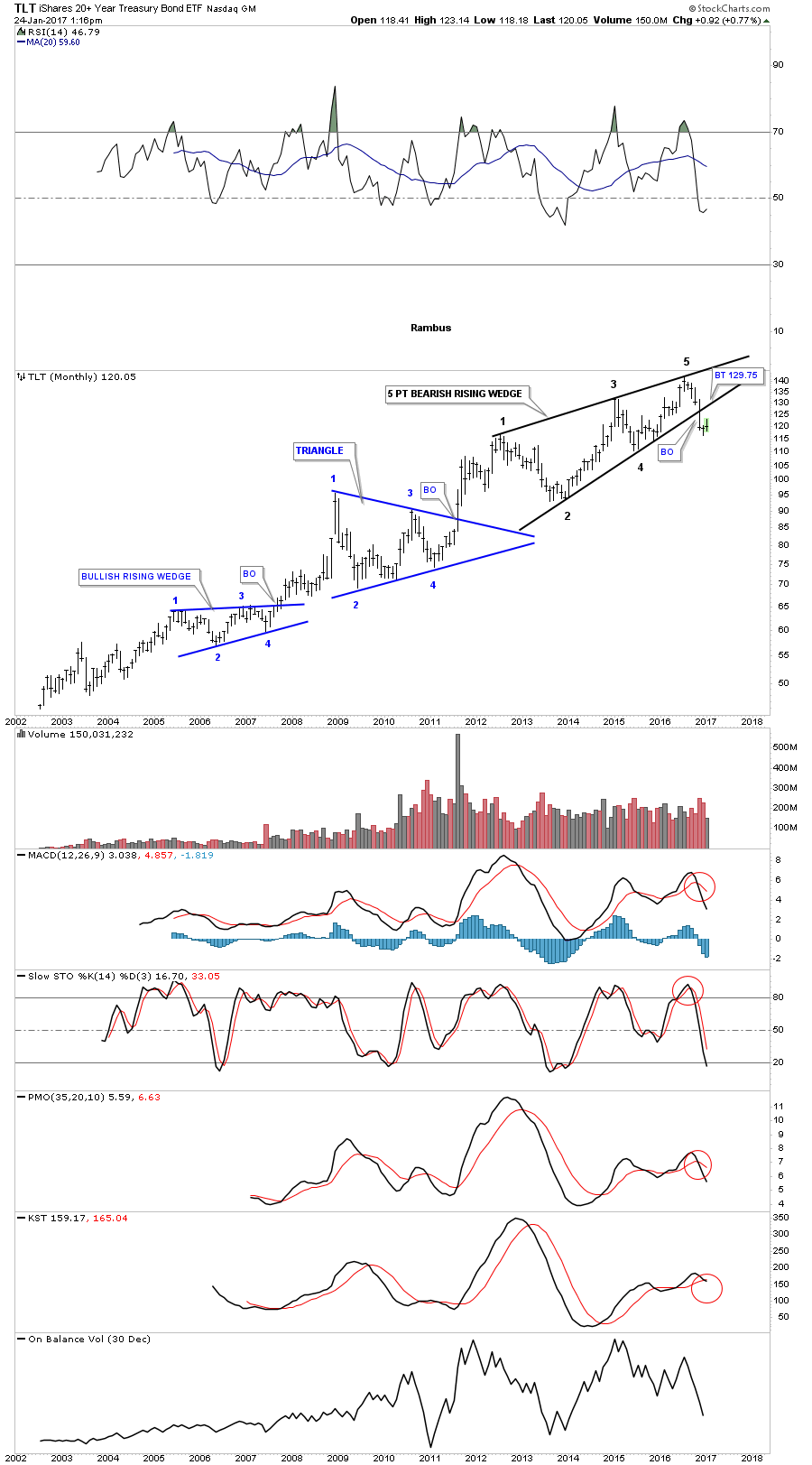
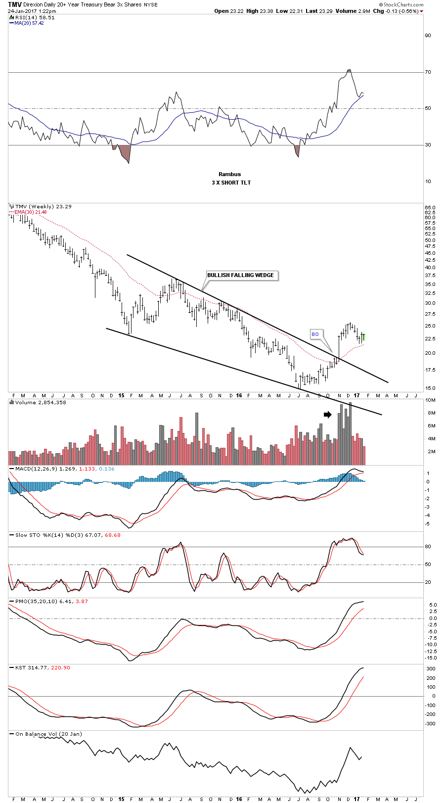
TMV is a 3 X short the TLT.
This last chart is a combo chart which has the TLT on top and GLD on the bottom. It’s not a perfect correlation by any means but these two have been moving together pretty consistently over the last year or so. GLD is currently backtesting its neckline and a support and resistance line going back a year and a half or so. If GLD can trade back above the neckline and the S&R line the bulls will be talking to us. To say this is a critical area for GLD is an understatement. Definitely an area to keep a close eye on.

Tonight I would like to update you on the US dollar as it plays such an important role in so many different markets. Getting the big trend right on the US dollar can help you see what areas are affected by the dollar to invest in. There are alot of areas that have an inverse correlation to the dollar, such as commodities and the precious metals in particular.
Let start with just with just a simple daily line chart that shows the two year sideways trading range with the breakout and the backtest that is currently underway. As you can see this is actually the 2nd backtest to the top rail at the 100 area so there is no question the top rail is hot.
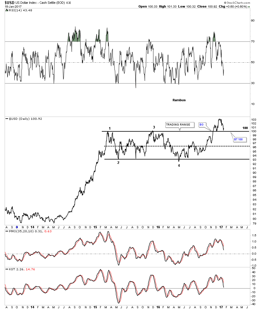
This next chart for the US dollar is a daily bar chart which I’ve been showing as a rectangle consolidation pattern. If one were to connect the reversal point, #1 and #3 for the top rail, and reversal points #2 and #4 for the bottom rail, we would have an expanding falling wedge. The top rail would be sloping slightly down just a tad which would help in showing the backtest a little more clearly. The difference between the two would only be about a point or so. A good habit to get into when you see there may be a little morphing of a trendline is to tweak it, because it may be tested again at a later date.
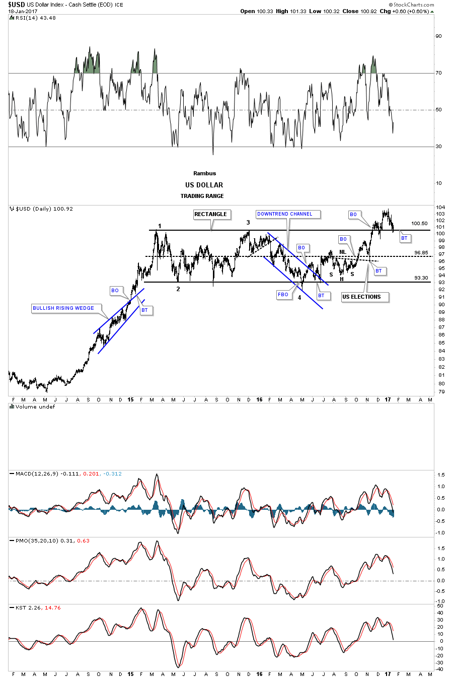
Below is the updated version of the morphing rectangle halfway pattern which shows the nearly 2 year expanding falling wedge.The top rail is almost perfectly horizontal, but to get the backtest price objective right, every fraction of a point helps.
Tonight is the first time I’ve shown this chart to you. Below is a weekly look at the US dollar which shows the blue expanding falling wedge and how it fits into the big picture as a halfway pattern to the upside. I’ve shown you many bull markets that form one consolidation pattern on top of the next, which can go on for years. When a bull market ends there is usually a recognizable reversal pattern that will build out which will signal a trend change. As long as the top rail of the blue expanding falling wedge holds support we have a consolidation pattern in place. Until the price action takes out the top rail to the downside we have a consolidation pattern, not a reversal pattern.
Note the H&S consolidation pattern that formed on the right side of the blue consolidation pattern which should give the US dollar the energy it needs to have a successful breakout and impulse move to the upside. After the neckline breakout and the initial breakout above the top rail of the blue expanding falling wedge, the price action backtested the neckline with a nice long daily reversal bar. This week the US dollar is backtesting the top rail of the blue expanding falling wedge. The symmetry of the bigger H&S shows the neckline symmetry line which is parallel to the neckline that showed us the low for the right shoulder.
If the US dollar is in a bull market on an intermediate term bases it should make higher highs and higher lows which creates an uptrend. Note how many touches the bottom rail of the major uptrend channel has which tells us it’s an important trendline. You can do the same thing with the top rail which shows about 4 touches. Also, as you can see the major uptrend channel is not parallel, but more of a rising wedge formation with still a lot of overhead room for the US dollar to move higher.
That brings me up to the measured move for the blue expanding falling wedge halfway pattern. The first price objection is measured from the last reversal point in the blue triangle pattern at the bottom of the chart to the first reversal point in the blue expanding falling wedge. That distance is taken and added to the 4th reversal point in the blue expanding falling wedge to get a price objective up to the 113 area, as shown by the blue arrows, and is called an impulse measured move.
The second measured move is taken from the breakout point from the blue triangle to the first reversal point on the blue expanding falling wedge. That distance is then taken and added to the breakout point of the blue expanding falling wedge which gives us a second price objective up to the 117.30 area. This is called the breakout to breakout measured move. This is on a linear scale chart.
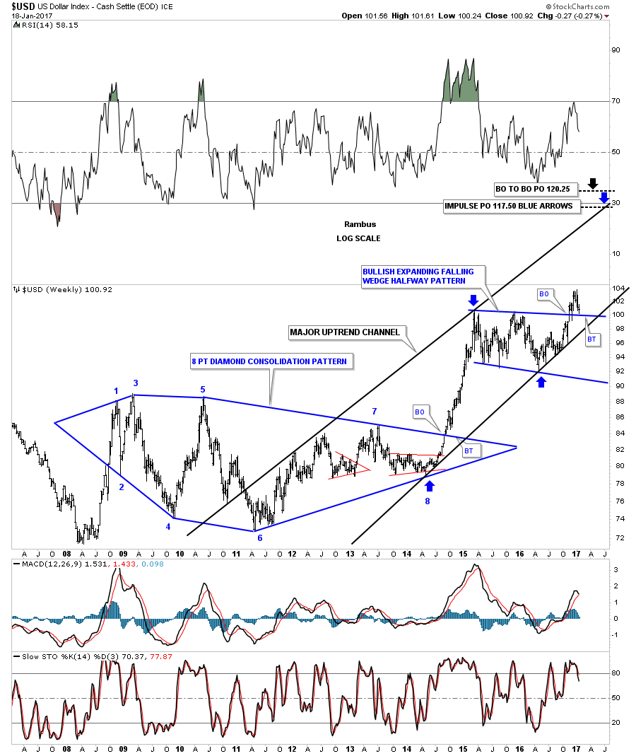
This next chart is a log scale weekly look at the US dollar which gives us a little higher price objectives based on the two measured move techniques. If one was to look at the price action since the 2011 low and you didn’t know what stock you were looking at you would most likely think that this stock is in a beautiful uptrend.
This next chart is a 35 year monthly look which shows the two big fractal bases labeled big base #1, and big base #2. Back in the late 1990’s when the US dollar broke out of big base #1 it formed the blue bullish rising wedge as a halfway pattern. That backtest to the top rail took three full months to complete before the second impulse move took off. If our current blue halfway pattern plays out it will have a price objective up to the 120 area which is about as high as the the 2000 bull market high. At that point we can look for another consolidation pattern to start building out if the US dollar is in a strong secular bull market. If this rally is like the last major impulse move up out of big base #1 then we should see some type of reversal pattern build out similar to what we saw at the 2000 high. That H&S top in 2000 built the foundation for gold’s bull market to follow, which lasted close to 11 years.
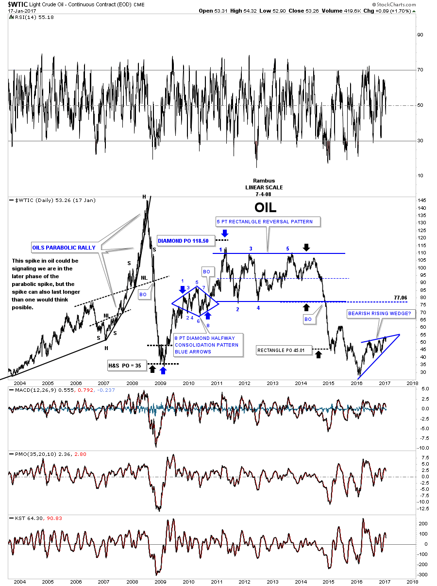
Again, if the US dollar is in a secular bull market then it will most likely have a negative impact on commodities and the precious metals complex. For those members that were with us during the strong impulse move up out of big base #2 you will remember what that did to commodities, the precious metals complex and most of the important currencies of the world. With that said I’m paying especially close attention to the commodities indexes for any sign of failure. The chart for the $WTIC I posted earlier today is a good example of to watch for. The price action will let us know of its intentions if we can keep an open mind. It is what it is until it isn’t. All the best…Rambus
After breaking out from the large blue triangle the $WTIC has been in backtest mode since early December. So far the 52 area has been holding support with several touches from the topside. Normally when a pattern is strong the backtest will come quickly and the impulse move will begin in earnest. For almost 2 months now the backtest is laboring with the impulse move failing to take off. I’m viewing this as a warning sign at the moment.
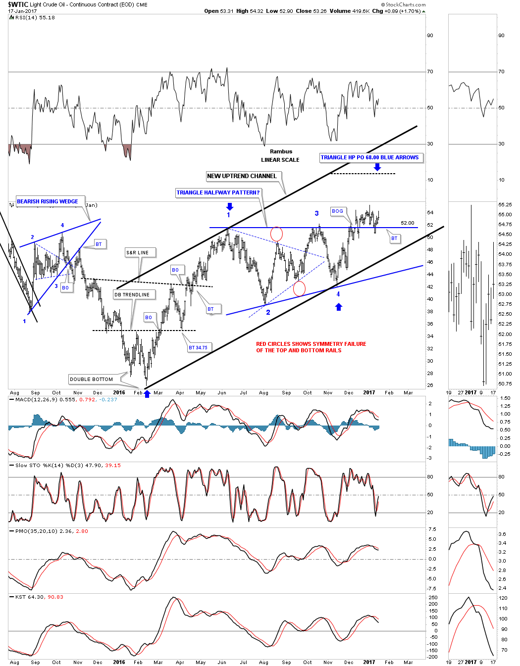
This next daily chart for oil shows what the breakout and backtest looks like from another perspective. The price action above the top rail on the blue triangle above, is showing a possible H&S top building out. If I adjust the top rail of the black uptrend channel on the weekly chart above, to the top of the potential H&S top we get a bearish rising wedge which has completed three reversal points so far with the H&S top being the start of the fourth reversal point to the downside. In big consolidation patterns there is usually some type of reversal pattern at the reversal points. If the neckline gets broken to the downside that will be a big clue that the bearish rising wedge is in fact a consolidation pattern and the blue triangle not a continuation pattern. A breakout below the bottom rail of the potential bearish rising wedge will be confirmation oil is going back down to the 2016 low.
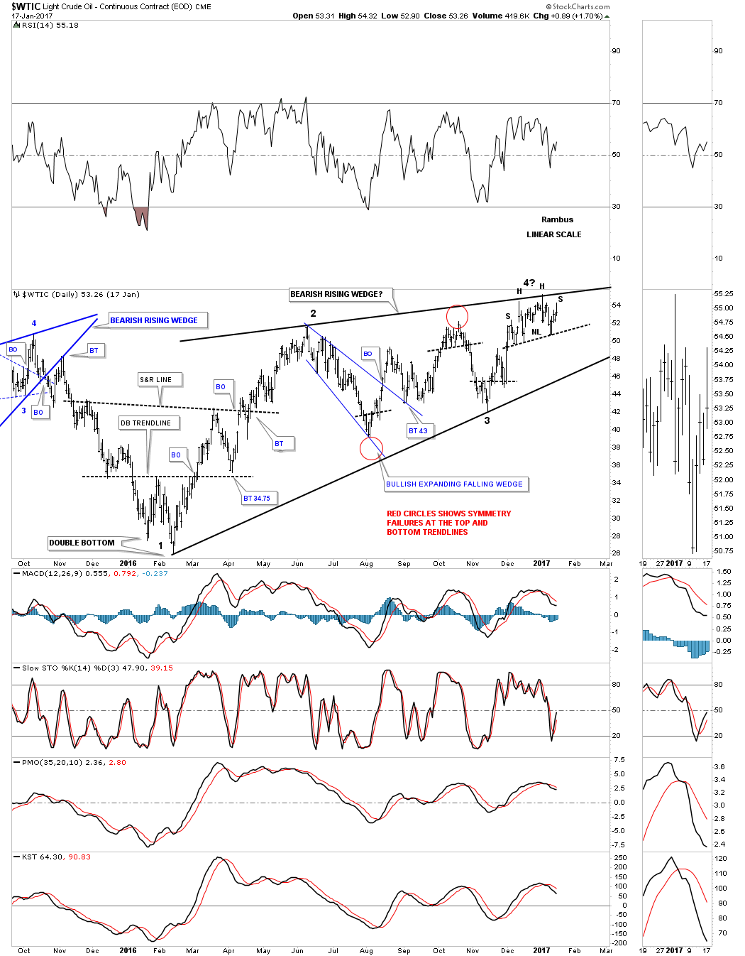
This next chart is a long term daily look at oil which puts the potential bearish rising wedge in perspective. Keep in mind the minimum price objective for a wedge is to the first reversal point which in this case would be the 2016 low.
If oil is truly building out a bearish rising wedge what is that telling us about commodities in general and the US dollar? I know most have given up on a bullish outcome for the US dollar which may be correct. Tonight in the Wednesday Report I’m going to post some charts on the US dollar that you haven’t seen yet. The US dollar is probably the most important chart to watch as it plays such a big role in many different markets.
The GLD has finally arrived to the big gap area made on the way down. This morning it officially closed the gap at 115. Now we see what happens.

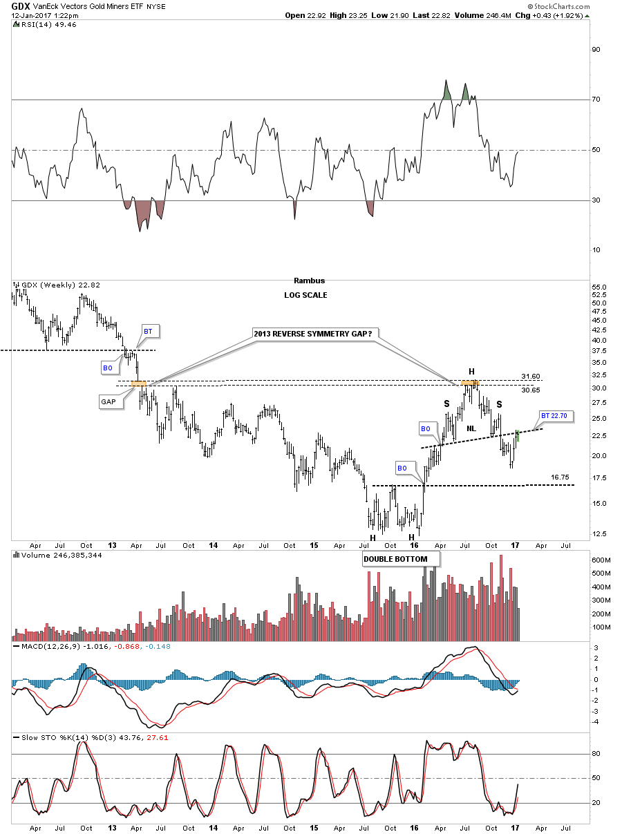
Below is a five year weekly chart for the GDX which shows the reverse symmetry gap made back in 2013. If you recall I was speculating at the time on what would we see when the GDX traded back up to the gap area last summer. Would the price action gap over it and just keep going up or would it hold resistance, or just bounce around for awhile and then take it out? The gap area held resistance for about six weeks before the bulls gave up and the GDX began the correction.