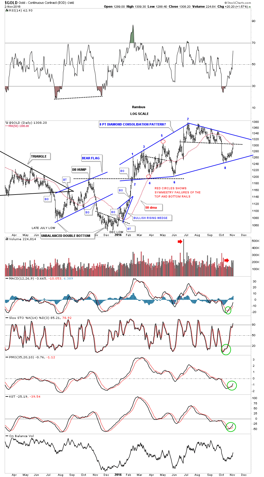
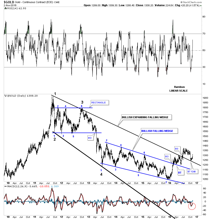
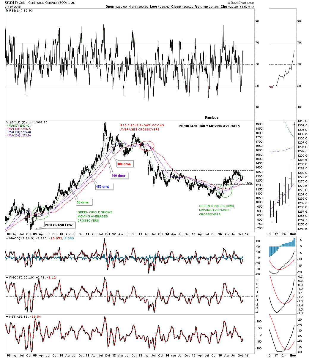
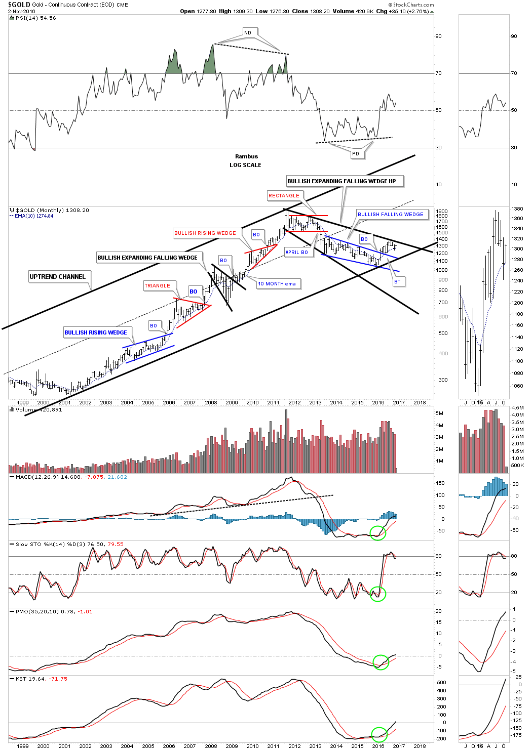
Tonight is a good night to post one of the ratio combo charts we’ve been following for a very long time , which compares the TLT:GLD ratio to the GLD. Below the ratio chart is a ten year weekly bar chart for GLD. There are many ways to analyze a ratio combo chart like this which can help one look for the intermediate to longer term trends.
When the ratio chart on top, the TLT:GLD is rising, that means the 20 year Treasury bond is out performing GLD and when the ratio is declining GLD is stronger than the TLT. On the left side of the chart you can see how the ratio chart on top built out a H&S top at the same time GLD built out a H&S consolidation pattern during the 2008 crash. Once both H&S patterns were complete GLD rallied for almost three years while the ratio chart declined. Note how the ratio chart on top and GLD on the bottom, both gave each other a nice kiss when gold topped out at 1920 in September of 2011 and the ratio bottomed, red arrows.
That point marked the exact starting point for GLD’s nearly four and a half year bear market. That bear market decline lasted until December of 2015 and ended when the ratio chart topped out at the previous 2008 high. Some of you may remember that when the ratio chart was trading at the 2015 high it was building out the blue rising wedge. If you recall I was looking for a possible breakout above the top rail which would have driven GLD down to the 700 area. What I knew was that whatever the direction of the breakout move, out of the rising wedge, a good move would occur.
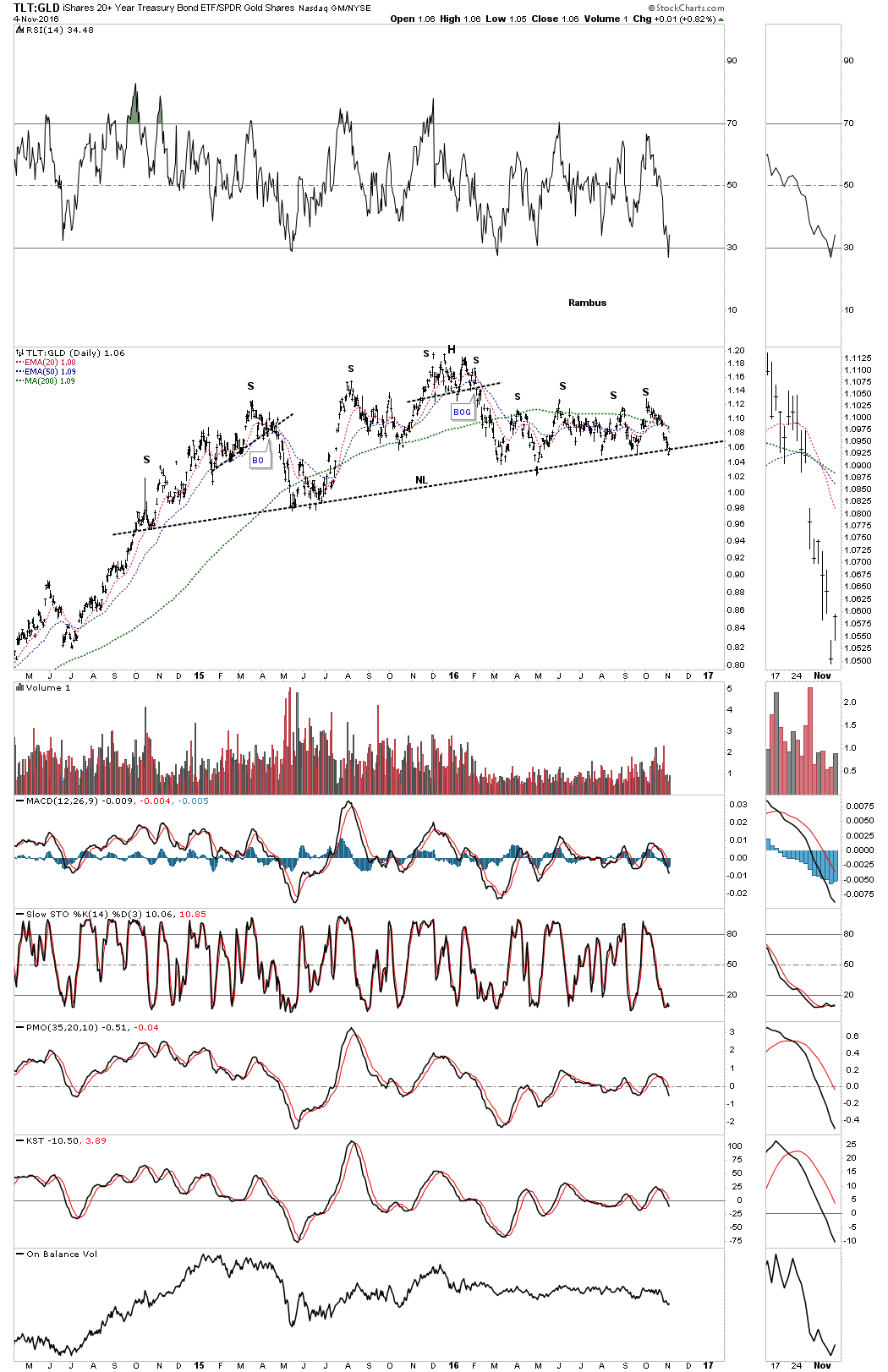
You have to look real close but the ratio left a nice big breakout gap the week the rising wedge broke to the downside telling us the bear market was over for the PM complex at the same time GLD was breaking out above the top rail of its inverse looking bullish falling wedge. As you can see these two have been in consolidation mode since the spring of this year. This week the price action on the ratio chart touched the possible neckline and bottom rail of a potential bear flag. Just like we had to wait for the ratio chart on top to tells us which way the rising wedge was going to breakout we are in the exact same situation right now. The odds favor the ratio chart breaking down but confirmation the next impulse move is underway will be when the ratio chart closes below the neckline and the uptrend line.
Keep in mind that is a two year H&S top on the ratio chart so a big move should occur if and when the neckline gives way. From a Chartology perspective the TLG:GLD ratio chart is still in an uptrend while GLD is still technically in a downtrend. You can see how the next impulse leg down in the ratio and up in GLD will complete the massive reversal patterns. Things are setting up. Now all we have to do is wait for their respective breakouts to happen.
One last note on this ratio combo chart which is showing GLD has formed a positive divergence to the ratio chart by forming a higher low vs the 2008 crash low while the ratio topped out at the 2008 top. It’s pure speculation at this point but if the ratio chart declined down to its 2011 low, GLD’s high with the positive divergence GLD has right now, how much higher would GLD be? Anyway, knowing the big trend is most important. Trading against the major trend can be done but just look at how much easier it would have been to trade in the direction of the big trend vs against it. The setup is there now all we have to do is wait for confirmation.
This ratio chart analysis can confuse even the most experienced members . I recommend you study these two charts and then re read the narrative above.
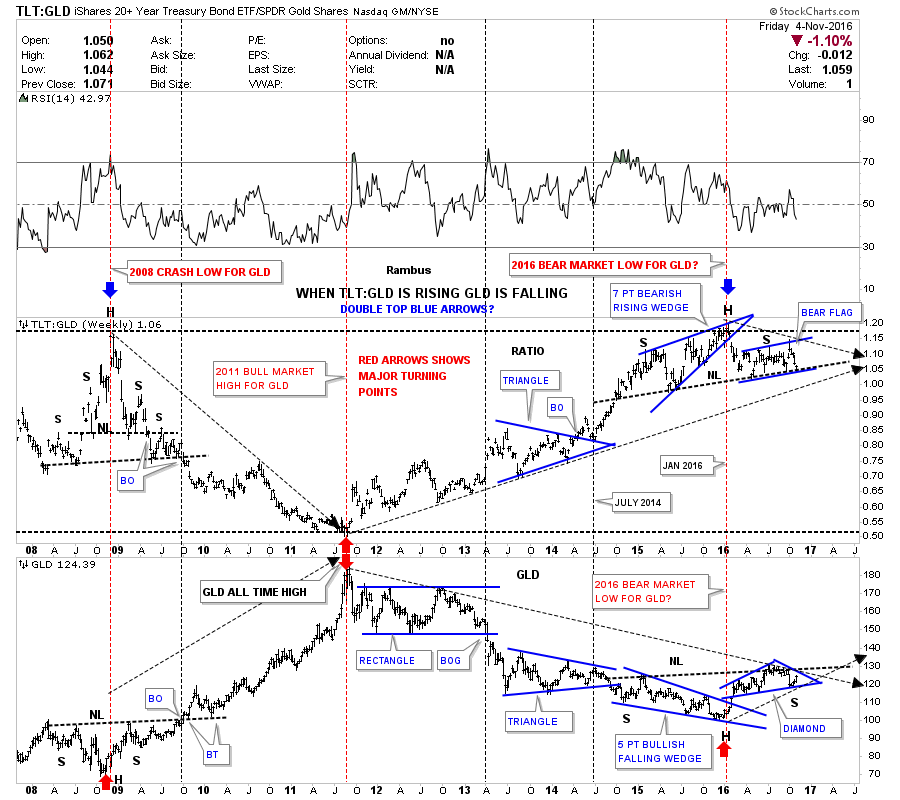
Below is a daily chart for the TLT:GLD ratio which shows the H&S top up close and personal. Today the price action touched the neckline for the seventh time which is telling us the two year neckline it’s hot. This chart will give us the first clue when the next impulse move up is really underway for GLD. Have a great weekend. All the best…Rambus
PS
Sir Plunger at the Chartology Forum wanted to add the following to this discussion
Just had to comment on his TLT:Gold relationship post. Here is Rambus chart

Well there is a slight similarity of this pattern to something else near and dear to our heart. The great big H&S in oil before the big crash. Here it is:

and the resolution: