Wednesday Report…The US Dollar , What If Everybody is Wrong ?

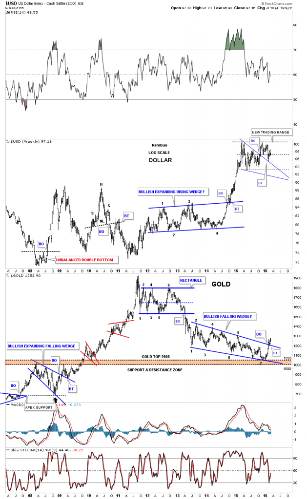
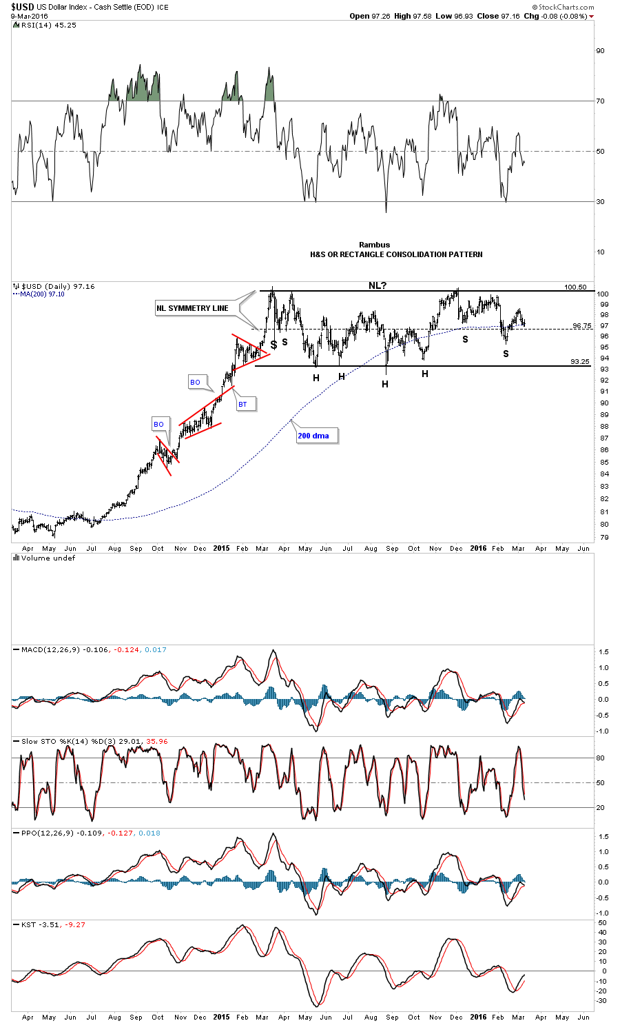
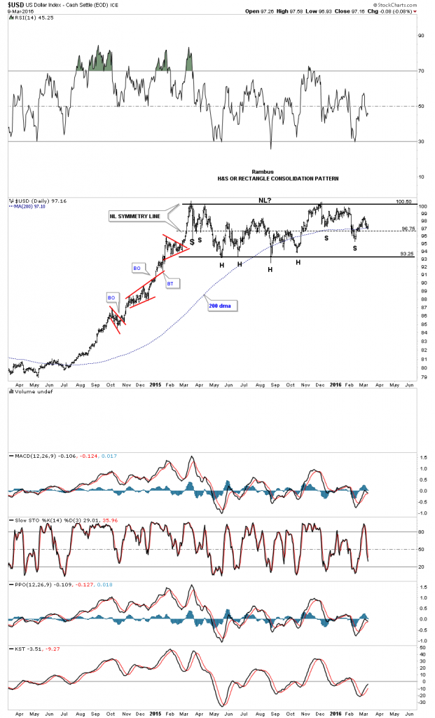
It’s been awhile since we last looked at the US dollar which has been consolidating its big impulse move up. The reason I haven’t posted it much is because it’s stuck in a sideways trading range going back over a year now.

99.9% of Market participants are either Bullish the Dollar , with all the implications including Lower Gold Prices or Bearish the Dollar, with the opposite implications .

However there are not two but THREE possible outcomes to this present trading range.

For the Bulls , the breakout is in progress with a present backtest of the bullish flag .

For the bears , if the 200 day ma fails to hold support in this general area for the bottom of a right shoulder, a move back down to the bottom of the trading range would then setup the possible rectangle consolidation pattern around the 93.25 area. The least likely, but is possible, is a huge double top if the price action breaks below the bottom rail.

The third possibility , the one most don’t consider , is a prolonged trading range.  At this point I favor the sideways trading range that forms a rectangle consolidation pattern as I explain below.

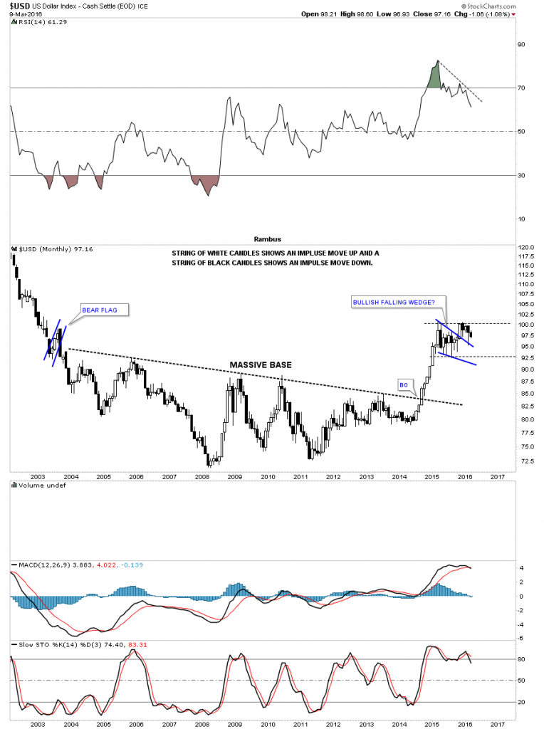
Note the three smaller red consolidation patterns that formed during its big impulse move up from mid 2014 to the early part of 2015. That’s what a strong impulse move looks like. Normally in strong impulse moves you’ll see at least three smaller consolidation patterns and on rare occasions four which strongly suggests you’re getting close to the end before a much bigger consolidation pattern starts to form. As you can see that is what has taken place so far.

usd day rect

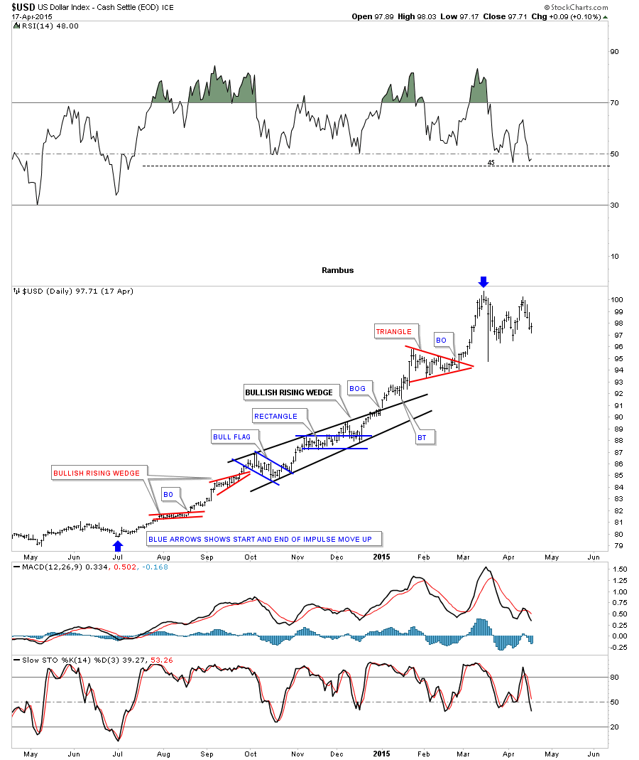
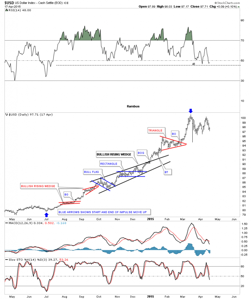
Below is a static chart for the US dollar which shows more details of that massive impulse move up. The blue arrows shows the beginning and the end of that rally phase. You can see how several smaller consolidation patterns formed a bigger bullish rising wedge which is centered about in the middle of that uptrend. The blue arrow at the top of the chart shows the beginning of our current one year trading range as shown on the daily chart above.

usd daystatic

For newer members, who may not have witnessed that big impulse move up,  below is a monthly candlestick chart which shows a string of nine white candlesticks all in a row when the US dollar broke out of that massive base. Note the blue falling wedge that looked like it could have been the perfect consolidation pattern for the next leg up but the failure to take out the high suggested that the consolidation pattern was going to be more complex and take longer to build out. The top blue rail of the falling wedge was backtested in February, but again the price action couldn’t take out the high of the pattern.

us dllar candlestick

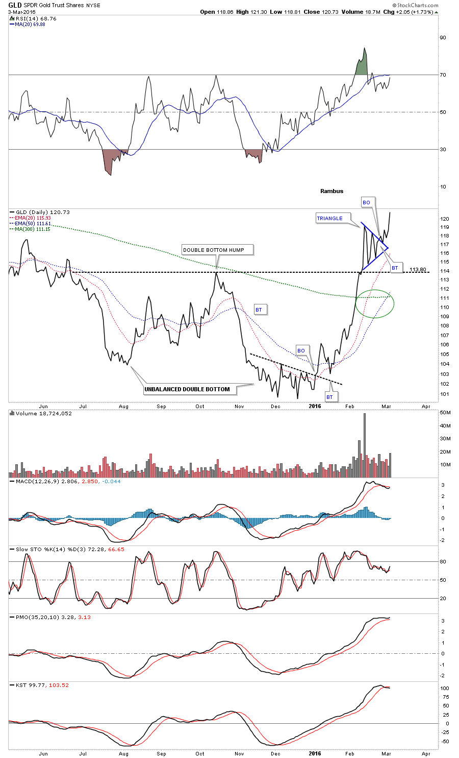
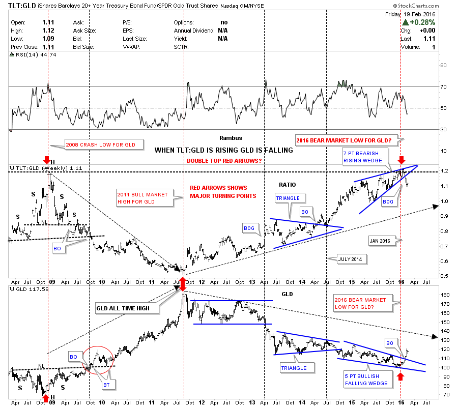
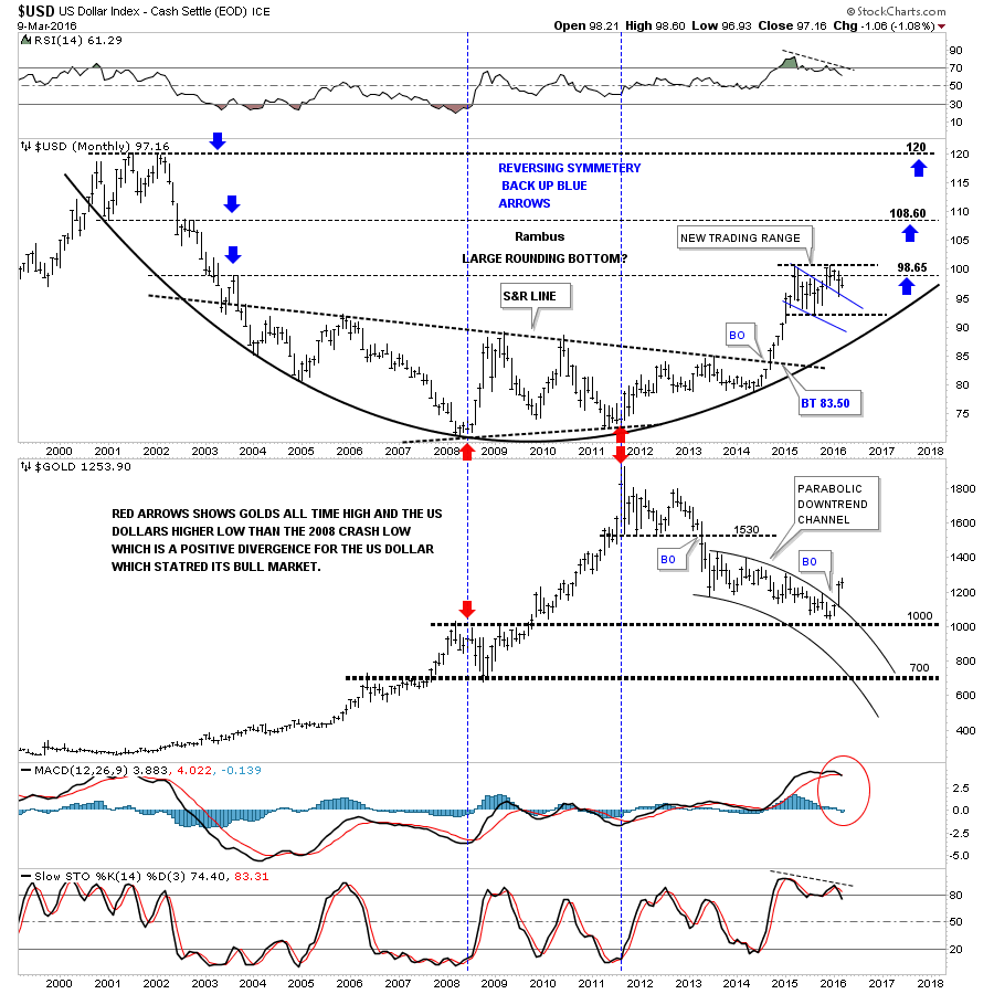
Below is a monthly combo chart that has the US dollar on top and gold on the bottom. The last time we looked at this chart gold was still trading inside of the parabolic downtrend channel. Gold had a nice clean breakout of the top rail of the parabolic downtrend channel in February, and has continued to move higher this month. When I look at the blue falling wedge on the US dollar chart I see a failed pattern for two reasons. The first reason is that it couldn’t take out the first reversal point high, the second reason is with this type of pattern the US dollar should have risen strongly after the initial backtest four months ago. The failure to make a new high after the initial backtest says to me that the trading range is going to take more time before it matures out.

There is one more important aspect to see on this combo chart. The red arrows on the left side of the chart shows where the US dollar bottomed and gold topped just before the 2008 crash in gold. Now look at the two red arrows in 2011, which shows where gold’s bull market topped out after a nearly parabolic rise while the US dollar actually made a higher low vs the 2008 low. That was a big positive divergence for the US dollar which also shows that gold can rally on a relative basis to a strong US dollar. There is no way to know how long the US dollar will work on its consolidation pattern. Its already taken one year and with the impulse move being so big it’s seems likely that the US dollar will be working on this trading range for much longer than we can imagine.

us como

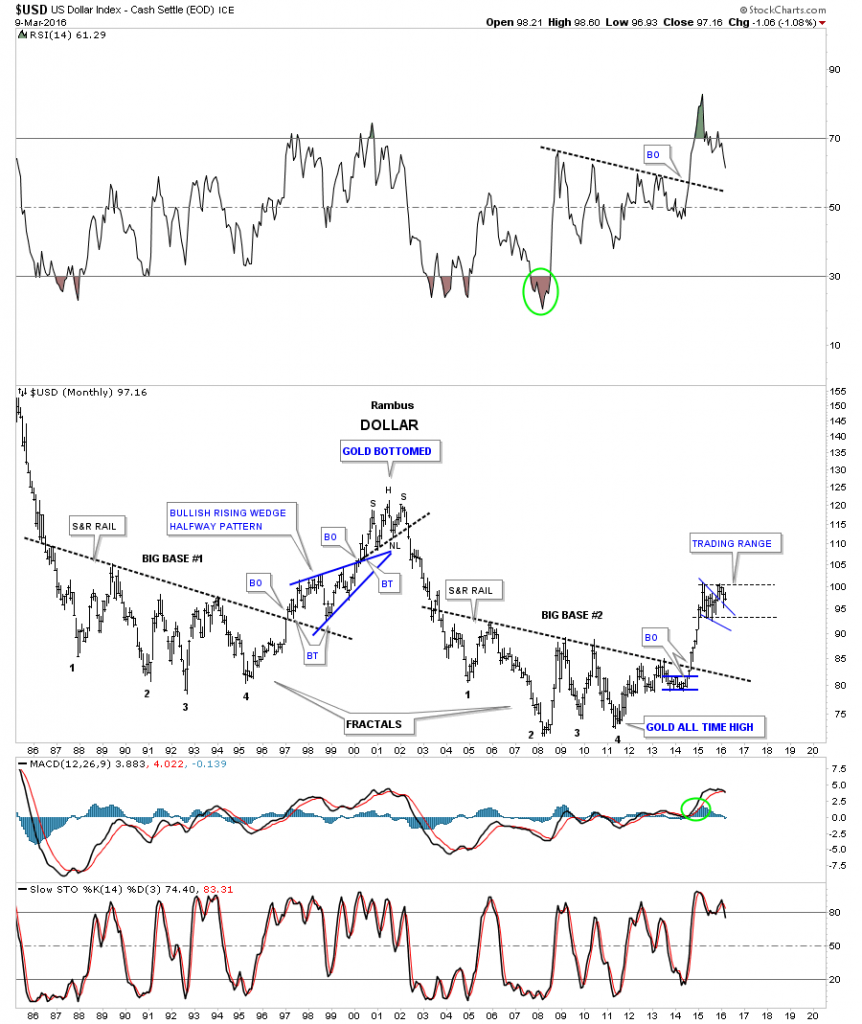
This next chart may give us a glimpse on how long our possible trading range may take to mature out. Below is the 30 year fractal chart we were watching before the US dollar broke out from big base #2 which launched its massive impulse move. Note the big blue bullish rising wedge which formed as a halfway pattern when big base #1 broke out. That big blue rising wedge began to form in 1997 and the breakout came just less than three years later in March of 2000. Again there is no way to know for certain how long our current trading range may last but if the fractals keep playing out like they have the US dollar could be in a lengthy trading range giving  the precious metals complex time to flex their muscles. Note the H&S top on the US dollar in 2000 which marked the beginning of gold’s bull market.

us dllar fractals

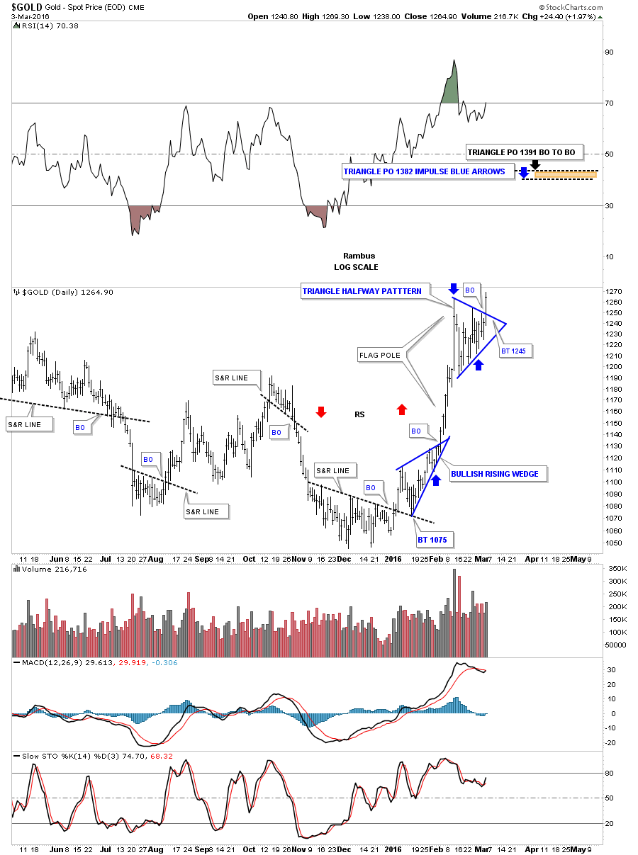
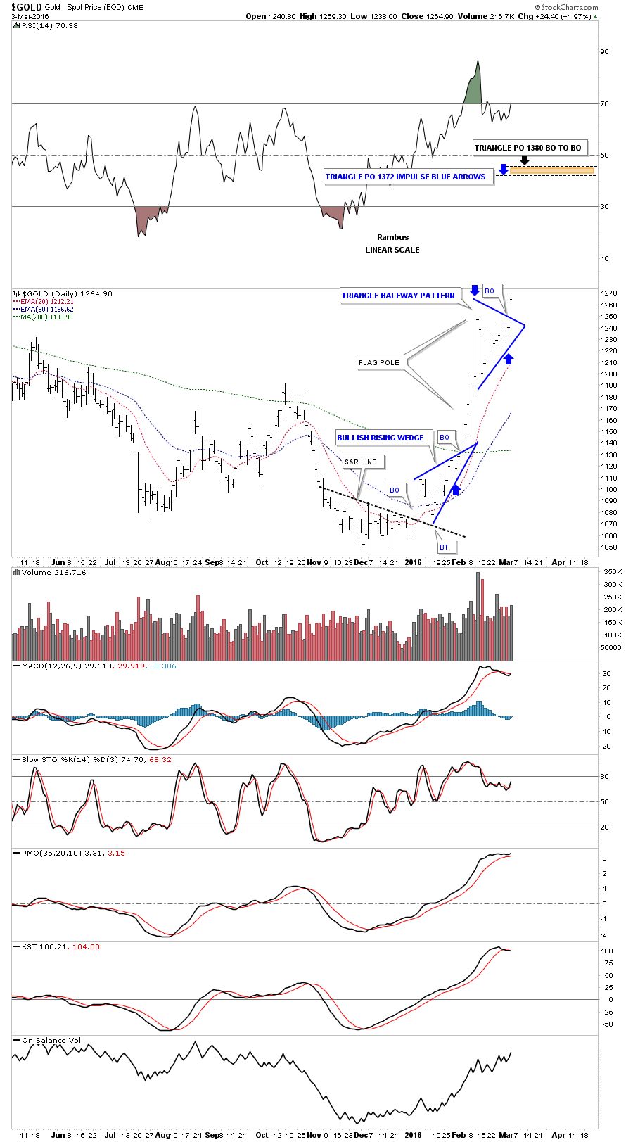
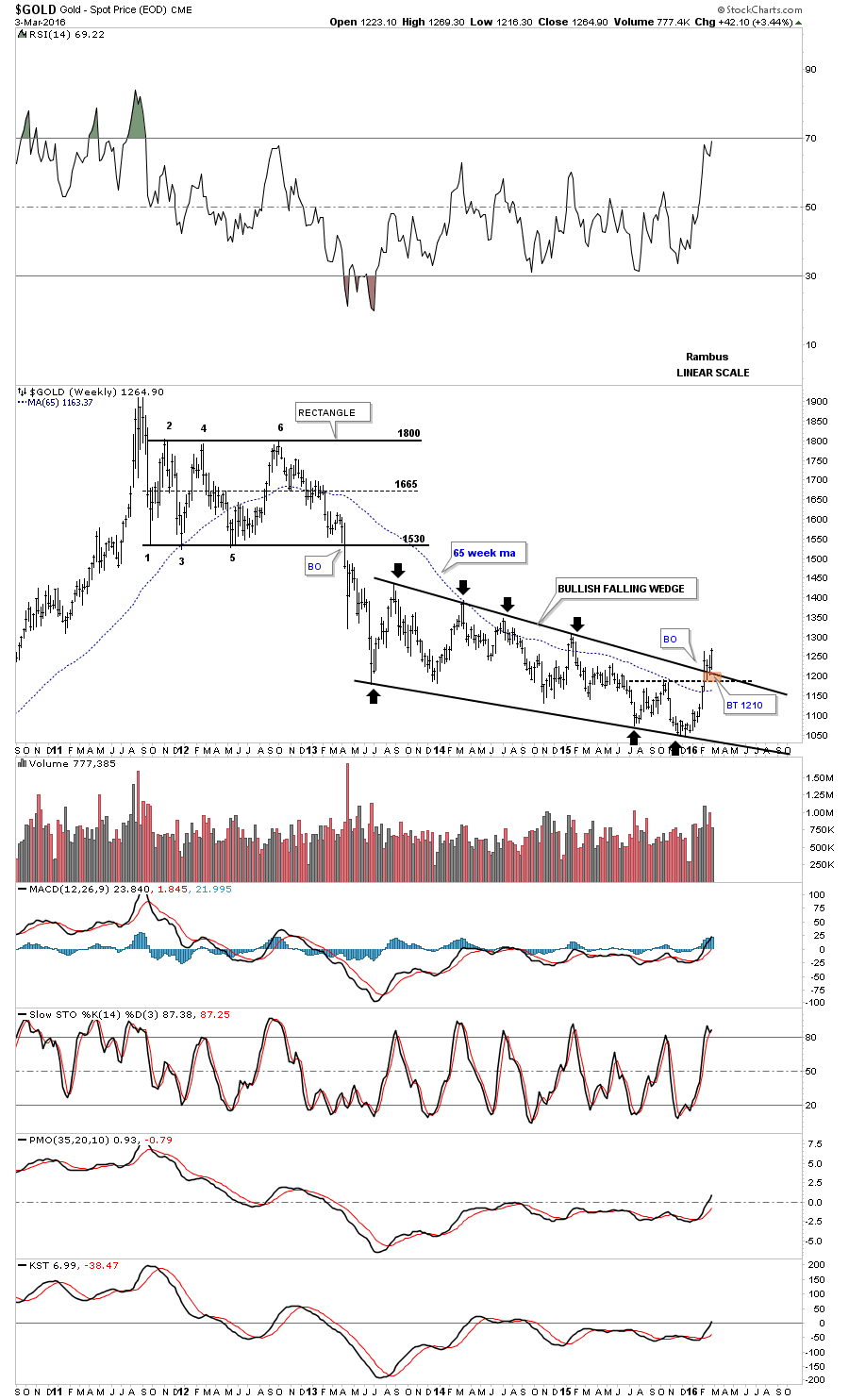
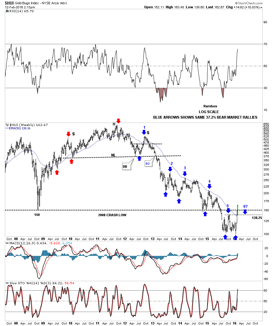
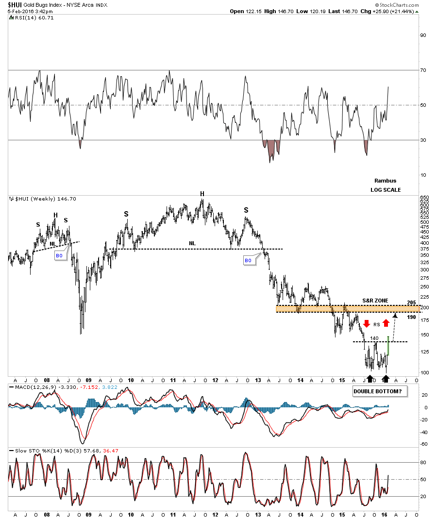
Below is another combo chart which has the US dollar on top and gold on the bottom. Lets start by looking at the gold chart on the bottom. The brown shaded support and resistance zone is built from the top gold made in 2008 before it crashed to just below 700 or so. Note where the 7th reversal point on the falling wedge formed on gold, right on the very top of the brown shaded S&R zone at 1035. The bottom of the S&R zone is at 1000. After almost three years of building out that blue falling wedge on gold, it finally looks like the wedge has broken to the upside and has had one backtest so far. As long term members know I was looking for one last capitulation move down to finish off the bear market but when I look at this chart it’s very clear to me that gold found support right on top of the 2008 high, resistance turning into support.

Note that massive rally the US dollar had that started in the middle of 2014 and ended in the first part of 2015. While the US dollar was rallying in a near vertical move , gold just kept on chopping out the blue falling wedge, which in hindsight now, we can see was a positive divergence for gold to the US dollar. IMHO the setup for gold couldn’t be anymore bullish with a nearly three year seven point bullish falling wedge which formed on the brown shaded support and resistance zone at 1035 and has had a breakout and backtest to the top rail. We have a very clean line in the sand with the top rail of the seven point blue falling wedge reversal pattern similar to the breakout and backtest gold had when it broke out of the blue bullish expanding falling wedge in early 2009. That top rail was tested multiple times and held support which eventually led to the biggest rally in gold history. So the next time you’re feeling bearish on gold bring up this chart and see if gold is trading above the top rail of the falling wedge. As long as it is, all systems are go. All the best…Rambus.

bbbbbbbbbbbb

Gold Special Update…

Last week I showed you a daily line chart for GLD which I called a coiling triangle as the price action was getting more compressed as it traded toward the apex. This daily line chart shows the breakout and backtest. Most technicians are aware of the triangle consolidation pattern but its implications may not be understood by most.

gold line

Now I would like to show you a daily bar chart for gold which shows you the power of this particular triangle. If you recall last week I showed many bullish rising wedges in many of the precious metals stocks that looked very bullish. They have morphed a bit but the essence of the bullish rising wedges are still there. This brings us up to the triangle that has been forming in gold. Just like all the bullish rising wedges we looked at on many of the PM stocks, gold has formed it own halfway pattern which is the triangle that everyone now sees. What makes this triangle halfway pattern so important is the way it formed. Whenever you get a vertical move in a short period of time that is called a flag pole. The price action then consolidates that vertical move with a small, usually less than three weeks, flag, wedge or triangle. In gold’s case it formed a triangle.

There are several ways we can measure out for a price objective. The first method on this daily log scale chart is what I call the BO to BO, breakout to breakout method. The measurement starts at the breakout of the lower consolidation pattern which in this case is the bullish rising wedge, up to the first reversal point in the blue triangle halfway pattern. You then take that measurement and add it to the breakout point of the blue triangle halfway pattern to get your price objective which is up to 1391 black arrow.

The other measurement technique I use is the impulse method which measures the impulse move from the lower consolidation pattern, again the blue blue bullish rising wedge, which starts at the last reversal point before the breakout. Take that measurement and add it to the last reversal point in the blue triangle halfway pattern to get a price objective up to 1382 as shown by the blue arrows.

gold log scale

Below is the same chart but this one is in linear scale. The linear scale measures out about ten points lower but it still measures up to the 1400 area which is a nice big round number that should offer some resistance on the initial hit. If you look at the move leading into the triangle halfway pattern, which is nearly vertical, we should see something similar as the price action leaves the blue triangle in time and price.

gold linear scale

Lets look at one more piece of the puzzle using the blue triangle as a consolidation pattern. Below is a six year bar chart for gold I’ve shown you many times which shows the breakout above the top rail and the backtest that has been taking place. That backtest area, just above the top rail of the bullish falling wedge, is the blue triangle consolation pattern we just looked at on the daily charts above. From a Chartology perspective all the clues are now in place for another impulse move higher. Gold is just now breaking out from the massive four and a half year consolidation pattern.

When you look at this long term weekly chart you can see where the first real area of resistance comes in which is the bottom rail of the blue rectangle that formed the first consolidation pattern with the bottom rail coming in around the 1530 area. So what the price objectives are suggesting and the first real area of resistance at the 1530 area shows it will be interesting to see just how high this impulse move goes. Gold may very well form another consolidation pattern just under the 1400 area that will lead to a move up to the underside of the blue rectangle at the 1530 area. One step at a time.

Some folks are worried that the indicators are all getting overbought but in moves like this they can give you a false sense of security as they can get embedded and just go sideways until the move finally runs its course. The bottom line is that we’re experiencing something very special here. It’s like we’re in the top of the first inning of a new baseball game and the bulls are up to bat. Once the bulls side is retired it will be time for the bears to play their bottom half of the first inning. The game is just getting started folks. All the best…Rambus

GOLD WEEKLY BAR FALLINGWWEDGE


Members Attention

If you are logged out and come to the site you will only see the public posts on the main page .

No Titles of the  Members Only Posts  appear for the time being .

You must log in to see all current posts .Click “log in” on the sidebar

This wont affect you if you visit the posts from the email   alerts

Fully

Late Friday Night Charts…Gold Ratio Chartology Quietly Suggesting a Bottom .

Tonight I would like to update a few of the ratio charts we’ve been following that are still showing an important low or bear market low is in place for gold. There are so many things we read where this analysis says this and that analysis says that but the more one reads the more confused they become. There is no Holy Grail when it comes to trading the markets although everyone is looking for one. Every trading discipline has its own unique characteristics that if one has the discipline to study it long enough they may eventually get pretty good at interpreting what it’s saying. Find something that matches your own personality and through trial and error you maybe surprised at what you may discover.

Keep in mind we’re playing the hardest game on the planet to win. There are investors from all over the world that want your money and they wont’ be satisfied until they get every last penny. There are computer programs, hedge funds, you name it and they want to win just as badly as you if not more so. It’s a dog eat dog business we’re in and to the victor goes the spoils.

This first chart for tonight is the ratio / combo chart which has the TLT:GLD ratio chart on top and GLD on the bottom. The TLT:GLD ratio chart has served me well through the years. Lets start on the left hand side of the chart which shows the bottom for GLD during the 2008 crash low. As you can see GLD formed a beautiful and very symmetrical H&S consolidation pattern while the ratio chart on top formed a H&S top. It wasn’t until GLD broke above the neckline in 2009 that the bottom was confirmed from a Chartology perspective. Even though the breakout didn’t occur until October of 2009 there were still alot of clues that GLD was forming a very large H&S consolidation pattern. Waiting for the breakout would have cost you some good low risk entry points in many of the PM stocks that had crashed.

Study the breakout and backtesting sequence on GLD when it broke out above the neckline, red circle. Put yourself back in 2009 at the breakout point keeping in mind this is a weekly chart and each bar represents one weeks worth of trading. You can see right after the initial breakout GLD backtested the neckline about four weeks later and the neckline held support which told us the neckline was hot. GLD then rallied for about eight weeks which looked like the impulse move up was starting only to see a second backtest the neckline. That second backtest took about 12 weeks or so to complete but knowing the neckline was hot gave us something positive to look for and not let our emotions get in the way of what was going to be a near parabolic rise in gold to its bull market peak in September of 2011 at 1920. The reason I’m showing you the breakout and backtesting sequence in such detail is because our current breakout of the seven point bearish rising wedge is only in its third week. Patience is one of the hardest things to learn when it comes to trading the big trend. I will post the ratio chart here and look at it again for the bull market peak in 2011.

a tlt

Now lets look at the exact same chart and follow the price action up on GLD and down on the ratio chat into the 2011 high for GLD and low the for the ratio chart. The red arrows shows how they both found their respective reversal points which led to the bear market in GLD. As the TLT:GLD ratio was rising GLD was falling. The bear market for GLD had been going on for well over four years until just recently. About three weeks ago the ratio chart on top broke below the bottom rail of the seven point bearish rising wedge while GLD broke above the top rail of a five point bullish falling wedge. This is where patience will come into play. Until either the ratio chart on top or GLD on the bottom breaks below their breakout trendlines the bull market is in place for GLD. Mentally prepare yourself for a backrest to the bottom rail of the seven point bearish rising wedge on the ratio chart and the top rail of the bullish falling wedge on GLD. We now have a very clean line in the sand in which to watch for a backtest to occur. Until those important trendlines fail it is what it is, a bull market for GLD. This is also the point where you have to have faith in your trading system in order to take advantage of the possible brand new bull market in the precious metals sector. This is also where the bargains are found.

a tlt

Below is another ratio combo chart which has the Gold:$XAU ratio chart on top and the $XAU on the bottom. We’ve already gone over this combo chart recently so I just want to focus in on the top right hand side of the chart. It doesn’t look like much on this monthly chart but the ratio chart on top looks like it’s putting in a double top reversal pattern which maybe reversing the uptrend that actually began in 2006. What that means is that gold has been outperforming the $XAU for ten years. That’s pretty amazing when you think about it. Relative to gold the PM stocks have never been cheaper compared to gold.

During the bull market years I would add a blue arrow when the ratio chart would rally up to the 5.10 area where I would be looking for a reversal to the upside on the $XAU. As you can see I haven’t added any blue arrows since the one that failed in 2008 which led to the crash, blue arrow with the green circle around it. That failure in 2008 on the ratio chart, when it broke above all the previous highs blue dashed horizontal line, was a history making event for the PM stocks. As you can see I’ve added a blue arrow at the double top high for the ratio chart and a blue arrow at the the recent low on the $XAU chart at the bottom.

Note the purple annotation I wrote back in 2008 right after the crash. I said this was the highest the ratio had ever been in history thinking it would move back down into the old trading range between 3.70 and 5.10 or so. Little did I know that was only the beginning of the move all the way up to the 24 area on the ratio chart. There was no way to know back in 2008 that the PM stocks would underperform gold on the magnitude it has. If there was ever a once in a lifetime event to get positioned for a new bull market this is it.

I had been looking for one last capitulation move down in the PM complex but with the recent developments on these ratio charts I have to go with the new information as it comes in. As the information changes so do I. If you have ever wondered what it feels like to buy at the bottom of a bear market I think now is a good time to find out. It always looks easy in hindsight but to live through the moment is another matter altogether.

In the Weekend Report we’ll look at some of the changes that are taking place on some of the precious metals stocks which will show some more clues that the bear market low may well be in place. Have a great weekend. All the best…Rambus

xau to gold 66666666666666

FNV Update…

When a good move begins it’s always nice to see the leaders leading. FNV was one of the leaders during the bull market years. Starting with the 2 hour chart FNV has built out a blue bullish rising wedge and has broken out topside. Remember these types of patterns show up in strong impulse moves.

fnv 2 h

The weekly chart for FNV shows it has broken out from a bullish expanding falling wedge this week and is testing its all time highs. Note the big volume breakout.

fnv weekly

I’ve been showing two different long term monthly charts with one showing a triangle consolidation pattern and the other one was a possible rectangle. Right now the pattern that is winning out is the potential triangle which has just completed its fourth reversal point right at its all time highs. The bullish rising wedge on the 2 hour chart above suggests that there is a good chance that FNV will breakout to new highs as the bullish rising wedge is forming just below the top rail of the four year triangle. Is this previews of coming attractions? I plan on doing the Weekend Report showing some other PM stocks that look to be turning around.

FNV MONTHLY

HUI …Meet Me at The Bottomz Inn ?

This is the Question on Everyone’s mind .

Earlier this week we looked at the expanding triangle as a possible reversal pattern as it was testing the top rail with a beakout gap. The next two days saw the HUI decline back down to the top of the double bottom hump at 139 where it found support. Yesterdays price action took out the top rail of the expanding triangle again. Today the HUI backtested the top rail around the 155 area and is bouncing. There is no doubt the PM complex is overbought but we now have two possible reversal patterns in play. The double bottom which was the first pattern that showed itself and now the expanding triangle which has an odd number of reversal points, five, which makes it a reversal pattern instead of a consolidation pattern.

HUI DAY 1

This next daily chart for the HUI shows the double bottom with the flag pole and backtest to the double bottom hump at 139. In a perfect Chartology world what would make the most sense would be for the HUI to form a small consolidation pattern in the area I’ve marked, trading range, which is the area between our current high and the top of the double bottom hump at 139 which is also the 38% retrace of this impulse move. Again this would be the perfect setup but the markets have a way of faking you out sometimes which it maybe doing right now. Even tho the HUI is overbought there is no law that says it can’t get more overbought before the inevitable correction takes place.

hui double bottom

Below is a long term daily line chart which shows the HUI is trading right into the brown shaded support and resistance zone right now.

hui day 3 line chart

We’ve been following this long term monthly chart for the HUI which shows the fanlines that have developed during the bear market. Normally when a fanline is broken to the downside many times you’ll get a rally that will backtest the previous fanline from below. Right now the HUI is testing fanline #3 from below. The Chart in the ointment .

hui monthly fanline

The weekly chart shows the HUI breaking above the top rail of its bear market downtrend channel.

hui9 weekly

This last chart for the HUI shows its double bottom which has formed after an almost five year decline. I mentioned in the past the two patterns that generally show up at the end of a trend is a H&S or a double bottom or top depending on which way the trend has been going, so the double bottom fits in perfectly for a reversal pattern. The HUI is doing all the right thing in here to reverse its major bear market. There is still some overhead resistance to contend with but if the new bull market is beginning the HUI will find a way to takeout that overhead resistance and start making higher highs and higher lows.

hui biggest rally

zombies

Next Week will be very interesting . Stay Tuned

All the best

Rambus

HUI Update…

The HUI is doing everything right. Any backtest to the double bottom trendline around the 140 area should be bought now as it’s a very clean line in the sand. This is the Chartology talking to us. The move is impulsive which is what we wanted to see.

HUI UPDATE

HUI Update…Double Bottom ?

Last night I showed you this potential double bottom forming on the HUI. Today is the first big test of the double bottom hump at 140. If this is indeed a double bottom forming we should see a strong move up after a possible backtest to the 140 area. Keep your fingers crossed.

bb hui double bottom

Wednesday Report…

There is alot of action going on this week in all the different areas of the markets. The PM complex has been rallying, the US dollar tanking today and the stock markets trying to make up their mind which way they want to go in the short term. I have a ton of work to do on the side bar where all the trades are listed so I’m going to show you what I would like to see happen in regards to the HUI, gold and silver.

If the PM complex is bottoming in here it has to show us its hand. There is no way around it. Usually when a bottom or top is formed the first move out of the reversal pattern, after a possible backtest, should be very strong or impulsive in nature. The bigger and stronger the move is the better. Below is a weekly chart for the HUI with few annotations on it so you can see the clean picture. Most of the time you will either see some type of H&S reversal pattern or double top or bottom reversal pattern.

The best reversal pattern for the HUI at this point is the double bottom with the first bottom forming last August and the second one 2 1/2 weeks ago. If this possible double bottom is going to play out I want to see the double bottom hump or double bottom trendline broken to the upside. Then after a possible backtest to the double bottom hump at 140 or so we need to see a strong impulse move up to the brown shaded support and resistance zone between 190 and 205. We may see some reverse symmetry as shown by the red arrows. If the HUI can make it up to the brown shaded S&R zone it will be due a breather and some type of consolidation pattern will build out. We should also see a fib retrace of 38%, 50% or 62% of the rally out of the second bottom at 100 or so. This would be the perfect setup.

a hui 1

Below is a weekly chart for gold which shows the price action out of the 2008 crash low. The top of that trading range came in around the 1030 area as shown by the brown shaded S&R zone. On the right hand side of the chart you can see the blue falling wedge, the pattern from hell, with the possible 7th reversal point forming just above the brown shaded S&R zone. With seven reversal points in play, and if gold can breakout above the top rail, then the almost three year falling wedge would be a reversal pattern to the upside. That big falling wedge reversal pattern should give gold a lot of energy to rally. So if gold is bottoming in here then it has to show us the way by taking it one step at a time.

1 gold 1

This next chart for gold I’ve been showing you is the important moving averages chart. Today gold closed above the very important 200 day ma with only the 300 day ma left above. It’s going to take some time to turn all these moving averages around like after the 2008 crash low but once they’re all nicely aligned to the upside they will show us the major trend.

1 gold ma

This next chart of GLD is one I showed you last week which shows the one year double trendline downtrend channel with the pink numbers on it. Gold closed right on the outside dashed trendline today completing the seventh reversal point with the 65 week moving average just above at 111.20.

1 gld pink n

This next chart is another one I showed you last week which has the fib retracements on it. The previous decline labeled with black arrows retraced 62% of that move before gold fell lower. The blue arrows shows the fib retrace of the last down move. As you can see today gold close above the 62% retrace which is a positive. Also notice how its reversing symmetry back up as shown by the red arrows. It looks like the brown shaded S&R zone between 1170 and 1180 should be the next place to look for some resistance to show up.

1 gold fib

Here is the other chart for gold I showed you last week that just has the black dashed support and resistance lines on it. The blue bullish rising wedge just became apparent today when the price action took out the top rail.

1 bullish rising wweedge

This last chart for gold is a long term monthly chart we’ve been following for several years which shows the brown shaded S&R zones with the 10 month ema. When I first built this chart I labeled it as a reverse symmetry chart as I was expecting the bear market to resemble the bull market to a certain degree. It did when gold initially bottomed at the brown S&R zone labeled #3. From that point the reverse symmetry went out the window as the blue falling wedge took over. These same numbers have been on the chart since the first day I built it. The 4th S&R zone is between 985 and 1034 which is taken from the top in 2008 and 2009. This month is still very young yet but gold is trading above the 10 month ema which has done a good job of holding support during the bull market years and resistance during the bear market years. The only change I’ve made on this chart, and that was just now, is I’ve adjusted the bottom rail of the blue falling wedge to fit the bottoms better. Is 1034 going to be the actual low?

1 gold 10 month ma

Now lets take a quick look at silver which looks like it broke out of a nice base today. You can call the price action anything you want below the S&R line but the S&R line is now our line in the sand, above is bullish and below is bearish. There was a nice increase in volume today also.

A SILVER BASE

Below is an old chart I just dug up which shows the old blue rectangle which broke down in April of 2011. At the time the blue rectangle was forming I showed how the center dashed line works as support and resistance. Notice the last two blue arrows inside the rectangle just before silver broke below the bottom rail. First silver got a little pop off of the dashed center line, and then the drop through the center line with one last backtest. That was the start if the major impulse move down. Now lets look at the price action which has made up the black falling wedge. As I’ve mentioned many times in the past a chart pattern can be made up of several smaller consolidation patterns before it finishes building out. The first consolidation pattern that formed inside the black falling wedge was the blue triangle that broke down to reversal point #3. Some of you may remember the H&S consolidation pattern that formed next with several  backtests to the neckline. Silver has completed 6 reversal points so far with the seventh underway right now. If this is the start of a new bull market for silver it needs to complete the 7th reversal point and then take out the top rail of the falling wedge.

a silver weekly falling wedge

Today was a bit frustrating in regards to the stock markets as there are many rising wedges and flags that have formed over the last three weeks or so. Below is the 2 hour chart we’ve been following lately that shows the red expanding triangle inside the blue rising wedge. As you can see the SPX found support again today on the bottom rail of the expanding triangle and then bounced all the way up to the bottom rail of the blue rising wedge where it closed the day. Normally with these types of patterns don’t waste much time in fulfilling their expected move. Tomorrow is going to be critical, on the short term, to see if the bottom rail of the blue rising wedge holds resistance or fails.

A SPX BLUE RISING WEDGE

Below is a 2 hour chart for the QQQ which shows the blue rising wedge up close and personal.

1 QQQ 2 HOUR RISING

The last chart for tonight shows the importance of the little blue rising wedge as it could very well be the right shoulder of a H&S top. To say the moment of truth has arrived for the stock markets is an understatement. The same can be said for the PM complex as well. Are we witnessing a major inflection point where the stock markets enter into a bear market and the PM complex a bull market. As they say, we’ll know in the fullness of time.  All the best…Rambus

1 qqq day h7s