SLV Update…

Last week we looked at this 2 hour chart for SLV which was showing a 7 point rising channel that had a false breakout above the top rail and the very next day it gapped below the top rail which looked bearish. This morning SLV gapped back above the top rail of the 7 point rising channel which, with an odd number of reversal points, equals a reversal pattern.

SLV 2 HOUR

Below is the longer term daily chart which shows you our little blue rising channel and how it fits into the bigger picture. As you can see the little blue rising channel has formed at a possible 5th reversal point within the year old black falling wedge. It looks like the 14.80 area is going to determine if SLV is in a new bull market if the price action can close above the top rail.

slv day falling w

QQQ Update…

The QQQ is sitting at a very interesting place right now. It has formed a reverse symmetry blue rising wedge as a possible right shoulder. The left shoulder was a bullish expanding falling wedge. Our first clue that the bigger H&S top is in play is when we see the bottom rail of the rising wedge give way. So far the brown shaded S&R zone has held resistance.

QQQ DAILY

Weekend Report…US Dollar and US Treasuries Big Picture

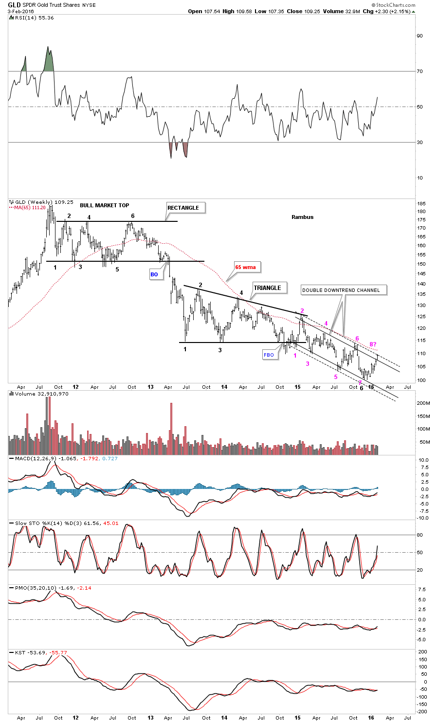
Since we covered the many different markets in detail last week I would like to focus back in on the US dollar and the TLT looking for clues for the big picture direction. The huge daily swings, in say the INDU last week, makes it very hard to keep and hold a short or long position unless you’re perfect on your entry point. In a bull market it’s two steps forward and one step backward and in a bear market it’s two steps down and one step up. If an entry point in a bear market is not made in the first part of the two steps down sequence you’ll find your self behind at some point in the trade if the entry point was made in step two. This is one reason why it’s so important to know the direction of the big trend. Until something changes I believe the US stock markets are now in a bear market. There are a lot of things that can change that outlook but for today that’s what the charts are suggesting.

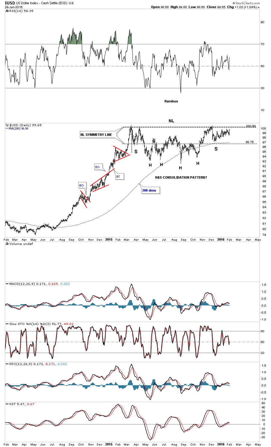
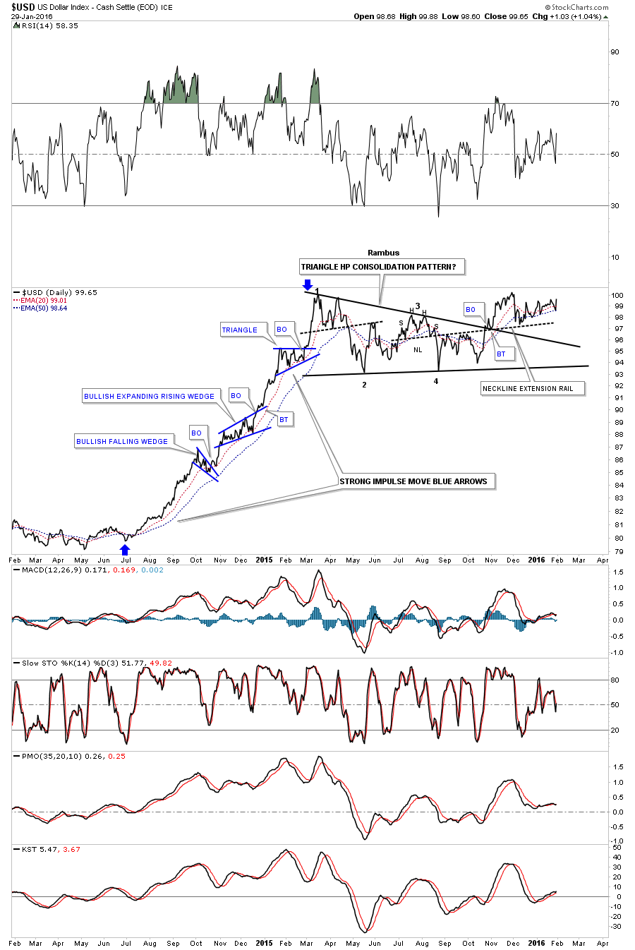
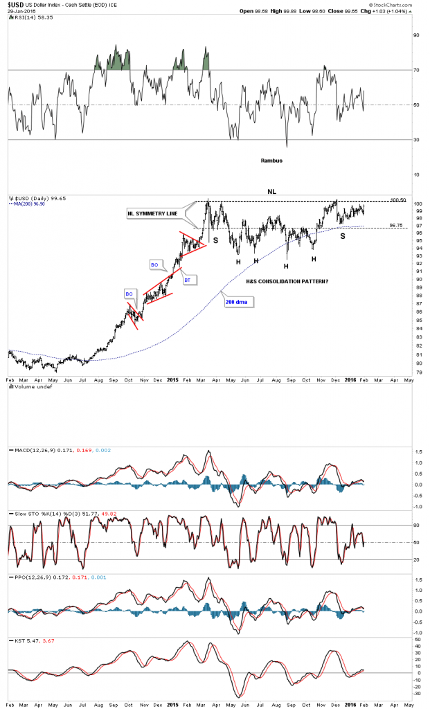
Last Friday the US dollar had a nice up day to end the month of January which was positive. There are two consolidation patterns I’m keeping a close eye on for the US dollar which is the bullish falling wedge and the H&S consolidation pattern. This first daily chart for the US dollar is the H&S consolidation pattern we’ve been following since December of last year. Even tho last Friday, the US dollar had a nice up day, the price action still hasn’t broken above the neckline yet. It’s getting close but not quite there yet.

us dollar day h&s

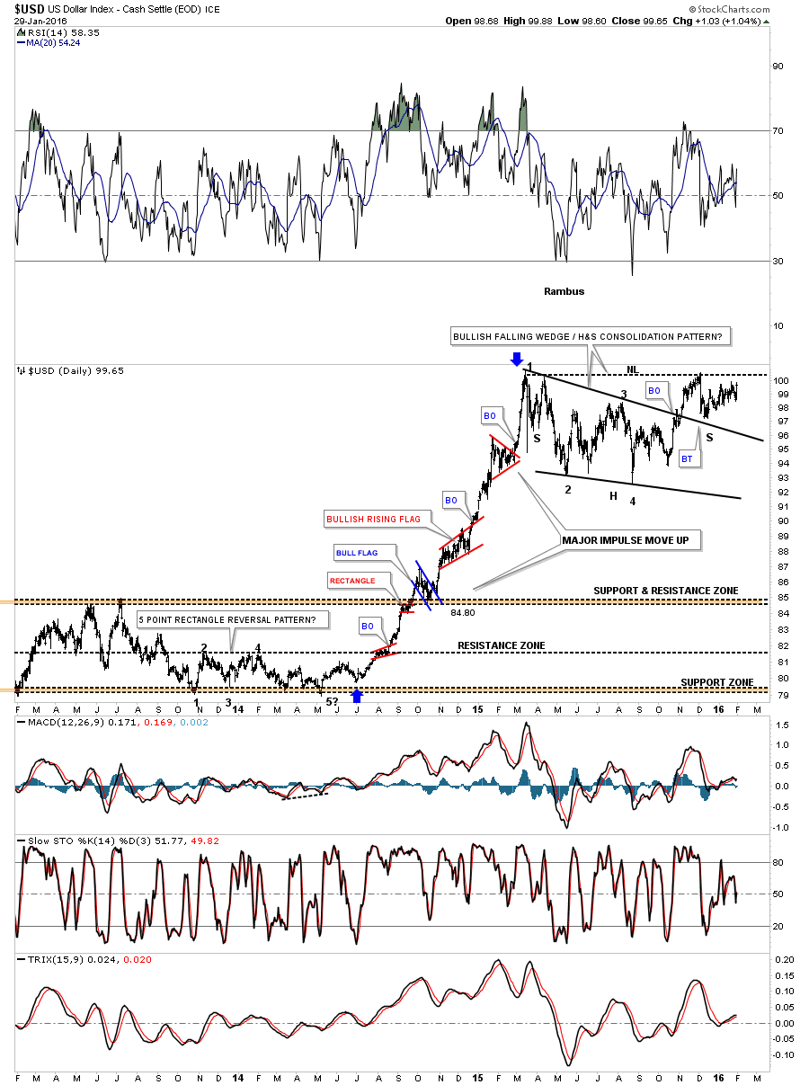
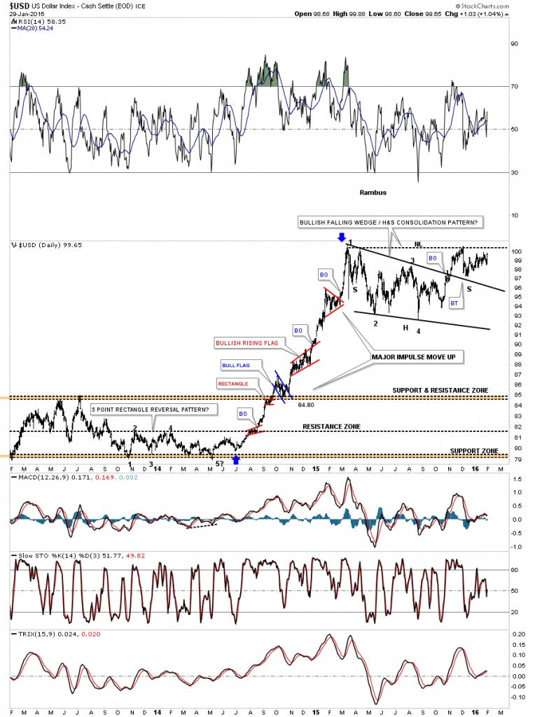
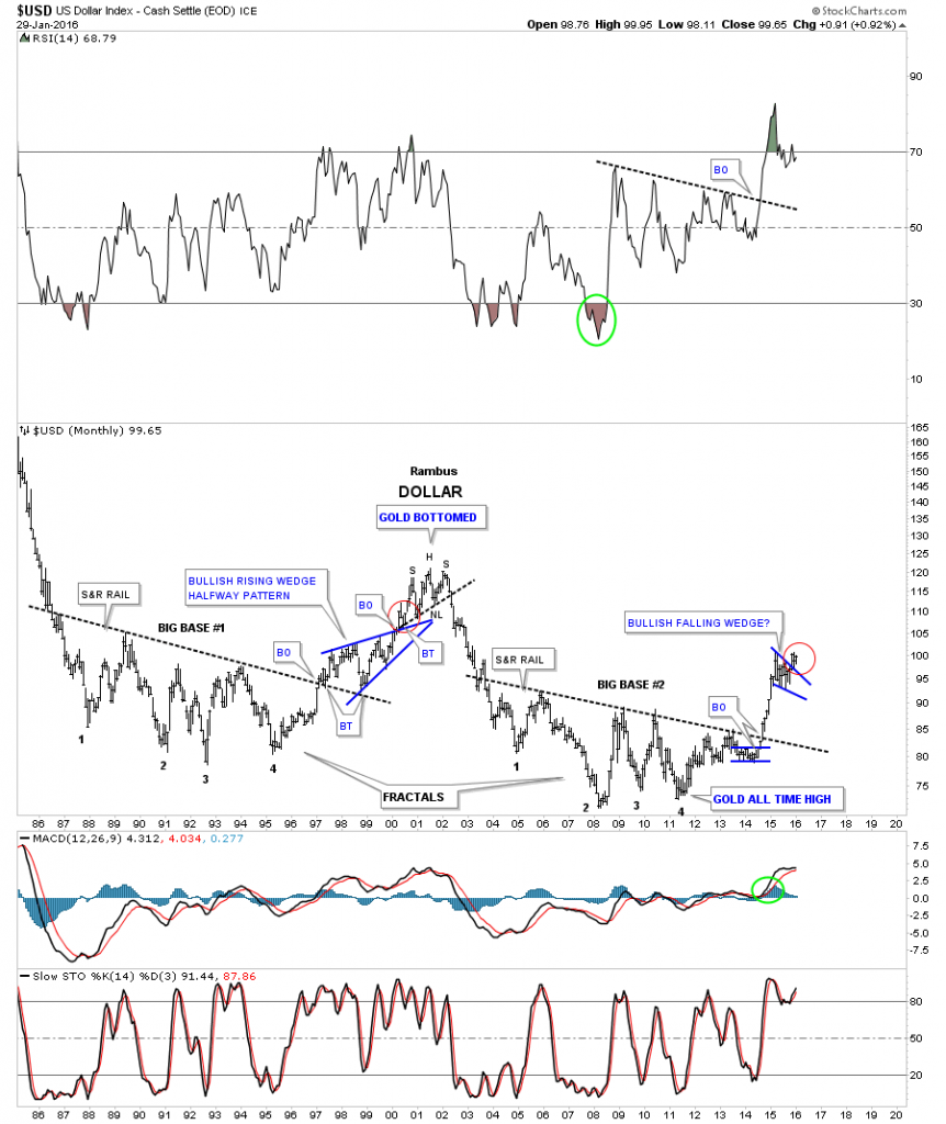
This next chart for the US dollar shows the combo bullish falling wedge and the H&S consolidation pattern being one of the same, a consolidation pattern. The blue arrows shows the last major impulse move up with several smaller consolidation patterns that formed.

USD COMB WEDEGE H7S

Below is a daily line chart for the US dollar which shows the price action still trading above the 20 and 50 day ema’s.

us dollar line

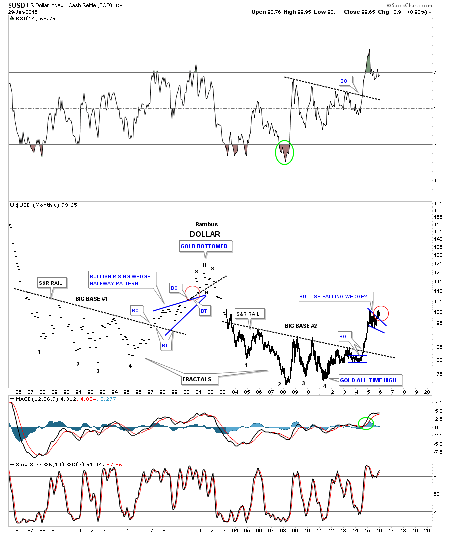
Last weekend I said I would like to see the monthly candlestick chart for the US dollar form a white candlestick and a new high for its bull market. We got the white candlestick but not the new high yet.

US DOLLARMONTHLY CADLE

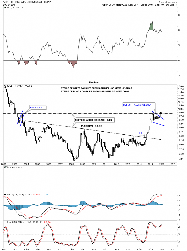
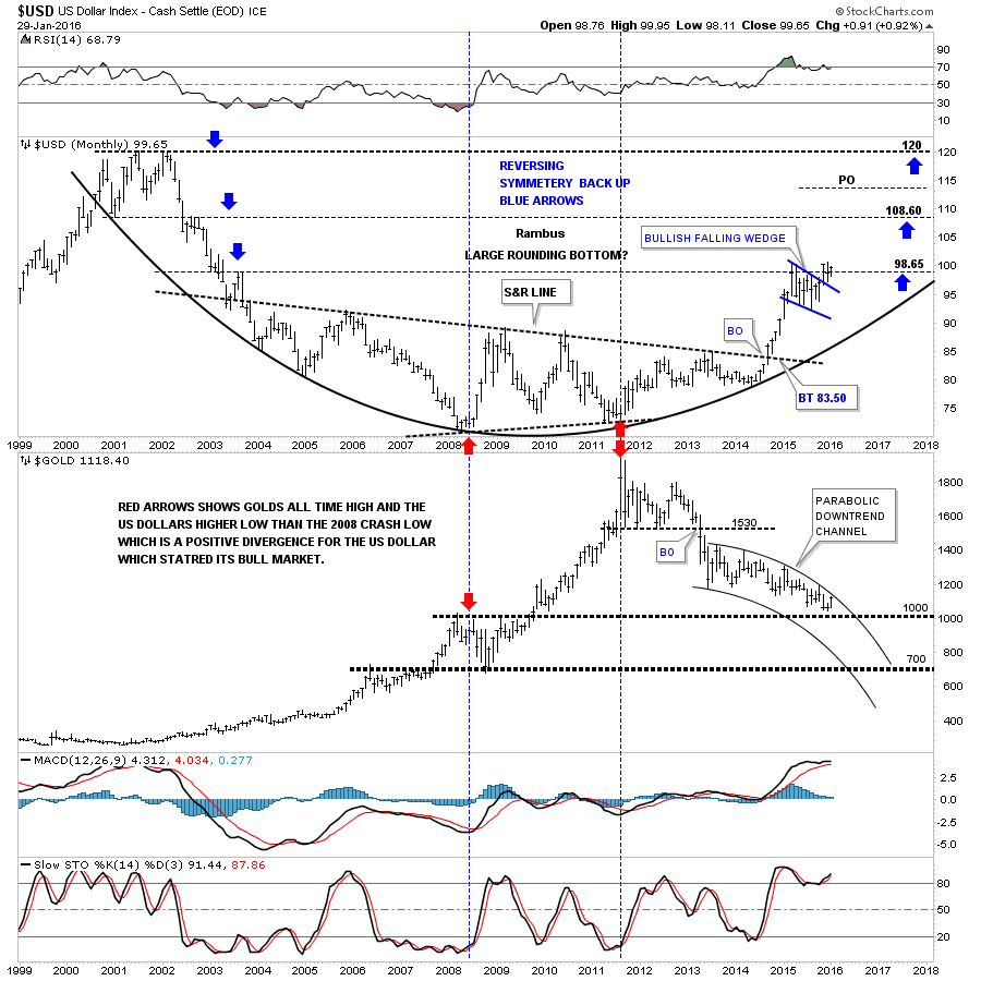
The 30 year chart for the US dollar puts our current big base and bullish falling wedge in perspective. Our current breakout and backtest to the top rail of the blue falling wedge looks very similar to the one that occurred during the breakout and backtest sequence of the 1999 blue bullish rising wedge which took about three months to complete. Tomorrow starts the beginning of the fourth month since the breakout of the blue falling wedge which is similar to the 1999 breakout as shown by the red circles.

us dollar 30

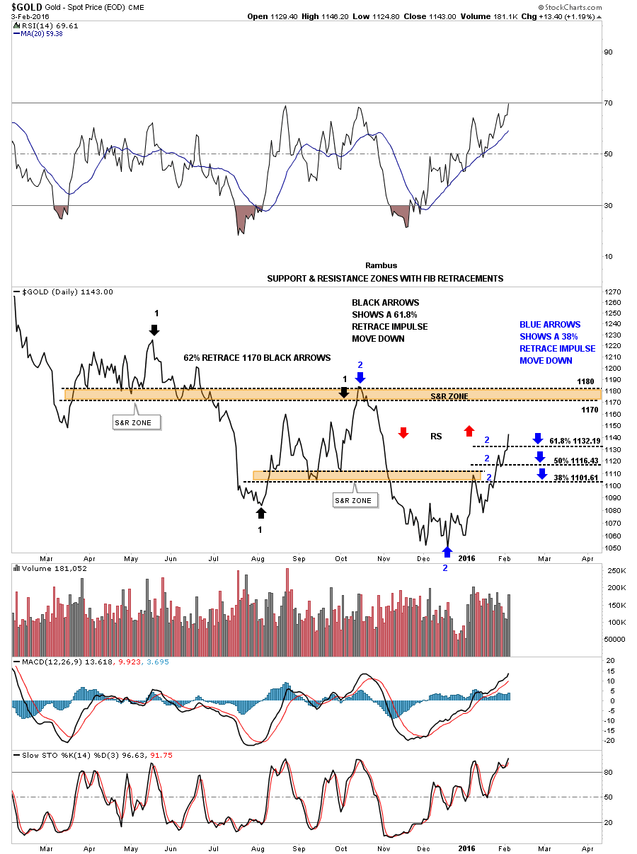
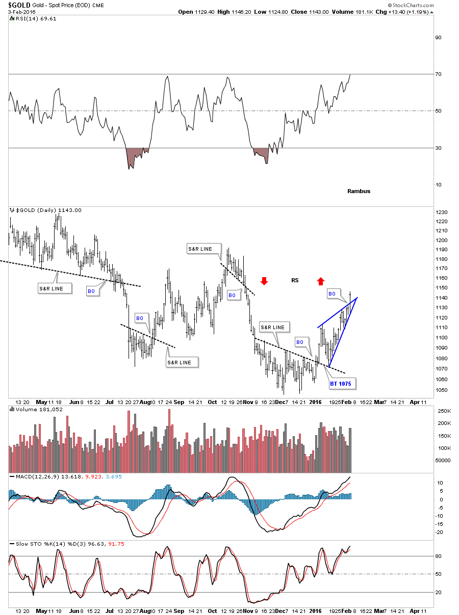
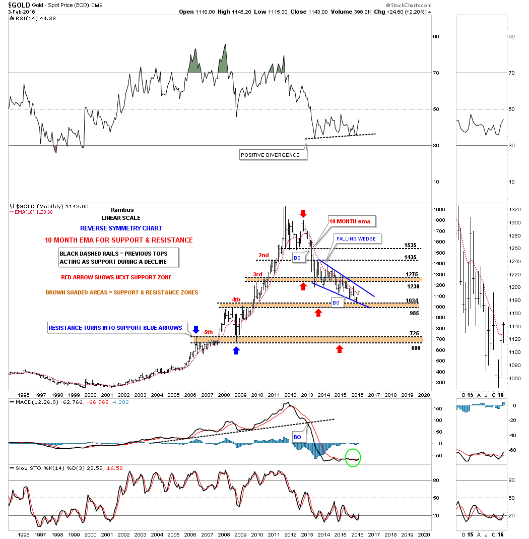
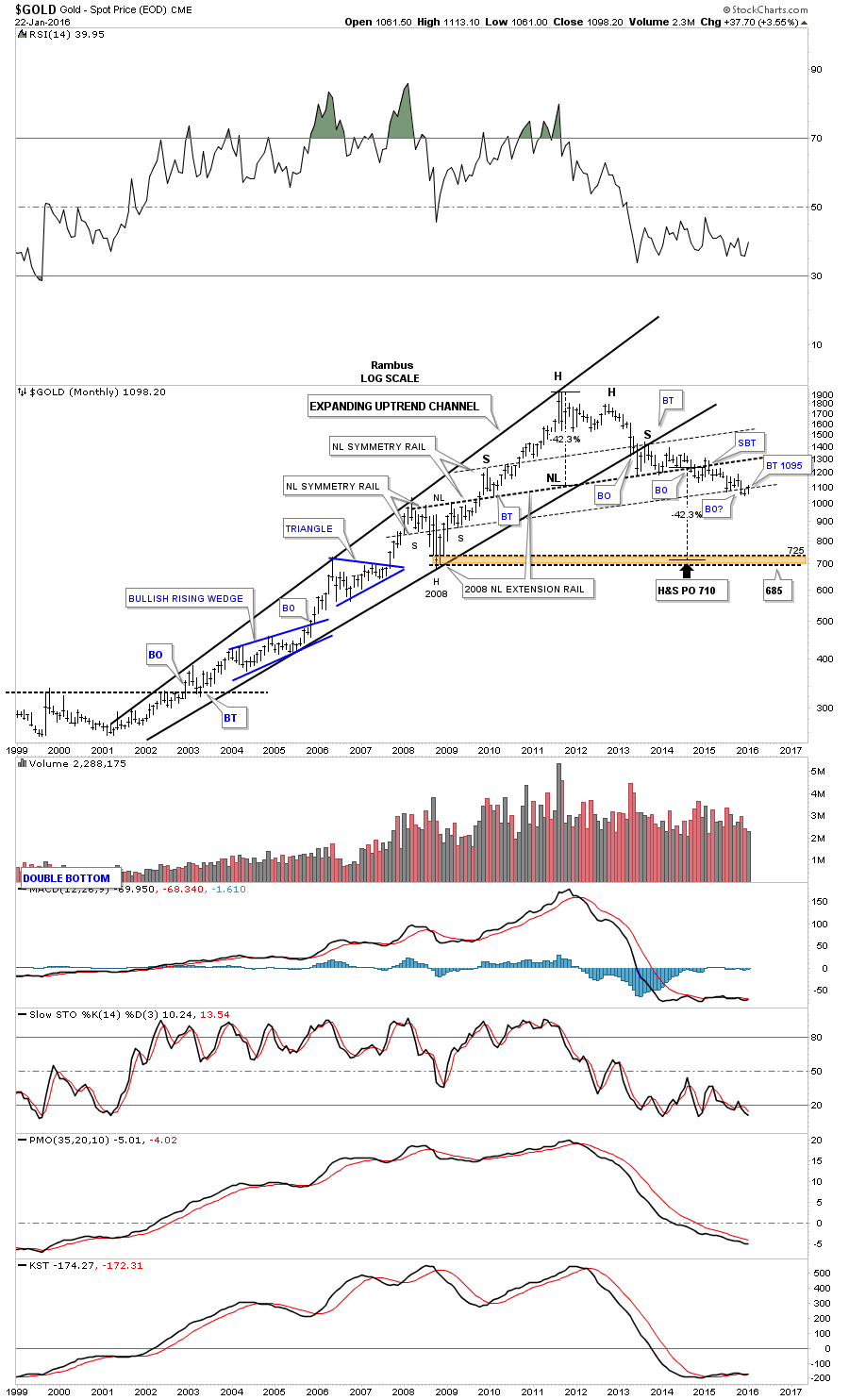
This last chart for the US dollar is a long term monthly combo chart which has the US dollar on top and gold on the bottom. As you can see a serious inflection point is right at hand. If the US dollar can breakout to new highs for its bull market, gold which is testing the top rail of its parabolic downtrend channel should decline inversely. Keep in mind this is a monthly chart. It will be interesting to see what the monthly bar looks like for both the US dollar and gold come the end of February.

us dolla gold combo chart

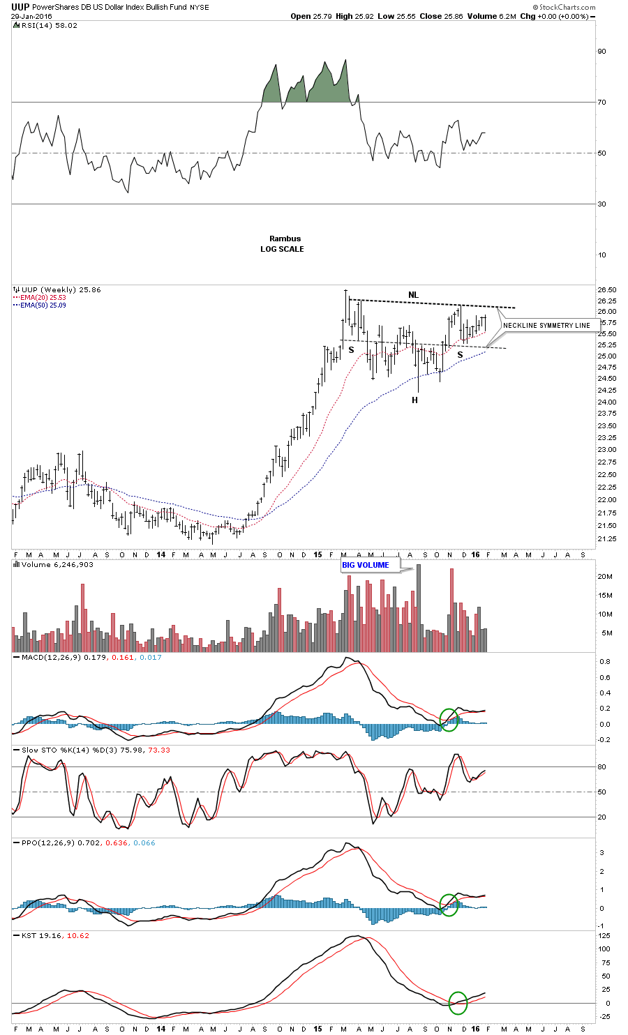
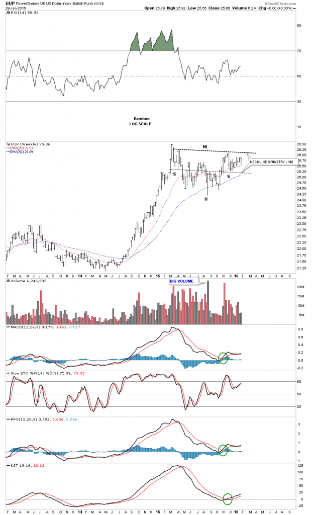
Below is a weekly chart for the UUP which shows the possible H&S consolidation pattern with alot less noise than a daily chart can make.

uup weekly inerse

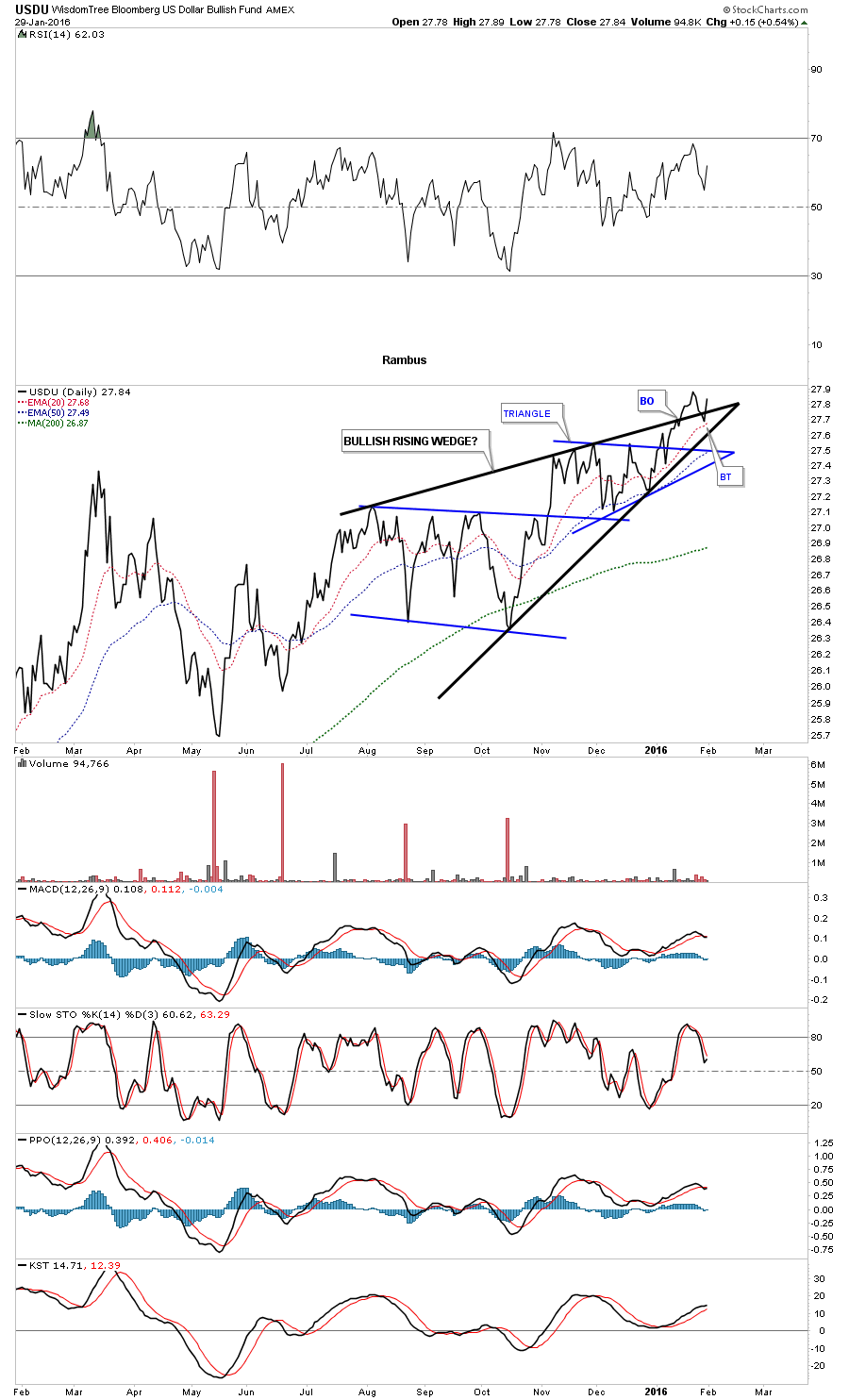
This next chart is the USDU which is the newer version for the US dollar which is more equally weighted. Several weeks ago it broke out topside from the black bullish rising wedge. This past week it backtested the top rail and is getting a bounce. This is a critically important area right here.

usdu day line

The weekly bar chart for the USDU shows it’s ahead of the traditional US dollar index as it has made an new high for its bull market complete with the breakout and backtest.

usdu wekly bar

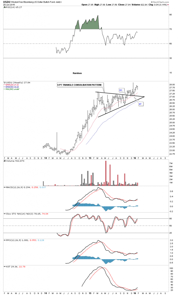
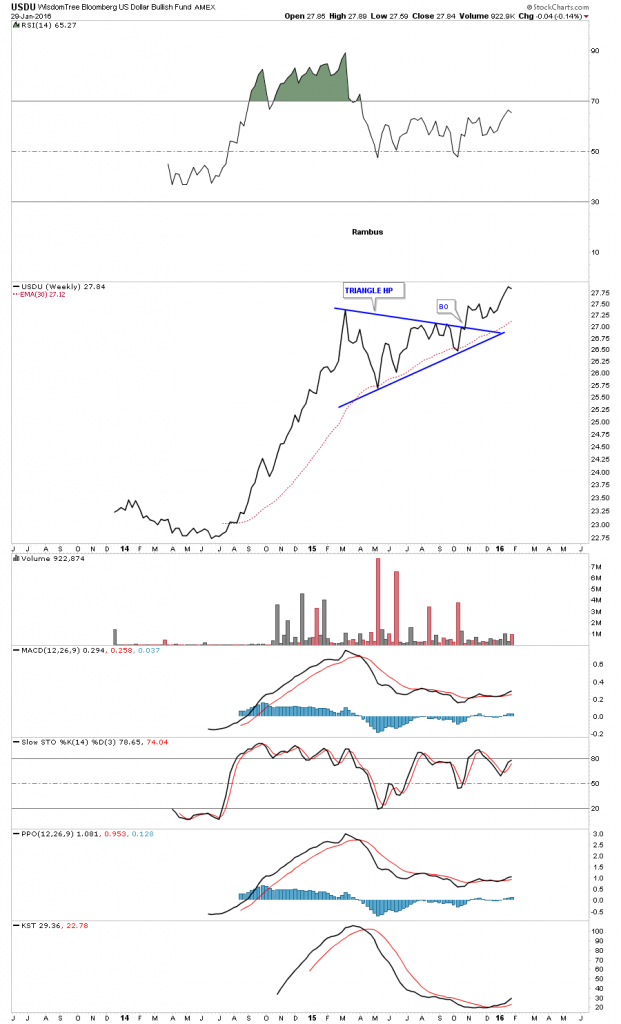
The weekly line chart for the USDU shows it actually broke out of its blue triangle consolidation pattern last fall with the 30 week ema giving strong support.

usdu weekly line

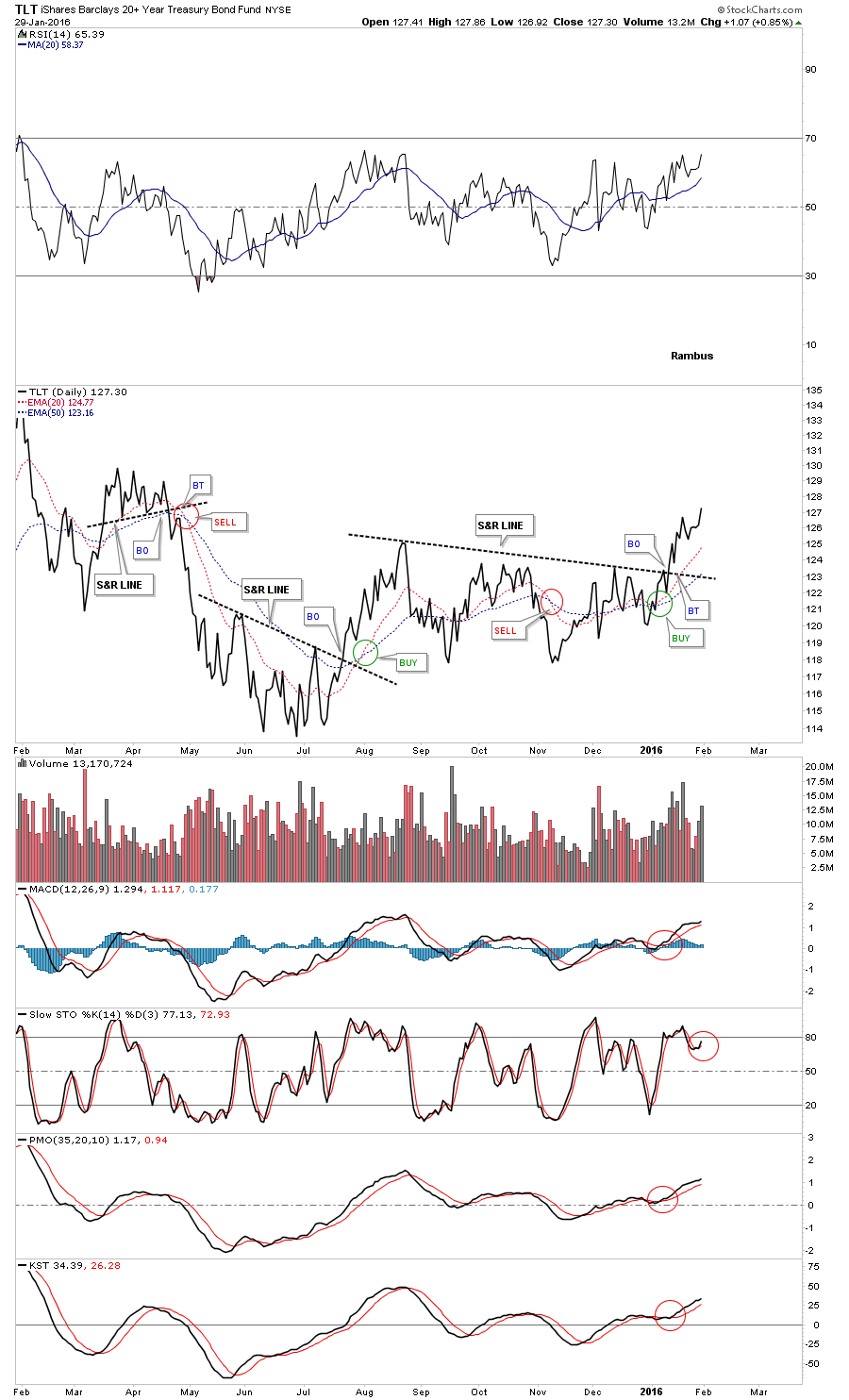
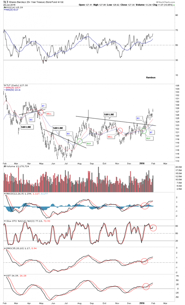
Next I want to focus in on the TLT, 20 year treasury bond fund, which is playing a big role in how I’m looking at commodities, the precious metals complex and the deflationary spiral we find ourselves in. The first thing we need to know is if the TLT is in a bullish or bearish mode right now. This first chart is a daily line chart which shows the TLT breaking out of a pretty nice base at the beginning of 2016. The 20 and 50 day ema’s have a bullish crossover while all the indicator are positive. I’m going to show you this daily line chart first so you can see the difference between a bar chart, which can produce more noise sometimes, vs a line chart. Both charts will be identical except one will be a line and one a bar.

tlt line

Now the bar chart.

tkt brr

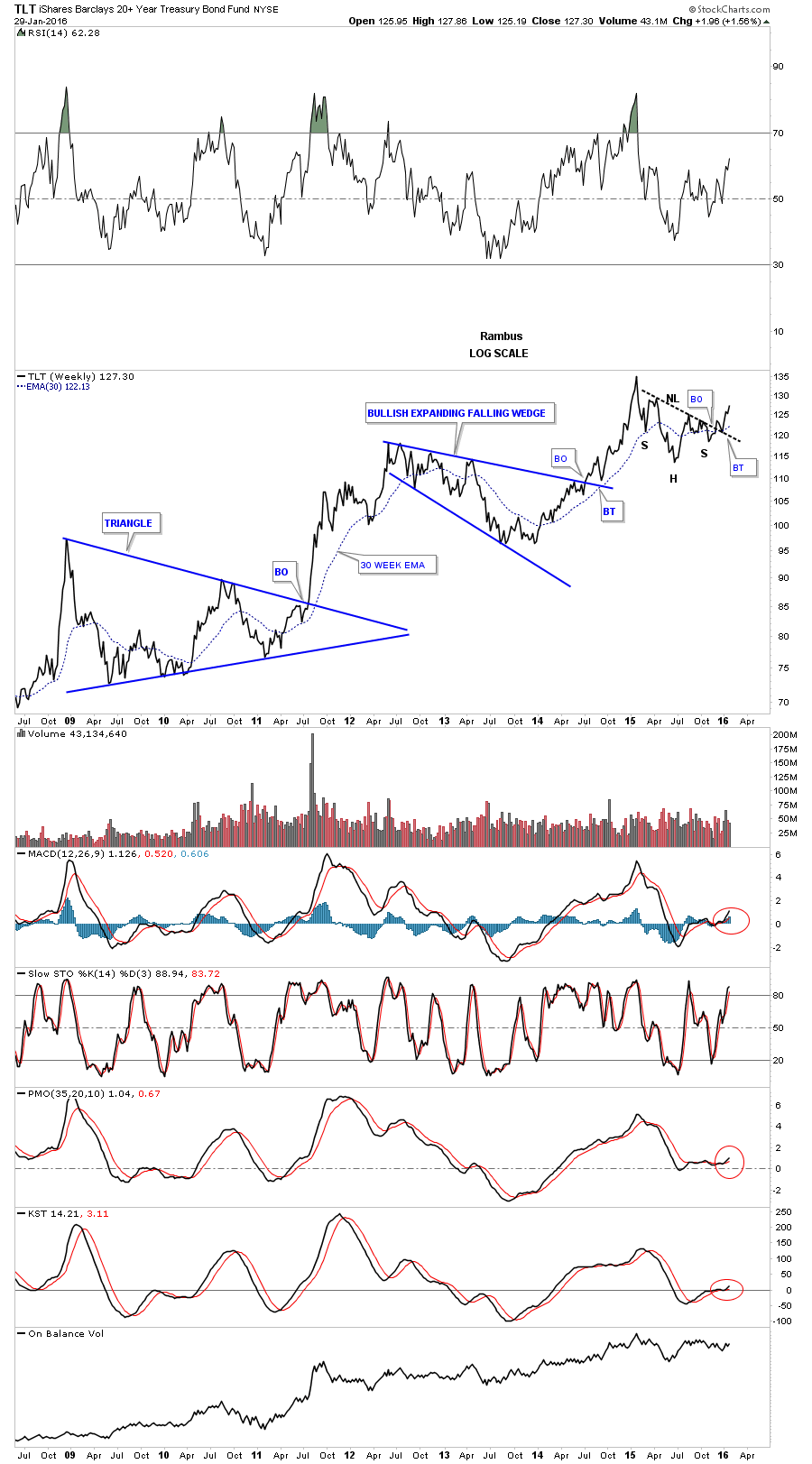
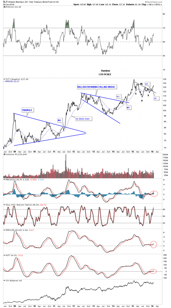
Next lets look at the weekly line chart for the TLT which shows its bull market consolidation patterns. Note the strongly slanted H&S consolidation pattern which has just completed the breakout and and backtest. Note how the backtest to the neckline found support right on the 30 week ema. All the indicators are positive.

TLT WEEKLY LINE CHART

Below is the exact same chart using a bar chart.

tlt weekly bar

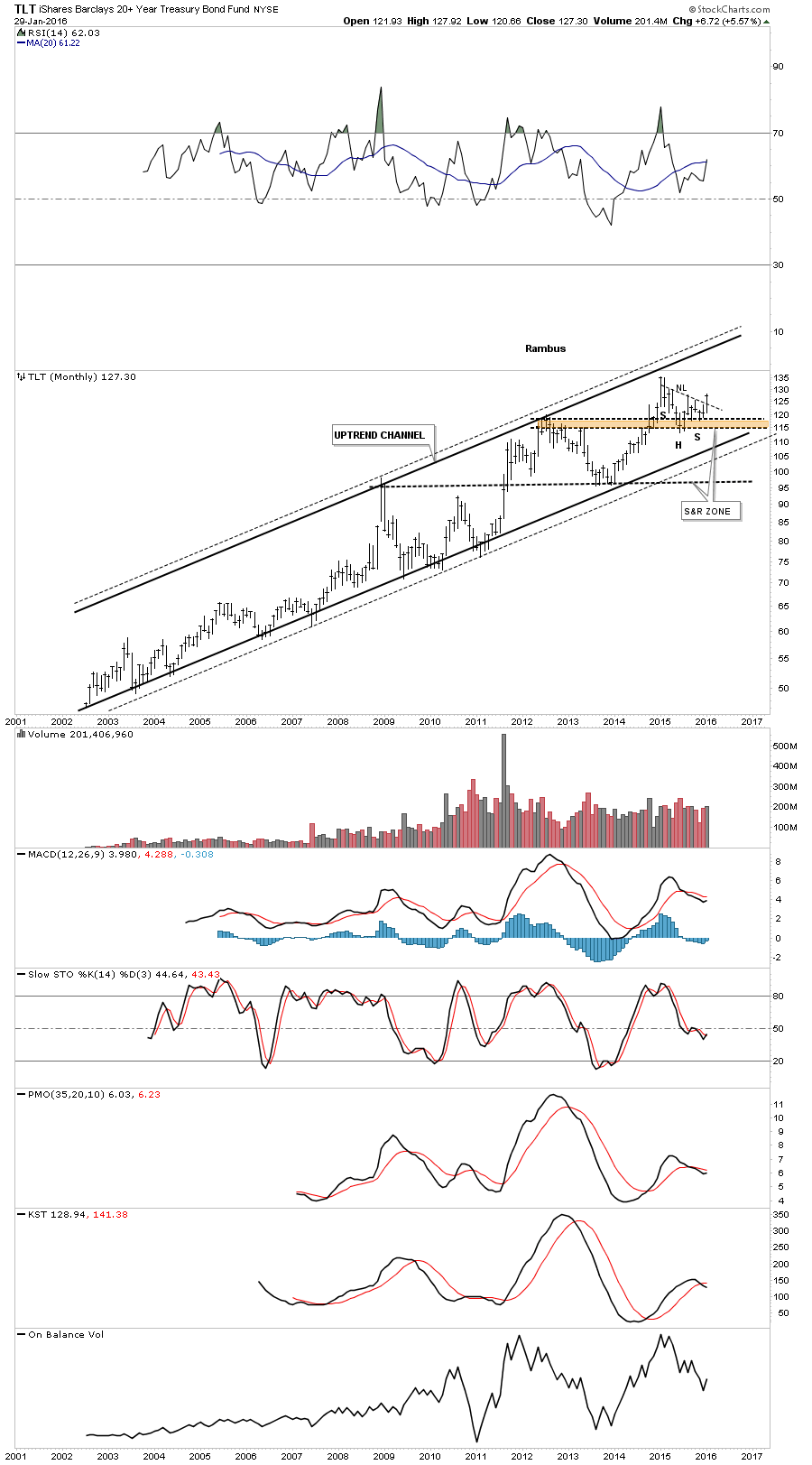
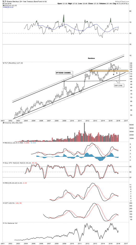
The long term monthly chart for the TLT shows its complete history which is a double trendline uptrend channel. Note how our current H&S consolidation pattern formed right on top of the brown shaded support and resistance zone. So far so good.

TLT MONTYHLY

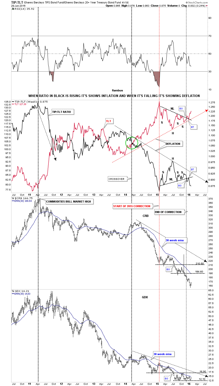
Now I would like to show you why it’s so important to have a bullish looking TLT in regards to being short the commodities and the PM complex. This next chart is a ratio chart which compares the TIP:TLT on top with the $CRB and GDX below it. This is where the TLT charts we just looked at above come into play. I’ve overlaid the TLT in red over the ratio chart TIP:TLT in black. When the ratio chart on top in black is rising, it’s showing general inflation and when it’s falling deflation. Note the H&S consolidation pattern on the TLT, which we looked at earlier in red, and the inverse look which shows the ratio chart in black with a H&S consolidation pattern. As long as these keep moving in their current direction we should see deflation picking up. Note how the  $CRB and the GDX have behaved during this deflationary cycle. Also note how the ratio chart in black topped out in 2011 along with the $ CRB index and the GDX. It’s not a perfect correlation but close enough to get the sense of the inverse movement.

tlt tip raito achart ffffffffffffffff

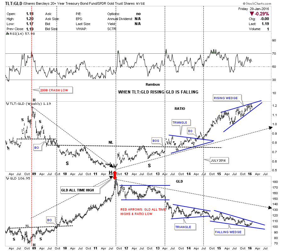
This last chart for tonight I’m going to use the TLT to GLD ratio chart on top and GLD on the bottom. When the ratio chart is rising, meaning the TLT is outperforming GLD, gold generally goes down. Note the inverse look at the 2008 crash low where the ratio chart made a high and GLD on the bottom made its low. From the 2008 crash low GLD then went on its near parabolic run to new all time highs while the ratio chart on top fell to its low. As you can see the ratio chart bottomed in 2011 while GLD topped out as shown by the red arrows. Note the three year H&S bottom the ratio chart made on top, with the head being the 2011 low. The ratio chart on top built out a blue triangle consolidation pattern as the backtest to the neckline which led to the next impulse move higher for the ratio chart. That brings us up to our current situation. Note how the ratio chart on top has formed the blue rising wedge while GLD on the bottom has formed a blue falling wedge. When the ratio chart on top breaks out from that blue rising wedge, whichever direction that is, a good move for GLD will most likely occur. If the charts for the TLT, which I showed you earlier prove to be bullish, then the TLT:GLD ratio chart on top should breakout through the top rail of the blue rising wedge. Until something changes with these ratio charts for the TLT this is the way I have to play the commodities and the PM complex. All the best…Rambus

a tlt gld


Late Friday Night Charts…One Gold Chart is worth 10,000 words .

This weekend I’m going to try and put together a comprehensive report on how all the different pieces of the puzzle are fitting together right now in regards to the stock markets, precious metals complex, currencies and the commodities. There is a big picture look that I hope I can show you so you will know where I’m coming from and why I’ve taken the trades I have. All these different markets are connected in a certain way that hopefully I’ll be able to show you using charts. It will be a long report which I will post in two parts, over the weekend. Either I have the big picture right or I’ll be totally wrong in my perceptions of what the different markets are doing right now. You should have a clear understanding of the big picture after this weekend.

I’ve been working on a lot of charts over the last several days to get ready for the Weekend Report and I still have more to build so there will be just one chart tonight, the long term monthly chart for gold. I first built this chart back in 2013 after gold broke below the bottom rail of its bull market uptrend channel, the expanding rising wedge. You can see where gold broke below the bottom rail of its expanding rising wedge and backtested that important trendline from below which created the right shoulder of that massive H&S top.

Long term members may remember when I extended the neckline from the 2008 H&S consolidation pattern all the way across the chart which came right in line with the initial break of the bottom rail of the bearish expanding rising wedge. It’s called the 2008 neckline extension rail with the heavy NL on it. That heavy neckline held support for close to 15 months before the price action finally broke below it signalling the big H&S top was breaking out. You can see there was a strong backtest to the underside of the heavy neckline but it held resistance. From that strong backtest high gold spent the next year declining down to the lowest neckline symmetry line which is taken from the bottom of the left and right shoulder of the 2008 H&S consolidation pattern.

Gold finally broke below the lowest neckline symmetry rail in November of last year, third bar from the right. So far gold has been backtesting the neckline symmetry rail for this month of January. There is still one more week left to trade this month so it’ll be interesting to see if the neckline symmetry rail holds resistance.  If the current backtest holds resistance and gold begins to break below last months low then it should start heading for the massive H&S price objective down to the 685 to 725 area as shown by the brown shaded support and resistance zone.

Ever since I put that heavy neckline extension rail on this chart there hasn’t been one time when I thought the bear market was over. Just the opposite as you can see by the series of lower lows and lower highs all the way down from the bull market top in 2011. Just think for a moment about how hard its been for us shorting this bear market vs all the gold investors who have bought each bottom thinking the bear market was over and each time gold went lower. The bottom line is that it looks like 2016 is going to be a very interesting year. Have a great weekend and all the best…Rambus

gold h&s


PS: My buy point was hit today on JDST when it backtested the S&R line at 36.25 where I bought another small position of 250 shares. As you can see this is a critical backtest taking place right now.

JDST BUY

DWTI Update…

I didn’t get a chance to post this longer term daily chart for DWTI as things are moving so fast right now. This chart shows the big picture which I wasn’t able to show you on the 2 hour chart just a few minutes ago.

DWTI BULLISH

Below is a long term monthly chart for $WTIC which shows the blue bearish falling wedge as a possible part of an A B C decline, black arrows. This would be a more conservative price objective.

WTIC 1

Below is a 30 year look at oil which shows how the bearish falling wedge fits into the very big picture. As you can see the price action is hitting new multi year lows now. Also notice how the blue falling wedge has formed just below the bottom rail of the major uptrend channel which is usually a bearish setup.

WTIC 2 WALLDEG

Below is a log scale chart for $WTIC which shows the H&S consolidation pattern has a price objective down to the 22.24 area.

OIL LOG CALE H&S

Below is a linear scale chart for oil’s H&S consolidation pattern which has a price objective down to the 13.15 area. It seems impossible but we’ll just have to keep following the price action for more clues.

OL LINEAR SCALE

Below is a 10 year chart which shows the parabolic rise and the parabolic decline. I used the linear scale chart to measure the H&S top which gave me a price objective down to 35 which at the time seemed impossible whereas the log scale measurement was higher.

oil parabloic

Weekend Report…PM Miners Bottom ?..Do they Ring a Bell ?

Today I would like to take a look at the PM complex as there are some interesting charts building out. Please don’t confuse this report with what Sir Spock, Sir Norvast and others are doing at the Chartology Forum as they’re looking for undervalued PM stocks that will be ready to buy when the time is right. In some cases the time might be now as a few of the PM stocks are holding support. In the vast majority of the cases though, excluding some of the Australian and a few South African PM stocks, most are still under pressure. So for some folks who like to get in a little early and have the patience to wait for the bear market to exhaust itself, one can start picking up a few shares of their favorite PM stocks and see what happens. There won’t be a bell go off at the bottom I can assure you of that.

This first chart is a combo chart which has Gold, Silver and five different PM stock indexes, big and small caps on it, to help give you a feel for where we stand right now in regards to the bear market that began in 2011. These charts don’t have any patterns on them just a few simple black dashed horizontal support and resistance lines. The vertical dashed line shows the 2008 crash low and how the PM stock indexes are all trading below that important low while gold and silver are trading well above it. The red dashed horizontal line shows the 2008 crash low. Looking at all these chart objectively it’s hard to see any type of bottoming action taking place yet. The very first thing we would need to see is the price action take out the first overhead resistance lines to even consider that a bottom is building out. There is no law that says it can’t start tomorrow but with a few of the PM stock indexes breaking down to new bear market lows there is alot of work to do for this sector to start looking bullish. Keep in mind I’m not talking about the Australian PM stocks or even a few of the South Africa gold mining stocks which are showing a little strength in here, but the general big picture which is still very negative.

cdxn combo

A quick look at the $BPGDM shows it’s on a sell signal as the price action is trading below the 5 day ma and the 5 day ma is trading below the 8 day ma.

bpgdm

It has been quite a long time since we last looked at this long term chart for the $CDNX, which is basically a small cap Canadian stock index which is made up of precious metals and other small resource companies. This small cap index had one of the biggest bull runs during the earlier part of the bull market in the PM complex. It was the first to top out in 2007 with a huge, I labeled it whatever you want to call the formation inside the blue box, anything you’d like. I remember at the time the bull market was still going strong and what ended up forming  inside the blue rectangle, had several different patterns. The big give away that the pattern would break to the downside was the small red triangle that formed on the right side of the blue top. That red triangle broke down first and then shortly afterwards the big blue trendline gave way. There was no way to know back then the magnitude of the 2008 crash or even that the blue trading range would be the actual bull market high which formed several years before the rest of the PM stock indexes. I think we’re seeing something similar in the stock markets right now with the Russel 2000 and micro caps leading the way down. Small caps, in any sector is where the extra cash will go in a bull market and exit first during a bear market.

cdnx weekly long

There are several H&S consolidation patterns that are forming on some of the PM stock indexes. The $XAU is the leader breaking below its neckline last week. Below is a three year weekly chart which shows the blue eight point Diamond with the H&S consolidation patterns just below it and our most recent H&S consolidation pattern which has a price objective down to the 32.05 area.

XAU WEEKLY 1

The 30 year monthly chart for the $XAU shows it built out a massive 5 point bearish rising wedge and is currently sitting right on the all time low. Note how the two blue consolidation patterns formed one above the bottom rail of the five point rising wedge and one consolidation pattern just below. This usually sets up a bearish scenario which so far is playing out.

xau monthly 1

It’s been awhile since we last looked at this long term weekly chart for the HUI which shows it’s double rail bear market downtrend channel.

a hui down tjre

The long term monthly chart for the HUI shows the fanlines it has made since the bear market low in 2000. Normally when the third fanline breaks the pattern is complete.

hui monthly falnlines

Sometimes the markets will do something that makes you go WOW. This next chart is a weekly bar chart which shows all the bear market rallies were the same exact height on a percentage basis as shown by the blue arrows on log scale.

hui bear market rallies

Not to be out done by the bulls the HUI bears have created two major legs down that were the same length as shown by the black arrows. If this next impulse move down matches the previous two then the price objective would be down to the 54.45 area. It will be interesting.

hui bear market declines

The short term weekly chart for the GDX shows it’s trading right at the neckline of the lower H&S consolidation pattern. A break below the neckline will complete the H&S consolidation which would give us a price objective down to the 9.78 area.

GDX WEEKLY 1

So there you have it . Not exactly the best time to be a bull in this disintegrating forsaken sector . But as always we watch the charts for clues .

Since the markets are closed in the US tomorrow I’ll do a part two for the Weekend Report as there is so much to look at right now. For US members enjoy the day off monday. All the best…Rambus


DGAZ Trade Setup…

DGAZ 2-4-16. I’m going to place a sell/stop at 14.89 just below the S&R line and the 50 and 20 ema’s on the daily line chart.

DGAZ DAU LINE

DGAZ weekly:

dgaz weekly

Below is a two hour chart for the UNG, US natural gas fund, which got a bounce off the low and has been in a small trading for the last since late December. I’m calling this pattern a 5 point bearish expanding rising wedge reversal pattern. As we need the trend has been up I needed to see a reversal pattern form with an odd number of reversal points which this pattern now has. The top rail isn’t as clean as I like to see but it’s the essence of the pattern which is important. The blue trendlines represents a possible trading range that may develop consolidating the first massive impulse move down.

ung day

Below is a weekly chart for $NATGAS which I’ve been showing which shows the triple H&S top. As you can see the neckline #2 price objective was reached when we got our current counter trend rally back up to neckline #3 at 2.46. We have a pretty clean line in the sand using neckline #3. Above it will be bullish and below bearish.

natgas

Based on the two charts above I’m gong to take an initial small position and buy 1000 shares at the market at 13.89 with the sell/stop placed just below the top blue rail at 8.83. This is a very risky and volatile etf to trade so take very small positions. KOLD is a 2 X short natural gas etf. The more conservative members will want to wait and see if DGAZ backtests the top rail at 8.95 to take this trade and keep risk to a minimum.

dgaz buy


The Scariest Chart on the Planet

Excerpt from Tonight’s Wednesday Report

The implications of this 60 year quarterly chart for the CRB index is staggering if it completes this impulse move down which so far has been working out beautifully. Again on this massive time scale you can see an unbalanced H&S top that measures out to just below the major support zone at the bottom of the chart .

Back to the Future Indeed .

crb