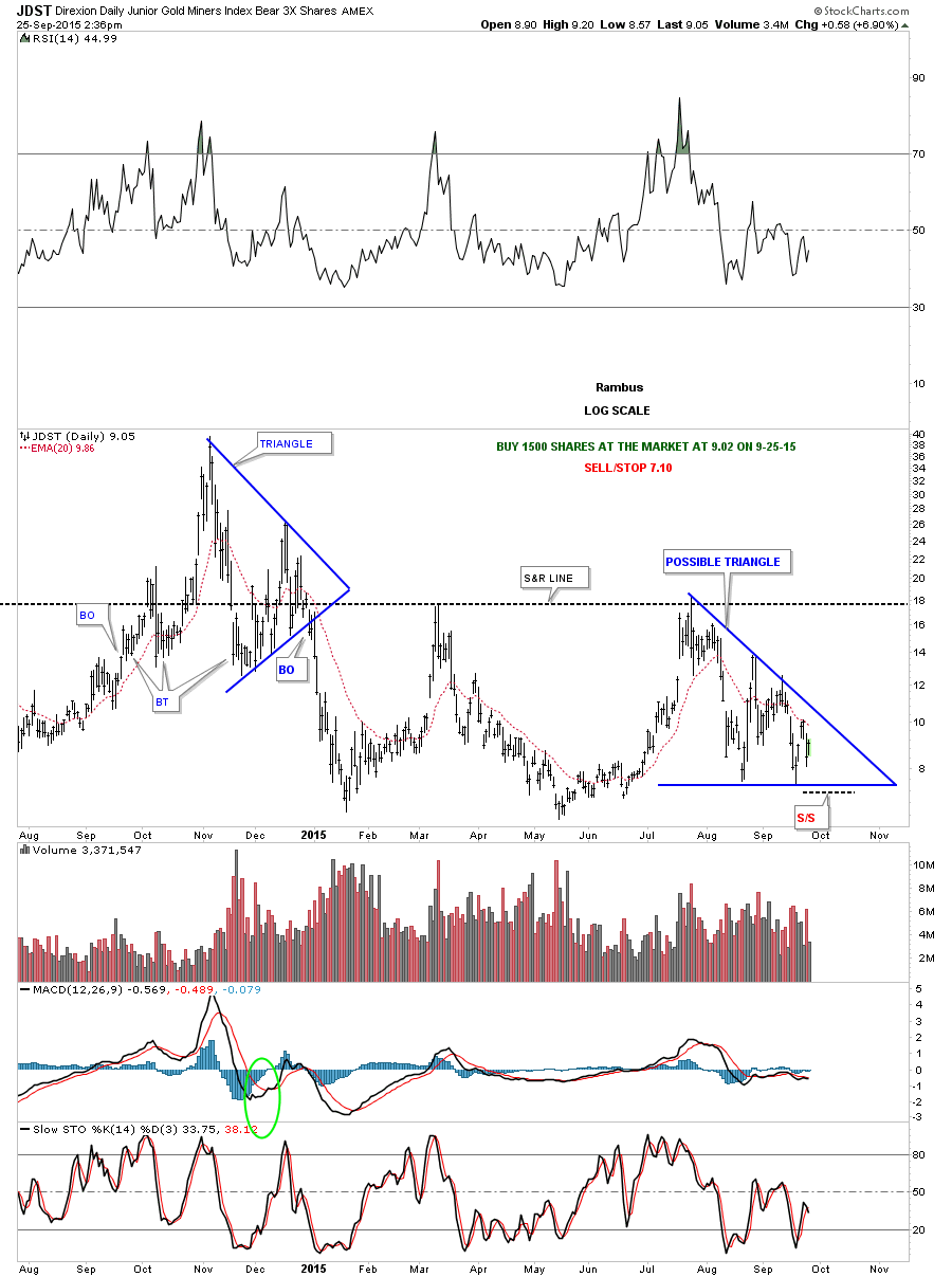
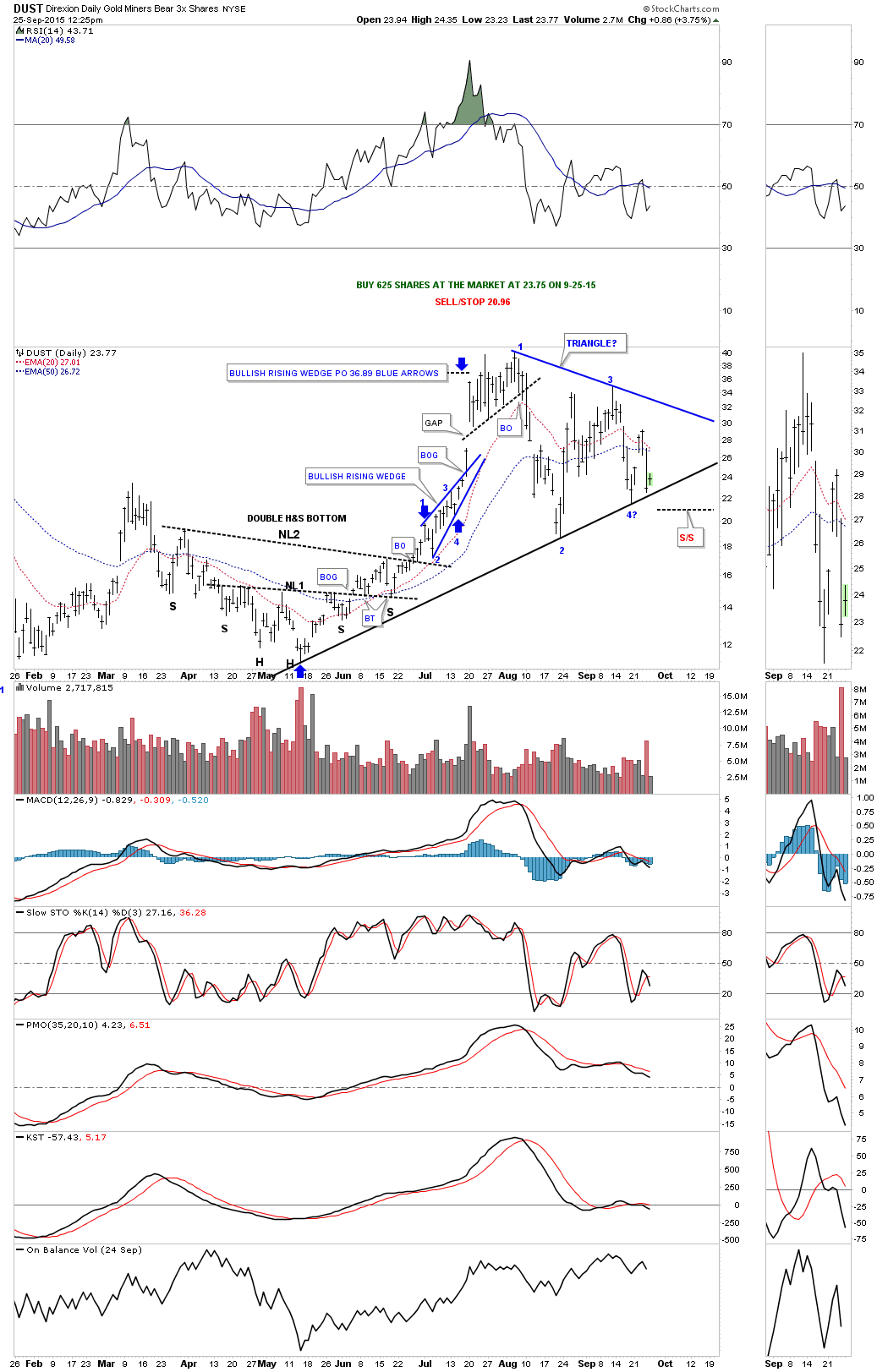
In this Weekend Report I would like to focus on the PM complex as it has rallied for the last several days. During most of the bear market gold has held up better than the PM stocks and silver so we’ll start there to see if we can find any clues on what’s really going on.
Last week I noticed a potential small H&S consolidation pattern that was forming above the July lows. Last Thursday I seen the breakout and Friday looks like a backtest to the neckline as it held support through out the day. If this little H&S consolidation pattern plays out it will give gold a price objective up to the 1187.30 area. So far gold has produced a higher low but not a higher high off of the July bottom. The brown shaded support and resistance zone shows major resistance between 1215 and 1230 or so.
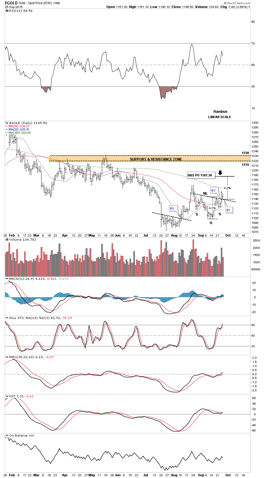
Gold is testing the upper band on the Bollinger bands currently which may offer some short term resistance.
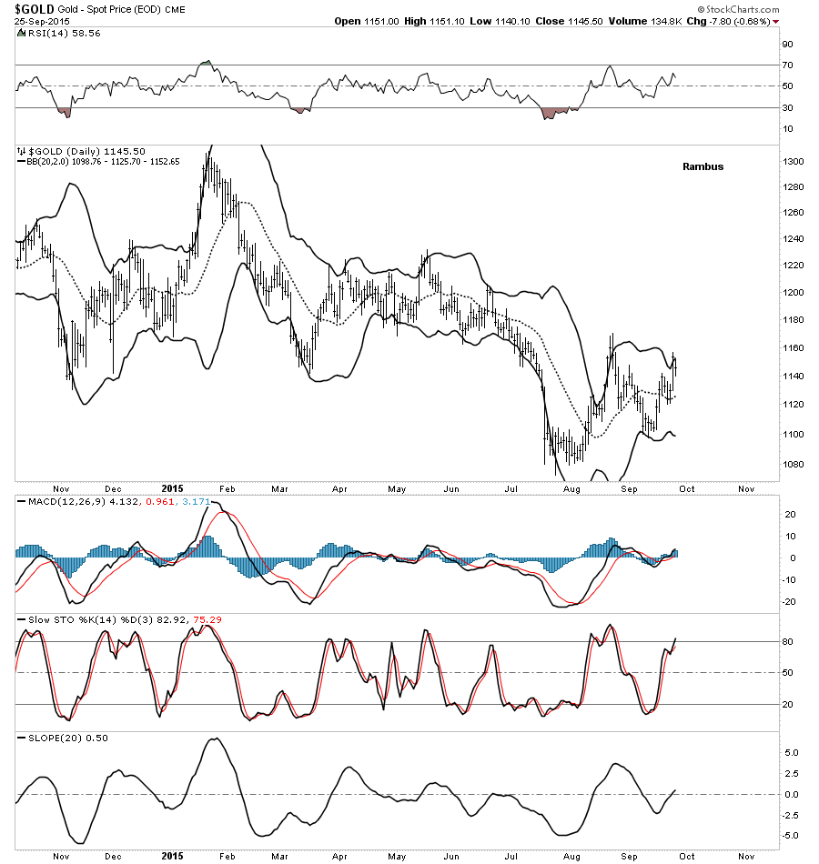
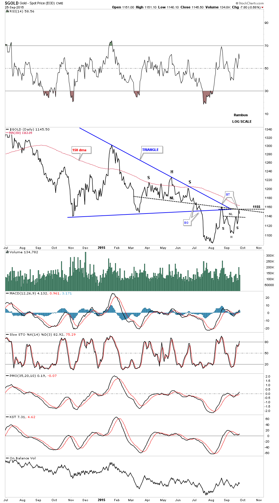
The next chart for gold is a daily line chart that shows the blue triangle with the H&S formation that formed out toward its apex. So far the neckline has held resistance on two separate occasions at 1155. Note the possible little H&S consolidation pattern that is forming just below the apex that we looked at on the first chart above. The 150 dma is also just above the apex and neckline. Needless to say this is a critical area for gold.
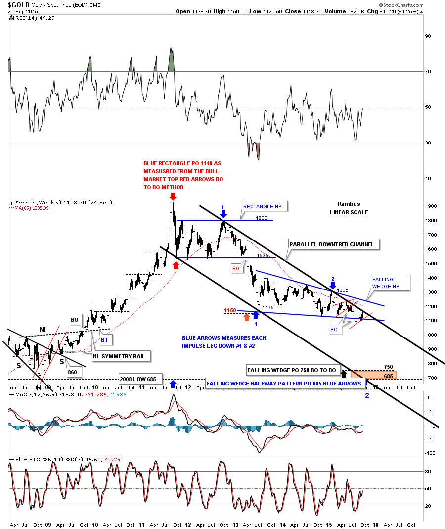
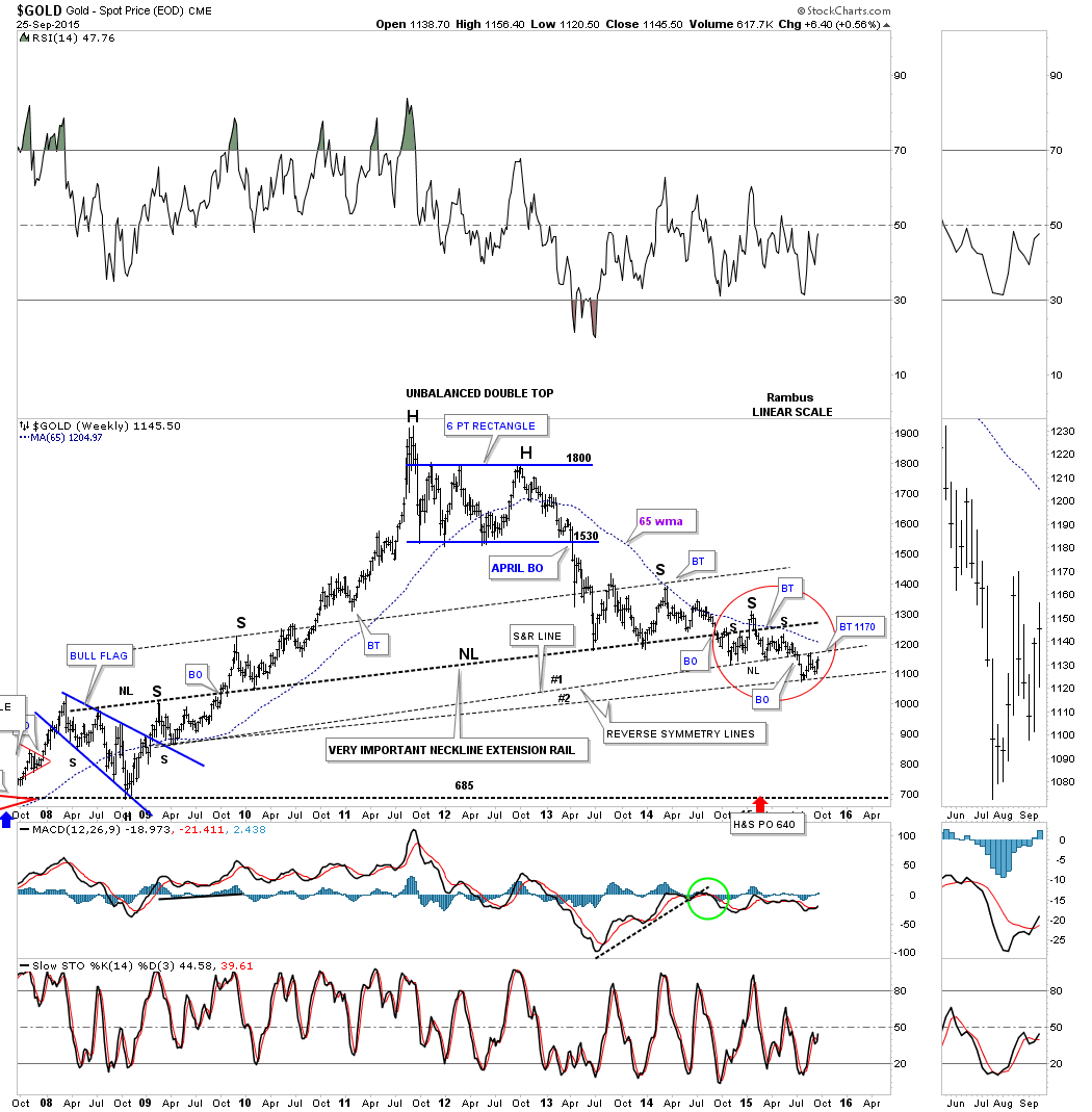
Lets look at one last long term weekly chart for gold which we been following for a very long time. This is the weekly reverse symmetry chart goes back to the big rally out of the 2008 crash low. Reverse symmetry just means how a stock went up is often how it comes back down as shown by the black dashed trendlines. What I want to focus in on are S&R lines labeled #1 and #2 inside the red circle.The thin dashed S&R line #1 ended up being the neckline for the smaller H&S that started to form last October and broke down in July of this year. Note how the S&R line reversed its role from support during the formation of the little H&S neckline to resistance on the first backtest around the 1170 area. S&R line #1 or the small neckline maybe tested once again at the 1170 area as a second backtest. If the small neckline holds resistance and gold begins to decline again from the 1170 area the little ping pong move taking place between S&R line #1 and S&R line #2 will have formed a small consolidation pattern between the two trendlines. The all important 65 week moving average now comes in at 1204. Needless to say this is a very important area of overhead resistance.
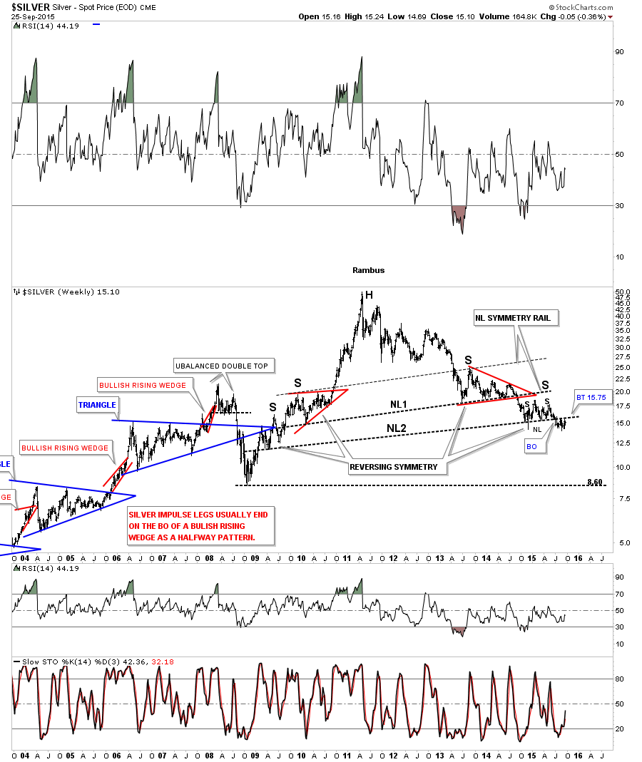
Now lets look at a long term weekly chart for Silver which is showing us a H&S consolidation pattern which is very similar to the one we looked at on the daily chart for gold. This H&S consolidation pattern has formed just below the bottom rail of the blue triangle consolidation pattern. Just like gold it broke its neckline in July of this year and has experience one backtest so far and maybe attempting as second backtest at the 15.75 area. If gold and silver break above their respective necklines that would be the first bullish signs for the PM complex in a very long time. Until the bulls can show their strength and break back above their necklines I will remain a bear. If the bulls do show strength I will have no problem in reversing my nearly four year bearish stance on the PM complex.
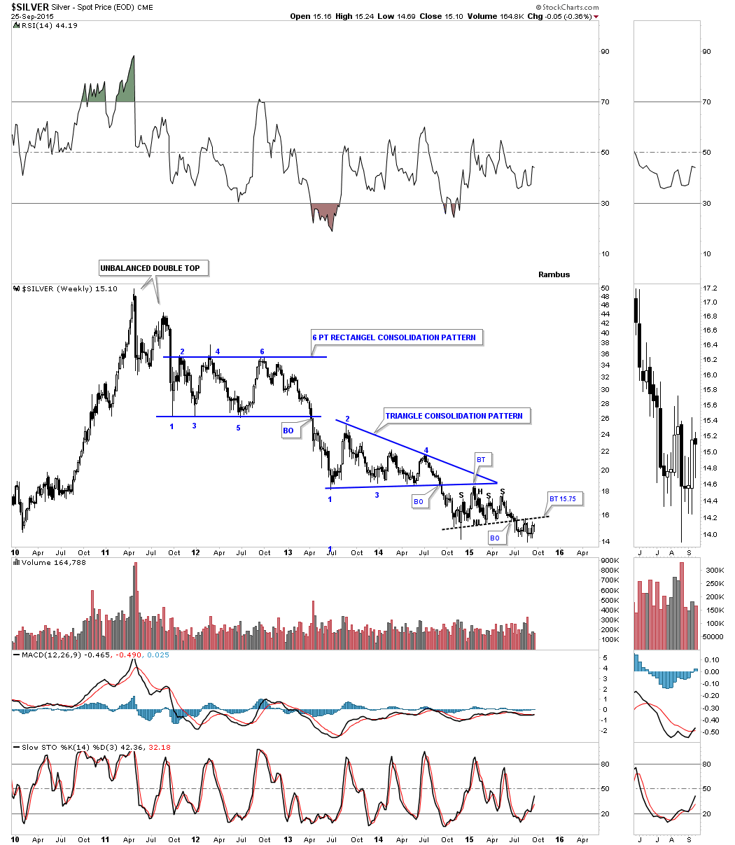
This last very long term weekly chart for silver shows its potential massive H&S top that has been forming for about four and a half years or so. Again you can see how important the 15.75 backtest to neckline #2 is in the big picture. I know it feels like we may have missed the beginning of the new bull market for some of you in the PM sector but if you look at this chart we are currently trading just off of multi year lows. If for instance silver was ready to launch a brand new bull market the very first thing it would have to do is trade above the neckline at 15.75 and rally up to possibly the right shoulder high on the small H&S pattern. You have to have a higher low and higher high to begin an uptrend. There is no getting around that very simple basic fact.
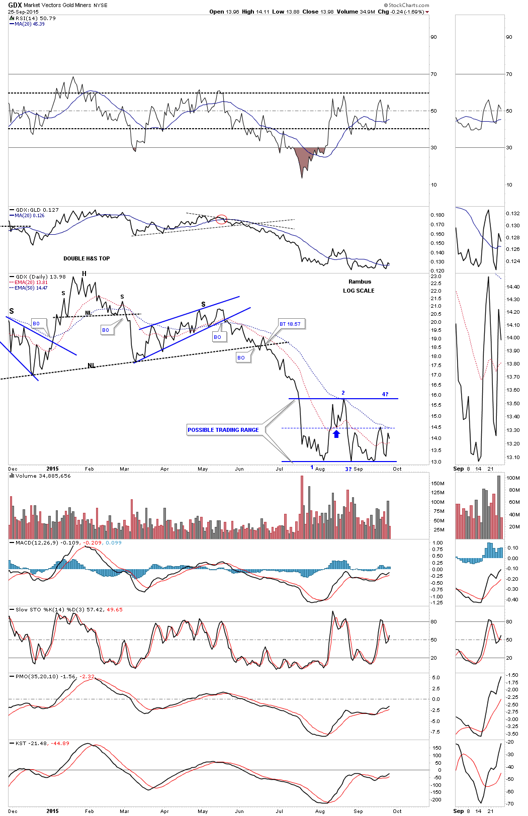
Now lets look at the GDX as a proxy for the other PM stock indexes. This first daily chart shows the breakdown from the double H&S top which led to the August low. Its been chopping out what originally looked like a H&S consolidation pattern but the neckline failed to give way and now the price action has rallied back up to the vicinity of the left and right shoulders. It’s possible it’s building out a more sideways consolidation pattern if the price action can rally back above the center dashed line at the 14.38 area which it has tested twice so far.

Below is a daily line chart that takes out a lot of the noise a bar chart can make which is showing the possible trading range.
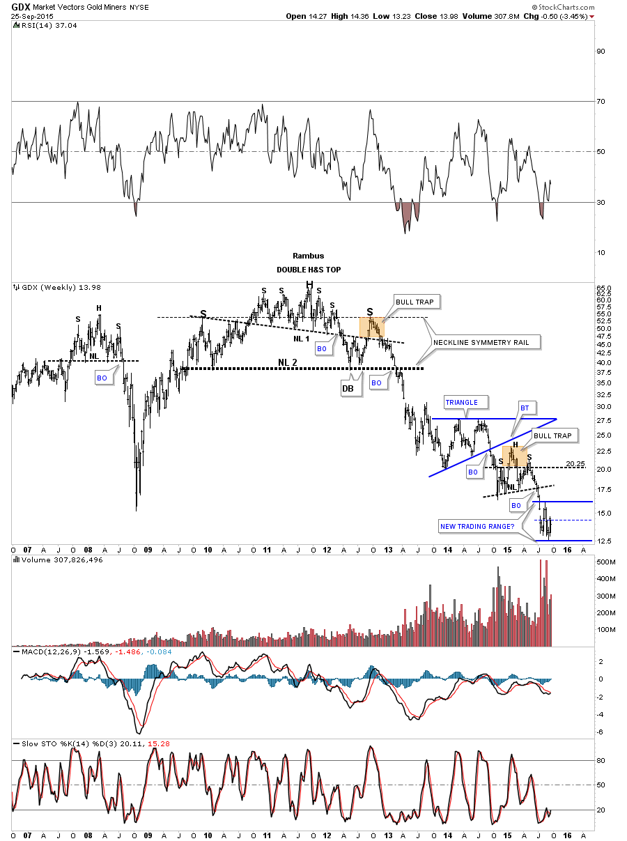
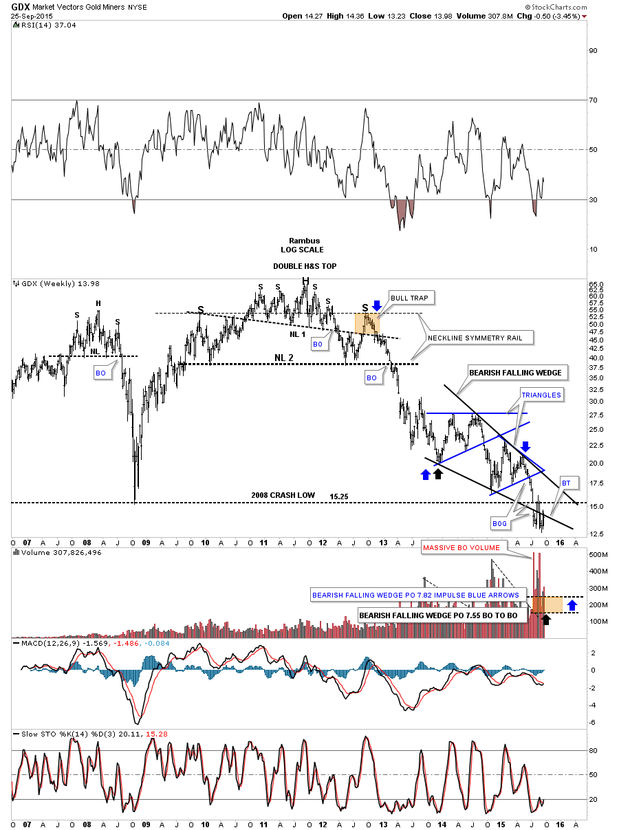
This first long term weekly chart for the GDX shows its massive H&S top and our current and possible new trading range that is forming down at the bottom of the chart.
This next weekly chart shows the potentially bearish falling wedge. The breakout and backtesting has been rather laborious so far but nothing is broke yet in regards to the bearish falling wedge. If the bulls are in charge the very first thing that will get my attention is if they can take the price action above the top rail of the falling wedge. It’s as simple as that.

The next chart shows a close up view of the falling wedge which is made up from the blue triangle and the H&S consolidation pattern. Real short term resistance comes in at the bottom rail of the falling wedge at the 14.40 area.
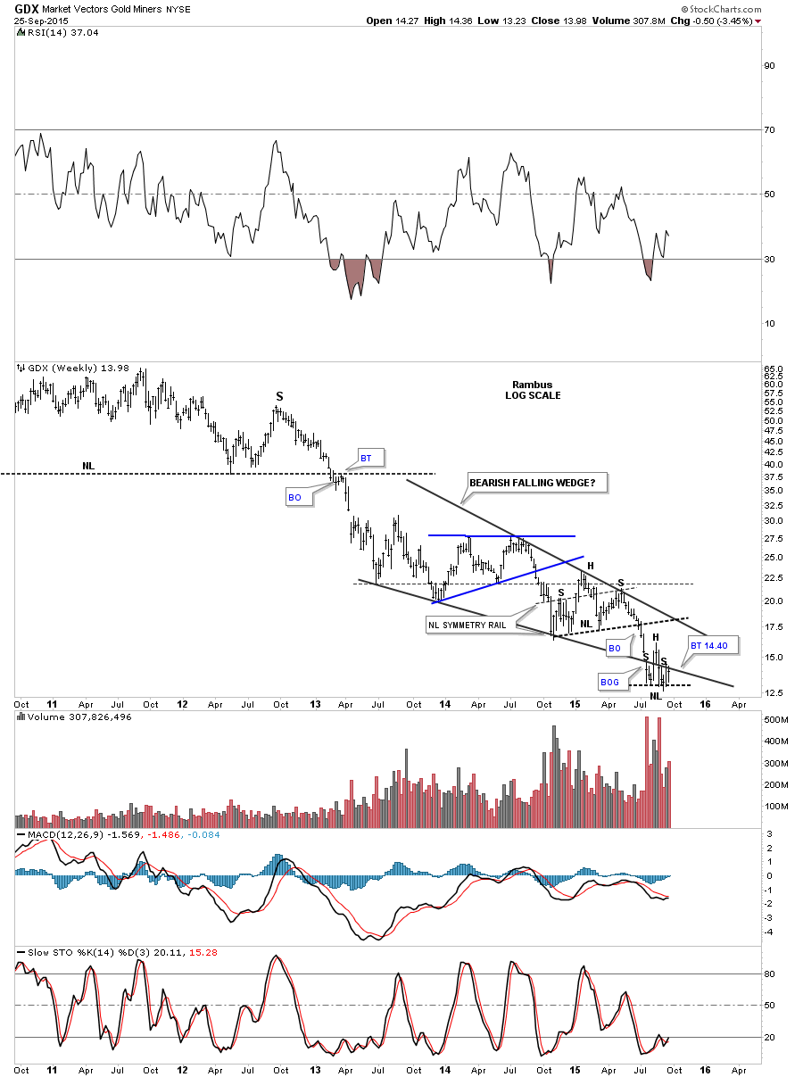
Next is a longer term weekly view for the GDX which shows the price action is testing the bottom rail of the falling wedge with the 2008 crash low coming in at 15.20 which has already been tested once so far, brown shade rectangle. The bulls are looking at this falling wedge as a bullish falling wedge which may come to pass but until the top rail is broken to the upside the main trend is down. If the falling wedge plays out to the downside I have the two different price objective labeled below using two different measuring techniques.
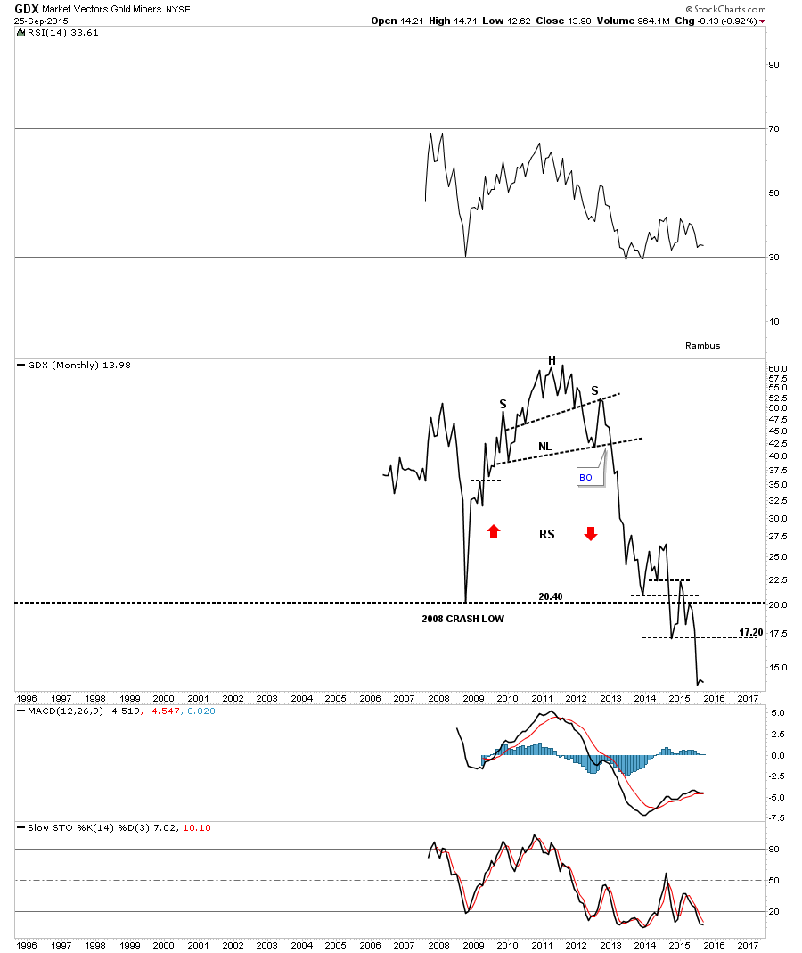
One last chart for tonight will be the long term monthly line chart for the GDX which shows the entire history for this PM stock index. This monthly line chart really takes out the noise and shows you how the bear market has unfolded since the massive H&S top in 2011. Maybe the current low is the beginning of the new bull market as so many folks are talking about right now. If it is this chart shows you that you have missed very little of the new bull market if the gold bugs are correct. This chart also shows you how hard it has been to trade the long side of this bear market.
I’m going to wrap up this Weekend Report and go outside and watch the lunar eclipse as Mother Nature is getting ready to put on a beautiful show for us tonight. All the best…Rambus