In this Weekend Report I would like to look at the Chartology of the precious metals complex as this is either a consolation phase or as some think a bottoming formation is building out that will lead to the next bull market. In order to grasp what is really going on we need to look at all the possibilities and try to gain some perspective on which course of action the precious metals complex is likely to move in the short to intermediate time frame up or down.
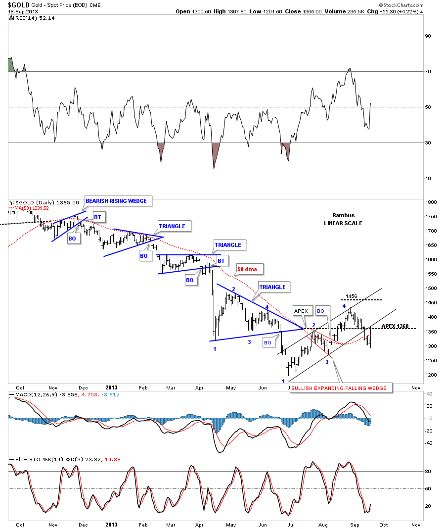
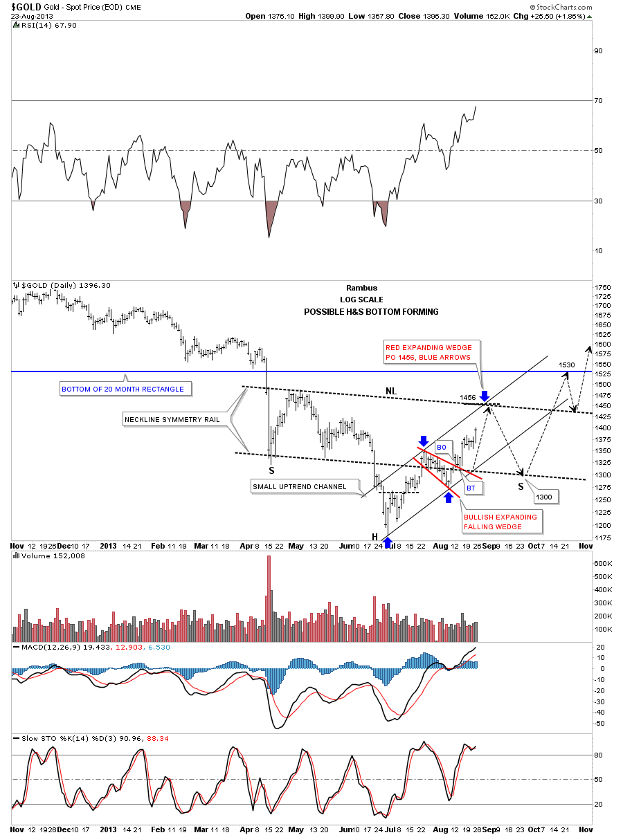
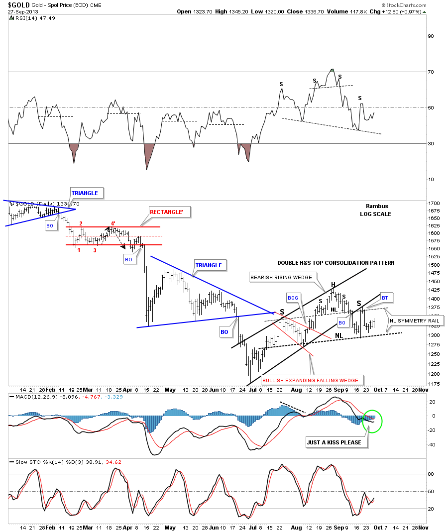
The first chart I would like to show you is what I call my bull or bear chart. Many chartists are looking at the inverse H&S bottom that actually started to form back in April of this year, left shoulder. The head was formed during the late June low followed by the ten week rally to the September high around the 1435 area. As you can see there are two black necklines labeled #1 and #2 that shows a possible double inverse H&S bottom. In order to keep the symmetry alive gold would need to decline down toward the 1250 area where it could then form the second right shoulder. To confirm an inverse H&S bottom is in place gold would have to takeout the bigger neckline #2 around the 1400. This would be the bullish case for gold. The bearish argument for gold is that it is forming a H&S consolidation pattern as shown by the blue annotations. The flash rally that took everyone by surprise made the right shoulder high which quickly reversed direction. So at this point we have two inconclusive patterns to work with.
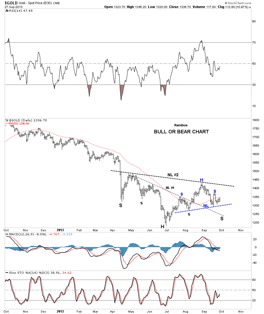
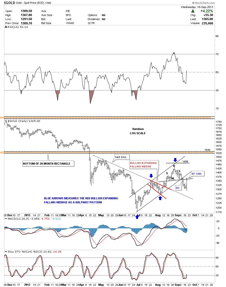
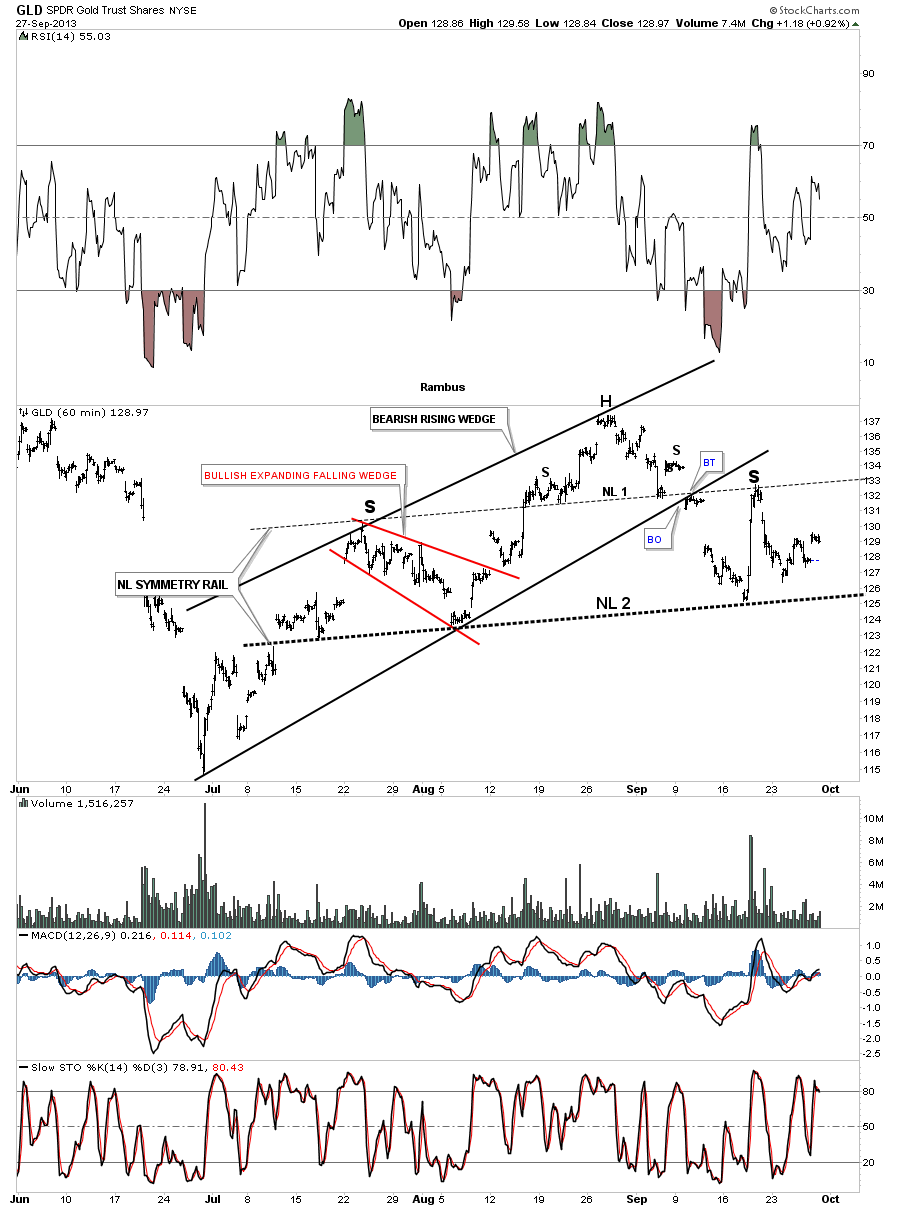
As I will show you in the following charts I believe the blue H&S consolidation pattern will be the correct pattern to follow. If gold rallied up through the bigger neckline #2 then I will have to reassess the situation. The 60 minute chart for GLD shows all the chart patterns that have developed since the late June low. The first chart pattern to note is the black bearish rising wedge that had built a smaller red bullish expanding falling wedge as a halfway pattern which created the left shoulder. The breakout from the red expanding falling wedge led to the high for this move which is the head portions of the double H&S top. Note the small H&S top that reversed that 10 week rally labeled neckline #1. Once the smaller neckline #1 was broken to the downside that led to the bottom of the bigger H&S neckline #2 where we got the flash rally that formed the right shoulder. Note the neckline symmetry rail that was made off of the smaller neckline #1 that gave us a good place to possibly look for a bounce for a bigger H&S top which turned out to be the case with the placement of neckline #2. A neckline symmetry rail is just a parallel trendline made off the original neckline. It doesn’t work all the time but it does give you a rough place to look for a second neckline which happens quite a bit.
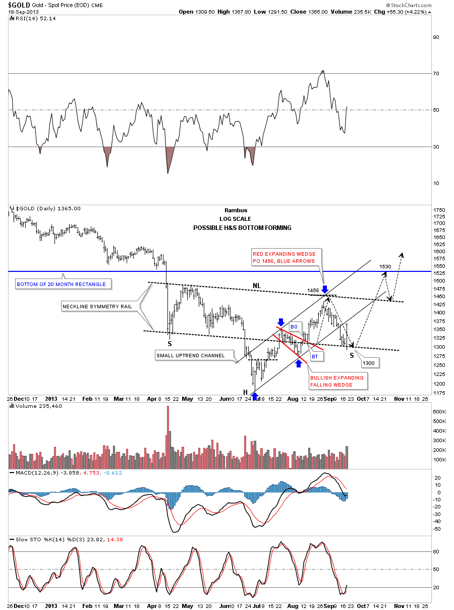
Let look at a daily chart for gold that puts the 60 minute H&S consolidation pattern into perspective. As you can see the price action is trading right in the middle of both necklines in no man’s land.
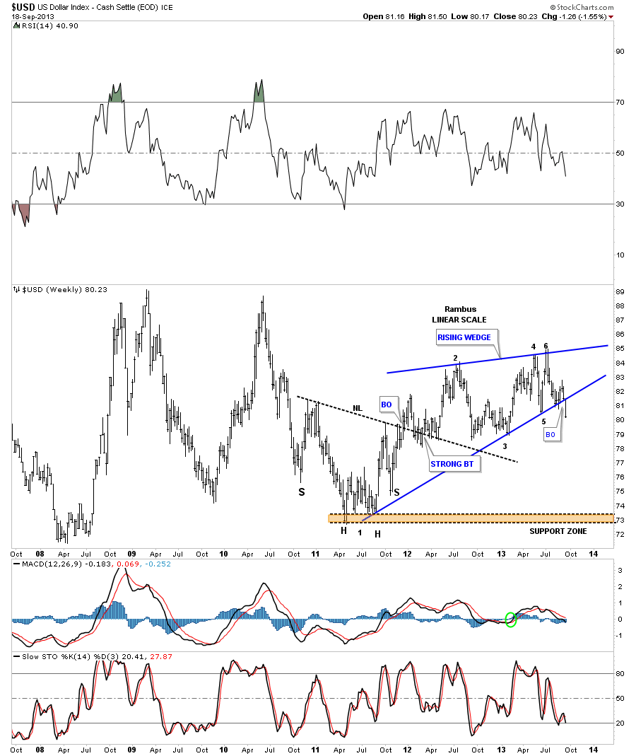
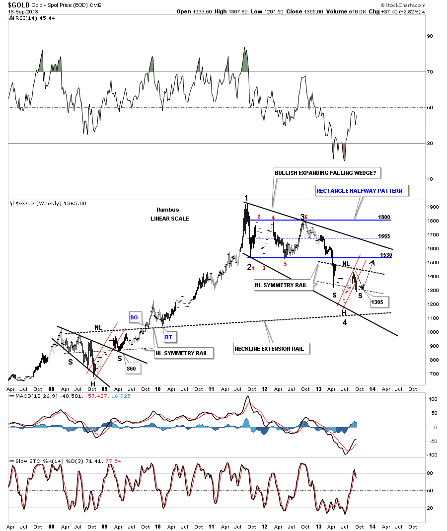
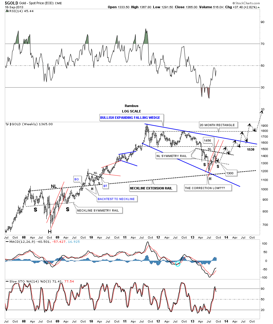
This next chart shows the big 20 month rectangle that gold broke out from back in April of this year. That was a major nail in the coffin for the bull case as gold should have never broken that critical bottom rail of the 20 month rectangle. That confirmed the bear market for me.
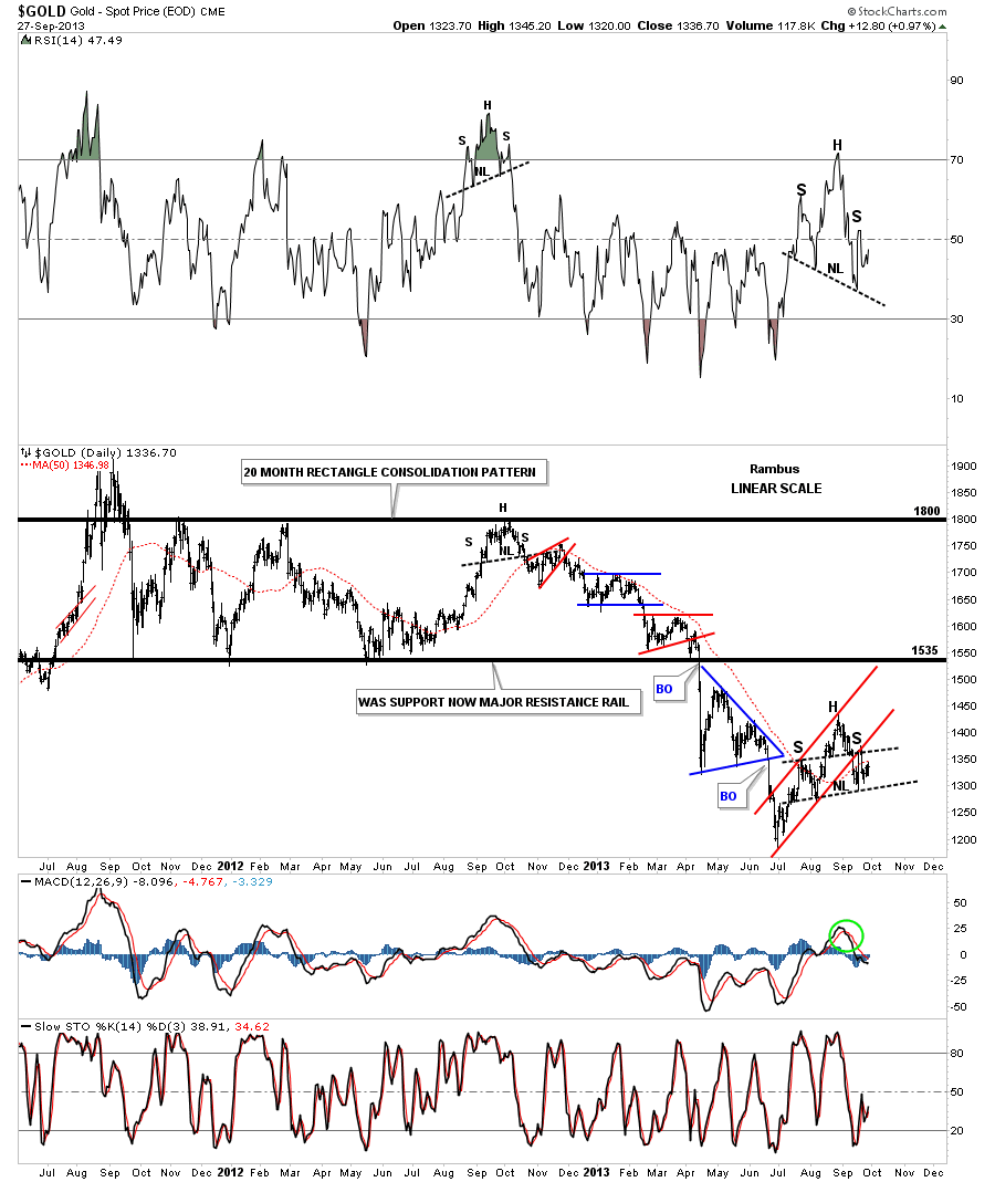
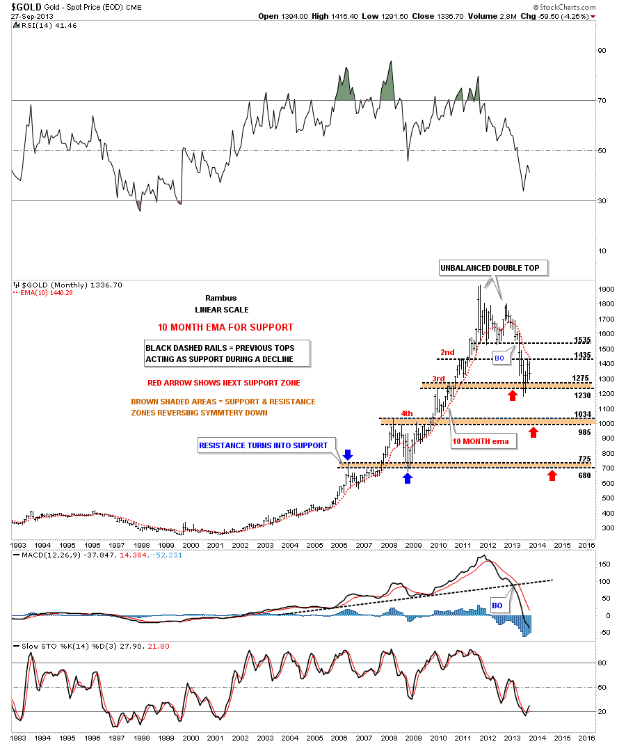
Lets look at one more chart for gold that shows a very long term monthly view going back 20 years. This chart makes it painfully clear if you’re bullish on gold that there is a lot of work to do to repair all the damage that has been done since the unbalance double top was put in. First note the 10 month ema that held support for most of gold’s bull market years and was rising. Since the unbalanced double top was put in note how it’s now acting as resistance on any rally and is falling. The brown shade support and resistance zones I have added that shows the previous tops that were made on the way up should now act as initial support on the way down. If gold takes out the 3rd brown shaded support and resistance zone there will be little in the way of support until it trades down to the 4th support and resistance zone around the 1000 area. I often write about reverse symmetry which means how a stock goes up, especially in a strong move, will reverse that move in similar fashion on the way down. As you can see that is exactly what gold is doing.
Lets now focus our attention to silver by looking at the 60 minute chart that shows it too has a small H&S top in place with a possible bigger H&S pattern developing right now. There have been two backtests to the smaller neckline around the 22.25 area. Note the flash rally that took the price up to the smaller neckline and has created the right shoulder of the bigger H&S pattern. As you can see the bigger H&S pattern is strongly slanted but the neckline symmetry rail suggested that the right shoulder high would come in around the smaller H&S neckline. The price action has been crawling along the bottom neckline for a week or so which if it’s broken to the downside the bigger H&S pattern would have a price objective down to the previous low at 17.82.
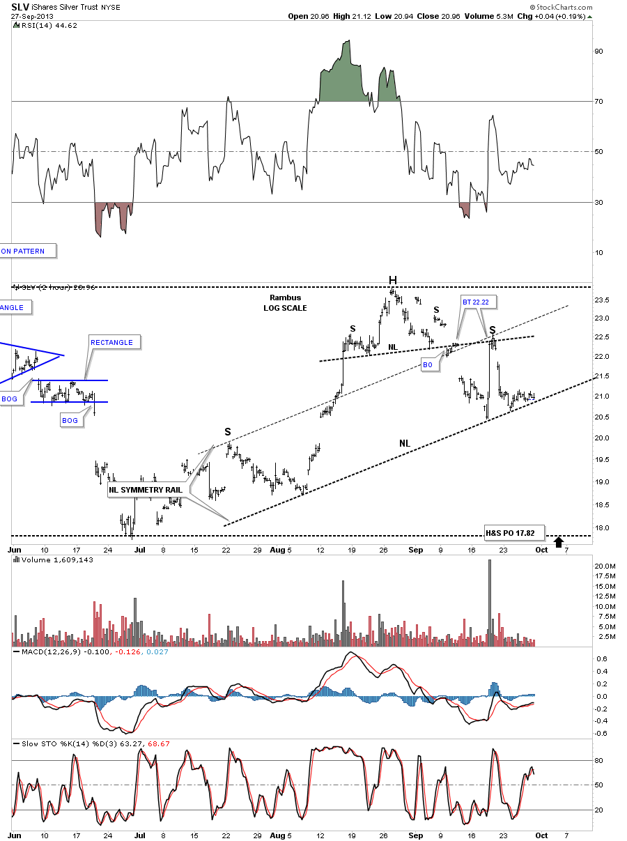
The daily look at silver shows how the flash rally ran into resistance at the neckline.
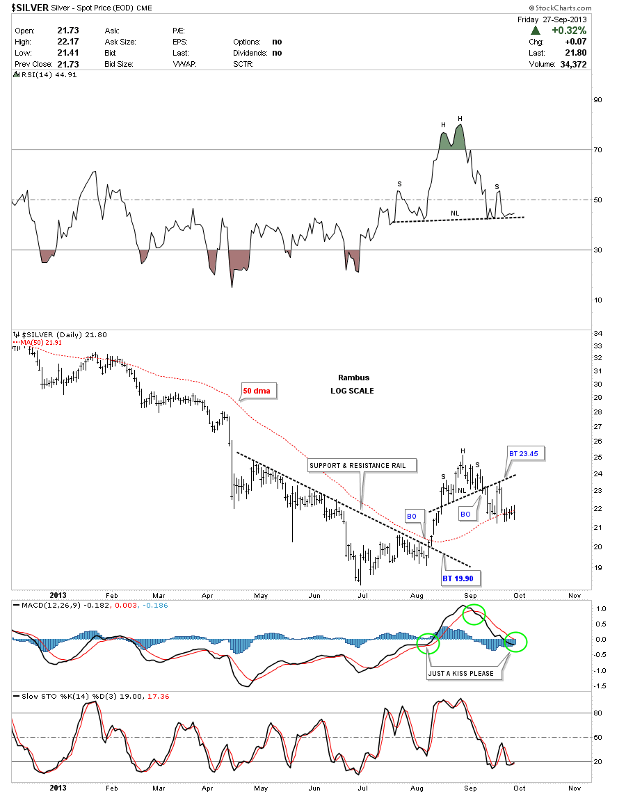
The weekly chart for silver shows its big 20 month rectangle that broke down in April of this year right at the same time gold broke below its own bottom rail. The blue arrows shows why the bottom blue rail of the rectangle is such a critical resistance zone. It’s a 38% retrace of the last reversal point in the big rectangle at reversal point #6. The brown shaded area shows how silver came close to actually backtesting the bottom rail of the 20 month rectangle. Again that bottom rail is critical resistance so if silver can ever overcome that blue rail that would be a big deal for the bulls but until they can over come that all important trendline defensive action is the best policy.
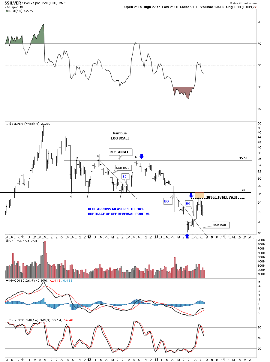
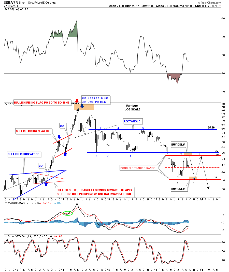
This next chart for silver shows a possible consolidation area that maybe forming at this time. It’s too early to tell yet buy it makes sense from a Chartology perspective. As you can see silver had a big decline starting at the 6th reversal point in the blue rectangle at the 35.50 area all the way down to the 17.80 June low. That was a very big decline and now it needs time to consolidate that move regardless if silver is still going to move lower. Right now silver is trading right in the center of a possible consolidation pattern as shown by the thin red dashed center rail.
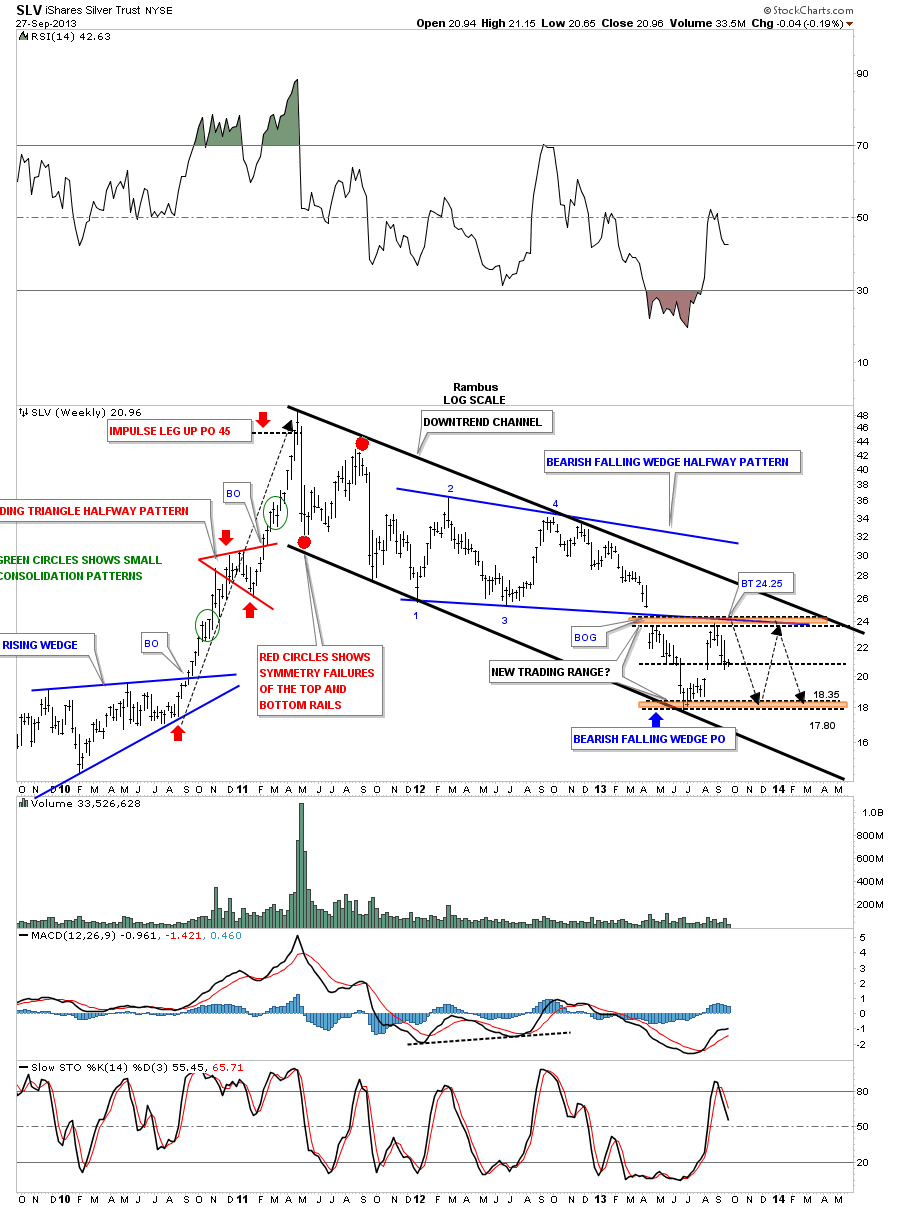
Lets look at a weekly chart for SLV that shows a slightly different consolidation pattern vs the 20 month rectangle. Here you can see a blue bearish falling wedge that has four reversal points with a big breakout gap and a completed backtest to the bottom blue rail. Again, you can see how SLV can trade sideways for many months before a definitive breakout would occur. These types of trading ranges can offer up some good profit potential if one can identify them early enough.
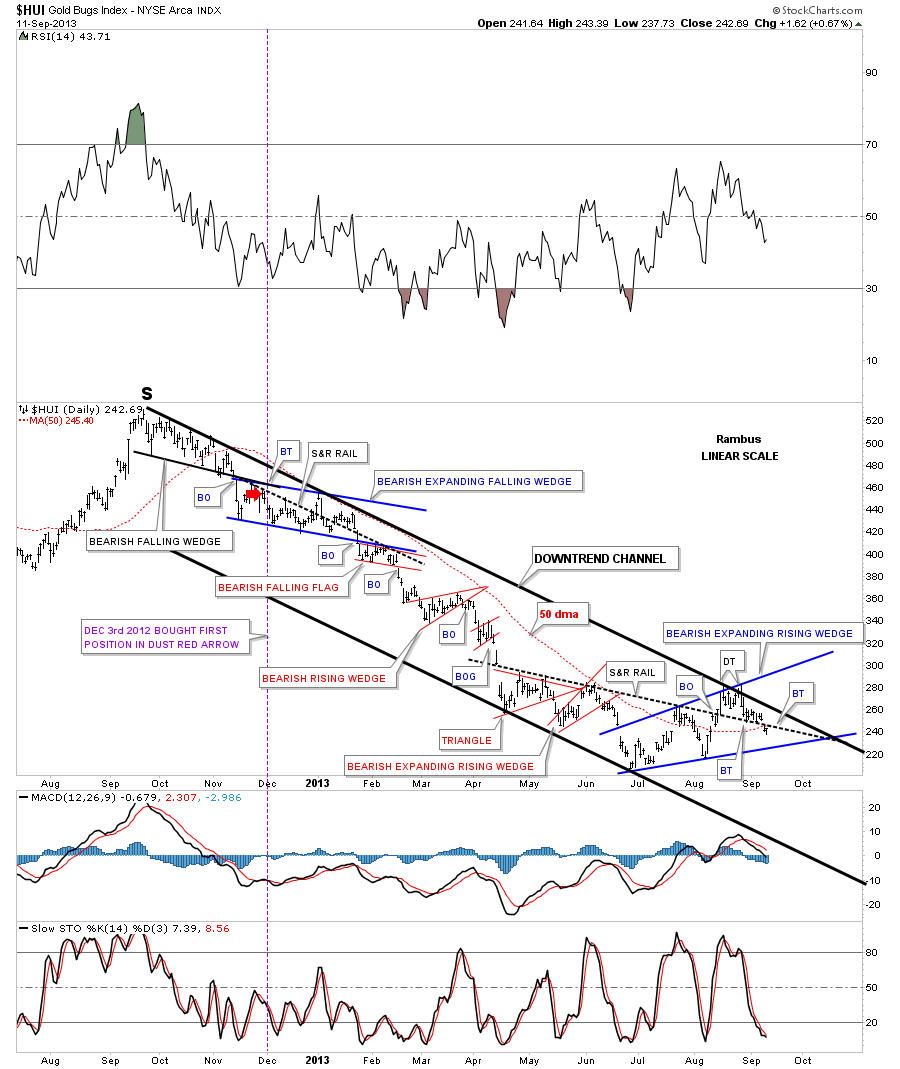
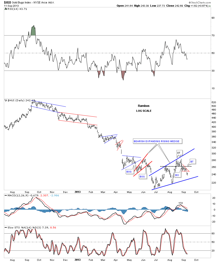
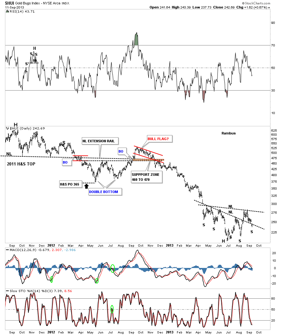
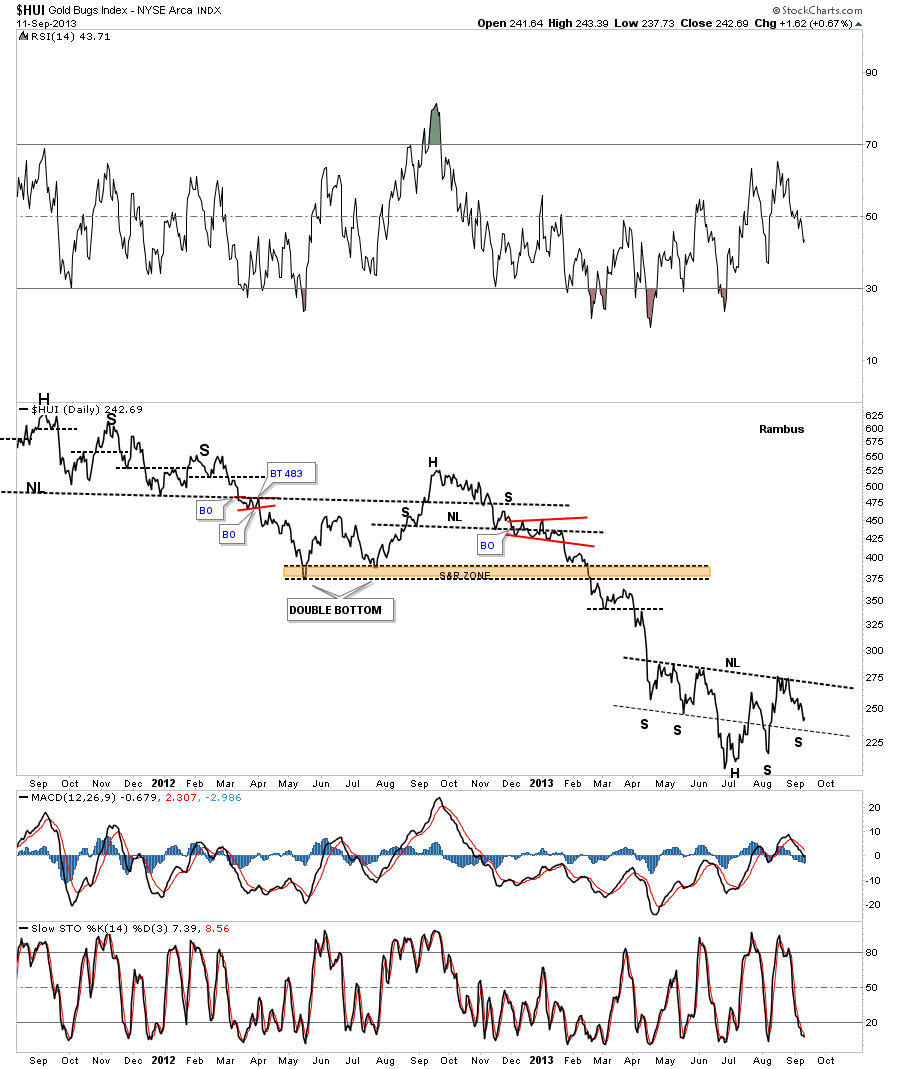
I would like to finish up this Weekend Report by looking at some of the precious metals stock indexes that are showing two different patterns at the moment. LIke I showed you on the short term charts for gold and silver they both have formed H&S consolidation patterns. The first pattern I would like to show you on the HUI is its own possible H&S consolidation pattern. Here you can see the flash rally formed the right shoulder and the HUI is now testing the possible neckline. Just think of the neckline for the HUI as positive above and below negative. Of the four precious metals stock indexes I follow the HUI is showing the most strength as the other ones have already broken down.
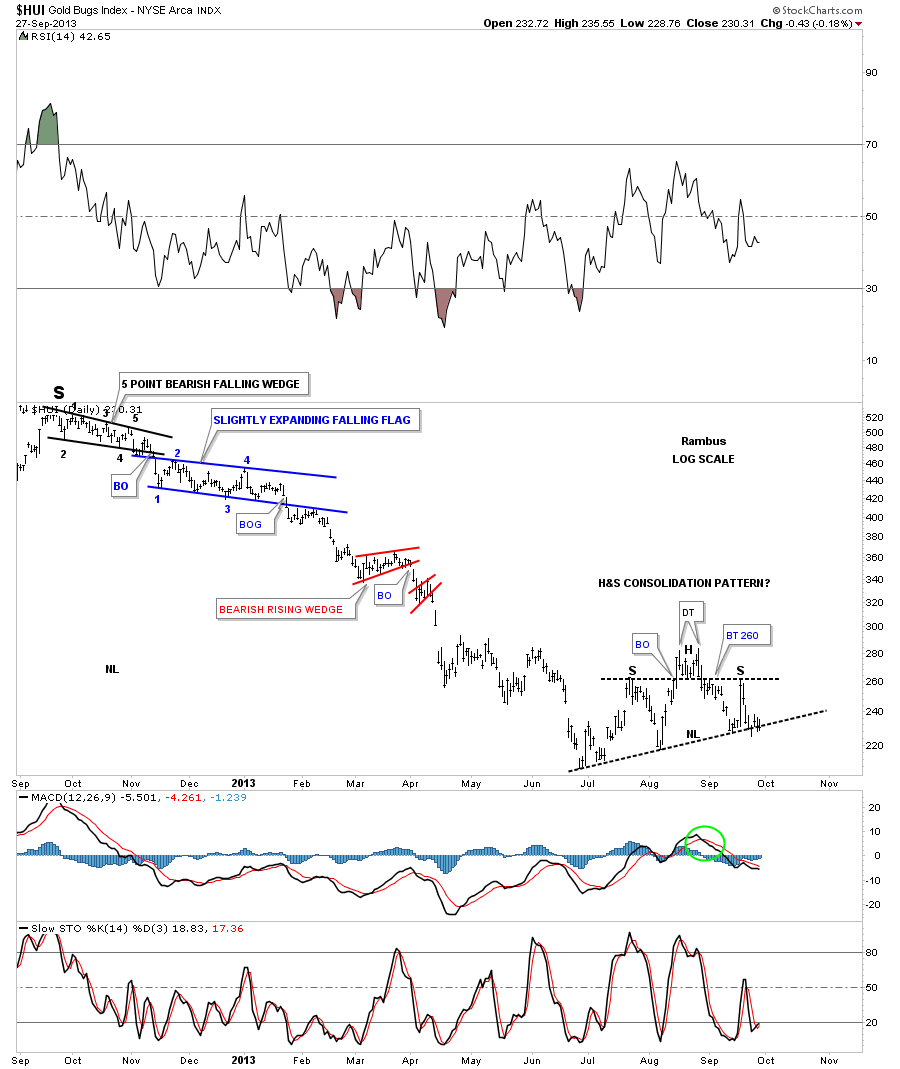
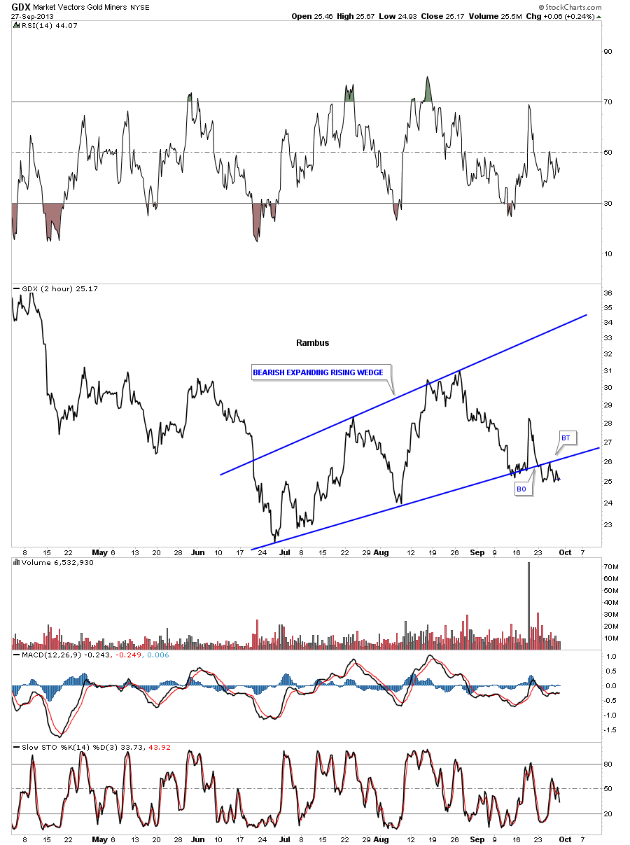
The 2 hour line chart shows the other chart pattern the PM stock indexes are all making is a bearish expanding rising wedge with the H&S pattern as part of the bigger pattern. As you can see the bottom rail is very hot as its been tested many times. We will know soon enough who is in control the bulls or the bears by what happens around this very important trendline.
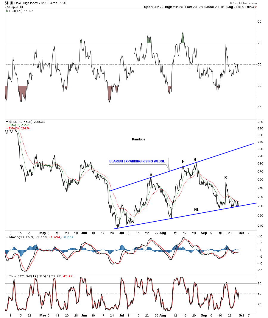
As I stated early the HUI has been the strongest PM index as it’s still trading above the bottom rail. Lets look at a few more PM indexes that are showing weakness and are trading below that all important rail. First lets look at the GDX that shows it already breaking below the bottom rail complete with a backtest. The bottom blue rail is now your line in the sand.

The 2 hour line chart for the XAU shows a breakout and backtest.
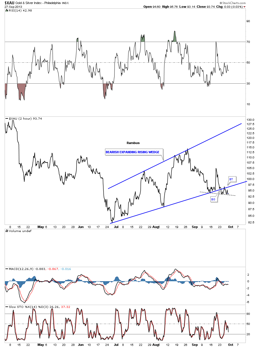
Even though there wasn’t a lot of movement this week in the precious metals stock indexes there was some very important changes being made namely the breakout and backtest of the bottom blue rails of the bearish expanding rising wedges. So far this is how we want to see the breakout occur. The important thing to keep in mind is that we don’t want to see the price action trading back above the bottom blue rail if one is short. If one is bullish that is what one wants to see. The main thing is we have a line in the sand in which to operate.
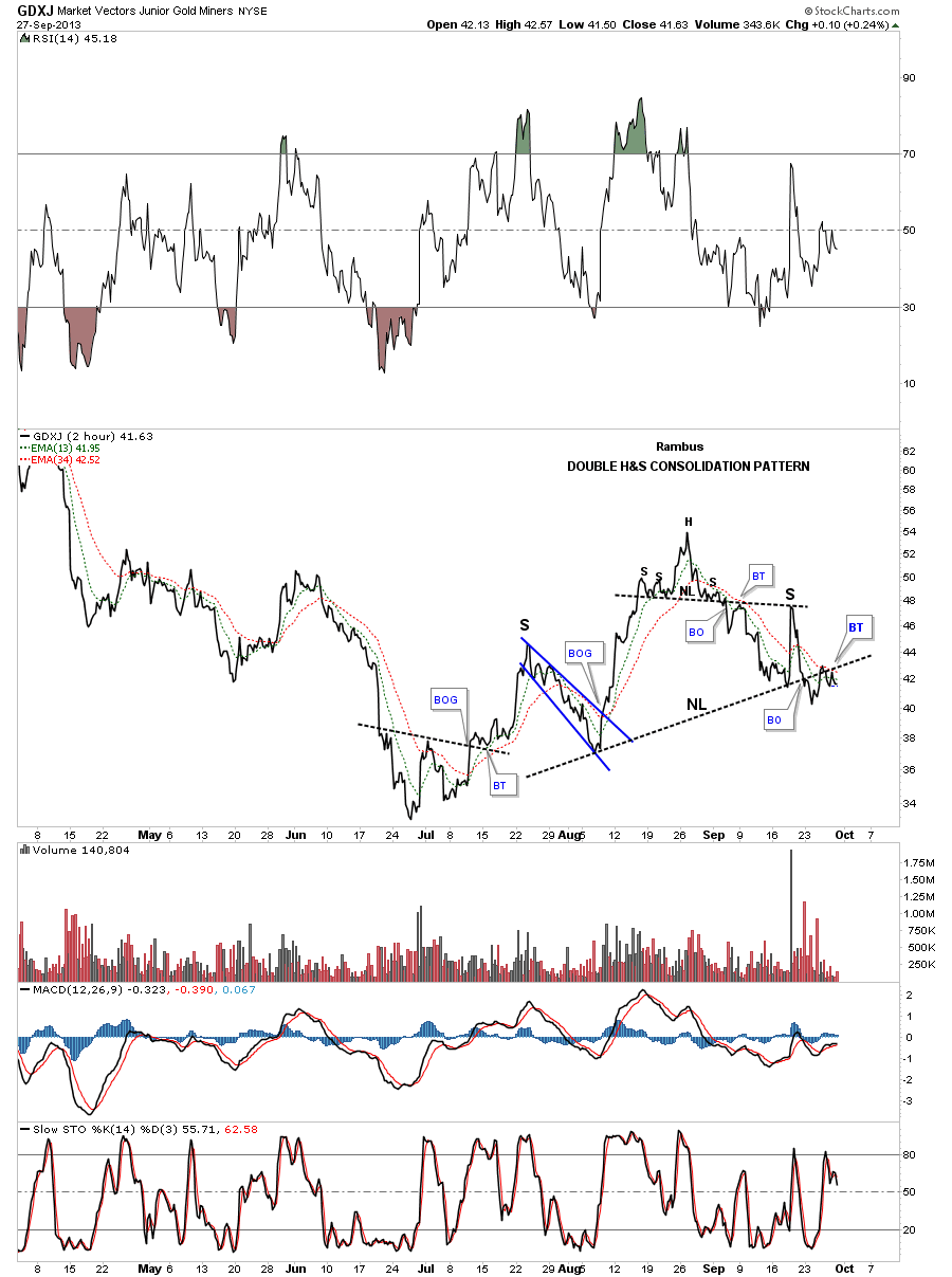
The GDXJ is showing a double H&S top in place with the all important backtest taking place right now.
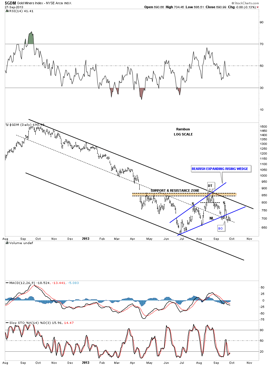
The long term daily chart for GDM shows how this potential topping area started out as a small double top which is the head portion of the H&S consolidation pattern. The brown shaded area shows why the double top head formed where it did as it was previous resistance.
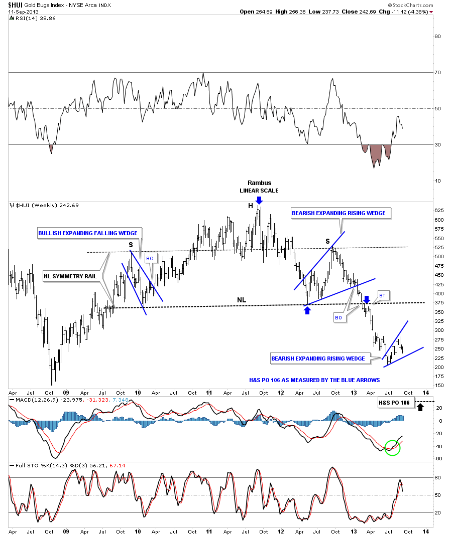
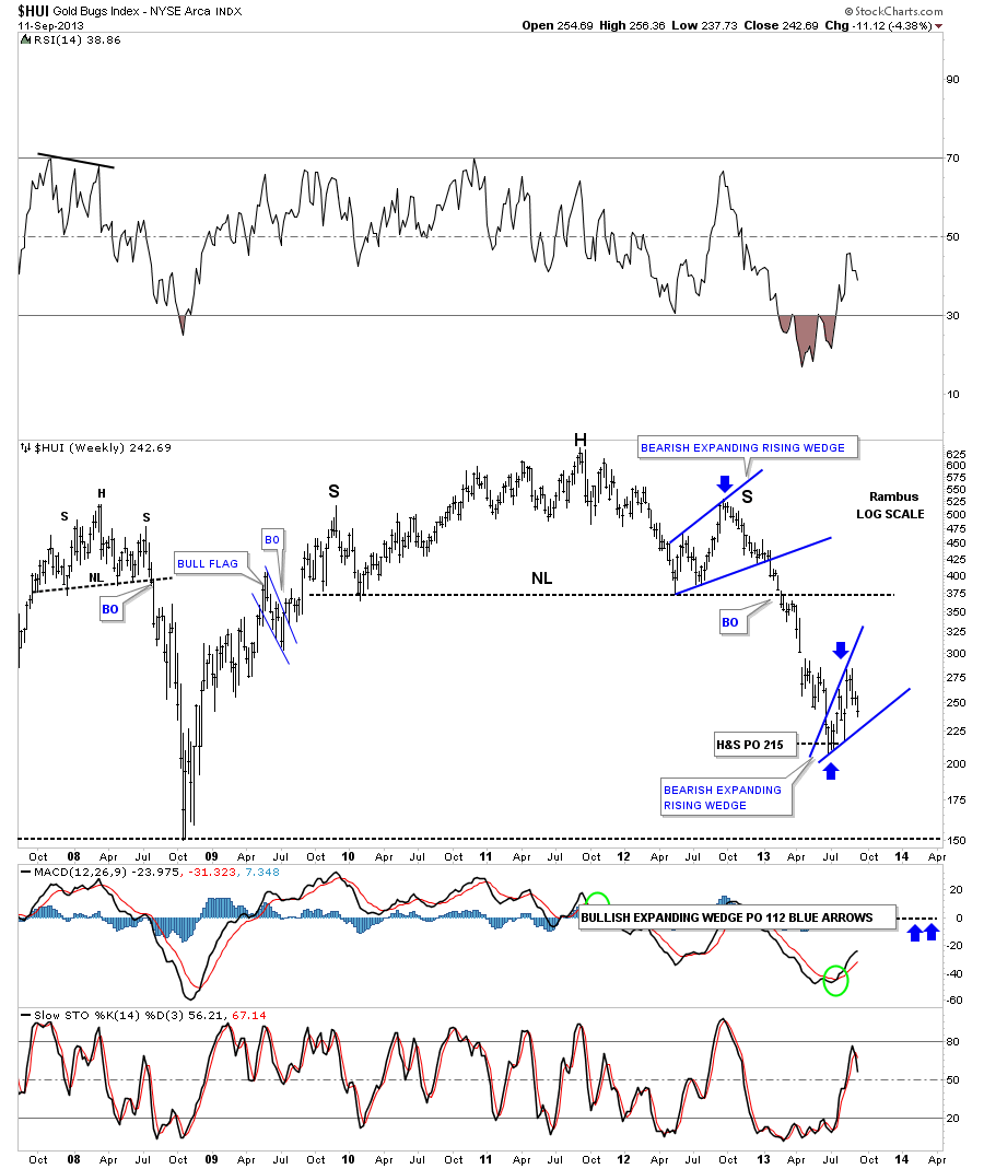
I want to leave you with one last long term chart for the HUI that shows the massive H&S top we’ve been following and our current blue expanding rising wedge pattern in linear scale. We have two price objectives as shown on the chart below. The first one is the price objective of the big H&S topping pattern that measures down to the 106 area as measured by the blue arrows. The second price target is based on our bearish expanding rising wedge as being a halfway pattern. This price target is measured from the breakout of the big H&S top to the first reversal point in the blue bearish rising wedge. Add that measurement to the breakout of the blue expanding rising wedge to get your price objective down to the 65 area, red arrows.
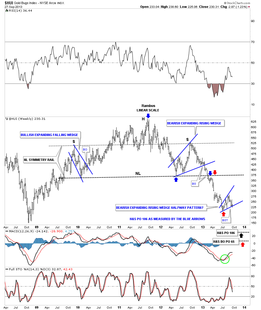
I know it seems impossible at this time for such a low price objective but when I look under the hood of the precious metals stock indexes there is still a lot of room to move lower for many of the big cap stocks. Until something changes this scenario this is what the charts are telling me. Having capital when the PM complex is finally finished going down is going to be key in taking advantage of the bargains that will be there for the taking. That’s the bottom line. This week I’ll update some of the big cap precious metals stocks again as that’s where the real story lies. All the best…Rambus