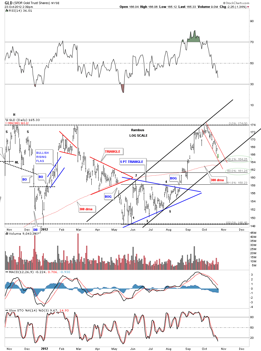
Just a quick update that shows GLD approaching the bottom rail of the downtrend channel and the 38% fib retrace. The 300 dma comes in at 163.12.
Category Archives: public
UUP Update
Weekend Report…Charting the US Dollar and Gold
In this weekend report I want to get everyone up to speed on the US dollar and gold.This week will mark the start of the 6th week of consolidation time for the precious metals complex. We are now in the timing band if these little consolidation patterns are going to be little flag type patterns. These type of patterns generally last between 3 to 6 weeks before they are complete and produce a move of similar magnitude that led up into these patterns. These patterns will look like they formed in the middle of the impulse leg when the move is completed.
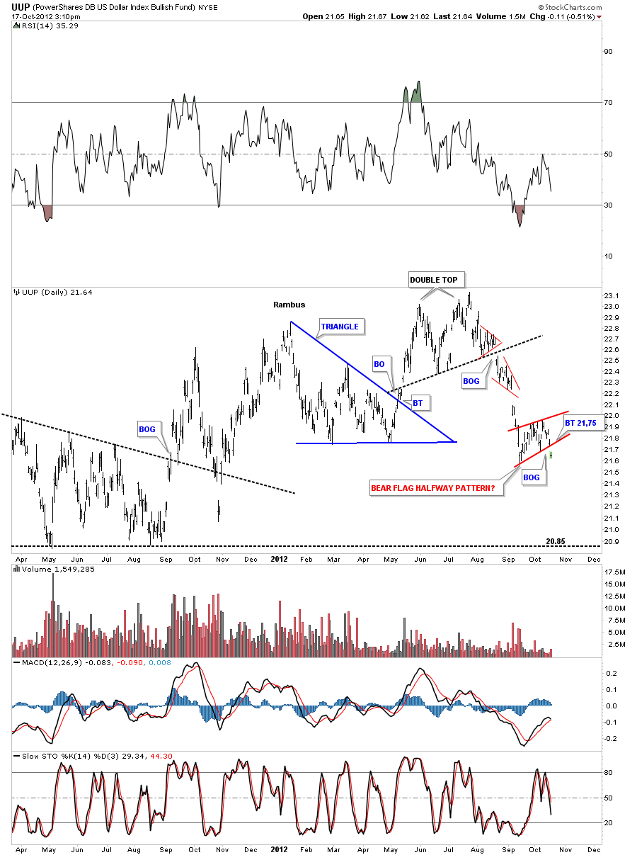
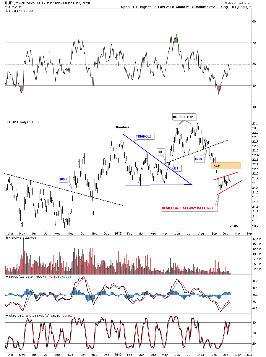
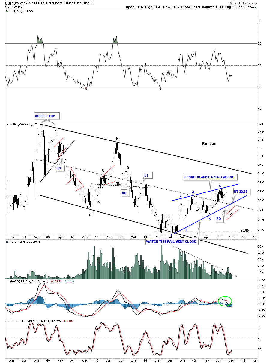
The most important chart we have to look at first is the UUP chart which is the US dollar etf. On the daily chart below you can see the possible bear flag that is equal in time to alot of the precious metals stocks small consolidation patterns. A breakout of the bottom red rail will complete the consolidation period and set the stage for the second leg higher for basically the risk on trades including the stock markets. Its still unknown how much longer the UUP will chop around within the boundaries of it’s bear flag but at some point the pattern will be complete and the move to risk on trades will begin in earnest.
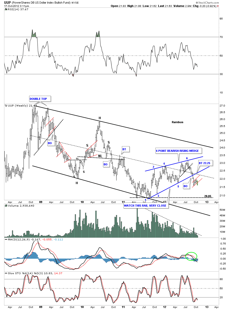
The weekly look shows the small red 5 week old bear flag still building out below the 6 point blue bearish rising wedge.
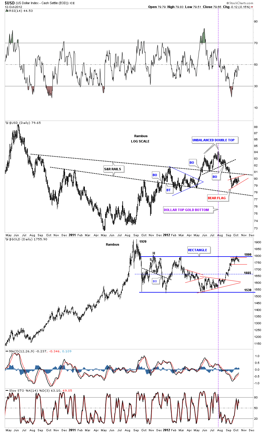
The next chart is a combo chart with the US dollar on top and gold on the bottom. The purple dashed vertical line shows how the US dollar and gold have been trading in the opposite direction since the dollar topped out above 84. You can see if the dollar breaks down below it’s red bear flag that will propel gold up and over the critical resistance rail at 1800 and complete the 5 point rectangle reversal pattern I’ve been showing for sometime now.
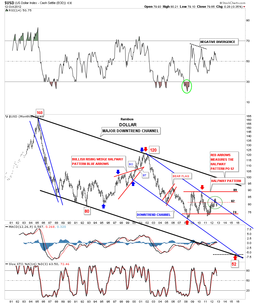
The last chart I would like to show you is the long term look at the US dollar that shows the blue downtrend channel inside the much bigger long term black downtrend channel. The green circle shows what now looks like a false breakout above the top blue trendline. As you can see the dollar is now trading back below the top blue rail for the last month and a half now. Its not the prettiest rectangle I’ve ever seen but I’m going to label it as a rectangle halfway pattern as measured by the red arrows. If in fact the red rectangle ends up being a halfway pattern the price objective would come in around the 52 area three or four years from now.
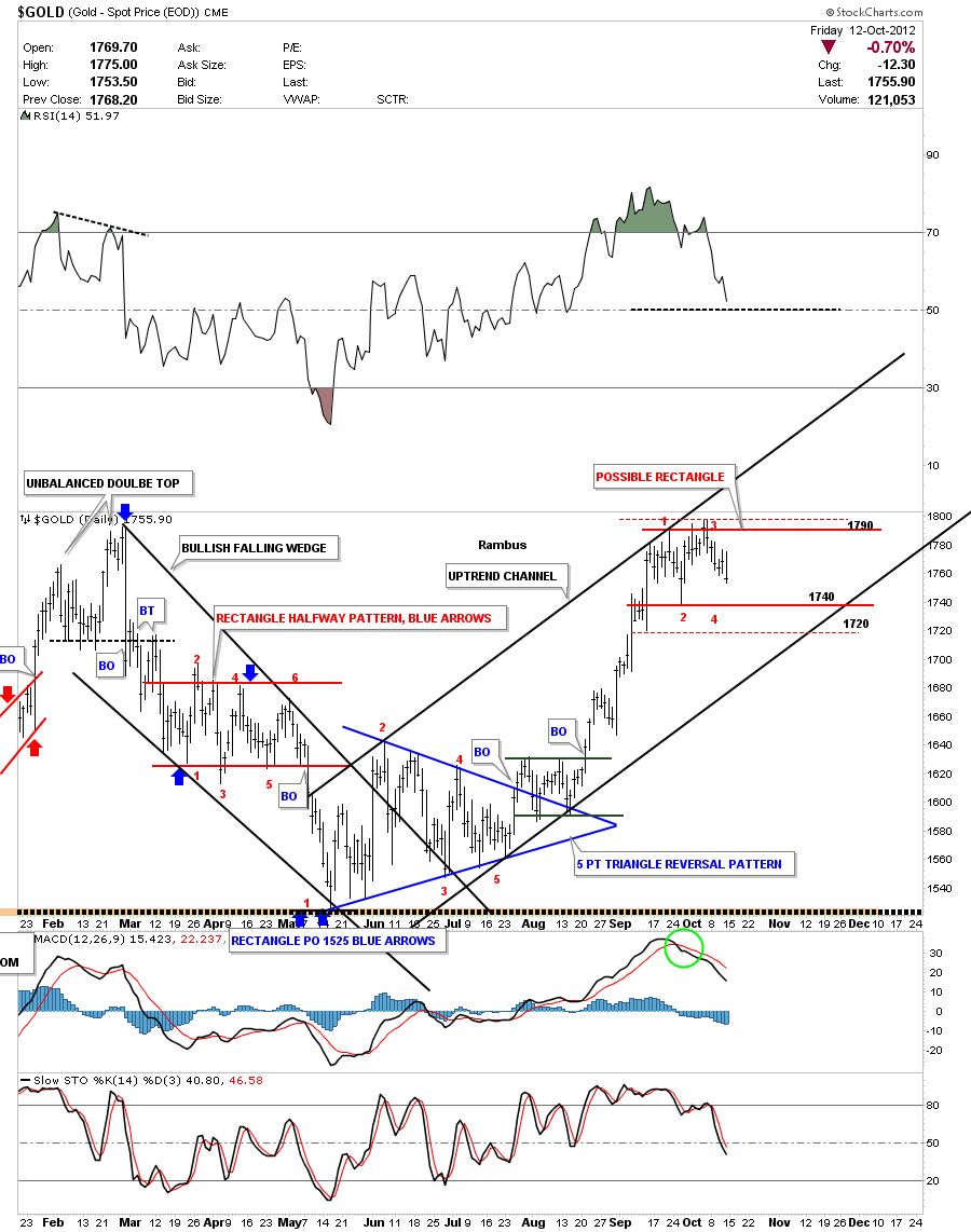
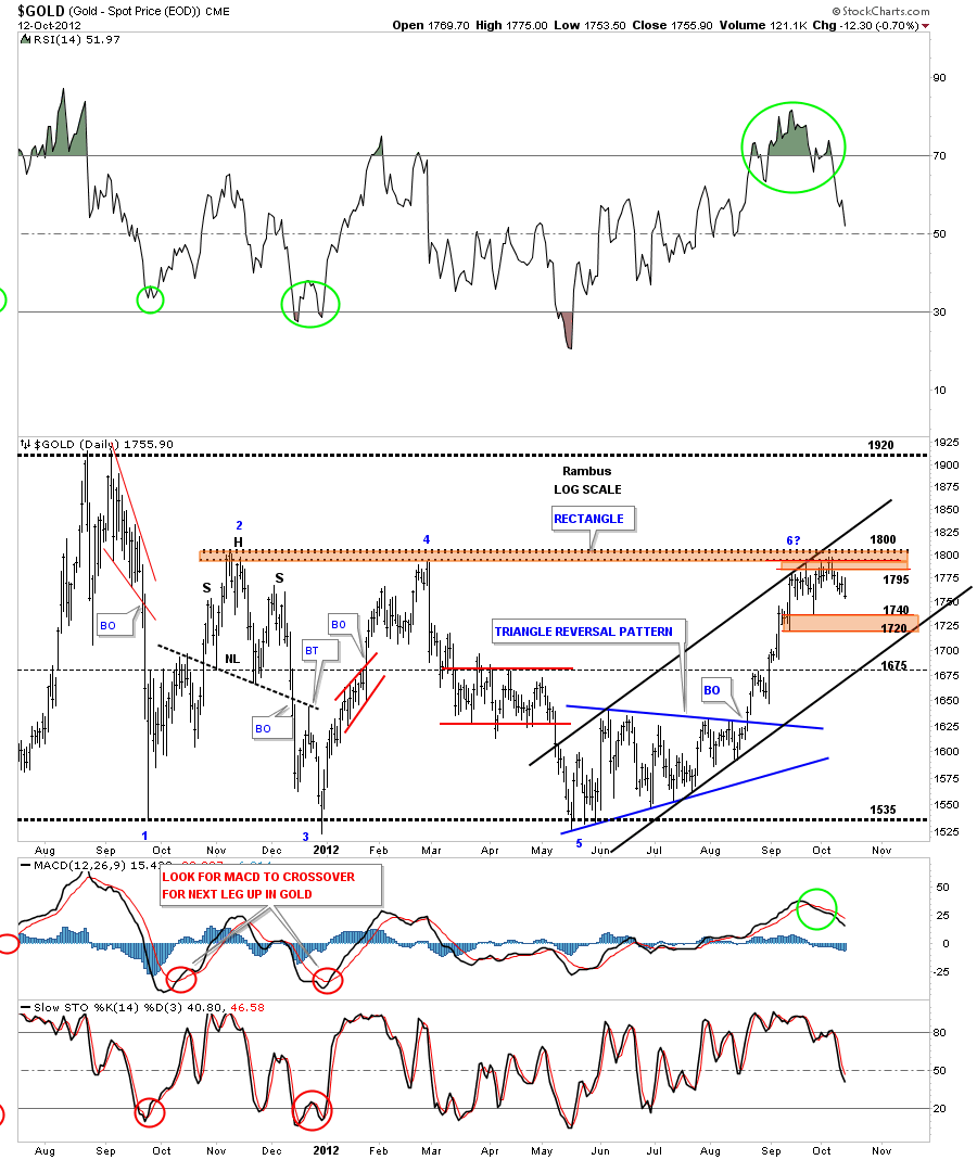
Lets now take a look at a daily chart of gold that I showed you several weeks ago with an uptrend channel and a possible horizontal trading range between 1740 and 1800. It looks like gold wants to test the 1740 bottom rail again which is about 15 points lower from Fridays close. I really wouldn’t like to see gold trade much below the 1720 area that was a previous low made on the way up. In a strong uptrend we shouldn’t see a lower low form.
Below is a longer term daily look at gold that takes in the big completed rectangle. So far the resistance at 1800 was to be expected on the last hit as everyone knew this was a resistance zone. The thing I’m would really like to see is a small consolidation pattern form right where it is now to build up the energy to finally takeout the top rail at 1800. So far so good.
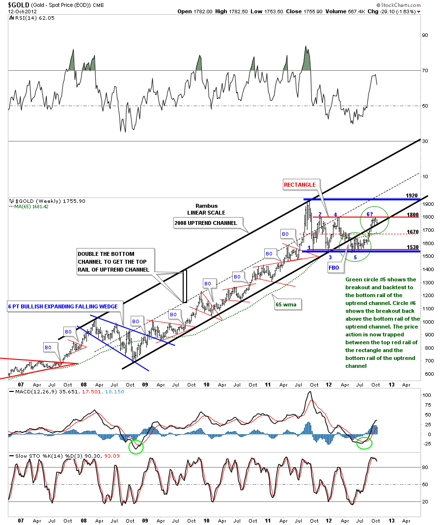
This last chart for gold is a weekly chart that I showed you many time in the past. I call this chart my 2008 uptrend channel chart as its the best look at the huge impulse leg up off the 2008 bottom. First I want to focus your attention to the bottom black rail of the uptrend channel. If you recall when gold broke that bottom rail of the uptrend channel, to the downside, that was one of the reason I had to put the model portfolio into cash. That was also about the time the HUI was also breaking below its neckline. So from a technical perspective I had no choice. The lower green circle with the #5 in it shows the breakout to the downside and then a nice clean backtest to the underside of the bottom uptrend rail. That was textbook. That same area started to trade sideways and didn’t break much lower which eventually carved out that 5 point triangle reversal pattern that is the bottom at point #5. I said at the time that the 5 point triangle reversal pattern would have enough energy to get the price of gold back up to the top rail of the big red rectangle which has occurred.
Sticking with the same chart lets now focus in on the second green circle that has point #6 in it. This is where it gets interesting. Once gold was able to trade above the bottom black rail of the 2008 uptrend channel, that was a very bullish situation, as it showed gold being very strong. Now gold is trapped between the top red rail of the rectangle and the bottom rail of the 2008 uptrend channel. As you can see on the chart below the price action is being squeezed out into an apex where the two trendlines come together. Its only going to be a matter of time before one of those trendlines gives way. This brings us back to why I showed you the dollar charts above because if the dollar breaks down from the bear flag gold will breakout above the top red rail at point #six. Once gold trades comfortably above the top rail of the rectangle the top red rail will reverse its role and act as support on any decline. It will also confirm the 5 point rectangle as a reversal pattern to the upside.
These charts above are showing that the risk on trade is entering a very critical area. The consolidation period is now 5 weeks in the making which isn’t all that long but if gold is in a strong move higher this might be all it takes to make the breakout move higher. Notice all the small red consolidation patterns that formed between the 2008 low and the top at 1920 made last September within the 2008 uptrend channel. Put yourself in one of those many red consolidation patterns to get a feel of time, as time can wear most investors out waiting for the price action to start. All the best…Rambus
…………………..
EDITOR’S NOTE :
Rambus Chartology is Primarily a Goldbug TA Site where you can watch Rambus follow the markets on a daily basis and learn a great deal of Hands on Chartology from Rambus Tutorials and Question and Answeres .
Most Members are Staunch Goldbugs who have seen Rambus in action from the 2007 to 2008 period at www.goldtent.org and now Here at Rambus Chartology since early 2012 .
To review his Work and incredible calls from the 2007-2008 period click on the top right sidebar in the “Wizard of Rambus” ….”What If !!” Post
To Follow Rambus Unique Unbiased Chart Work and participate in a Chartology Form with questions and answeres and learn the Art and Science and Mindset of a Pro Trader please Join us by subscribing monthly for $29.99 at
www.rambus1.com
We have many subscribers from all over the world who are glad they did as they enjoy the many daily updates and commentaries provided at this exciting new site
As you will see Rambus (Dave) has prepared us for this difficult period by being one of the only ones to see and warn about this incredibly debilitating PM smackdown as early as Jan 2 2012 …click on the” HUI Diamond in the Rough” Post in the “Wizard of Rambus” top right
More Recently Rambus called a Bottom in HUI in this post…and has subscribers on board for a Powerful Run to the Upside
http://rambus1.com/?p=5651
What is he seeing Now ?
You will find Rambus to be a calm humble down home country tutor with an incredible repitoir of all the TA based protocols tempered with his own one of a kind style…simply put…He wants to keep his subscribers on the right side of these crazy volitile and downright dangerous markets
See you at the Rambus Chartology
…………………….
CALVF
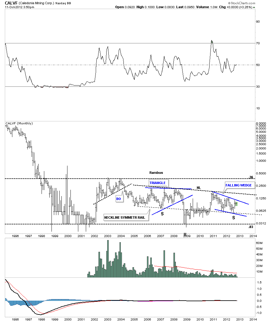
Fully asked me if I would post a chart on CALVF as there seems to be a big debate going on about this this stock. The monthly chart is the only chart that needs to be shown to get a feel of where its been in the past and where it’s currently trading. CALVF has been trading in a very large trading range between .03 at the low end and .36 at the top. There appears to be a possible large inverse H&S bottom forming with the left shoulder being a triangle and the right shoulder taking on the shape of a falling wedge. I’ve also put on a neckline symmetry rail, thin black dashed trendline, that is parallel to the neckline that showed the low for the right shoulder. The first step in the right direction would be for a close above the top rail of the falling wedge on increased volume. There could be a ping pong move between the neckline and the top blue rail of the falling wedge which would be a backtest move. The real tell will be a breakout of the potential neckline of the inverse H&S bottom on big volume. So far volume is light on the falling wedge, right shoulder, which is OK for now. It just needs to start expanding when and if a breakout occurs. All the best…Rambus
Attn Chartology Students
New Feature added
Scroll down to the bottom of the right sidebar for near realtime daily quotes (15 minute delayed)
on all Rambus PF Stocks and Kamikazi Trades
More to come
Weekend Report…Chartology of the FULL HUI BULL
Charting is one of many disciplines used to follow the markets. You have Elliot wave guys that base the market movements on wave counts and cycle analyst that look at the different cycles from short to long term. A good Elliot Wave analysts can look at a chart and start counting waves based on years of experience. An experienced cycle guy will understand when a cycle is left or right translated whereas the inexperienced cycle person will say, because the price action didn’t turn on a dime when he expected it to, cycles are worthless to follow. With any discipline that one uses, it takes alot of hard work and time to finally become some what proficient in understanding what the markets are throwing at them. There is no holy grail when it comes to the markets but if one takes the time and makes an honest effort to understand one of the disciplines they can get the odds in their favor to make a trading decision base on something other than pure emotions.
For me personally, charting the markets is the way I interrupt market movements based on chart patterns and understanding how support and resistance works. In the late 70’s an old timer gave me a book by Edwards and Magee, Technical Analysis of Stock Trends, that showed all these neat chart patterns but it bored him to tears. I couldn’t put the book down. I read it over and over again until I understood exactly what was being taught. That was the book learning part of charting. Then you have the “real time” work to put in, following the markets on a day to day basis and learning through trial and error and mistakes, that finally, if one sticks with it, things start to make sense. There is no better teacher than real time experience.
In this weekend report I would like to show you the chartology of the HUI based on my own personal experiences with charting over the years. We’ll look at some chart patterns based on bar charts and some line charts in different time frames. I want to focus in on the big one plus year top that the HUI craved out mostly in 2011. As you can see on the chart below the big top was made up of two different chart patterns. The first pattern to observe is the 11 point diamond reversal pattern. The red numbers shows you the 11 complete reversal points, which an odd number of reversal points, makes a reversal pattern. Just a quick note. A double bottom or top is a three point reversal pattern. A H&S top or bottom is a 5 point reversal pattern. The diamond on the chart below is an eleven point reversal pattern. You can have five, seven or more odd numbered reversal points in a triangle or rectangle that will reverse the trend. An even number of reversal point such as four, six, eight or more will end up being a consolidation pattern or continuation pattern.
As you can see on the chart above there is also a beautiful nine point H&S reversal pattern, not numbered. The diamond pattern actually gave one an earlier warning that the trend was about to reverse back down with the breakout gap just below point number 11. Note the quick backtest to the blue rail and then the fall away move down to the big neckline where a small rectangle formed, right on the neckline. As the little red rectangle was only a four point pattern it had to be classified as a continuation pattern to the downside. I know alot of gold bugs were not happy with my call to go to cash but the evidence was so overwhelming. I had no choice in the matter.
Next I want to show you the same one year top using a daily line chart. A line chart just takes the closing daily price and adds it to the next days closing price connected by a line. On the chart below you can see how beautiful and symmetrical the H&S top looks. On the line chart the little red rectangle formed just below the neckline, which was now acting as resistance, followed by one more small consolidation pattern, the four point bearish falling flag. The big H&S top hit its measured move price objective down at 370. That satisfied the minimum price objective.
Lets look at one more chart of the big H&S top, on a weekly line chart, before we move on to our most recent pattern, the double bottom. Sometimes a line chart can takeout some of the noise a bar chart might show by taking out some of the big interday price swings that can get wild sometimes. Double bottoms and double tops, on a line chart, often stick out like a sore thumb whereas on a bar chart they might be harder to spot. Anyway you can view the neckline as a support and resistance rail. Above is support and below is resistance. Note the other two H&S patterns on the chart below.
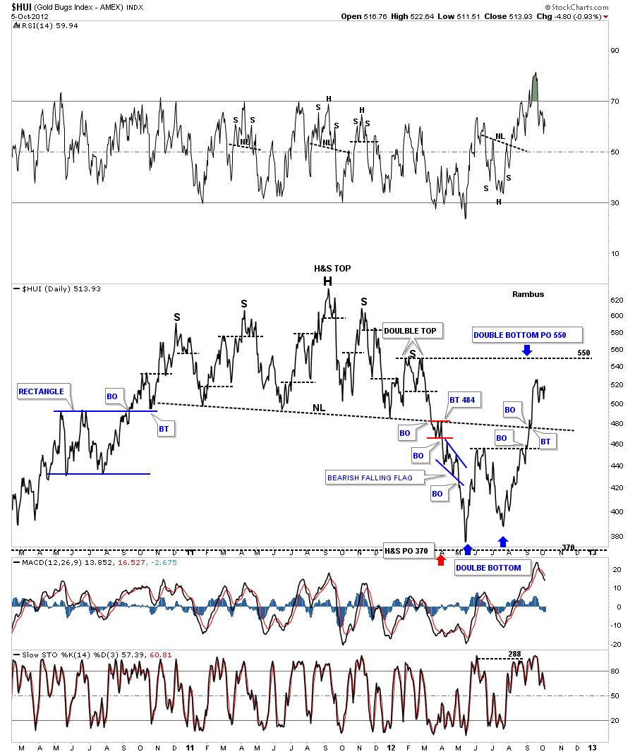
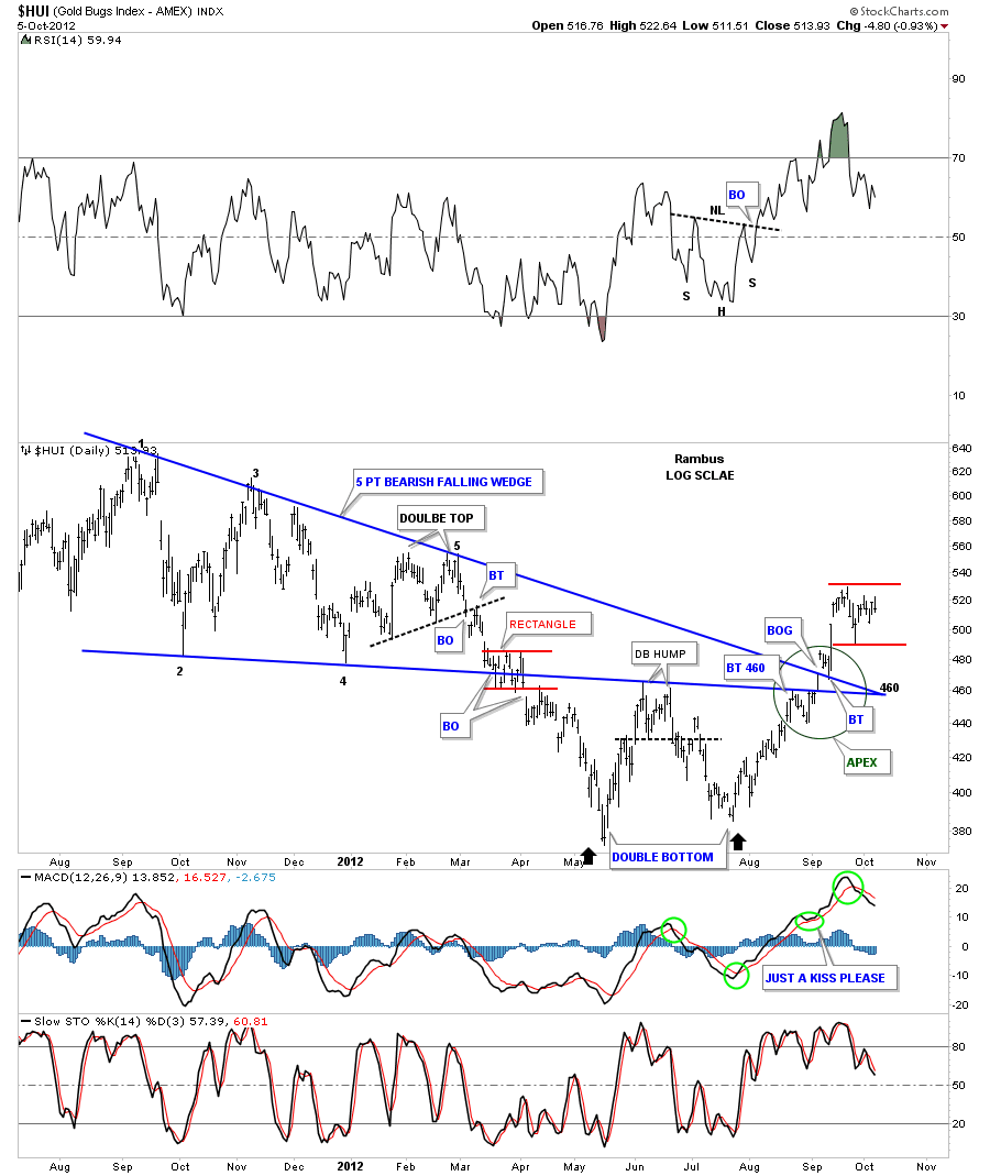
We now know that the big H&S pattern was a reversal pattern to the downside which met its downside price objective at 370. Now, in order to get a reversal of trend we need to see some type of reversal pattern form at the lows. The two patterns I always look for is an inverse H&S bottom or a double bottom. In our current situation the HUI has put in a beautiful double bottom reversal pattern. A double bottom isn’t complete until the double bottom hump is taken out to the upside. You can see on the chart below the double bottom hump was actually a small double top that separated the left and right bottoms. This chart is also a good study in how support and resistance works. If you follow the price action up from the right bottom, note how cleanly the HUI moved up and through the apex of the five point bearish falling wedge, green circle. Keep in mind trendlines on a chart pattern are nothing more than a support or resistance rail. Chart patterns shows you the battle that is going on between the bulls and the bears until one side wins out. The way the price action moved through the apex of the falling wedge tells me the HUI wants to go higher as it’s not wasting much energy getting above the two blue trendlines, at the apex, which should have been some pretty serious overhead resistance. The two small red horizontal rails shows where we should see some kind of consolidation pattern form if indeed the bottom is in place.
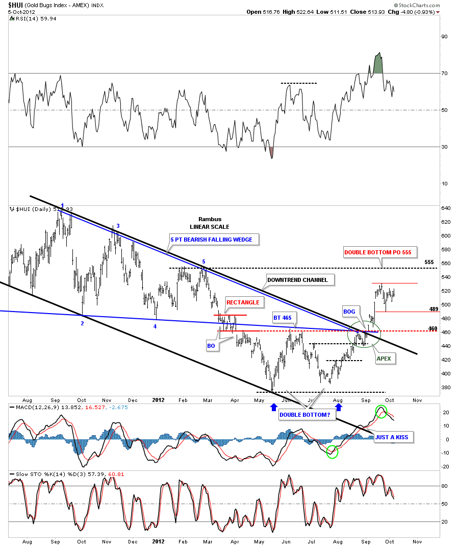
The next chart shows the downtrend channel that is made up of the five point bearish falling wedge and our current double bottom. Again note how cleanly the price action was when the HUI took out the overhead resistance, green circle.
Alot of times when a stock makes a double bottom there will be a strong decline going into the first bottom. After the second bottom is completed a move of equal magnitude, in the opposite direction can take place, I call this reverse symmetry. The chart below shows our double bottom with the reverse symmetry taking place shown by the black arrows.The double bottom has a price objective up to the 550 area
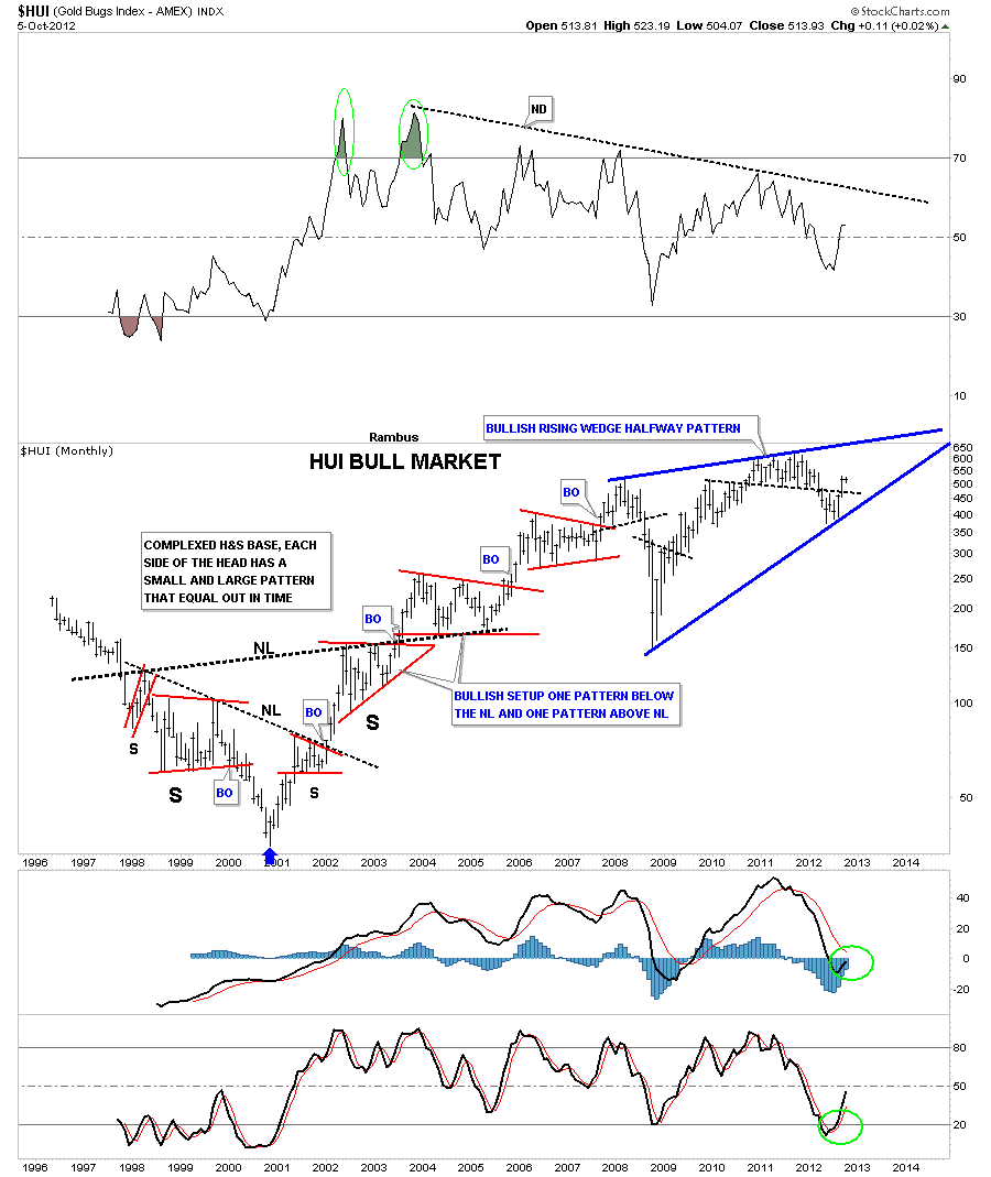
I want to show you one last chart that I have never posted. Until our recent double bottom became apparent I wasn’t able to draw in the bottom trendline. Most chartists will view this chart as bearish but I can assure you if it breaks out through the top blue rail it will be very bullish for the HUI. The chart below shows the whole bull market with the big complex inverse H&S base and the smaller red consolidation patterns that formed up until the 2008 top which is the start of this pattern. With the completion of our recent double bottom we now have four reversal points in play. The first reversal point is the 2008 H&S top. The crash low inverse H&S bottom that I showed you on the weekly line chart is reversal point number two. The big H&S top that we discussed at length at the beginning of this article is reversal point number three and our recent double bottom is reversal point number four. The HUI still has alot of work to do yet to get up to the top blue rail of the bullish rising wedge. How we interact with the top rail will give us some major clues if this potential blue bullish rising wedge will be a halfway pattern to the upside. The potential bullish rising wedge is telling us that the HUI has been basically consolidating since the 2008 H&S top was made.
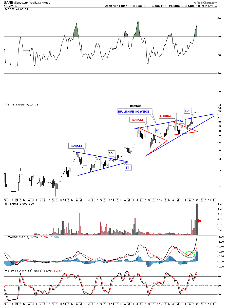
If you think a rising wedge is always a bear pattern I would like to show you one we’ve been following at Rambus Chartology that is made up of two small red individual chart patterns.
So there you have it from this chartists perspective, The Chartology of the HUI bull market to date. All the best…Rambus
………………………..
Rambus Chartology
www.rambus1.com
Wednesday Chart of the Week…Gold (Will you get filthy rich ?)
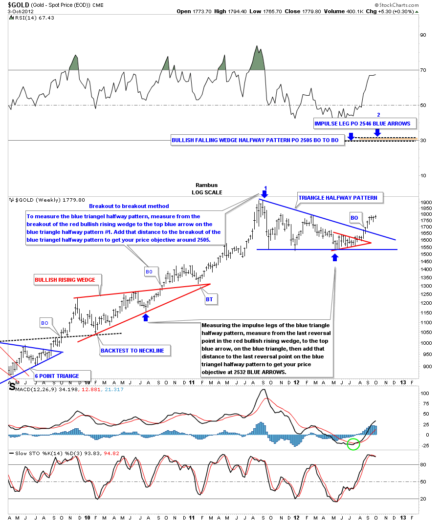
Tonight I want to show you my long term price objective for this next impulse leg higher for gold.This would be of the intermediate term variety. There are two ways I measure for price objectives. The first one is what I call the breakout to breakout method. To get your price objective you have to have two confirmed consolidation patterns in which to make your measurements. With this method I measure from the breakout of the lower consolidation pattern to the top of the current consolidation pattern. In this case the blue arrow with the #1 above it. I use the Fibonacci tool to measure the distance. Then you take that measurement from the breakout of the red bullish rising wedge to the top blue arrow with the #1 above and add that distance to the breakout of the blue triangle, our current consolidation pattern. This method gives us a price objective up to 2505 on the chart below.
Sticking with the same chart above lets look at another way to measure for a price objective. This method measures each impulse leg starting with the lower consolidation pattern, in this case the red bullish rising wedge. I always take the last reversal point in the lower consolidation pattern to start the measurement for the impulse leg, blue arrow. The impulse leg we are measuring starts with the blue arrow at the last reversal point in the red bullish rising wedge to the blue arrow with the number 1 above it. That is an impulse leg. Next, you take that measurement and add it to the last reversal point in the higher consolidation pattern, blue arrow. This method has a price objective up to 2546 for impulse leg #2. As you can see on the chart below that leaves our current blue triangle showing as a halfway pattern forming halfway between the two impulse legs number one and two. The brown shaded area, at the very top of the chart, shows how close these two completely different ways to measure a price objective come out very close together. Note this only a guide as sometimes a stock may go higher or not as high and sometimes they hit the price objective dead on the money. When we get up to the 2500 area I’ll be looking for some exhaustion and some type of reversal pattern such as a double top or H&S top to complete the impulse leg.
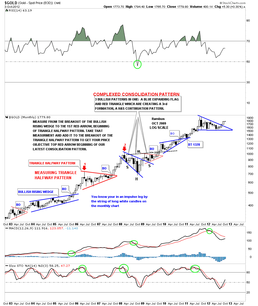
Below is a monthly chart for gold that goes back to 2003. Note the blue bullish rising wedge that formed in 2004 and 2005. I used the breakout to breakout method to nail the price objective for the 2008 high that came in just before the big crash started. The red triangle is your halfway pattern. Just measure from the breakout from the bullish rising wedge to the top of the red triangle halfway pattern, red arrow number one. Take that measurement and add it to the breakout of the red triangle to get your price objective red arrow number two. Note all the white candles for each impulse legs for number one and number two, red arrows.
Once gold breaks out to new all time highs we will have a road map to help guide us through some of the smaller corrections that will show up along the way. If we are in a true impulse leg higher the corrections will be short and sweet but will be painful when your living through them similar to what we’ve been experiencing over the last three weeks. The higher gold goes the harder it will be to stay on the bull as each pullback will affect you emotionally until you can’t take it any longer. You will come up with many good excuses to sell along the way. That’s just the way markets work. If it was easy everybody would be filthy rich which we know that can’t happen in the markets. Only a small percentage of investors become filthy rich. All the best…Rambus
EDITOR’S NOTE :
Rambus Chartology is Primarily a Goldbug TA Site where you can watch Rambus follow the markets on a daily basis and learn a great deal of Hands on Chartology from Rambus Tutorials and Question and Answeres .
Most Members are Staunch Goldbugs who have seen Rambus in action from the 2007 to 2008 period at www.goldtent.org and now Here at Rambus Chartology since early 2012 .
To review his Work and incredible calls from the 2007-2008 period click on the top right sidebar in the “Wizard of Rambus” ….”What If !!” Post
To Follow Rambus Unique Unbiased Chart Work and participate in a Chartology Form with questions and answeres and learn the Art and Science and Mindset of a Pro Trader please Join us by subscribing monthly for $29.99 at
www.rambus1.com
We have many subscribers from all over the world who are glad they did as they enjoy the many daily updates and commentaries provided at this exciting new site
As you will see Rambus (Dave) has prepared us for this difficult period by being one of the only ones to see and warn about this incredibly debilitating PM smackdown as early as Jan 2 2012 …click on the” HUI Diamond in the Rough” Post in the “Wizard of Rambus” top right
More Recently Rambus called a Bottom in HUI in this post…and has subscribers on board for a Powerful Run to the Upside
http://rambus1.com/?p=5651
What is he seeing Now ?
You will find Rambus to be a calm humble down home country tutor with an incredible repitoir of all the TA based protocols tempered with his own one of a kind style…simply put…He wants to keep his subscribers on the right side of these crazy volitile and downright dangerous markets
See you at the Rambus Chartology
…………………….
XAU Update
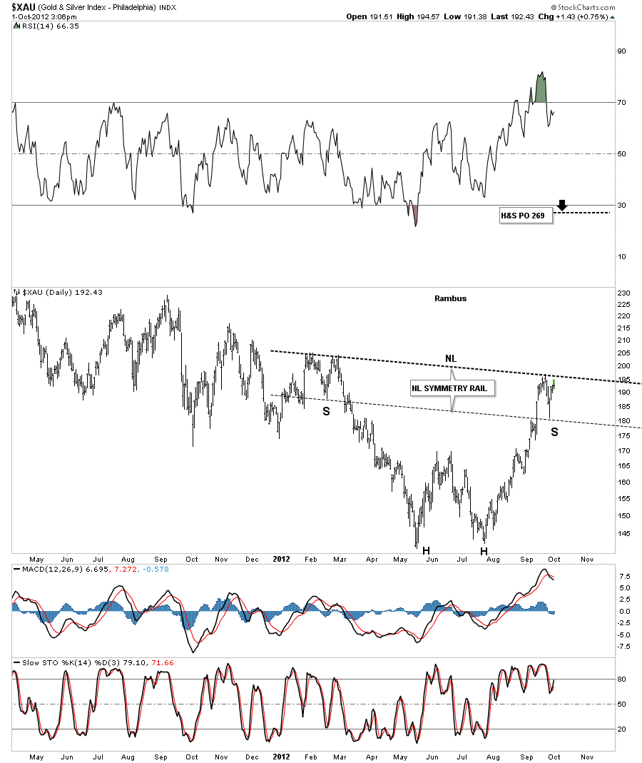
The XAU has one of the cleanest charts of the precious metals stock indexes in that the double bottom was very symmetrical, both bottoms were very close to the same low. It also had very nice reverse symmetry in this last rally off the second bottom. That brings us up to speed on the reason for this post. On the chart below I’ve drawn in a possible inverse H&S bottom with the head portion being the double bottom. I’ve also added a neckline symmetry rail that so far nailed the low for the possible right shoulder. I have shown you before how I use a neckline symmetry rail to look for an area that might form the bottom of the right shoulder. Sometimes they can hit dead on the money like this XAU chart and sometimes the low for the bottom of the right shoulder may be higher or lower. It just gives us a rough estimate, if one is looking for a H&S pattern, to look for some symmetry to the left shoulder. What I’ll be watching very close is how we interact with the neckline which will give us some important clues if I’m right about the potential game changer. This will show up in the other precious metals stock indexes as well.
EDITOR’S NOTE :
Rambus Chartology is Primarily a Goldbug TA Site where you can watch Rambus follow the markets on a daily basis and learn a great deal of Hands on Chartology from Rambus Tutorials and Question and Answeres .
Most Members are Staunch Goldbugs who have seen Rambus in action from the 2007 to 2008 period at www.goldtent.org and now Here at Rambus Chartology since early 2012 .
To review his Work and incredible calls from the 2007-2008 period click on the top right sidebar in the “Wizard of Rambus” ….”What If !!” Post
To Follow Rambus Unique Unbiased Chart Work and participate in a Chartology Form with questions and answeres and learn the Art and Science and Mindset of a Pro Trader please Join us by subscribing monthly for $29.99 at
www.rambus1.com
We have many subscribers from all over the world who are glad they did as they enjoy the many daily updates and commentaries provided at this exciting new site
As you will see Rambus (Dave) has prepared us for this difficult period by being one of the only ones to see and warn about this incredibly debilitating PM smackdown as early as Jan 2 2012 …click on the” HUI Diamond in the Rough” Post in the “Wizard of Rambus” top right
More Recently Rambus called a Bottom in HUI in this post…and has subscribers on board for a Powerful Run to the Upside
http://rambus1.com/?p=5651
What is he seeing Now ?
You will find Rambus to be a calm humble down home country tutor with an incredible repitoir of all the TA based protocols tempered with his own one of a kind style…simply put…He wants to keep his subscribers on the right side of these crazy volitile and downright dangerous markets
See you at the Rambus Chartology
Weekend Report…Gold Testing Critical Resistance at 1800
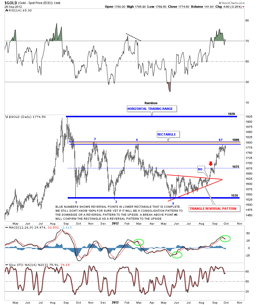
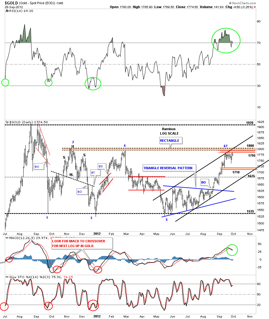
In this weekend report I want to show you the chartology of gold focusing in on the last year of trading that takes in the all time high made last year about this time at 1920. After the all time high was made it only took alittle over a month for gold to correct almost 400 points down to the 1535 area. That correction was about as violent as they come. Alot of times when you see a panic decline like that it can mark the low for the consolidation area that tends to form if the bull market is still intact. On the chart below you can see that is exactly what happened. That panic low has held for close to a year now with two more touches, one in December of 2011 and one last touch in May of this year points three and five.
On the chart above you can see the big horizontal trading range that gold has produce since it’s bull market high at 1920. There are several possible chart patterns that could play out as this one year consolidation area matures. On the lower 2/3’s of the chart I have marked the number of reversal points on the rectangle from one to 6?. That rectangle is a completed pattern and gold is now trading at the top rail at roughly 1800, point 6? This is the most important area for gold right now as it has completed the 5th reversal point that puts this consolidation area in the reversal pattern category. Because the rectangle has formed below the all time high we have to see some type of reversal pattern to reverse the trend from down to up. The odd numbered 5 point rectangle fits the bill. Gold has to take out the 1800 top rail to confirm the rectangle as a reversal pattern. Until that happens gold is still working within the confines of the big rectangle.
The next chart focuses in on some of the internal makeup of the rectangle that has been building for close to a year now. The last pattern that was built, within the rectangle, was the blue triangle reversal pattern that strongly suggested, at the time, that gold would move up to test the top rail of the rectangle, which it has done. Again you can see how important the top rail of the rectangle is at 1800. Gold has been chopping around just below the all important trendline for close to two weeks now.
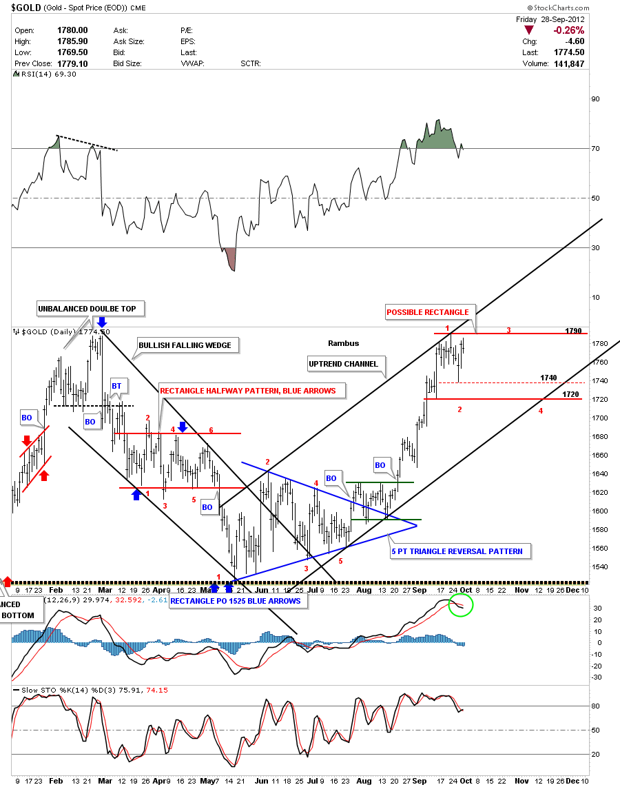
Lets now look at the last nine months of price action within the big rectangle that shows the previous leg down and our current leg up. The last decline took on the formation of a bullish falling wedge with a red rectangle that formed as a halfway pattern to the downside. From that low at 1535 gold then went on to form that all important 5 point blue triangle reversal pattern to the upside. As you can see on the chart below the last rally was very strong when it reached the top of the rectangle at 1800 or so. That put the RSI indicator, at the top of the chart, in overbought territory. What I would like to see and would be good for gold is to work off some of the overbought condition by trading sideways just below the the all important 1800 area. Its still way too early to know if this is what will happen but I’ve marked a possible trading range, red horizontal trendlines, that could allow gold to chop around for another month and work off some of the overbought condition that would be very healthy and not hurt the overall bullish look of the chart.
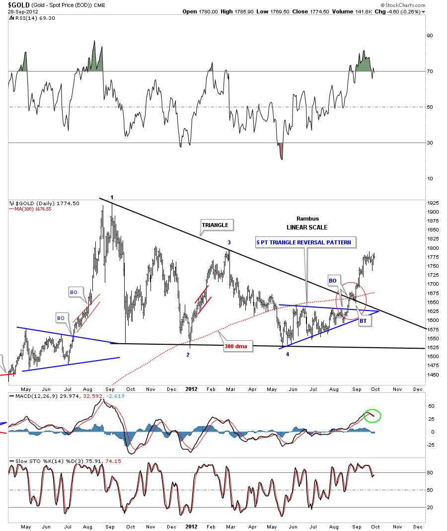
What I’ve shown you so far had been the horizontal trading range gold has been in since the 1920 high made last year. There is another possible important chart pattern that is in play also and that is the big black triangle consolidation pattern on the chart below. The red circle shows the breakout and backtest to the top rail of the triangle and the 300 dma which was most important. As you can see the most recent price action is now trading just below the all important 1800 area that is the top rail of the rectangle that I showed you on the charts above. So, anyway you look at it 1800 is still the most important number to keep your eyes on.
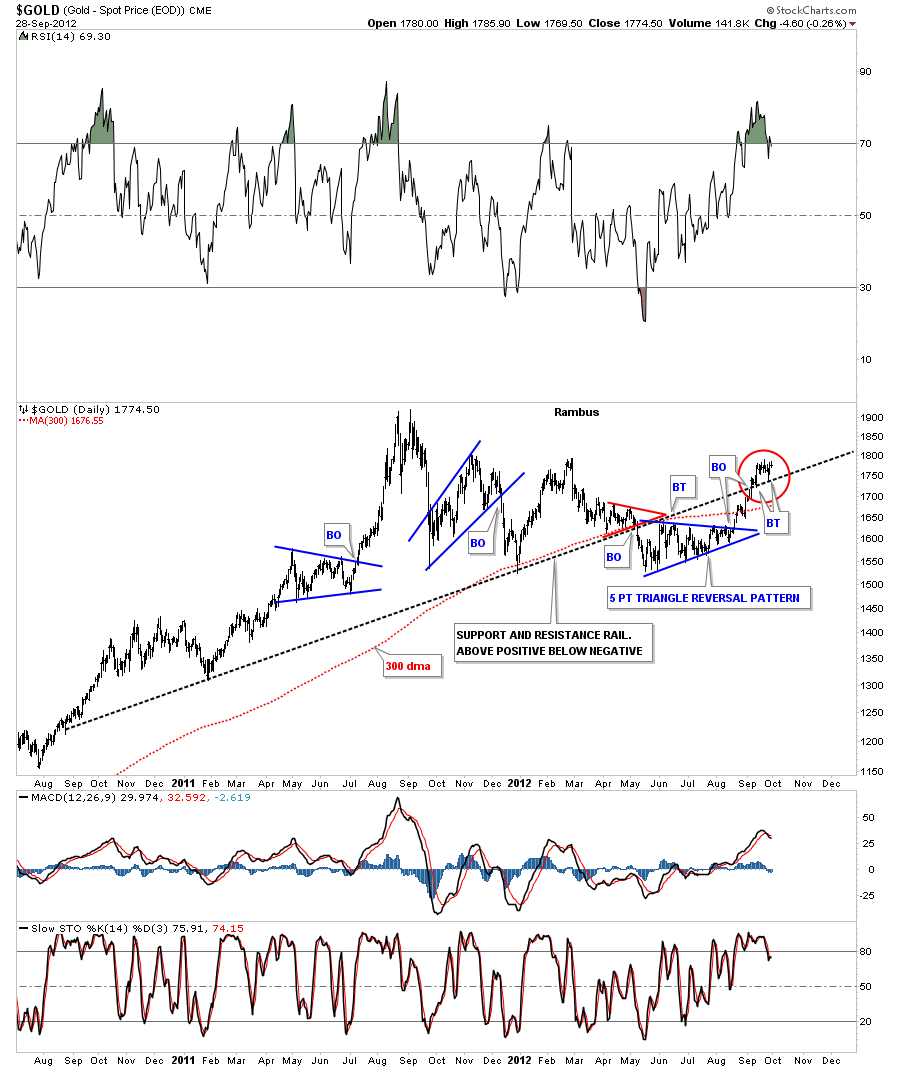
There was an important development for gold that has a support and resistance rail that stretches all the way back to August of 2010. The simplest way to view support and resistance rails like this is, when the price action is trading above, things are positive and when below, is negative. As you can see on the chart below this S&R rail has reversed its role from support and then when gold broke below it it acted as resistance. The blue five point triangle reversal pattern gave gold enough energy to break back above that important support and resistance rail. The red circle shows gold breaking back above the S&R rail with two small backtest from the topside. As long as gold can trade above that S&R rail it will remain positive.
This last chart for gold is a long term look using candlesticks. When gold has a positive month you will see a white candle and when it has a negative month you will see a black candle. When you start a new impulse leg up you will see a string of white candles. That helps me confirm the move is impulsive in nature. As you can see on the chart below we have four white candles in a row right now. So gold is off to a good start if it can string together a few more white candles before we see a black one.
Gold has had a strong rally after breaking out from the 5 point triangle reversal pattern back in late August. The price has now risen to the top of the horizontal resistance rail, of the rectangle, at 1800. When you see 1800 taken out to the upside you will know gold is strong and the next point of resistance will be the all time high at 1920. Gold could very easily chop around for several weeks to a month before the actual breakout occurs to relive some of the overbought condition. That would not hurt the overall bullish situation gold is now in. All the best…Rambus
………………..
EDITOR’S NOTE :
Rambus Chartology is Primarily a Goldbug TA Site where you can watch Rambus follow the markets on a daily basis and learn a great deal of Hands on Chartology from Rambus Tutorials and Question and Answeres .
Most Members are Staunch Goldbugs who have seen Rambus in action from the 2007 to 2008 period at www.goldtent.org and now Here at Rambus Chartology since early 2012 .
To review his Work and incredible calls from the 2007-2008 period click on the top right sidebar in the “Wizard of Rambus” ….”What If !!” Post
To Follow Rambus Unique Unbiased Chart Work and participate in a Chartology Form with questions and answeres and learn the Art and Science and Mindset of a Pro Trader please Join us by subscribing monthly for $29.99 at
www.rambus1.com
We have many subscribers from all over the world who are glad they did as they enjoy the many daily updates and commentaries provided at this exciting new site
As you will see Rambus (Dave) has prepared us for this difficult period by being one of the only ones to see and warn about this incredibly debilitating PM smackdown as early as Jan 2 2012 …click on the” HUI Diamond in the Rough” Post in the “Wizard of Rambus” top right
More Recently Rambus called a Bottom in HUI in this post…and has subscribers on board for a Powerful Run to the Upside
http://rambus1.com/?p=5651
What is he seeing Now ?
You will find Rambus to be a calm humble down home country tutor with an incredible repitoir of all the TA based protocols tempered with his own one of a kind style…simply put…He wants to keep his subscribers on the right side of these crazy volitile and downright dangerous markets
See you at the Rambus Chartology
…………………….

