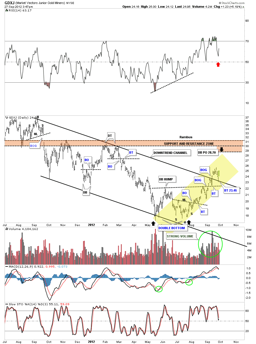
Just a quick update on the GDXJ chart that I showed you a couple of days ago. I showed you how perfect this junior index has been performing. The yellow shaded area shows you how each breakout was followed by a backtest. Yesterday we got the backtest to the the top rail of the downtend channel. This was a big deal IMHO. It told us that top rail is still very hot and to be respected. The yellow shaded area should be in a textbook somewhere that shows how charting works and that it isn’t some kind of voodoo magic or something. Its all based on investor psychology. Read my post on September 24th.
Category Archives: public
Weekend Report…The Gold to XAU Ratio, Some Major Clues
In this weekend report I would like to show you some gold ratio charts that compare gold to commodities or indexes. Ratio charts are a good way to see how a stock or index is moving relative to another stock or index. If you have several different areas of the market that you think might offer a good trade setup you can do a ratio chart to see which area is stronger or outperforming. This can be very helpful when it comes time to put your hard earned money on the line.
If you’re an investor in the precious metals complex, stocks and bullion, a gold ratio chart that compares say gold to the gold stocks, this will let you know which one is the best place to invest. If you’ve been investing in the precious metals complex for any length of time you know that the metals can move higher while the precious metals stocks hardly move at all. And then there are times when the PM stocks are strongly outperforming the metals. This is where the ratio charts come in handy.
The first chart I would like to show you is the Gold to XAU ratio chart that compares gold to the precious metals stocks that make up the XAU. So, if we are comparing gold to the pm stocks and gold is performing stronger than the stocks the ratio will rise. On the other hand if the ratio is falling that means the pm stocks are outperforming gold. This can be alittle deceiving sometimes because they can both fall at the same time but if gold is not falling as fast as the precious metals stock the ratio will rise even tho they are both declining. Its a relative thing. In this case gold is still outperforming the pm stocks by not going down as fast which is showing strength against the pm stocks.
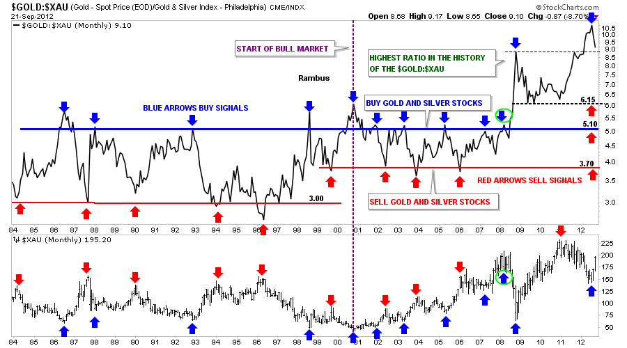
The chart below is a combo chart that shows the Gold : XAU ratio on top and the XAU chart on the bottom. The chart looks busy when you first look at it but its not. Lets focus on the top chart, the Gold : XAU ratio that goes all the way back to 1984. What becomes immediately apparent is the horizontal trading range the Gold to the XAU ratio chops out over time. I’ve drawn in a blue horizontal trendline that shows the top of the ratio and the red horizontal rail shows the bottom of the ratio. During the bear market years, before 2001, whenever the ratio got above 5 that was a good time to buy the precious metals stocks, blue arrows. The reason for that is because gold had been strongly outperforming the pm stocks as it reached the blue trendline. As the markets are always looking for balance it was now time for the pm stocks to rally as the pm stocks were now under valued and the ratio would then fall back down to the horizontal red trendline around three, red arrows. Note the blue arrows shows the highs in the ratio on top and the lows on the XAU on the bottom chart. The red arrows shows the bottom of the ratio chart on top that correspond to the tops on the XAU chart below.
There is still alot of information on the chart above that I would like to go over yet. The dashed vertical purple line represents the beginning of our current bull market for the XAU. Since the beginning of this new bull market the bottom red horizontal rail has risen from 3 before the bull market started to now about 3.70. The top blue rail has stayed pretty much in the same place showing where to buy the precious metals stocks. Up until the big crash in 2008 one could buy their precious metals stocks everytime the ratio got up to the blue trendline and sell their PM stocks when the ratio fell down to the red trendline around 3.70 as shown on the XAU chart.
I’m going to show the same chart below as there is one more important feature that needs to be addressed. Lets now focus on the 2008 crash, blue arrows with a green circles. This is the point where a new paradime shift took place never before seen with this ratio. The precious metal stocks were now the most undervalued in history compared to the price of gold. As you can see on the chart below once the blue horizontal rail was broken to the upside the breakout was vertical. On a bar chart the ratio would show a spike all the way up to 11 which more than doubled the trading range since the bull market for precious metals began in 2001. One would have thought that it couldn’t get much worse since the XAU had a nice 2 year rally taking the ratio back down to 6.15 which is still considerably higher than the old blue resistance rail at 5.10. From that point the ratio rallied all the way backup and above the 2008 crash spike on the monthly line chart over the next year. During that same time the XAU was in it’s own one year bear market which seems to have bottomed in July. The million dollar question now is will the XAU outperform gold in such a way that the ratio will fall back into it’s normal trading range between 3.70 red horizontal rail and the 5.10 blue horizontal rail? Even after our most recent rally in the XAU this ratio is telling us the precious metals stocks are still extremely cheap compared to gold. I’ve place three red arrows, on the right side of the chart, that shows where we could see the ratio bottom. We’ll just have to wait and see how this plays out over time.
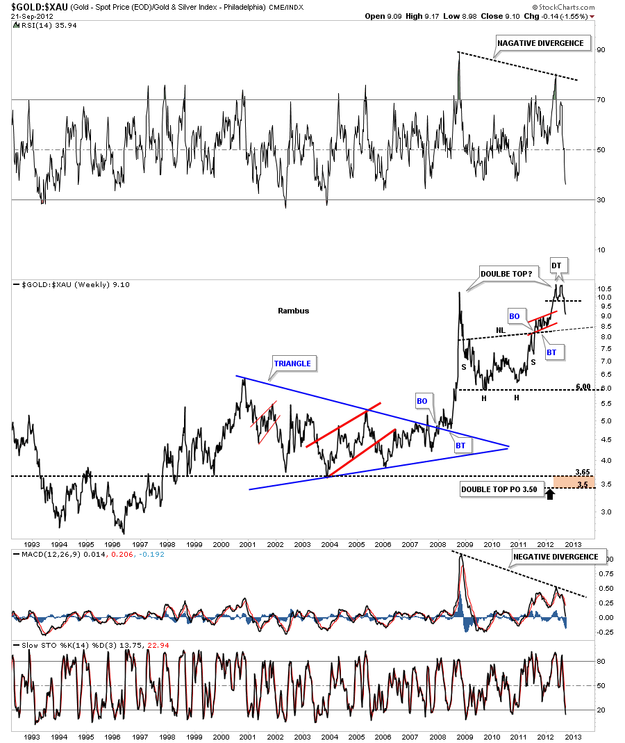
Next I would like to show you the same Gold : XAU chart from a chart pattern perspective. This weekly line chart shows the breakout from the blue triangle that actually launched the parabolic move. You can see there was a nice breakout and backtest before the rally was launched. After topping out around 10 the ratio declined back down to 6 where it then formed an inverse H&S bottom. Once the neckline was broken to the upside that told me this correction wasn’t yet finished yet. The ratio then rallied up and past the old high made at the 2008 crash spike. This was a very critical area now for the ratio as the precious metals stocks were once again extremely cheap relative to gold. If there was ever a place to look for a reversal pattern such as a H&S top or a double top this was the place to look. As you can see on the chart below the ratio has put in a small double top over the last month or so which could be part of a much larger double top that takes in the 2008 spike. If, and I say that with a big if, the bigger double top actually plays out the price objective would be all the way down to 3.50 which would put the ratio in the vicinity of the horizontal red rail that I have shown you on the charts above. That would definitely make the precious metals stocks overvalued compared to gold something we haven’t seen in a long time. Note the negative divergence on the RSI and the MACD indicators at the top and bottom of the chart. This is a big deal IMHO.
Lets now look at a weekly long term bar chart where we turn things upside down by using the XAU : Gold ratio that shows what I consider to be a positive divergence taking place. Again the ratio chart is above and the XAU is below. On the chart above I showed you the possible double top that has the potential to be forming. By reversing the ratio, putting the XAU first and gold second, you can now see a big double bottom on the ratio chart and a small double bottom on the XAU chart below. The reason I”m showing you this chart, this way, is so you can see the positive divergence that is taking place between the XAU :Gold ratio on top and the XAU on the bottom. Note the red arrows that show the possible double bottom on the ratio chart. Now look at the red arrows on the XAU below that are showing the XAU is trading way above the 2008 crash low while the ratio is back down to the 2008 crash low.
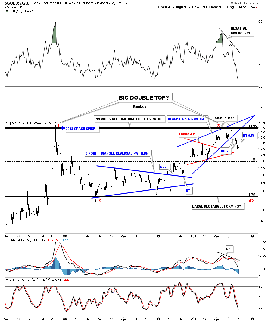
The last chart I would like to show you is the chartology of the Gold : XAU ratio that shows in finer details some important chart patterns that’s are taking place right now. The heavy top and bottom black rails shows the trading range the ratio has been in since the 2008 crash spike. There are two likely patterns that may develop from this horizontal trading range. The first one is the possible double top that we discussed on the charts above and the second could be a huge horizontal trading range similar to the ones I showed you on the very first chart of this article. Lets now focus in on the last year of trading for this ratio that is showing a bearish rising wedge that is comprised of the small red triangle and the small double top. As you can see on the chart below the blue bearish rising wedge was broken to the downside about 6 days ago while the small double top broke down 2 days ago. This chart tells us we can expect the XAU to outperform gold going forward. Note the big negative divergence with the RSI and the MACD indicators.
The bottom line is that these charts above are showing me that the precious metals stocks are still massively undervalued relative to gold and that it looks like its time for some outperformance from the PM stocks. How far can the Gold : XAU drop remains to be seen. If you recall Silver had a nearly parabolic run higher back at the beginning of 2011 where the precious metals stocks hardly participated. Then gold had a very strong, almost parabolic move higher that started in the middle of 2011, and again the precious metals stock didn’t participate. What the charts above are telling me is that its time for the precious metals stocks to outperform both gold and silver in this next impulse leg up that is already underway. At a bare minimum its at least time for a means to the regression to help balance out some of the out of whacked readings between the precious metals and precious metals stocks. All the best…Rambus
ALL CHARTOLOGY STUDENTS : You have Homework
Professor Rambus has Updated all the Trades on the Sidebar
They are updated above the previous updates (which remain )
Just click on any of the Active Trades , Kamikazi Trades , or Model Portfolio Stocks
And you will see the Updates With BUY Points , Sell Stops , and Near Term Targets !
Excellent New Feature
Holey Molars ! ..there are some stunning gains in some PF Stocks !…and Especially the Kamikazi Trades !
Fully
Chartology Forum
Many Subscribers have questions for Rambus
Some of you are entering them in the comments section of the posts
These are easy to miss at Rambus Chartology
The best place to ask questions or leave comments is the forum
It is linked on the right sidebar
Its a simple chat board where you can interact with other subscribers as well
Rambus sometimes posts charts there
anybody having difficulty accessing or using the forum contact us at
gmag@live.ca
see you at the forum
Fully
GOOG Update
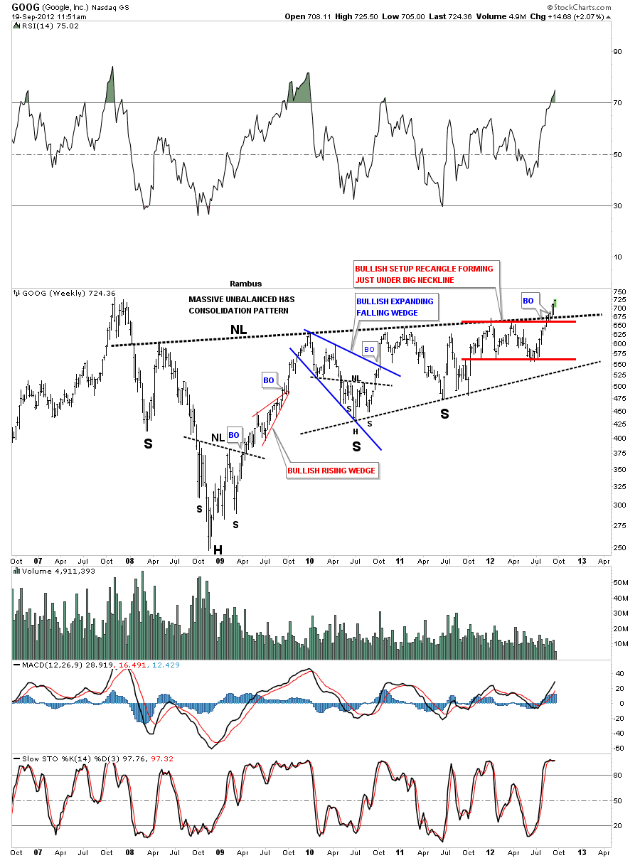
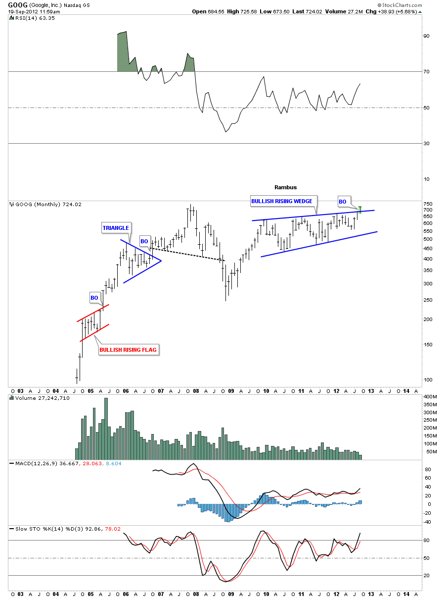
I’ve been waiting along time for this huge tech stock to finally breakout of a massive unbalanced H&S consolidation pattern. The right shoulder could be classified as a bullish rising wedge. Apple is also breaking out to new all time highs. These tech giants are telling us the world isn’t going to end anytime soon. Don’t fight the Fed.
GOOG weekly
GOOG monthly
Portfolio Stock #15 Trade Setup
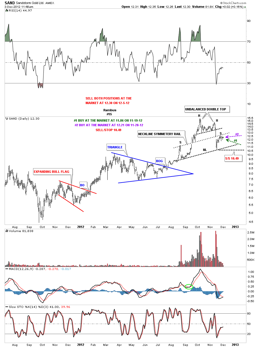
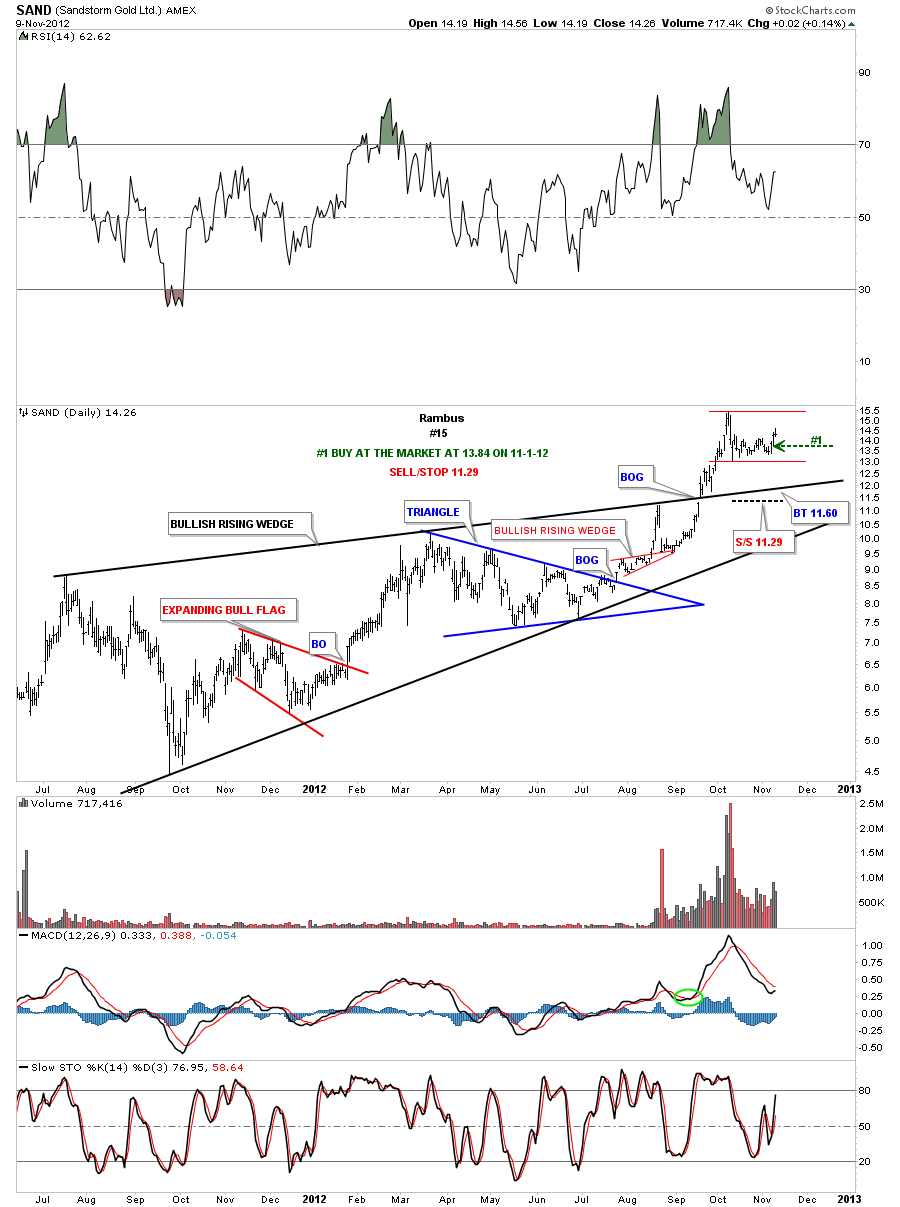
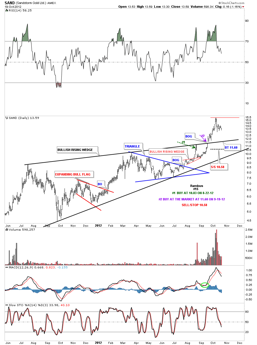
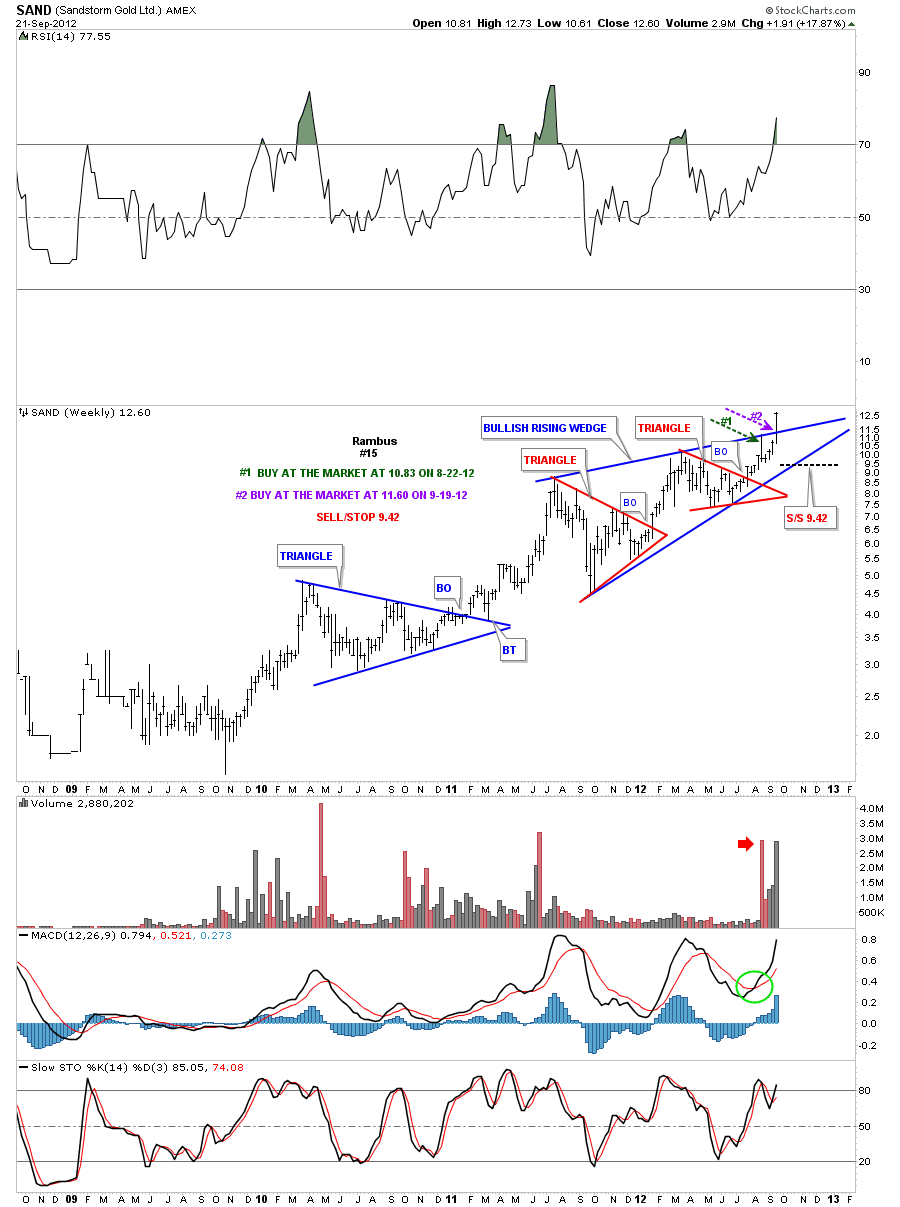
SAND daily 12-3-12. I’m selling at the market as it looks like a possible right shoulder could be forming. Sold at 12.30.
SAND daily 12-1-12. After further study it now looks like this stock could be forming H&S top with an unbalanced double top as the head. I removed the top and bottom rails of the rising wedge that makes it easier to see the potential H&S top. I also added a neckline symmetry rail that shows the height of the right shoulder.
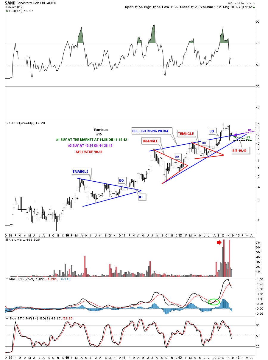
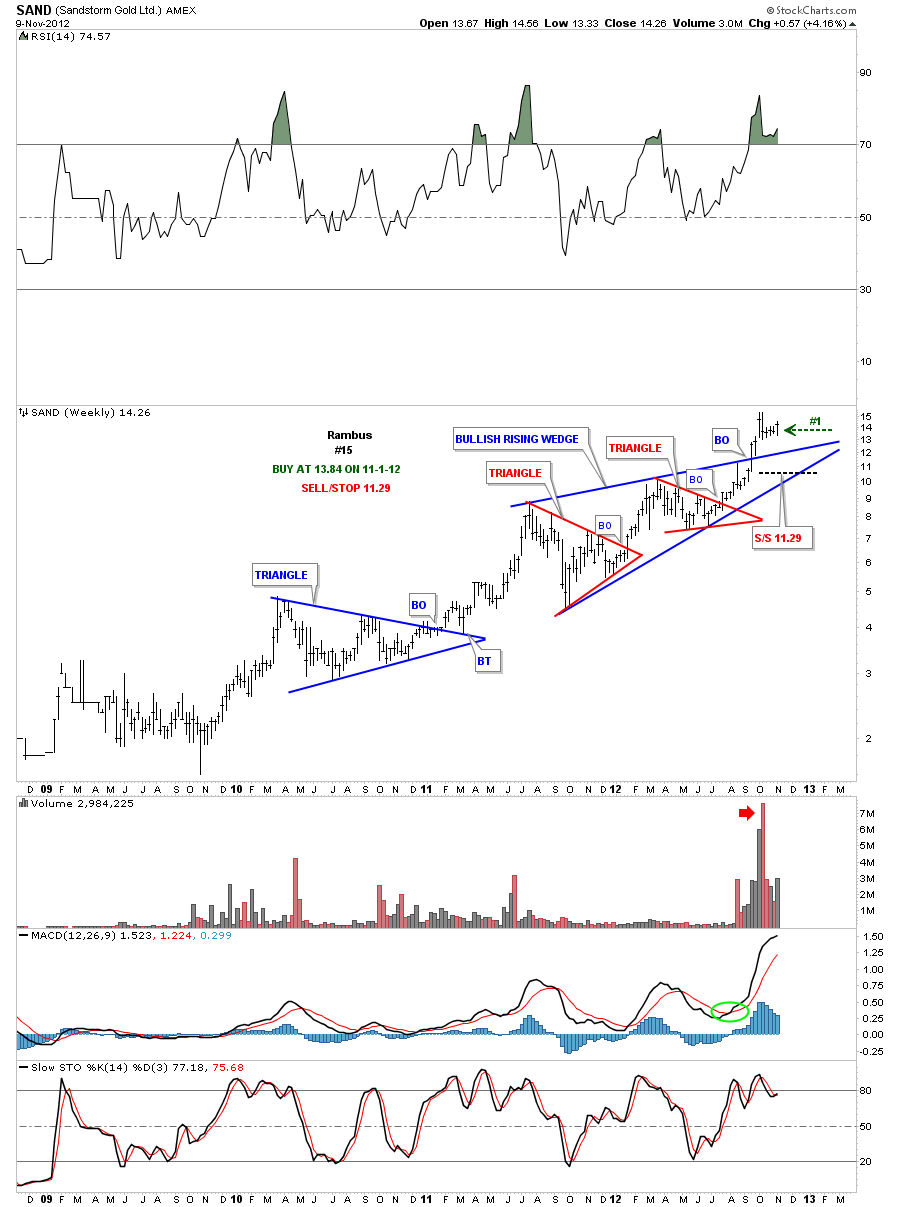
Weekly 12-1-12. The weekly chart shows the blue rising wedge with the backtest taking place.
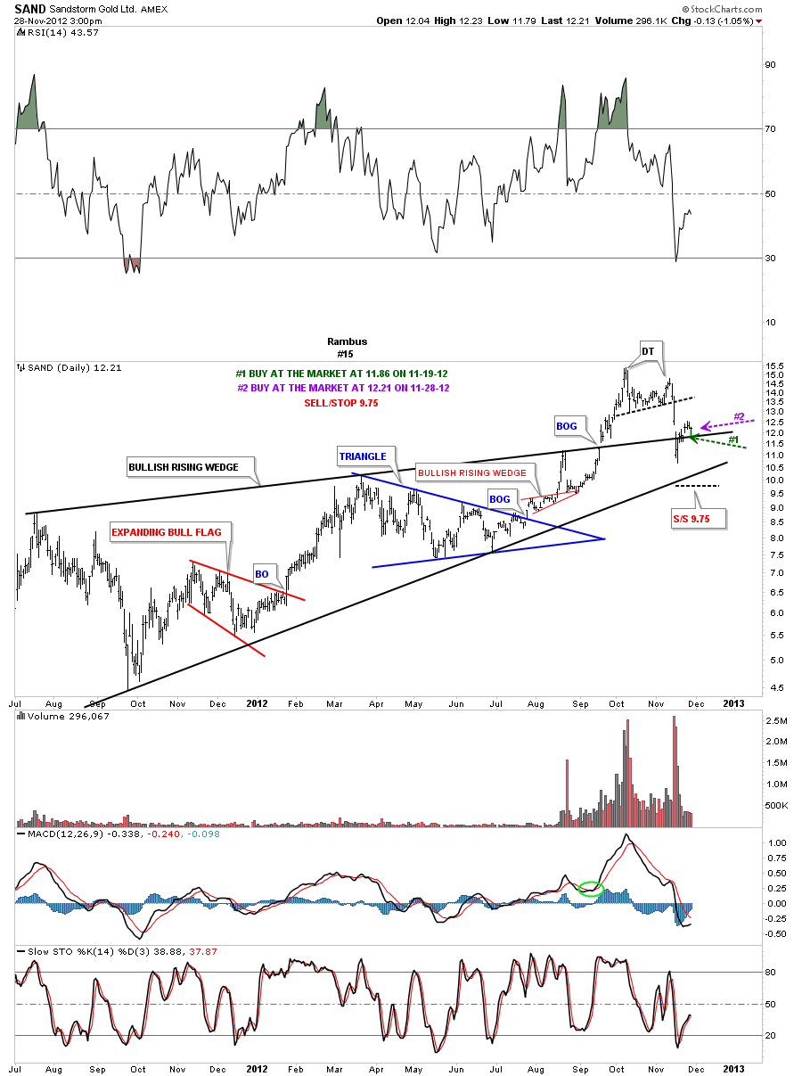
SAND daily update 11-28-12. Its backtesting the top rail of it’s bullish rising wedge today. Bought at the market today, purple annotations.
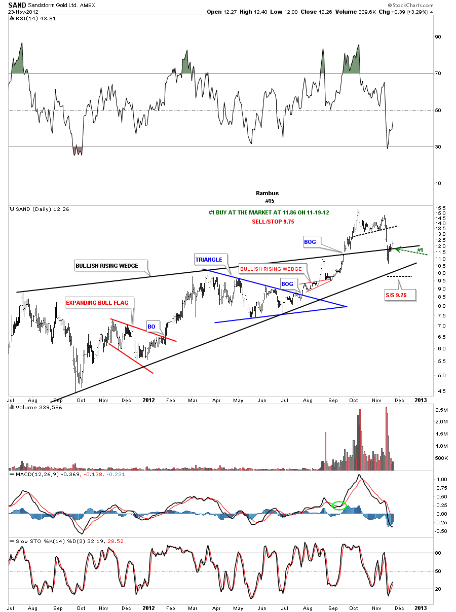
SAND daily update 11-23-12. Was one of those stocks that just barely hit our sell/stop. Its now trading back above the top rail of the bullish rising wedge.
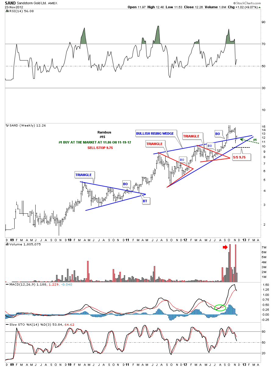
Weekly. Shows the strong backtest is the reason we got back long again.
SAND monthly 11-23-12. Shows the strong backtest.
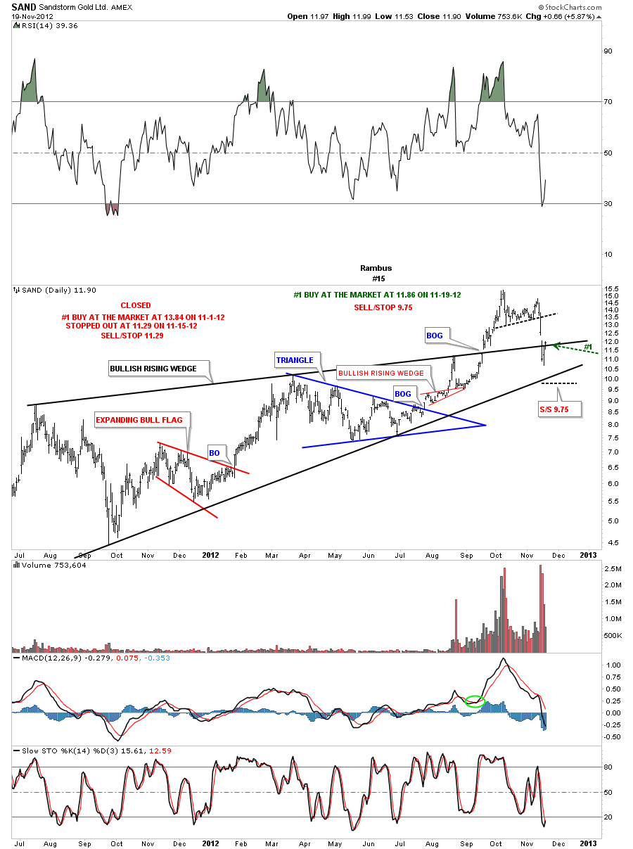
SAND daily update 11-19-12. We were stopped out last week by the thinnest of margins. I’m going to get back in right here at the market. Instructions on chart below.
Weekly 11-19-12.
SAND daily update 11-10-12. Still consolidating after a nice run higher.
Weekly. Still trading nicely above it’s blue bullish rising wedge.
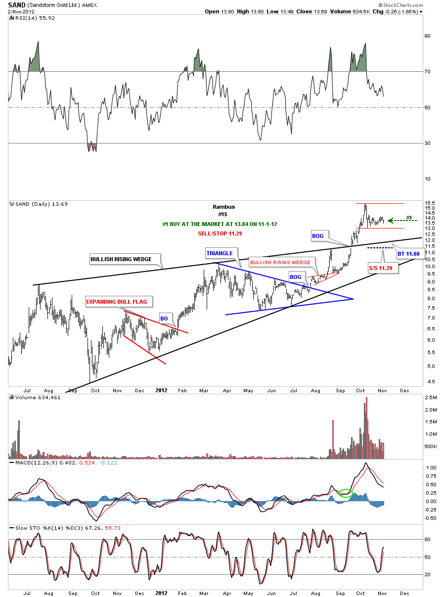
SAND daily update 11-2-12. Consolidating after good move up.
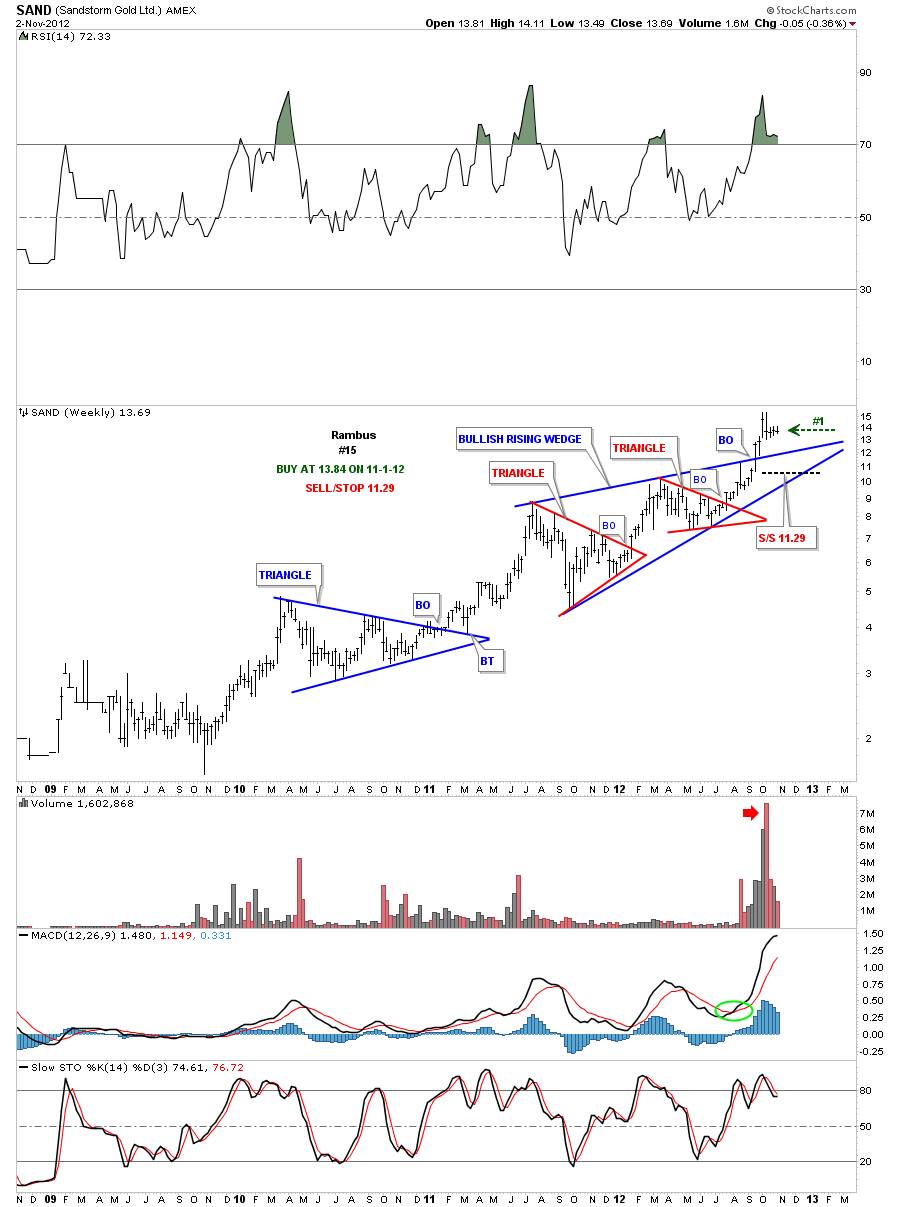
Weekly. Still trading above the bullish rising wedge.
SAND daily update 10-26-12. Sold full position at 13.81.
SAND daily update 10-20-12. Trading sideways.
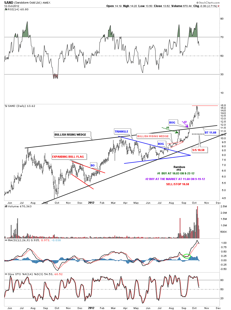
SAND daily update 10-13-12. Still trading above the big bullish rising wedge. I’m moving the sell/stop up to 10.58.
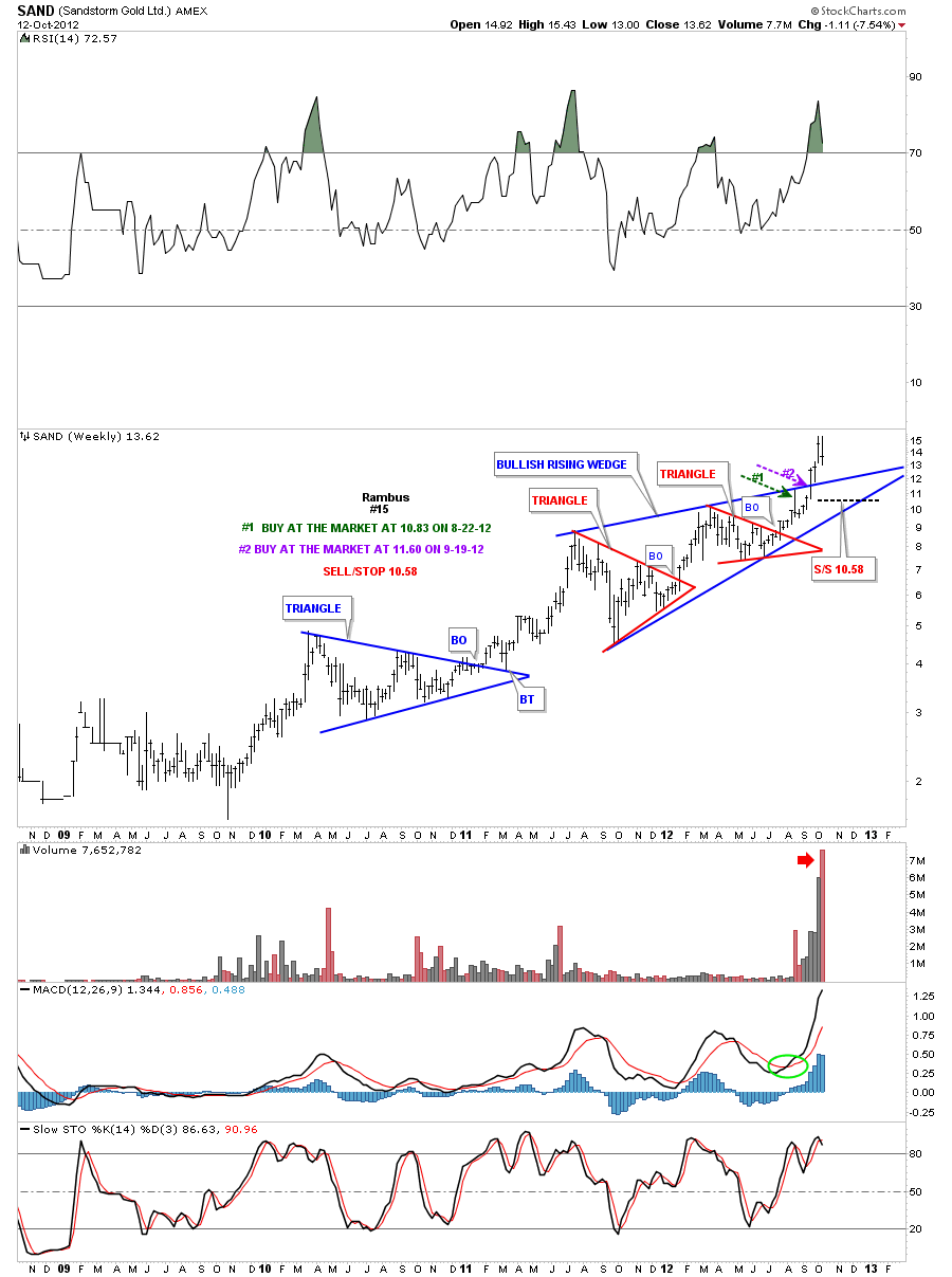
Weekly.
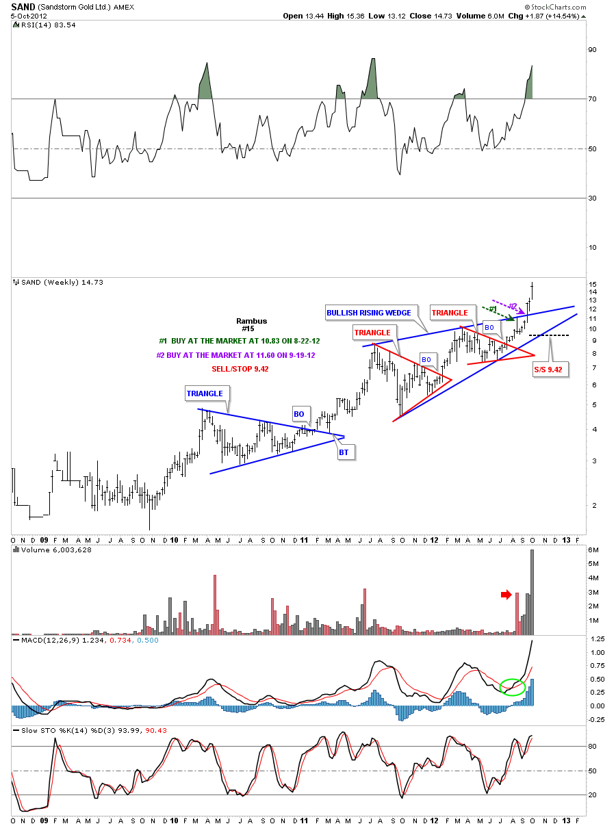
SAND daily update 10-6-12. One of the strongest PM stocks.
SAND weekly update 10-6-12. Beautiful breakout of bullish rising wedge.
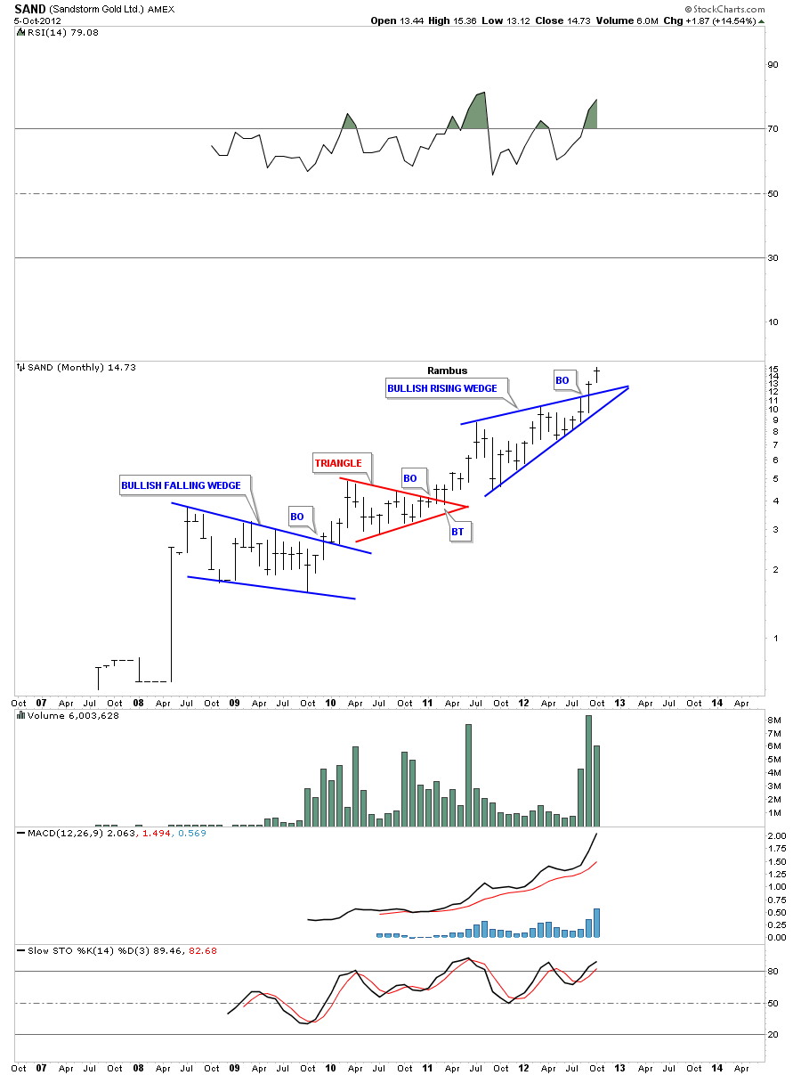
SAND monthly update 10-6-12. Bullish rising wedge breakout.
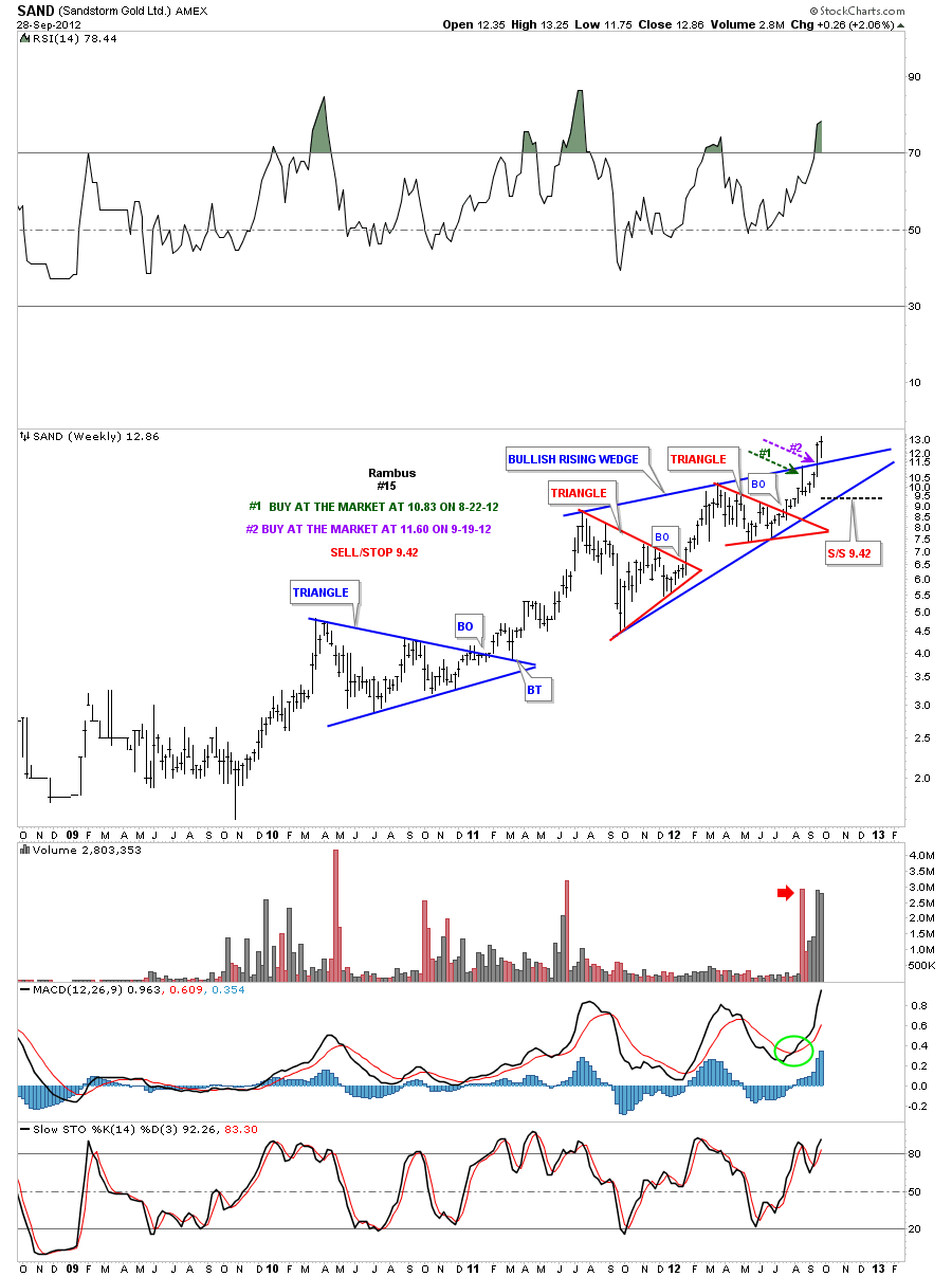
SAND daily update 9-29-12. Still trading above the breakout area.
SAND weekly update 9-29-12
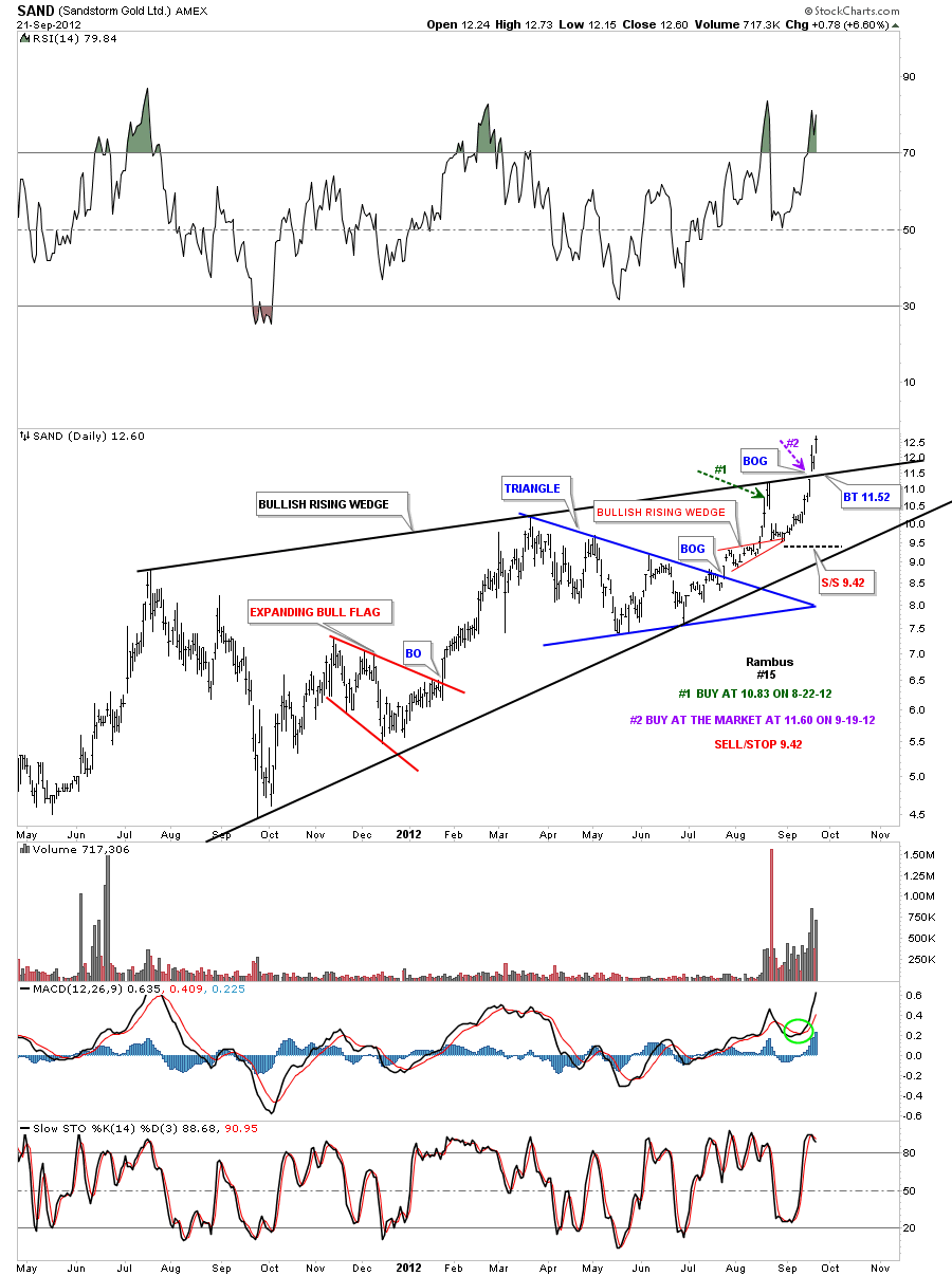
SAND daily update 9-22-12. Breakout of bullish rising wedge this week.
Weekly update 9-22-12. Breakout of bullish rising wedge this week.
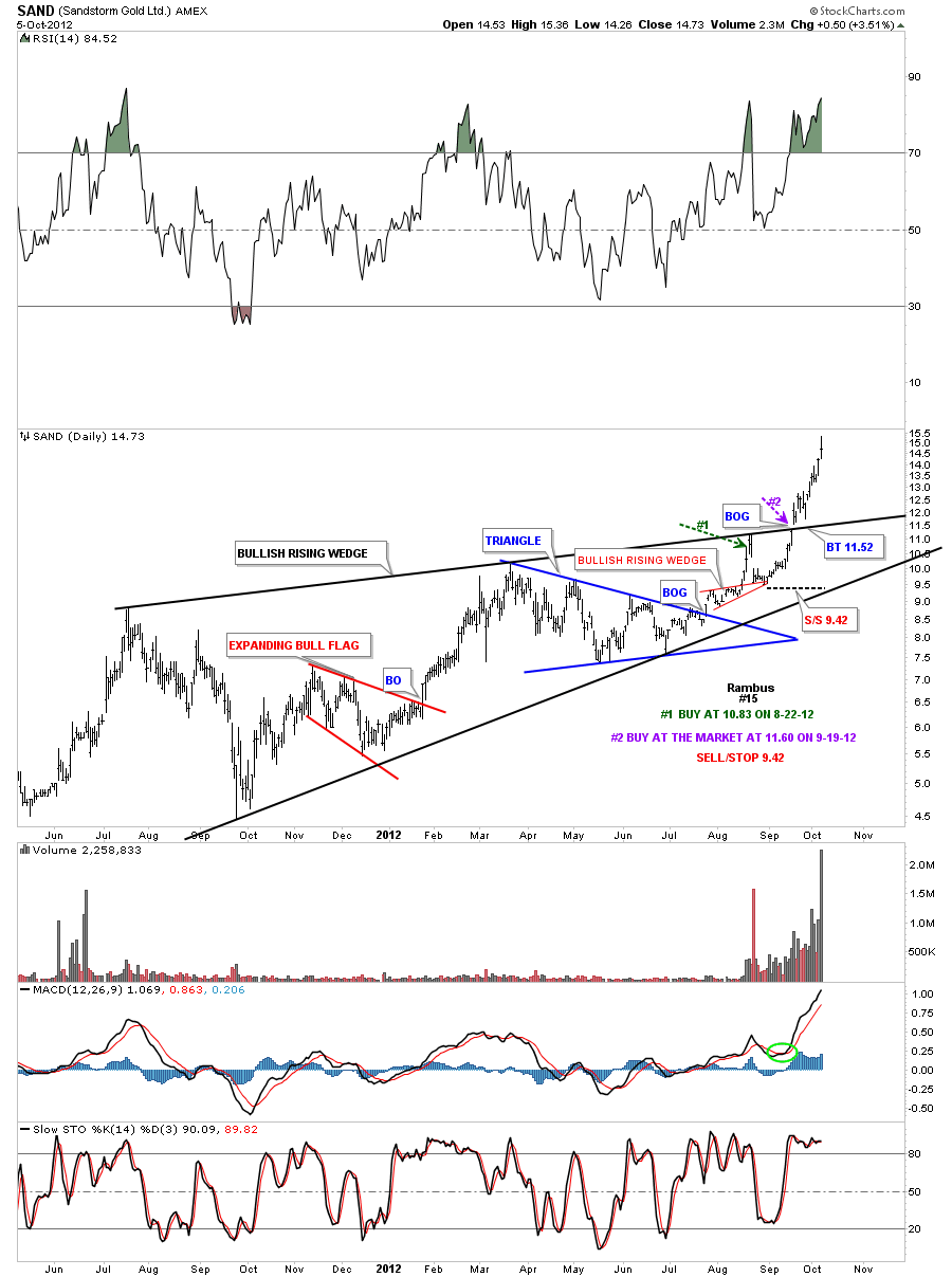
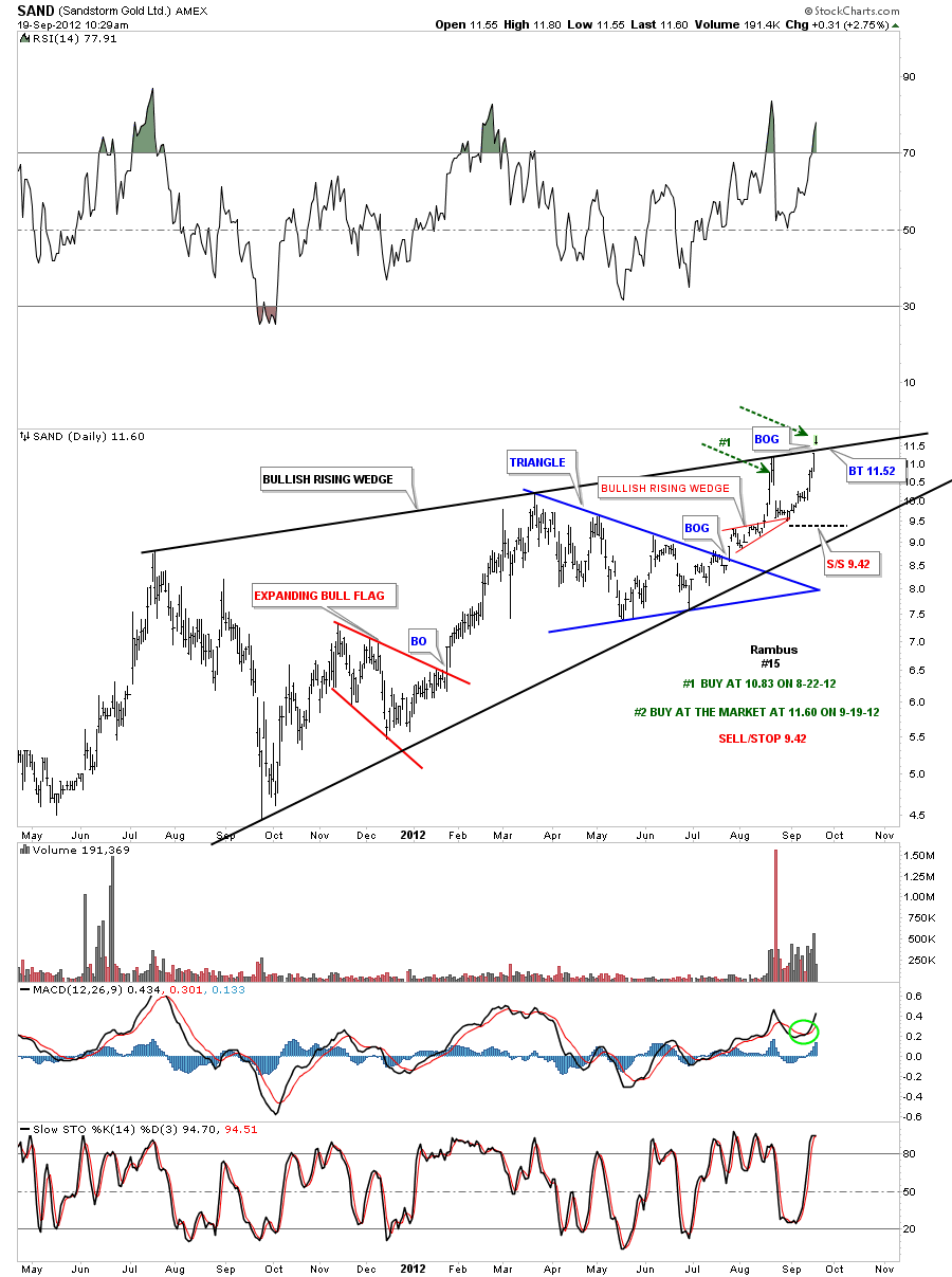
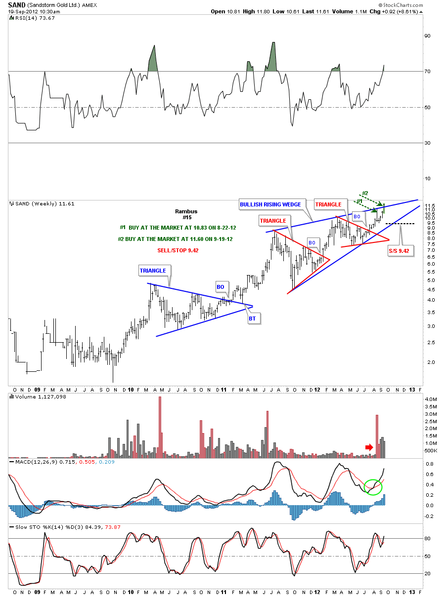
SAND gaped above the top rail of bullish rising wedge this morning. I’ve been waiting to see how the price action was going to behave once we got back up to the top rail. The breakout gap says the top rail is hot. We already have one position bought at 10.83 on 8-22-12. I”m moving the sell/stop up to 9.42. The royalty companies are the strongest group right now so I’m going to add a second position right here. Its very possible we get a backtest to the top rail in the next few days where you can add more shares if you desire. Instructions on chart below.
Weekly update 9-19-12
DAG Update
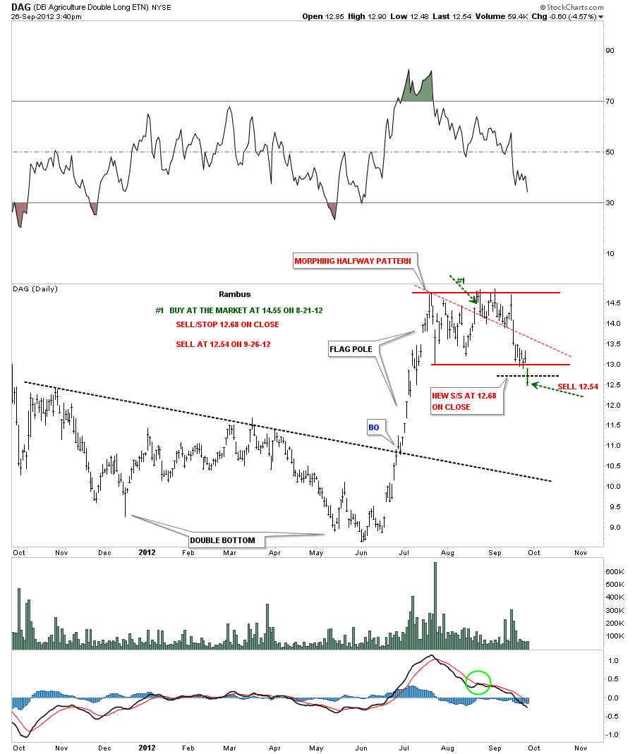
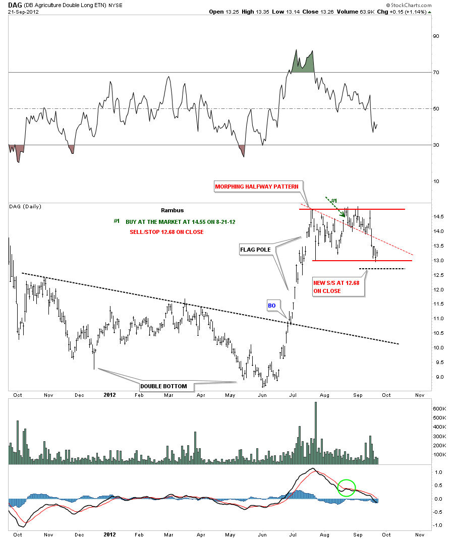
DAG daily update 9-26-12. Sold today at 12.54.
DAG daily update 9-22-12. Moving sell/stop down to 12.68 on close. If DAG closes below 12.68 we are out.
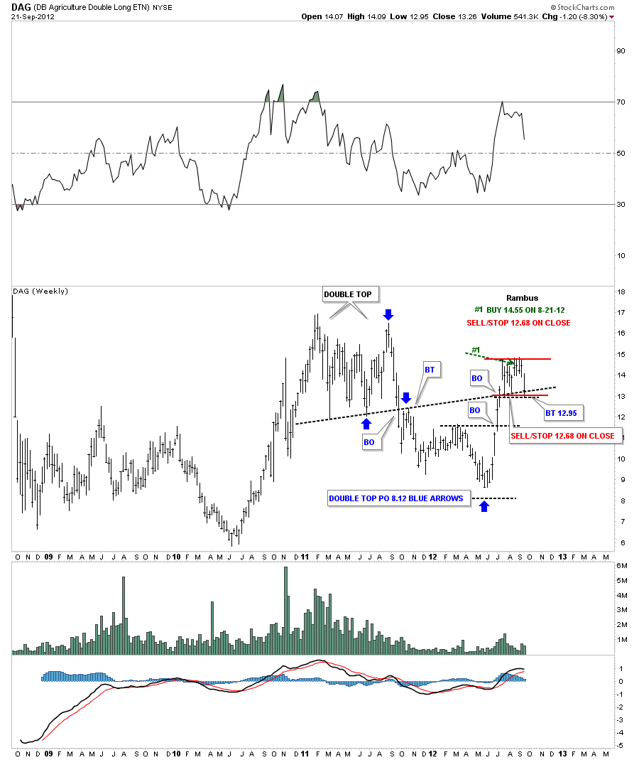
DAG weekly update 9-22-12
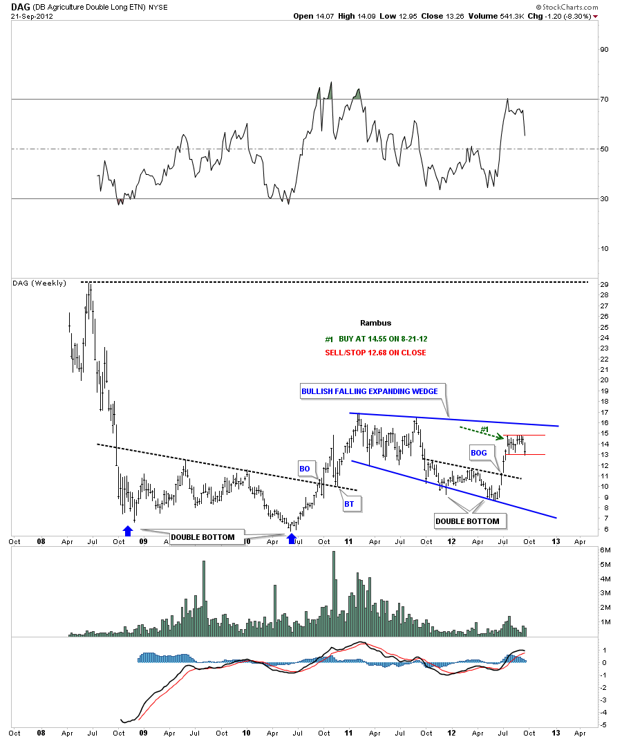
DAG weekly update 9-22-12. Another view of the weekly chart.
Update 9-20-12
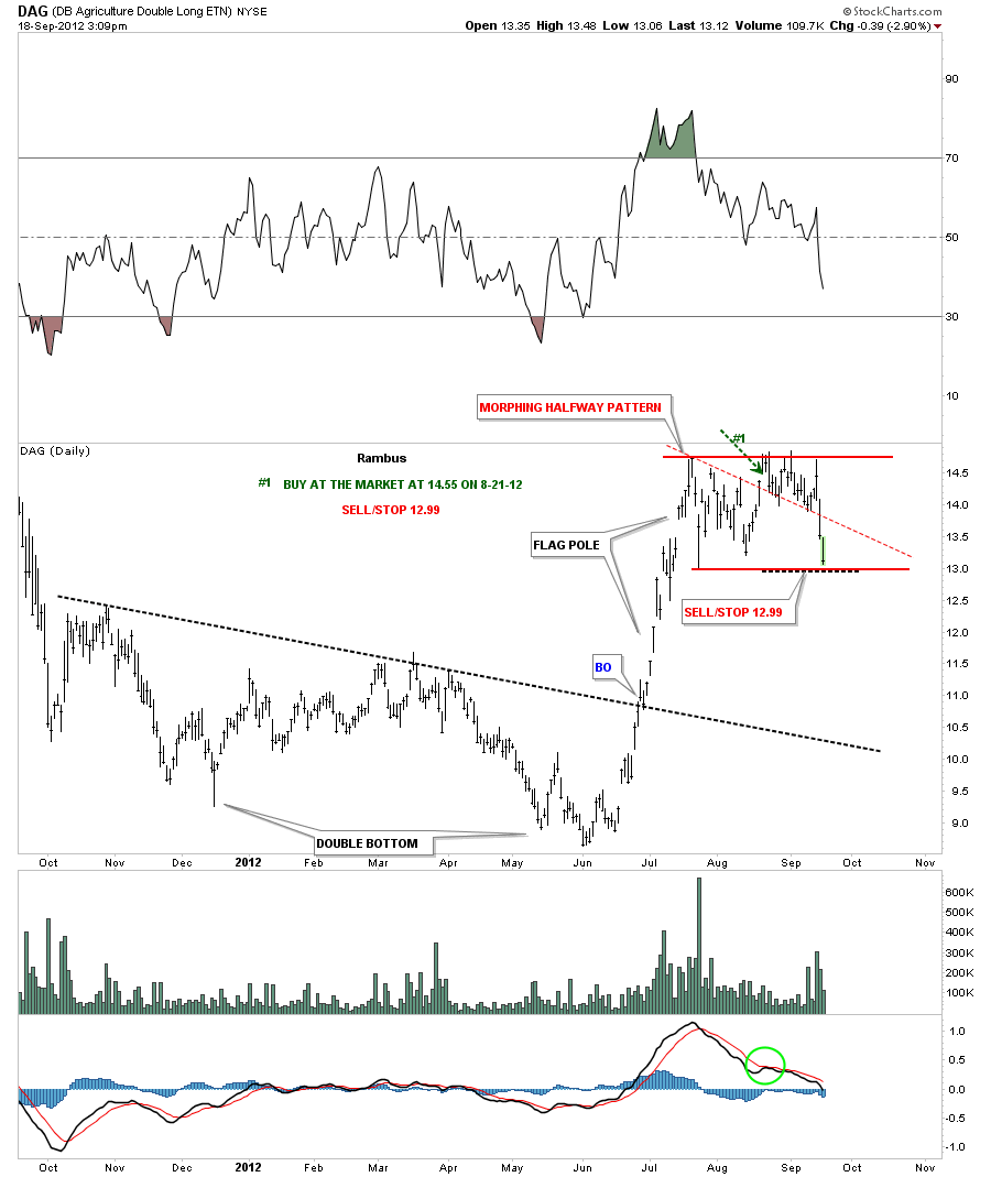
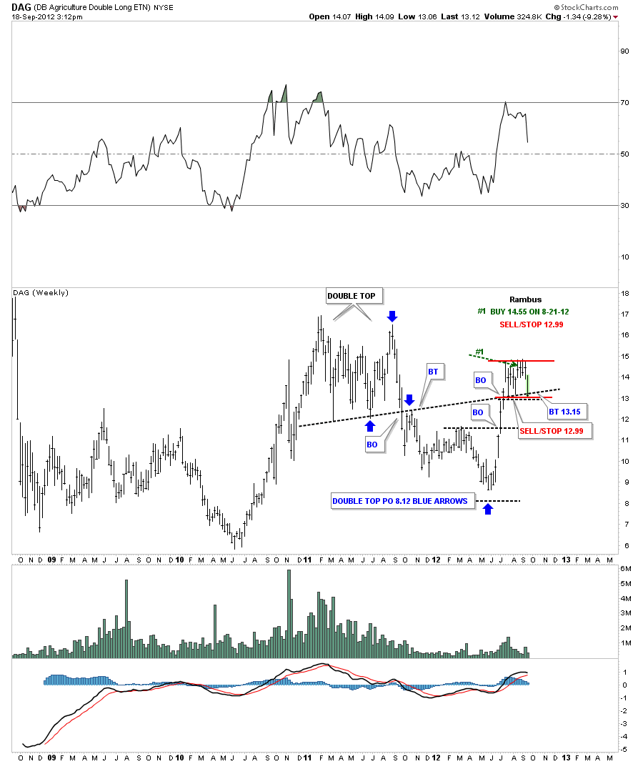
DAG is approaching it’s sell/stop at 12.99. The original pattern started out as a triangle that has now morphed into a horizontal trading range or rectangle. You can see on the chart below our buy point was on the breakout gap from the smaller triangle. The top rail of the triangle was the red dashed trendline. DAG is now trading back at the bottom of the trading range just a few points from our sell/stop. This pattern could still be a consolidation where prices breakout to the upside. The weekly chart looks more encouraging. First the daily chart.
You can see on the weekly chart that the price action is now testing the black dashed support and resistance rail. This would actually be the best lowest risk entry point if one wasn’t already in. I’m personally going to wait one more day and see what happens tomorrow around the support and resistance rail. You can use the existing sell/stop at 12.99 if you prefer. There are many other places to put your capital to work if you get stopped out. I will let you know when I actually sell my position if it happens.
Weekend Report…A Look at the Pure Symmetry of the HUI Chartology
The last several weeks have really changed the look of the HUI and the precious metals complex in general. In this report I would like to examine the HUI going back to the October 2008 bottom to the present. Its hard to believe the HUI topped out almost exactly one year ago at a price close to 640. This almost one year decline is the second largest correction since the bull market began back in late 2000. This correction was totally different from the one made in 2008. The 2008 correction was more of a crash whereas our most recent one year correction was a more controlled move lower. Either way you look at it a correction is a correction and there is nothing fun about them.
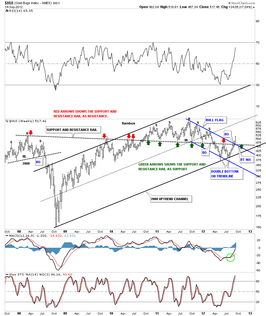
As the weekly chart below shows the 2008 correction was a crash – panic move lower, with many big long bars. It only took about 7 months to complete the move from top to bottom that totaled about 370 points. Our latest correction started in September of 2011 at 640 and it looks like the bottom was put in in July of this year at 370 for a loss of 270 points. It almost felt worse because the time factor was much longer even though the decline was 100 points less than the 2008 event. Anyway, the job of corrections is to produce pain either by a panic move or by a long drawn affair that wears most investors out. The most interesting feature on the chart below is the down sloping black dashed support and resistance rail that is over 4 1/2 years long starting at the 2008 H&S top. This S&R rail is a perfect example of how a trendline can divide the price action between support and resistance. The red arrows shows it acting as resistance and once it was broken to the upside the green arrows shows how it reversed its role and held support. It reversed its role once again in March of this year when it closed below the S&R rail again. This told us to be on the defensive again. The red arrow, in July of this year at 465, shows how the S&R rail again was back to playing its role as resistance which led to the second bottom which now we can label as a Double Bottom reversal pattern. If you look at the last two bars on the right side of the chart you will clearly see how important the last two weeks of price action as been. Two major resistance rail were taken out two weeks ago that has changed the total complexions of the one year down trend. The HUI now has a double bottom in place. It has traded above the support and resistance rail and is now trading above the blue downtrend rail of the bull flag. Most importantly it’s making a higher high something it hasn’t done since the bull market peak at 640 made a year ago.
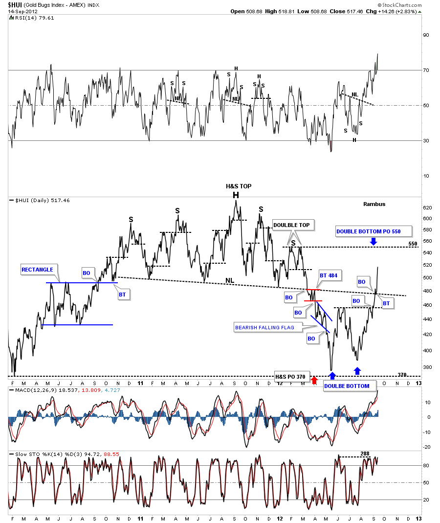
The next chart is a daily line chart that shows the big H&S top that reversed the big rally off the 2008 crash low at 150. That H&S top was very large and showed some awesome symmetry between the left and right shoulders. No matter how bullish one maybe on the precious metals stocks when you see such a beautiful H&S top reversal pattern you better pay attention. I’ve extend the neckline to the right side of the chart so you can see how it still influenced the price action all the way up to last week. Below is negative and above is positive. Last week’s price action was extremely bullish as the HUI is now trading back above the neckline.One last note on the chart below is the H&S top basically hit it’s price objective at 370 which was the minimum price target.
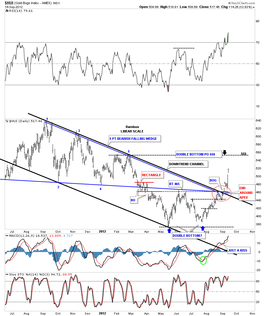
Next I want to start showing you some shorter term charts that have some important patterns that are harder to see on the longer term look. As we look at smaller and smaller time frames we can fine tune what is happening in more detail. There is alot of information on this next chart that shows the one year black downtrend channel, five point bearish falling wedge and the double bottom reversal pattern. The chart below shows the red circle where the confluence of four resistance rail all come together at one point. The market speaks to you when you see how it interacts where all the important trendlines come together. The red circle shows you a bullish setup that is called an end around the apex move. It shows why 465 has been our key resistance level as all the important trendlines converged at one location and now the price action is trading well above resistance.
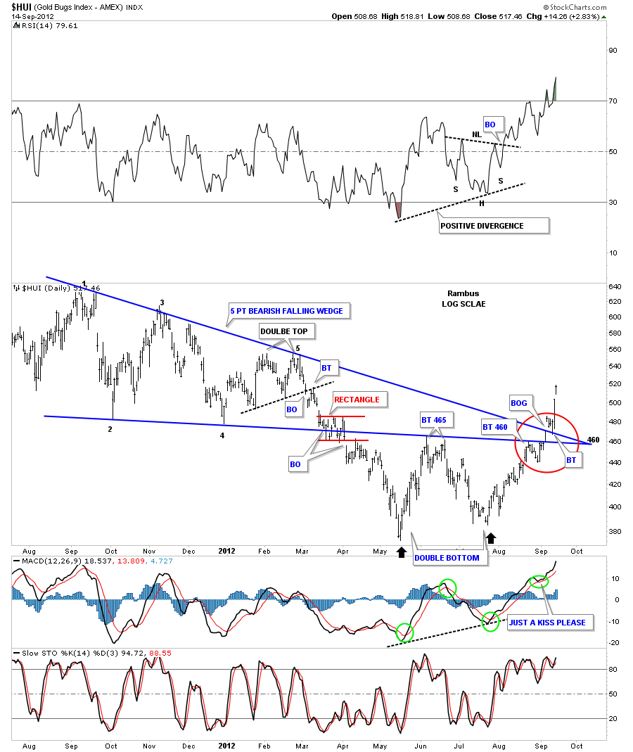
This next chart shows the 5 point bearish falling wedge and how beautifully the price action has behaved based on the top and bottom blue trendlines. You can see how cleanly the price action bounces between the top and bottom blue rails of the 5 point bearish falling wedge telling us that both rails were hot and would come back into play further down the road. After the HUI broke below the bottom blue rail back in March of this year, red rectangle, it wasted little time in declining to the first bottom of the the double bottom reversal pattern at 370 or so. From the May low at 370 the counter trend rally took prices all the way back up to the underside of the 5 point bearish falling wedge which had reversed it’s role from support to now resistance at 465. The bottom blue rail held resistance and the next decline began to the second bottom was underway. There was nothing on this chart, at the time of the backtest to the bottom blue rail, that showed any reason to be bullish. The HUI then began an eighty point decline off the 465 resistance point to 385 which would be the second bottom of the double bottom reversal pattern to the upside. This was the moment of truth for the HUI. Either it finds support at the previous bottom at 375 or it breaks down to new lows creating a much bigger correction. The second bottom held about 10 points higher than the first bottom which was showing some resilience if the face of all the negative news that was coming out at the time. The red circle shows how cleanly the price action was as the HUI worked its way higher taking out the overhead resistance rails. The price action in the red circle shows how the HUI hit the bottom blue rail again and bounced off in a 5 day decline. It then rallied up to test it again where this time the decline only lasted 3 days. What was happening was the bears were running out of ammunition and the bulls were getting stronger. Note the single bar that traded between the top and bottom rails of the 5 point bearish falling wedge. That was the last bar to trade below the top blue rail as it was still acting as resistance. The next day the HUI gaped above the top blue rail telling us the bears were exhausted and had very little fight left in them. There was a small 4 day backtest to what had been a resistance rail and now had reversed it’s role and fond support from the topside. After the backtest was complete and the bulls wasted little time moving price higher.
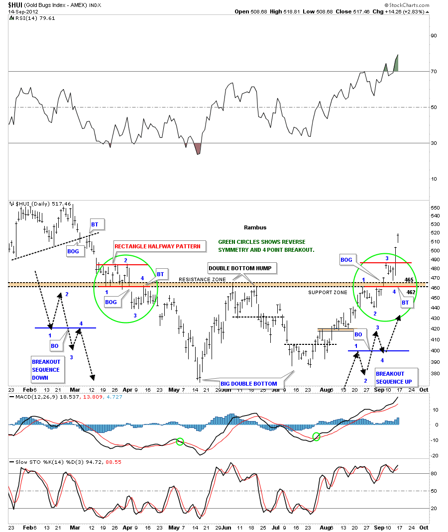
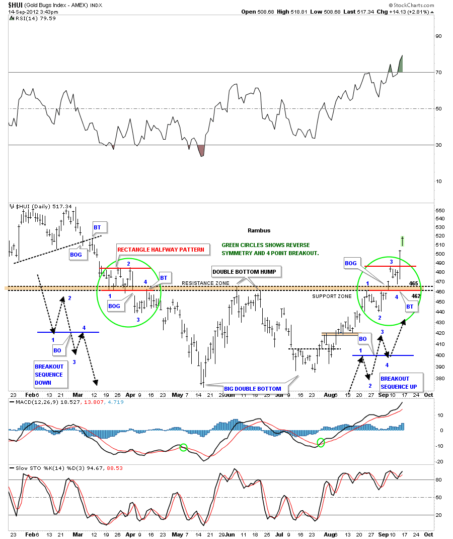
Next lets focus in on the double bottom and show in detail how beautiful the price action has been regarding symmetry. You have heard me talk about reverse symmetry in the past that means how you came down, in our recent case, is how you will reverse back up. What happens on the way down will have a direct impact with how the stock will move back up. I’ve add two green circles, one on the left side of the chart where the HUI was declining and one on the right side of the chart where the HUI is rallying. The brown horizontal support and resistance zone shows the double bottom hump at 465. That brown horizontal support and resistance has a direct influence on how the HUI broke below in a 4 point sequence breakout shown with black dashed arrows on the left side of the chart. Now focus your attention to the green circle on the right side of the chart. We have the same 4 point breakout sequence in play only this time its to the upside that completed the double bottom reversal pattern. After the backtest to point number 4 the bulls have had a field day as the bears are retreating looking for a place to setup their next area of resistance to stem the bulls attack. The double bottom measures to about the 550 area so we may find some bears there.
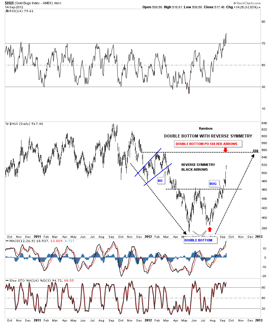
I want to show you one more chart that shows the double bottom and the reverse symmetry that is playing out to the upside. The double bottom has a price objective to the 550 area that also coincides with two previous highs that were made in March on the way down. I think we will see some type of reaction at the 550 area where the bears had some control creating a small double top.This will also help relieve some of the overbought condition that is starting to build. From that point we will just have to see how things play out over the short term.
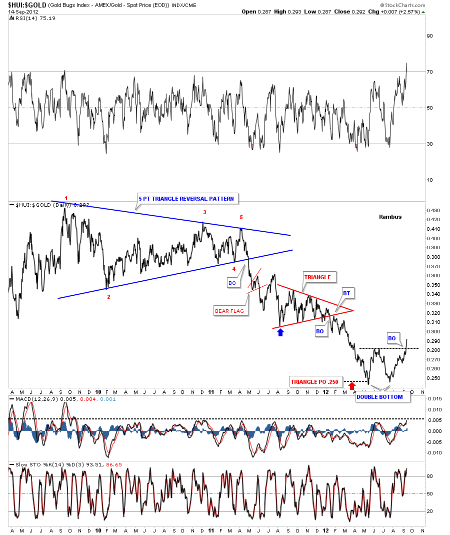
As the charts above are showing the HUI is putting on the strongest rally since topping out last September. I can’t stress how important it is that the price action is now trading above most of the overhead resistance rails which is reversing the downtrend to an uptrend. A one year downtrend has now been reverse to an uptrend that could last one to two years. So far the price action has been absolutely stunning from my perspective. Let me throw in one more chart that is show the precious metals stocks are getting ready to start outperforming the metal. The HUI to Gold ratio chart also has double bottom in place. When the price action is rising the PM stocks are out performing gold. As you can see on the chart below the breakout occurred last week and now the precious metals stocks maybe in control for a while which is what I would like to see.
Alot of positive things have been happening in the PM complex that has been a long time coming. I really believe we are seeing the early stages of a true impulse leg up that is going to last possibly several years before this run burns itself out. I have been working on several long term chart patterns that I will show you when they have a little more time to develop. Suffice to say they could be very bullish for the precious metals stocks. All the best…Rambus
………………………..
EDITOR’S NOTE :
Rambus Chartology is Primarily a Goldbug TA Site where you can watch Rambus follow the markets on a daily basis and learn a great deal of Hands on Chartology from Rambus Tutorials and Question and Answeres .
Most Members are Staunch Goldbugs who have seen Rambus in action from the 2007 to 2008 period at www.goldtent.org and now Here at Rambus Chartology since early 2012 .
To review his Work and incredible calls from the 2007-2008 period click on the top right sidebar in the “Wizard of Rambus” ….”What If !!” Post
To Follow Rambus Unique Unbiased Chart Work and participate in a Chartology Form with questions and answeres and learn the Art and Science and Mindset of a Pro Trader please Join us by subscribing monthly for $29.99 at
www.rambus1.com
We have many subscribers from all over the world who are glad they did as they enjoy the many daily updates and commentaries provided at this exciting new site
As you will see Rambus (Dave) has prepared us for this difficult period by being one of the only ones to see and warn about this incredibly debilitating PM smackdown as early as Jan 2 2012 …click on the” HUI Diamond in the Rough” Post in the “Wizard of Rambus” top right
More Recently Rambus called a Bottom in HUI in this post…and has subscribers on board for a Powerful Run to the Upside
What is he seeing Now ?
You will find Rambus to be a calm humble down home country tutor with an incredible repitoir of all the TA based protocols tempered with his own one of a kind style…simply put…He wants to keep his subscribers on the right side of these crazy volitile and downright dangerous markets
See you at the Rambus Chartology
…………………….
HUI Update
Just a quick update on the HUI that finished the backtest Wednesday morning just above 465. This completed the point #4 backtest to the now important support zone 465. Then once it traded above point #3 that created another new higher high suggesting the HUI is now headed up to the double bottom price objective which I will discuss this weekend.
I just have to say the symmetry on the HUI and many other stocks for that matter are as beautiful as you will ever see. In charting there are two aspects that help you make a decision. There is the technical look with trendlines and indicators which is the science part and then there is the art aspect of charting which lets you know when you are looking at something beautiful without all the trendlines or indicators on the chart. All the beauty and symmetry is there on the charts for all to see. Its my job to try and understand and show you, with my trendlines and squiggles, what the chart is saying. One has to be a good listener to understand what some of these charts are telling us. Right now the HUI is telling us everything is OK.

