This weekend I’m going to fine tune a list of precious metals stocks that I think will have a good move when this next upleg begins. I’m seeing signs that this might be happening now. If any of our subscribers have any stocks that you have been following for sometime and think they might be a good candidate for the list just post them at the forum and I’ll take a look at them. They can be juniors or big caps. To all a good weekend…Rambus
Category Archives: public
Fully Here
Just a reminder to all Subscribers:
For automatic e mail notification of all new posts by Rambus immediately
just set your preference at the link on the bottom of the right sidebar
a must do !
Hecla Mining
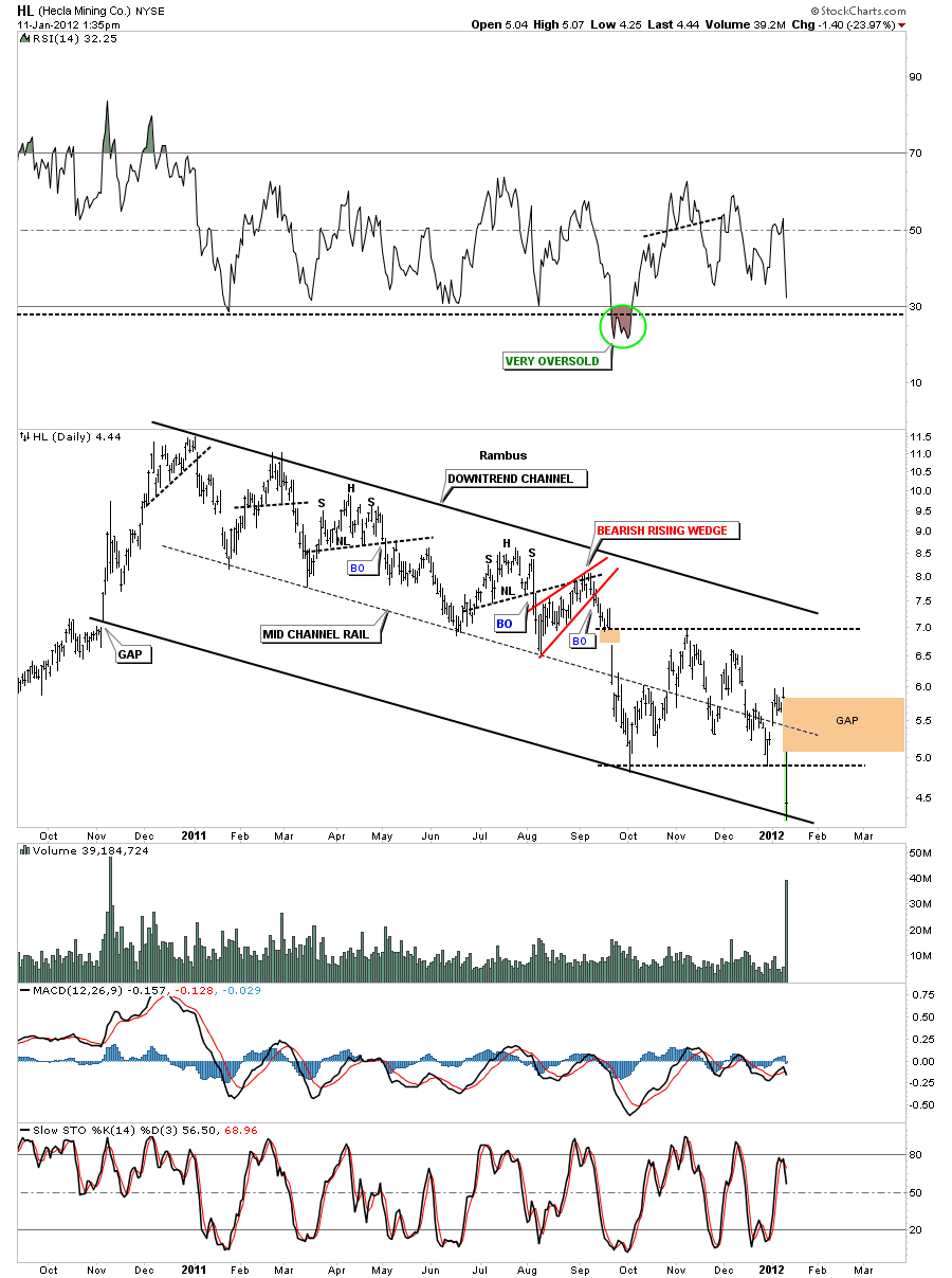
I just wanted to post this chart of HL as its been a very tough year for holders of this stock. This stock is a good example of why one doesn’t become married to a position. There were many many signs along this one year decline that a trader could have gotten out, probably with a loss but it at least it frees up capital to be used in something better.
HL daily downtrend channel.
SLV Update
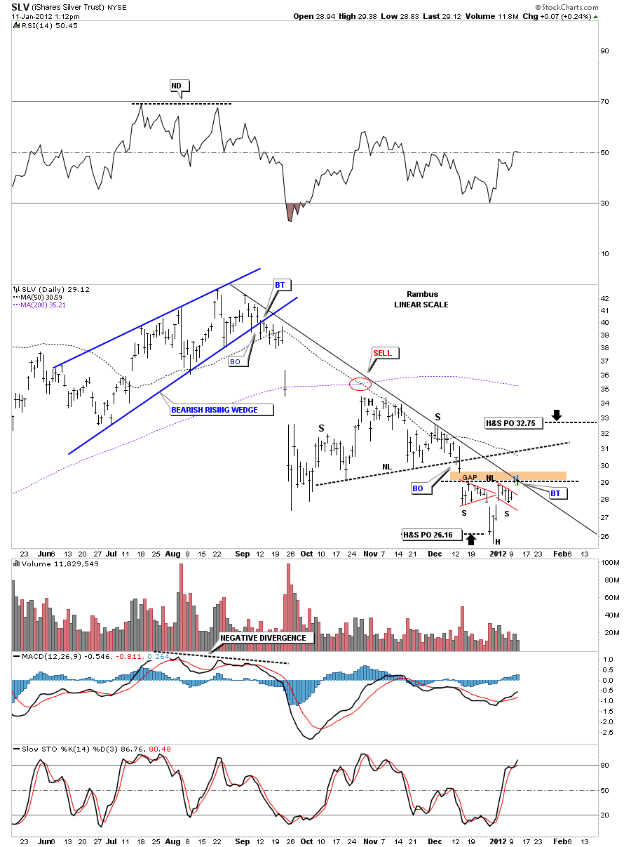
Yesterday SLV broke above the neckline of a potential inverse H&S pattern. I showed the downtrend rail that it needed to break before it could really start it’s move up. Today we backtested the neckline and presently trying to break the downtrend rail. This is a low risk setup right here for a few points to the upside. Use the neckline as your line in the sand to place your sell/stop.The H&S measures to about 32.75 but the neckline from the previous H&S consolidation pattern comes in alittle lower around 31 or so.
SLV daily H&S breakout and backtest to neckline. Cracking down sloping rail.
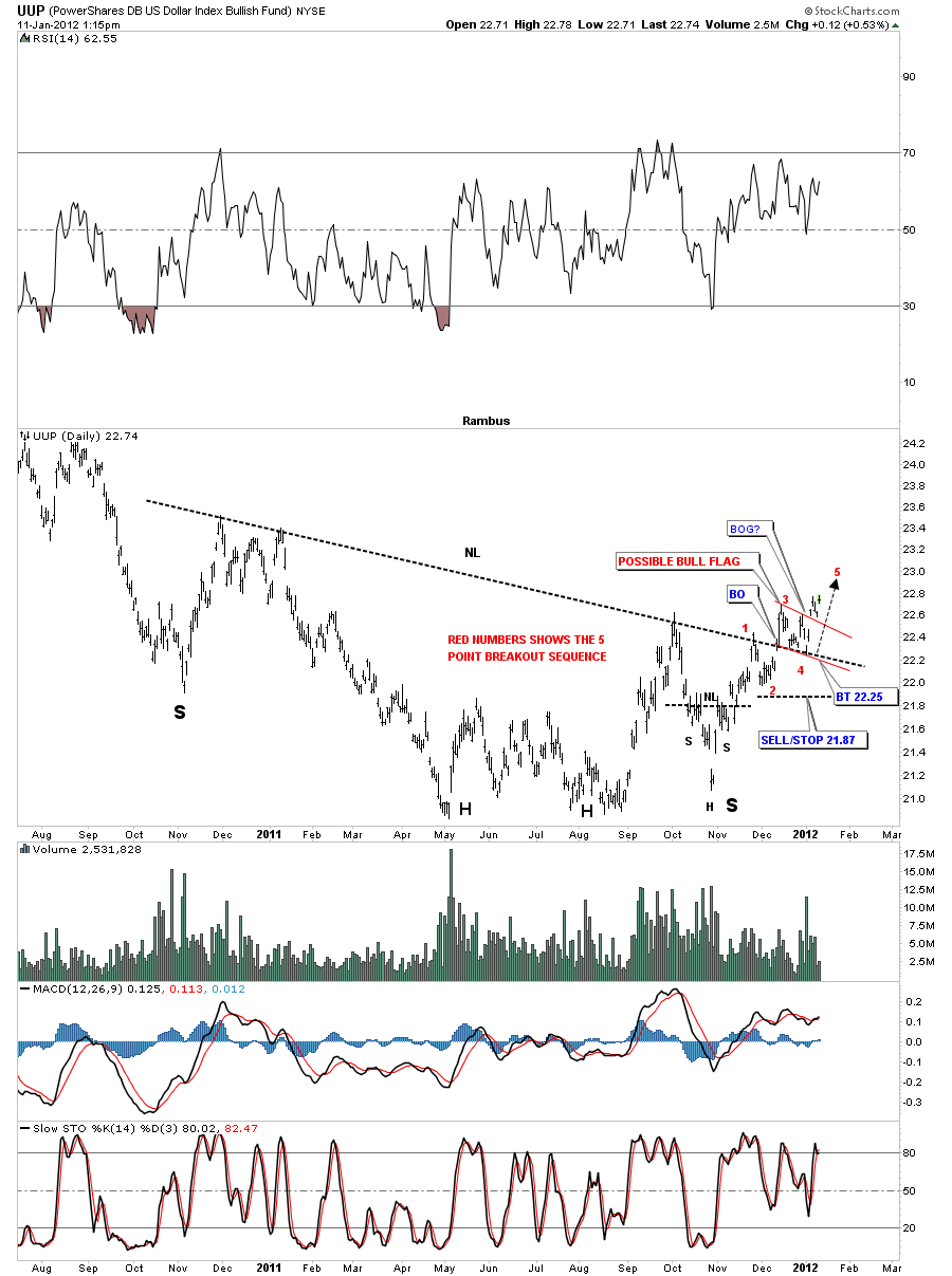
It’s been somewhat frustrating in here as I’ve been looking for a strong dollar to put pressure on the stock markets and the precious metals complex but so far its had very little affect. Maybe there is subtle change taking place that is not quite evident yet. Time will tell.
UUP daily H&S breakout and backtest completed. Five point breakout sequence.
Attention Chartologists :
New Feature on the site….sign up for e mail notification of all posts on the site ….at the bottom of the right sidebar
Especially useful for those interested in the Real Time Trade Set Ups
Thanks to Contributor caspercg… for the suggestion and to Audept Site developer …for fast implementation
Hello Chartology Students…Its Fully Here
We have a great tool here at Rambus Chartology….designed by our resident tech genius Audept
Its way underused
Its the Chartology Forum
Click on the link on the right sidebar and use your password to enter
Ask Questions and Rambus will soon be there to answere
Post your own insights requests and comments about the site
Read other chartists like member rlscott who has his own unique perspective
Vote at the Poll
Its similar to Poster’s Paradise at Goldtent
Dont be shy …its safe and secure…and we would like to get to know all of the members of this elite community
This is a unique feature…we dont know of any other Pay Site where you can discourse directly with the resident guru and other like minded people from many countries around the globe
See you at the Form
Fullgoldcrown (for Rambus and Audept)
Weekend Report : HUI Diamond in the Rough
In this weekend report we are going to look at the many faces of the HUI going from the daily, short term look, all the way out to the beginning of its existence on the monthly chart. As you well know the HUI has been in a sideways chopping mode for over a year now and no clear resolution yet as to what kind of chopping pattern we are building. Is it a consolidation pattern that will breakout to the upside, which most analysis think is going to happen, or is it going to be a big topping pattern that few are seeing at this point in time. I’ll try to strip away all the noise and see what the charts are telling us in an unbiased look into the future.
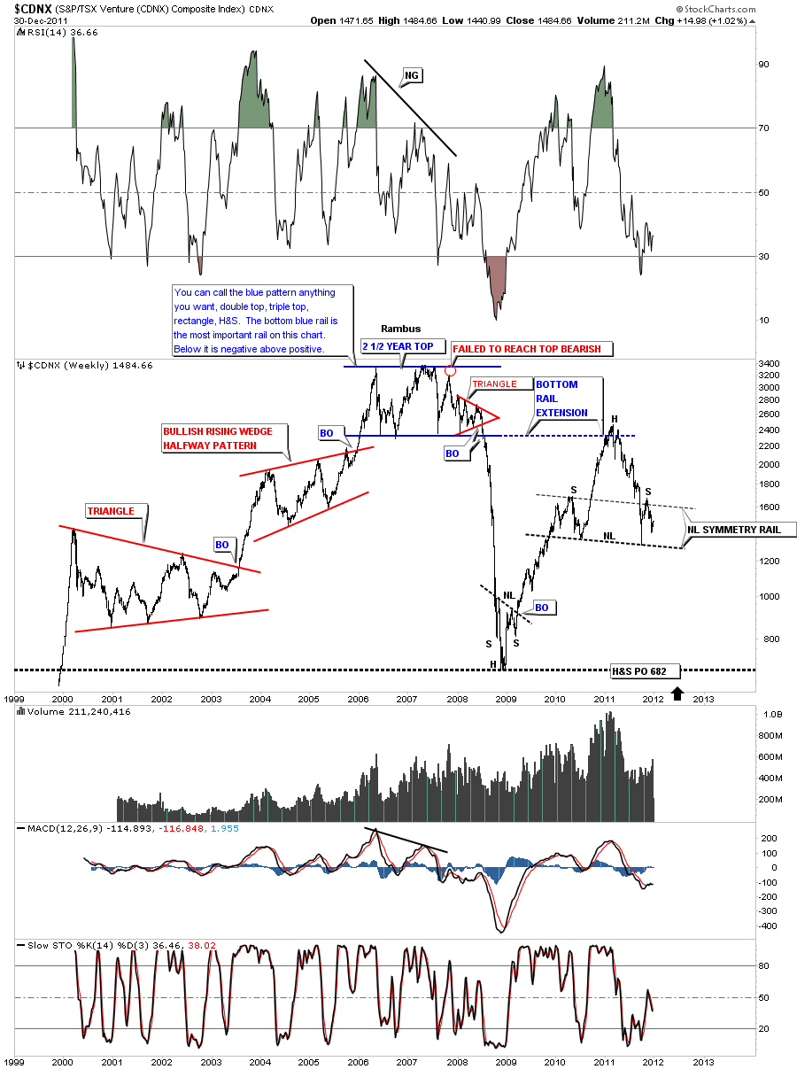
Before we dive into the charts for the HUI I want to start this post with a weekly look at the CDNX which was the only index we had, early on in the bull market, to gauge how the little junior precious metals stocks were doing. As you can see on the chart below the CDNX had a very good run from 2000 to 2006 where it began to digest the gains from the six year bull run. I want to focus your attention to the big blue topping pattern that started in 2006 and went on for 2 1/2 years. At the time it was forming no one knew if it was going to be a consolidation pattern or big top. As we were in a bull market, that horizontal trading range should have broken to the upside. As the pattern started to mature there were several clues that this wasn’t at all a consolidation pattern but a big giant top. You can see my annotations from that time where I said you can call this pattern anything you want, a double top, triple top, rectangle or even a H&S. I said at the time the bottom blue rail was the most important rail on pattern. Below it was negative and above positive. As it turned out the little juniors started their decline way ahead of the big cap PM stocks signaling the end of that phase of the bull market. There are two very important clues that led me to believe the 2 1/2 year sideways move was going to end up being a massive topping pattern. The clues are subtle but they are there. First clue was when we failed to reach the top of the big trading range on the last rally attempt, red circle on chart. That failure looked innocent enough but it was telling me we may have run out of energy. The second big clue was the little red triangle that formed at the end of the big trading range. Once that triangle broke to the downside the bottom of the trading range gave way in dramatic fashion. There were alot of hard core gold bugs that couldn’t believe the bull market could betray them like that and rode the whole move down. I won’t mention any names fully, but the carnage was complete when the final low came in. The lesson to be learned from that 2 1/2 year sideways move is never be married to a stock or index as they can divorce you in a heartbeat and feel no remorse. The reason I’m showing you this chart on the CDNX is that it may pertain to our present day trading range on the HUI.
CDNX weekly 2 1/2 year trading range turns out to be a top not a consolidation pattern.
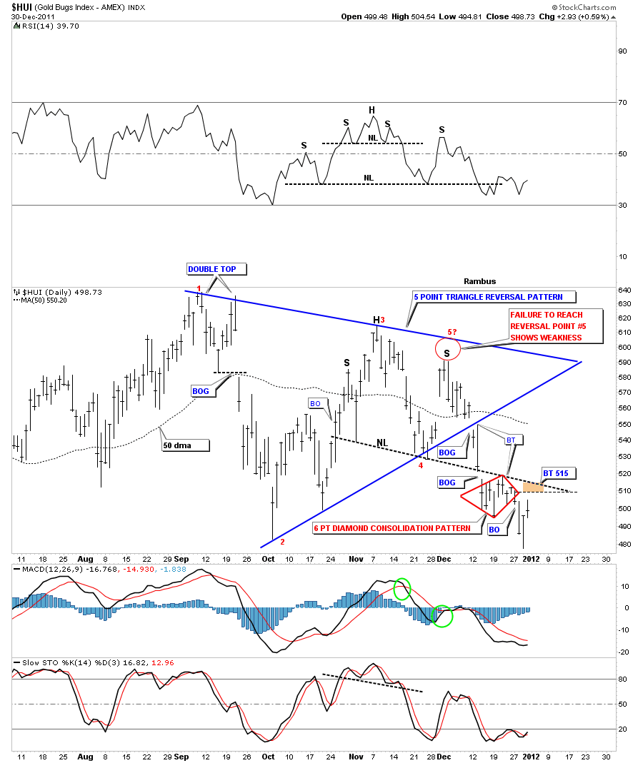
Now lets move on the the HUI keeping in mind the two important clues, the failure of the last rally attempt to reach the top resistance rail and the triangle pattern that formed at the end of the 2 1/2 year trading range. The 6 month trading range on the HUI shows a very similar setup to the end of the 2 1/2 year trading range on the CDNX. First note the blue triangle is a 5 point triangle reversal pattern where the 5th reversal point failed to reach the top rail. Sound familiar. And as you will see the blue triangle will play a very important role in a pattern that only subscribers of Rambus Chartology will see. I will go out on a limb here and say I’m probably the only chartists on the planet that is viewing this sideways trading range as a Diamond pattern.
HUI daily triangle with failed last rally attempt.
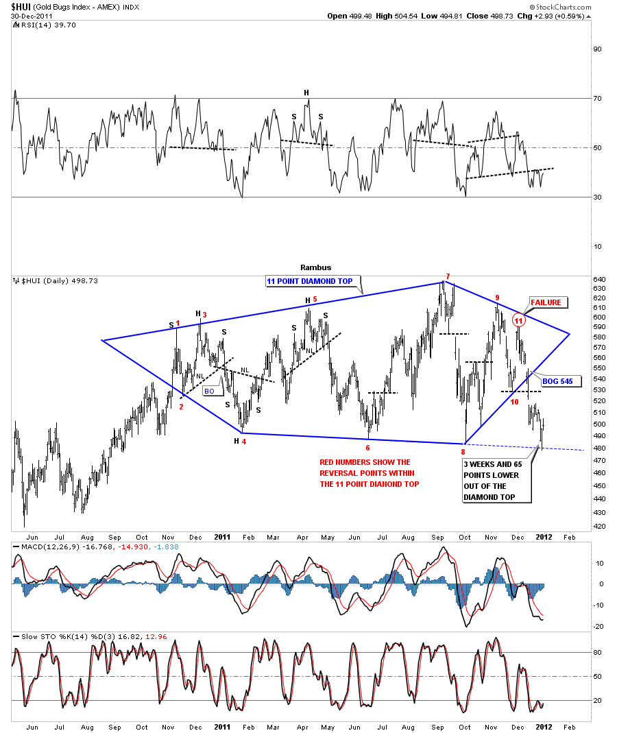
This next chart of the HUI will show you why the blue triangle and the failure at point 5 on the chart above plays a key role in understanding the finishing touches to a much bigger pattern, an eleven point Diamond top reversal pattern. I’ve labeled the reversal points with red numbers and circled the 11th reversal point that failed to make it all the way up to the top blue rail of the triangle. So for your eyes only the eleven point Diamond Top.
HUI daily 11 point Diamond top.
There are several more patterns of this year long trading range that I will show you in just a bit but there are two more things I want you to see on the 11 point Diamond. First, notice where the breakout came. It came on a breakout gap at 545 vs a breakout of the bottom rail of the expanding triangle that will come in at 480 or 65 points lower. The second thing is that the HUI has been in breakout mode for well over three weeks already. So the Diamond pattern is giving us an earlier heads up compared to the other patterns I will show you next. These next chart patterns are all valid and will confirm the 11 point Diamond top when they break thru their bottom support rails.
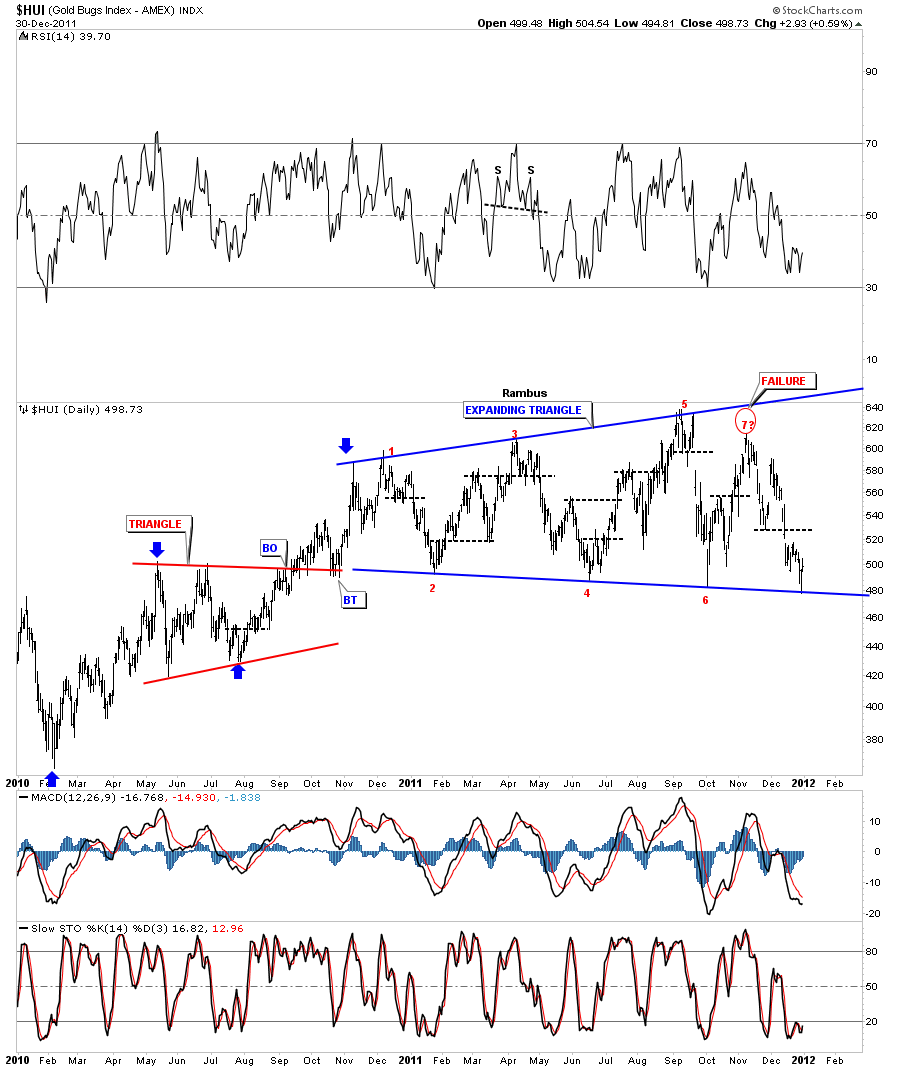
First is the expanding triangle that everybody is seeing. I’ve labeled the 7th reversal point as failure. An odd number of reversal points equals a reversal pattern.
HUI daily 7 point expanding triangle.
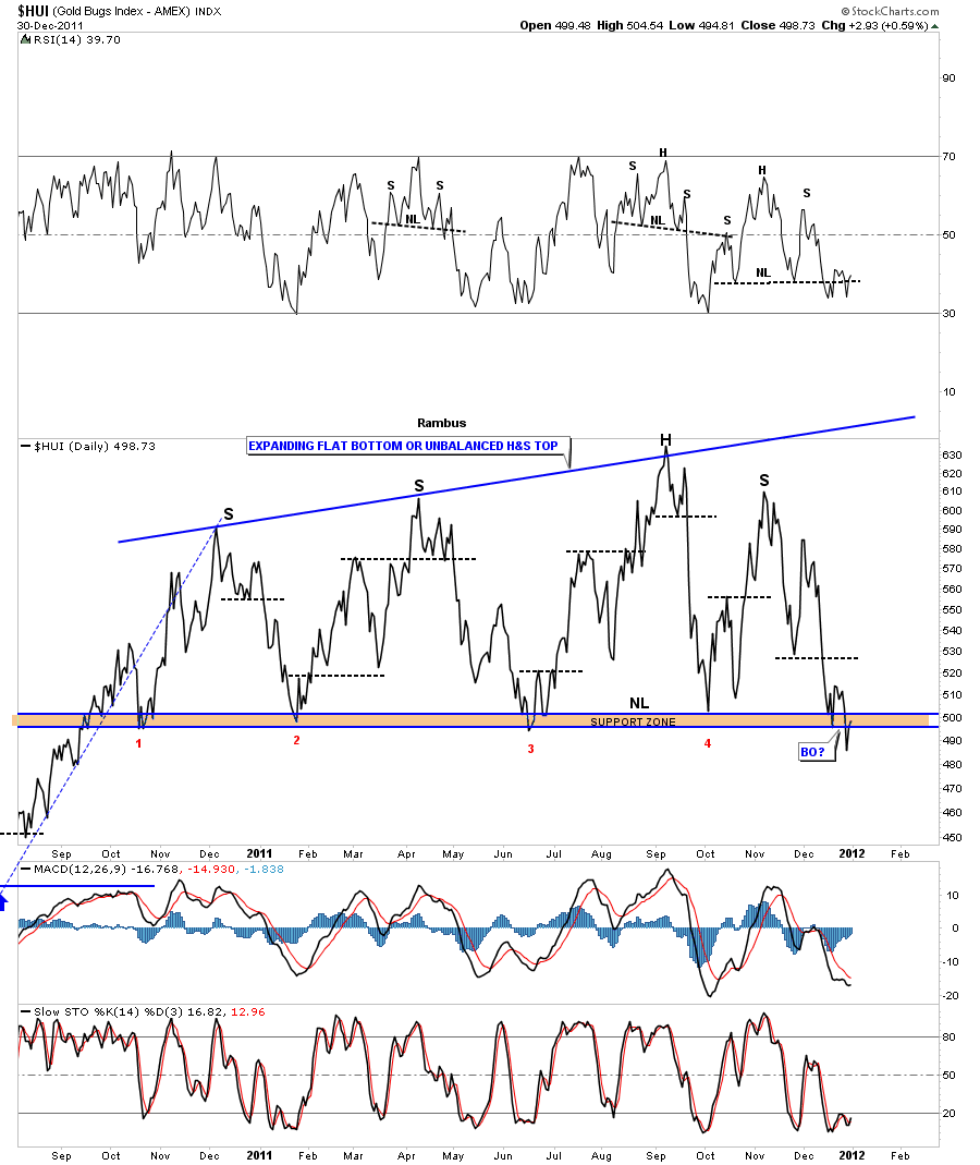
This next chart of the HUI is a line chart that shows two more equally important reversal patterns. The first one is an unbalanced H&S top pattern. There are two left shoulders and one right shoulder thus creating an unbalanced H&S. The other pattern on this line chart is a flat bottom expanding triangle. The rule of thumb is that the pattern usually breaks out through the flat rail, in this case the bottom. In the case of a flat top triangle the breakout usually comes through the top rail. Notice last weeks breakdown and now possible backtest to the flat bottom rail. We will have confirmation the top is in when the gravity of the bottom rail finally lets go and prices start to drop in earnest. We are close.
HUI daily line chart showing an unbalanced H&S top and flat bottom triangle.
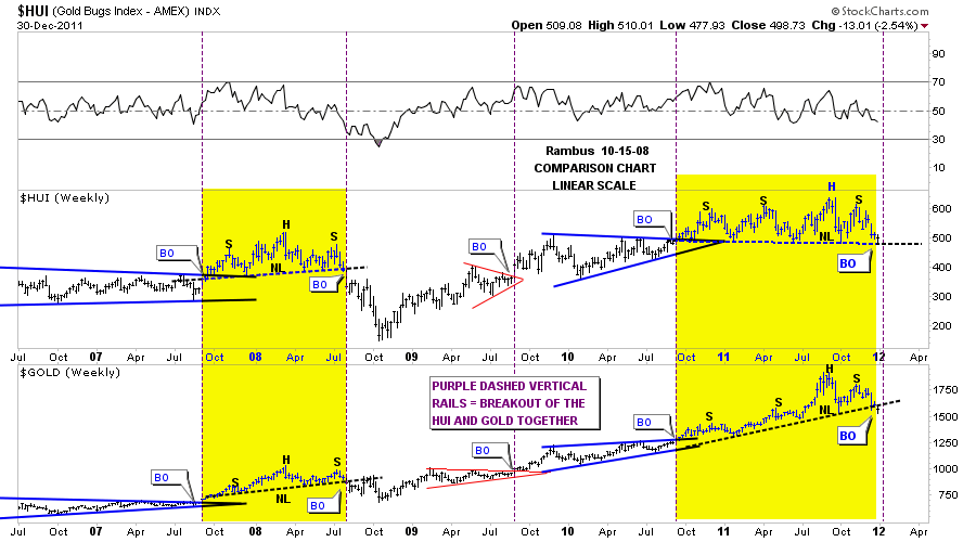
Now I want to look further out in time showing the HUI unbalanced H&S top and compare it to what we are seeing with gold. This next chart is a comparison chart with the HUI on top and Gold on the bottom. This weekly look shows how the HUI and gold tend to form similar chart patterns and breakout at the same time. Even tho gold has been much stronger than the HUI the patterns are very similar in nature. I would like you to take a good hard look at the yellow areas on the chart below. You will see both the HUI and Gold formed H&S tops back at the 2008 high. The big caps ended up being much weaker than gold but they both formed reversal patterns at same time and bottomed at the same time. Now look to our most recent area in yellow. You can clearly see the unbalanced H&S top on both the HUI and Gold. If you look real close at the last bar on the chart you can see gold broke it’s neckline last week where the HUI did not. Both those unbalanced H&S tops look very ominous to me. I think we are getting very close for the other shoe to drop once we get the backtests over with.
HUI and Gold weekly combo chart showing 2008 and 2011 H&S tops.
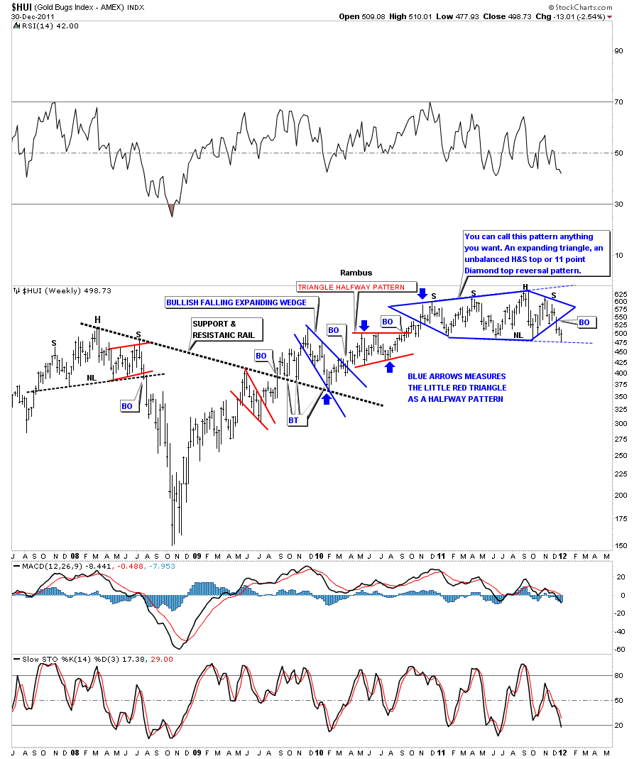
Below is a weekly chart showing the many faces of our one year trading range. Call it what you will but the break of the bottom rail will signal the top is in that is reversing the uptrend off the 2008 crash low.
Weekly one year trading range creating several different topping patterns.
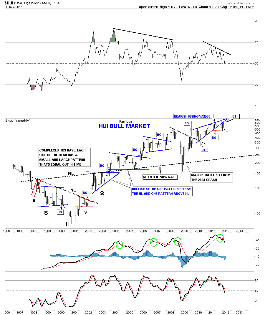
The monthly chart shows all the price action of the HUI since coming on line in 1996. Its really a very beautiful chart that shows all the nice consolidation patterns and the beautiful symmetry of the massive H&S base that was made to launch the bull market for the big cap precious metals stocks. If you look to the right side of the chart you will see one more reversal pattern that is part of the multiple reversal patterns in our one year trading range. Its a bearish rising wedge. Early on I was looking at that rising wedge as a bullish rising wedge consolidation pattern but the bottom rail kept getting broken to the downside and then we would rally back up into the pattern. So I gave up on that pattern and concentrated the other aspects of the side ways trading range which proved to be more useful. Note the HUI was down 86.04 points for the month of December. According to all the seasonality charts this was supposed to be one of the strongest times of the year for precious metals stocks. I think this weakness, during this time of the year, is another big clue the top is close to completing on the HUI.
HUI monthly look.
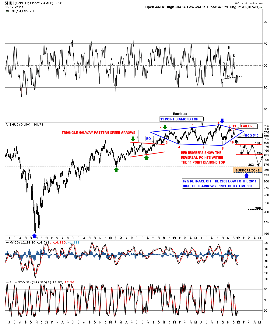
I want to end this post by looking at the 11 point diamond reversal pattern again and show a possible scenario if indeed the top is in. I don’t think we will get a crash type event but more of a slower grind lower. Reverse symmetry plays a big role in how markets behave after a top or bottom has been put in. How we went up, in this case, will play a direct role on how we may come down. You can see when we formed a triangle halfway pattern on the way up in 2010 and there is a possibility that we may form some kind of halfway pattern on the way down to the brown area that shows where I will be looking for some support to come in. That area is roughly 340 to 365. There is a 62% retrace off the 2008 low to the 2011 high that comes in at 338.
HUI 11 point Diamond top showing possible reverse symmetry going down.
So there you have it. The many faces of the HUI that maybe telling us a very interesting story if we listen. The 11 point Diamond top pattern has given us an early warning by already breaking out 45 points and 3 weeks ago. The scenario on the chart above that may or may not play out but it gives us a road map on what to look for.
I just want to wish everyone a Happy New Years and may the charts tell their story in a way we can take advantage of the situation. All the best ..Rambus
DOW Update
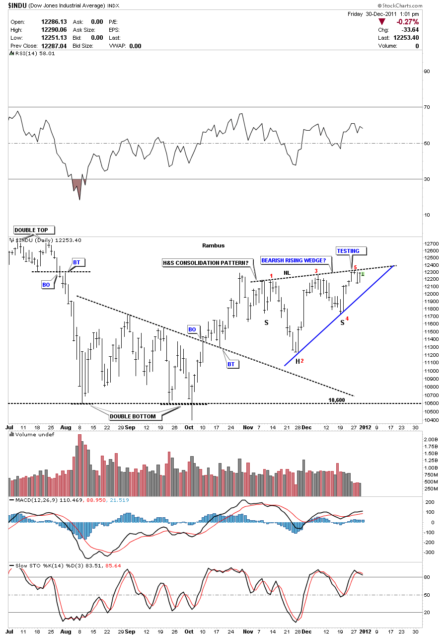
Last week I presented a chart of the Dow that showed a possible H&S consolidation pattern. Since that time the Dow has failed to break the neckline, to the upside, as this weeks action wore on. Potential patterns are just that until you get confirmation of a breakout on heavy volume. Neither has occurred with the Dow. It looks like the potential neckline is now going to act a the top rail of a bearish rising wedge. I left the annotations in place on the possible H&S consolation pattern on the chart below so you can see what has transpired. Usually after about 4 or 5 days, when you trade at a resistance rail and fail to get through, the stock will usually give up and start to decline. I think this is what we are about to see now. I’ve labeled the bearish rising wedge with red numbers. If we take out the bottom rail that will complete a 5 point reversal pattern which is what we want to see as the markets have been rising. This Dow chart will be a good proxy for adding to your short ETF’s as this is a low risk setup. We have a line in the sand with the top rail of the bearish rising wedge now in place.
Dow Jones daily potential 5 point bearish rising wedge.
Deja Vu ?
Hi its Fully here
I was just going through Goldtent archives and came across a series of posts by Rambus from 2008…which he called “What If”
March 28th 2008
These Posts from the old Goldtent site lost in the shuffle to the new site
March 31 2008
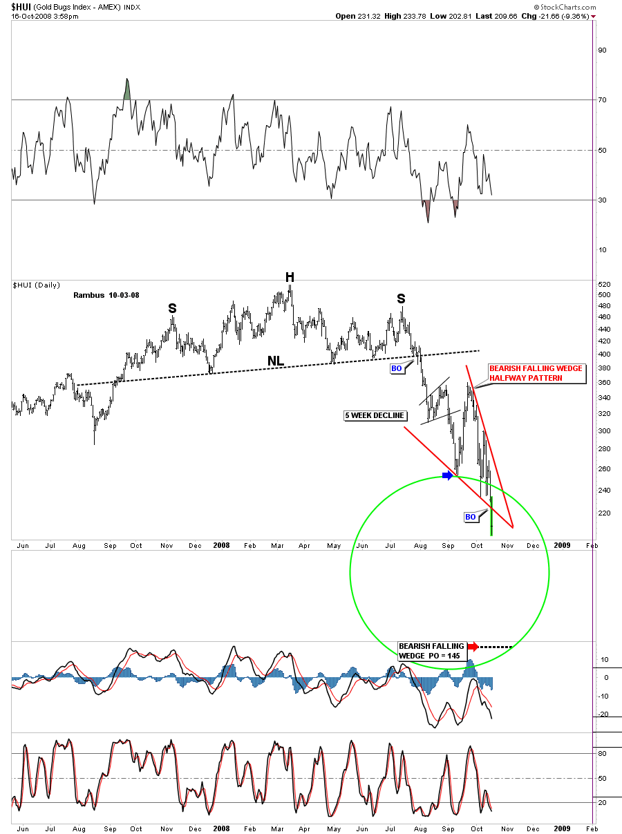
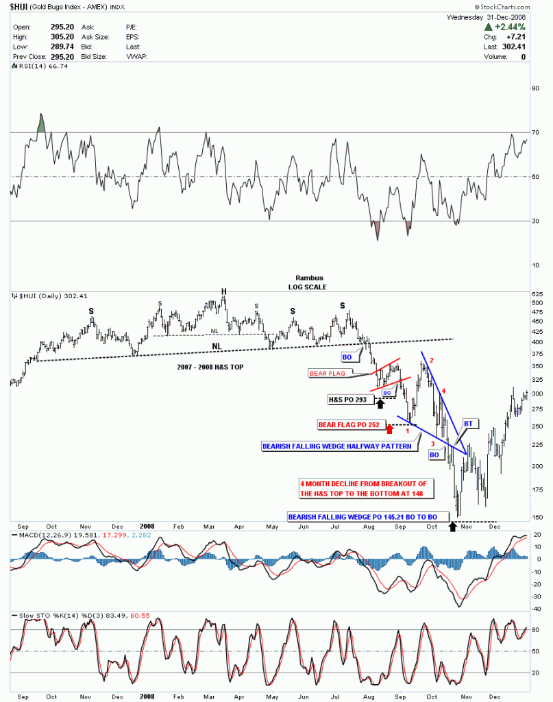
We were on a great run in 2008 and Rambus was hot…and bullish…making one great PO after another…then suddenly he turned bearish and Many scoffed at him….here is one of his charts from that era…just to show you …he projected HUI 145….I though he was a raving lunatic !! HUI dropped to 149 shortly thereafter !
Now I Pay attention when Rambus Speaks !
and here is what happened
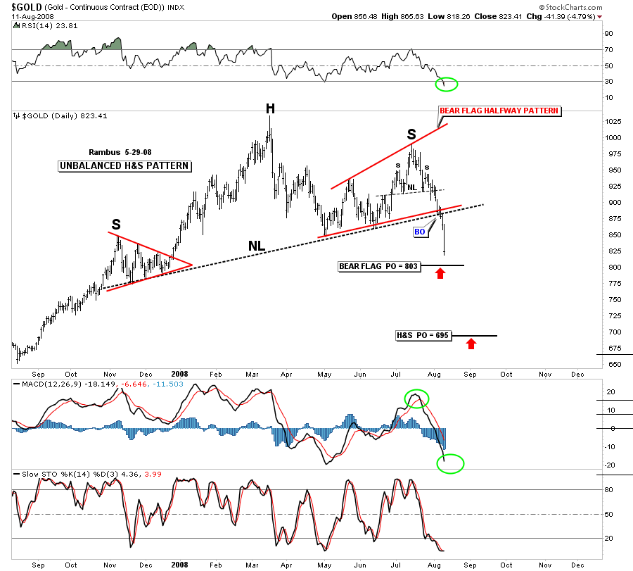
and how about this ONE for Perfection….sheesh Rambus !
Gold Bottomed where ?
695 !
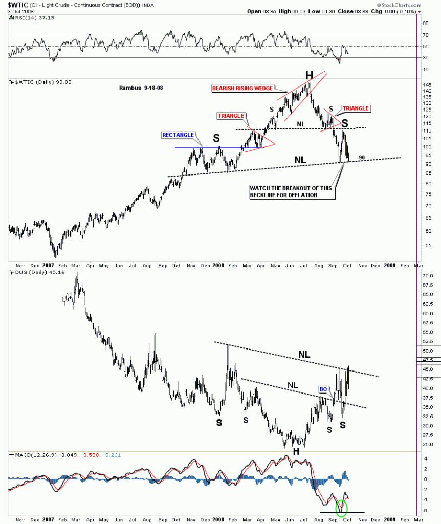
Then there’s this chart of Oil calling for 35 after a parabolic move to 145 ! Which is exactly where it went !
Rambus Quote from the 2008 era
I just want to say the reason I haven’t posted much lately is because I know I am in the small minority here and you all don’t need somebody with a bearish mindset to make you feel insecure about your long term positions. It isn’t about being right or wrong for me, about keeping it true. If the market changes I have to change or I will get left behind or trapped in a position that will be hard to recover from. I know most here are long term bulls with a long term look at things so until the market changes to the more positive side I will just post once a week or if something important happens to bring it to your attention.
All the best…Rambus

