IMPULSE MOVES

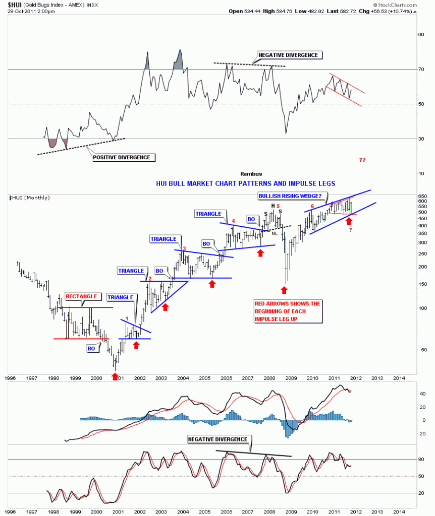
What is an impulse move and where does one begin? An impulse move is a very strong move that takes place after a period of consolidation or at the end of a very large decline. Depending on what time frame you are looking at they can be small if you are looking at minute charts or they can be very large if our are looking at a daily or weekly chart. An impulse move starts from the last reversal point within a consolidation pattern just before the breakout. The HUI bull market is a text book example of what an impulse leg looks like. From the very beginning of it’s bull market in early 2001 there have been 6 impulse legs higher, red numbers on the chart below. Two have started at the bottoms and the rest during consolidation patterns. The two bottoms where an impulse leg got started was the bear market low in 2001 and then after the 2008 crash. When you look at the chart of the HUI below it becomes very obvious what an impulse leg looks like. They are the straight line advances out of the consolidation patterns.

HUI weekly bull market chart patterns and impulse legs.

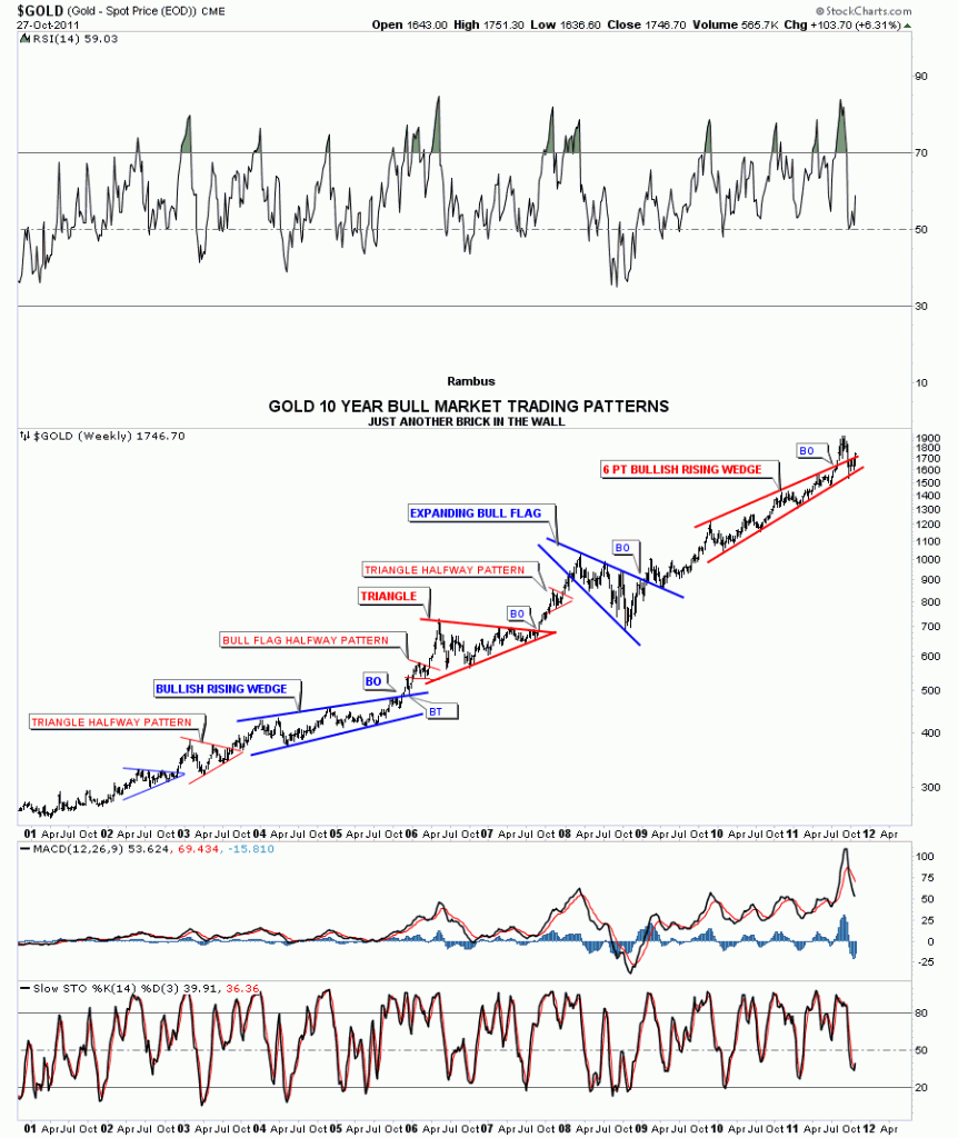
Gold has also been creating nice consolidation patterns and impulse legs since the beginning of it’s bull market. Alot of times an impulse leg up will be divided into two equal parts with a smaller halfway pattern that shows up in the middle of the move. I’ve labeled two little red triangles as halfway patterns on the chart below. You can see they came right in the middle of the impulse leg up. One at the end of 2005 and the other in 2007.

Gold weekly chart patterns with impulse legs in between.

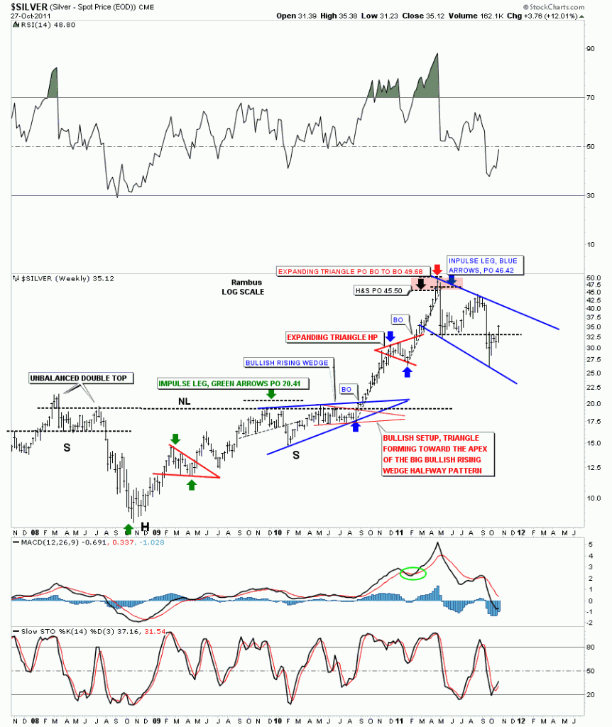
Lets take a look at Silver’s last impulse leg up to the 50 area. It was a text book move divided by an expanding triangle halfway pattern. On the silver chart below there are two impulse legs measured by the green and blue arrows. Just remember an impulse leg starts from the last reversal point within the consolidation pattern. Impulse legs are the power moves during a bull market.

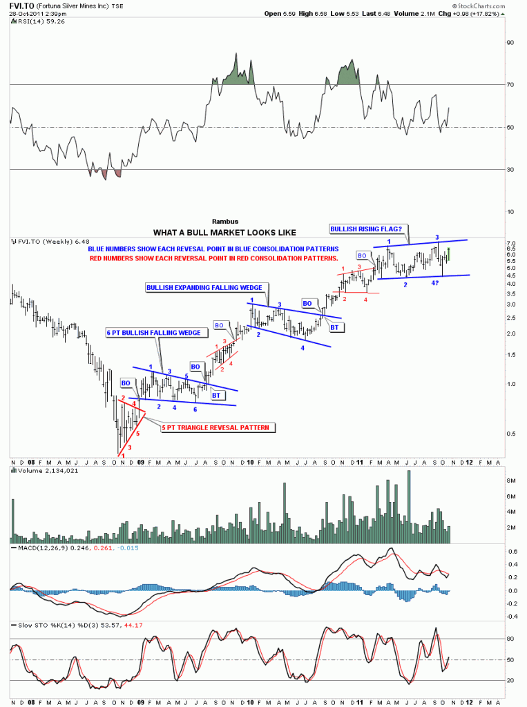
Lets take one more look at what an impulse looks and feels like. Below is a chart from our model portfolio that shows each impulse leg higher off the 2008 crash low. The big blue consolidation patterns are where the energy is derived from to create the next impulse leg up. The smaller consolidation patterns are roughly the halfway point during the impulse leg higher.  If you look at our latest blue consolidation pattern you may begin to understand what might be coming down the road in the not to distance future. Understanding how markets works, from a chartists point of view, can give you an edge in knowing what and where to look for certain things to develop.

FVI.TO weekly look.

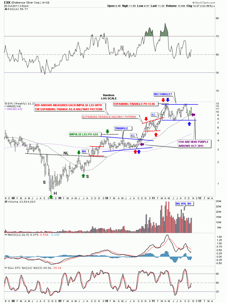
I posted this chart a couple of weeks ago showing where I think we are in context of the big picture. Note the purple arrows, your are here, on the chart below. If this is truly the start of the next big impulse leg higher you can see what lies ahead of us. Impulse moves are NOT to be traded. They are to be rode like a wild bronco for 8 seconds and then you jump off after the impulse leg is finished and wait for the next consolidation phase to begin.

EXK weekly look, you are here.

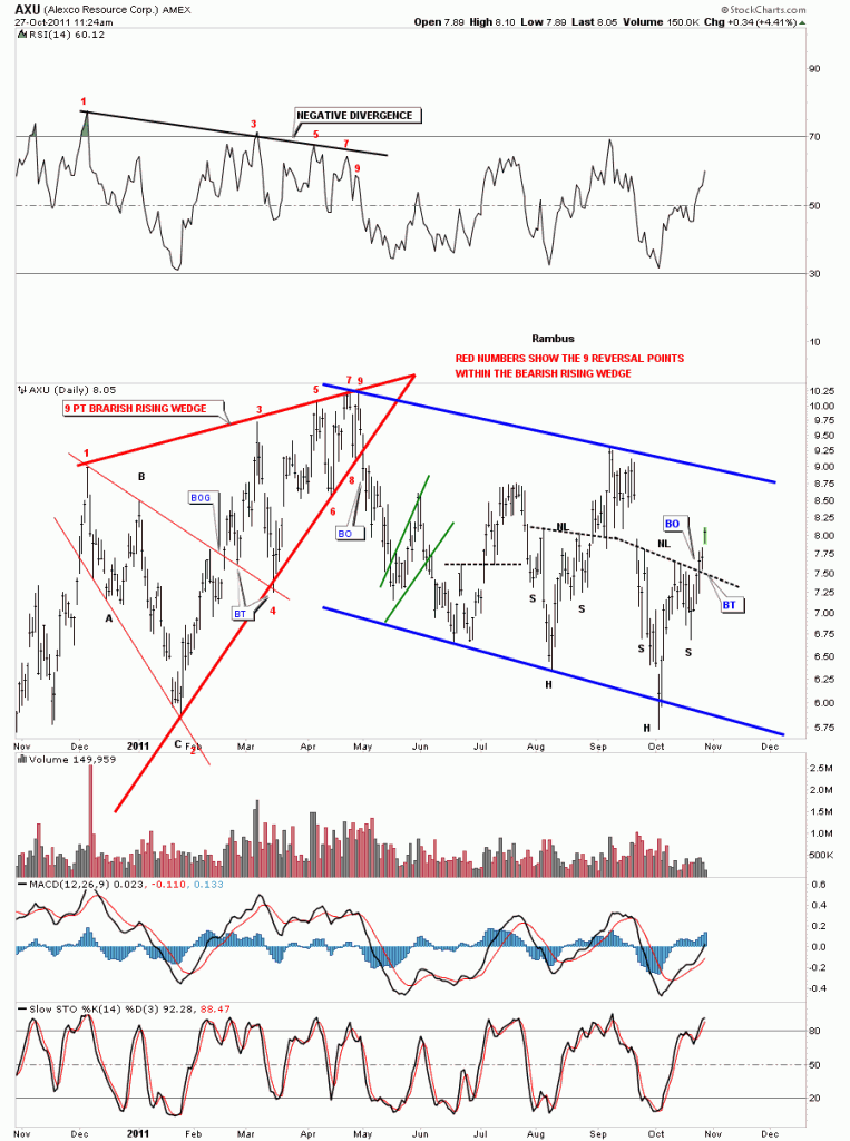
AXU H&S bottom

If the precious metal stock indexes are making H&S bottoms then it stands to reason that many individual stocks will also be making the same pattern. AXU is a good example of a completed H&S bottom. AXU broke the neckline 3 days ago. If you remember the sharp shakeout yesterday morning, after a very good open, alot of precious metals stocks did their backtest to the neckline to complete the breakout. H&S patterns are the most useful chart pattern to show reversals, either up or down. If you see one don’t ignore its implications for the stock or index as these are very powerful reversal patterns. H&S patterns also are good for measuring the future price objective of the underlying asset.

AXU daily H&S breakout.

HL quick update

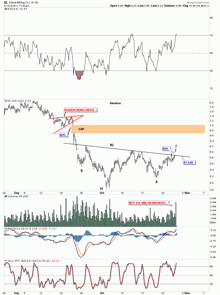
Last night I did the weekly stock analysis for HL that was requested by Goldfool. I pointed out the H&S bottom was nearing completion as we were trading right at the neckline. The 60 minute chart shows the clear breakout this morning with nice volume accompanied by a breakout gap.

HL 60 minute breakout.

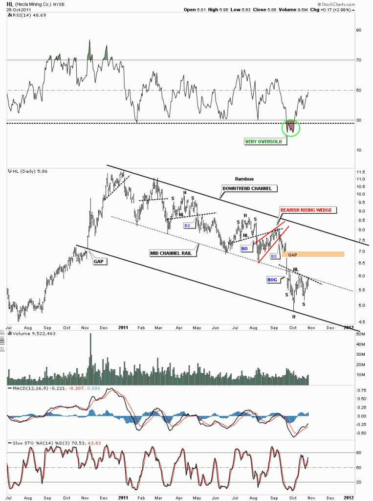
The daily look shows how this mornings gap up, on the breakout, took out two resistance rails at one time, the neckline and the mid rail of the downtrend channel. Its possible HL may do a backtest to the breakout point but there is no guarantee that will happen. If it does happen that would be a great low risk entry point  if one is not already in the stock.

HL daily H&S breakout.

HL chart of the week

Goldfool requested to see Hecla Mining Co. as his chart of the week. HL has been one of those precious metals stocks that have been in a slow motion, downward grid for the better part of a year now. It’s been locked in a downtrend channel creating one H&S top pattern below the next one. It has lost almost 50% of it’s value since the beginning of this year. It diffidently has not been a star performer by any stretch of the imagination.  So without further ado lets see what this silver miners chances are for the next impulse leg up for the precious metals stocks.

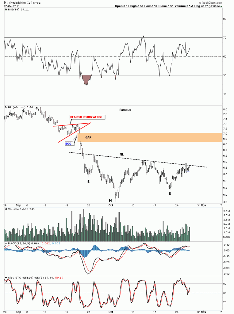
As always we’ll start with the short term 60 minute look and work our way out to the long term 20 year monthly chart for perspective. As with so many precious metals stocks right now there are many stocks that are chopping out H&S bases. This H&S bottom, on HL, is very similar looking to many other H&S bases forming across a broad range of PM stocks. HL is testing the neckline but hasn’t broken out yet.

HL 60 minute H&S bottom.

The daily look really shows the terrible grind HL has been in since the first of the year. It wasn’t bad enough that HL was trapped in a downtrend channel but it actually broke out thru the bottom rail toward the last of September and actually doubled the downtrend channel. HL has been one beaten up stock but after such a long drawn out downtrend it’s now beginning to show some life. We will now take the H&S bottom on the 60 minute chart and transpose it to the daily chart so you can begin to see  how important the placement of this pattern is. This H&S bottom is coming at the end of something not the beginning of something which is what you need to see from a reversal pattern. Keep your eye on the neckline as we are there right now and the center black dashed mid line. This may offer some very short term resistance but if the H&S bottom is for real the break of the neckline should come fairly quickly.

HL daily downtrend channel with H&S bottom.

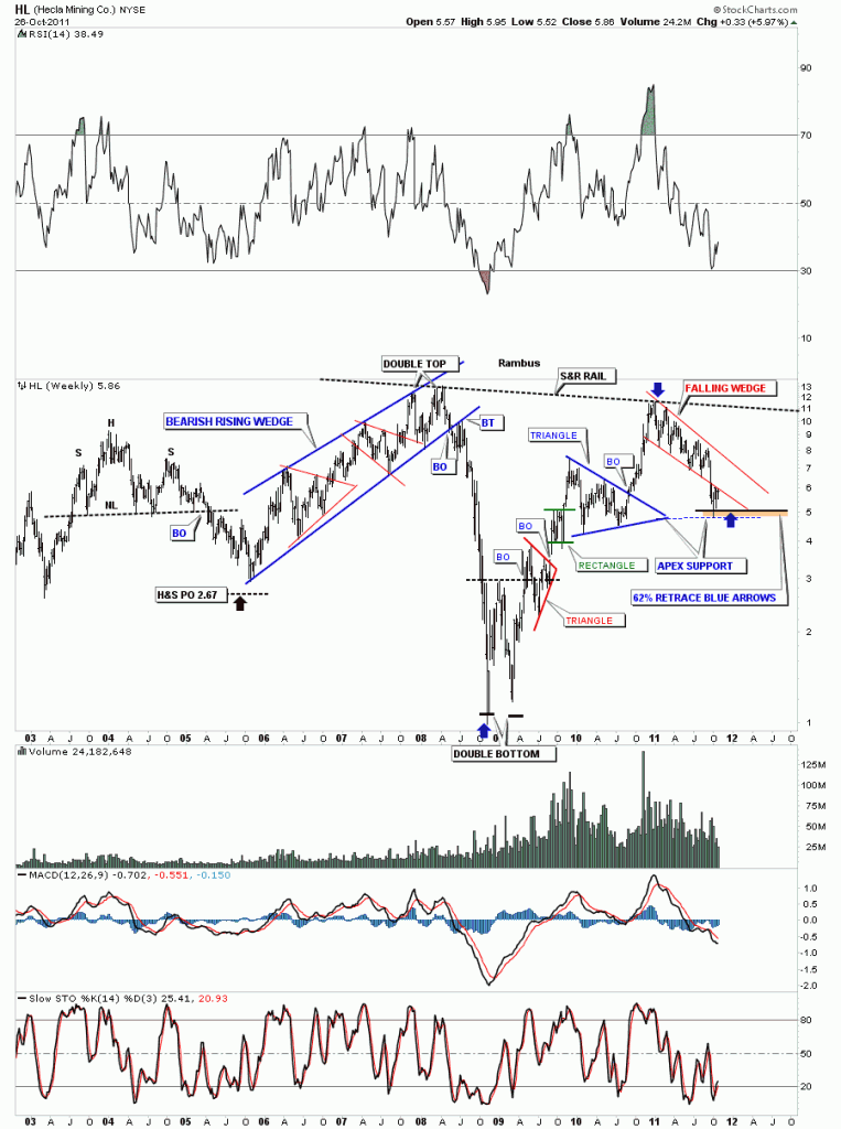
The weekly look gives you a feel for where HL has been in relation to where it is right now. Here are a couple more reasons why the H&S bottom is forming right where it is. First we have the apex of the blue triangle that often times gives good support. As long as we don’t do an end around the apex move the support is solid. Next is the Fib 62% retrace off the rally that began at the crash low in  2008 and our most recent high at the beginning of this year. So again this is a perfect place for a H&S bottom to form. The brown area shows where the two support zones come into play.

HL weekly look.

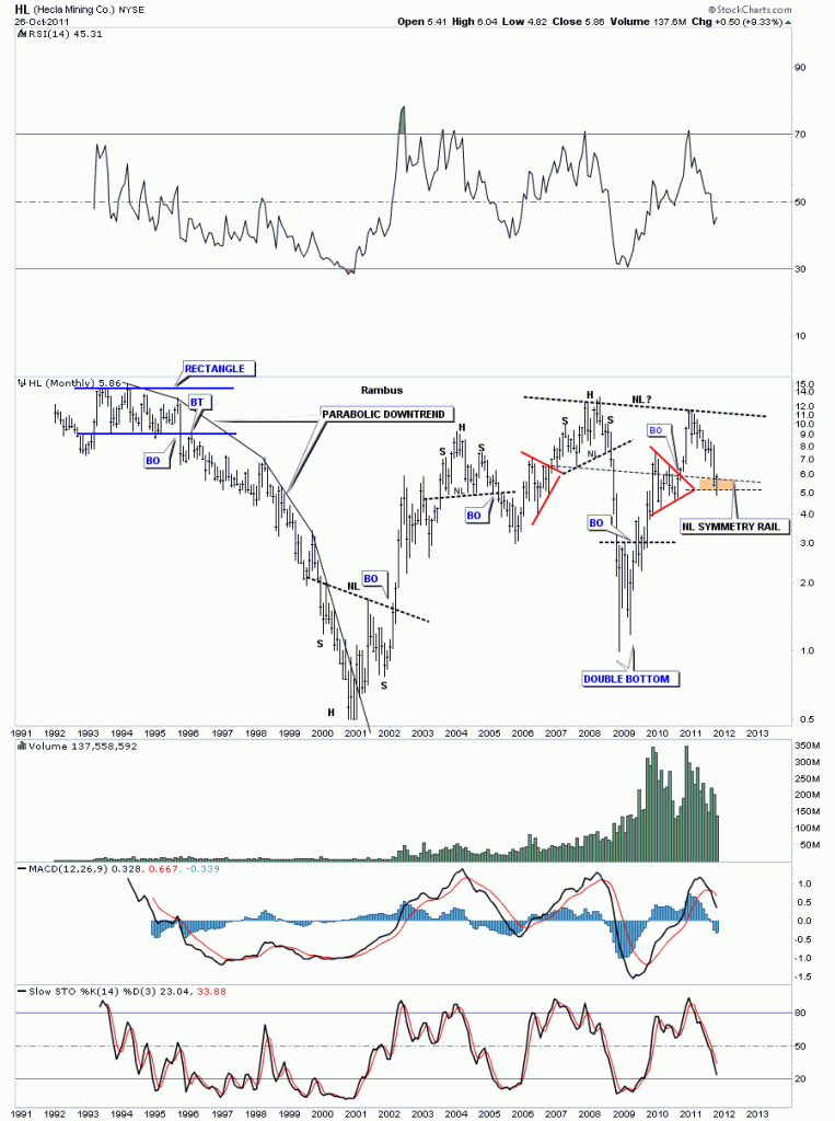
The monthly look shows 20 years of price action. HL had a parabolic downtrend from the rectangle top in the mid 90’s to the bear market low in 2001. I have added a brown zone, buy area, based on one more pattern that says this could be an important bottom. Sometimes I will use the original neckline and bring it down to the bottom of the left shoulder to help find the bottom of the right shoulder. I call this the neckline symmetry rail. HL could be forming a very large H&S bottom that has taken 3 years to build. I don’t know if this pattern, that is setting up on the monthly chart, is actually going to be a H&S bottom or morph into something else. We just have to take it one step at a time. First we have to see if our H&S bottom, that shows up on the 60 minute and daily look, is going to actually be the bottom of the right shoulder. Watch the neckline very close for your clues on what may unfold.

HL monthly look.

I hope, Goldfool,  this little exercises in charting gives you a clearer understanding of where HL is in the big scheme of things. Bottom line, there are much better precious metals stocks out there that are close to breaking out into new all time highs and are leading this impulse leg higher. On the other hand you have a beaten up stock that has corrected more than half of it’s value and looks to be putting in some kind of bottom in this area. Good luck and all the best ….Rambus

GLD

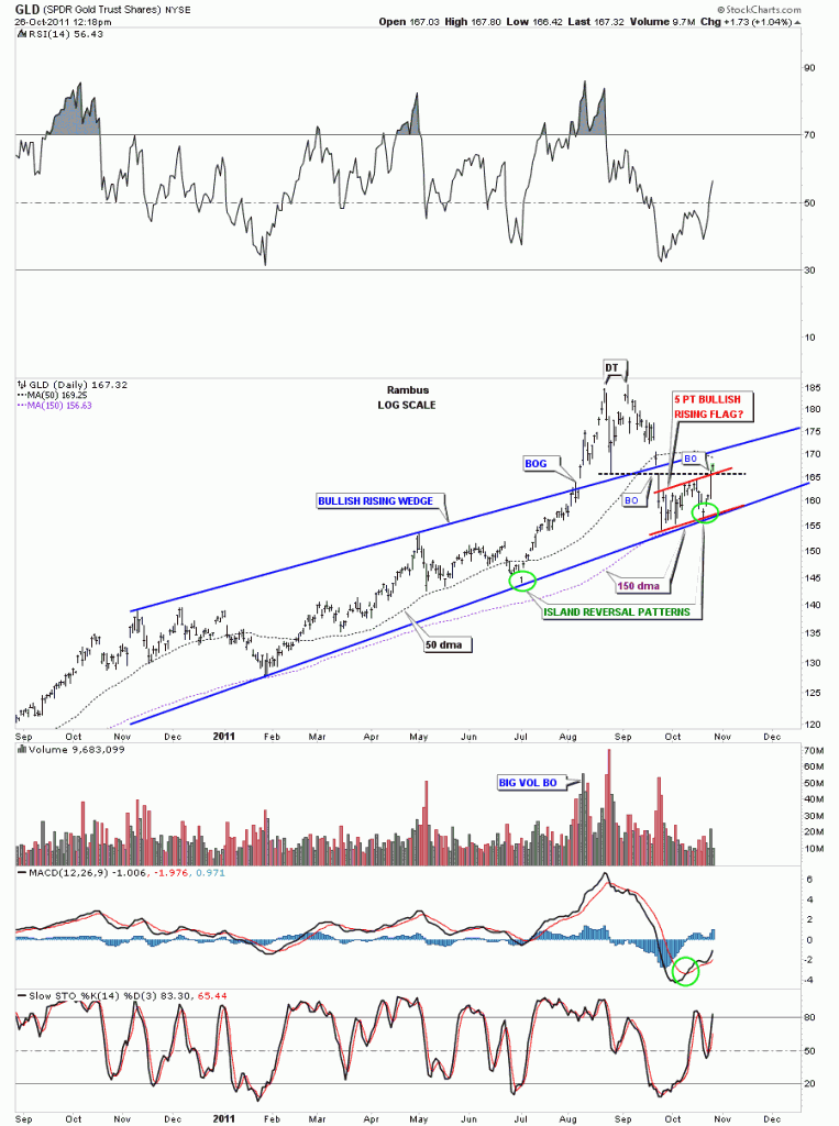
Yesterday we looked at alot of short term, 60 minute charts, to see how our month long consolidation patterns have been progressing. Today I want to put our little 5 point bullish rising flag into perspective on the daily look for GLD. So far GLD is doing everything right for a positive resolution to the upside. This morning we took out two critical resistance rails, one being the black dashed horizontal rail that marked the breakout from the double top. We also took out the top rail of the 5 point bullish rising flag. As you can see the two rails intersected right at today’s price action. If GLD was weak it probably would have failed at that critical resistance point. The fact that we are trading above that resistance is a good sign. I have circled in green two little Island reversal patterns that formed right on the bottom rail of the bullish rising wedge. This is also a positive. The next positive thing about the daily GLD chart is we once again have bounce off the 150 dma which has held any correction for the last two years or so. One more positive sign is how the bottom rail of the bullish rising wedge has held support during this correction. That takes care of the positive stuff. As you can see on the chart below we have 2 more resistance rails just above today’s action. One is the 50 dma and the other is the top rail of the bullish rising wedge. If we can get thru those last 2 resistance points then GLD should be go to go for awhile. Stay tuned as these are interesting times in the precious metals complex.

GLD daily look.

GLD update

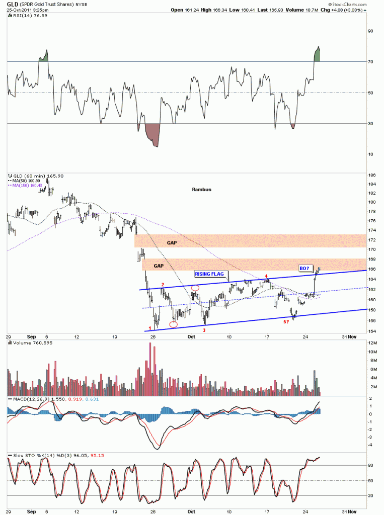
Just like SLV the GLD also has been consolidating for the last month chopping in a tight range. Below is a 60 minute chart showing the 5 reversal points and today’s breakout above the top rail. We had nice volume on today’s rally that makes the breakout more satisfying from a Technical Perspective. It will be interesting to see how we inter act with the two big gaps that are just north of where we are currently trading. We should get a backtest to the top rail now that should pave the way for higher prices. As I stated earlier today, if we get back into the rising flag we would have to go back to a neutral reading and await further developments. Keep your fingers crossed.

GLD 60 minute look.

XAU update

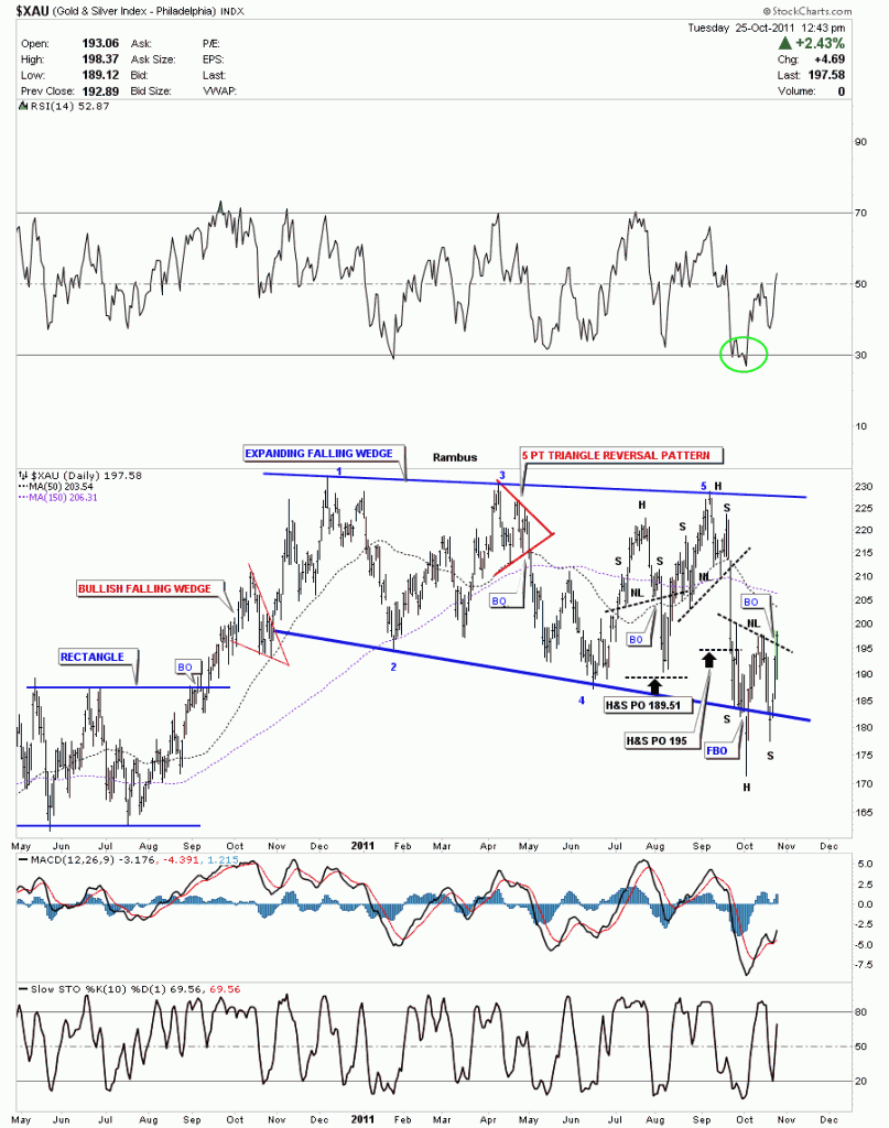
The XAU is one step ahead of the smaller cap index GDXJ as it’s breaking the neckline today signaling the completion of it’s H&S base. As I showed yesterday, on the HUI 60 minute chart, whenever you get a false breakout and then the price action takes you back into the original pattern, chances are it was a shakeout just before the big move gets underway. The specialist, market maker, will clear his books of all the stop loss orders which resides just below an importing support zone. He will then sell his bounty to the Johnny come latelys later on when the impulse leg becomes mature. This is just typical market action.

XAU daily H&S breakout.