Weekend Report…Chartology vs Fundamentals

I’ve been holding off on writing this Weekend Report for the US stock markets until I got just a little more confirmation that the next impulse move higher is underway. Last weeks price action is strongly suggesting that the nearly 2 year consolidation phase is drawing to a close. Lets say I’m seeing some green shoots sprouting up in many different areas of the markets.

Most investors rely on the fundamentals in which to make their trading decisions because that is how its been since the beginning of trading the markets. Fundamentals do have a place in investing in the long term trend but they usually lag at the beginning of a major turn in the markets. Normally when the fundamentals turn up at the bottom of a bear market the price action has already turned up many months in advance. The same thing is also true at tops. Before the fundamentals turn down the smart money has already gotten out while those looking at the fundamentals are left holding the bag.

If what I’m seeing in the charts right now is correct then the Chartology is going to show you what the fundamentals will be like in 6 month or longer down the road. Most fundamentalist have been looking for the stock markets to crash based on their own interpretation of the fundamentals. At some point they will be right, but until then they have missed out on the biggest bull market in history which only comes around once or twice in a lifetime.

At this point in time Chartology is suggesting there will be some good fundamentals that will drive the stock markets higher over the next year or two. Right now investors who look at the fundamentals think that Europe and the emerging markets are on their death bed with no heartbeat, but the Chartology is strongly suggesting something entirely different is taking place. With weak energy prices and commodities in general that suggests a weak global economy which has only one direction to go which is down, but the Chartology is suggesting something else is brewing. We keep hearing that the Fed is going to blow another bubble in the money supply which is going to crash the markets this time, but this is the same story we’ve heard over the last 10 years. At some point the fundamentals are going to be correct, but at what point, one year, two years, five year maybe another ten years in the future? The fundamentals can’t tell you when that day of reckoning will come but Chartology will give you a much quicker heads up when some type of reversal pattern shows itself.

Keep in mind we still haven’t even seen the blow off phase in the stock markets yet which will be another good clue that the markets are becoming exhausted as everyone and their brother want in. If you were trading in the late 1990’s you know exactly what I mean. The pessimism right now with many investors is too strong for the bull market to end. When they finally relent and begin to turn bullish you will then know the bull market is living on borrowed time.

Lets start by looking at some mechanical trading systems we’ve been following for many years now which takes all the emotions out of the equation. Mechanical systems don’t care about interest rates, unemployment, currencies or anything else that can affect ones judgment. It’s pure and unbiased.

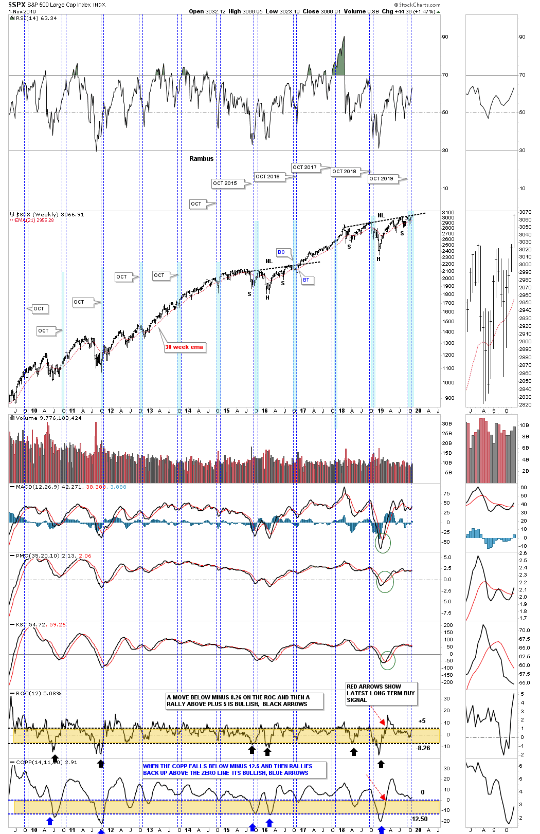
This first mechanical trading system is the 21 month trend follower chart which I won’t go into a lot of details as we’ve covered this chart for many years. It’s very simple and easy to understand. When the SPX is trading above its 21 month simple moving average you are on a long term buy signal and when the price action closes a month below the 21 month sma you are on a sell signal. This 25 year monthly chart shows just two outright sell signals, one in 2000 and the other in January of 2008. Note how the price action interacts with the 21 month sma which works like a moving trendline. After a breakout above or below the 21 month sma you will generally see a backtest to confirm either the buy or sell signal as shown by the red and green circles.

Over the last 25 years there were just four small whipsaws as shown by the blue circles. The first one occurred in 2011 that lasted just one month. The second one happened during the consolidation phase in 2015 which was a particularly touch correction when you live though it in real time. The last one took place about 10 months ago on Christmas Eve 2018 which lasted just one month.

As you can see this 21 month mechanical trading system has been on a buy signal since January of 2019. Note how well the 21 month sma has held support since the beginning of the year. At some point when this new impulse move gains strength we should see the SPX start accelerating away from the 21 month sma which it may be in the process of doing as this month is still young and the SPX is trading above the previous monthly bar. Currently the SPX would have to close this month below the 21 month sma which is at 2822 to confirm a new sell signal.

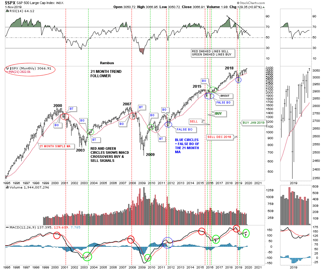
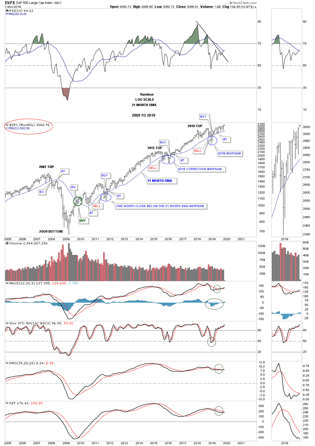
This shorter term monthly chart shows how the 21 month sma has done since the 2009 crash low. Keep in mind when the price action breaks below the 21 month sma you are on an automatic sell signal with confirmation when the backtest is complete. Just the opposite is true for a buy signal. Since the bear market low in 2009 the SPX has only spent 5 months on a closing basis below the 21 month sma which is pretty incredible when you think about it.

This second long term buy and sell signal chart I like to use in conjunction with the 21 month sma Trend Follower mechanical systems which uses the the MACD and blue Histogram. Again this mechanical system is very easy to understand. A long term buy signal is given when the black line crosses above the red line on the MACD, red circles. Confirmation of that buy signal is when the blue Histogram crosses above the zero line as shown by the green circles. Note how our latest buy signal was executed just 2 months ago in September which now confirms the 10 month January buy signal on the 21 month Trend Follower chart.

Back in 2015 when we were waiting for a new buy signal to take hold I compared how similar the 2015 low looked to the 2002 low. The point I was making at the 2015 low was how low the MACD was in comparison to the price action on the SPX. While the MACD was just crossing over to the bullish side, the SPX was trading right near its all time highs which strongly suggested that the SPX would experience a big move until the next sell signal showed up on the MACD which happened 2 years later in November of 2018. As you can see we have a very similar setup right now with the MACD just beginning to turn up while the SPX is trading in new all time high territory.

The last point I would like to make on this chart is the buy signals that occur on the RSI at the top of the chart. So far every buy signal over the last 25 years has occurred when the RSI broke above its down sloping black dashed line at the same time as the blue histogram bars and the MACD. As you can see the black dashed downtrend line on the RSI is currently giving way to another buy signal.

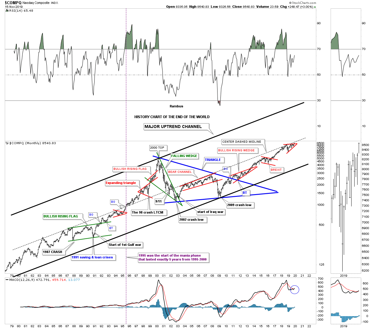
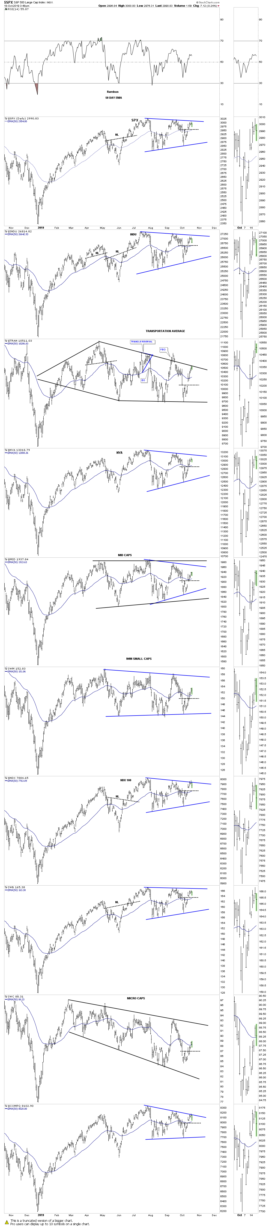
Generally the two weakest months of the year are in the stocks markets are September and October with October being regarded as the crash month. This year all we heard was how the markets were going to crash in October and the new bear market would begin and the world as we knew it was going to come to an end according to the fundamentals. A funny thing happened on the way to the crash scenario, the SPX ended up making a new all time high.

This next chart is a long term 10 year weekly chart in which I show the price action for each October going back to 2009. Generally speaking October is a great time to buy your favorite stock as the stock markets are entering into the strongest period of the year that usually runs until May of the following year. This years looks to be no different as the SPX is breaking out to new all time highs. I’ve been showing the H&S consolidation for quite some time now which is on the verge of breaking out which ties into the strong period of the stock markets. Note the impulse move that followed the breakout from the 2015 H&S consolidation pattern.

At the bottom of the chart there are 2 long term indicators that give long term buy and sell signals which I describe on the chart.

I’m just scratching the surface using charts to show you how the next impulse leg up is unfolding in the stock markets. I have some daily and weekly charts that I haven’t shown you yet that are strongly suggesting the breakout is underway. I realize that most only care about the PM complex but I believe that having some positions in both the stock markets and the PM complex is justified IMHO. I have many more charts that I will share with you in the Wednesday Report.

All the best…Rambus


Friday Sell/stops Update…

I’m going to hold all positions into next week.

There was little action in the PM complex today which can happen at important inflection points when investors are waiting for direction. This daily chart for the GDX shows today’s price action still trading at the potential neckline.

This daily chart shows the potential trading range building out with the GDX trying to establish a low for a rally up toward the top of the trading range.

And then we have this weekly chart for the GDX which shows the horizontal resistance line forming between the 2016 and 2019 highs at the 31 area. For now I’m viewing the 2016 – 2019 resistance line as bullish above and bearish below for the long term picture. Short term anything is possible.

I’am well aware of the possible falling wedge that many of the PM stocks and indexes are  building out. The real question will be how the falling wedges workout. Will they be a stand alone pattern, meaning they will show up as a bullish falling wedge halfway pattern in the next impulse move up? The other possibility is will they just be the first and second reversal points in a bigger consolidation pattern?

Below is a daily chart for AG which shows the falling wedge as a stand along or part of a bigger consolidation pattern?

AU shows another example.

As you know I used the 30 week ema as my sell/stops when I had the Gold Stock Portfolio fully invested earlier this year before I went to cash in September. This week I would have had to exit several more of my original positions if I had stayed long. What we are beginning to see is what PM stocks are holding up the best which I’ll be watching very closely when I’m ready to jump back in. For me personally I’m content to be in cash in the PM Stock Portfolio for now. I know there are going to be many more trades that are going to develop over the life of this bull market.

Below is the daily stock market combo chart for the US stock markets which shows most of the indices building out a 3 month trading range. The price action on some of  the indexes hit the top rail this week and is backing off which is to be expected on the initial hit. If the bull market is going to play out the first thing we’ll need to see is the top rail of these smaller consolidation patterns, which are part of a bigger consolidation pattern, breakout above their respective top rails.


Late Friday Night Chart..Perspective is Everything

Perspective is everything when it comes to the markets. It is always most important to look at the long term charts first and then work your way back to the shorter timeframes. Long term charts also show where major support and resistance resides that can have a calming affect on ones emotions when the inevitable corrections take place.

Its been several months or so since we last looked at this 30 year quarterly chart for Gold that gives us very clear roadmap of how the price action may play out over the intermediate to longer term. Looking at the massive double bottom which launched Gold’s 2000’s bull market you can see there were three quarters of price action that took place on the breakout above the double bottom trendline with the final backtest occurring during the 3rd quarter of the breakout.

Now compare our current breakout above the 6 year H&S neckline to the breakout above the double bottom trendline in 2002. How many PM investors do you think were waiting for the backtest to occur in 2002 so they could buy their favorite PM stock? The psychology is no different now then it was during the backtesting phase in 2002. Investors who bought the breakout back then became just as discouraged as many in the PM community are today that don’t understand what is taking place right now.

Everything is big when you look at big chart patterns from the patterns themselves, to the impulse move that follows, to the breaking out and backtesting process. A backtest to the six year neckline around the 1350 area would be perfectly normal and actually should be expected. I’ve mentioned previously that I would prefer to see a backtest to the neckline as that would confirm the massive H&S consolidation pattern and ensure a bull market that could last for years to come.

The last point to make on this 30 year quarterly chart is the ping pong move that is taking place between the neckline and the bottom rail of the 6 point rectangle consolidation pattern that formed at the bull market high in 2011 at 1550. So from a Chartology perspective we couldn’t ask for better price action taking place within the big picture look.

Big patterns lead to big moves. All the best…Rambus


Weekend Report…The Incredible World of Gold Stock Chartology

Tonight I would like to start out by looking at the old ratio combo chart that has the GOLD:XAU ratio chart on top with the XAU on the bottom. I’m not going to go over all the details the ratio combo chart has, only to emphasize the 20 year 6 point parabolic arc which shows how gold had been outperforming the XAU until the small double top at 24.33 in late 2015. When the parabolic arc was broken to the downside in early 2016 that strongly suggested that it was going to be the XAU’s turn to outperform gold.

Initially, you can see the sharp vertical move down that broke the back of gold outperforming the XAU at 12.50. From the low in early 2016 the ratio had been building out the blue rising flag until the bottom rail was broken to the downside just 3 months ago in June. Since then the ratio has been in backtest mode to the bottom rail of the rising flag which looks like it could be coming to an end which shows up better on the weekly chart we’ll look at later.

As you can see I’ve labeled the blue rising flag as a halfway pattern that could very well lead to a vertical move lower similar to the one we seen off the double top at 24.33. If that ends up being the case then the XAU, on the bottom chart, will be a halfway pattern to the upside. The big question regarding the GOLD:XAU ratio is, will the old trading range between 3.70 and 5.10 come back into play at some point in the future? If that is the case then the  XAU and PM stocks in general have a lot of catching up to do and should outperform gold in a big way going forward.

Next is the weekly line combo chart for the GOLD:XAU ratio on top with the XAU on the bottom that focuses in on the shorter term look. As you can see the ratio chart on top has clearly broken the bottom rail of the blue rising flag and has been in backtest mode. The XAU on the bottom chart has clearly broken out of its 2016 bullish falling wedge inversely to the ratio chart.

Below is the exact same combo chart as the one above but I’ve changed the setting to show a bar chart instead of a line chart. It looks like 2 weeks ago the price action backtested the bottom rail of the rising flag which may now be complete. You may have also noticed the massive H&S top on the ratio chart and the H&S bottom on the XAU that are still in play. Unlike gold which has already broken out of its 6 year H&S base the XAU along with the rest of the PM stock indexes have yet to breakout of their massive H&S bases which really puts things into perspective IMHO.

It’s been awhile since we last looked at this long term monthly chart for the HUI which shows its entire history and all the Chartology. You may recall that when the price action was still trading inside of the 2016 bullish falling wedge I was looking for a possible touch of the bottom rail of the major bull market uptrend channel that would have been hit around the 120 area. The actual low for the 2016 bullish falling wedge was about 10 points higher at the 130 area for the 4th reversal point.

You’ve often seen me point out the 2008 crash in the PM complex. If you were trading back then you know exactly what I mean by crash. On the other hand there are new investors in the PM complex that never felt the pain of that crash event which is unfortunate as it was a good learning lesson. You can see what the crash looks like on this history chart for the HUI.

For me personally I was able to see the 2008 H&S top forming well before it broke down. There were very few leveraged etf’s back then in the PM complex so I ended up buying DUG which is a 2 X short oil etf and SMN which is a 2 X short the basic materials sector. I was able to sidestep that crash and actually did very well with just those two 2 X etf’s.

Below is what that 2007 – 2008 H&S top looked like at the time. It seemed pretty obvious to me what was building out but keep in mind that was at the height of the bull market that had been underway since 2001. Emotions were running high and nobody could remotely imagine the PM complex crashing. Even though I saw the H&S top building out I had no idea the crash would be as severe as it was, I only knew that a top of some degree was forming.

I was posting at the tent ( Goldtent) back then and this chart shows how I charted out the 2008 crash in real time.I took a lot of flack for daring to consider a bearish scenario . Outside of the H&S top being the dominate chart pattern the blue bearish falling wedge was the 2nd most dominate chart pattern. As you can see the volatility was incredible, something that new investors would have a hard time understanding as shown by the blue bearish falling wedge halfway pattern. Note the breakout below the bottom rail of the blue falling wedge with a nice clean backtest that lasted just two days which led to the final low 5 days later. Over the next 4 weeks or so the HUI formed a double bottom which officially ended the crash which led to the final rally into the 2011 top which you can see on the long term history chart above.

Since we are looking at old charts tonight here is one for the HUI that shows the bull market as one giant bearish rising wedge with the 2011 H&S top forming at the 4th reversal point. Note the massive breakout move below the neckline of the 2011 H&S top and the bottom rail of the bull market bearish rising wedge. That marked the second crash in 2013 which really set the tone for the bear market that followed. Whenever you see a long bar around an important breakout area that is a very good clue the breakout is going to stick. As you can see there was never a backtest to the bottom rail of the rising wedge which trapped most investors that didn’t get out in time.

This next chart for the HUI is one we haven’t looked at in a long time which shows some interesting price structure. I can’t quite remember when I first discovered the link with each bear market rally being right at 39% as shown by the blue shaded areas and blue arrows. This all started with the height of the right shoulder high off the 2011 neckline blue #1. From that point on each bear market rally was right around 39%.

The first failure came at the 2016 low when the HUI rallied above the double bottom trendline labeled, failure. Note how the price action showed lower lows and lower highs from the right shoulder high to the 2016 low. That is classic bear market action. After the 2016 high was in place and the first decline finished the HUI was back to its old habit of a 39% bear market rally at #6. The HUI then began its last important decline which ended a year and half later in September of 2018.

What still blows me away is the fact that the HUI rallied 39% off the September 2018 low to the high at 180 labeled #7 and began to decline once more. This time though the decline stopped at the old crash low at 150 and began to rally. Once the price action rallied above 180 that created a higher high something that hadn’t been done since the HUI rallied above the double bottom trendline in 2016. You can see our latest rally off the previous low at 150 is now the 2nd biggest rally since the 2016 rally phase. Our current rally is also the 2nd biggest since the bear market began at the head of the 2011 head and shoulder top. To put that into context we are now enjoying only the second biggest rally the HUI has had since the bear market began over 8 years ago to the month.

The bottom line is that whenever you see a H&S top or even a H&S bottom forming for that matter, don’t let your emotions get in the way of what the Chartology is suggesting. Emotions are the #1 reason why many investors lose money in the stock markets. Our new bull market in the PM complex is really just getting started that should last for many years. You are going to be faced with some real issues all the way which you are going to have to deal with. If you see a H&S top forming of some degree don’t let the herd sway you from what the Chartology is suggesting. All the best…Rambus


UWT Update…

Last Thursday the price action tested the top rail of the April falling wedge and declined on Friday which told us the top rail was hot. Today the UWT gapped above the top rail which appears to be the breakout move. I’m going to take my second and last position and buy 400 shares at the market at 13.28 with the sell/stop just below the previous low at 9.98 for now which I’ll be raising shortly. This can be a very volatile eft so if you don’t want the leverage you can buy USO or UCO 2 X leverage.

PPLT Update…

This week PPLT is officially ending its bear market that began with the rest of the PM complex back in 2011. For the past year PPLT has been building out a 5 point bullish expanding rising wedge reversal pattern that completed with the breakout gap yesterday. A backtest to the top rail would come into play around the 89.25 area.

This weekly chart shows some classic Chartology with a nice long breakout bar last week through the top rail of the 2016 downtrend channel. This week you can see a nice breakout gap above the top rail of the now 5 point bullish expanding rising wedge reversal pattern.

This long term monthly chart shows the 2011 high and the bear market that ensured. Just like silver there is a good chance that PPLT could start outperforming the rest of the PM complex. We can now add Platinum to the list of good clues that the PM complex is truly in a long term bull market.

Wednesday Report…PM Complex Super Bases

The most important part of investing is knowing if you are in a bull or bear market. It’s always much easier to trade in the direction of the main trend. There are times when a market is reversing from bull to bear or vise versa that there is not a lot of confirmation the turn has completed which leaves one apprehensive about getting fully invested. The more clues you can get that the major trend has reversed the more confident you can become to put your hard earned capital to work.

Over the last year or two we have been slowly gathering clues on the PM complex that is reversing from the 2011 bear market to the new bull market which has just started to takeoff. There are still many investors that can’t believe the 2011 bear market is over and are gun shy to put capital to work in the PM complex. This is perfectly understandable because the job of a bear market is to crush any optimism one may have had with the PM complex.

Tonight I would like to show you some super bases that will leave no question in your mind  that the PM complex has indeed reversed course from the 2011 bear market to a new and long term bull market that will have many years to run. I know you are tired of me saying, “big patterns lead to big moves.” but the charts to follow will show you exactly what I mean by that statement.

When looking for big bases or reversal patterns in the PM complex I like to use a quarterly line chart. Keep in mind we are looking for big patterns that are well over 5 years in the making that show up at major reversal points from bull to bear or bear to bull markets. When you find a big pattern like I’m going to show you then you can be pretty confident of what the major trend is and invest accordingly.

Lets start with the quarterly line chart for gold I first showed you back in 2017 when the price action bounced off the 2013 neckline failing to breakout. At the time we did have the possible H&S neckline building out but no confirmation the H&S bottom would eventually play out. What we did have in place were 2 left shoulders and a possible head with one right shoulder. Symmetry suggested before the H&S bottom would be completed that we would most likely see 2 right shoulders form. As you can see that was the case.

Also what a quarterly line chart can show us is reverse symmetry, how a stock goes up is often how it comes back down over the same area and visa versa. You can see this very clearly on this quarter line chart for gold. Also when looking at the quarterly line charts to follow take a quick look at the indicators for confirmation the major trend has reversed from down to up. I’m starting with the gold chart because it has been leading the rest of the PM complex higher and shows you what to expect with the rest of the PM complex when it becomes their turn to run higher.

Many PM investors are in awe of the run silver is having right now not knowing why. The reason silver is rallying so strongly right now is because it has just broken out of its massive H&S base that had 2 left shoulders and 2 right shoulders. There is no question that silver has been one of the laggards when it comes to the PM complex as shown by the downscoping neckline. Nevertheless its 2013 neckline has given way completing its massive H&S bottom. Again, look at how gold reversed symmetry up after breaking out from its H&S bottom. Silver is going to do the same thing and has already started.

Next is the quarterly line chart for the GDM, gold miners index, which has been around the second longest of all the PM stock indexes except for the XAU. Note the massive base which formed from the mid 1990’s to the early 2000’s which launched this PM stock index on its bull market run. As you can see it is now in the process of breaking out above its 2013 neckline. There appears to be some possible serious reverse symmetry just above the neckline.

Below is the quarterly line chart for the HUI which is still trading below its 2013 H&S neckline. There is no doubt that the HUI will follow suit and breakout from is super base. Again, note how the price action could very well reverse symmetry back up over the same area on the way down as shown by the blue arrows.

Next up is the XAU, gold and silver index, which is breaking out from its 2013 H&S neckline. Again, note the super base on the left hand side of the chart which launched this PM stock index on its bull market that ended in 2011. What’s interesting is that the XAU actually retraced 100% of its 2000 to 2011 bull market because this index is made up of some silver stocks which were very weak during the bear market years.

The GDX has only been around since 2006 but has still produced 2 super pattens, the 2011 H&S top and the current 2013 H&S bottom. The price action is currently trying to breakout from the 2013 H&S neckline.

The GDXJ, junior gold miners etf, has only been around for 10 years. When you compare this 2013 base to the GDX 2013 base you can see the juniors have been slightly underperforming the big cap PM stocks up to this point. At some point in the future we will see the juniors outperform the big caps in a big way once the speculative fever hits the PM complex.

This next stock, HGU.TO, Canadian gold miners etf, is setup a bit differently than the rest of the PM stock indexes we’ve looked at so far. It doesn’t have a lot of history but it does have enough to show a 3 year double bottom building out. A breakout above the double bottom trend line will complete the reversal pattern. To measure for a price objective just measure the distance of the double bottom and add it to the breakout of the double bottom trendline. Again, there could be some very nice reverse symmetry to the upside.

Yesterday we looked at a short term daily chart for the SIL, silver miners etf, which was breaking out from a bullish rising flag. I mentioned that SIL was probably the weakest sector within the PM complex but it could be getting ready to play some catch up. This quarterly line chart really drives home just how weak this index is vs the rest of the PM stock indexes.

What all these charts above are strongly suggesting is that the corner has been turned from bear market to bull market in regards to the PM complex. The indexes where the necklines are sloping up are showing more strength than the ones that are sloping down. Either way though a breakout above any of the necklines is a very bullish setup and lays the groundwork for many more years of bull market price action. Big patterns lead to big moves. All the best…Rambus


PPLT Update…

Yesterday we looked at PPLT, Platinum, which broke out from a small bullish falling wedge last week. I suggested it could be time for PPLT to start outperforming the rest of the PM complex for awhile as it has been a laggard. Today we got a massive gap to the upside on the daily chart.

It doesn’t show up on this weekly chart but the reason for the massive gap today is that the price action finally broke out above the top rail of its 2016 downtrend channel. So now platinum has joined the rest of the PM complex in its new bull market.

Below is the long term monthly chart showing the breakout above the top rail of the 2016 downtrend channel.

Wednesday Report…What About Silver ?

Tonight I would like to take an in-depth look at Sliver and show you the bottoming process that finally came to an end in late May of this year. There is no question that silver as been the laggard when it comes to the PM complex similar to what we saw back in the early 2000’s when gold led the way for the rest of the PM complex. Silver eventually caught fire and actually topped out in April of 2011 a full five months before gold and the PM stock indexes. If you’ve been trading silver for any length of time then you know when it moves it can make up lost ground in a hurry.

Since the early 2016 low SLV has been trying to bottom around the 13 area. Every time it would find support and rally higher SLV could never maintain its impulse move higher. Below is a one year daily chart for SLV which shows a small double bottom that formed late last year and after reaching the double bottom price objective at 15.00 the price action declined once again toward the bottom of the previous lows.

This time however SLV was able to find its low slightly above its 2018 double bottom low forming the blue bullish falling wedge. The blue bullish falling wedge ended up being part of a bigger reversal pattern the four month classic H&S bottom with the left shoulder and head forming inside the falling wedge and the right shoulder low forming on the neckline symmetry line. Note the big breakout gap above the neckline with no backtest. This is one of those cases that if you didn’t buy on the breakout and waited for the backtest you don’t get positioned.

This next chart for SLV is a slightly longer term daily chart which shows the fall 2018 double bottom with the late May of this years low which has created a bigger double bottom. Note the double bottom hump that came into play around the 15.20 area which initially found resistance when the price action rallied up to the previous multi 2018 lows as shown by the red arrows. Once the 2018 lows were broken to the downside that double bottom trendline would then reverse its role to resistance just like we saw at the double bottom hump. That’s classic Chartology.

Once this years H&S bottom was confirmed it strongly suggested that the double bottom hump at 15.20 would give way. As you can see the initial rally out of the H&S bottom slammed into the black dashed double bottom trendline and had a small selloff. That is what you would expect on the first hit. From a psychological perspective everyone that bought SLV above the double bottom hump were underwater at that point so those that wanted to get out had their shot. I have to say I’m a bit surprised  that it only took one hit and a backtest for SLV to breakout through such a powerful resistance line. We now have a strong line in the sand for SLV, above the double bottom trendline at 15.20 is bullish and below is bearish.

Now lets work our way further back in time and look at a 4 1/2 year weekly chart for SLV. As you already know the dominate chart pattern for the PM complex is the 2016 bullish falling wedge which is showing up on most of the PM stock indexes and most of the individual stocks. SLV is no different from the others just a bit slower in the breaking out process. Here you can see how the H&S bottom formed just below the top rail of the 2016 falling wedge which again strongly suggested the breakout would finally take place. Again, if you didn’t buy the breakout above the neckline and the top rail of the 2016 bullish falling wedge you didn’t get positioned as there wasn’t a backtest.

The other important feature on this weekly chart is the massive three year double bottom. The left side of the three year double bottom was actually a small double bottom. The decline from the August 2016 high formed the bullish falling wedge which finished up with a small double bottom, late last year which is part of a bigger double bottom with the head of the H&S reversal pattern being the second bottom. Note the strong volume that took place on the simultaneous breakout of the H&S neckline and the top rail of the 2016 bullish falling wedge.

This next long term weekly chart for SLV puts the three year double bottom in perspective. The double bottom hump comes into play around the 19.75 area. The price objective for the 3 year double H&S bottom would be up to the 28.75 area. I would expect we could see a small consolidation pattern form just below the double bottom trendline around the 19.25 area which would give SLV the energy it needs to reach the double bottom price objective.

The 2013 S&R line is the same line that is found on gold’s 2013 H&S bottom neckline. When drawing a trendline, in this case the 2013 S&R line, I always look for a minor low, minor high, or a gap on the left side of the chart in which to set the trendline. This 2013 S&R line actually starts at the breakaway gap that really put the bear market under pressure. If one didn’t heed the warning of that breakaway gap it has been a slow and painful ride to the bear market bottom.

This chart also shows you why I took my third position in USLV this week because of the breakout above the S&R line. Again we have a very clear line in the sand with the S&R line.

This next chart is a long term monthly chart for Silver which shows its 2011 bear market downtrend channel. Unlike gold and the PM stock indexes that have broken out above the top rail of their 2011 downtrend channel Silver is just now showing its breakout move on a nice increase in volume.

This last chart for tonight is one that I hold near and dear to my heart. This is the very first chart I ever posted publicly back in the old days at, Gold Eagle. Silver was just in the process of breaking out above neckline #1. Back then no one was looking at charts that were 40 or 50 years old. For me the symmetry was just to important to ignore, how silver came down was how it was going to go up. For those that don’t believe in big patterns leading to big moves I would like them to explain away the 25 year double H&S bottom.

Note the perfect breakout and backtest to neckline #1 before silver went on to breakout above neckline #2. I don’t know how many remember the 2008 crash in the PM complex but silver found support on the backtest to neckline #2 which led to the nearly vertical move to fifty. With the 2011 bear market downtrend channel now being broken to the upside is that downtrend channel going to be the handle of a massive cup and handle formation? As they say, we’ll know in the fullness of time. All the best…Rambus