This weekend I would like to review the state two markets. The general stock market and the precious metals market. Following this I will give an update on Plungers Core-7 portfolio.
Consider this report an opportunity to read an alternative view of the markets. My views of the major averages are certainly at odds with consensus opinion. Furthermore, they are also at odds with the methodology of chartology. A strict interpretation of the charts will not lead to the conclusions I present here. I understand I am not in synch with the Rambus interpretation of the stock market, but he has been gracious enough to allow me to present it anyway.
The General Stock Market: Run!… Don’t walk away from this thing.
Identifying whether it is a bull or bear market is a more effective method to operate than focusing on individual stocks that may go up or down. Most investors however, are mainly engaged in stock selection and spend little time in deep thought as to the state of the averages. This directly relates to what I consider the most important thing in investing. That is aligning oneself with the primary trend.
My method is to begin with first things first. The first thing is one must know the direction of the primary trend of the market. It is my belief that all other things are secondary. That would include stock selection and anything else that enters the equation. It is my considered opinion that the general stock market began a bear market back on October 3, 2018 according to Dow Theory. That of course means that the Primary Trend is now DOWN. This may seem ridiculous to you since you have been inundated with bull talk and major averages going onto new highs. How could anyone call that a bear market?
That’s what I am going to explain to you right now:
Let’s spend some time analyzing Plunger’s chart of of the averages below. Please don’t gloss over this as it holds what I regard is the key to the market.
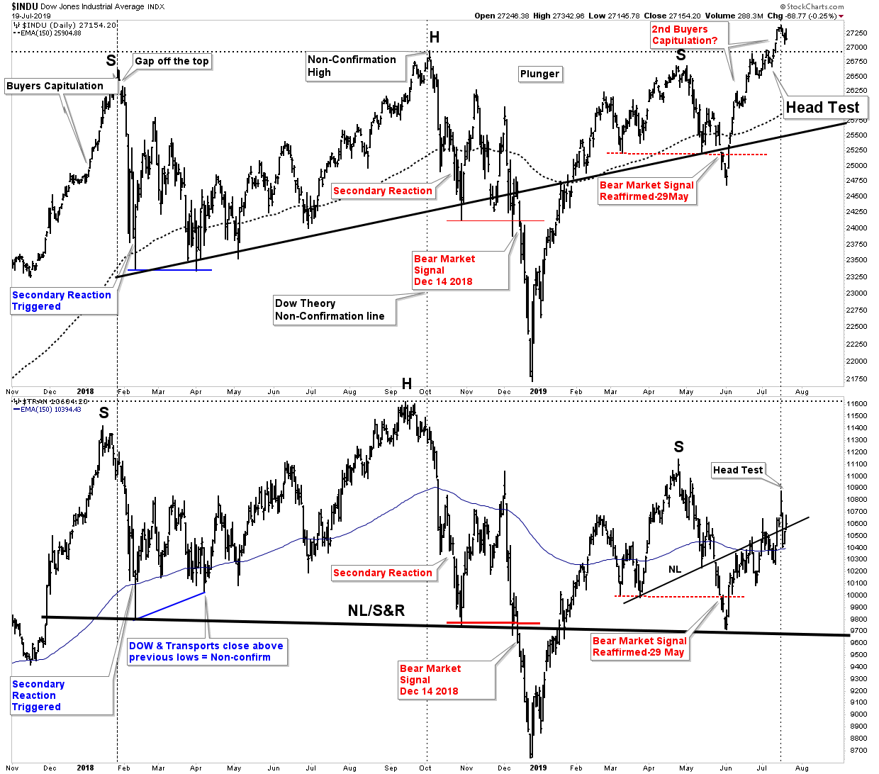
Dow Theory has been the only reliable method of forecasting the market over the past 120 years. It is of no use to the market scalper as it acts as a weather barometer, not a precise timer. The chart above depicts what I interpret as a massive 2-year rolling top in the DOW/Transports. The DOW traces out a massive H&S top followed by a head test of the top. A head test is a phenomenon that often develops after a H&S traces itself out. It is a last attempt to jam anyone cute enough to think he can short the market. The NL in both charts is drawn with some artistic license as it serves as both a NL and a S&R line.
The bottom chart of the transportation index has traced out a more conventional H&S top. The key Dow Theory principle that this chart highlights is that since the DOW has gone to new highs the transports have failed to confirm the move, therefore the Dow Theory sell signal triggered last December 14th remains in effect. In other words…we are still in a bear market.
Let me repeat, despite the DOW going to new highs the transports have not confirmed. Once a valid Dow Theory Bear Market Sell Signal is triggered the primary trend is down and in virtually all cases it does not reverse upward until the economic excesses which were incurred in this cycle have been purged or corrected for.
I encourage you to sit alone in a dark room sometime and contemplate what that could actually mean. Bear markets virtually ALWAYS violate the highs of the previous bull market. The high in 2007 came in about 14,200 which would require a 48% decline to reach today. The NASDAQ would require a 65% decline to reach its 2007 bull market high. Furthermore, for the DOW to reach a normal bear market valuation would require a 60% decline. Finally, it is normal for a market which overextends its upside to similarly overshoot its statistical mean on the downside. I am not trying to ruin your weekend, but one should know these salient stock market facts.
Market action since the December 24th low:
Previously I have covered in depth, the process the market underwent in 2018 to arrive at a bear market trigger. The buyers capitulation in late 2017 can be interpreted as a Phase III blowoff. In these episodes there is always an object of speculation…bitcoin fit the bill here. It’s blowoff was chiefly a liquidity function. Jan 2018 was a world wide synchronous top of all markets. The US market then entered into a secondary reaction. It found its bottom without triggering a Dow Theory sell signal. It spent the next 6 months rallying to a new high, topping on Oct 3rd, 2018.
The FED Pivot
After the late fall mini crash the FED panicked and did a full reversal of policy. Markets have reacted with an epic 7 month rally. This rally even exceeds the post 1929 crash rally of 1930. It has been truly awe inspiring. However, once this rally initially peaked in early May it entered into its own secondary reaction which violated its previous rally correction low thus reaffirming the Bear Market sell signal given on December 14th, 2018. (see chart) This is highly significant and serves as a major tell of the primary trend.
DOW at a new high… is it just an overshooting top?
So what is one to make of the new high in the DOW? To me it has the appearance of a second buyers capitulation. Since early June the DOW simply went straight up. It resembles that final 2 month burst in late 2017. Buyers capitulated, they threw caution to the wind and no longer considered any risk. It was their response to the FED now having their back…AGAIN.
But the non-confirmation of the transports is a glaring signal. Until the transports can rally to a new high, on a closing basis, the primary trend remains in effect. And that trend is down! Keep in mind the Dow Theory tenant that the primary trend remains in force until proved otherwise. The proof that the bear market signal is no longer valid comes if the transports close at a new high.
The Secret is contained in the averages
This is not a dogmatic position it is a safe approach born from a 120 year method that has a time tested track record. The averages contain more intimate knowledge than the second guessing of a gullible public. The number one rule in investing is don’t lose money. Now for those who would respond: Come on Plunger there has been a lot of money to be made on the long side since the Dow triggered a bear market sell signal. You’re saying stay out of the market and leave it all on the table?
No, I am saying keep your investment capital out of the market. If you want to play with speculative capital well then knock yourself out, but know that you are betting against the primary trend. Good luck, you will need it.
Final word on the stock market; The FED is going to lower rates at the end of July. Actually they will likely accelerate their drop over the next 6 months down to zero or close. They can’t drop them enough to combat the next recession. You can see this from the chart below:
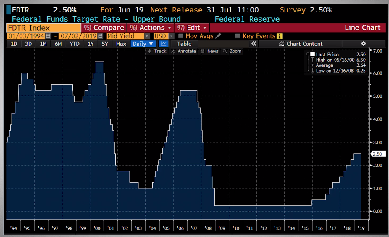
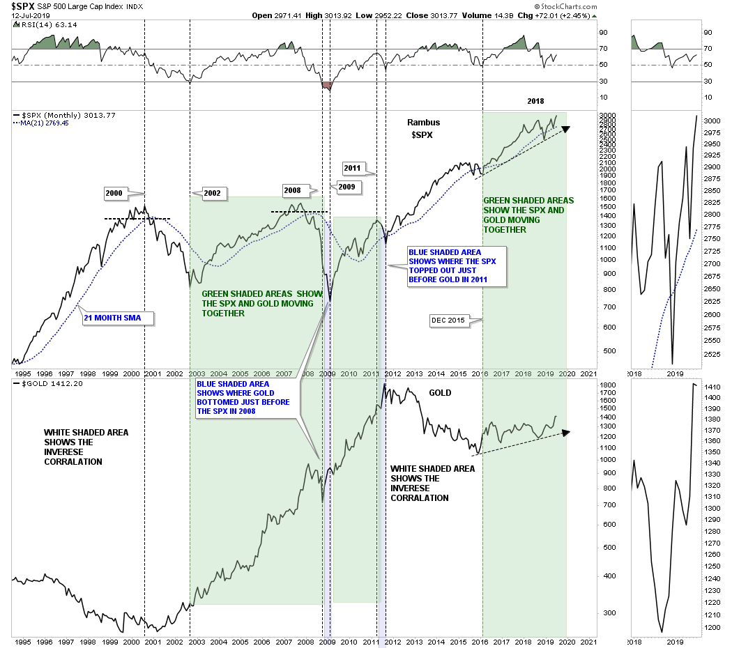
You can see how much they dropped them in the last two recessions so they don’t have enough dry powder for the next one. Instead, they are going to try to get ahead of the down turn and go to zero rapidly. Then they will come up with the next hairbrained idea when the market wants more. This should play well with gold… that is until it gets really ugly. At that time we could have a deflationary impulse and it could hit gold hard along with everything else. We can see this coming in the chart below:
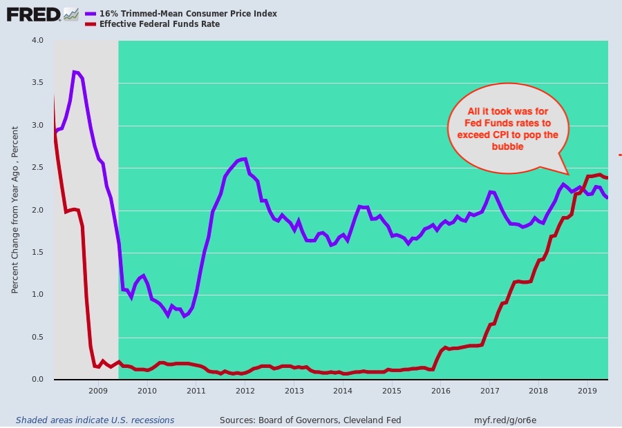
The chart depicts the negative REAL interest rates that have existed over the past 10 years. Call this bubble juice as it fed the bubble. No coincidence that the crack in the market came when these lines crossed last year. Think of the open space between the lines over 10 years as what kept the bubble levitated. If inflation drops to zero the bubble could unravel. This would likely pull down most asset classes except government bonds. Until that happens, expect the party to continue in the gold market.
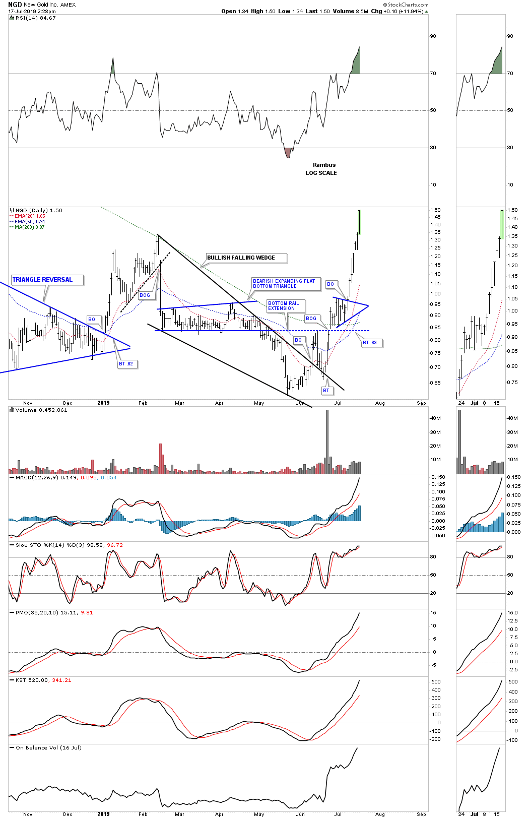
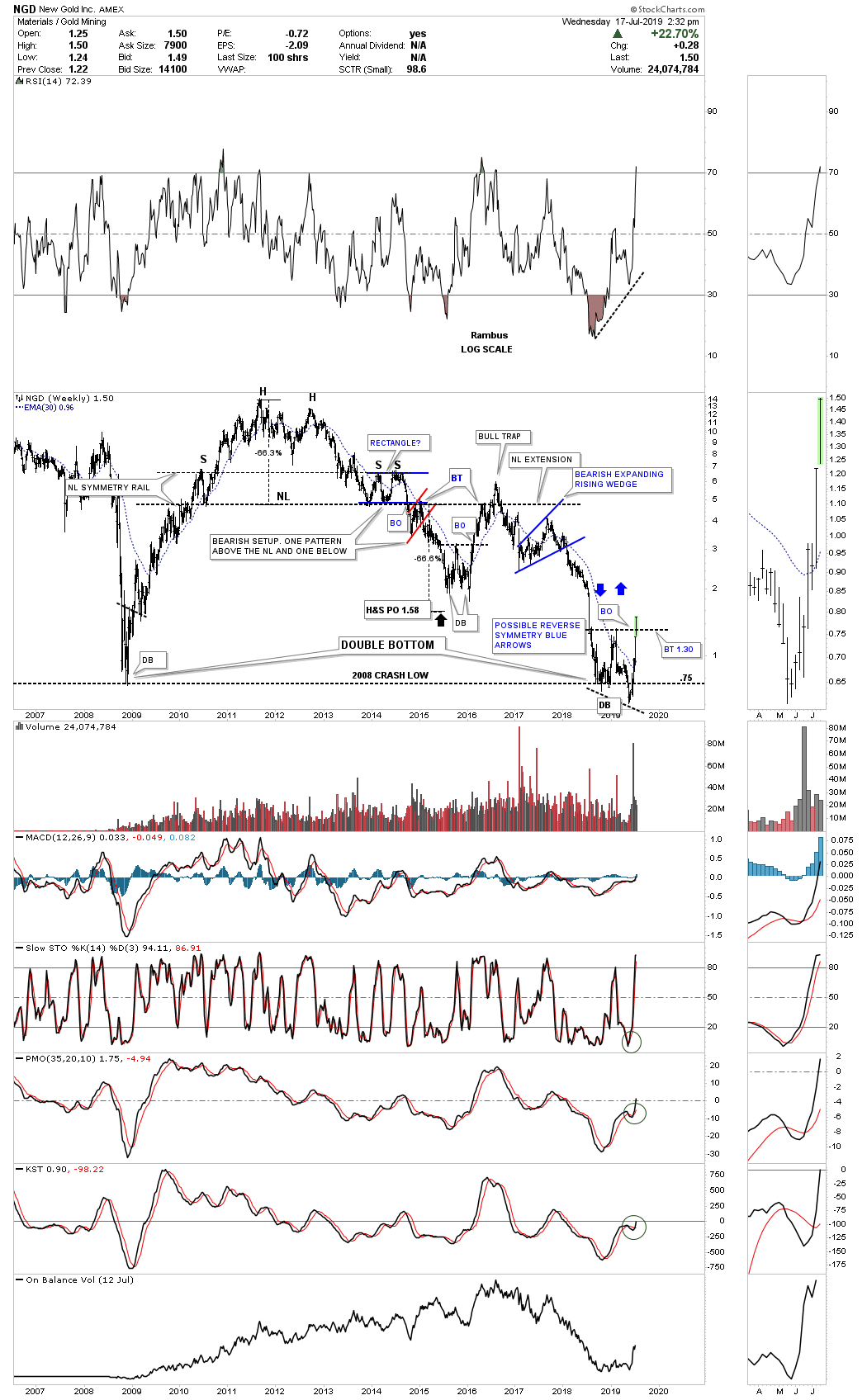
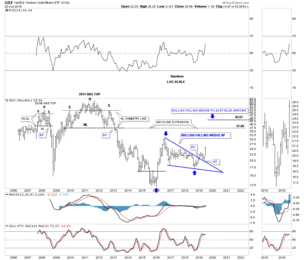
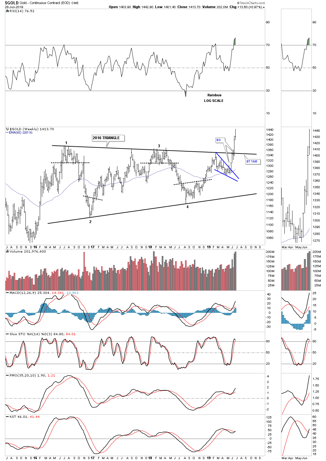
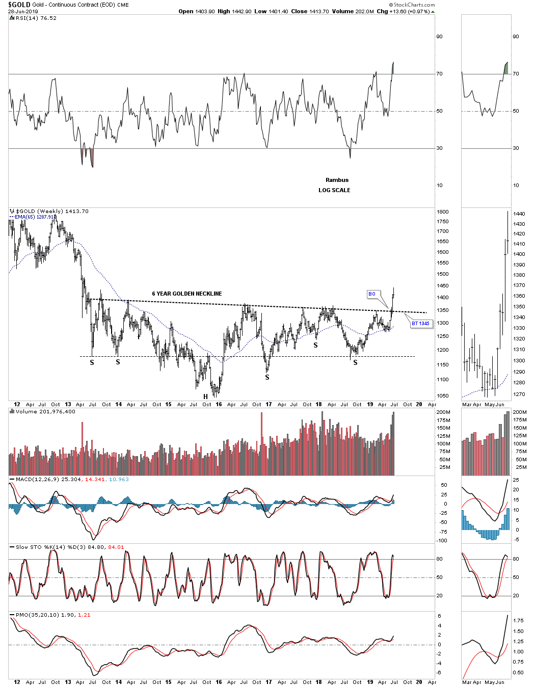
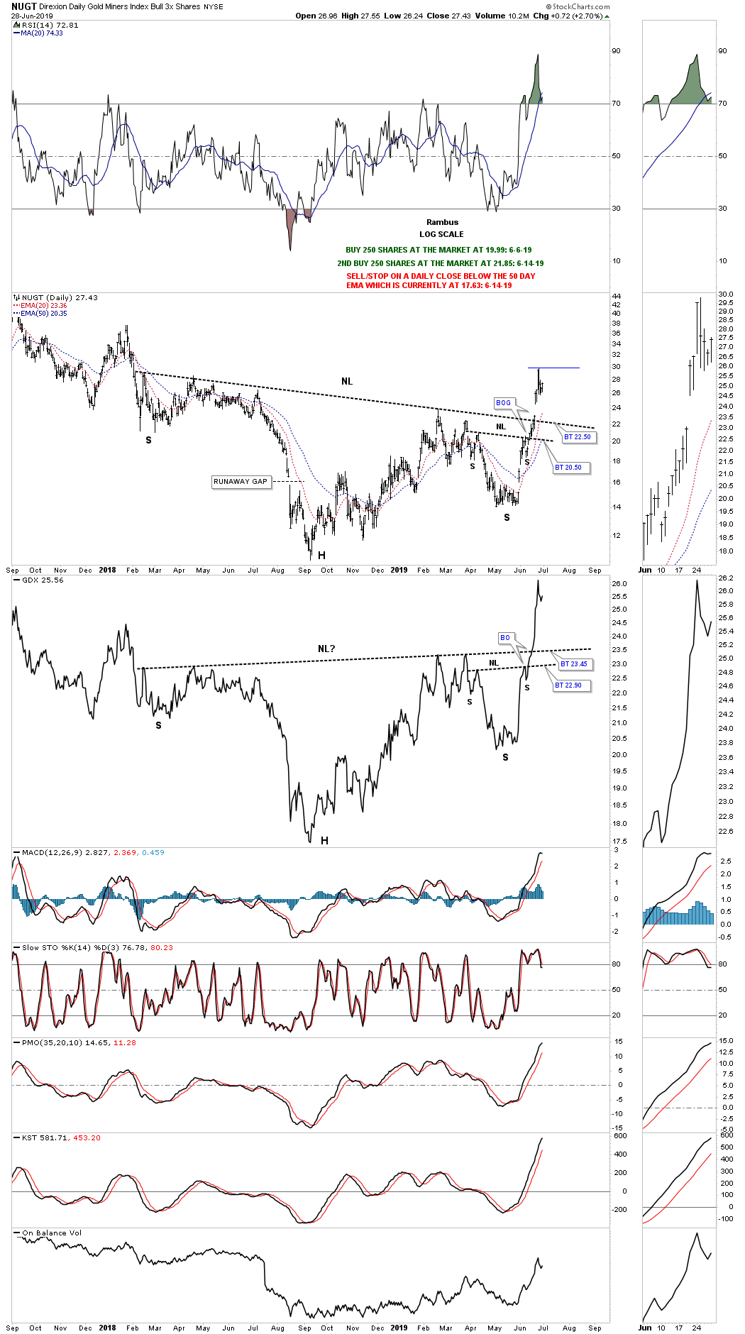
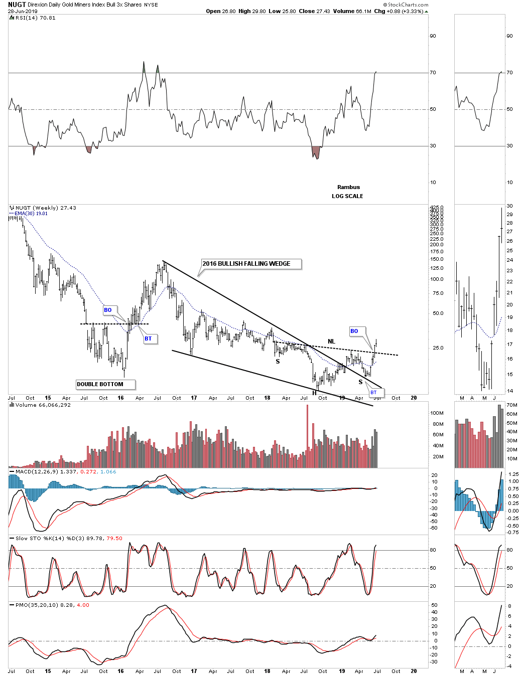
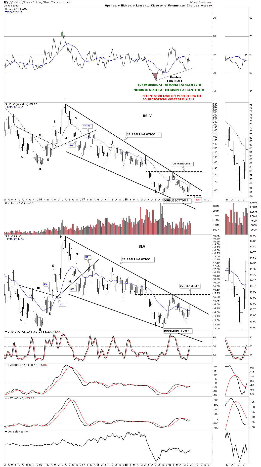
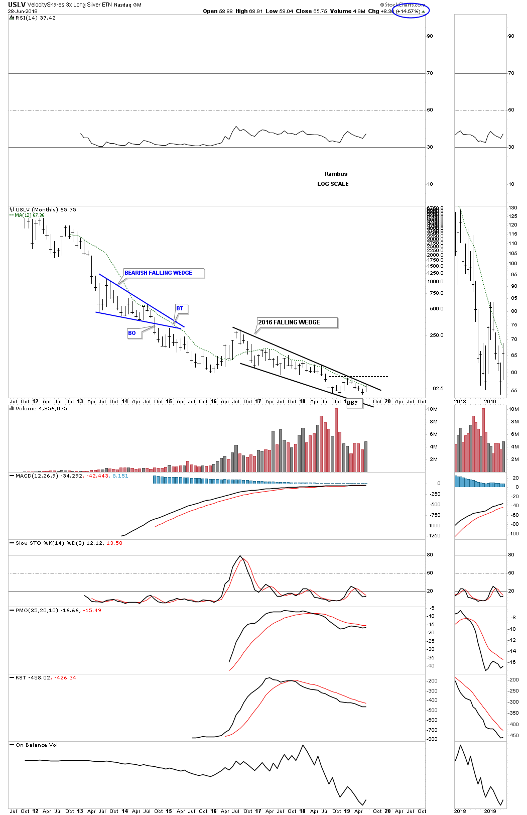
The Gold and Silver Market- Ka Boom!
Last week the gold and silver stocks went through a rare week of panic to the upside. Over 40+ years of observing markets I have seen only a handful of upside explosions as the one we are seeing now. Here is my reaction: I sit down at my desk and close the door to my office and block all interruptions. I scroll through my charts of the prominent gold and silver companies and see their upside explosions. Then project myself to the year 2030. I look back to this moment and ask what did it all mean?
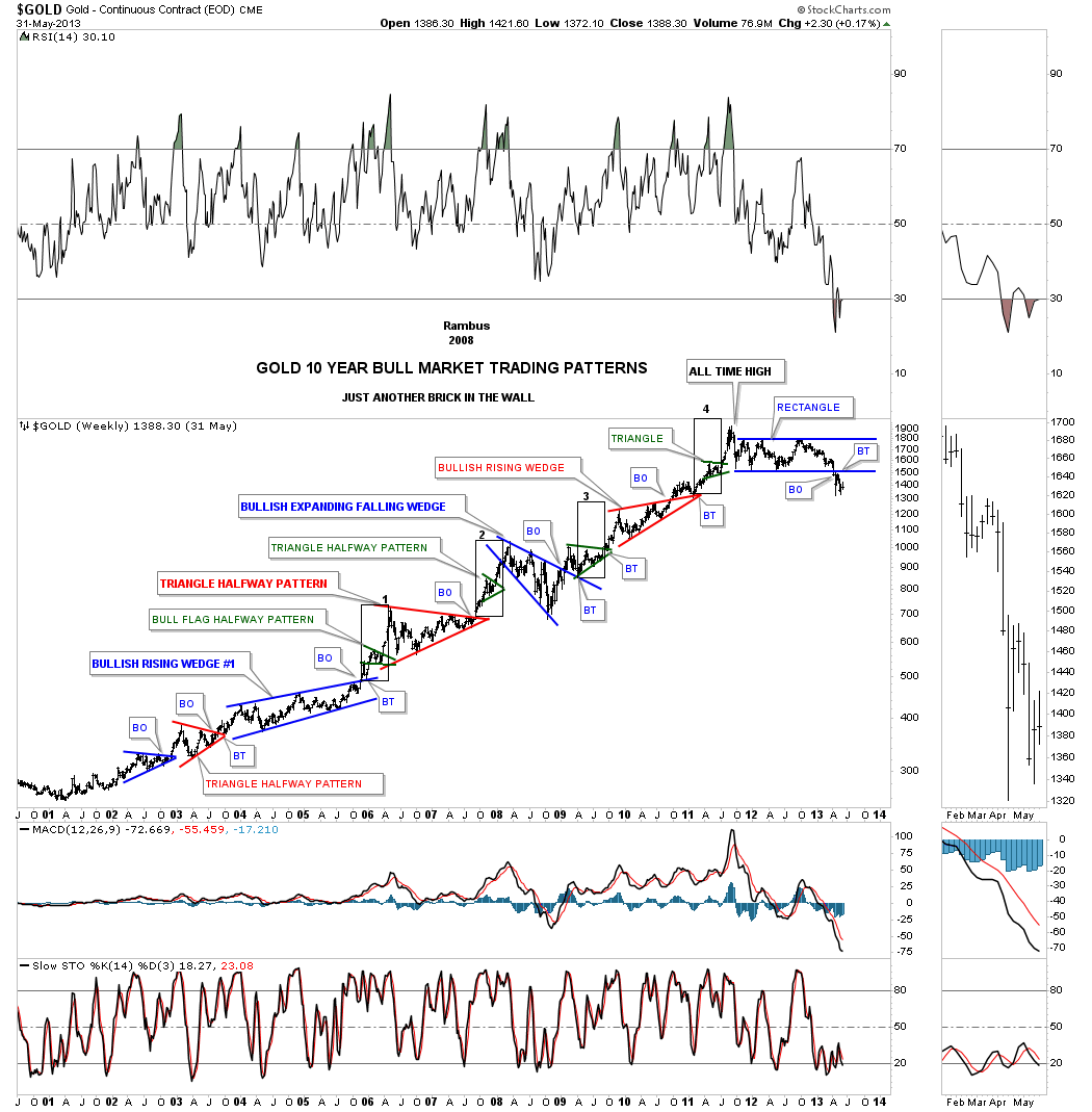
Here is what I see. First the analogy of what occurred in the stock market from 1974-1982. A case can be made that the great bull market of the past 45 years began at the bottom in November 1974. On a nominal basis not accounting for inflation it did begin then. That bottom was met with black pessimism. Everyone was bearish. The market then rose in a bull market but over the next 7 years one could say the stock market was in no-mans land. That is, it was a period where it can be classified as the first leg of a bull market, but make no mistake it was a war zone from 75-82.
In August 1982 the market blasted off in a powerful vertical rise that left everyone on the sidelines in disbelief. The massive bull had been born. But here is the thing, the rise did not come out of an atmosphere of black pessimism as was the 74 bottom. Skepticism sure, but not pessimism. This lack of pessimism is what actually kept the pros guessing and unable to buy the market. It was truly phenomenal as it was the launch of a 6 year massive bull market which actually morphed in a run which topped 16 years later in 2000.
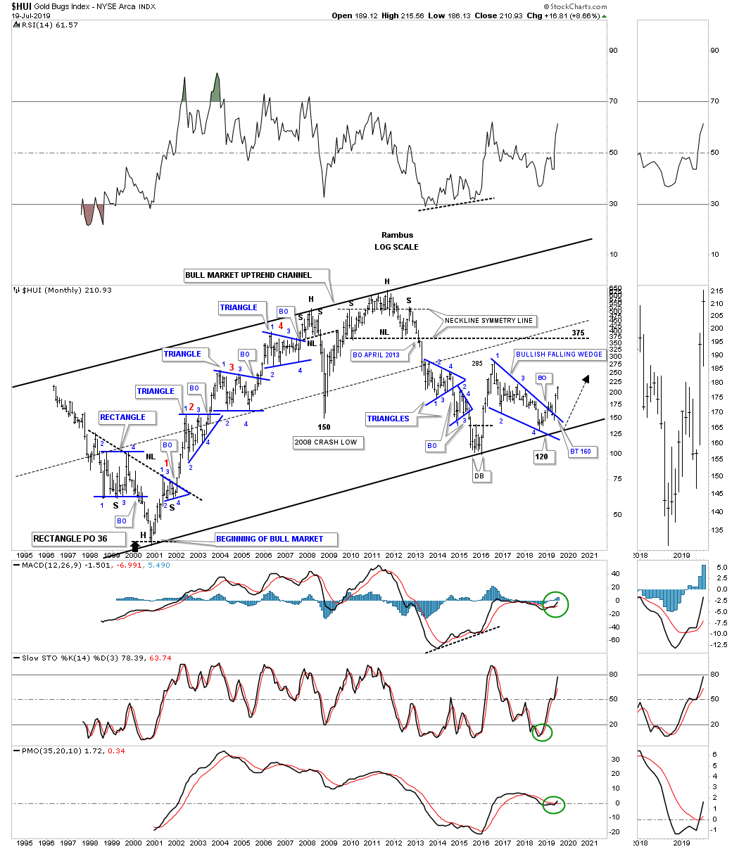
This analogy applies to the present gold bull market I believe. The beginning in January 2016 was indeed one of black pessimism. Everyone was bearish, which explains why the initial rise was so violent, but after the 7 month rally ended in July 2016 the market entered no-mans land and you know how bloody it was, a war lasting 25 months. The recent launch In gold since June has been like the 1982 launch in the stock market. It did not come out of black pessimism, frustration yes, but not pessimism and it’s turning out to be powerful.
The primary trend in gold has been up since January 2016, but it was held back for over two years. History shows us however, that the greater the consolidation and accumulation period within a bull market, the longer and higher the subsequent advance. That is what I believe is behind this powerful advance.
A Review of Plunger’s Core-7
This past week I will call “the awakening”. It felt like larger sized money began to wake up to the advance of gold and silver. Big money now senses they have to at least dip their toe in the water. That’s about all they can do since they can’t jump in the pool as it’s too small. This action in the market is evident in Plunger’s Core-7.
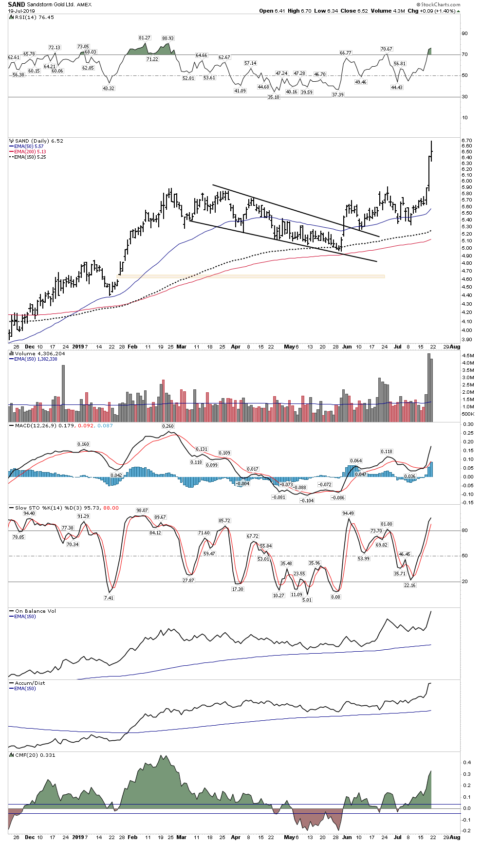
Sandstorm
Big money wants in to FNV but it is pricey and they know it. Sandstorm offers the same play at a discount price so the herd began to move into SAND this week.
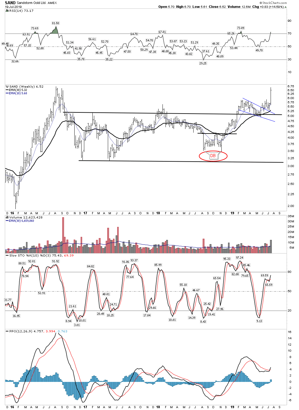
What a beautiful chart! One doesn’t need too much of an imagination to see where this thing is going. Keep in mind that SAND doesn’t include in its reserves royalties that are uneconomic. So when gold gets above say $1,500 its reserve base mushrooms. The technical action during all of 2019 consisted of backtesting its breakout from the horizontal channel. It has been building its energy for 3 years now…the launch has begun.
Daily- Explosive
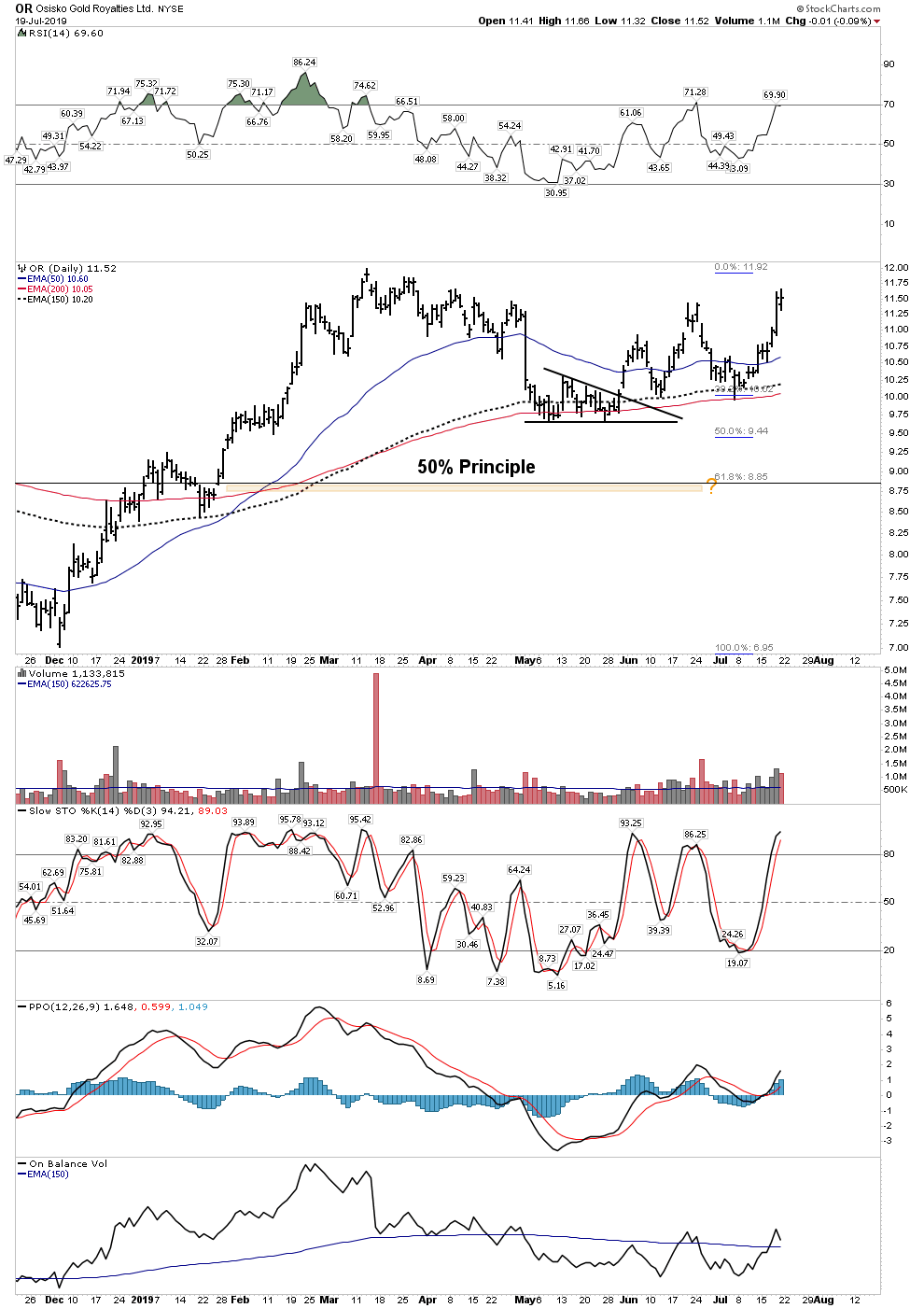
OSISKO- OR
What most don’t know about Osisko is the discovery potential of the company. Goldcorp will soon drill for new discoveries nearby existing royalties in the St James Bay Area. Osisko requires patience, but pays a decent dividend and has explosive upside potential.
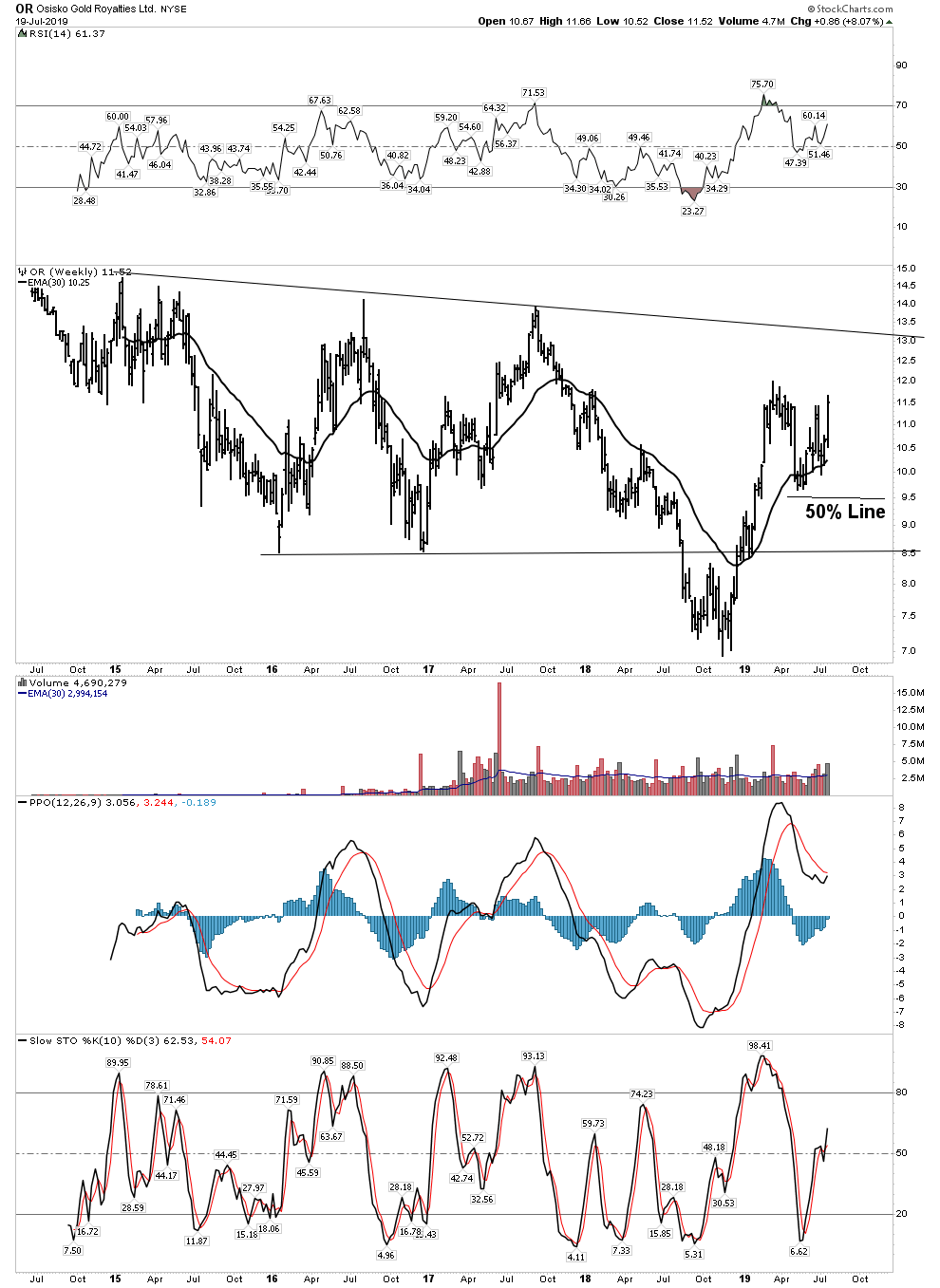
Daily:
WPM- Finally getting in the grove
Wheaton spent the bear market gorging on the misery of companies unable to get financing. With its tax issues behind them they are now ready to reap the fortune.
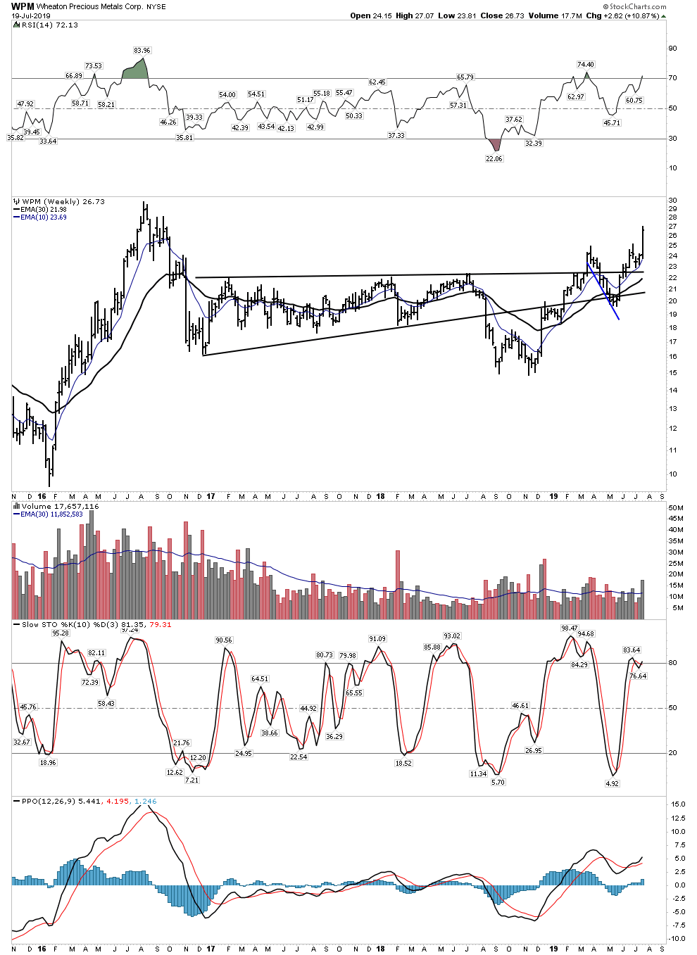
Soon they could be breaking into new ground.
Daily:
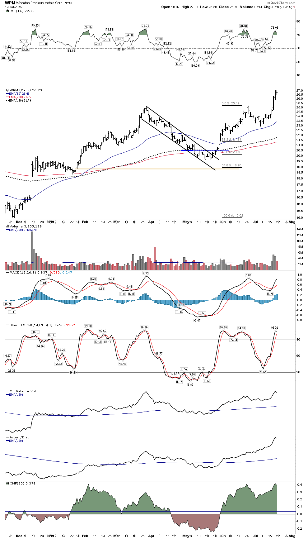
Monthly- The monthly chart deserves a look. Massive inverted H&S projecting a rise to $56

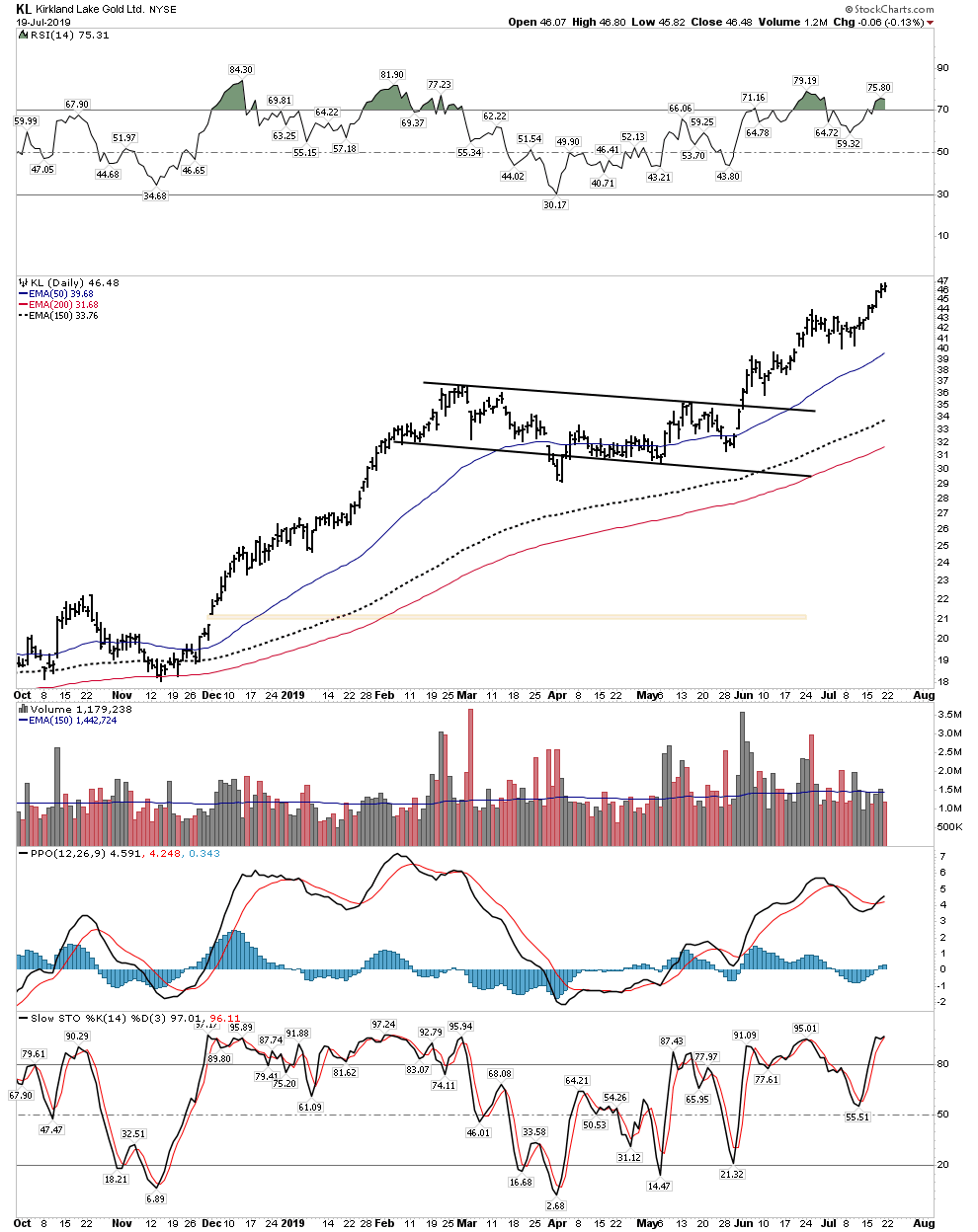
Kirkland Lake
Many would say, its had its run… time to get off, enough already. Well one could take his cost basis off the table, but this stock is going much higher. It is going to be a power broker. It is going to start buying companies with all of that free cash flow… whose first?
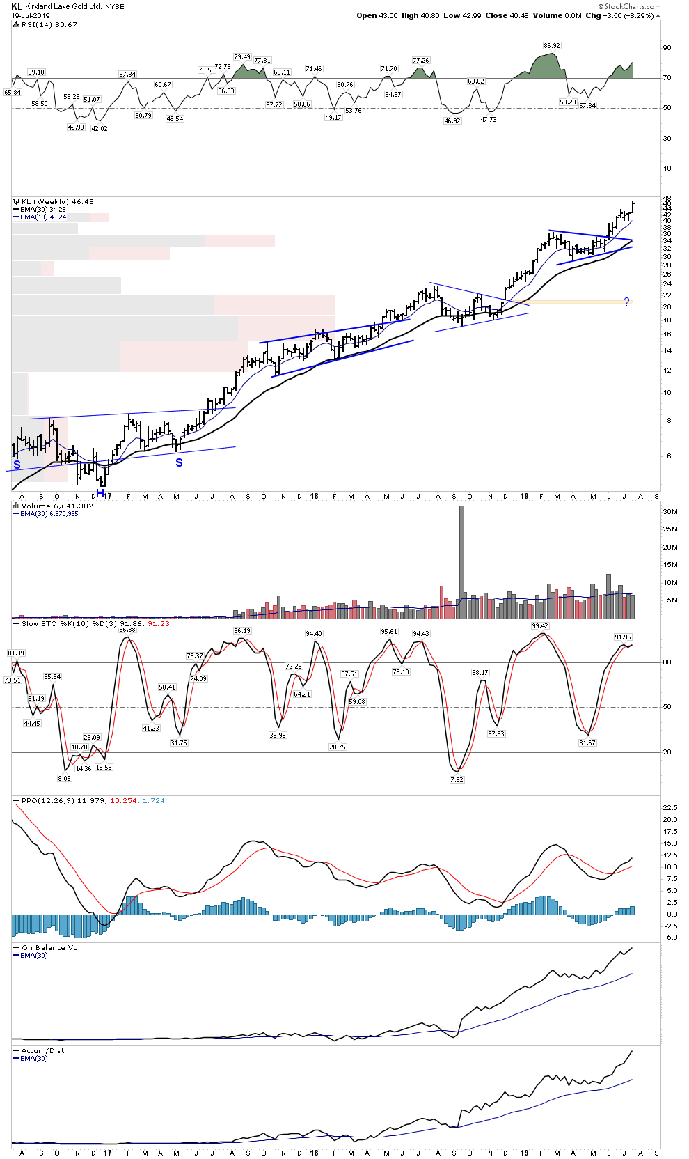
Daily- on fire
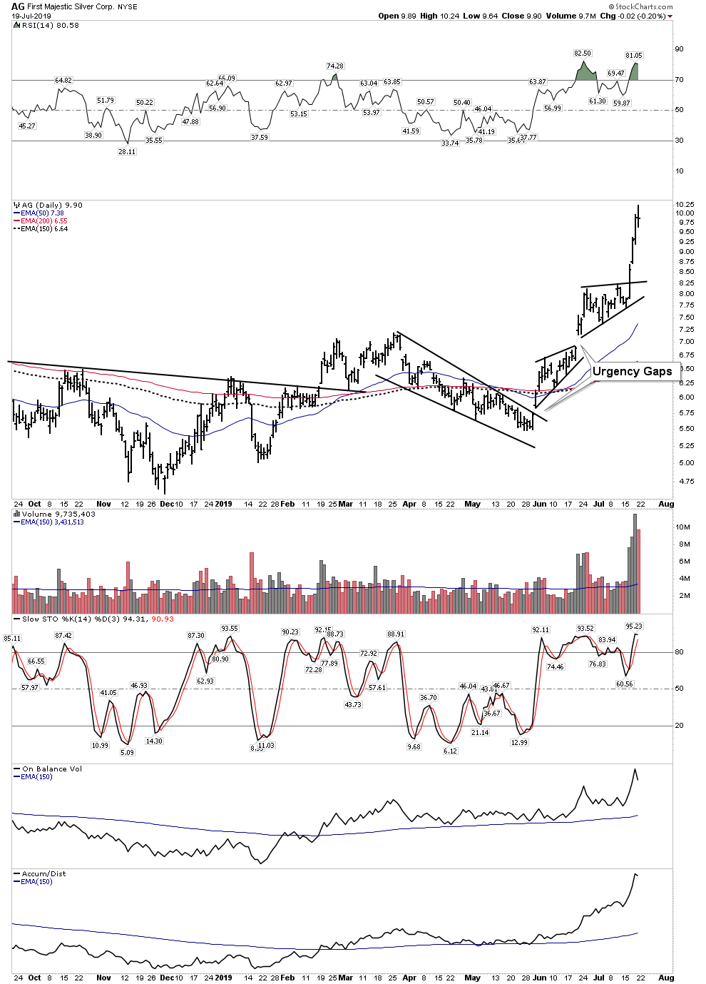
First Majestic- AG
Checkout the weekly volume bar- explosive… money is coming into this stock.
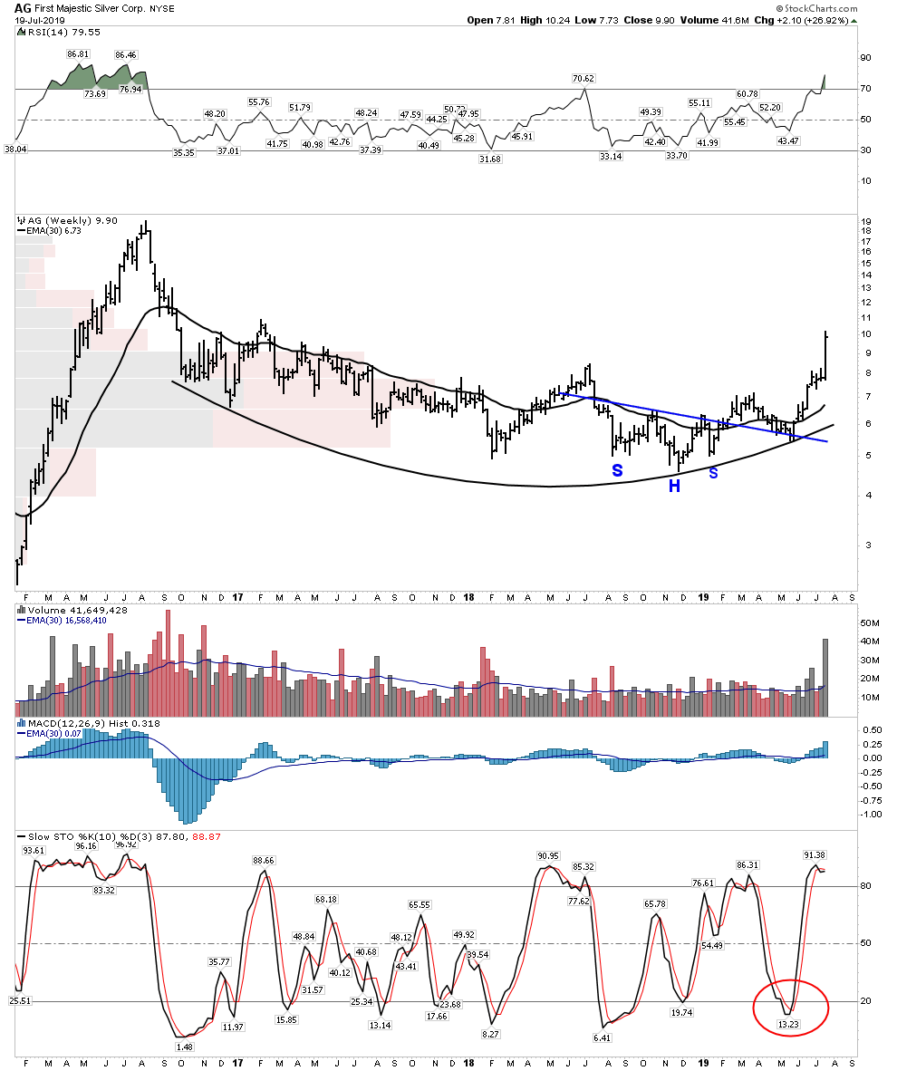
Daily: WOW, violent upside panic buying.
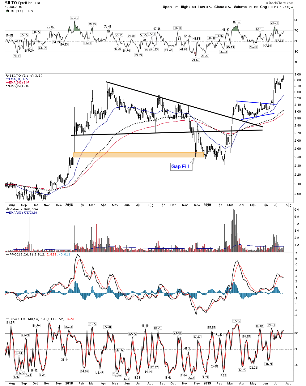
Sprott Inc -SII.to
This was my dark horse when I originally bought it. But I think one can easily see by the clean well formed chart action on the monthly that this stock is just beginning to unleash its power. Just 3 months ago its debt free market cap was about $600M. Some analysts forecast the top of cycle earnings in 6 years to be up to $1.5B. Just think where the market would value that to. It is why I say this stock has 15-20 bagger written all over it.
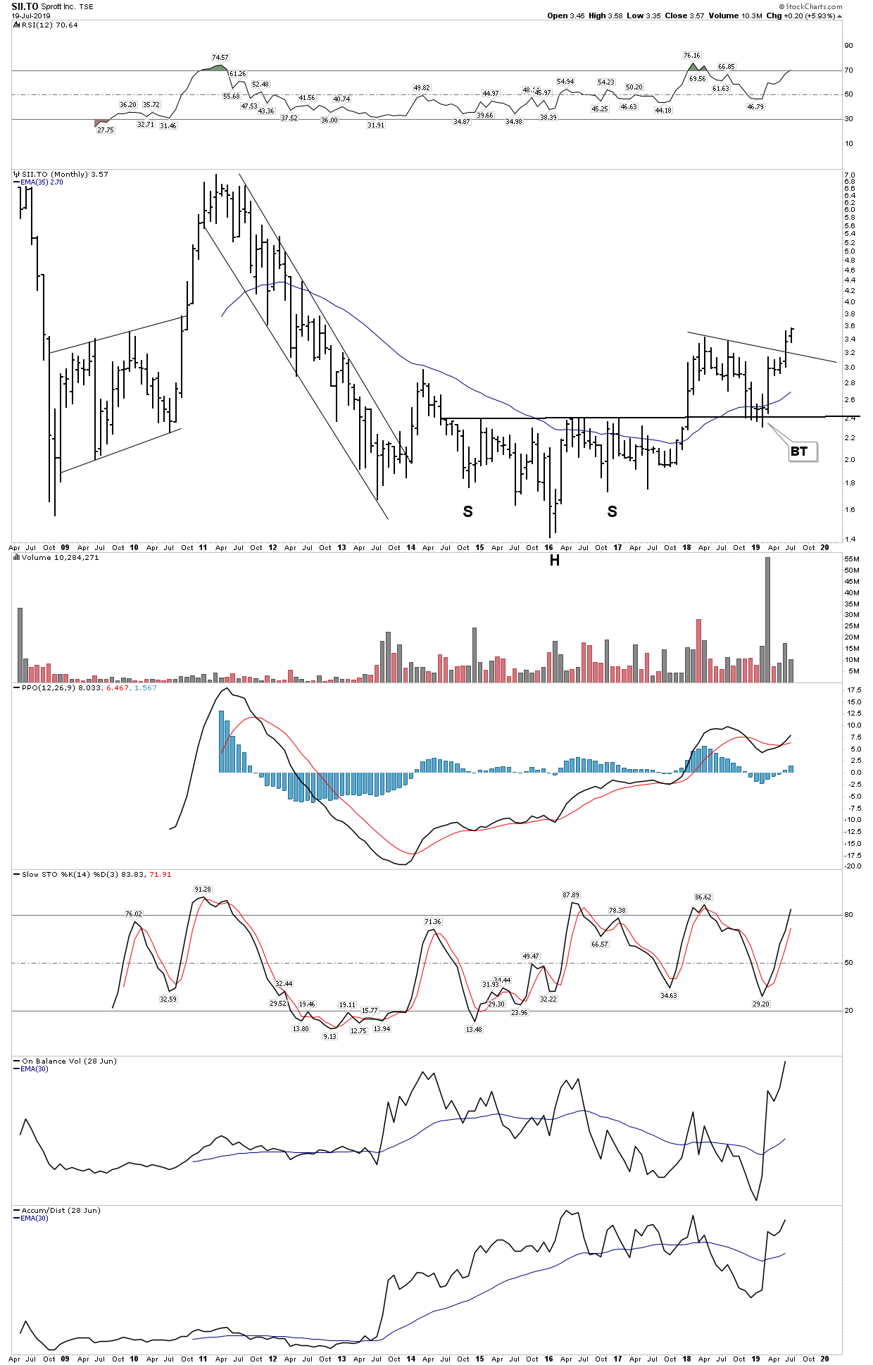
Daily:
Barrick -GOLD
Who would of thought the old debt soaked bureaucratic American Barrick would ever get into Plunger’s Core! But if left alone, bear markets do their work and the bear breathed new life into this company. It now has an entrepreneurial spirit in it and it owns 4 Tier one assets. IMO these will be regarded as national treasures within a decade. Institutional capital will power this stock higher. We are seeing the beginning of that now.

Daily: Not bad action for a big cap.

So Plunger’s Core-7 is now hitting on all 7 cylinders. I own all 7- in size, and I am holding. The plan is to hold these stocks for the length of the bull market. Let’s just see where that brings us.
A word of caution… If you are carrying a margin balance we are now at a time that violent short term corrections can strike at any time. Your objective should be: Be Right-Sit Tight. Don’t get yourself blown out.
………….
Plunger is Resident Market Historian at Rambus Chartology