There is something happening in the commodities complex that has been going on for awhile now that needs to be addressed tonight. A subtle change actually started earlier this year and has been gaining momentum especially in the energy sector. I know for a lot of you, with the weak US dollar, you are thinking, “how could commodities be declining,” which goes against everything you have learned about how the markets are supposed to work. If the markets always behaved like everyone thinks they should then there would be no markets, because everyone can’t be right. That’s the nature of the beast we’re trying to tame.
Tonight I would like to show you some bearish rising wedges which have formed all over the place in the commodities complex. Many of the rising wedges took over a year to build out so that sets up a healthy decline. The bigger the pattern the bigger the move.
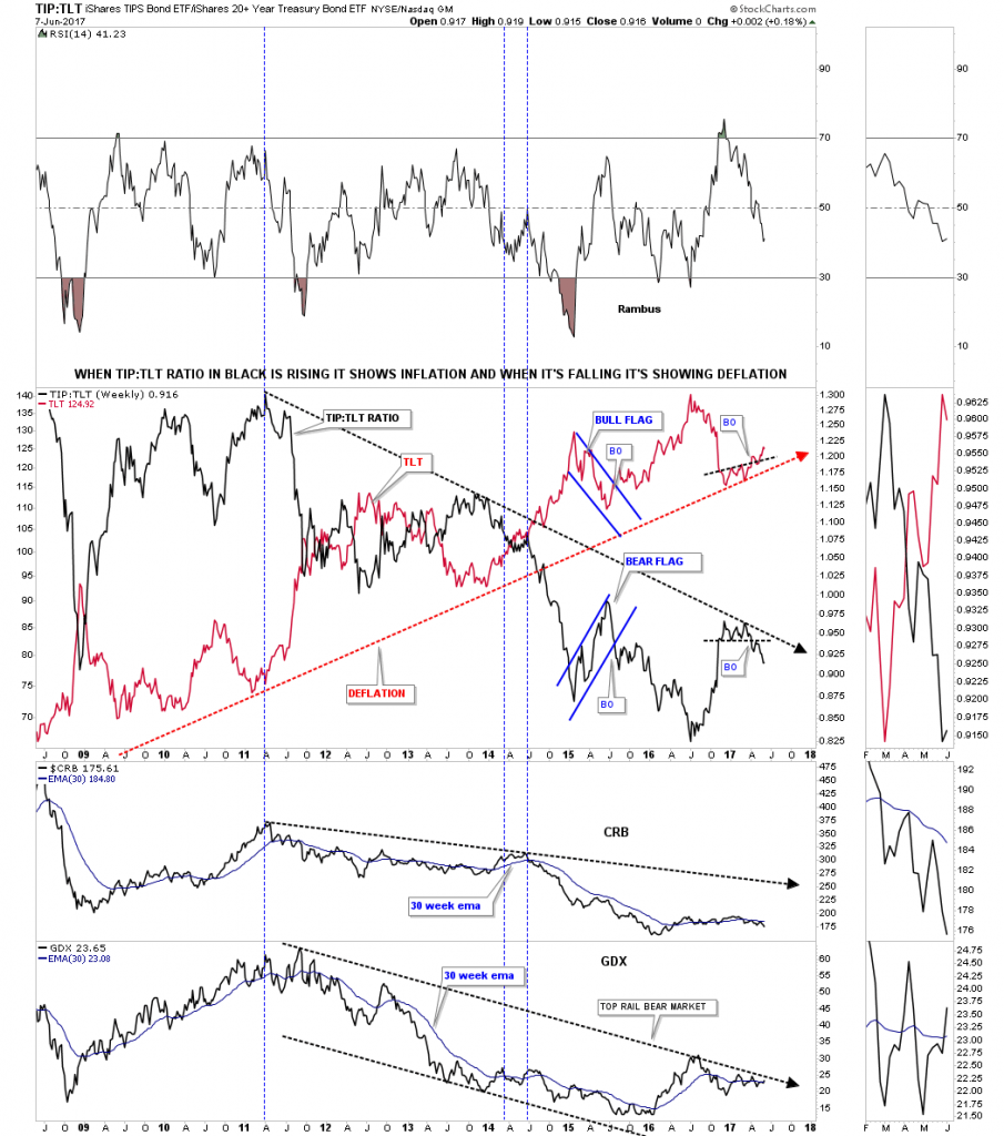
This first chart tonight is the ratio combo chart using the TIP:TLT to gauge if we are experiencing inflation or deflation. Earlier this year the ratio in black formed a small topping pattern just below the black dashed trendline, then had a quick backtest, and is now starting to gain momentum to the downside. When the ratio in black is falling it shows deflation. The CRB index along with the GDX are still in a downtrend with the CRB index being weaker than the GDX, as show by the 30 week ema.
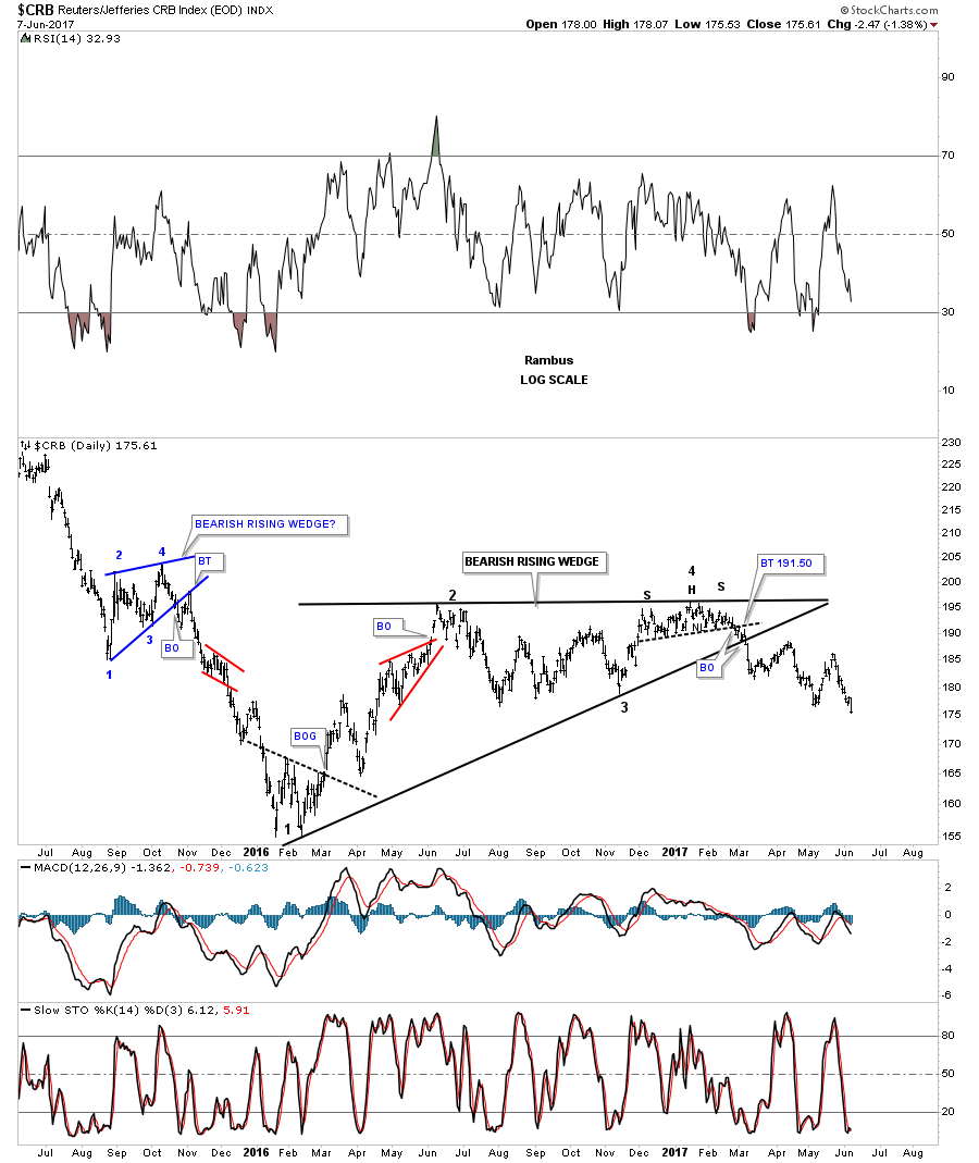
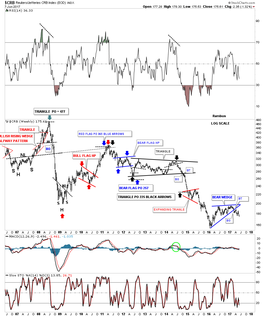
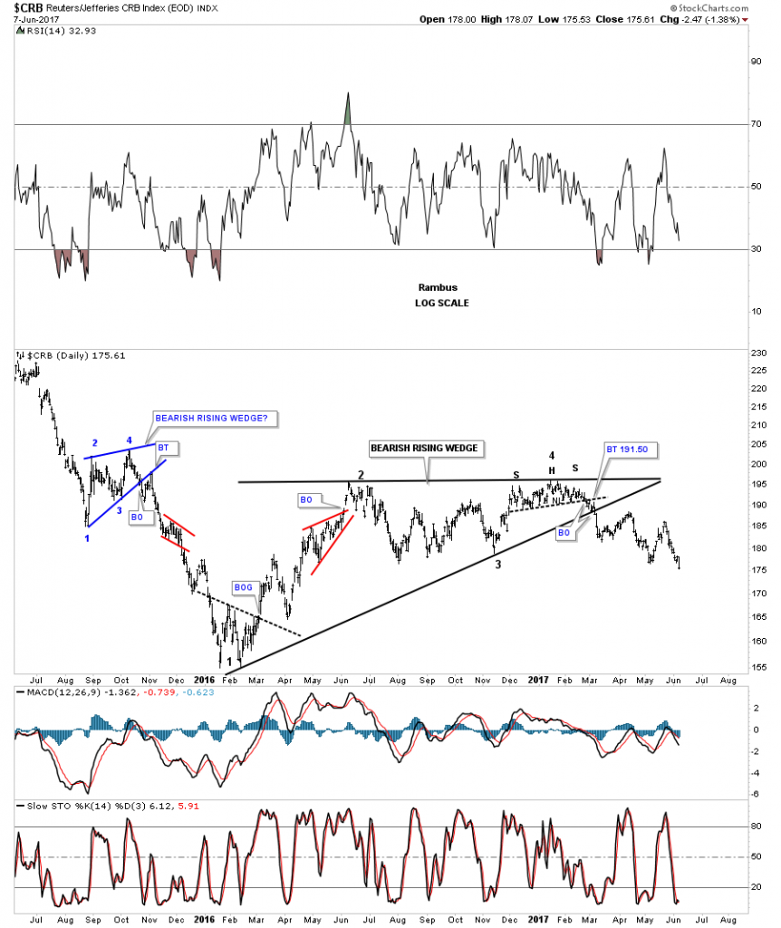
Next lets look at some different commodity indexes to see what they may be telling us. This first commodities index we’ll look at is the old CRB index. This bearish rising wedge began to develop way back in early 2016 with the 4th reversal point taking place a year later at the top of the rising wedge. As you can see the 4th reversal point was a H&S top reversal pattern. The breakout came in March with no backtest. There was a small blue bearish rising wedge which formed in the middle of 2015 which was part of that huge impulse leg down.
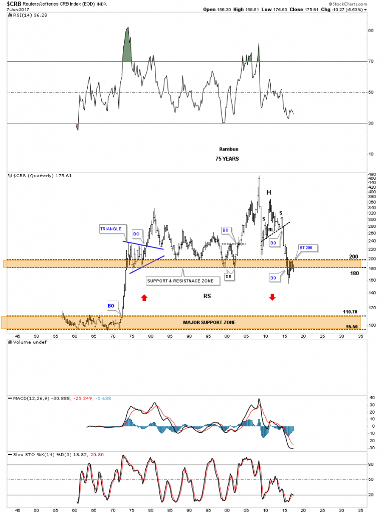
This next chart for the CRB index I’ve used for many years which shows alot of nice Chartology on it. The CRB index is a good producer of chart patterns and measured moves as shown by the different colored arrows. Note how every important high is lower that the previous high going back to the top in 2008. Our bearish rising wedge doesn’t look so big on this long term chart.

This last chart for the CRB index shows the 75 year history. During the 2015 crash the price action punched through the upper brown shaded support and resistance zone before reversing back up. It looks like the CRB index is either going to put in a double bottom or make a new low that hasn’t been seen since the early 1970’s.
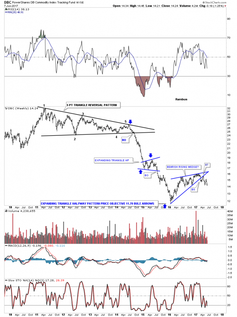
The DBC looks a lot like the CRB index, but it trades with a lot move volume.
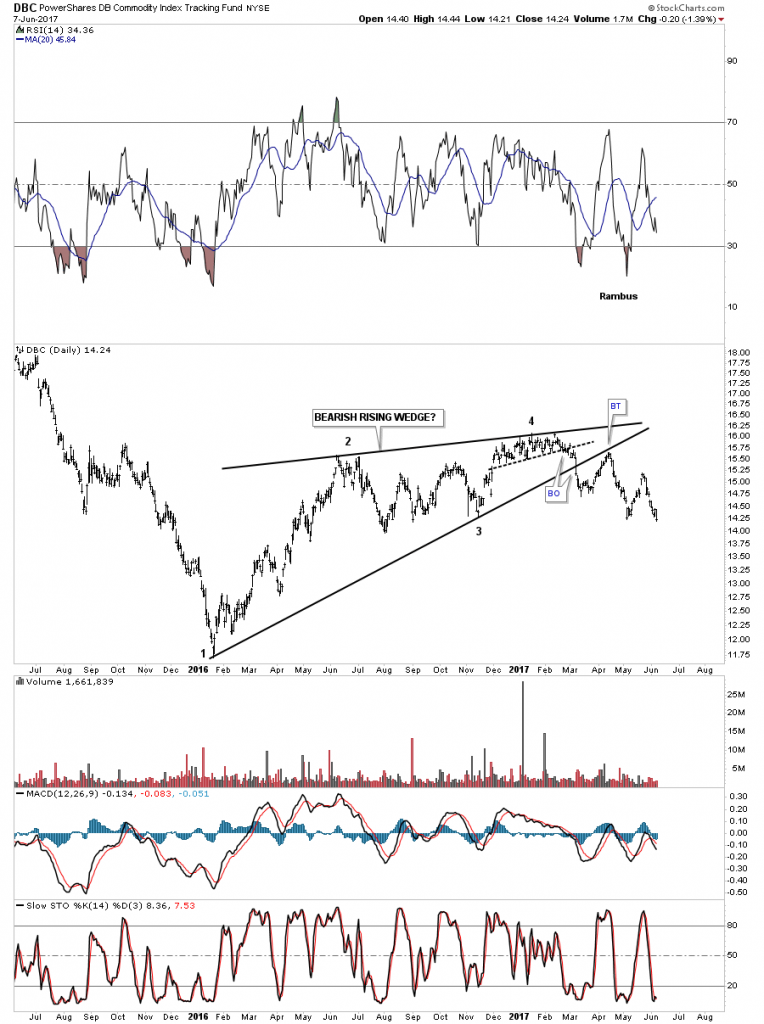
This long term weekly chart shows a 5 point triangle reversal pattern which started the infamous crash into the January 2016 low which is the first reversal point in the blue bearish rising wedge. The blue arrows measures the price objective using the expanding triangle as the halfway pattern.
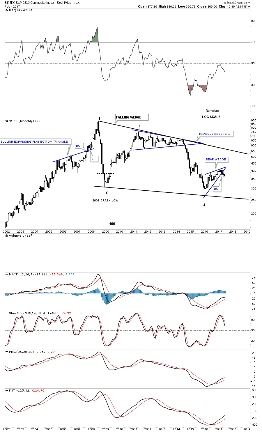
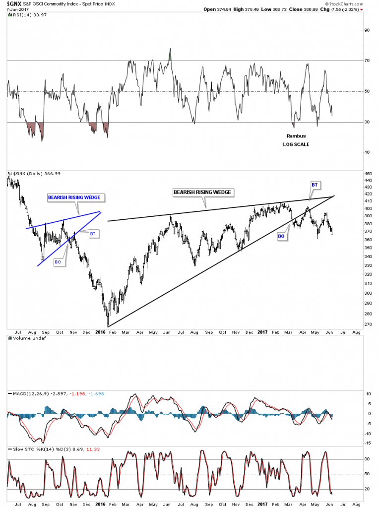
The $GNX commodities index shows a similar bearish rising wedge.
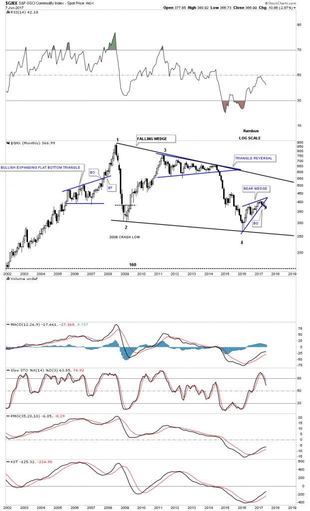
The price objective of a rising wedge is down to the first reversal point at a minimum. This monthly chart for the $GNX shows a very large 10 year falling wedge. The bottom rail of that 10 year falling wedge would mark a great price objective to maybe complete the bear market.
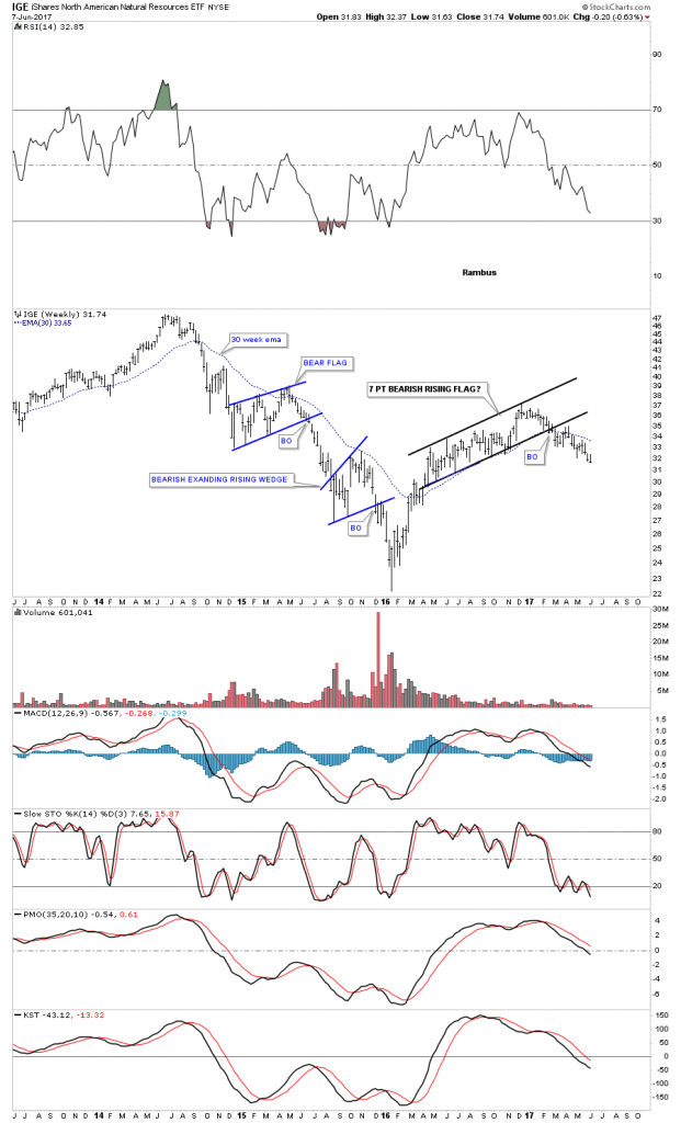
This next stock is the IGE, natural resources etf, which is setup differently than the commodities indexes above. IGE built out a 7 point bearish rising flag with the breakout taking place earlier this year.
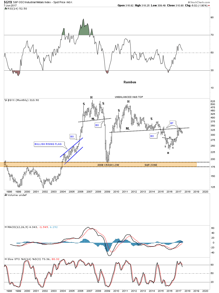
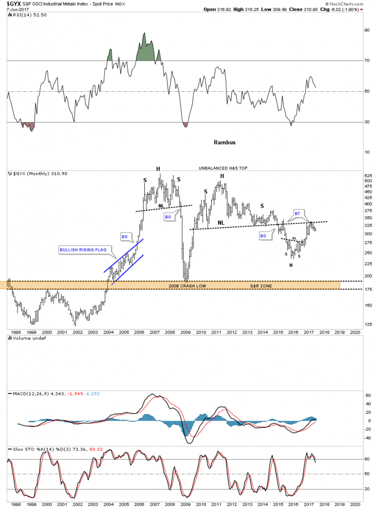
The $GYX, industrial metals index, built out an unbalanced H&S top with the backtest looking like its complete. A move down to the brown shaded support and resistance zone at the bottom of the chart would be a good place to look for an important low.
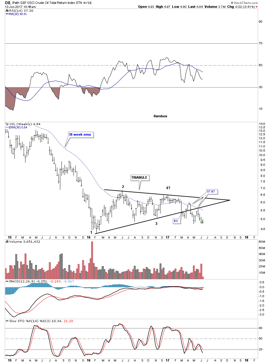
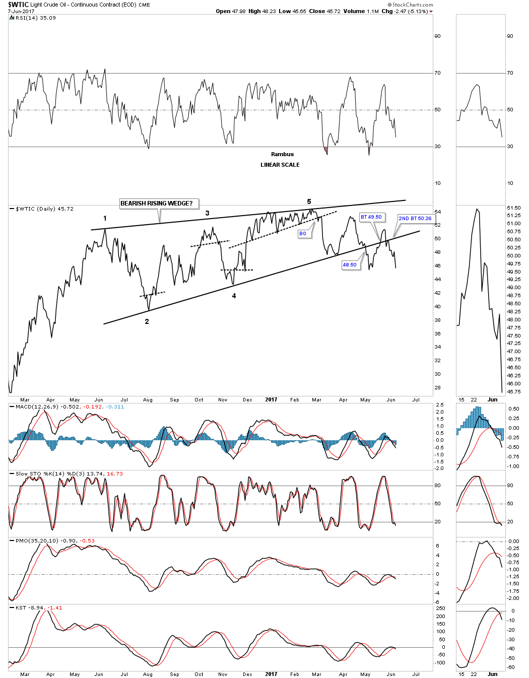
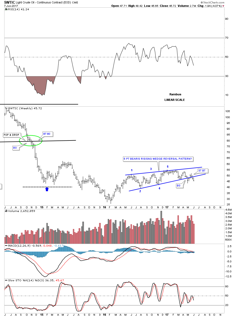
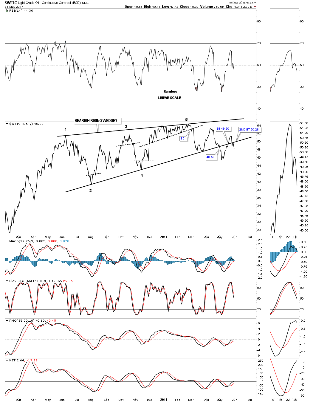
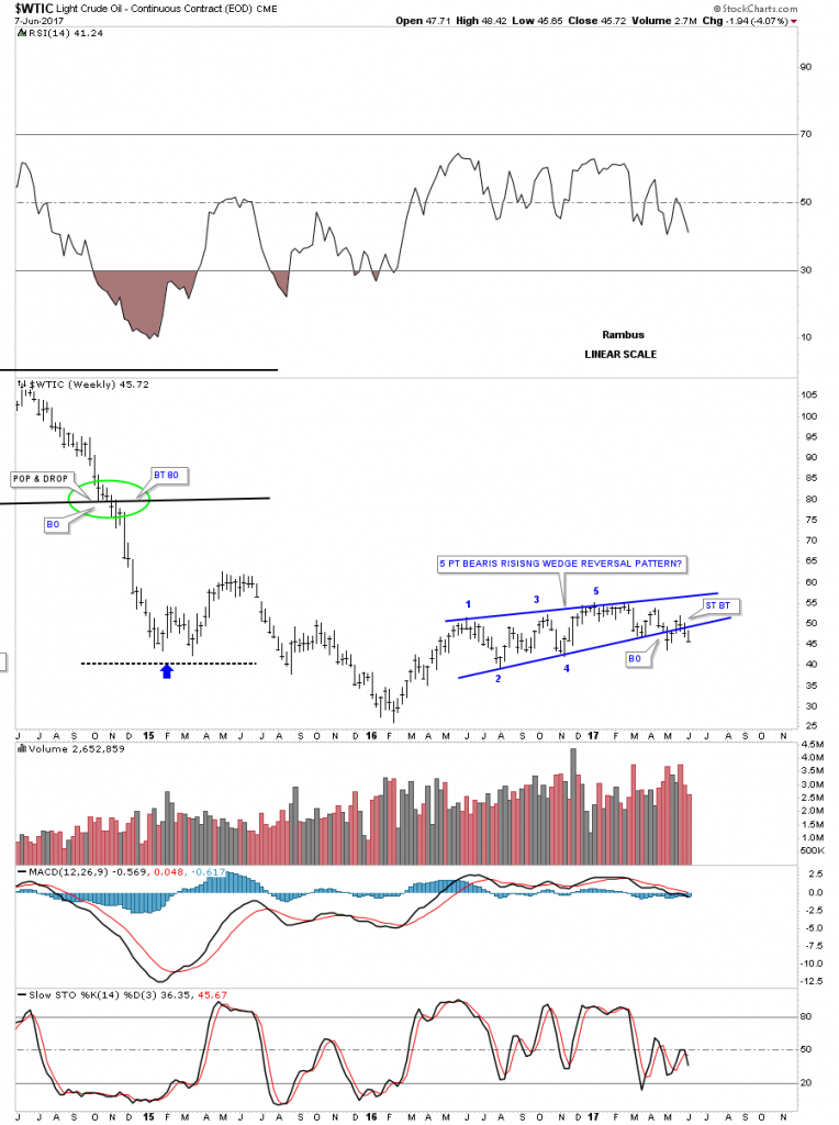
Now I would like to get into the meat and potatoes of this post and look at the energy sector from several different angles. First lets look at the $WTIC which is showing two different rising wedges. This first one is a daily line chart which shows the first reversal point starting at the first reaction high. The backtest was a little sloppy but held.

This is what it looks like on the weekly bar chart.
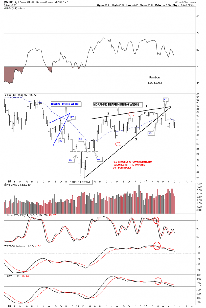
Awhile back I showed you this weekly chart for the $WTIC which shows how it was morphing into a bigger bearish rising wedge as shown by the red circles. Even without the red circles there are still 4 reversal points with a clean breakout and backtest.
The 10 year daily chart shows how the rising wedge fits into the big picture.

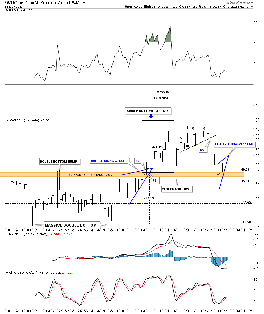
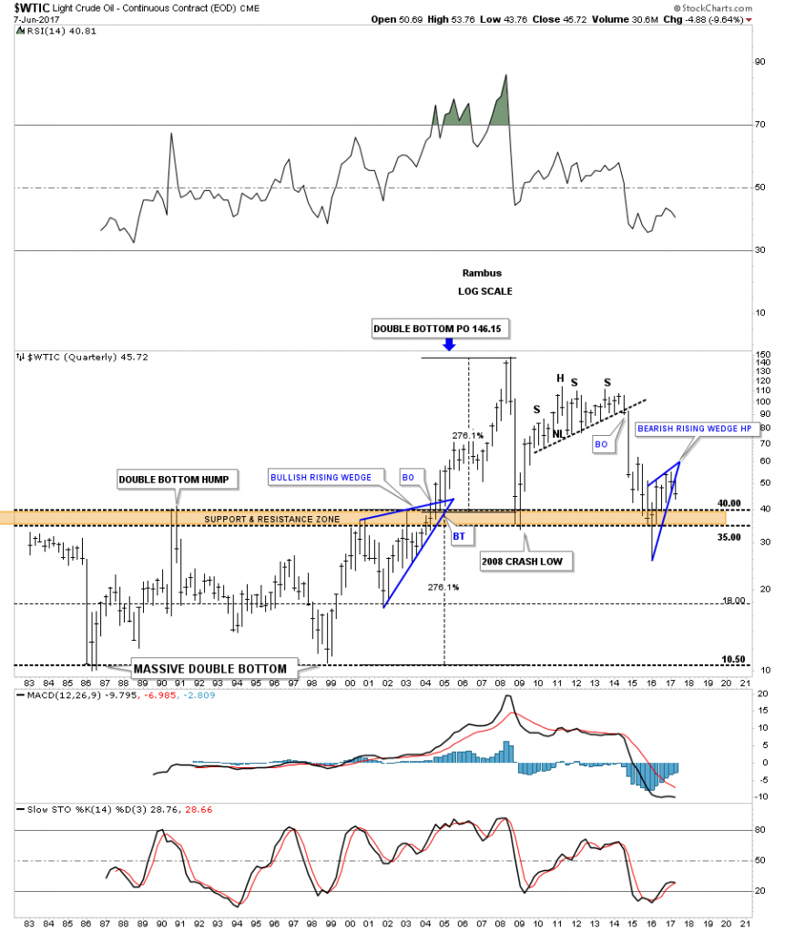
This last chart for WTIC is a 35 year quarterly chart which really puts the bearish rising wedge into perspective. At a minimum the blue rising wedge should reach the previous low, from there its anyone’s guess.
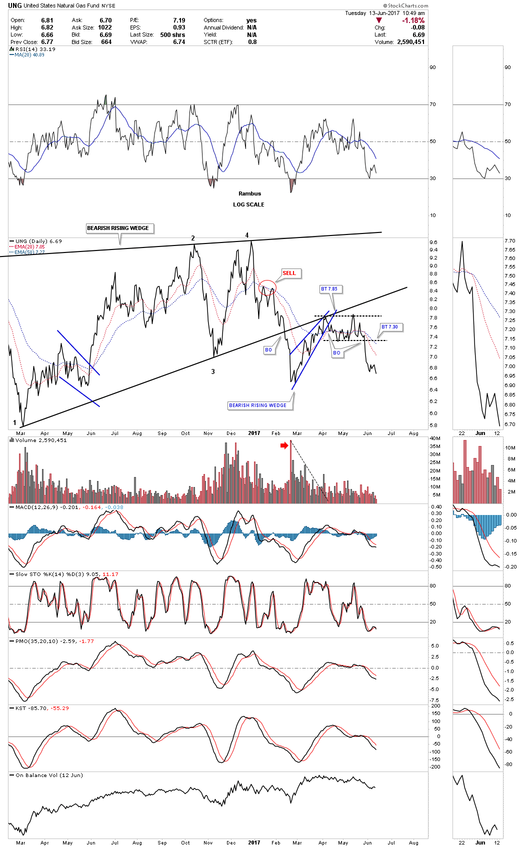
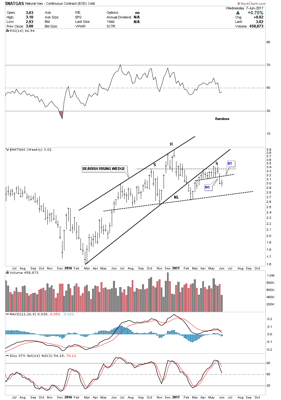
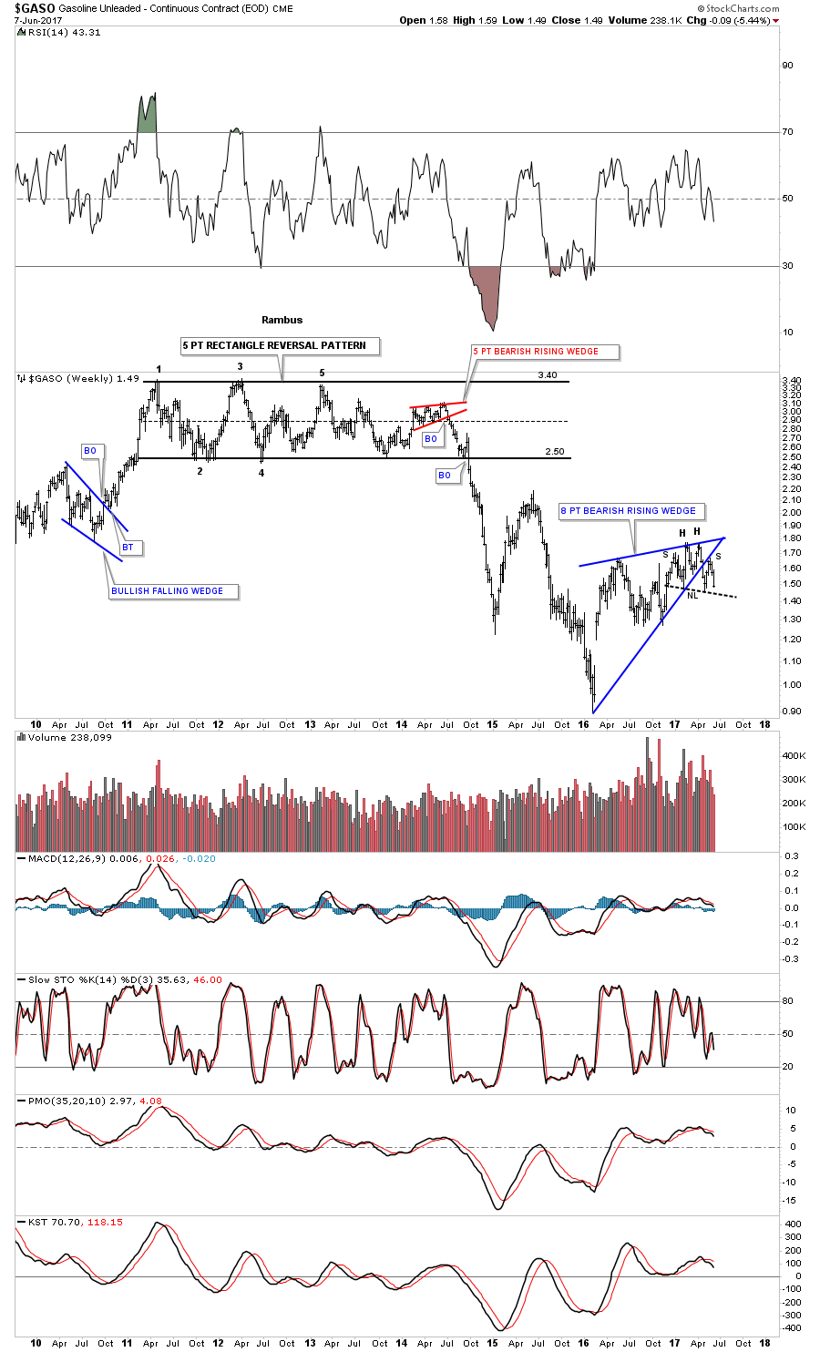
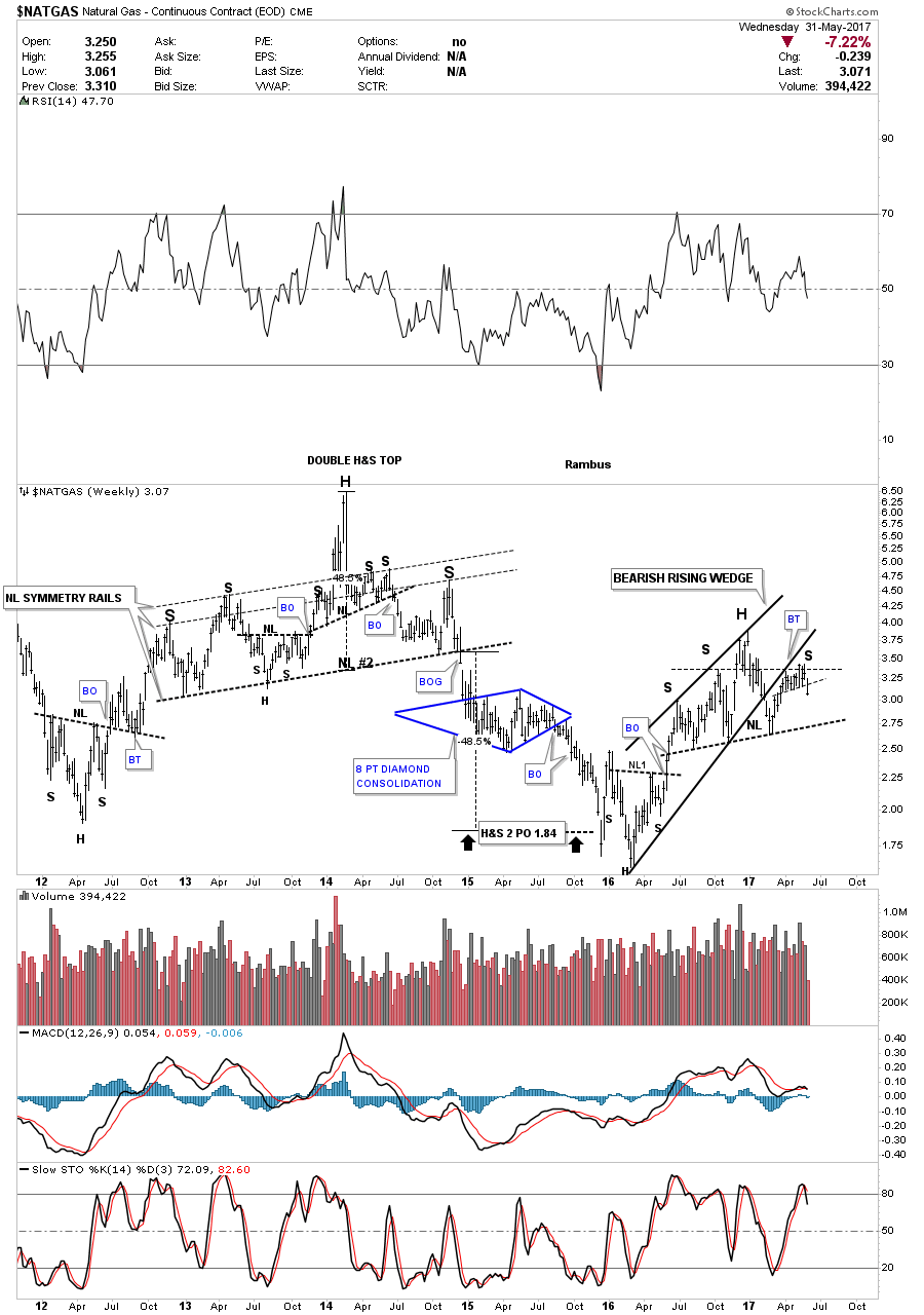
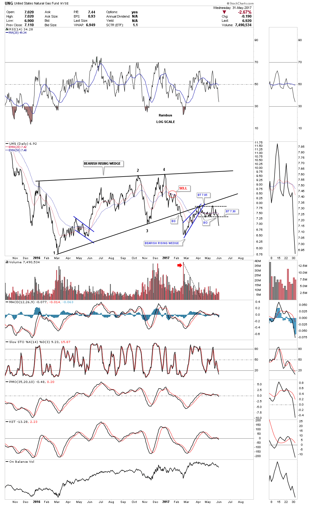
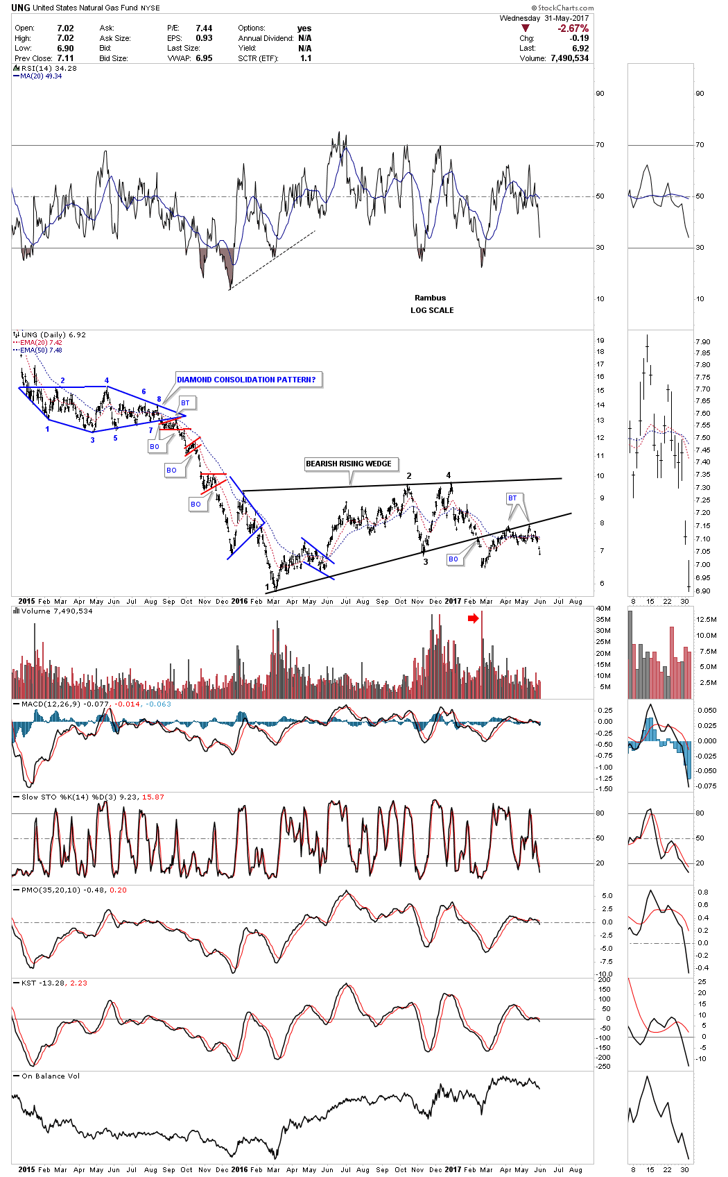
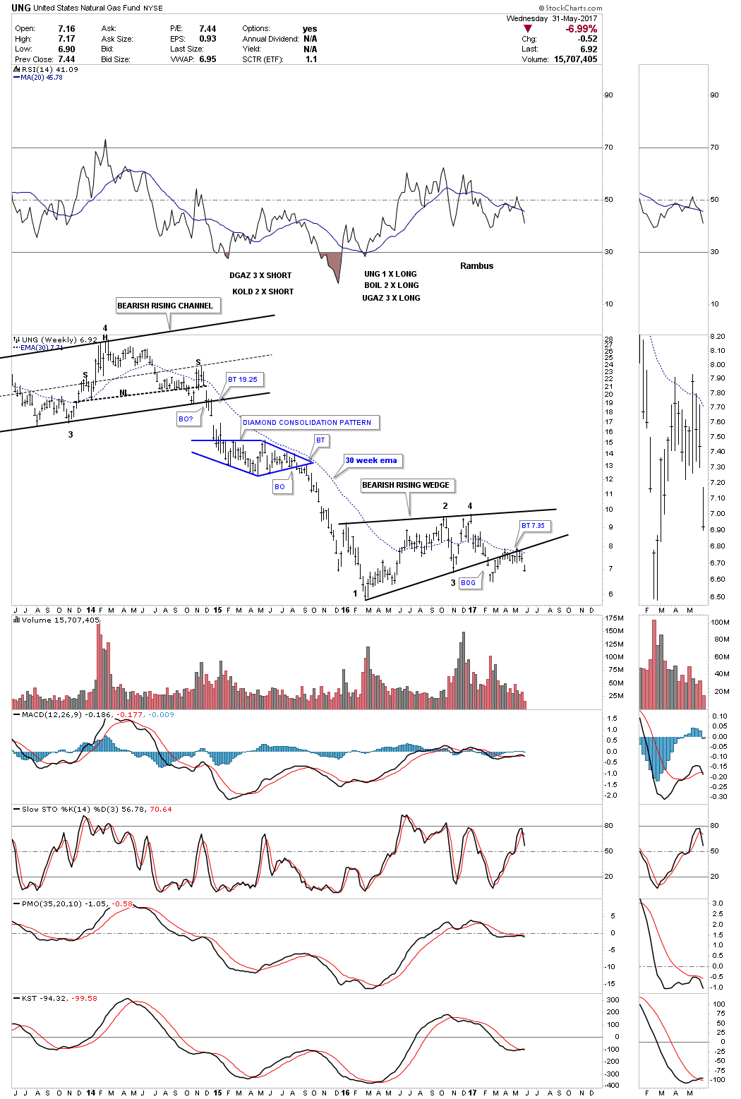
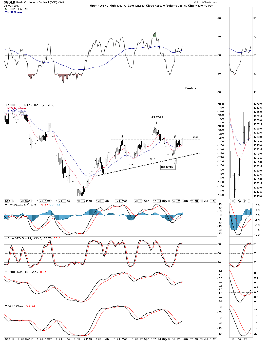
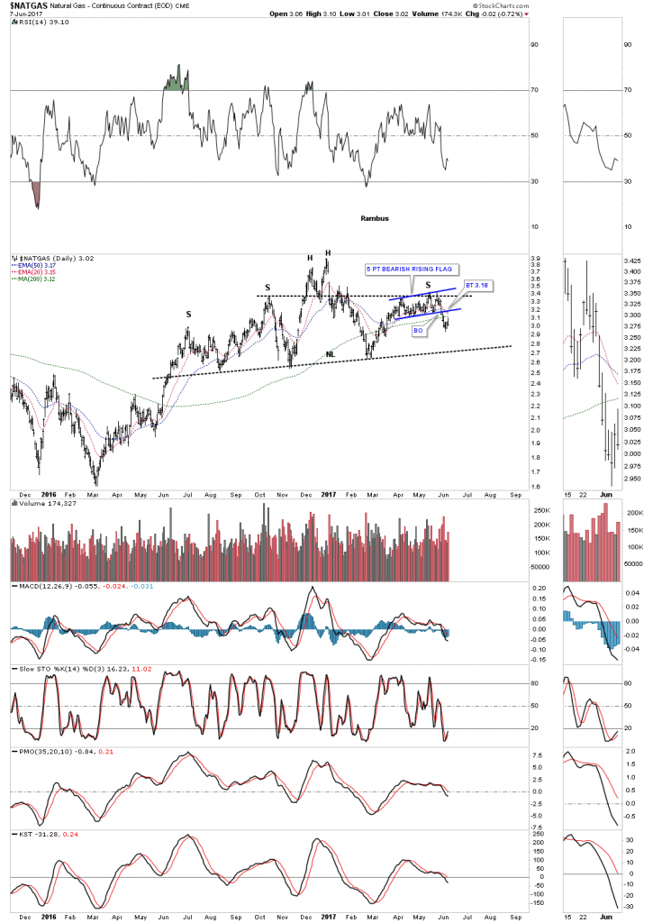
Now lets turn our attention to natural gas which built out a classic H&S top with the left shoulder and head forming inside the bearish rising wedge and the right shoulder forming as the backtest to the bottom rail of the rising wedge, with the height of the left and right shoulders being equal. This is the same setup I was looking for on gold, but it never materialized.

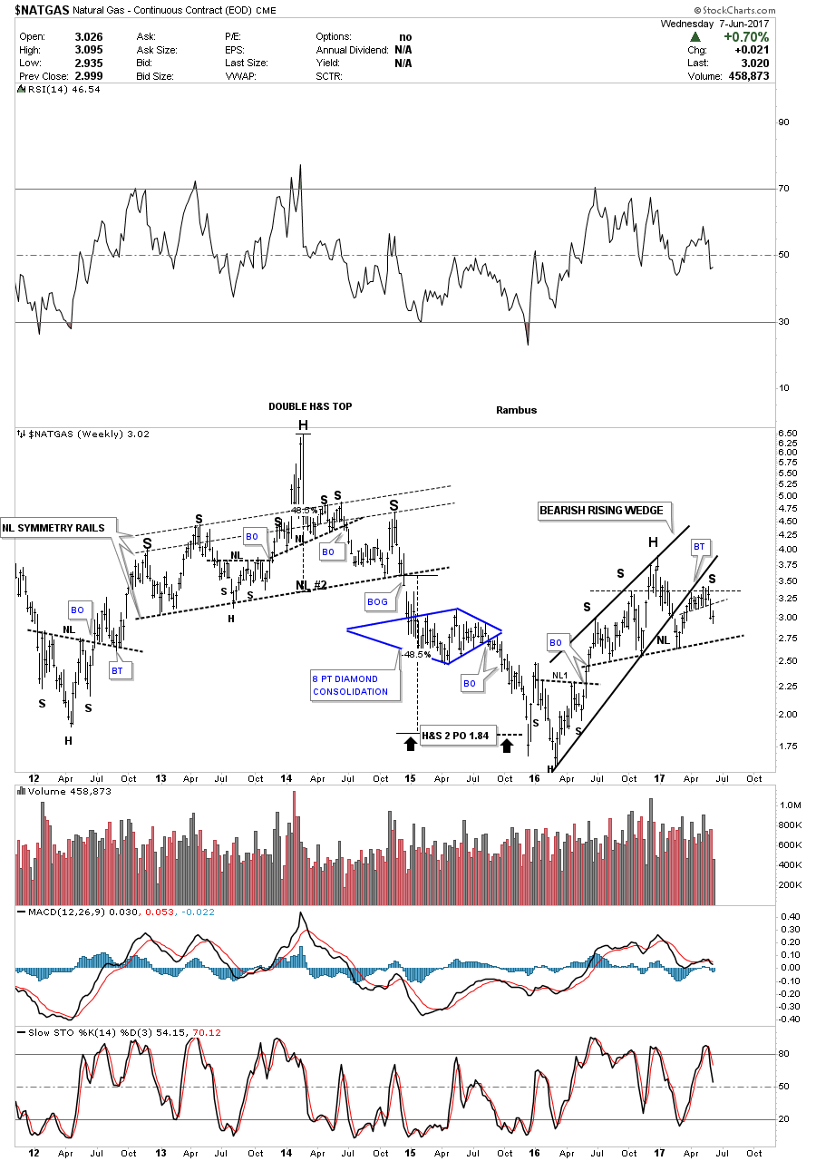
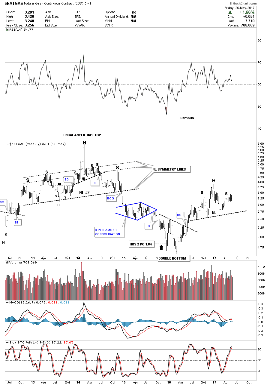
This long term weekly chart for Natural gas shows how the combo bearish rising wedge and H&S top look in the big picture. As you can see Natural gas likes to build out H&S reversal patterns which are generally pretty symmetrical.

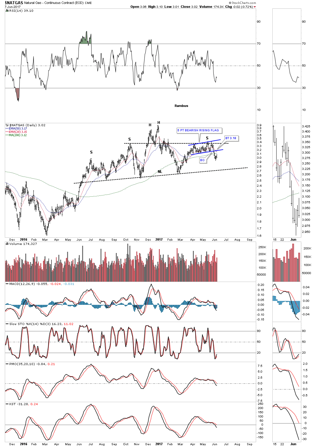
Below is the short term daily chart which shows the H&S top in more detail.
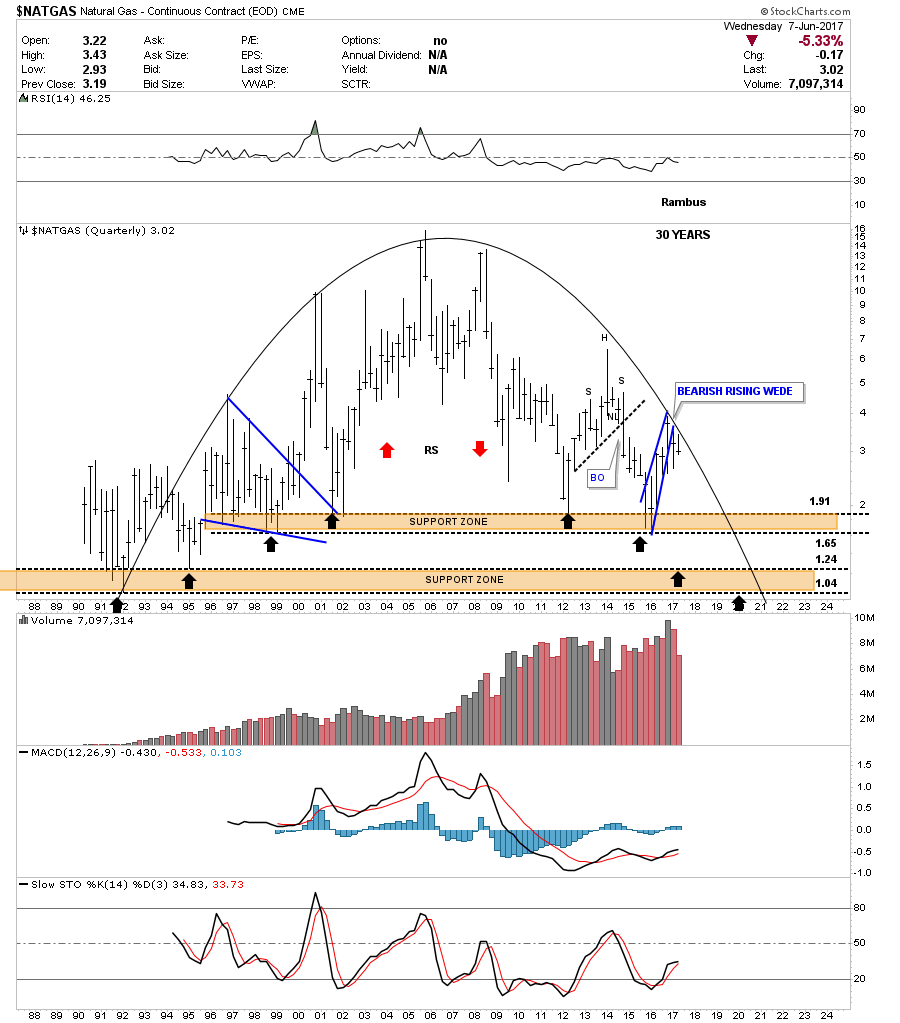
This last chart for Natural Gas is a 30 year quarterly chart which shows the complete history. I’ll let you use your own imagination on this chart.
When we first opened up our doors at Rambus Chartology I used to post this chart as the Late Friday Night Chart. Note the 5 point rectangle reversal pattern at the top of the chart. Our first clue that the rectangle was going to break down was the small red 5 point bearish rising wedge. Note the touch of the bottom rail at 2.50, the little pop telling us the bottom rail was still hot, and then the breakout to the downside.
I still have many more chart to show you, but I’m way past time to put this post up. I’ll save the rest of the charts for part 2 for the Weekend Report. It all makes sense when you see the big picture unfolding before your very eyes. All the best…Rambus