Hello :
For new members and trial members who don’t know I am Gary (aka Fullgoldcrown)
Resume :
Former Gold Permabull ..then after having my crown handed to me by Mr Gold Market
Converted Rambus Student ( Dave calls me his first and most difficult student)
Rambus Chartology Editor
and
Town Crier / Class Clown .
I would like to take this opportunity to review Rambus Chartology and explain what our site is all about .:
Rambus (Dave Tablish from Northern Arkansas) has been a Market Technical Analyst since long before it became fashionable and easy with the advent of computers .
He started out when he came across the original work of Edwards and Magee in “Technical Analysis of Stock Trends” originally published in 1948 and started applying it with pencil and ruler protractor and graph paper over 30 years ago .
Sixty-three years. Sixty-three years and Technical Analysis of Stock Trends still towers over the discipline of technical analysis like a mighty redwood. Originally published in 1948 and now in its Tenth Edition, this book remains the original and most important work on this topic. The book contains more than dry chart patterns, it passes down accumulated experience and wisdom from Dow to Schabacker, to Edwards, and to Magee, and has been modernized by W.H.C. Bassetti.
Bassetti, a client, friend, and student of John Magee, one of the original authors, has converted the material on the craft of manual charting with TEKNIPLAT chart paper to modern computer software methods. In actuality, none of Magee’s concepts have proven invalid and some of his work predated modern concepts such as beta and volatility. In addition, Magee described a trend-following procedure that is so simple and so elegant that Bassetti has adapted it to enable the general investor to use it .
……………………………………..
Rambus learned the only way , from the school of hard knocks ,from trial and error , and more error and losses. But his fascination with the incredible symmetry of chart patterns and his never quit attitude convinced him to stick with it .Technical Analysis became his passion . Over the years he refined his skills and added many of his own observations from his real time charting and trading. Many of these insights can be found in the section on the sidebar of Rambus Chartology called ‘Timeless Tutorials”
Dave finally hit the jackpot in the late 1990s teck mania blowoff when he attached himself to the stock RMBS and traded it all the way to the incredible top. Then spotting a tiny head and shoulders top he exited and left that market to build his dreams .
Hence in about 2006 when Dave started posting his original charts at Goldtent ( a site where rabid goldbugs like myself inhabited) he took on the moniker “Rambus”
After a short hiatus from the Markets in 2000 (Rambus has always told me that when you make a good score in the markets its best to take much of your winnings out and use them for other purposes lest you give them all back) , Dave returned to his charting and identified what appeared to be a 5 year bottoming pattern in the Gold Market
In about 2002 he started to study and learn everything he could about this horribly beaten down and forgotten market . He familiarized himself with the Metals and the Miners both individually and via the Mining Indices . he was immediately very impressed that the PM markets held some of the most pure and beautiful symmetrical patterns and he quickly became hooked .
He traded the PMs from the long side in quiet obscurity for several years before he found Goldtent and started to contribute posts. We were in awe of his work .
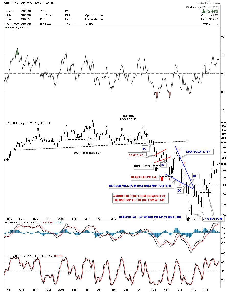
Rambus charts predicted more and more upside all through 2006-7 and into 2008. Nothing but Bullishness as far as the eye could see. Consolidation Patters always broke out to the upside . he was a hero to us goldbugs . Until that fateful post one fine day in mid 2008. he called his post “What If ? ”
I attempted to save all the goldtent posts from that era but many are now dead links.However here is the post I put together in December 2011 called “Deja Vu” which contains some the charts from the 2008 era .Wow. Notice the WTIC call too .
http://rambus1.com/?p=1829
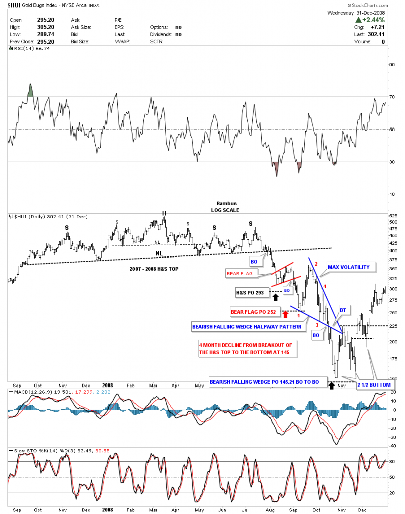
Rambus located this chart which was posted on New Years Eve 2008 which chronicles his calls from that incredible era in the PM markets .
Well: That was then and this is Now . And here we are again.
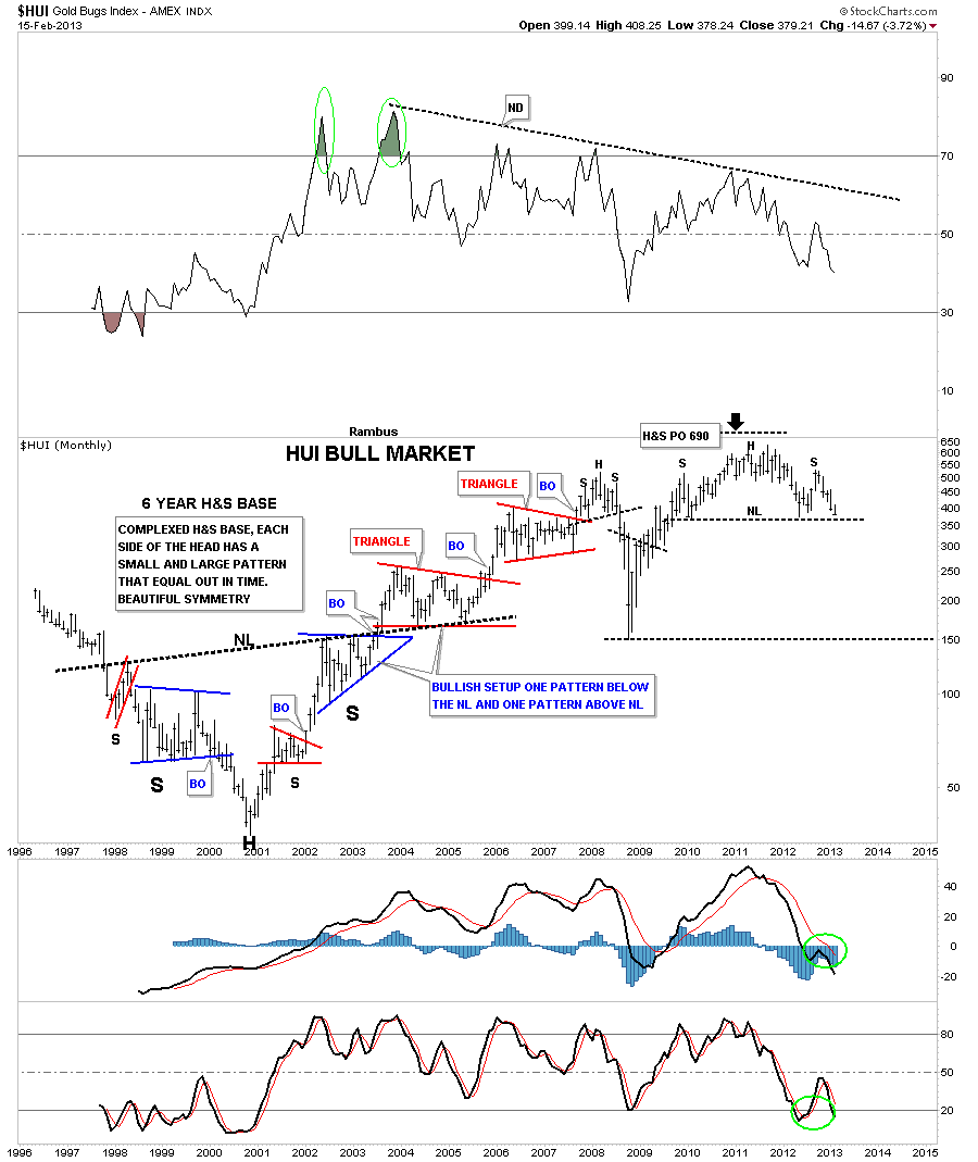
Here are some more recent charts in which Rambus Projected the present PM carnage as long as 2 years ago.
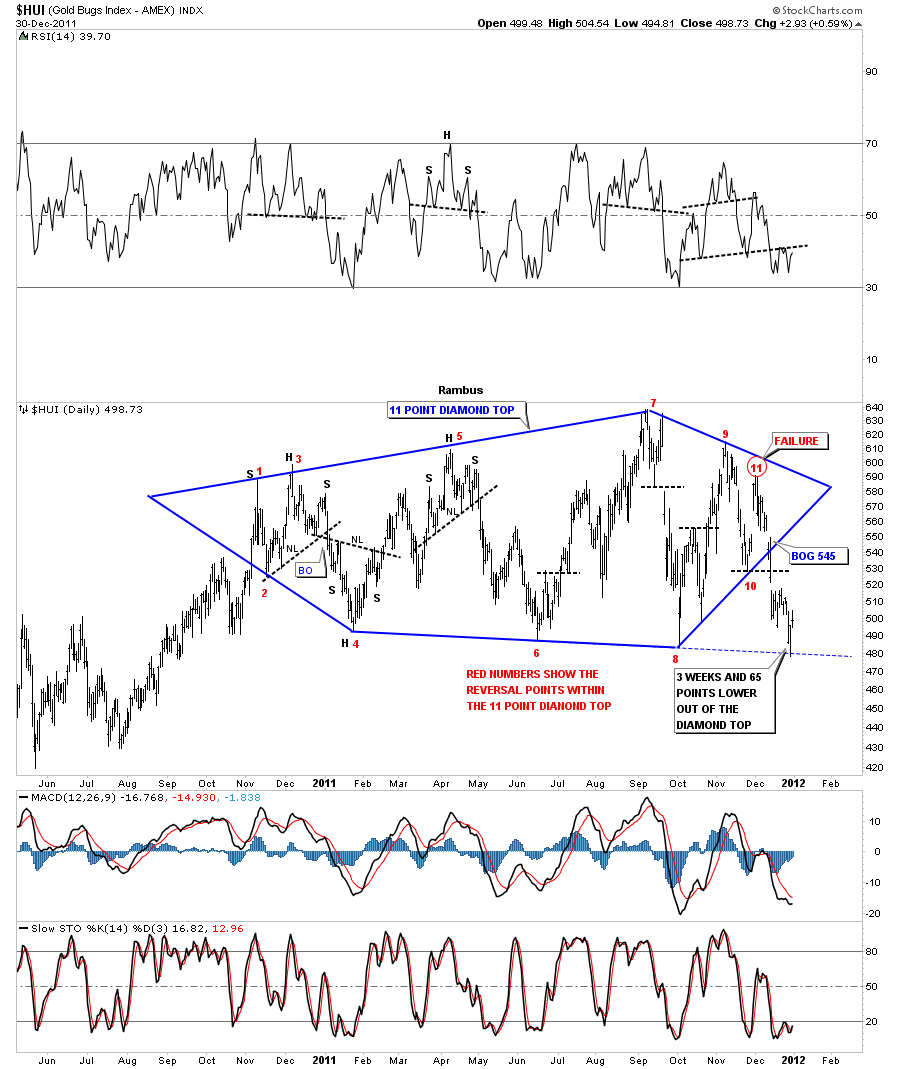
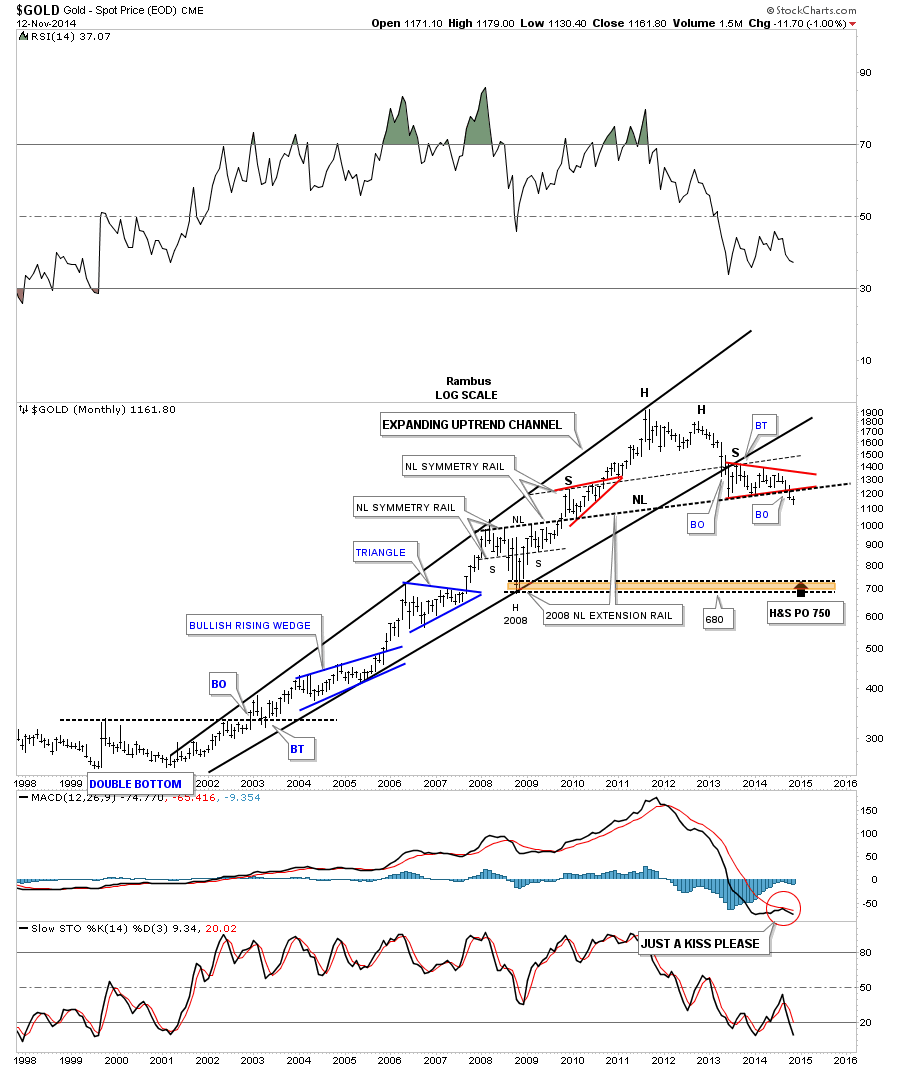
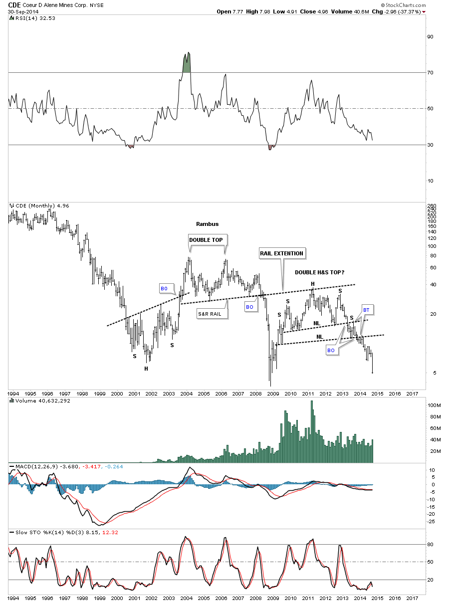
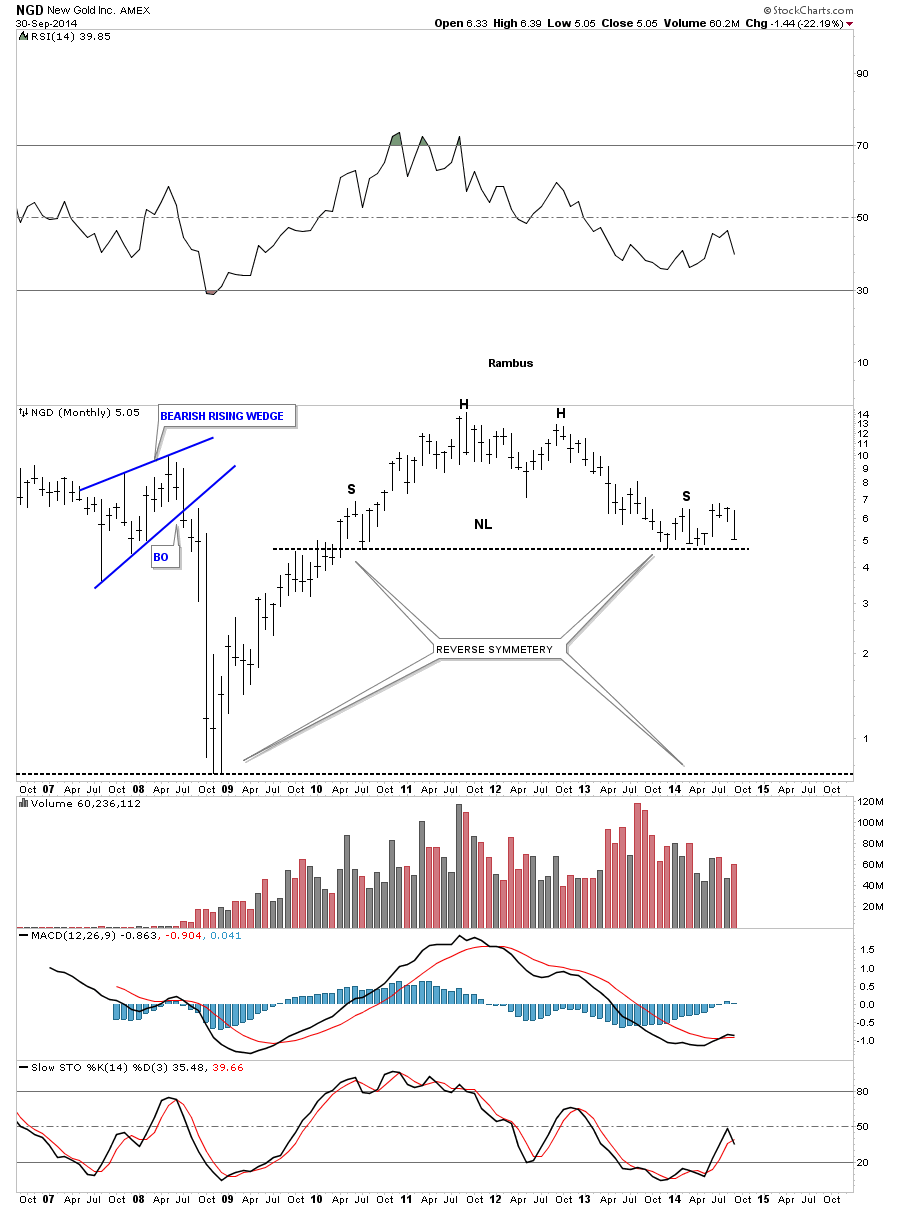
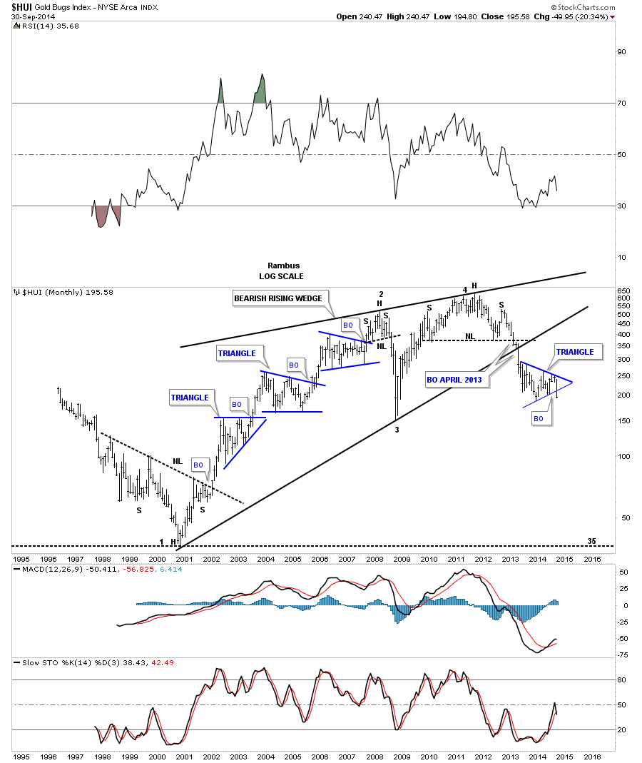
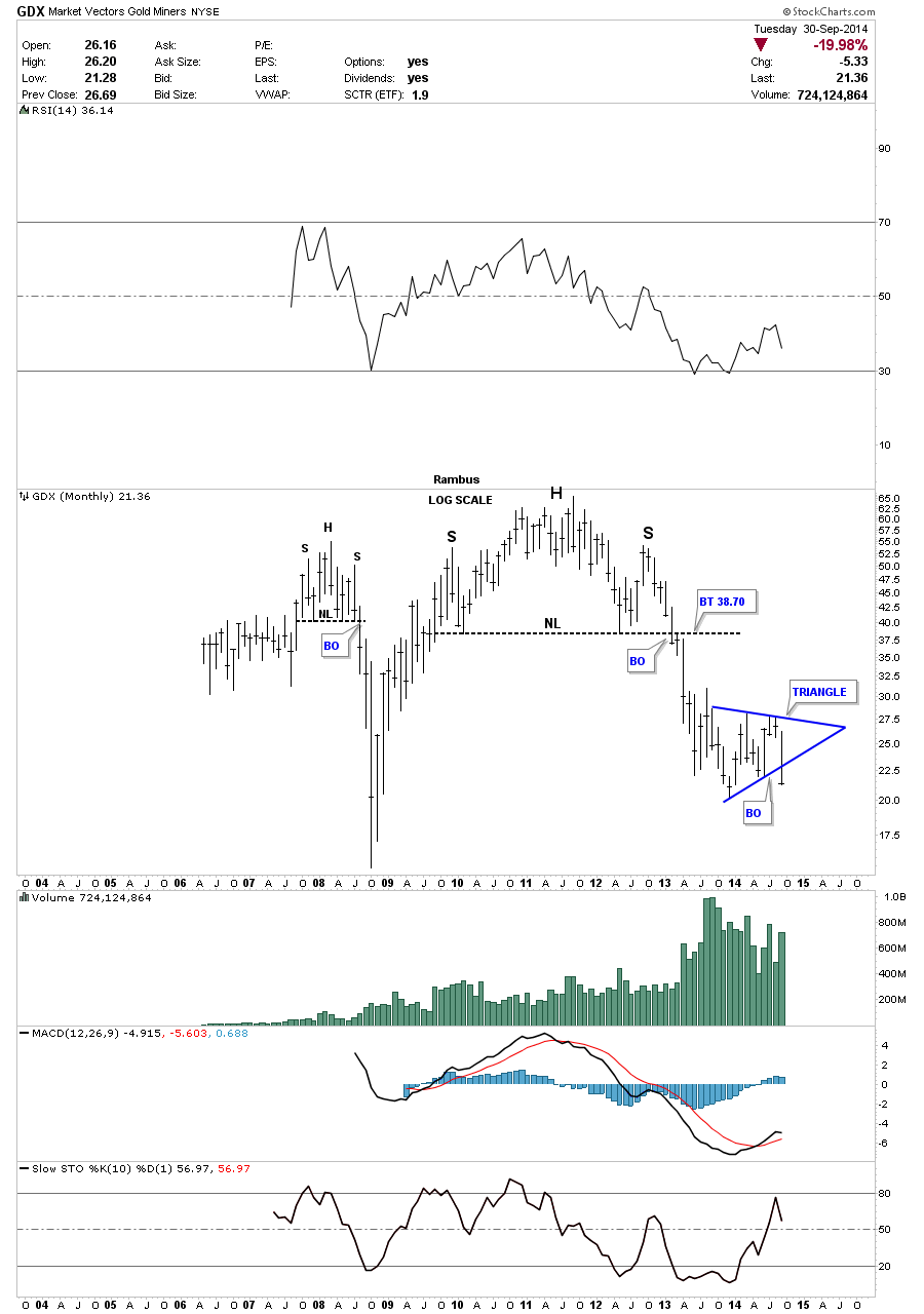
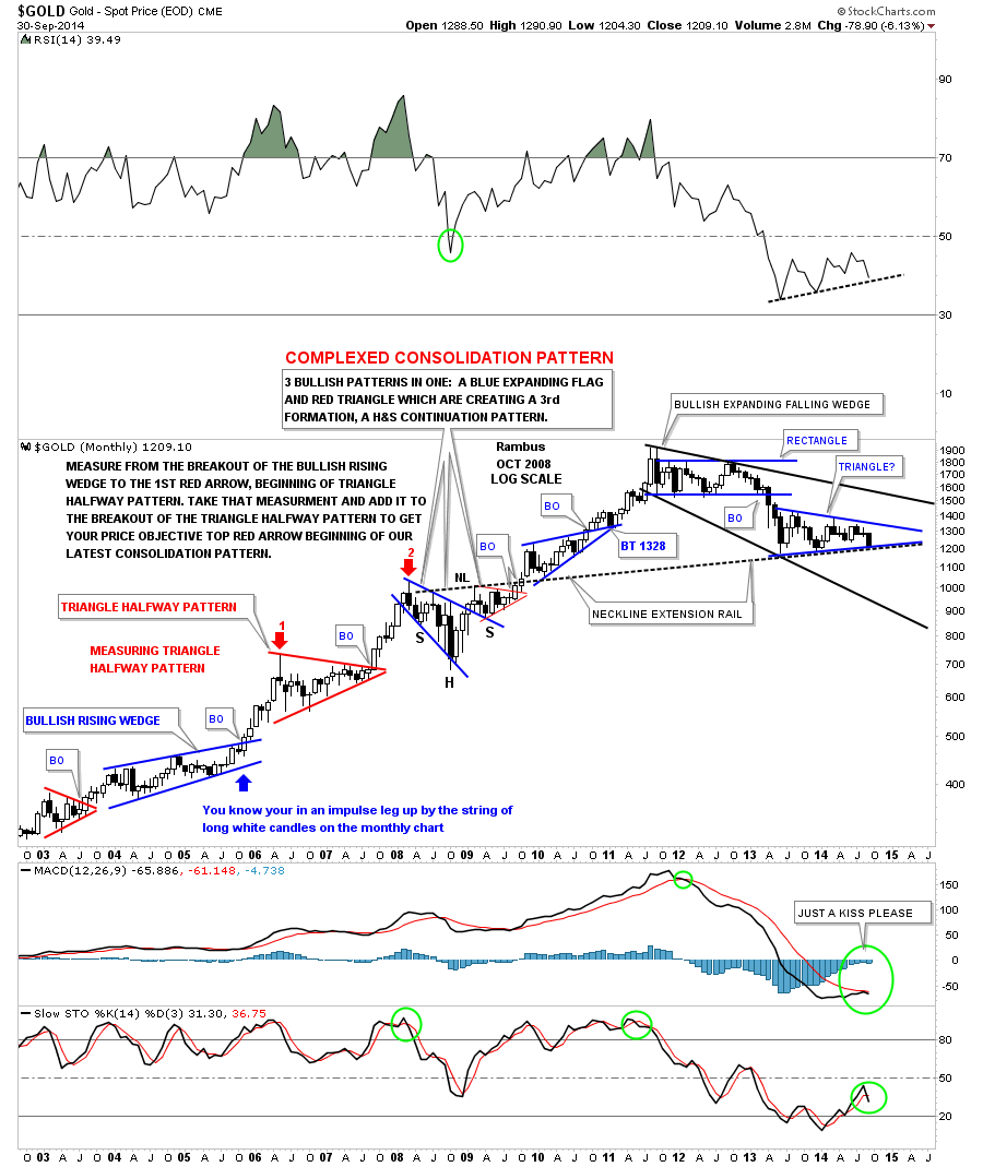
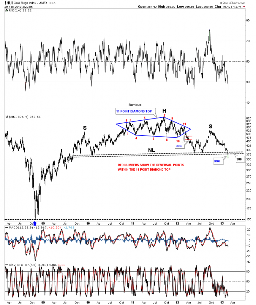
This chart produced Feb 15 2013 , shows how the HUI top was actually predicted by the price objective contained in the 6 year head and Shoulders bottoming pattern from 1997 to 2003 . Incredible Chartology .

BUT how did Chartology do in forecasting this present Bear Market ? Well for one thing look at that chart above and see the impending Head and Shoulders TOP !
Wouldn’t you have loved to have seen that Top back the in Feb 2013 ? What would you have done differently ?
Here is the Rambus Comment from the post of this work
“The Chartology of the entire chart is one of beauty and symmetry which some will see and others won’t. They say beauty is in the eye of the beholder. What do you see?”
…………………………………
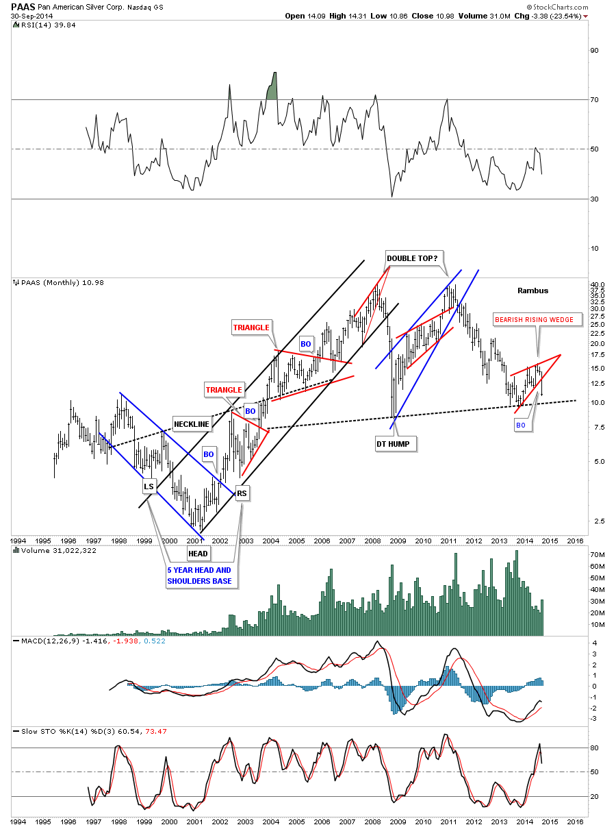
Actually Rambus Produced a Chart called “A Diamond in the Rough” on New Years Eve 2012 which preceded the above chart and was the first warning of impending doom .
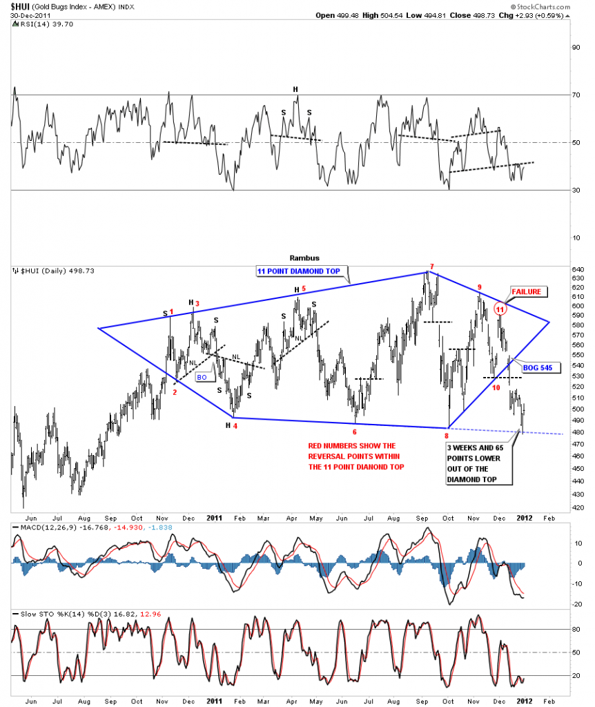
Diabolically this breakout was followed by a huge bull trap rally back to retest the diamond and that formed the right shoulder of the Huge head and Shoulder pattern which proved to be the Top
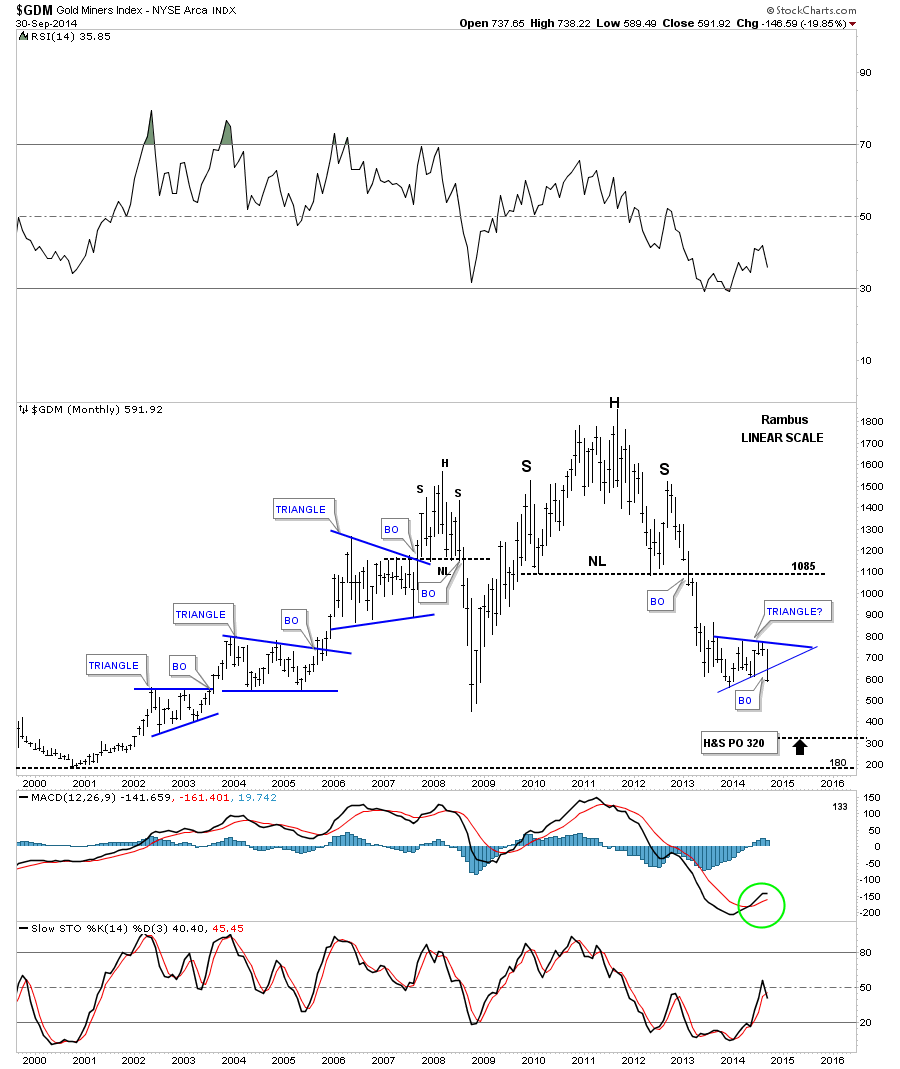
Fast Forward February 22 2013
“Lets look at one more example that you won’t find anywhere else except here at Rambus Chartology. You can see two reversal patterns, the 11 point Diamond that is actually the head portion of the much bigger H&S top that few believe is for real. The other pattern is the massive H&S top. Its good that few believe this pattern is authentic because everyone can’t exit at the same time. The lower it goes the more people will begin to understand what is actually happening but it will be too late to take action and they will most likely ride the whole thing down or sell into any counter trend rally that will occur thus putting a ceiling above the price action. I hope these examples help you understand what I mean when I talk about odd and even numbered chart patterns.”
All the best
Rambus
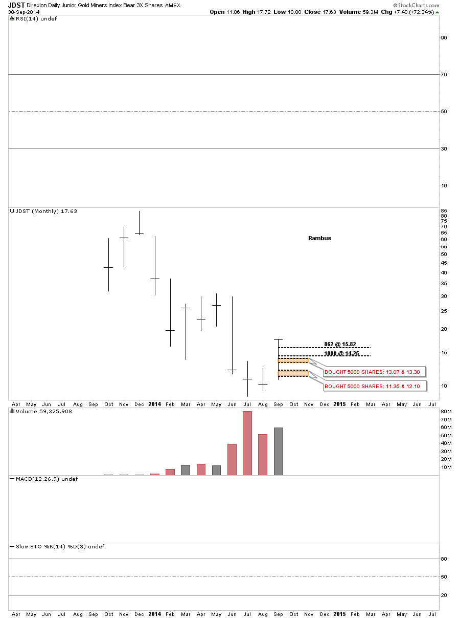
Chart 3: Nervous Breakdown !
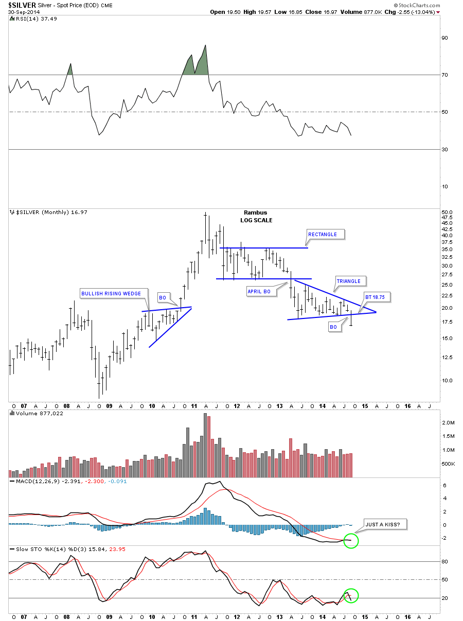
Here is a Call on Silver (via SLV) that I couldn’t believe at the time .”SLV BLUE DIAMOND”
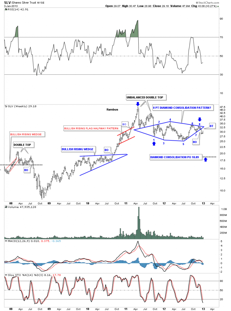
Followed soon after by “SLV RED DIAMOND”
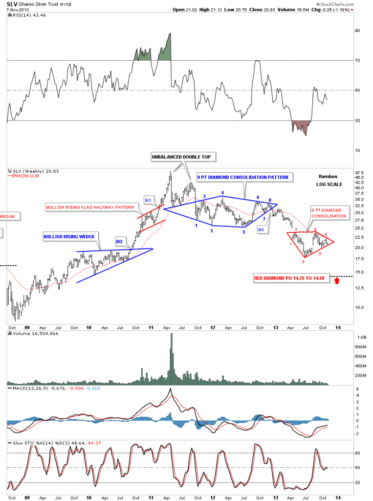
See that PO ? Of the Red Diamond ? Made 1 year ago …14.50 !!… Which is exactly where SLV has bottomed to date . Yikes !
……………………………………………………….
OK : The real point of this post is to Explain this Rambus Chartology Website .
On a day to day basis we all of course focus on the daily and minute charts as that is where the rubber meets the road. However we feel that Rambus best value is in identifying major trends and major trend reversals .As you all know identifying trends and profiting from them in real time are two different animals .This is what Rambus attempts to do in his daily realtime market commentaries.
Rambus Chartology is First and Foremost a teaching site. The greatest value of this site is learning Chartology ( a blend of Chart pattern recognition with Market Psychology). The aforementioned “Timeless Tutorials” as well as “The Wizard of Rambus” are the places to go for this.
We realize that not everyone is inclined to learn Technical Analysis and that many come here to see how Rambus is trading the various markets in the desire to trade with him.
For you ,as you know Rambus is not a Certified Financial Planner and he trades his own portfolios (see the obligatory disclaimer)
He has 4 Virtual Portfolios on this website (Rambus also trades his own personal portfolio with the same trades)
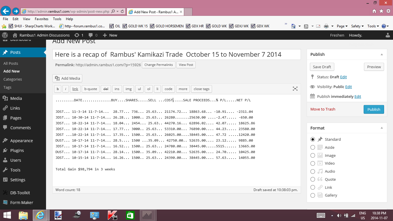
The Most widely followed Portfolio is the Kamikazi Portfolio.
Rambus recommends you put a maximum of 5% of your risk capital in these trades. To say they are volatile is an understatement.Recently a 200% profit in 3 weeks has vaporized.
http://rambus1.com/?p=14865
His other Portfolios are The Junior and Model Portfolios which were originally meant to hold PM Miners in Bull Mode but which now have various other trades.
AND
The new (from May 2014) General Market Leveraged Portfolio which trades 3X ETFs on selected market sectors.
http://rambus1.com/?page_id=23371
In Summary Rambus would like each an every one of his members to learn and be able to utilize the principles of this incredible Market Forecasting Discipline .
In closing here is a response to a member who asked probably the most important question of all .
Why do charts work ?
…………………
“Hi its Fullgoldcrown here
In case Rambus misses this question I will answer it as I know he would .
……………………………….
Simply because Human Nature is predictable . Market Participants are all motivated to act by the basic emotions of Fear and Greed. Charts are the sum total of the opinions of Market Participants. Rambus favorite expression of this is “Its All in the Charts”. What he means is …we can never really Know the fundamentals and how they will play out .We will never really know the extent of Manipulations .We will never really Know Sentiment…or Seasonal Effects or anything in real time. What we think we know about all these things is just our speculation
What’s that brilliant quote again ..? “Its not what we don’t know that gets us in to trouble It’s what we think we know that isn’t so”
The real drivers of the markets are in sum total only knowable by reading the charts . We can all see the history of the price action by viewing a chart .
Where Rambus is Invaluable is his ability to read the language of the markets through its Price Action .
OK Now
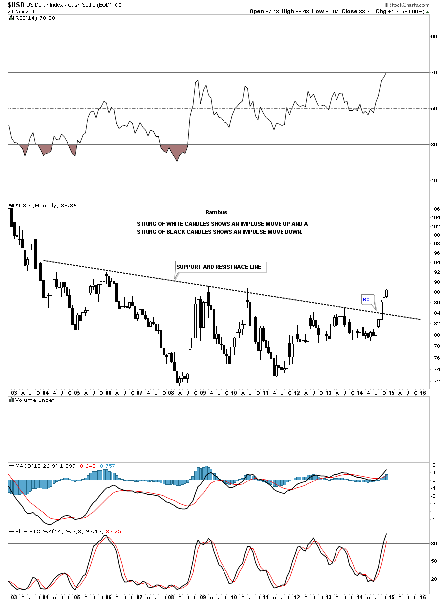
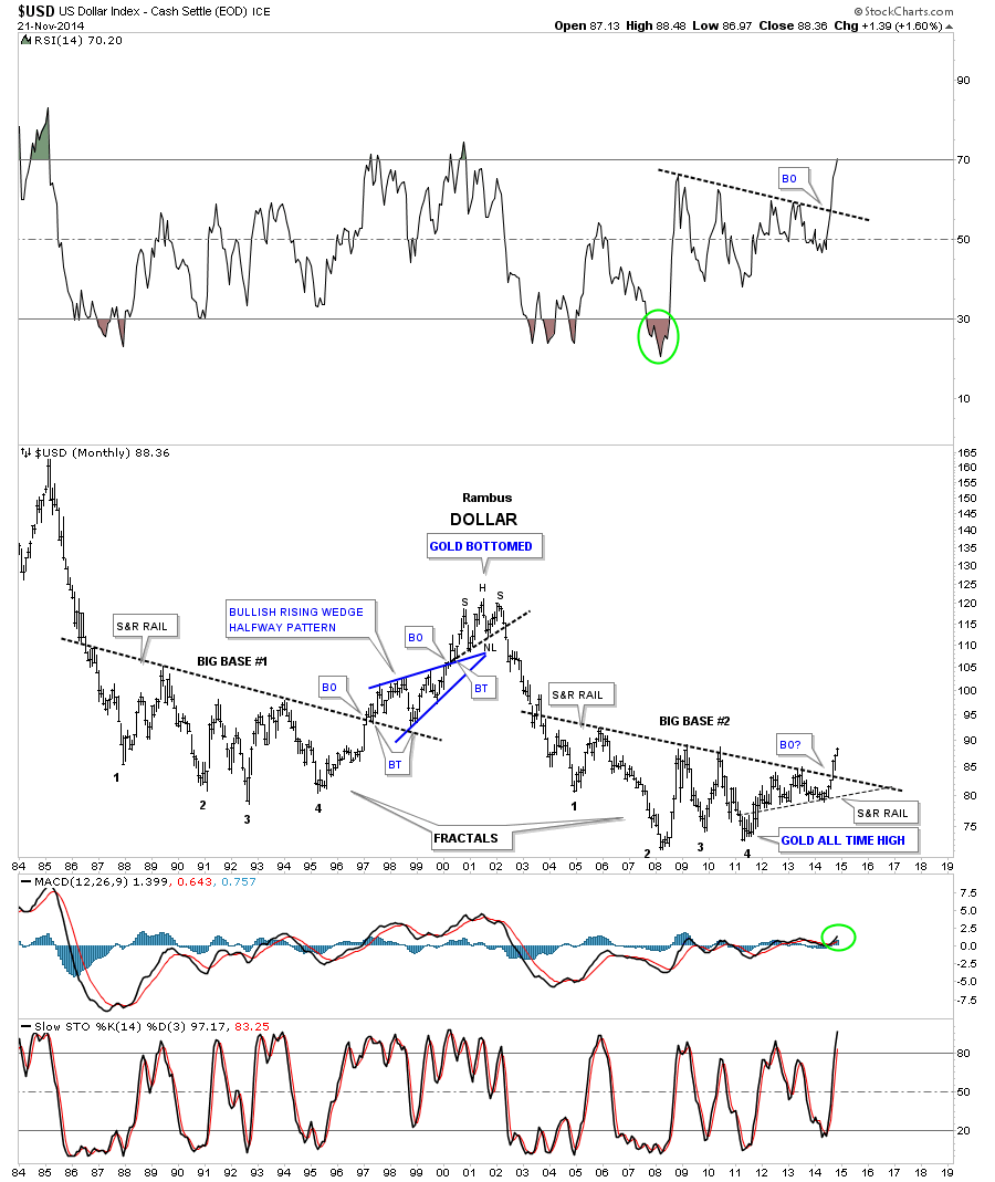
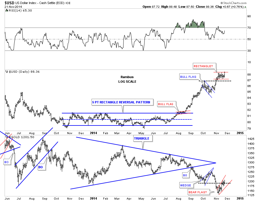
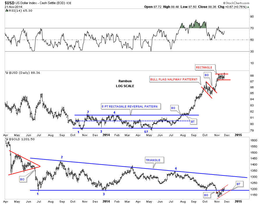
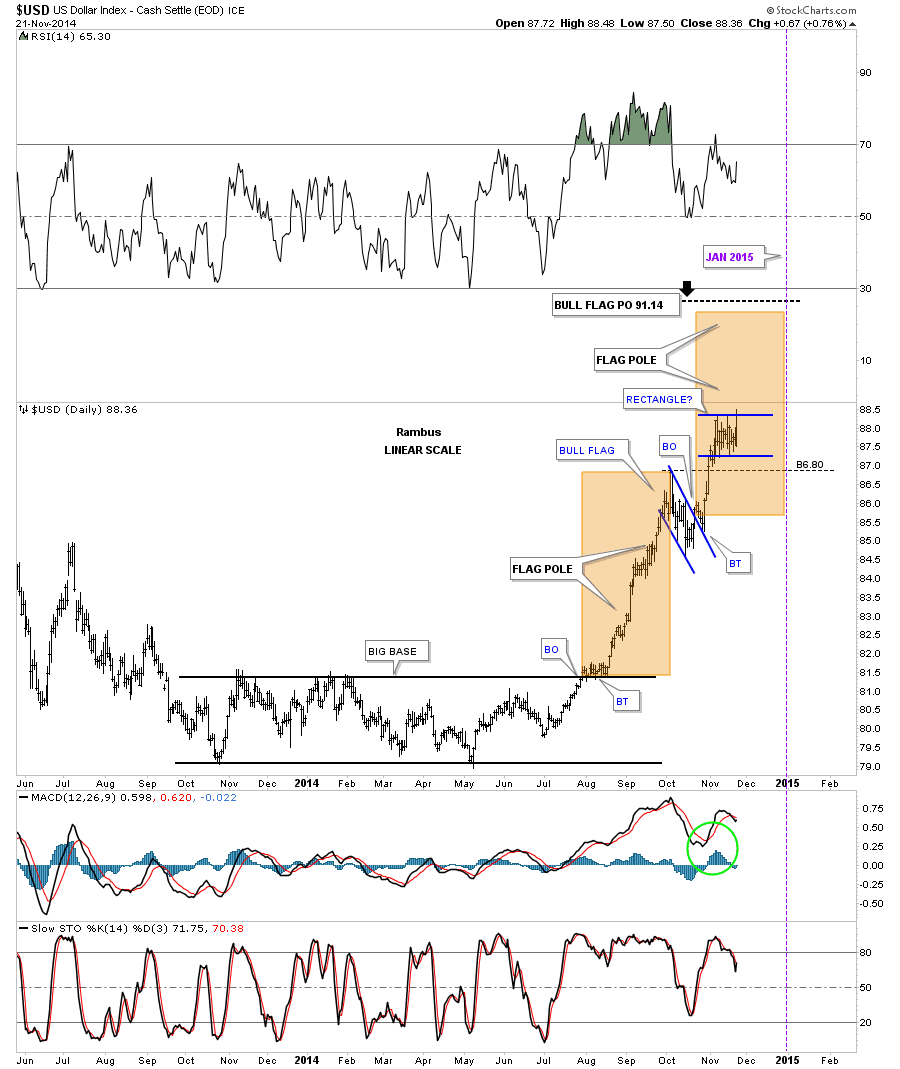
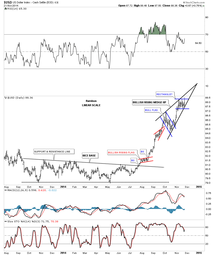
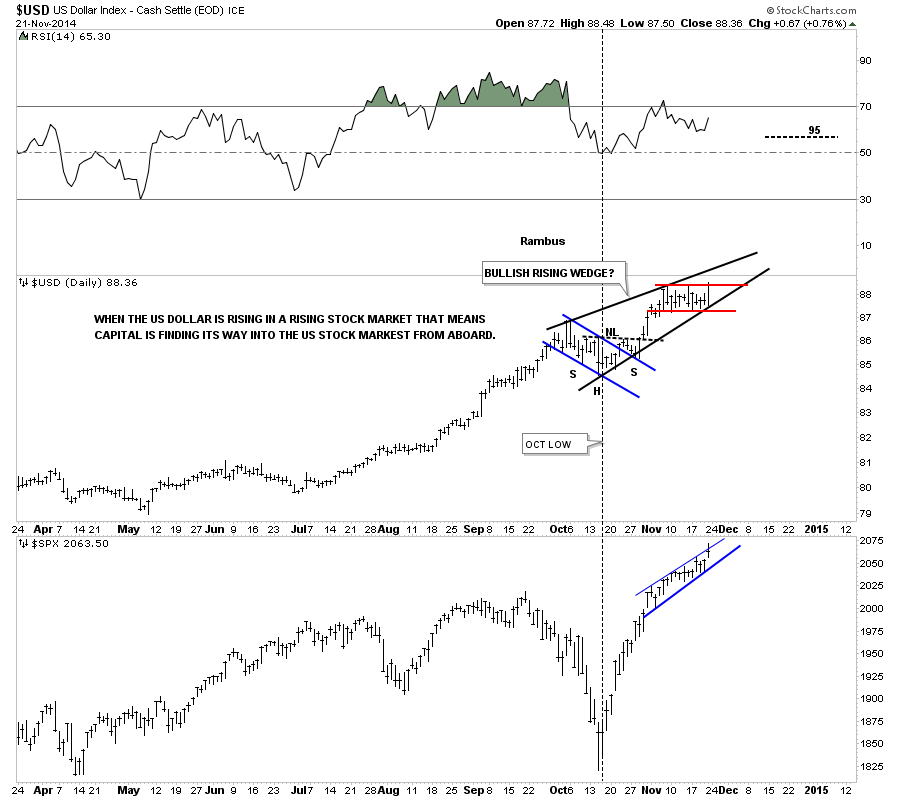
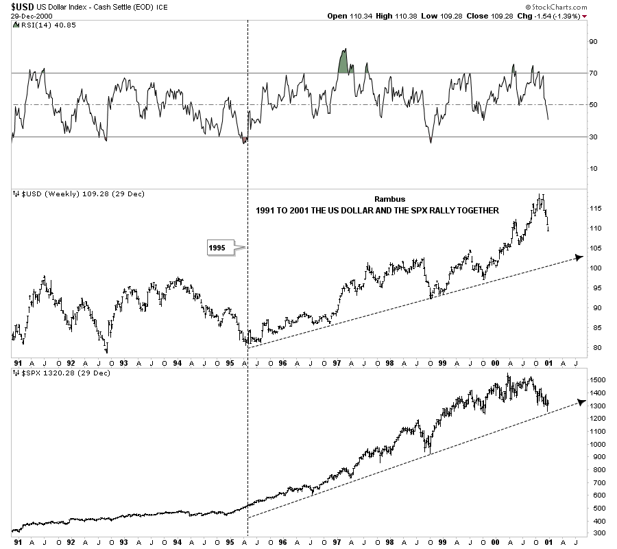
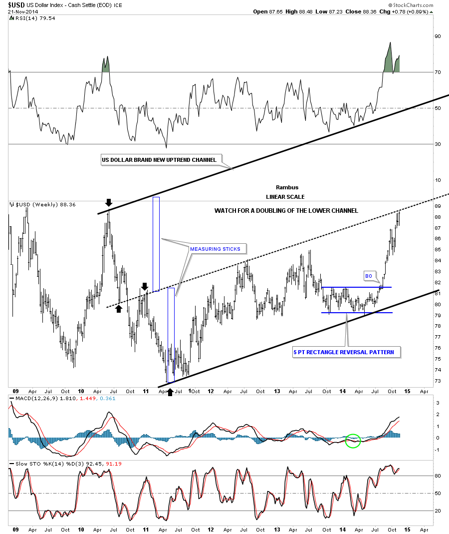
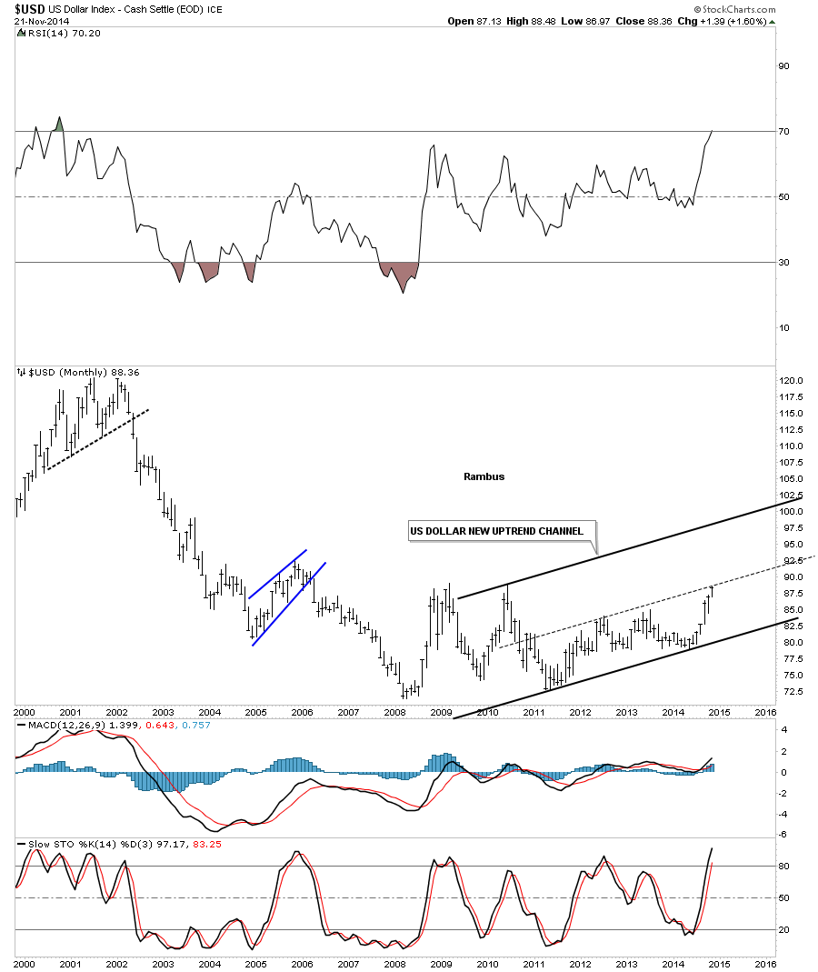
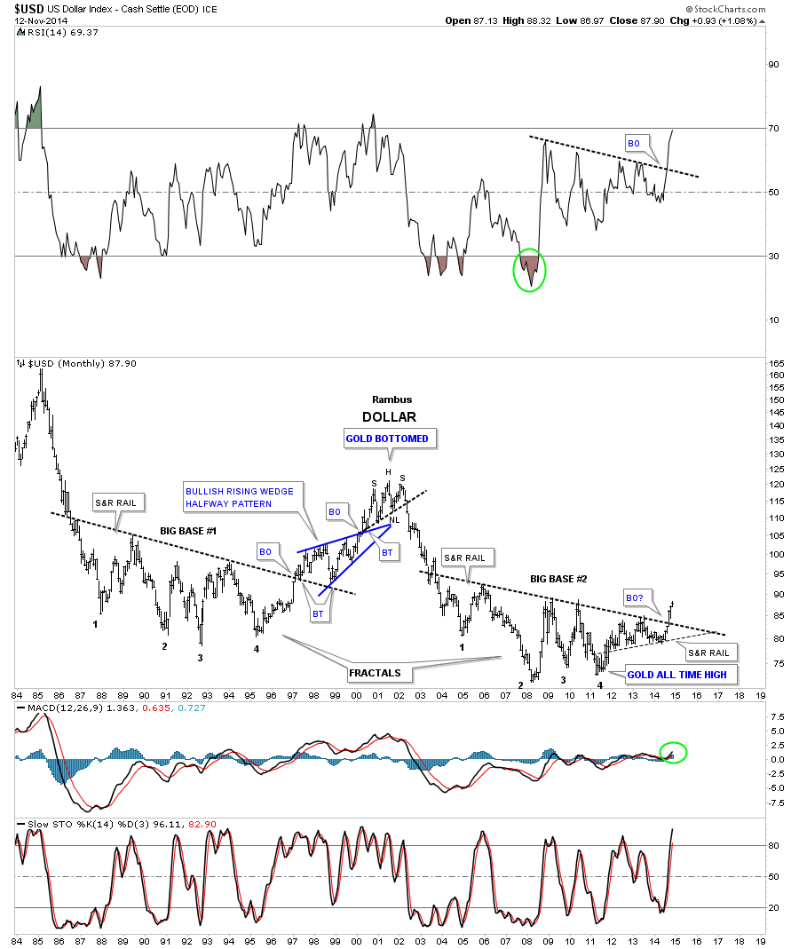
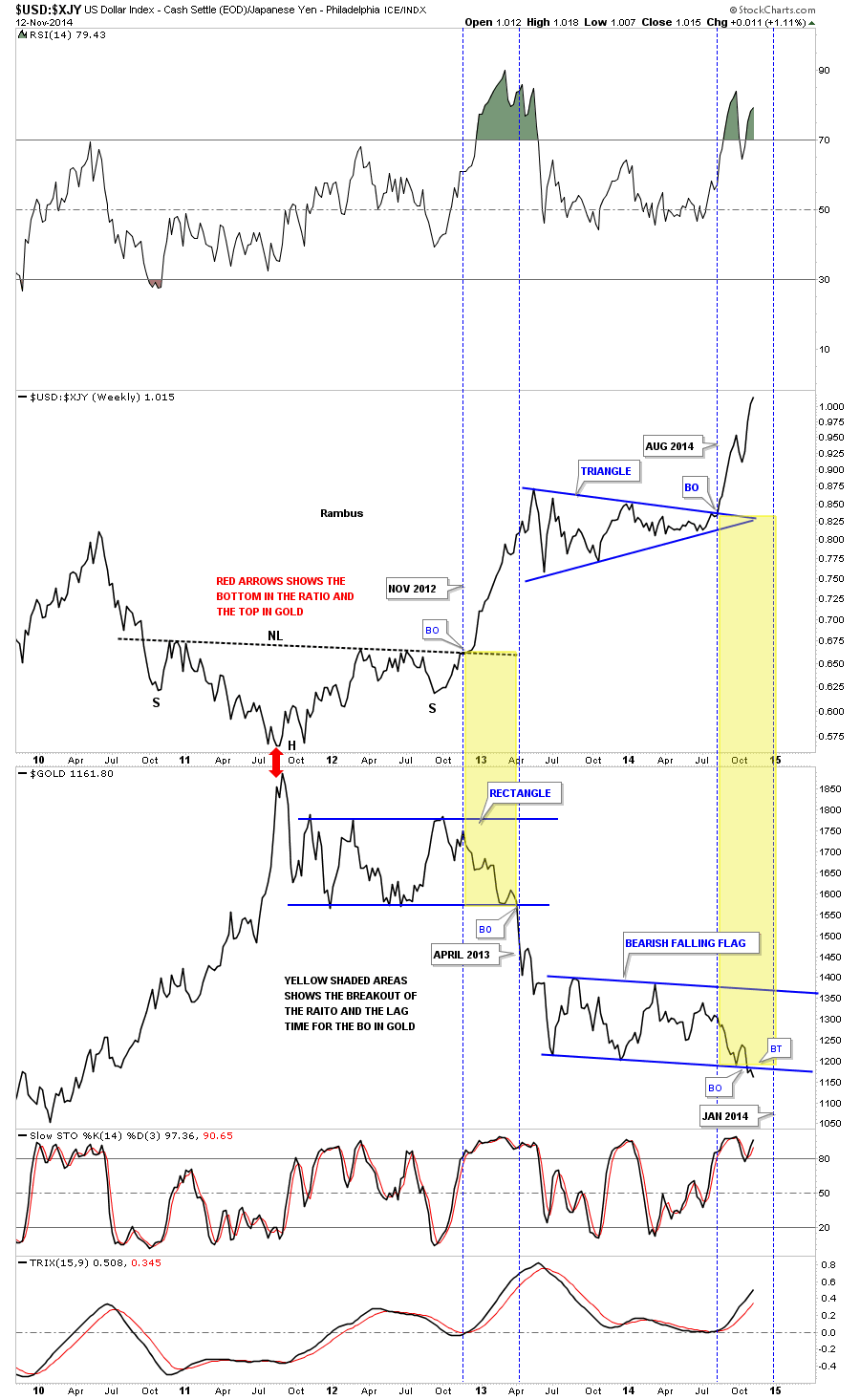
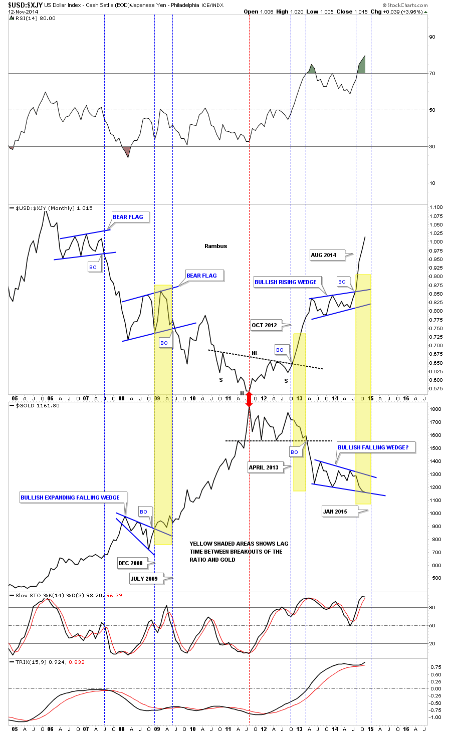
One Of My Personal Favorites where in March 2013 Rambus Posted
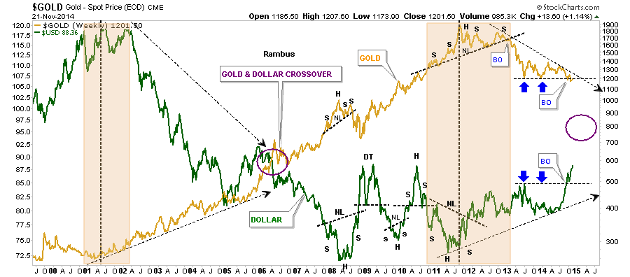
“Dollar Bears Prepare to Hibernate”
(be sure to read the last 2 charts )
http://rambus1.com/?p=11237
…………………………………
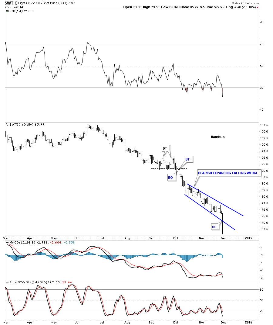
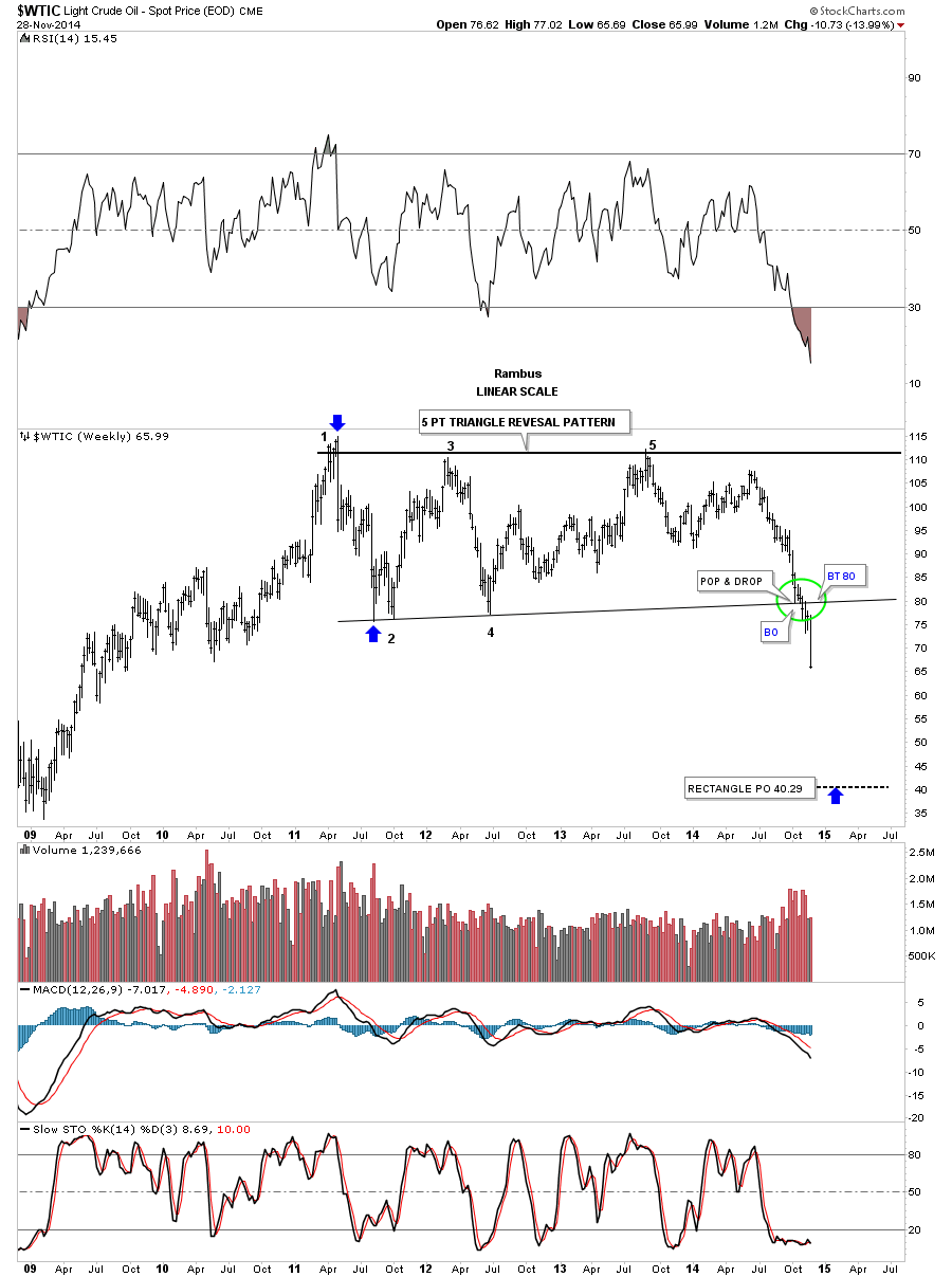
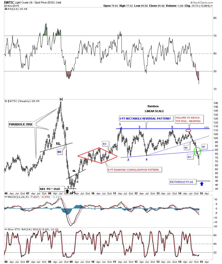
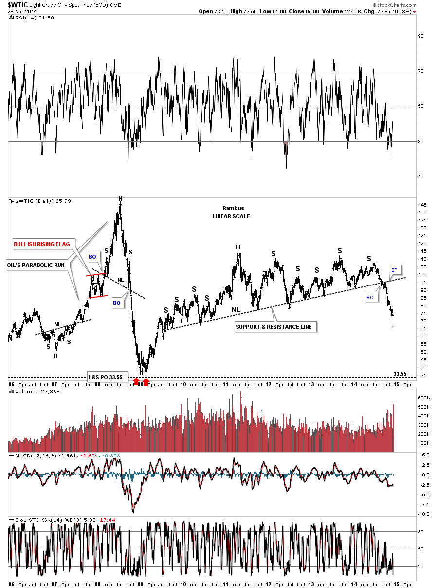
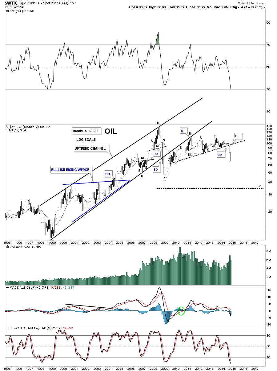
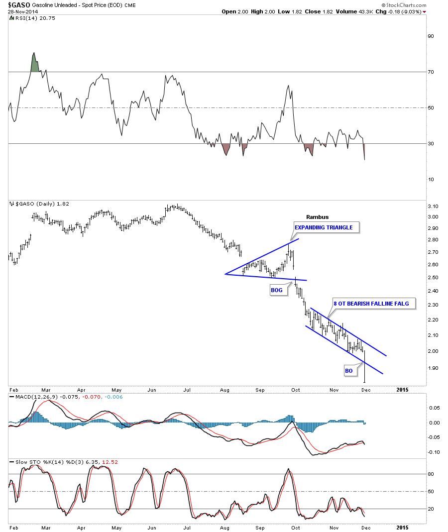
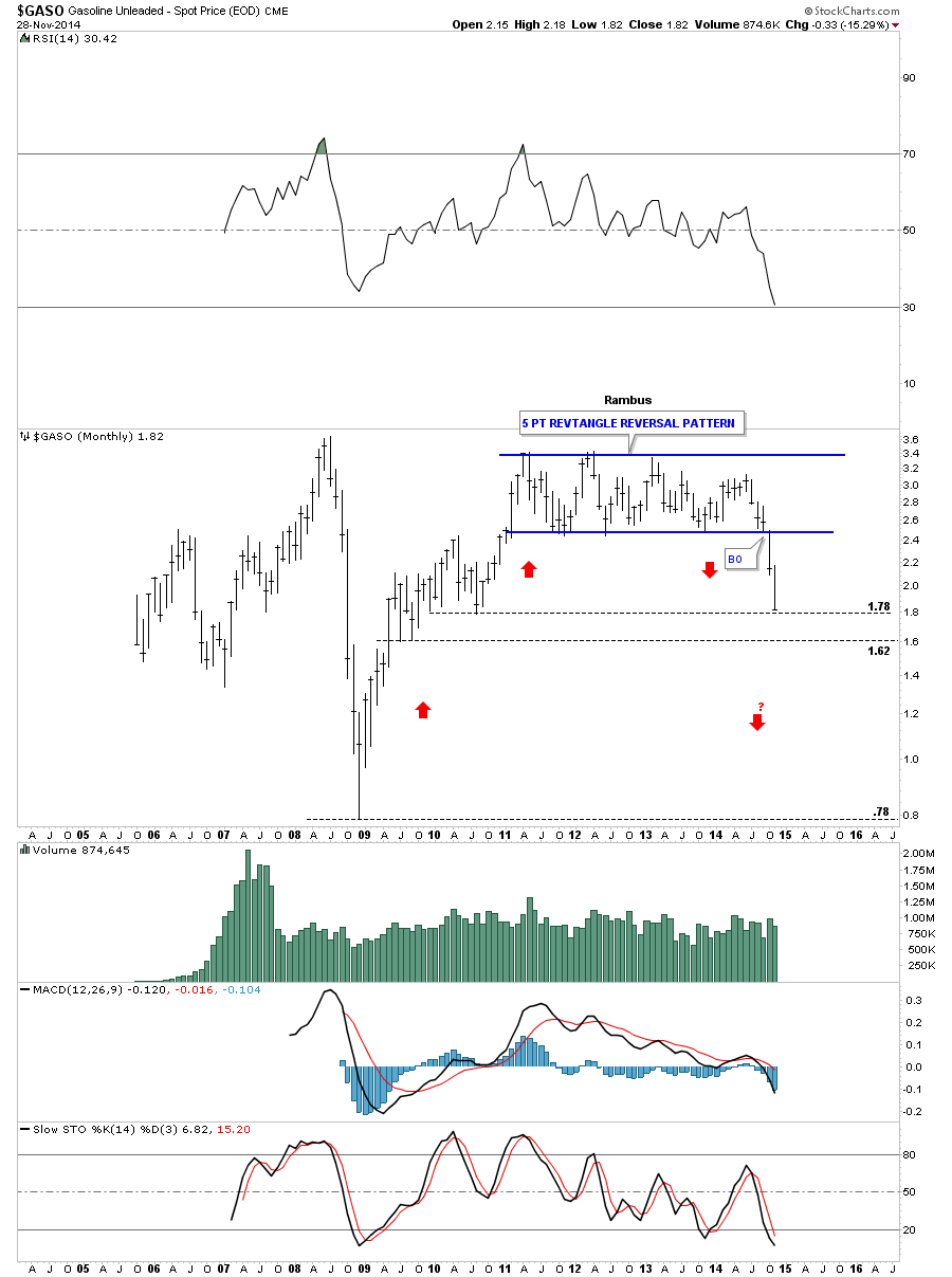
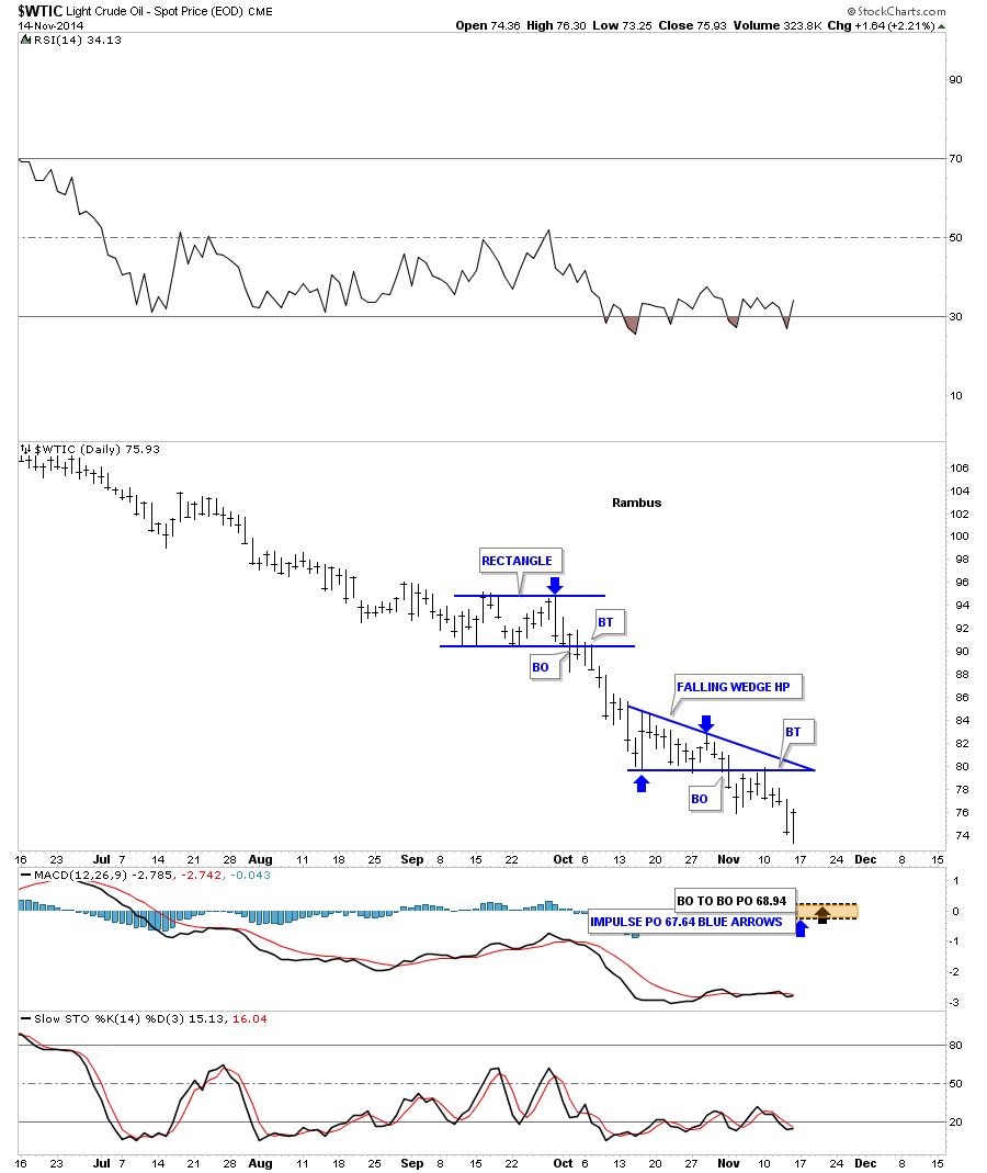
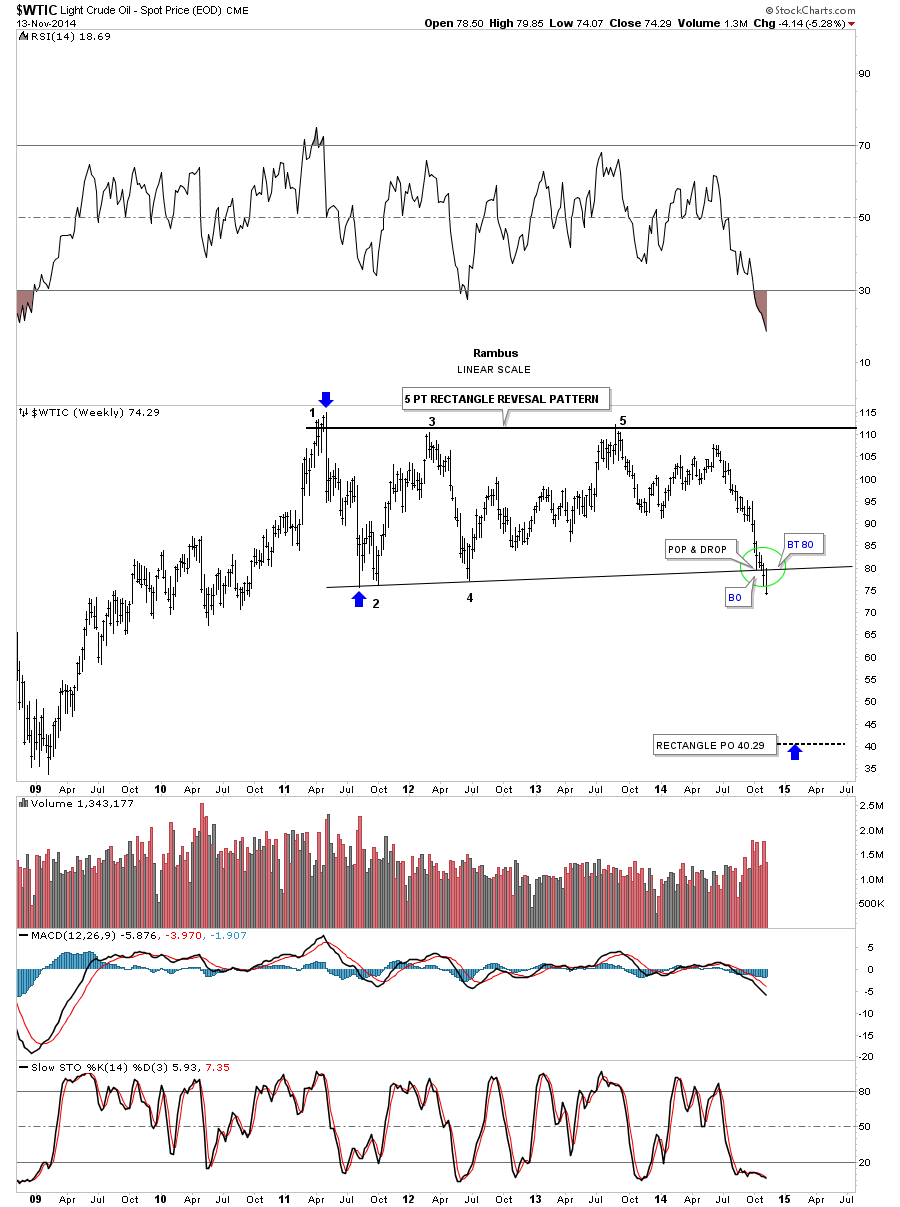
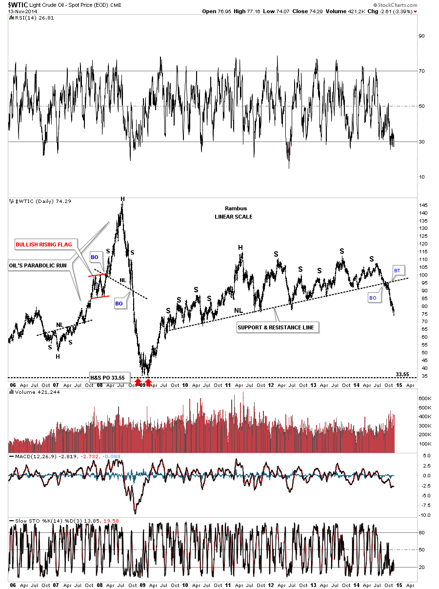
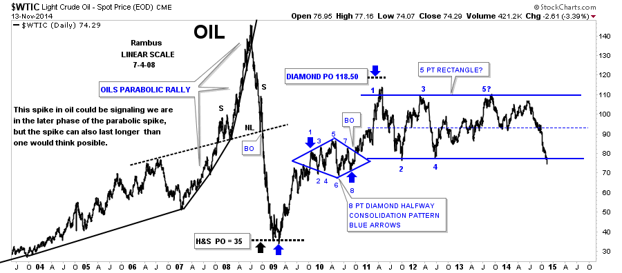
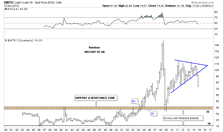
Update : Nov 28 “Energy Deflation Here and Now”
This post highlights the Evolution of this Hugely important Deflationary event
http://rambus1.com/?p=29640
……………………………
Years of Study and Experience , a Gift for Pattern recognition and a touch of Intuition
I doubt that we will ever see Rambus’ equal .
But of course I am Biased
🙂
Fully