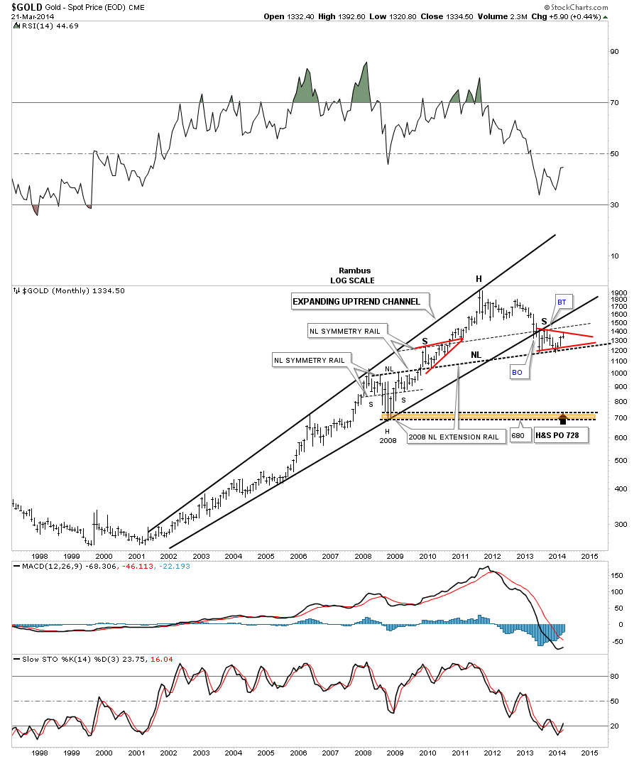
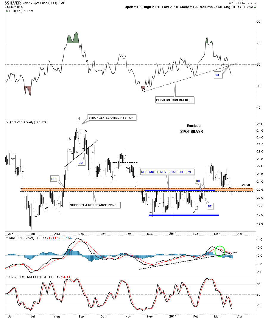
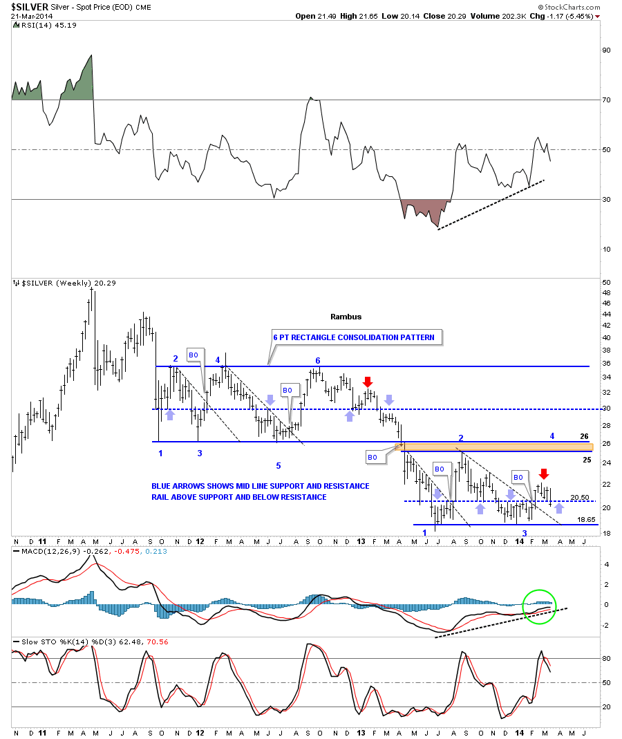
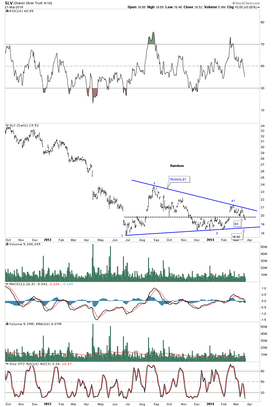
We’re going to do something a little different for the Weekend Report this week. I would like to give the spotlight to Sir Plunger for his most excellent work on the Phase 3 for the PM stocks bear market. It deserves to be read by the members of Rambus Chartology and the general public at large. I just want to thank you Sir Plunger for all the time, research, and energy it takes to put together something like your Phase 3 bear market outlook for the precious metals stocks .
As most of you know , Plunger is our resident expert on market history .
He has devoted himself recently to the study of Bear markets in general
and now has zeroed in on our presently ongoing precious metals bear .
This Essay was penned this weekend and posted at our members forum .
I trust you all will find this as fascinating and provocative as have I .
Warning : This essay contains disturbing material and is not for the feint of heart
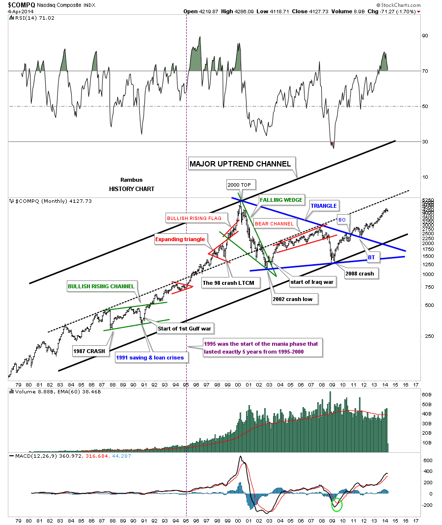
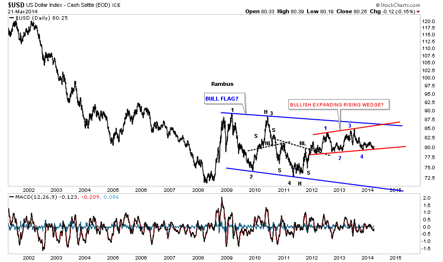
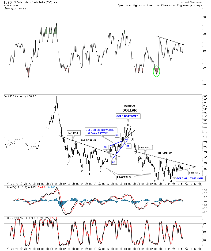
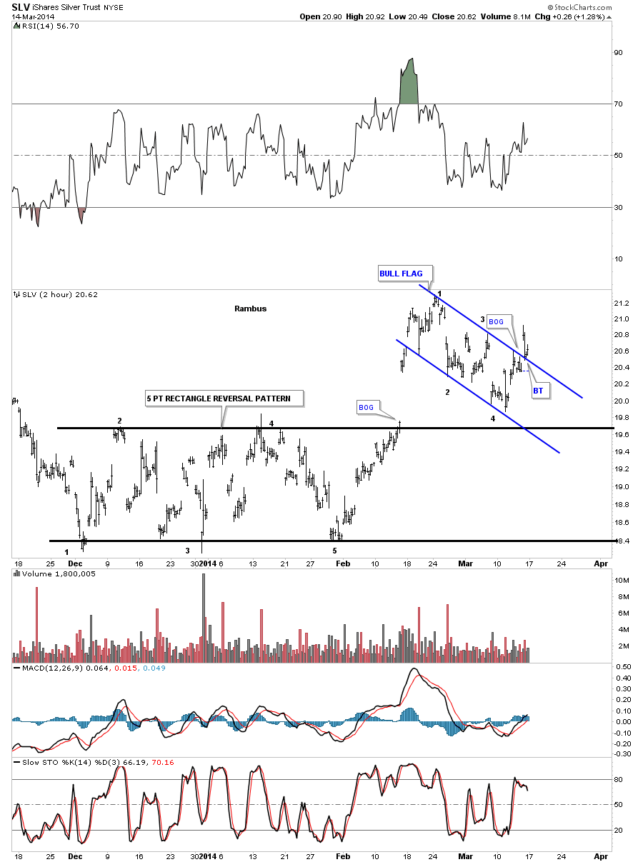
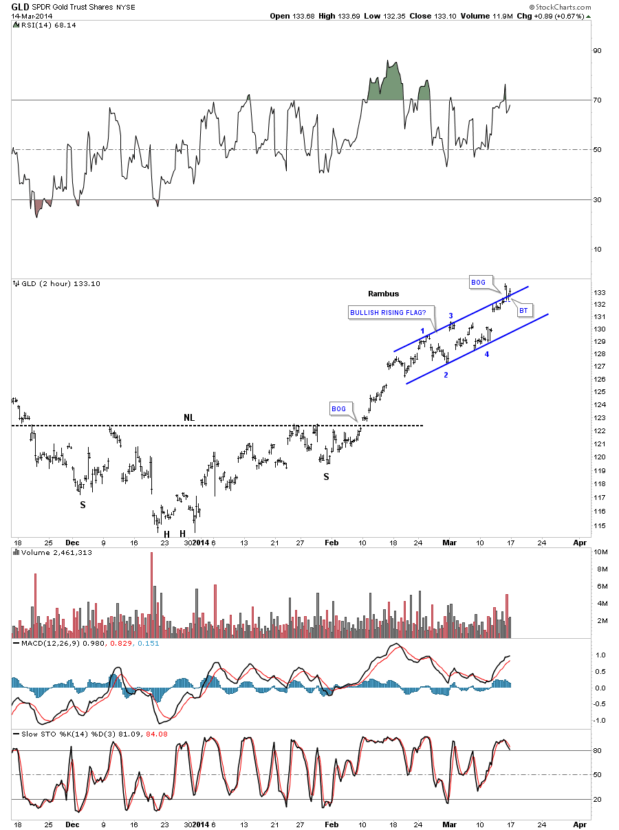
Rambus
………………………………
This essay builds on my previous bear market studies by drilling down into the third and final phase of a bear market. I recommend reviewing the three phases of a bear market in my previous posts.
Dow theorist, Robert Rhea is credited with developing the concept of the three psychological phases of both bull and bear markets back in the 1930’s. I have attempted to advance his work by applying chartology and thereby assigning price patterns to these phases. I have discovered that deep bear markets undergo similar progressions and similar patterns to each other. Following the progression of these patterns along with studying the prevailing psychology gives us clues as to where a bear market is in its life cycle. The value of this should be obvious and by knowing where we are in this bear market we enable ourselves to position our portfolios for generational sized gains at the bottom. This essay develops the second half of the study of Chartology… the psychology part.
Three Phases of a Bear Market
The Route to Phase III
The conclusions of this study come from a review of the major bear markets of the past 150 years. It is original work as not much wall street brain power has been devoted towards bear markets since wall street exists for one reason only, and that is to distribute product. (plus skimming through HFT) With this as their purpose it is convenient for them to pretend that bear markets never really happen, or at least it seems that way when one reads their material. Its hard to sell product in a bear market, so bear markets are glossed over. This of course opens great opportunity for reality based market students willing to study markets and their cycles. I have observed that the price patterns of a bear market progress through a methodical sequence of patterns just like the psychological phases do. The beginning of the bear is characterized by a topping pattern. It can be any pattern, but typically it is a H&S, or sometimes a rising wedge followed by a failure and a prolonged back test of the breakdown pattern. Review the Bear Market Models essay and one can see these patterns. Next comes a prolonged decline down the slope of hope where the public thinks lower prices are providing them a buying opportunity since it is simply just a “correction”. A bear market rally (BMR) may get ignited along the way which serves to reinforce the belief that the previous bull market remains intact. Eventually however, the price decline reaches a point of recognition (POR) where the public as a whole collectively recognizes that it is not just a correction but something more, quite likely a bear market. The POR is often associated with a news event or some type of catalyst that accelerates the existing downtrend. The POR ALWAYS comes in phase II and typically is coincident with a crash. The crash is due to the simultaneous reversal of expectations of the average investor.
Once the crash is over the market enters a prolonged consolidation. The consolidation can take various forms and is often very complex, thus reflecting the general confusion present in the market. The post POR consolidation is often a robust battle between bulls and bears and quite often resolves itself with the ignition of a bear market rally (BMR). The BMR is the expression of the hope and belief that the bear market is over therefore it is more than just short covering as it includes elements of organic buying. Its duration typically lasts from 5-12 weeks, but burns out and finally succumbs to gravity and rejoins the downward trend of the cyclical bear. Eventually, this process of failed rallies takes its toll on the investor and the price action degrades to the point where all hope is abandoned. It may take a number of BMRs to complete this process of investor exhaustion and disillusionment. Once finally achieved, the market can now enter its phase III and in a deep bear market it is no less than an annihilation. In a nutshell here is the typical bear market roadmap: Market top-downward slide-BMR-POR w/crash- Consolidation- BMR- Consolidation departure-Phase III annihilation -final bottom. That’s the route a major bear market takes and its psychology reflects the price action all the way down. Here is our current Precious Metals bear market, its route reflects all these classic mile markers and it is my contention that we are about to enter Phase III….The Annihilation
Bear Market Models
The Horror.
Recall in the movie Apocalypse Now, when Col Kurtz (Marlon Brando) dramatically utters in the final scene….The Horror, …the Horror! That’s the image of phase III in a major bear market. Colonel Kurtz devastatingly describes the horrors of war, dismembering children’s arms and stacking them in a pile, the trauma that drove a hardened veteran as he, insane. This is the horror that happens to investors in phase III. Life savings shredded, dreams abandoned, college students called home for want of tuition, retirements ruined, …the horror. Phase III is a treacherous final slide that takes no prisoners. It devours anyone who even thinks they can maintain their buy and hold stance, since the price action crushes them, extinguishing any flickering hope of eventual gain they may have still harbored. The dreams of fabulous opportunity they once had at the top, finally snuffed out due to the series of false bottoms collapsing along the way in the long downward slide. With all hope of future gain now gone the investor aggressively moves to salvage what is left in a last ditch defensive reaction. Previously in phase II investors have cutely executed Warren Buffet’s advice of buying when others are fearful and now stare into the abyss as the fear of others now turns to their own horror. When the price action accelerates downward into phase III the pain becomes too great and the final capitulation is characterized as despair fueled by lost hope. For those who may think this is hyperbole, please review the phase III price action in the Bear Market Model series. The destruction wrought by a phase III collapse is truly breath taking. By the end of phase II in March of 1932 the DOW had already declined 77%. It would seem reasonable at this point to think the market near a bottom, enough damage had been done. Certainly, buying in anticipation of a rise would seem a lock, even prudent. If acted on, however one would have suffered a 55% further collapse in phase III over the next 3 months before the bottom was finally reached. That’s the destructive power of a phase III. The 1932 series is a valid model, since today’s HUI had declined a similar 69%, and the GDXJ 81% at their phase II lows in December. Even though todays psychology is very negative it has not yet progressed to that which prevails at phase III bottoms, that of black pessimism. So could the HUI/GDXJ get cut in half from today’s levels in an upcoming phase III even after these horrific declines? Quoting Nancy Pelosi: “are you serious”?
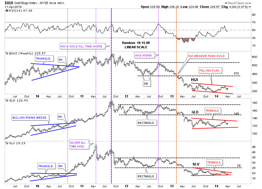
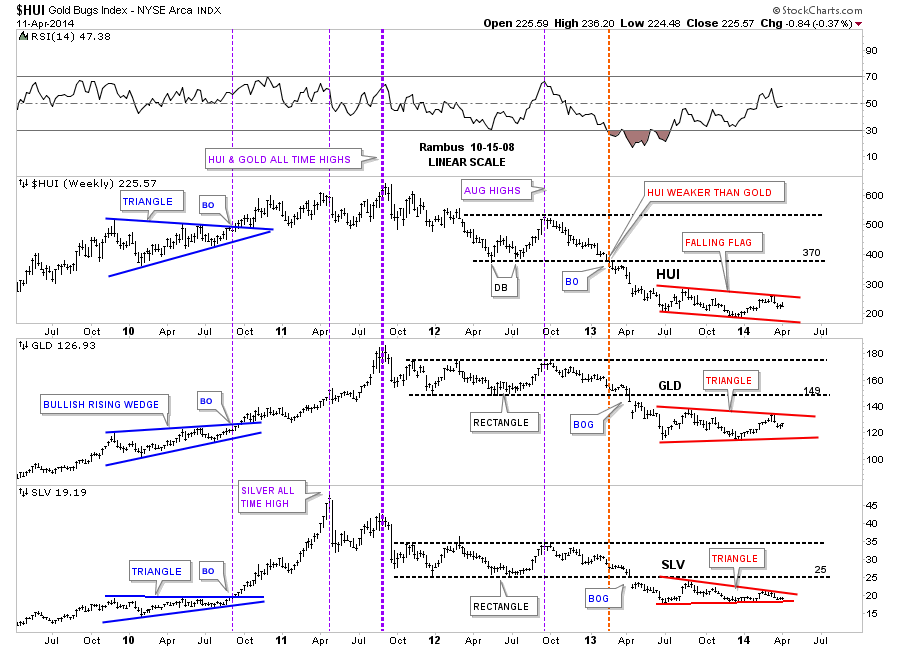
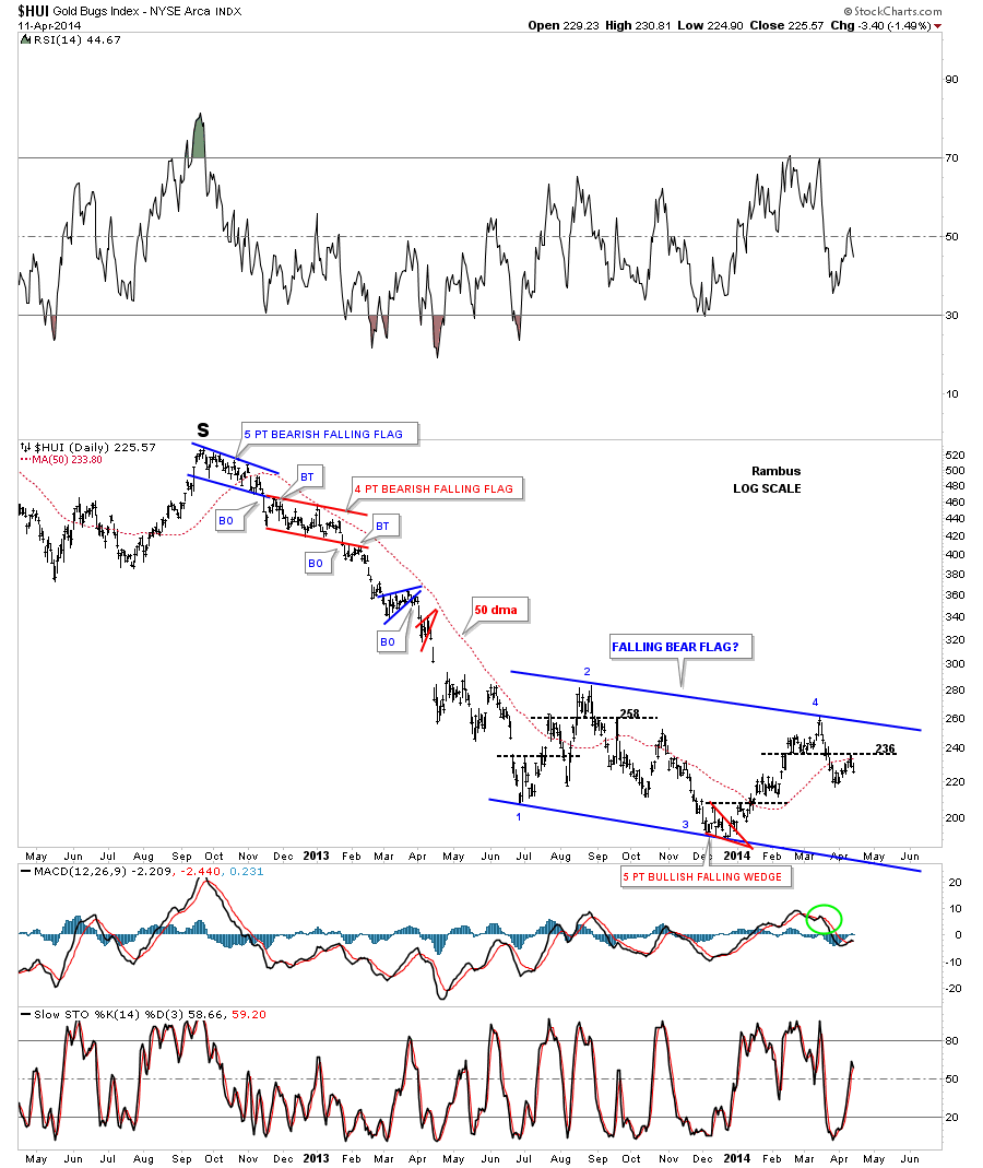
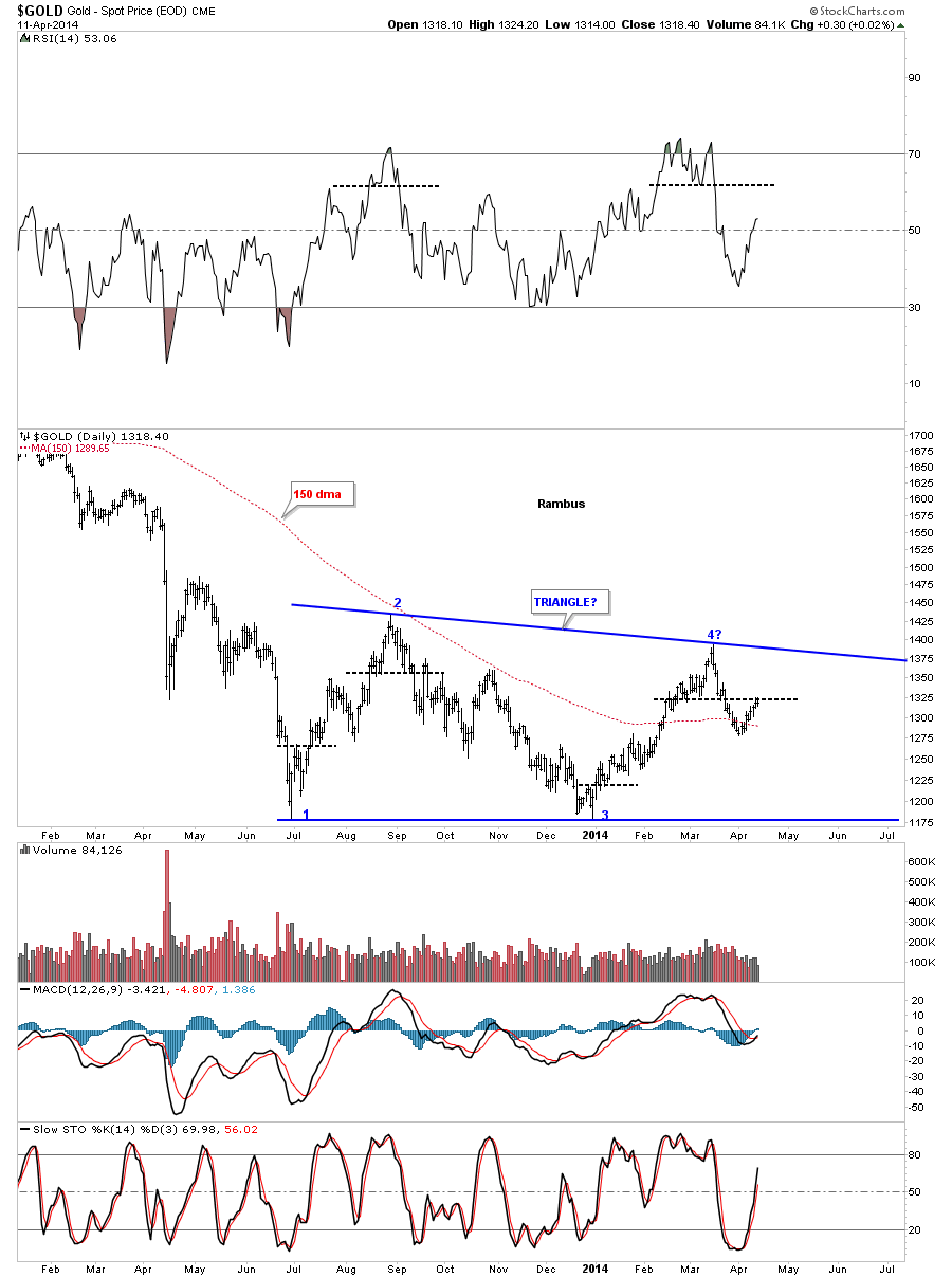
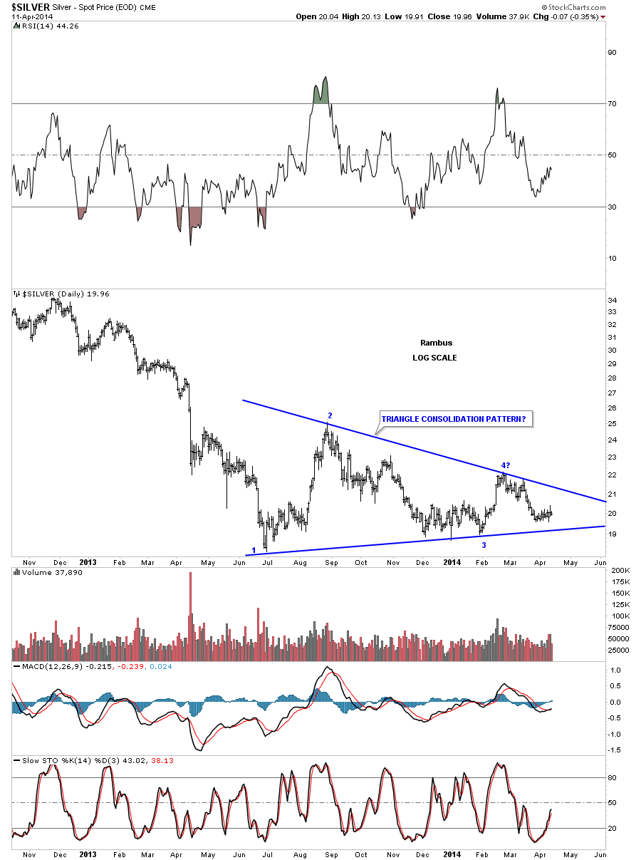
Please Click on chart 2X to Enlarge

Phase III Flush
The visual picture of phase III can be compared to flushing a toilet. At the top of the bull the lever was pulled and we have been watching the water swirl around the rim for 30 months and it has now finally reached the lower ends of the bowl. Investor hope keeps prices elevated just as centrifugal force keeps the water in the upper half of the bowl, finally reaching the bottom the rotation of the water accelerates as gravity overtakes the swirling centrifugal force and it finally goes straight down the hole. This visual picture is analogous to phase III action within a bear market. Phase III has no BMR, since there is no longer any hope to fuel it. Phase III is not about hope it is about liquidation. And it is that liquidation that leads to accelerated price decline. The 3 month sell off between March 1932 and the bottom encompassed a larger decline than the epic 1929 crash itself. Gold stocks are particularly vulnerable to rapid declines. In August of 1974, it took just 16 trading days to cut the Barrons gold mining index in half. Homestake dropped from 70 to 30 in what was called the Schaefer panic when the popular newsletter writer abandoned his advocacy of the sector. In Phase III, market shocks as these, can roil the sector pummeling even solid quality stocks. The downward spiral continues with no relief in sight with no rallies to allow an escape. The market desperately seeks any form of liquidity it can find therefore it now lowers its crosshairs on the blue chips since the junior and mid-tier sectors have long since been destroyed. Once the blue chips come under fire, the wailing is that heard in an inferno. Long term holders are forced to act in a bid to salvage what they have, unable to risk further declines and possibly end up retiring in poverty, the pain becomes too great, thus the selling orgy commences. For up to two weeks quality stocks are jettisoned at comical prices, the race for liquidity is on and people are motivated to sell at any price due to the despair of saving themselves from failure, regardless of any concern of embarrassment. Steady, dividend paying blue chips get sacked, dreams are destroyed, then in the last final decline, volume finally dries up, the markets then become immune to the most shocking of news, corporate closures or bankruptcies no longer drop the market since the selling has now exhausted itself. The bottom is then in. Stocks now sell at below known values. In Sept 1929 US Steel, the senior of blue chips, sold for $261, by July 1932 at the bottom of phase III, it traded for $22. That’s the power of phase III.

Phase III dead ahead – Factors demanding a verdict.
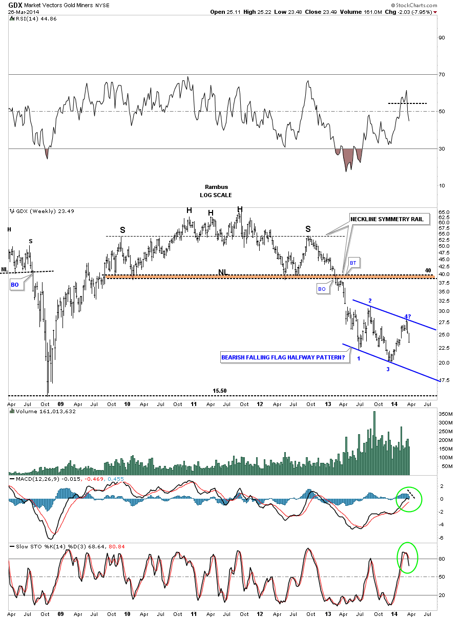
It has been my premise that despite the massive annihilation-class declines we have had across the PM spectrum we have still not had a phase III decline. I stake this claim for several reasons, the first being this bear market’s sequence of pattern construction. Recall my rule that the POR ALWAYS comes in phase II. The one fact that is unassailable about this bear market’s time line is that its POR came in April 2013. The POR was black and white and it came with all the classic indicators: a shift in psychology, a crash and volume to pinpoint it. After the Goldman bear raid (the POR) the word “bear market” surfaced and was now universally recognized as such. The Goldman raid just happened to be the trigger, and it was now collectively recognized as a bear market. Here is the significance of the POR, it gives us a stake in the ground to know where we are in the bears life cycle. Recall that after the POR a market then undergoes a prolonged consolidation. After this consolidation it may or may not have a BMR, but it then enters into a phase III after investors become sufficiently exhausted. In our current market we sparked a BMR after the post POR consolidation which lasted 12 weeks. So that’s where we are today, the question of whether its a new bull or still a bear is a case of Sherlock Holmes and the dog that didn’t bark. The post POR consolidation was followed up with a BMR, but we have not fulfilled the psychology and the liquidating price action of a phase III. In other words, the dog never barked.
The second factor is we have never had a prolonged period of illiquidity. In the twin crashes of April/June 2013 we only had 1-2 days max or little or no bid action. Previous bears have had up to 2 weeks of severe market stress with few bids offered. This is where the market experiences the dynamic of “comical” selling. That’s where investors are so distressed that they pick up the phone or grab their mouse and sell at any price, hence the name. The market undergoes truly comical trading with jokingly absurd price drops. This is full blown capitulation, and despite the current bears annihilation-class declines we really have not had this type of selling…yet. The psychology that accompanies this type of selling is that which I described in the previous flush paragraph.
The third factor indicating the bottom has not arrived is we have not yet seen the full work of the bear. We have not yet seen truly shocking news and events that rock the industry. These events surface at the bottom of phase IIIs but they have not yet occurred. Viscous bear markets see outright corporate liquidations at the bottom, surprises are to the downside. Not only do we see mergers and acquisitions of the weak sisters but we see bond defaults and companies entering into chapter 7 bankruptcies. The 10 year continued ascent of gold allowed wasteful practices to go unchecked. Over time, the industry morphed into a reckless uneconomic basket case of excess. These excesses became so extreme, the orebodies so low grade and the balance sheets so unsound that only a full phase III purging is capable of rectifying the distortions and laying the foundation for a sustained secular bull cycle. By the year 2000 the industry had wrung out all the excesses from the 1970s bull market in precious metals and it took a full 20 years to do it. From a beaten down level of $254/Oz gold it then embarked on an 11 year run to $1920/Oz. From 2000-2007 the PM sector became a go to alternative to the general stock market. The PM stocks soared and the excesses began to build. The concept of a well positioned mining company began to change. Previously an ideal company had a proven orebody and non-levered balance sheet, however as gold marched upward and government money printing increased the ideal company became one with low grade and large ore bodies in order to maximize the number of ounces in the ground. This was the most leveraged means to gain from constantly increasing gold prices which “had” to continue higher given the reckless printing of money by the central banks of the world. This shift in psychology incented managements to embark on acquisition and development sprees, scooping up big low grade deposits. Like the sub-prime housing boom in the USA this process corrupted the system. Engineers inflated estimates of value and understated development costs just as housing appraisers inflated the values of homes. The result was grossly uneconomic projects and over issued stock placements. This is the “junk” that Mr. Bear needs to clean up and it is the phase III that finishes the job. The amount of excess is directly proportional to the amount of downside pain required to correct the excess. So after a 10 year bull market it should not be surprising that it may take a 3-4 year bear market to clean up the mess.
The Step Sum
Finally, I would like to introduce the most compelling evidence that the bottom is not yet in. It is in the form of a new technical tool to evaluate the psychology of the market. It’s called the Step Sum. It has been developed by Mark Lundeen and it offers a unique insight into the psychology of the market. The SS offers a powerful clue that we have not seen the bottom, because it has not yet collapsed towards the price action which would indicate the psychology of capitulation. I recommend getting on Marks email list as he is a well seasoned observer of markets and offers insights not found anywhere else
Mark Lundeen
The step sum is simply a running total of up vs. down days and it reflects trader psychology. The unique insight that the step sum offers is that at the end of a bear market, the step sum normally collapses as the reflection of trader capitulation. The step sum usually remains steady thus diverging from the downward price action until the final capitulation stage. In the last stage when investor psychology finally becomes exhausted the step sum collapses, reflecting the final clean-out in psychology. This shows as a lopsided accumulation of down days. Here is how Mark describes the Step Sum’s utility: The step sum is a market sentiment indicator that provides an insight into the market’s psychology, and typically when step sum trends are out of step with the price trends, it’s the price trend that should be trusted.
In this first chart Mark shows us the step sum action over the entire secular bull and bear cycle from 1969-2000. Note how the step sum reflected the rise from 1969-81. Also note that in the 19 month 1975-76 cyclical bear the step sum correlates highly with the decline in the gold price reflecting an early break in psychology and lack of belief in that bull market. This is something it did not do in the upcoming 20 year bear market as bullish psychology had become well entrenched. Next observe how it refused to align itself to the price level until the final stages of the secular decline from 1980-2001. This shows how stubborn the psychology remained until the very end. It remained solid until 1996 where it finally gave in thus reflecting investor pessimism and exhaustion.

Lets see how Mark describes the step sum action in this chart: We can see when the gold bulls gave up their dreams of ever seeing gold resume its bull market, at the dotted line (1996) marking the beginning of the collapse of the step sum. Not surprisingly, this collapse in bullish sentiment in the gold market occurred just as the high-tech bubble entered its mania phase. Note too that gold’s step sum continued collapsing until 2001, when it then reversed to the upside. We see an eight year bear box beginning in 1988. The optimism of the gold bulls of the 1970s took a long time to die, as we see in the bear box below that began in the 1980s and didn’t terminate until the 1990s.
Now let’s move on to our current bear market in the Precious Metals. We can see how the Step Sum ( SS ) reflected the rise over the entire length of the bull market. Also observe how in the decline of 2008 the SS was late to reflect the decline in gold. It was not until 2-3 months before the bottom that investor psychology gave up and the SS declined thus reflecting investor capitulation. Now here comes the main insight of the SS when you look at the decline since the top of the bull in 2011. The SS has stayed solid and has NOT reflected investor capitulation! The huge declines in the gold stocks and gold has not even put a dent in it! The key message that this is delivering is that we have not yet had the requisite shift in investor psychology to drive down the step sum as a reflection of investor capitulation. Of course it is in phase III that this precise outcome occurs.

Here is what Mark has to say about final SS capitulation: So what good is the step sum when all you needed was price information to tell you the bulls in the gold market were losing money? Because when the step sum’s plot collapses downward toward the price trend, as it usually does in bear boxes, it tells us the bulls have capitulated in the face of reality and the correction is coming to an end.
Here is a close up of the SS intransigence through mid March. At what point will investor psychology “give it up” and allow the SS to align with the price action?

Its my premise that the answer to this question is that only after we violate the December 2013 lows will the SS collapse. We have expended investor energy and sentiment through almost 3 years, a 70% decline encompasing three BMRs , but we still need the final purging kicked off by a violation of that June 2013 , December 2013 double bottom to deliver demoralization to the party faithful gold bug crowd. That will usher in the final phase III annilhilation which clears the deck and establishes the base for a prolonged second half of the great 21st Century Gold Bull Market brought to you by the Western fiat decline.
Personally I take no joy in coming to these realizations , as by nature, I too am a goldbug .
For years I have been active in the gold community and travelled to precious metals mining meetings.
I count those in the industry and many precious metals investors as my friends . I look forward to
seeing this bear market finish its ugly business and seeing the precious metals investors again rewarded
for their faith .
Plunger