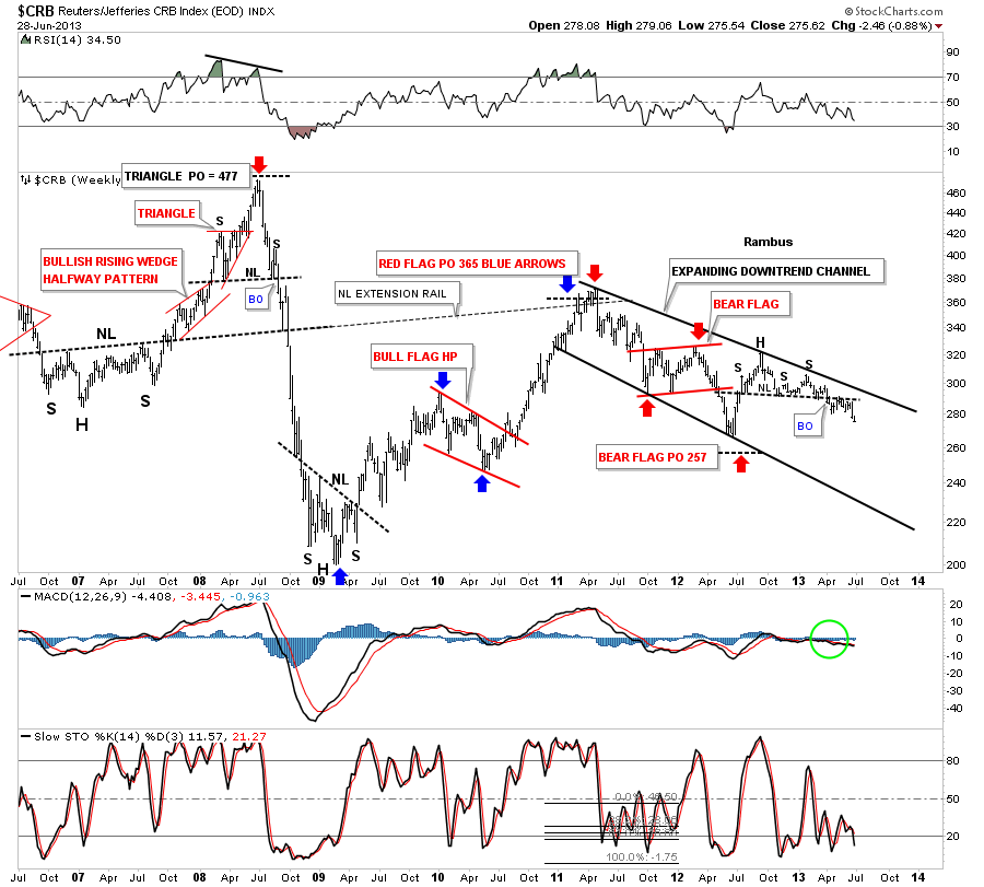
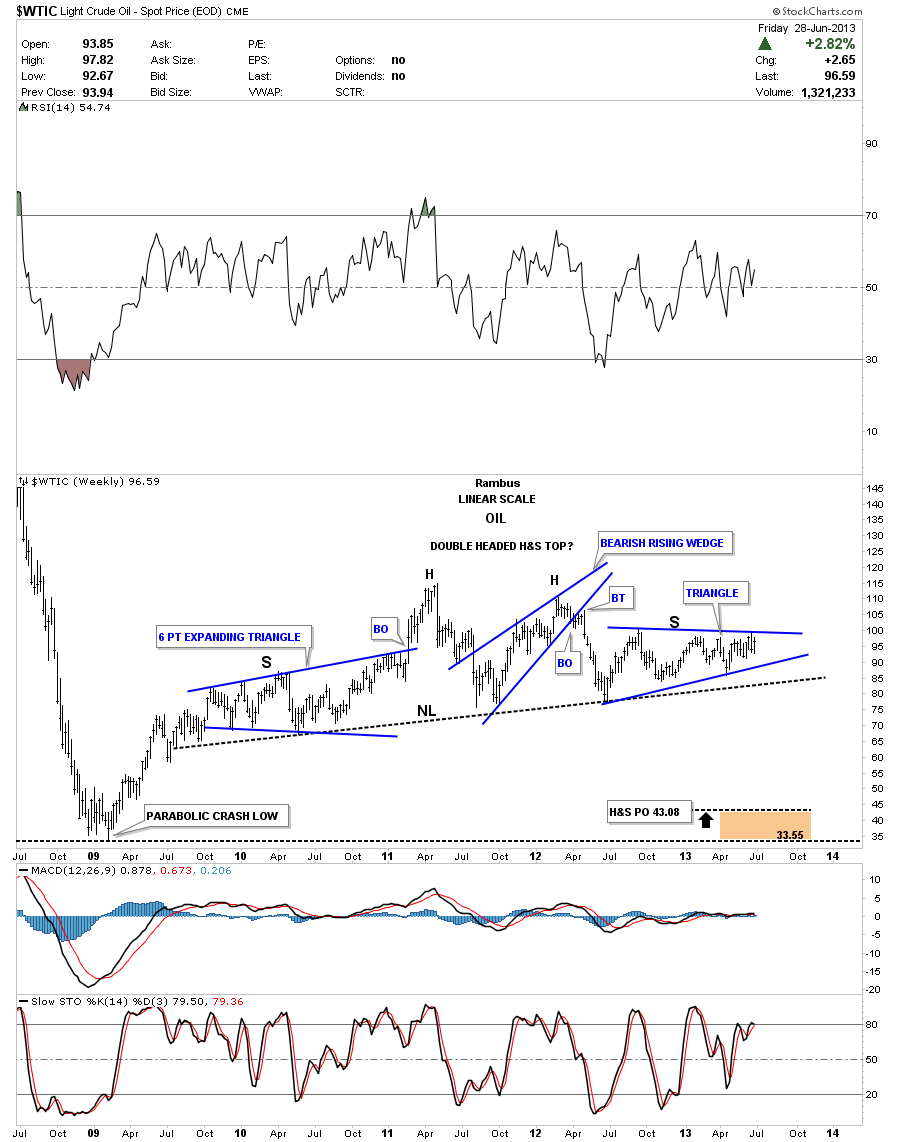
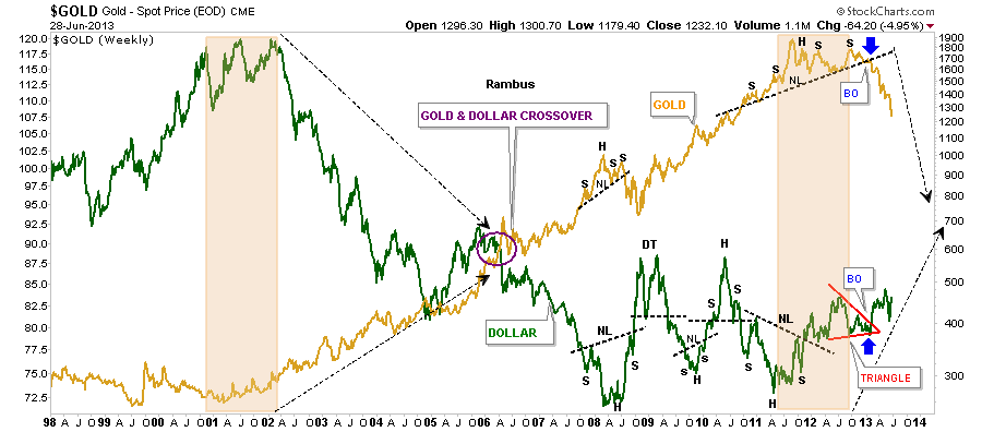
Editors Note :
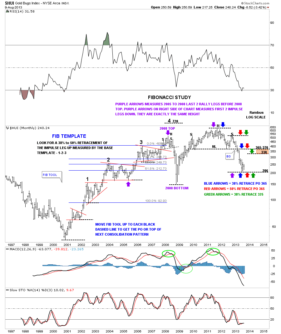
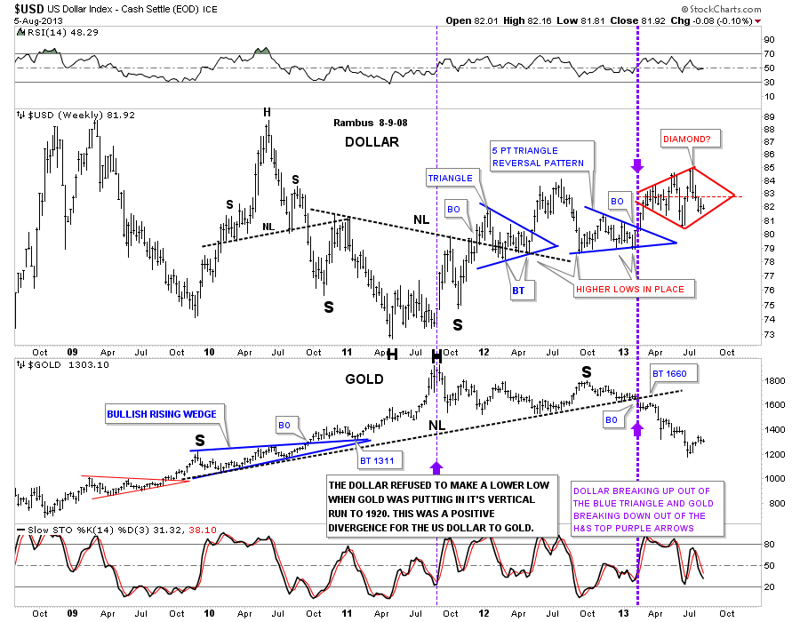
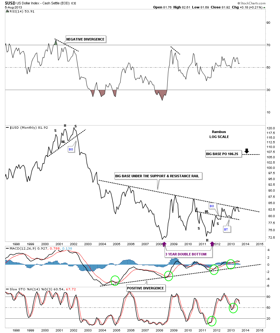
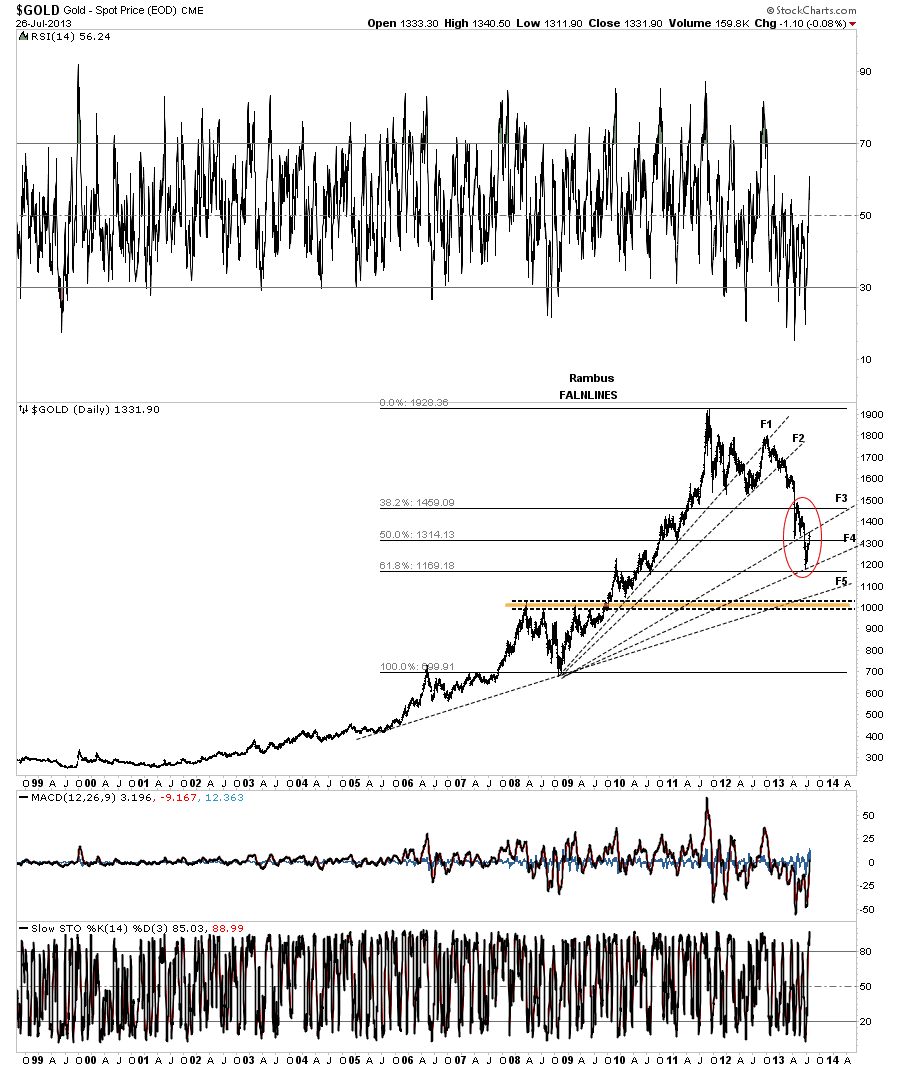
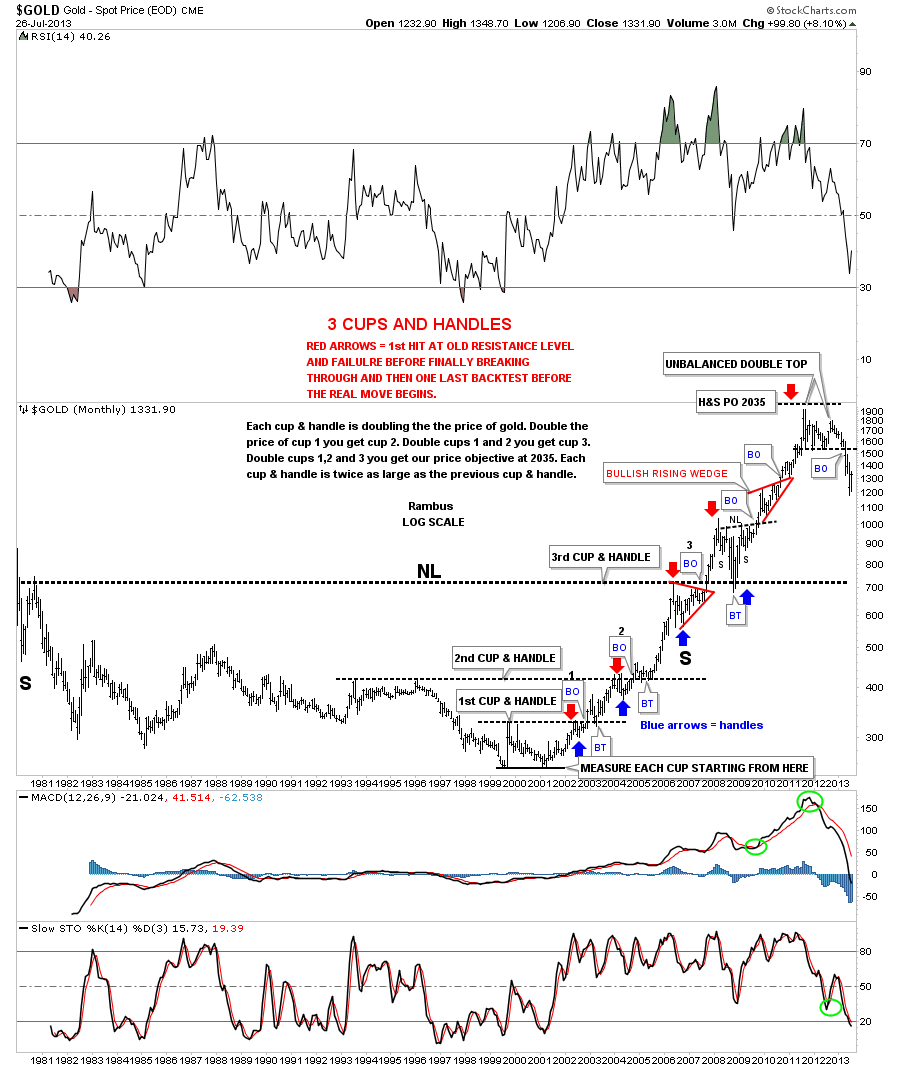
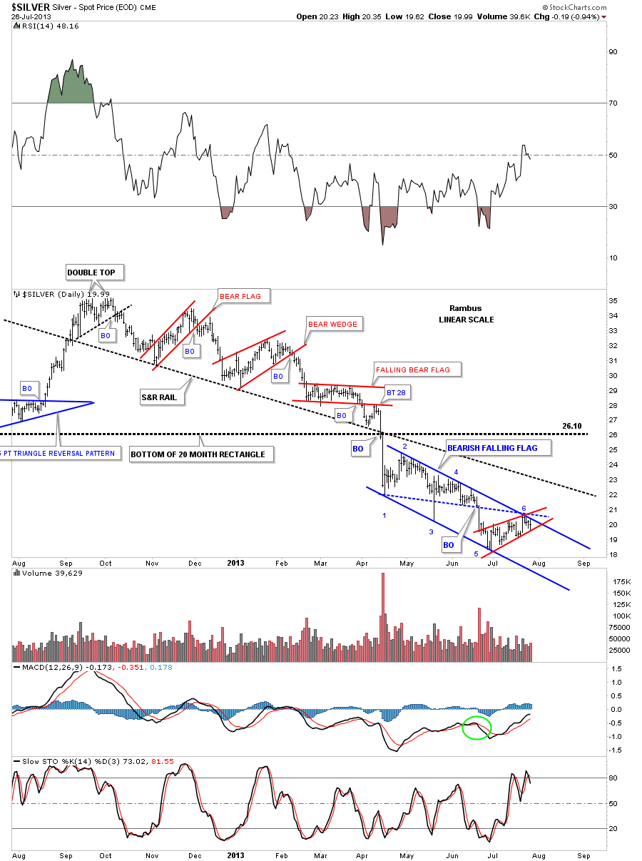
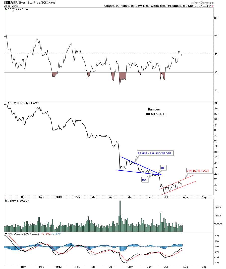
Last Weekend report , Rambus Showed a Provocative Scenario For the Precious Metals Markets dubbed “What If 1 : Circa 2013”
This Scenario was based on a comprehensive and rather complex analysis of the Chartology of the Precious Metals
…………………………………………………..
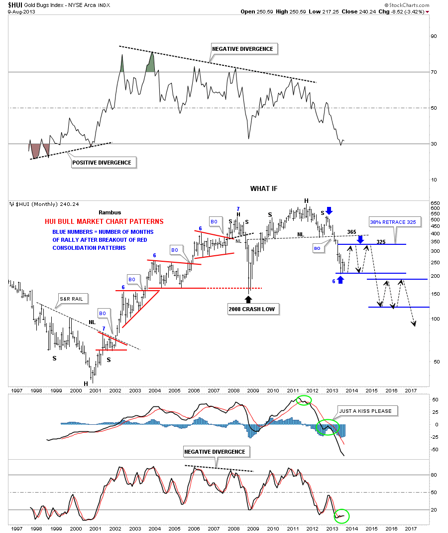
This Weekend Report (actually Published for Members Wednesday Evening) Has quite a different , perhaps even more provocative postulation
At this point Both of these What If Scenarios are Viable
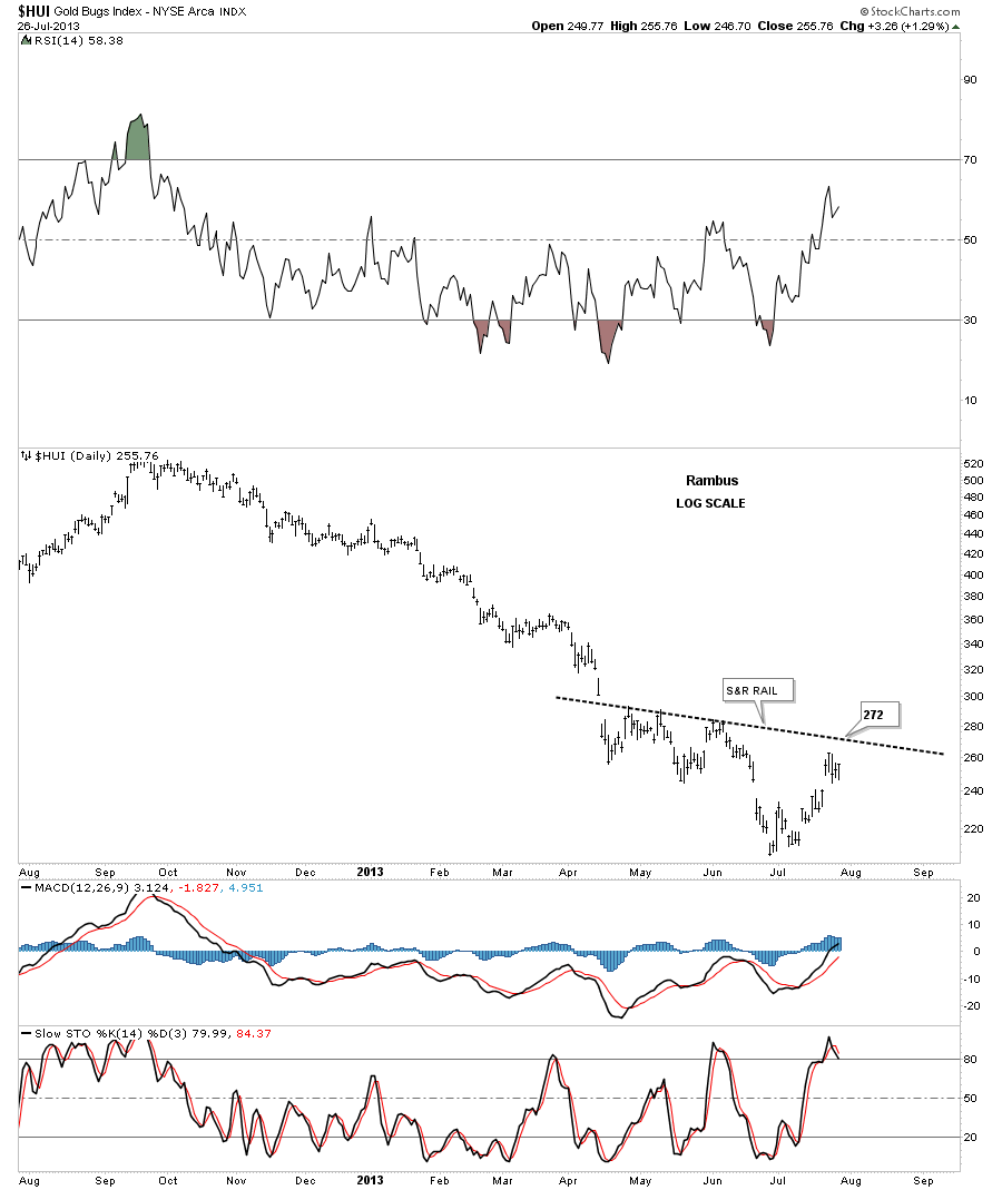
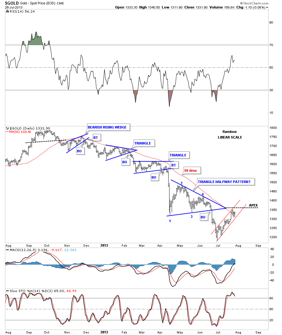
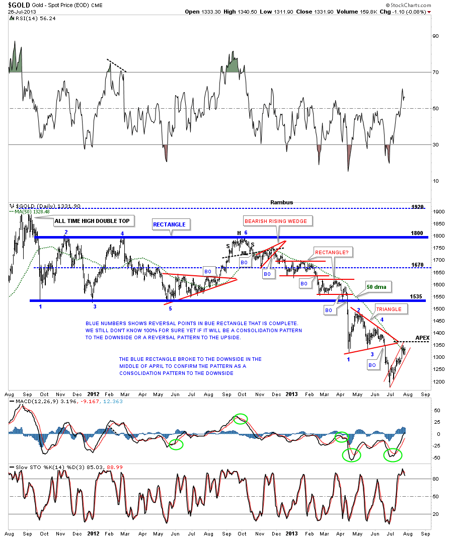
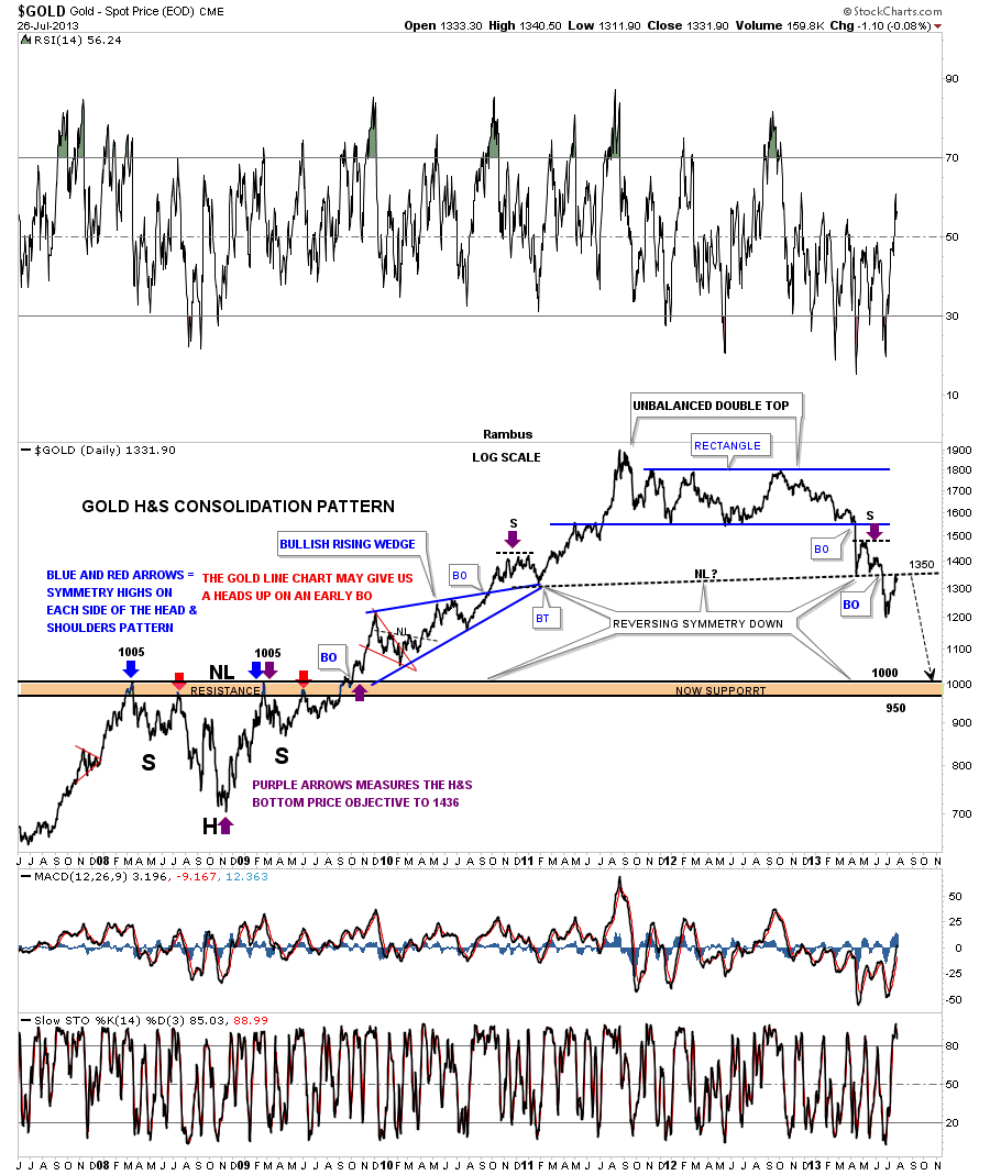
Here is “What If 2 : circa 2013”
………………………..
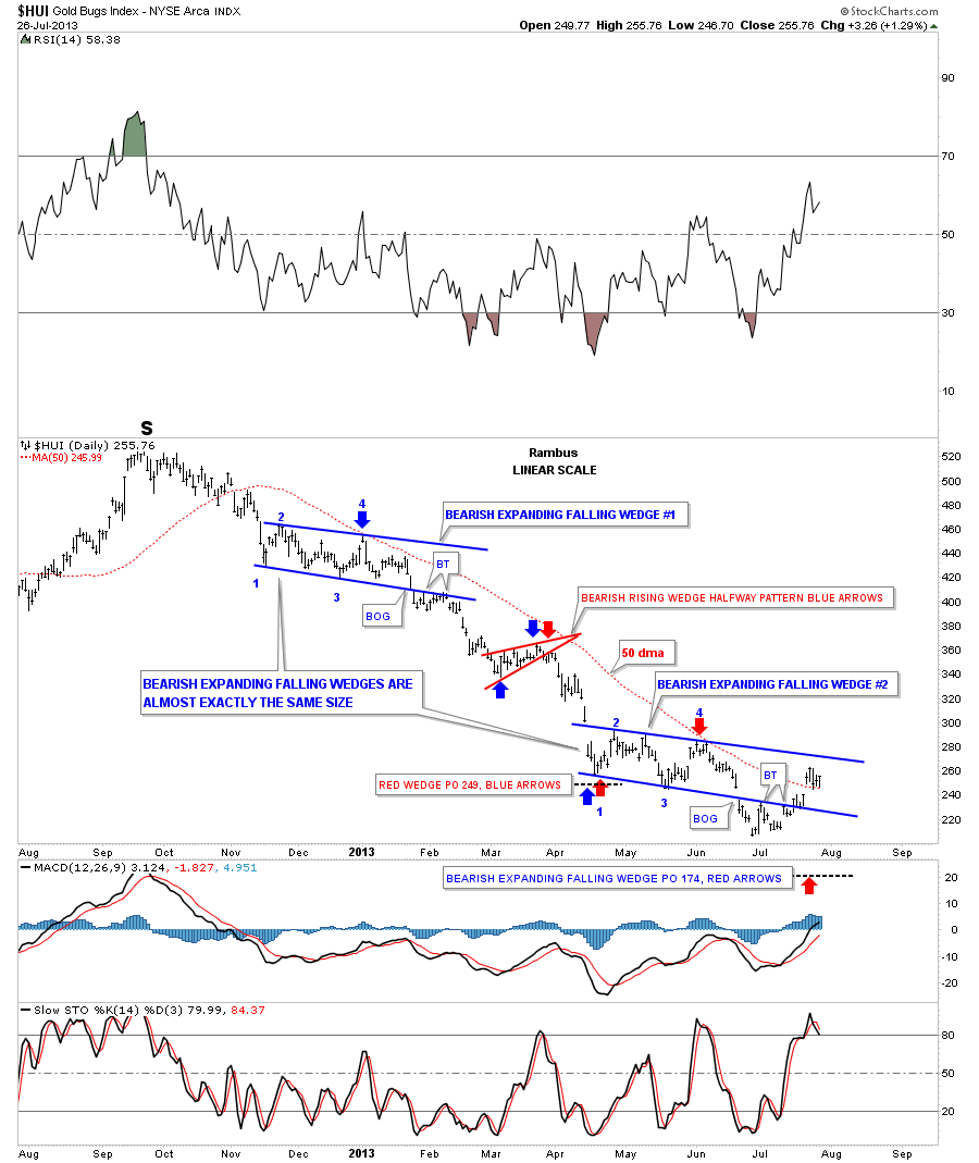
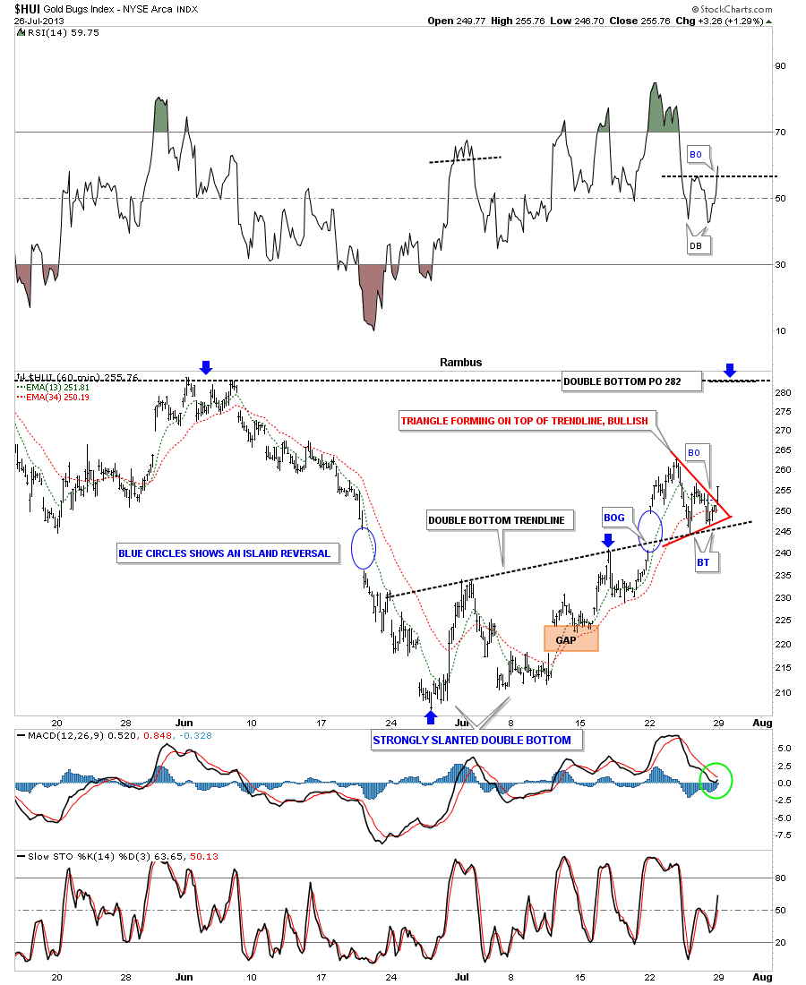
Tonight I would like to show you two stocks we bought, one yesterday and one today, that have nice inverse H&S bases. H&S patterns are generally reversal patterns that show up at the end of a move and in my book one of the more reliable chart patterns. They can also show up as a consolidation or continuation pattern but to a much lesser degree. Whenever I’m looking for a bottom I always look for a H&S or double bottom first as those two patterns usually show up there. There can also be a 5 point triangle, 5 point rectangle or 5 point falling wedge, but the most common reversal pattern is the H&S.
Lets start with AG that we bought yesterday which has a double bottom head, black dashed horizontal line, at the double bottom hump, and a left and right shoulders. We jumped the gun a bit yesterday but the pattern was too pretty to ignore. By pretty I mean the symmetry is beautiful. Note the H&S neckline symmetry rail that is a parallel neckline that measured the bottom of the right shoulder. The very nice double bottom that created two heads. It is just a very nice looking inverse H&S bottom.
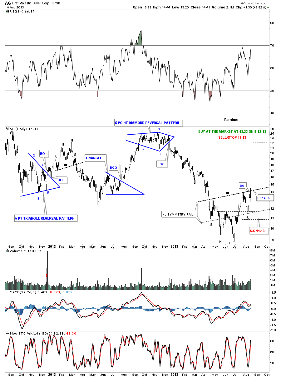
At the forum today I wrote a post to one of our subscribers telling him I was finding a lot of these types of bottoms in the precious metals stocks on the short term daily charts. I also said where these smaller inverse H&S bottoms were forming, on the longer term charts, maybe giving me some clues that this could be a very important bottom that is being made in the precious metals stocks. Remember it wasn’t until last Thursday that these right shoulders started to form so before last Thursday there were no H&S bottoms.
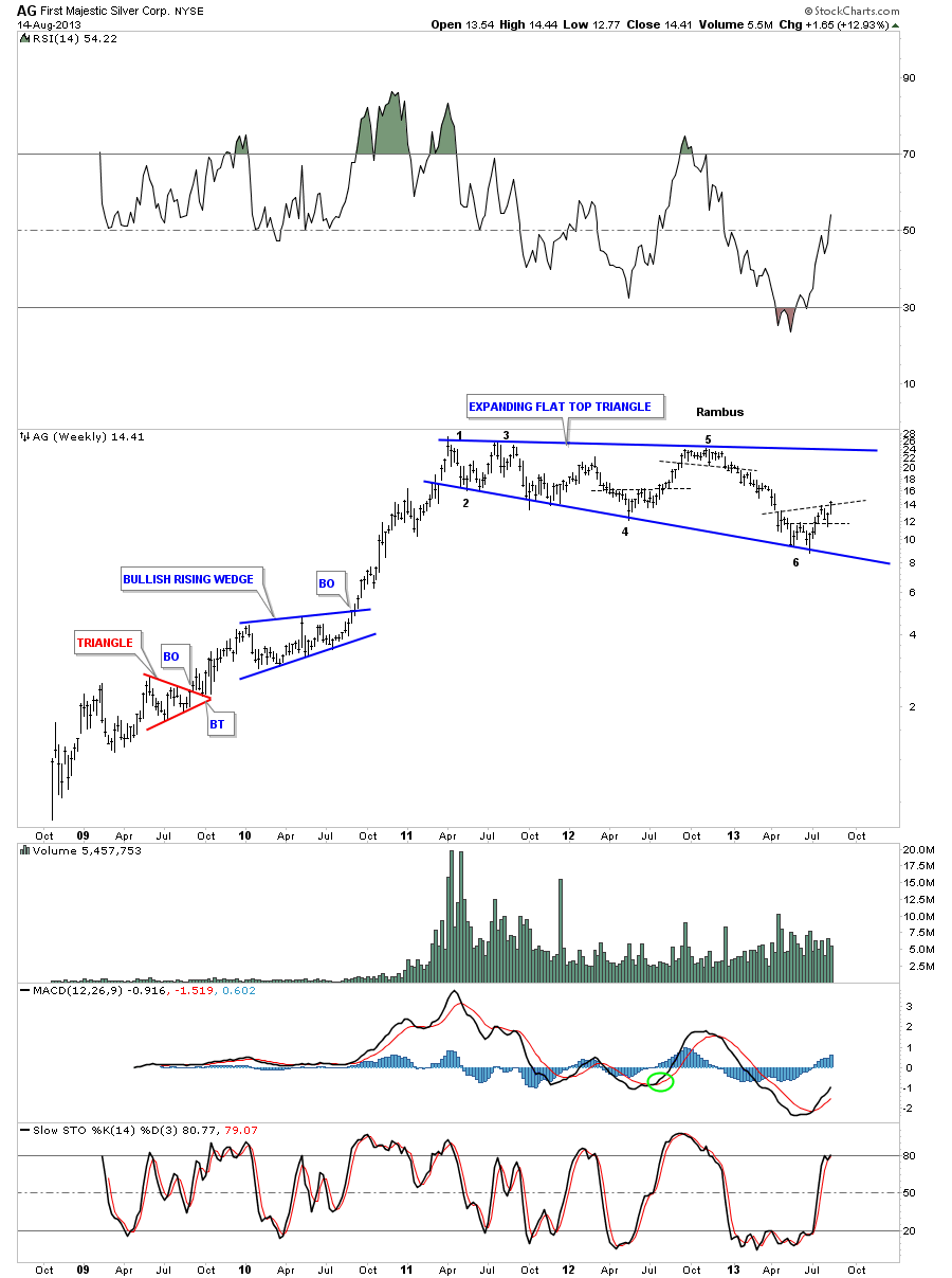
This is still a work in progress as I still have a lot of precious metals stocks to review yet but there are some promising chart patterns that are beginning to shape up for the big picture. As I told Sir Fully last night don’t get too excited yet as there is alot more work to do for these stocks to mature to their full potential. AG is a perfect example of what I’m seeing in some of the precious metals stocks that are giving me some hope this could be a very important bottom we are seeing right here. As I have shown you many times in the past, bigger chart patterns can be made up of smaller pattern, that create the final formation. In very large patterns the reversal points can and usually are made up of some type of smaller reversal pattern, such as a H&S or double top or bottom. Keep in mind the inverse H&S bottom, on the chart above, as it plays a big role in the long term weekly look below. Our current H&S bottom is the 6th reversal point in a very large 6 point, flat top triangle consolidation pattern. Notice I said consolidation pattern. These types of consolidation patterns are harder to pick up in real time because they keep making a lower low on the bottom rail. When you look at this weekly chart for AG the picture should be very clear to you of the potential for our current inverse H&S bottom to be the possible 6th reversal point in a very large consolidation pattern. Please keep in mind the 6th reversal point won’t be complete until it touches the top rail of the flat top triangle. Also this is a very large pattern so the price action will take time to reach its full potential. If this is a consolidation pattern it will be a very big deal as I will view the flat top triangle as a halfway pattern.
Below is another example of what I’m seeing when I look under the hood of the precious metals stock indexes. I’ve labeled all the reversal points on all the chart patterns so you can see what I mean when I talk about reversal patterns. In an uptrend the first reversal point will start at the first high and in a downtrend the first reversal point will always start at the first low. SLW is considered one of the better precious metals stocks to own during a bull market because of its leverage to the price of silver. Here you can see an unbalanced inverse H&S bottom that isn’t quite as pretty as AG, but it is still a valid reversal pattern. As you can see it had a nice breakout gap on Monday. There is still a possibility of a backtest to the neckline before the rally really gets going.
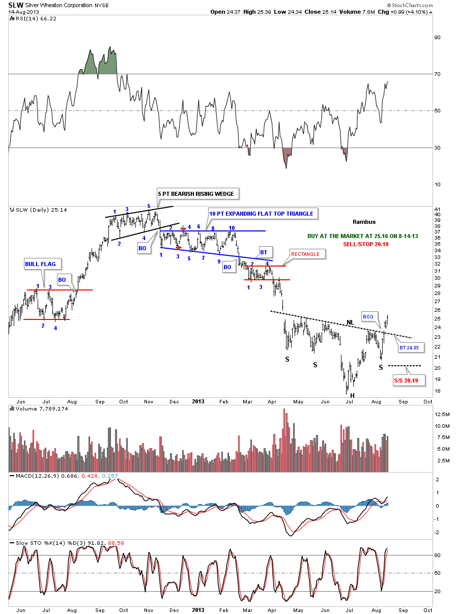
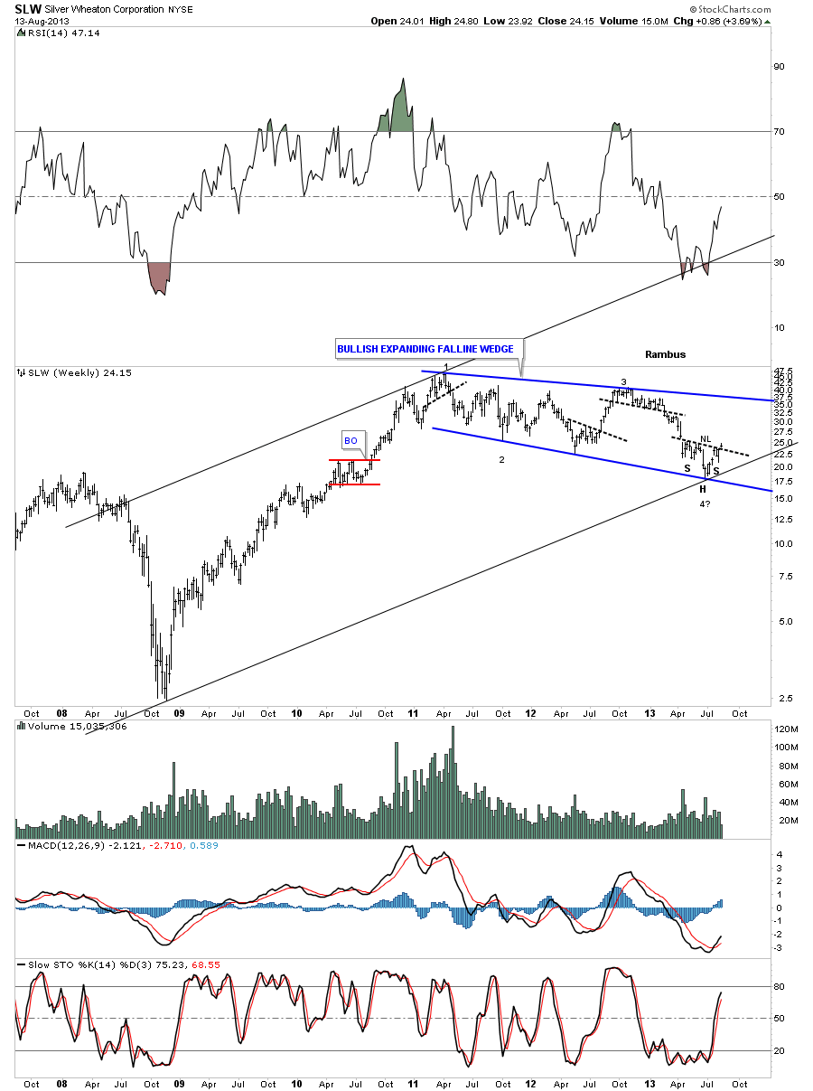
The long term weekly chart shows a similar setup that AG has only SLW has a bullish expanding falling wedge consolidation pattern. Notice where our inverse H&S bottom is located, reversal point #4, that I showed you on the daily chart above. I can’t tell you how important this potential bottom is in the overall big picture. WHAT IF, this is a consolidation pattern to the upside? I will let you use your imagination. Like I mentioned earlier this is still a work in progress but I have about 8 precious metals stocks that have a similar setup. As always we will follow the price action and see where it leads us. There is still a lot of work to do to make this possibility a reality but we do have something to guide us for as long as the picture stays clear. All the best…Rambus
So Now we have 2 Very Different medium to long term scenarios embedded in the Chartology of the Precious Metals Complex
Stay tuned as these scenarios continue to unfold
Rambus