Weekend Report…The Surprising Case For Deflation… Now !

I was going to write this article several weeks ago but the move in gold took the spotlight and I had to put this on the back burner. Now that gold has settled down a bit I would like to show you some charts that pertain to the Risk On trade that are showing commodities entering a weak period. By the looks of some of the commodity charts it looks like some deflation is on the way. Even with all the money printing it doesn’t seem like enough to stem another round of weakening commodity prices. So lets see what the charts are telling us.

The US dollar is key if we are about to enter the Risk On trade. If you recall the dollar sky rocketed during that bout of deflation as precious metals, commodities and the basic materials stocks fell on hard times in 2008. I know there is a lot of talk about inflation taking off but as the charts below will show, now doesn’t look like the time we have to worry about the inflation scenario.

The US dollar has been making a series of higher lows since the bottom in the summer of 2011. Late last year and early this year the US dollar made a double bottom which is now the head portion of a H&S consolidation pattern. The dollar is still working on the right shoulder but when the neckline gets broken to the upside that will start putting pressure on commodities and basic materials. A break above 84 should get the ball rolling.

dollar dy H&S consol

This next chart is a weekly long term combo chart with gold on top and the dollar on the bottom. Note the purple dashed vertical lines with the purple arrows. What that shows us is how the dollar refused to make a new lower low while gold went on its parabolic run to 1920. This was a major positive divergence for the US dollar to gold. Note the big rounding base the dollar has been carving out while gold has been trending down. It’s not perfect but you can see the inverse correlation between the two. A break above that long term black dashed support and resistance rail at 86 will really put pressure on gold and the rest of the Risk On trades.

dollar and gold

Lets take a look at one more chart for the dollar that is a long term monthly look that shows the huge base that is getting close to completing. You can see, on the chart below, there was a big base built back in the late 80’s and early 90’s, labeled big base #1 that led to a multi year rally in the dollar. Notice how similar the two big bases are. Once the dollar breaks out above the support and resistance rail, the big base #2 will be complete. Keep in mind this is a monthly chart so the move is not going to be a flash in the pan type of event but a multi year rally.

us dollar monthly #2

Lets look at the CCI commodities index that is showing the price action has been trading within an expanding downtrend channel since toping in the spring of 2011. The 20 and 50 week moving averages are just about ready to cross that will give a sell signal.

CCI ONE

The very long term weekly look at the CCI shows some very nice chartology that I used during the initial bull market off the 2002 bottom. I’m still amazed by the random walk of the stock markets that can create such beautiful symmetry and patterns that can be used to help take out a lot of the noise that keeps many investors confused.

CCI 3

The old CRB index is breaking down from a small H&S consolidation pattern within its expanding downtrend channel.

crb 5

The DBB Multi- Sector Commodities Trust Metals Fund has broken out of a very nice H&S top and is in the process of making new multi year lows.

dbb trust

Copper plays a big role in the Risk On trade. The weekly chart below shows the small H&S at the top of the chart that reversed the uptrend that began off the 2008 bottom. The big blue triangle is just the first consolidation pattern that has formed since the downtrend began. If your looking for inflation you don’t want to see this commodity fall in price.

copper wee

The long term monthly chart for copper is very interesting as it shows a big unbalanced H&S top that has just recently broken out. That’s a big top by any standard. It should have enough energy to move the price of copper down to the 2008 lows. Note the big negative divergences on the RSI on the top of the chart and the MACD on the bottom. Just think of the neckline as a line in the sand, above positive and below negative. Keep it simple.

copper monthly

The COPX broke out, with a gap, of a very symmetrical triangle consolidation pattern this week. There could be a backtest to the bottom blue rail at 10.75 before the move down begins in earnest.

copx

The IYM is your Basic Materials etf that looks like it’s completing an unbalanced double top. It had a breakout gap on Monday along with many other stocks and is now in the process of backtesting the double top trendline at 67.30 or so. This one really needs to breakdown for the Risk On trade to gather momentum to the downside. We’ll see if the backtest now holds as resistance.

iwm

I’ve been following this H&S top for KOL, coal etf, for what seems like an eternity. As you can see after breaking down through the neckline the price action has been testing the neckline from below for a year or better. It now looks like it’s finally starting to break a little harder to the downside. That’s another very larger H&S top that resembles alot of the precious metals stocks.

KOL

Lets look at the SLX which is a steel etf that just broke out of a pretty symmetrical triangle this past week. Note the small H&S at the top of the chart that reversed the uptrend off the 2008 bottom. This is Chartology at its best.

slx steekl

If we are truly entering another period of Risk On trades, Oil needs to participate along with the rest of the commodities complex. Oil broke out of a symmetrical triangle a week or so ago. Note the little H&S top that formed at the apex of the blue triangle that tipped us off that the triangle was going to break to the downside. Here a clue there a clue and pretty soon a picture starts to emerge.

oil weekly triangle

The second to the last chart I would like to show is a weekly chart for Oil that is showing a very large H&S topping pattern that will have a big impact on the Risk On trades. As I showed you the small H&S top, on the daily chart above, that gave us a clue that the triangle was going to break to the downside, we now have a similar setup with this weekly Oil chart. Here you can see the breakout of the blue triangle is giving us an early warning that the big neckline is going to get broken to the downside.

oil h&s top massive

I want to leave you with a very long term chart for gold that I have now labeled as having put in a very large unbalanced double top. It pains me to do this, as I know most Chartology Members are first and foremost Goldbugs, but I can’t argue with what the price action is showing. Until last week we still didn’t know for sure if the trading action below the 1920 area was a consolidation pattern to the upside or a topping pattern. There is now no doubt that gold has put in a major top that is going to take alot of time to turn things around. As you can see on the long term monthly chart gold has now put in a series of lower highs and lower lows which is a downtrend, Chartology 101. This chart shows exactly how a market that has gone parabolic, which some will disagree with me, breaks down. Last weeks major sell off has trapped many gold investors who bought into the unbalanced double top area, which will now be looking for a place to sell on any strength. Normally in these type of situations the market won’t be very obliging and will inflict much pain for those that don’t recognize or understand what is taking place.

gold 444444444444444

What these charts above are telling me is that inflation isn’t on the horizon right now. We need to be concerned about another bout of deflation and gear our portfolios to take advantage of that scenario. All the big H&S topping patterns that have shown up in the precious metals stocks, oil and many other commodities are telling us this isn’t going to end anytime soon. The US dollar is on the verge of breaking out of a huge base that is telling us this could be a multi year event and not just a flash in the pan. I hope the charts, I presented in this article, paint a clear picture of what lies ahead for us, regardless of how some interpret the fundamentals to be inflationary. The charts don’t lie but the misinterpretation of the charts can lead many astray. Knowing how  the battles between the bulls and the bears show up as a consolidation pattern or a top or bottom, can give one an edge if one can read between the lines and keep an open mind.  All the best…Rambus


Editors Note
Rambus Chartology is Primarily a Goldbug TA Site where you can watch Rambus follow the markets on a daily basis and learn a great deal of Hands on Chartology from Rambus Tutorials and Question and Answers .
Most Members are Staunch Goldbugs who have seen Rambus in action from the 2007 to 2008 period … and now Here at Rambus Chartology since early 2012 .
What is he seeing now ?

http://rambus1.com/

WELCOME NEW MEMBERS :

Many of Our Members are asking how Rambus Chartology was conceived .

……………………….

This is as good a time as any to explain who we are and how we happened !

……………………………..

Our Website was started December 2011

At first Rambus Chartology was know only to those at Goldtent (www.goldtent.com)

Which by the way was billed as the best damn Gold Site On the Net !

6 Years running self supported  Bulletin Board with some of the finest and brightest and definitely most militant Goldbugs you could ever get to know…And a cast of real interesting characters !

2.5 million Hits a month…thousands of lurkers and hundreds of posters !

Rambus was posting there and was a cherished member in 2007 and 2008

We loved him, as he showed Continuation pattern after Continuation pattern and Gold rose strongly as did Silver and the PM Stocks..He nailed every move .

…….All was right with the Gold World……

Then Rambus switched course ! egad !

Some damn thing about a breakdown that he didn’t like the looks of …but of course no goldbug could see .

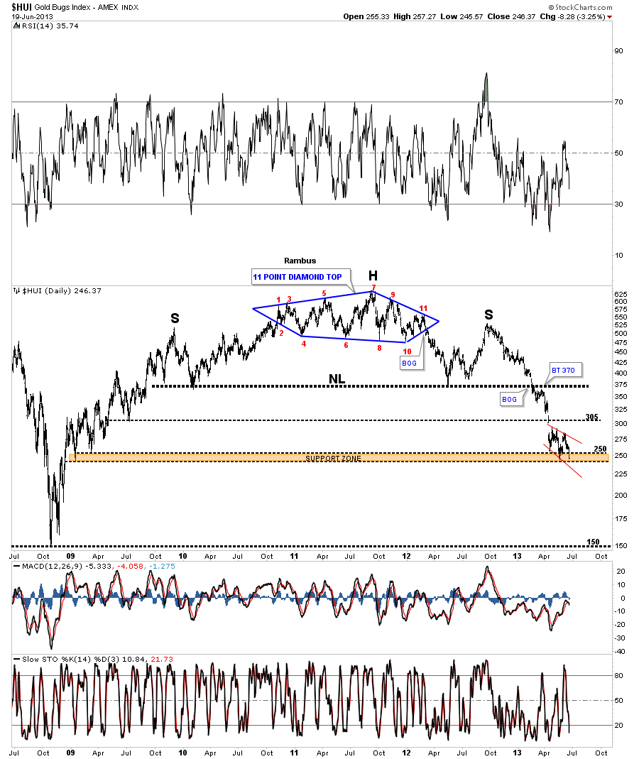
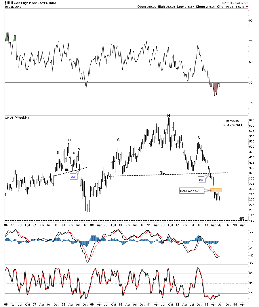
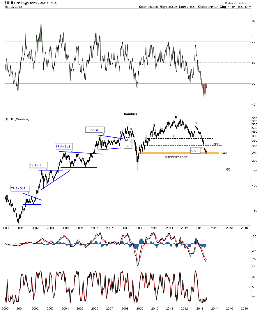
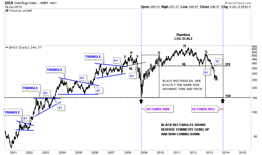
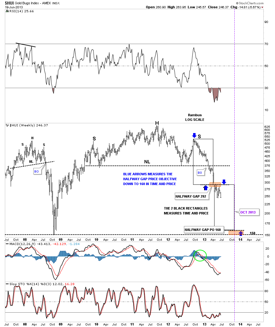
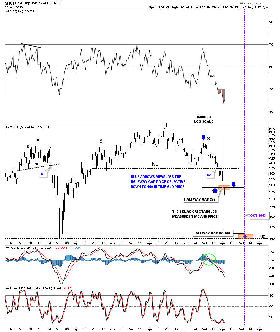
..Long story short ..Rambus called the HUI 150 bottom…(his target was 160)…a long time before it happened

But when he posted his now famous “What If” post (linked at the Wizard of Rambus ) we started to challenge his work

all of a sudden his shoulders weren’t big enough on his heads…his trendlines were arbitrary…and he took a lot of criticism from Us.

And no one participated more than I , Fullgoldcrown !

So he did what any self respecting Chartologist would do .

He took his Bearish Falling Wedges and 11 Point Diamond Topping Patterns and went home…Ozark Mountains Arkansas !

……………………………

2008 2009 2010 came and went ..and Goldtent was thriving…but every so often someone would say..I wonder whatever happened to that guy Rambus

He was so annoying but so right ?

Anyhow after 3 long years in self appointed exile….. Dave (Rambus) contacted me and said

He was reading ” The Tent” and was concerned again that everyone was all in ,  but there was again potential trouble on the horizon .

He sent free charts for me to post there..but goldbugs being goldbugs…we weren’t really listening…

I Encouraged Dave to Start his own site…and told him if you Build It They will come .

I am sure you longer term members all agree .. his work is unique .

He was reluctant to go through the drama and trauma at first but thankfully he hooked up with Audept who is The other Tech WIZARD on the site..

Audept is the Goldtent site creator and Webmaster

who also created this ever evolving Rambus Chartology Site !

Look for his voice interviews coming to the site some day soon !

……………………………………………….

So who is Rambus ?

Just a good old down home country boy who happens to have a Wizard like knack for Charting Market Psychology (Chartology)

and for being able to teach (preach) these principles in a very enlightening entertaining and informal manner.

I would describe him as a humble strait shooting teacher who learned his principles out of a book , Edward’s and Magee …the old fashioned way…then practiced and failed
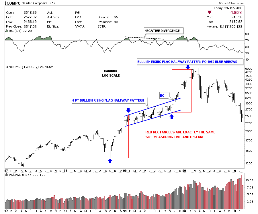
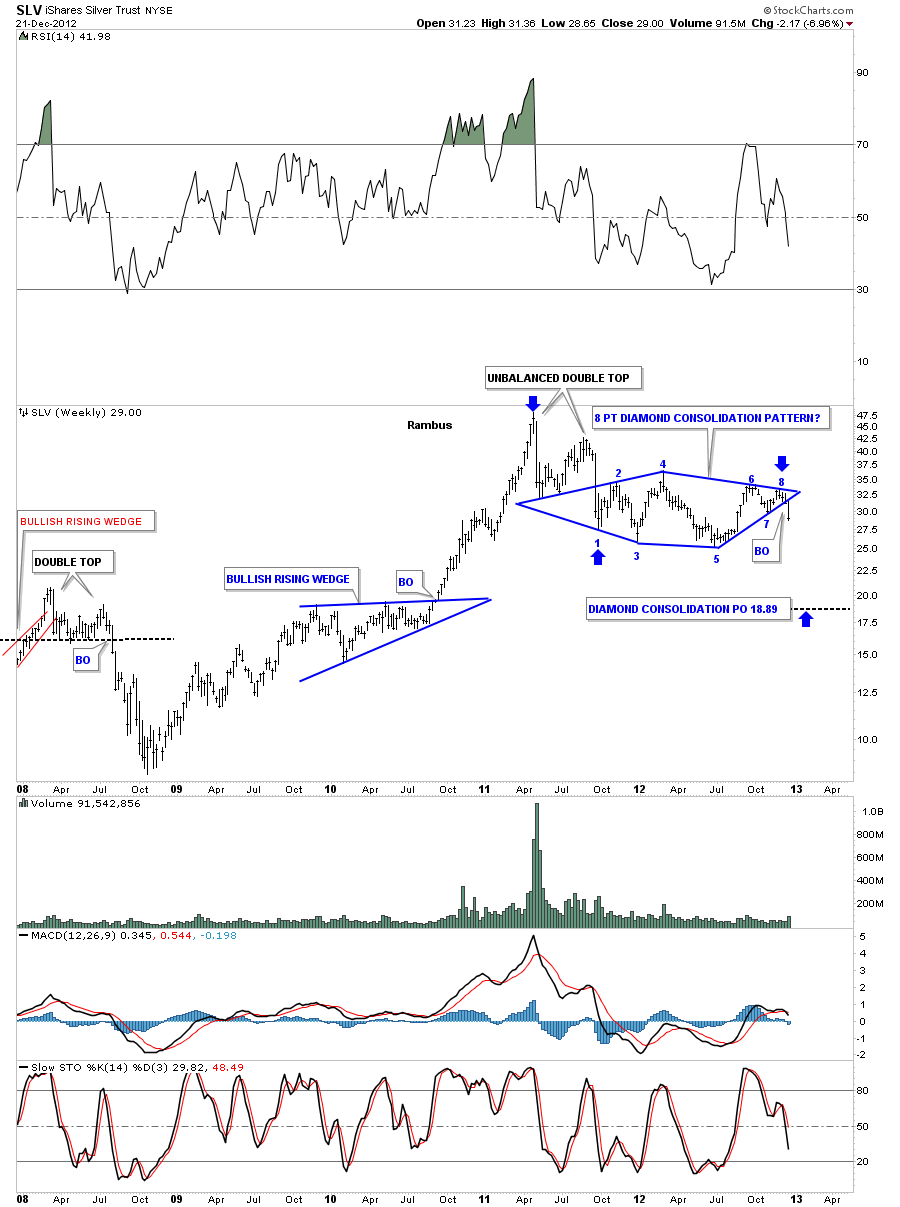
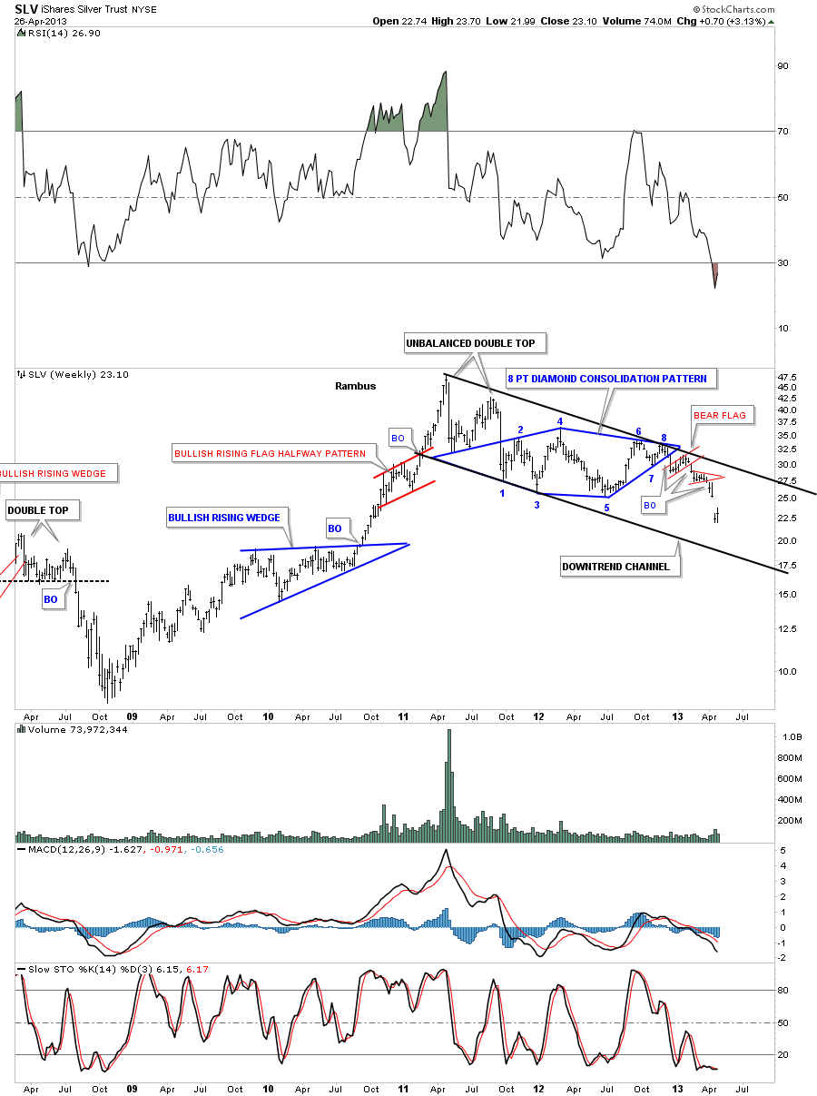
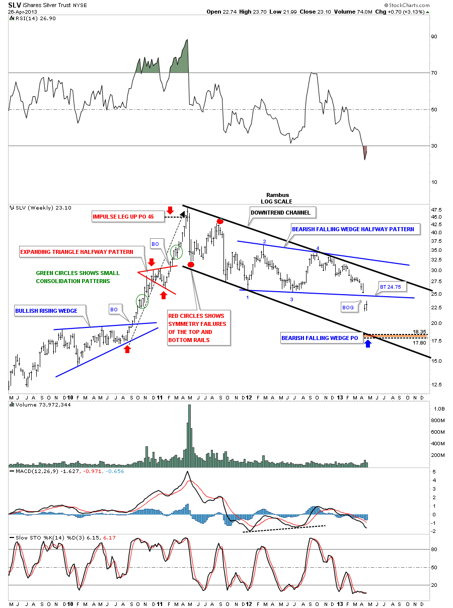
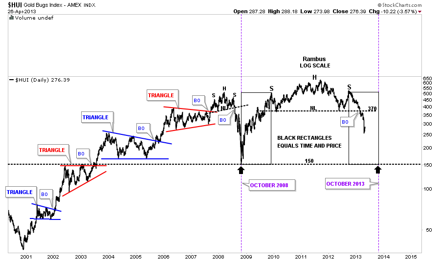
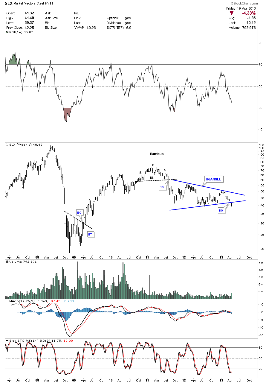
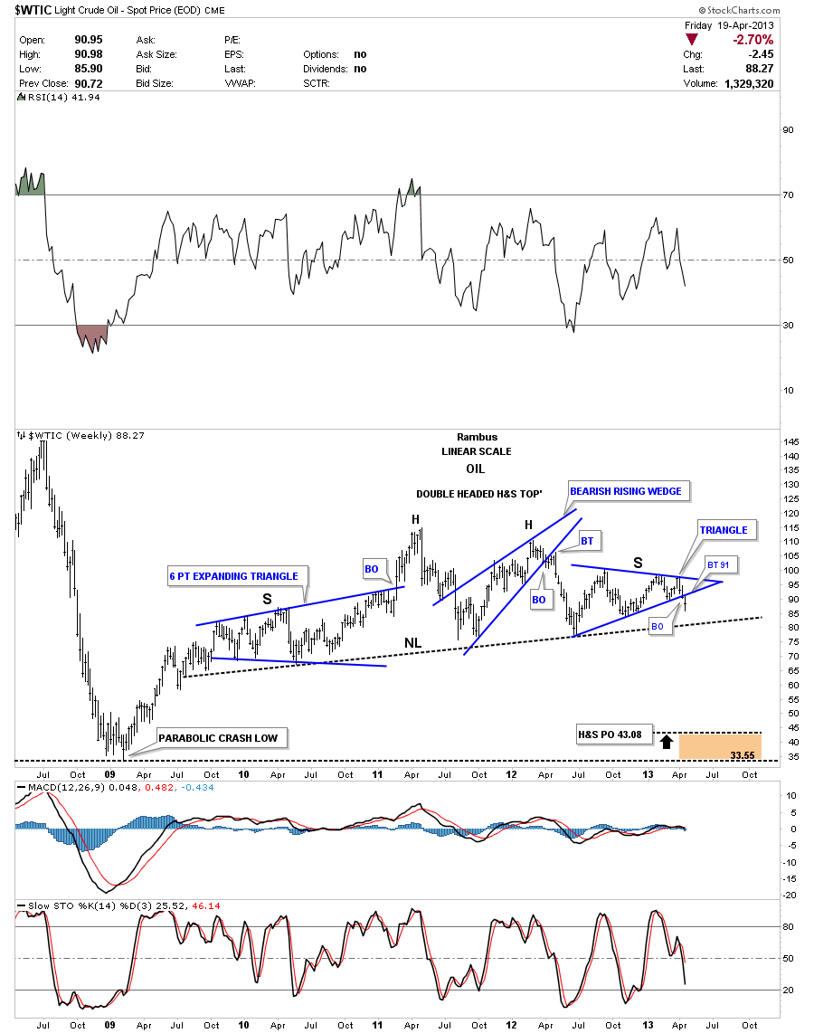
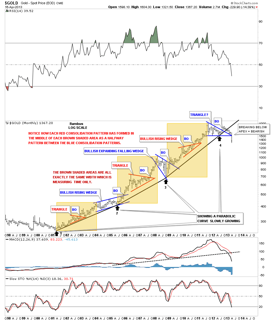
with sharp pencil and paper and ruler until he compiled enough knowledge to learn to spot things like 11 point topping patterns that are absolutely Invisible to anyone else

(See the Diamond In the Rough post at the Wizard of Rambus)

His Handle Rambus derives from his favorite trading stock of the tech mania

which he played until 2001 when he fell in love with the Gold Sector

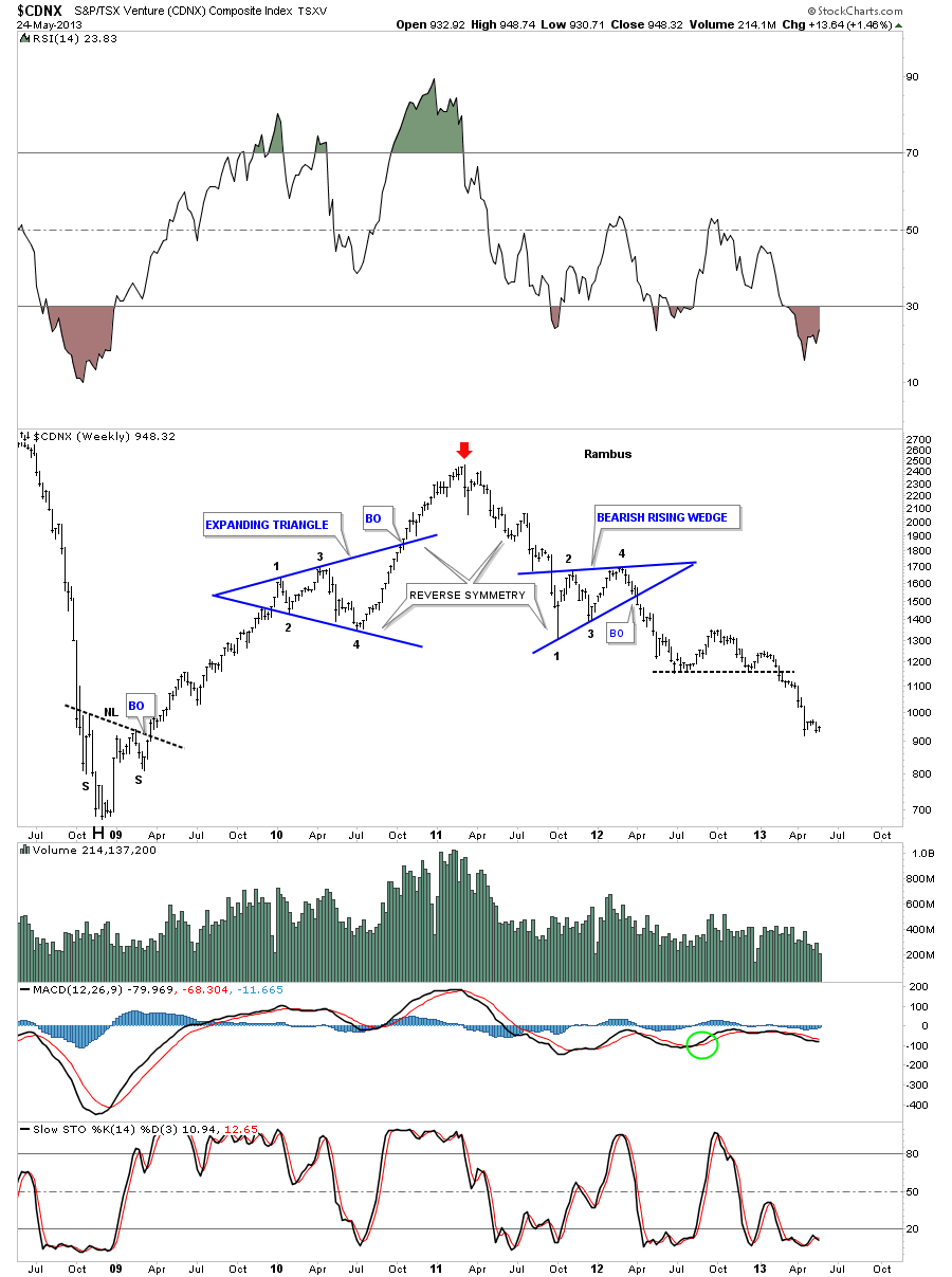
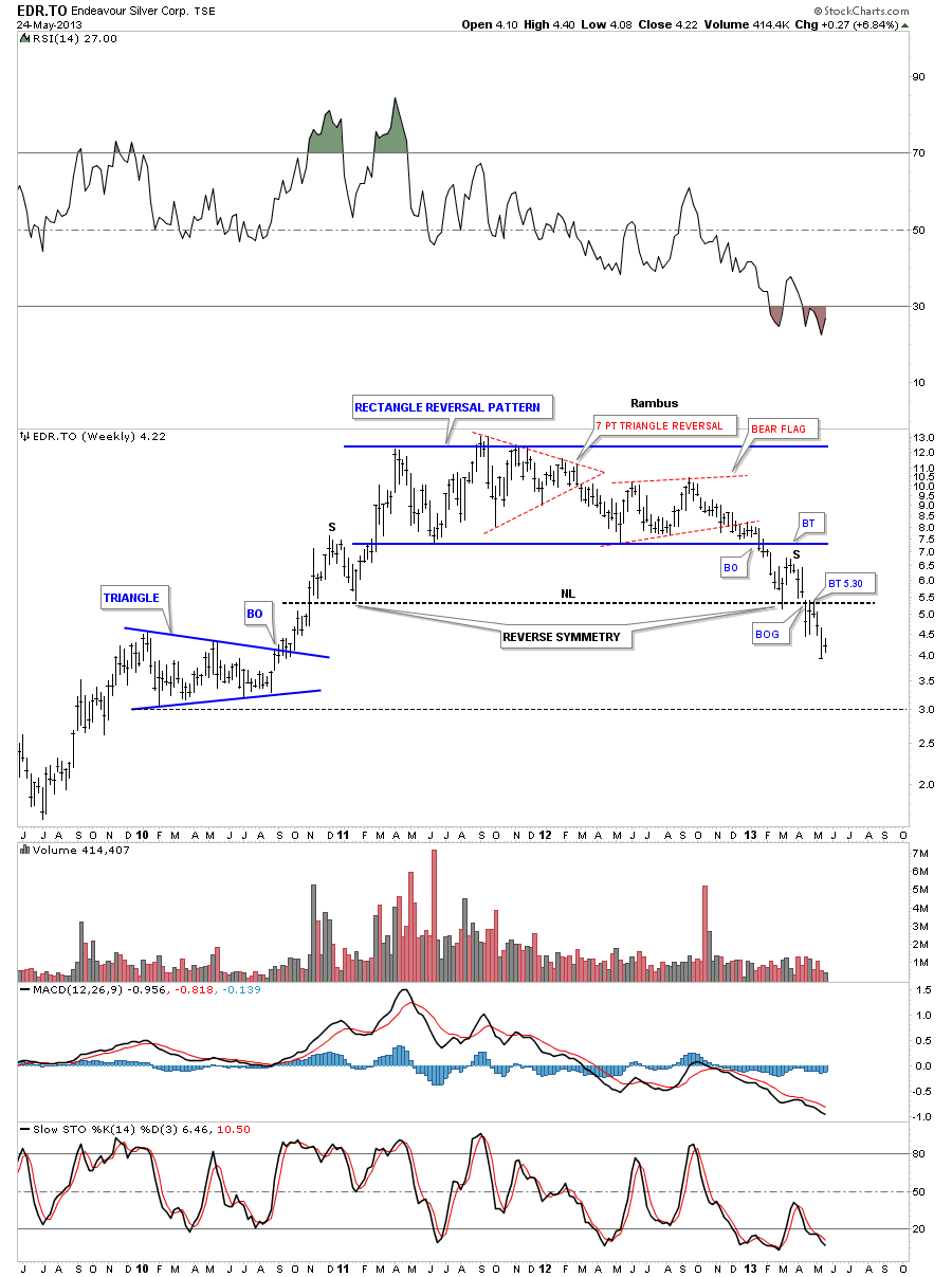
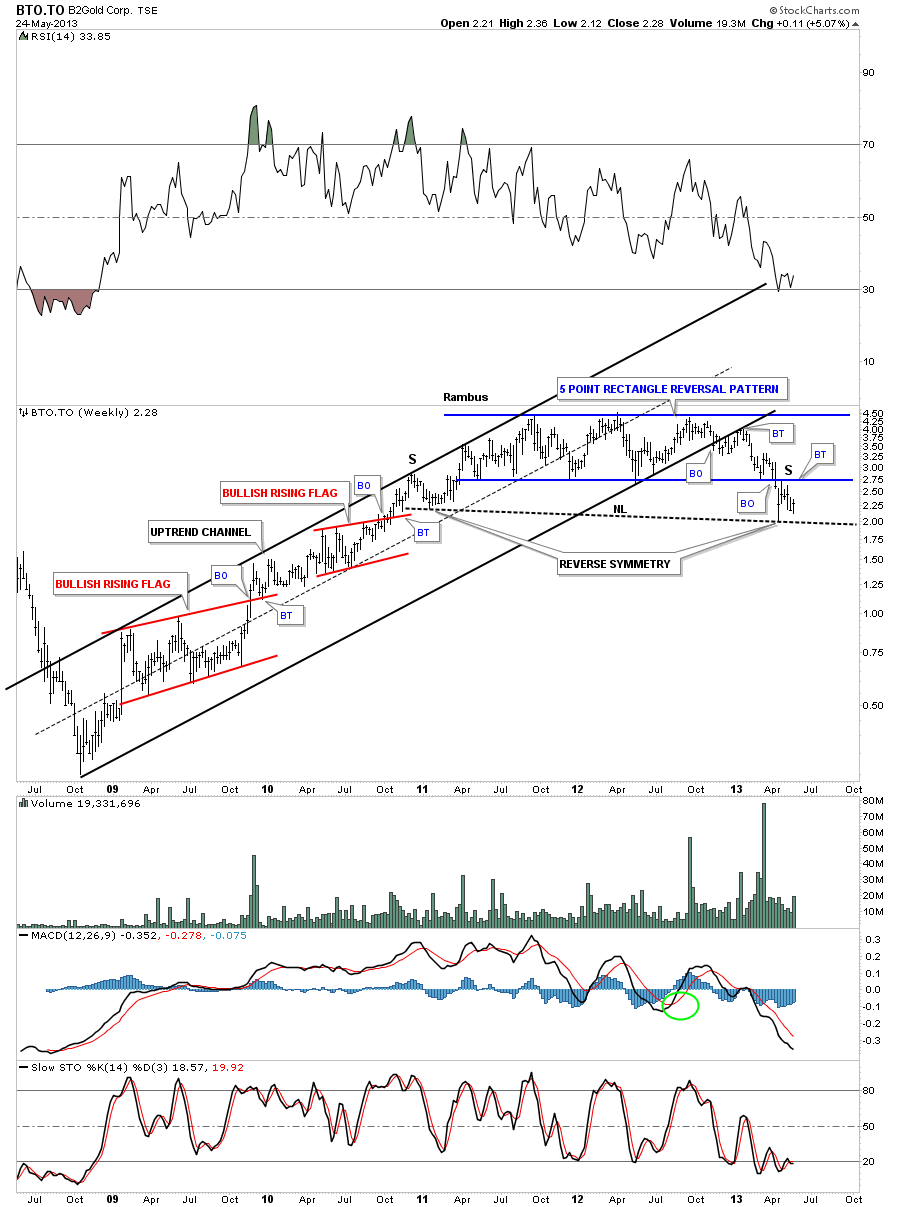
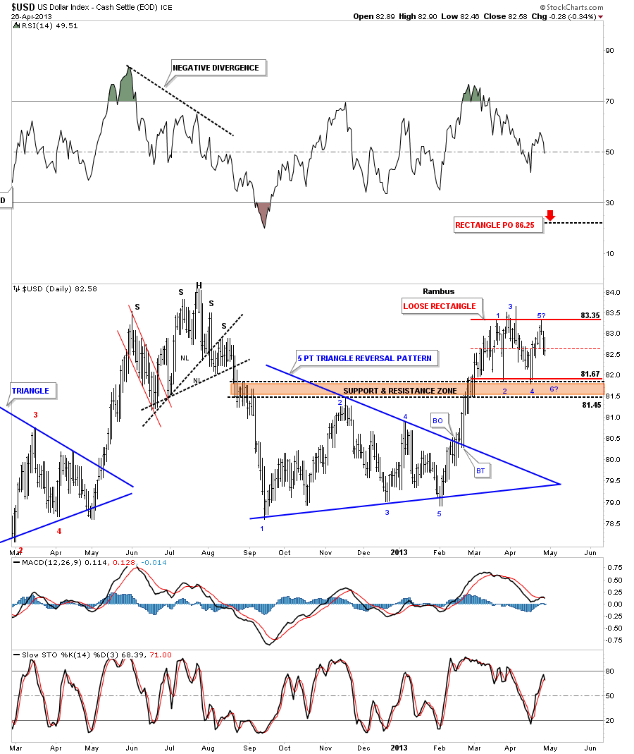
Dave has told me PMs have the BEST and most concise Chartology patterns of all the sectors .

Alas he is Not a Goldbug. He Doesn’t concern himelf at all with manipulation…its all in the charts anyhow

I of course used to furiously debate him on this point. But my take ..the manipulation is a source of supply and its baked into the cake too .

Personally I am a Goldbug to the Nth degree… but I decided I didn’t want to replay 2008 as I watched my pf loose 80%…as remote a possibility as that seemed to be

So How does a Goldbug like me rationalize being Darth Traitor…Holding DUST instead of NUGTs ?

Like This :

We all thought we would buy PM Stocks for the leverage…The Idea of course was to.. at the right time when Precious metals stocks go Nucken Futz

sell em and buy Physical

The leverage was expected to be 3 to 5 times

Wrong savage

How has that been working for us goldbugs ?

But NOW…I believe I have become a Wizard too !

I have just cashed some profits made in DUST this week and bought some really cheaply priced Gold Maple Leafs

This is Alchemy .. turning Dust into Gold !!!

………………………

This site also has 1 more participant without who we could not thrive

Mrs Rambus…Chief Financial Officer Extrodinaire

(Behind every successful man is his CFO 🙂
…………………………..

So that’s who we are and that’s how we got here and we are really excited to be attracting so many

who are willing to do the time and learn this method to Improve their trading skills

………………………

One of our mottos has evolved to :

“Give a Man a Chart and he will Thrive for a Day

Teach a man to Chart and he Thrives for a lifetime”

In Keeping with the Wizardry on the Site…we invite you all to use the Chartology Forum for banter and questions with Rambus and other members

Thank you all for joining us and as Rambus Says “Let the Games Begin”

Fullgoldcrown (For Rambus Chartology)

Gold Update…All Hail the Queen ( Is the Queen Dead ?)

I just want to show you an update on the long term chart for gold that had shown a parabolic move off the 2001 low. The bull market was a thing of beauty creating one beautiful consolidation after another. I used this chart in my “All Hail the Queen” post to show the beautiful symmetry of this bull market.

All Hail The Queen :

http://rambus1.com/?p=8414

It wasn’t a week or so later, after the post was made, that the price action started to change When gold moved below the last black parabolic trendline I knew something was amiss.

As you can see I was super bullish when I did that post but when the price action started to change I had to change with it no matter how bullish I felt inside. The breakout became more labored and just didn’t fit the bill anymore as to what a true breakout should be. Several months ago I labeled the apex of the last triangle, that was failing, showing that if the apex gave way that would be very bearish setup for gold. When gold broke below the apex, that is called, An End Around the Apex Move. The reason it’s so bearish is because, where the upper and lower trendlines intersect at the apex, that is where all the energy is focused. As you can see the energy was released to the downside in one big move.

For those still wondering, if the scenario that I showed in the All Hail the Queen post is still valid, I have to say no because we have three failures. One, the blue triangle failed. Two, the last uptrend rail failed. Three, the apex failed. This isn’t supposed to happen and if one doesn’t act on what the charts are telling you, you will be feeling the pain for ignoring the information down the road as many staunch gold bugs are feeling right now. The trap has been sprung on the gold bulls and now it’s a game of survival. If I can just get out even I will sell, is the new mantra. So at this point most rallies will be sold by those trapped gold investors. The same situation is taking place in the precious metals stocks right now.  Survival mode is taking over the psychology in the precious metals complex.

One last note on the chart below. Even though the scenario didn’t work out as I expected it is still a very good study in the chartology of a bull market that lasted almost 13 years. It served me very well for many years.

gold new apex

Weekend Report…Precious Metals : Apocalypse Now ?

In this Weekend Report I would like to take an unbiased look at the precious metals complex that has been showing substantial weakness since the October highs of last year. I’m going to show you some charts, further along in this article, that will shed some light on what is really taking place right now. Keeping an open mind is key to being successful in the markets.

This week marked the breakout of gold from the very large 20 month rectangle that finally let us know that the big sideways trading range is in fact a consolidation pattern to the downside and not a reversal pattern to the upside. The breakout was classic from a Chartology perspective. You can see on the the chart below there was a very large daily bar that was created on Friday April 12, 2013 on heavy volume. A breakout like this shows the bulls were exhausted and the bears are back in charge. The bulls had no fight left and are now in retreat looking for the next place in which to try and establish some support. It’s possible that we may see a backtest to the bottom blue rail of the large rectangle that will now reverse its role from support to resistance before the move lower begins in earnest.

gold rectangle

Next lets look at the silver rectangle that shows a very similar setup to gold. As gold broke significantly below the bottom rail of its rectangle silver is just barely cracking its bottom rail at this time. The three fanline pattern, starting off point #5, is giving us a heads up that silver will break below its bottom blue rail. Also like gold you can see an even number of reversal points, six, that tells us this is a consolidation pattern to the downside. Another clue that this pattern is a consolidation pattern to the downside is that it has formed below the previous high. In order for this pattern to be a reversal pattern to the upside it would need an odd number of reversal points such as 5, 7 or more. The evidence is mounting for a consolidation pattern to the downside.

silver weekly rectangle

Now that we can see that gold and silver have broken out from their respective six point rectangles lets look at the HUI and see if the precious metals stocks are in a confirmed downtrend like gold and silver. This next chart shows a huge H&S topping pattern for the HUI that broke down in February of this year a full two months before gold and silver did. The precious metals stocks are leading the way down for gold and silver that puts the whole complex in a confirmed downtrend or cyclical bear market.

hui day h&S

Next I would like to look at some shorter term charts for gold, silver, and some precious metals stocks that will show how bad the situation really is for this sector. I just want to say right here, before we look at the charts to follow, that the Chartology you are about to see is what it is and it’s just my interpretation of what the charts are showing me. Many of you will be in denial and will not accept what these charts are saying and that’s fine. Just use them as part of your overall view of the what your own interpretation of the precious complex is and take it from there.

The first chart I would like to show you is a daily look at gold that is showing a parabolic downtrend that has been forming since the important high made in October of 2012. Most of the time all we here about is the parabolic moves to the upside that happen on a much larger scale. Parabolic moves can also happen in the short term charts as this daily chart shows.

gold day parab no

Now I would like to show the the same chart that shows why this parabolic move lower is developing the way it is. You can see there have been three smaller chart formations that have formed one below the next that is creating the parabolic downtrend. Many are trying to put straight trendlines on their charts trying to show a downtrend channel which isn’t working very well. As you can see the curved trendline was hit four days ago along with the backtest to the small red triangle that has led to this most recent decline.

gold day para wth attern

Silver has a beautiful looking parabolic downtrend that started to form off its double top high back in October of 2012. Again you can see how each smaller red consolidation pattern has formed below the previous one creating the curved downtrend rail when the tops are connected. You can also see that silver has cracked the all important bottom support rail at 26.

silver para day

The precious metals stocks are several months ahead of gold and silver and are showing a strong parabolic downtrend well in progress. The Chartology, of this daily chart for the HUI, shows all the smaller consolidation patterns that have formed off the October high made last year. From a Chartology perspective this chart is as good as it gets. We have been following this beautiful downtrend channel since the breakout from the black 5 point bearish falling wedge reversal pattern. Some say I show too many chart patterns that are unnecessary but from my perspective each and every consolidation formation is giving us an important clue to the bigger picture. If you study each consolidation pattern, on the chart below, you will see each one has at least four reversal points which is what you have to have to form a consolidation pattern at a minimum. Sometimes there are six, eight or more and as long as there are an even number of reversal points you will have a consolidation pattern that will breakout in the direction of the move leading into the consolidation pattern.

hui parabolic dow trnekd

Lets look at a weekly chart that shows a parabolic downtrend that happened back in the later part of the 1990’s on CDE. You can see all the clean touches that occurred on the curved downtrend rail. Try to put a straight trendline where the parabolic trendline is and see what you get.

cde weekly

Lets now look at some individual precious metals stocks that exhibiting some parabolic downtrends. ABX is the biggest precious metals producer and is showing an accelerating parabolic downtrend, that started back in August of 2011. ABX has also broken out from the massive H&S top that few are willing to recognize even at this point in time. Denial can make an investor broke faster than anyway I know.

abx weekly

Lets look at the monthly chart, for the biggest cap precious metals stock, that really puts things into perspective regardless of how one may perceive the fundamentals. This chart isn’t lying but the the strong fundamentals, that so many are espousing for the precious metals complex are.

ABX MONTHLY 4444

ASA is showing a very large parabolic downtrend that stated all the way back in October of 2010.

asa parabolic

The monthly look at ASA shows a double H&S top formation that is in the third month of breakout.

asa nomth

AU is showing us a parabolic downtrend that started in October of 2010 which now seems to be accelerating to the downside.

au weeklypara

In conjunction with the parabolic downtrend channel AU has also broken out of its own massive H&S topping pattern.

au weekly H&S

Lets look at one more precious metals stock that has an accelerating parabolic downtrend that started last October of 2012. As you can see it has lost well over 50% of its value since the parabolic downtrend began.

aunff

The weekly chart for AUNFF shows its topping pattern as the five point triangle reversal pattern.

aunff weekly

I could show you countless other precious metals stocks with the same characteristics as the ones above. We don’t have to beat our heads against the wall to figure out why the precious metals complex is so weak right now. All we have to do is follow the price action and everything else becomes irrelevant. This is the beauty of Chartology. It doesn’t make any difference what the fundamentalist say or how short or long the commercials are, who’s buying and selling the precious metals, or how the stockpiles are falling to such low levels. It’s all baked in to the price action that shows up on charts. How one interprets this price action is an entirely different story. Some use Elliot Wave and some use cycles to interpret the charts. For me, following the price action, by looking for patterns that form consolidation or reversal patterns is the purest form for analyzing a stock or index as the charts above show. Just one simple trendline on a chart, think neckline on the ABX chart above, can mean the difference between success or failure. Above the neckline and the chart is positive and below is negative.

It still amazes me how this old school of charting is still relevant in this day and age with all the high powered computer programs out there that are trying find an edge in the markets. Understanding the price action between the bulls and the bears is a never ending story that goes back to the beginning of the stock markets. Its the interpretation of these battles, in the form of consolidation or topping patterns, is all that is needed to be on the right side of the markets more than on the wrong side. And that is the bottom line. To be right more than you are wrong. All the best…Rambus

……………………………………

EDITOR’S NOTE :
Rambus Chartology is Primarily a Goldbug TA Site where Members watch Rambus follow the markets on a daily basis and learn a great deal of Hands on Chartology from Rambus Tutorials and Question and Answers .

Most Members are Staunch Goldbugs who have seen Rambus in action from the 2007 to 2008 period at www.goldtent.org and now Here at Rambus Chartology since early 2012 .

What is he seeing Now ?

http://rambus1.com/

Friday Night Charts…Whither Gold ?

With today’s breakout of the huge 20 month rectangle for gold, tonight would be a good time to take another look, and see what has led up to this important breakout. This first chart is one I posted at the beginning of March when gold was trading at point #3. I put those black arrows on this chart to show you where I thought we should at least get one more reversal up to point #4? that was just below the brown shaded support and resistance zone. Some of you may remember this chart when I was looking for the 1620 area for a possible 4th reversal point. Sometimes the last reversal point in a rectangle will hit the middle of the rectangle before the actual breakout begins, red horizontal trendline  As you can see this was the case this week.

gold 555555555555

This next chart is a longer term daily look that shows all the consolidation patterns that have formed since the last high at 1800. Today’s price action shows a classic breakout of a major chart pattern, the 20 month rectangle. The red rectangle had a measured move down to 1475 which we hit today. That last red rectangle strongly suggested that the breakout of the big 20 month rectangle was going to happen because the price objective of the red rectangle was roughly 50 points below the bottom rail of the 20 month rectangle.  It should not surprise you if we now get a backtest to the underside of the big rectangle at 1530 before the price moves lower. Possible but no guarantee.

gold big rectangle

We finally got our answer to the question asked from the chart below.

gold bbbbbbbbbb

This last chart shows the best case scenario for gold. If the 20 month rectangle is a halfway pattern then the price objective would come in around the 1392 to 1435 area. This is just one scenario of several scenarios that are in the play book right now. Stay tuned as today marks a potential turning point for gold. All the best…Rambus

GOLD 4444445555555555556666

WOW…RAMBUS AROUND THE WORLD

List of Countries who have subscribers at Rambus Chartology

(39)

Italy

USA

Canada

Japan

Sweden

France

Spain

Finland

Germany

Portugal

Belguim

Channel islands

Gibralter

United Kingdom

Swizerland

Denmark

Netherlands

India

Kuwait

Australia

Singapore

Hong Kong

Tiawan

South Africa

Malaysia

Malta

United Arab Emirates (Dubai)

Lebanon

New Zealand

Nigeria

Nicaragua

China

Mexico

Thailand

Columbia

Hungary

Israel

Brazil

Ukraine

Peru

….. Sir Fully

GLD Update…Parabolic Chart

In this past Weekend Report,” Gold Bulls Do or Die”,

http://rambus1.com/?p=11845

I showed a daily chart for the GLD that showed a parabolic downtrend forming. That was the first time I posted that chart.  GLD was in the process of backtesting the triangle that had been forming since the end of February. The backtest was a little strong, which happens sometimes, but with the brown shaded gap area and the latest rail of the parabolic downtrend channel,  just above the bottom rail of the triangle, I thought there was a good chance that the GLD would fill the gap and touch the new downtrend rail one last time before the GLD  started the next impulse leg down. Below is the undated chart for the GLD that shows yesterday’s price action did in fact trade slightly above the bottom red rail of the triangle, closing the gap and bouncing off the newest rail of the parabolic downtrend channel. I can guarantee you won’t find a chart like that anywhere on the planet just here at Rambus Chartology.

gld paarabolic

Rambus Rant Redux

“Sir starr posted an article on the Chartology Forum, “Comex Gold Inventories Collapsed by the Largest Amount Ever on Record.”

Since I began trading the bull market in the precious metals complex, in the spring of 2002, I can’t even begin to count how many articles have been written on why its time to back up the truck because of this reason or that reason. There is no doubt that the precious metals, not so much the pm stocks, have been the best place in which to be invested for the last 12 years or so. Last October (2012) there was a paradigm shift from the precious metals stocks to the stock markets, as I have shown you. Most of these types of articles are written by analysts that will never tell you to sell. All they do is tell you why you must buy and buy right now or you will get left behind and lose a fortune. They are good at what they write and very convincing which is why so many goldbugs are still hanging on to their losing positions right now. You think you felt some pain today. What if you have been riding this decline all the way down from the October highs because some analysis told you the precious metals stocks were going to the moon because of the strong fundamentals. Instead of a moon shot most of the goldbugs have had a trip to hell looking for someone to blame because THEY said the fundamentals were so strong that the precious metals stocks couldn’t go down. If you follow the price action you don’t have to worry about what this analyst or that goldbug guru has to say. You will be able to look right through their bull crap and decide for yourself which is the best way to go.”

Rambus March 9 2013

Weekend Report…Gold Bulls : Do or Die !

I was going to write about the Risk on Risk off trade this weekend but with the big move up in gold on Friday I thought we should look at gold instead. As you know, gold along with silver, broke down from their respective triangles this week which we have been keeping a close eye on. The 60 minute chart below shows the price action for the last six months or so for GLD.  You can see the downtrend has been picture perfect so far with lower highs and lower lows all the way down. The price action broke below the bottom rail of the blue triangle early this week and had a strong rally, that so far, has taken the price back up to the underside of the bottom rail as the backtest. This is normal behavior. What I’ll be watching very close is how the GLD interacts with the bottom blue rail of the triangle. If the price action starts trading up and into the blue triangle that will mean we have a bigger consolidation pattern forming which will still be a consolidation pattern just a bit bigger at this time.

gld 60

The daily chart shows all the chart patterns that have formed since the October high last year. You can see how critical this backtest is right now to the underside of the red triangle. Again if the price action can trade above the bottom red rail that would be short term bullish for gold. A failure right here would confirm the red triangle as a valid consolidation pattern. So we wait.

gld day

Lets look at another daily chart for the GLD that shows a potential horizontal trading range similar to the one that formed just above our current one. Sometimes a horizontal trading ranges can be a little sloppy where the price action can trade slightly below or above the horizontal rails and then move right back in to the rectangle. If the backtest doesn’t hold on the triangle pattern, that I showed you on the chart above, then I would expect a more horizontal trading range to progress with a move up to the top red rail around the 156.50 area.

GLD RECTANGLES

Next lets look at a 2 year daily line chart that shows the big horizontal trading range that gold has been in since the fall of 2011. As you can see the price action is testing the bottom of the big 20 month rectangle. This daily line chart shows a little different chart pattern vs the bar charts above. The little red ascending triangle shows a backtest would come in around the 155 area. I will also be keeping a close eye on the brown shaded support zone, bottom of rectangle, as that has been major support for 20 months or so. We should have a clearer picture in a week or so as to what direction gold wants to go. For right now nothing is broken in regards to our DGLD trade.

gld line chart

There is a daily chart for the GLD that I haven’t shown you yet that is showing a parabolic downtrend channel that started off the October 2012 high. Silver also is showing the same parabolic downtrend channel. There is a gap just above Friday’s price action that may get filled this week. The gap could get filled and the GLD could still stay below the last downtrend rail which would be perfect. Again it looks like an interesting week ahead.

gld parrabolic

The five year chart for the GLD shows the price action trading well below the three most important moving averages. To really turn gold positive these moving averages will have to be broken to the upside to launch a new bull leg.

gld ma's

A weekly chart for the GLD shows the price action bouncing off the apex of an old triangle that was in play for some time before prices fell to the bottom blue trendline. It’s still an important  area as there are two trendlines that intersect at the 149 area. If the price action does break below the apex that would be very negative for gold.

gld apex

This next weekly look at the GLD shows the 2008 uptrend channel with all the smaller red consolidation patterns that formed during that advance. You can see how perfect the blue rectangle is with the price action testing the bottom blue rail this week. The rectangle is a completed pattern that still hasn’t told us yet which way it will breakout. As it has formed below the all time high made back in the fall of 2011 the odds favor a breakout through the bottom of the rectangle. Those are the odds but if the GLD starts to rally above the 65 week moving average then we would have to reconsider. For right now a bounce should be expected as everyone and their brother knows this is the bottom of the trading range. The big question is, How Strong are the Bulls? This is where talk is cheap. The bulls need to walk the walk and show us they mean business.

gld weekkly many patterns

I would like to leave you with one last chart that is a combo chart showing gold and top and silver on the bottom. The blue shaded area shows how each moved to their bull market highs at different times. As you can see silver reached its parabolic high first in April of 2011 while gold languished. There was about a 2 month correction and then gold took off to make its all time high at 1920 while silver fell way short of reaching its all time high made in April. This was a major negative divergence between gold and silver. When I look at this chart it tells me they both got their parabolic move albeit at different times and that a good correction was at hand. As you can see once they both had their highs in place they declined sharply together to point #1 on their blue rectangles. They have been trading in lockstep, for the most part, for the better part of 20 months or so. Both are testing the bottom blue rail of their respective rectangles as we speak.

glold and silvercombo

We are at a very important juncture right here where the gold bugs will have to step up to the plate and move the precious metals higher, not with talk, but with action. Believe me I will have no problem shifting from a bear stance to a bullish stance if the charts shows that is the case. For right now it’s up to the bulls to show the way. I will be watching their every move to see if they really have what it takes to move the precious metals up. This should get everyone up to speed on gold. All the best…Rambus


Editors Note:

To Learn More about the Incredible Art and Science behind Rambus Chatology Join Us at

http://rambus1.com/

“Give a Man a Chart and he may eat for a day

Teach a Man to Chart and he will never starve”

http://rambus1.com/?p=11625