In this weekend report I would like to show you some Diamond patterns that are not widely followed by most chartists. I think the reason most don’t look for the diamond pattern is because they are somewhat complex in nature vs a triangle or wedge pattern which is very basic. They act like any other consolidation or reversal pattern depending on how many reversal points they have. For instance if a triangle has an even number of reversal points, such as 4, 6 or more, the triangle will be a consolidation pattern and the breakout will go in the direction as the move leading into the triangle. On the other hand if a triangle has an odd number of reversal points, such as 5, 7 or more, it will be a reversal pattern, reversing the trend leading into the odd numbered triangle. I’m just using the triangle as an example but all chart patterns exhibit the same characteristics. A double bottom or double top will have 3 reversal points. A H&S pattern will have at least 5 reversal points making it a reversal pattern depending on which direction the move was going when the H&S reversal pattern was formed. With that said lets look at some Diamond patterns that will either show a consolidation pattern or a reversal pattern.
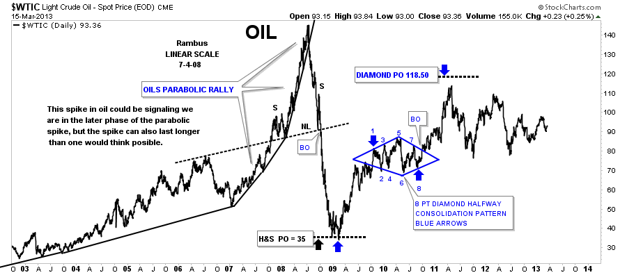
The first Diamond I would like to show you is an eight point diamond consolidation pattern that formed on oil back in 2010. That particular diamond formed after oil had its parabolic run in 2007 and 2008 and then the parabolic collapse. The rally off the crash bottom led to the development of the diamond as a halfway consolidation pattern as measured by the blue arrows. The actual price was a little bit lower than the diamond measured to but it still gave us a place to start looking for a top or another possible consolidation pattern to start forming. As you can see on the chart below that high has been the recovery high so far for oil. Note the big H&S top that formed at the parabolic high. That H&S top’s had a measured move down to 35 that was the bottom on the linear scale.
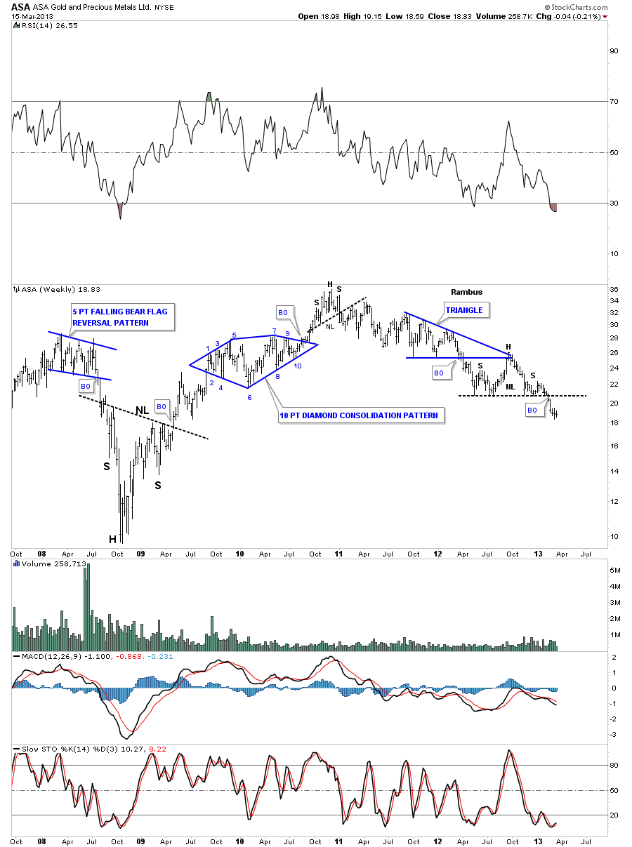
Lets look at another diamond consolidation pattern that formed on ASA back in 2010 that had 10 reversal points. As you can see it’s sitting about halfway from the breakout of the neckline of big inverse H&S bottom to the actual top that formed a smaller H&S reversal pattern. Most consolidation patterns tend to form like this whether it’s a triangle or rectangle or whatever the consolidation pattern is.
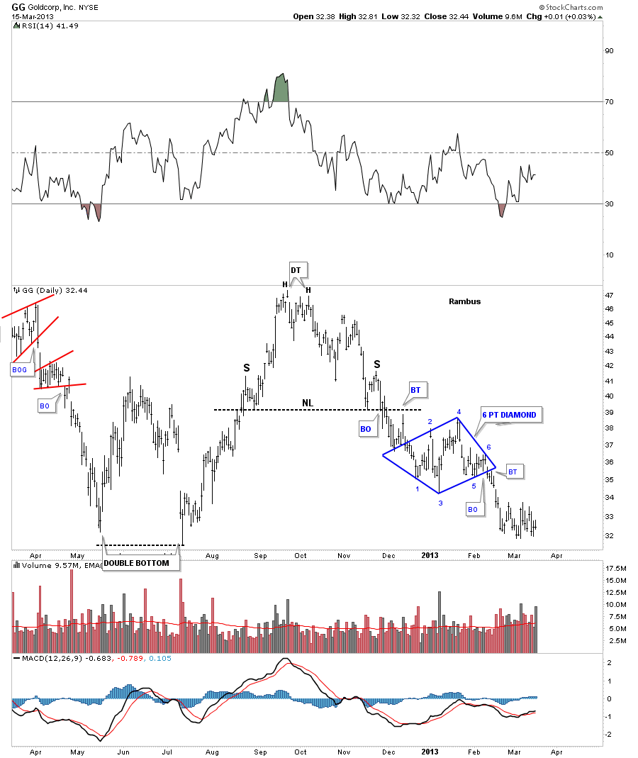
I would like to show you a couple of more current diamond consolidation patterns that have just finished and have broken down. GG has a six point diamond consolidation pattern that just recently broke down in February. This smaller diamond has six reversal points that formed after the H&S top gave way. It’s always important to watch the breakout area of any chart pattern for clues as to its validity. Here you can see the breakout was accompanied by a breakout gap and two days later there was a backtest to the underside of the diamond. Confirmation was now in place.
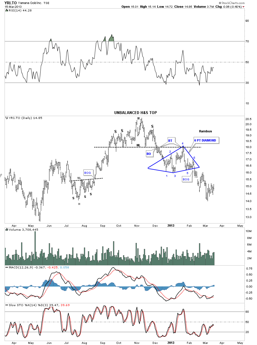
Lets look at one more recent six point diamond consolidation pattern that formed on YRI.To. This diamond consolidation pattern formed under the neckline of the H&S top. You can see reversal point #4 was the backtest to the neckline. Here you can also see the breakout from the six point diamond consolidation pattern was accompanied with a gap but no backtest.
Now that you have seen the diamond pattern acting as a consolidation pattern lets now look at the diamond pattern as a reversal pattern. Remember a consolidation pattern has an even number of reversal points as I have shown you on the charts above. These next diamonds will have an odd number of reversal points that will make these diamonds reversal patterns.
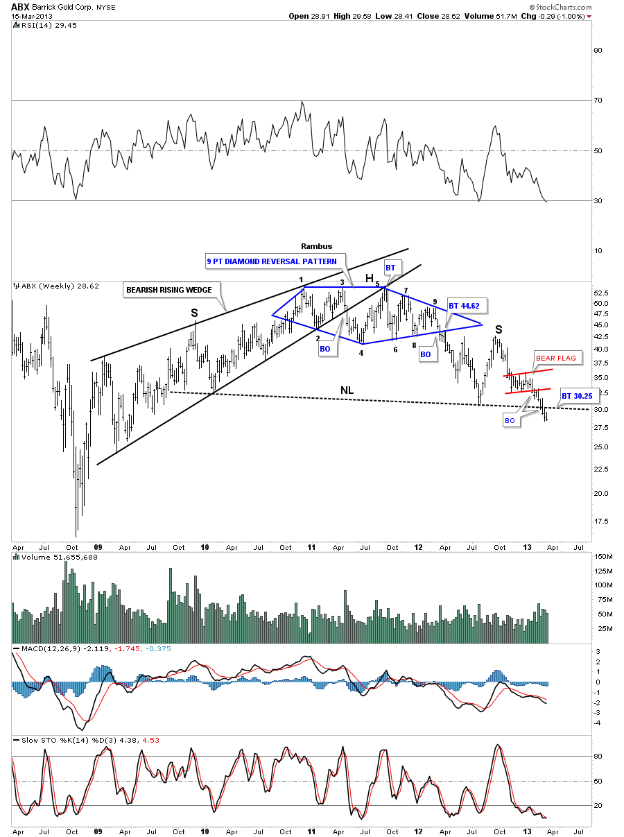
ABX has a very large two year nine point diamond reversal pattern as its bull market top. Gaps don’t show up alot on a weekly chart but you can see there was a nice backtest to the underside of the bottom blue rail at 44.62 before prices declined. As you can see the nine point diamond reversal pattern is the head portion of a much larger topping pattern, a massive H&S top.
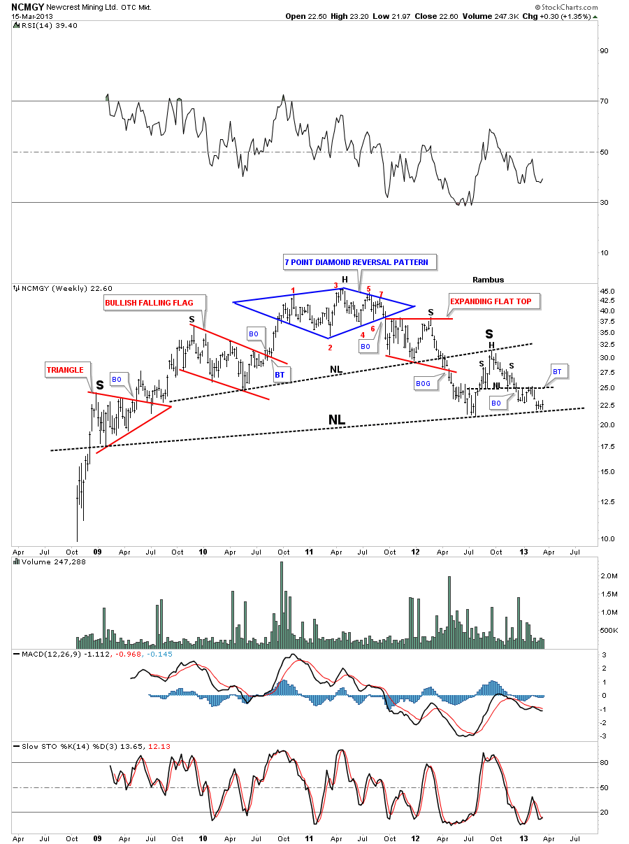
Next lets look at a weekly chart for NCMGY that has a 7 point diamond reversal pattern that is the head of the bigger H&S topping pattern. There is some nice reverse symmetry going on between the left side of the chart when the price action was in rally mode and the right side of the chart where prices are decline. Sometimes how a stock goes up is how it will come back down.
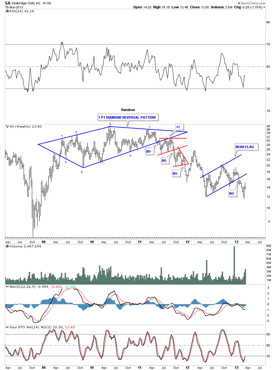
SA had a nice seven point diamond reversal pattern that broke out way back in the spring of 2011 unlike alot of precious metals stocks that have been breaking out this year. There are several precious metals stocks that have put in their bull market tops several years ago already and have been in correction mode ever since. Not all the precious metals stock have broken out at the same time which is why they are all over the place as to the breakout of their topping patterns.
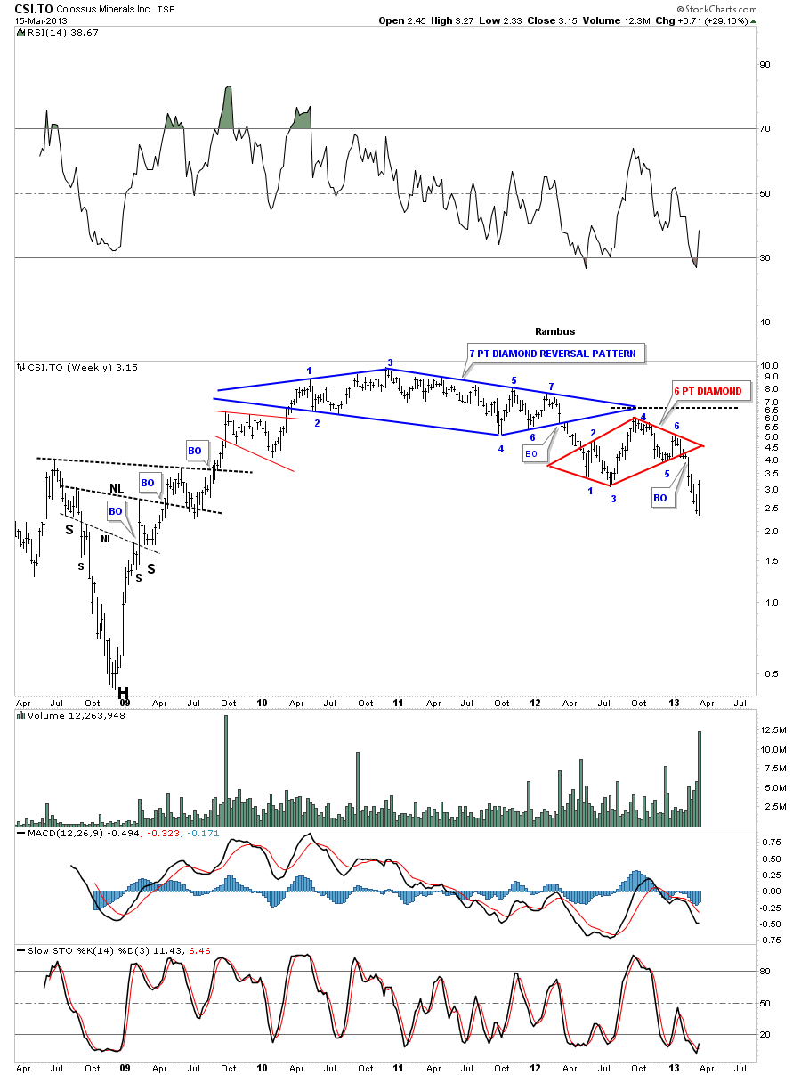
Lets look at one more stock before we move on to the reason for this post. CSI.To shows us two diamond patterns. The top is made up of a seven point diamond reversal pattern. After the bottom was broken to the downside this stock built out another diamond pattern only this time it was a six point diamond consolidation pattern.
There are several reason I’m showing you all these diamond chart patterns. First, I just want you to see how the old school of charting can still be relevant in this day and age when there is a plethora of technical indicators to choose from. For me, following the price action trumps everything else as it will keep you from being on the wrong side of the markets for very long. When the market changes the charts will change giving you clues as to what direction things are moving. The second reason I’m showing you all these diamond patterns is because the diamond pattern is giving us some very important clues for the precious metals complex right now.
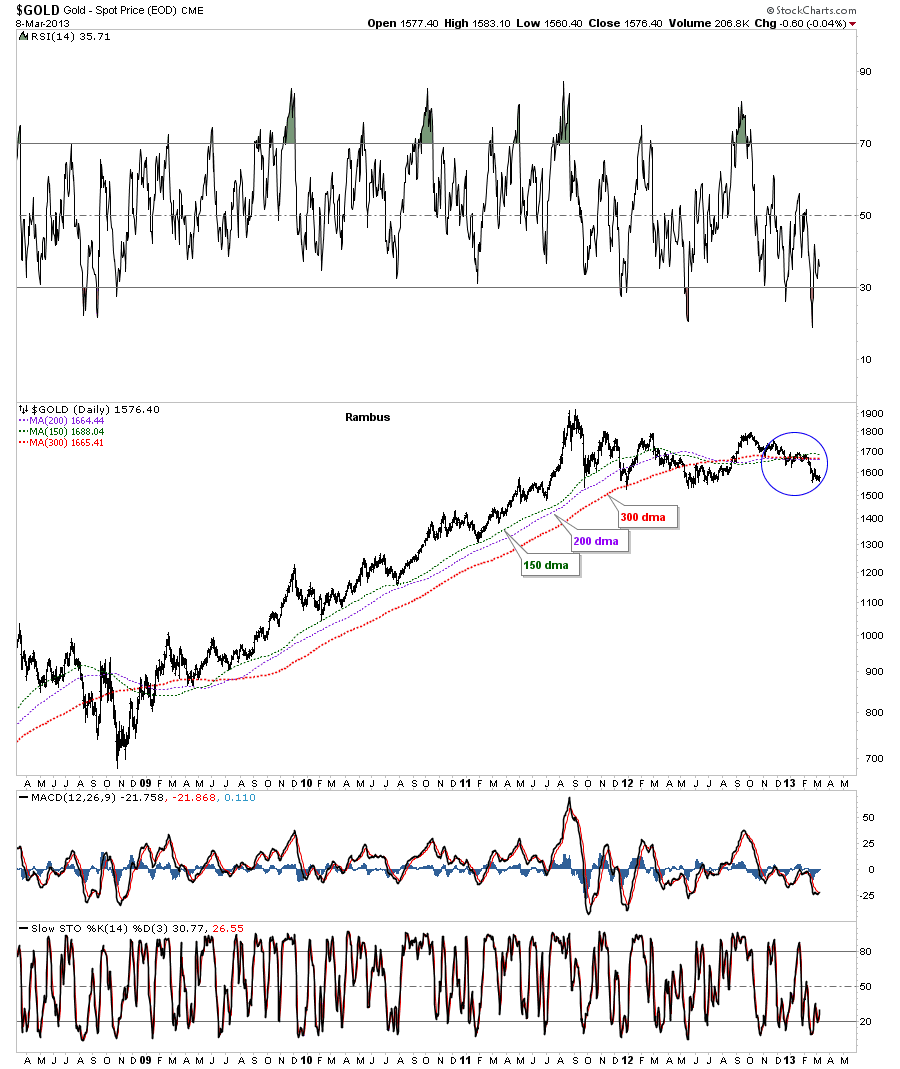
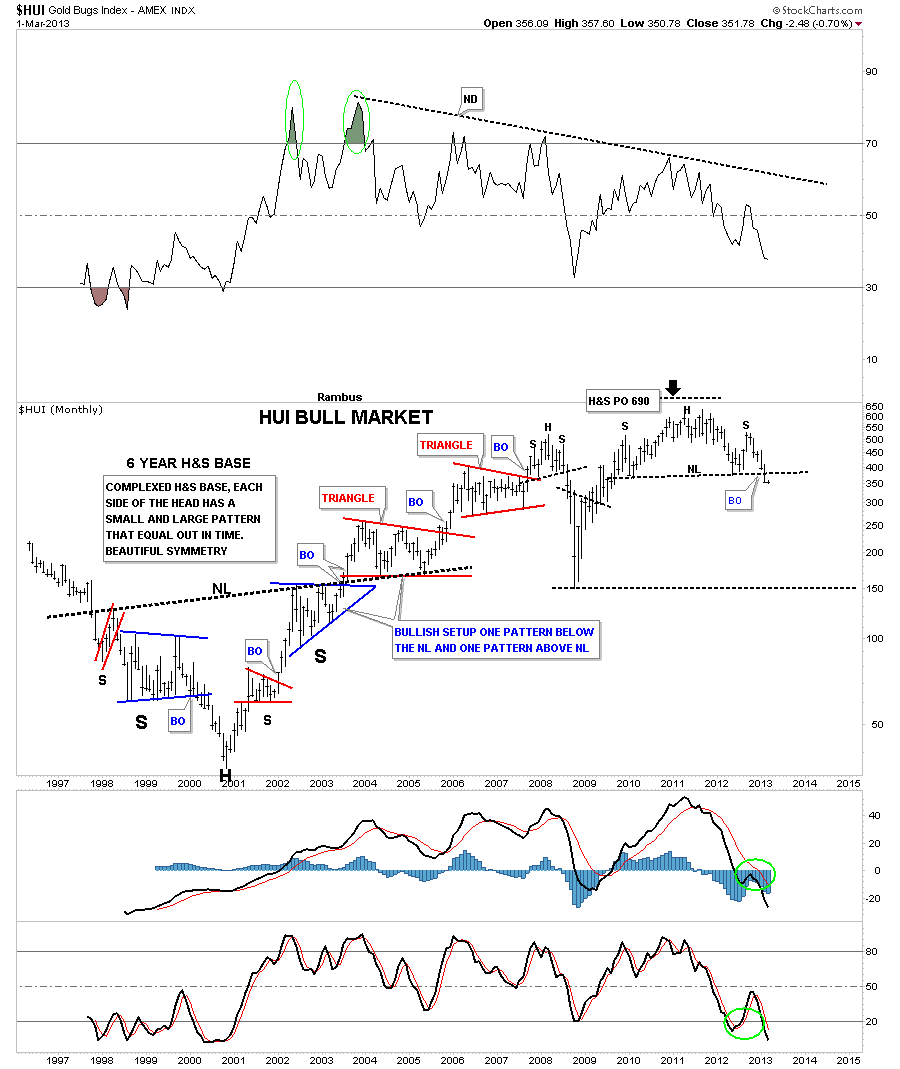
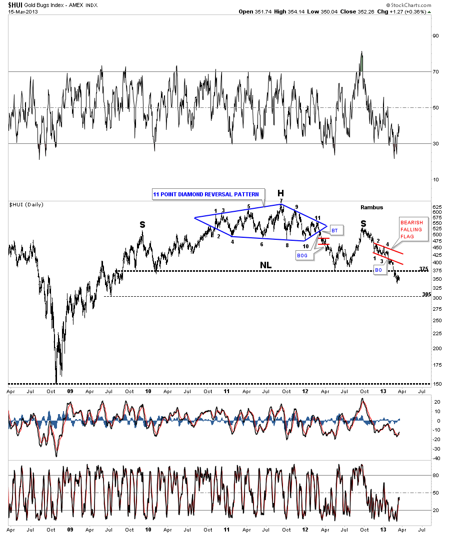
The first chart I would like to show you is a five year daily look at the HUI. Many times a H&S pattern can be made up from several smaller chart pattern. In this case the HUI has an eleven point diamond top reversal pattern that is making up the head portion of the much bigger H&S top. I know that many gold bugs don’t believe this massive H&S top is valid for a number of reasons. I won’t go into detail of why that is just to say until it’s broken it is what it is. One can deny the existence of this massive H&S top based on a number of fundamental reasons but from my perspective the fundamentals are baked into the chart pattern.
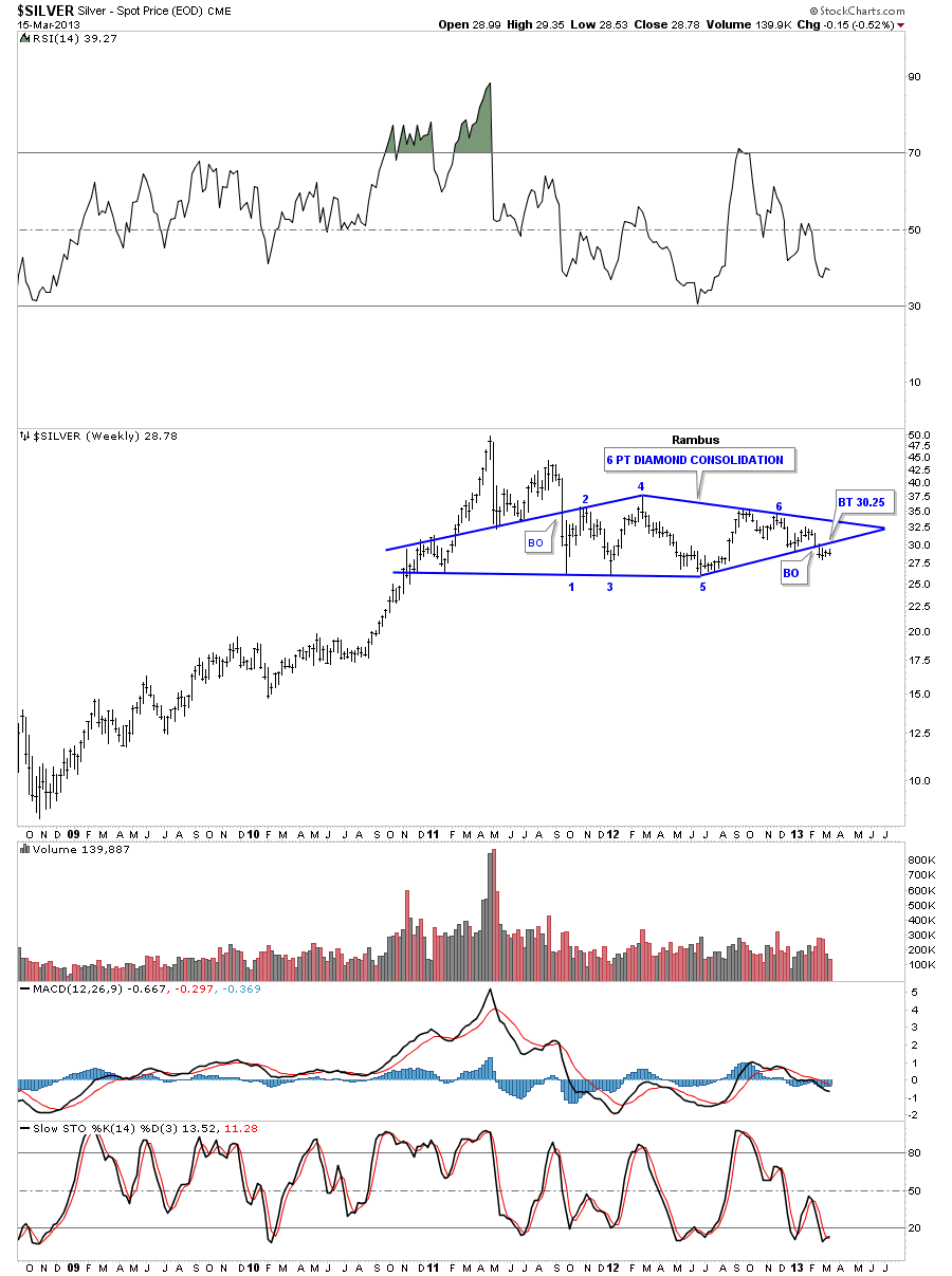
Silver is a very important part of the precious metals complex that needs to be studied to gain appreciation of the big trend. The first chart I would like to show you is a weekly bar chart of silver that shows a six point diamond consolidation pattern. I’ve been waiting for a backtest to the 30.25 area to confirm the breakout. I do see a clean breakout where the price action closed the previous week above the bottom blue rail and then the following week prices traded below the bottom rail in a clean breakout. So far everything looks to be on schedule.
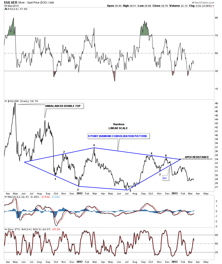
This next chart is a two year daily line chart that shows a slightly more complex diamond that has eight reversal points instead of six that shows up on the bar chart. If silver could have broken out above the top rail at point #8 that would have been a very bullish reversal pattern to the upside as point #7 would have been the last odd numbered reversal point. But the failure at point #8 caused the price action to reverse back down whereby it broke below the bottom rail signaling the diamond was a consolidation pattern to the downside.
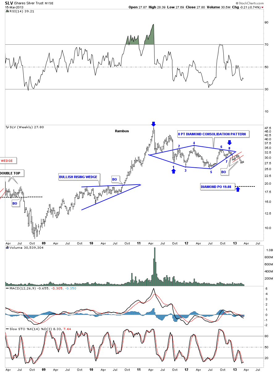
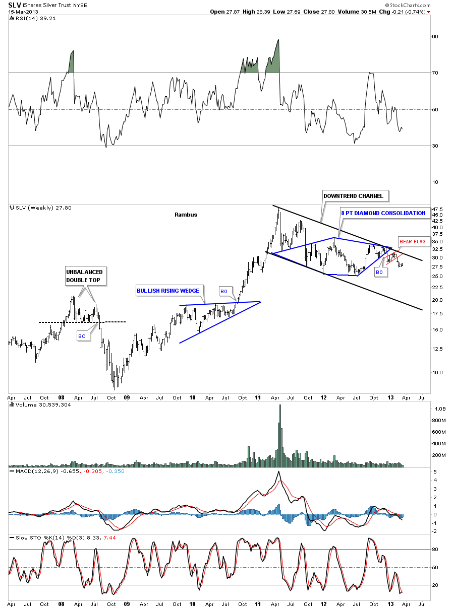
Lets look at a couple silver etf’s that may give us a little more insight to the big diamond consolidation pattern. The weekly look at SLV shows a beautiful eight point diamond consolidation pattern. Note the nice long bar on the week of the breakout. That’s what you like to see on a breakout move. The price action then went on to form an eight week red bear flag that gave way. SLV has now been trading below the red bear flag for four weeks now which looks like it could be forming another small consolidation pattern to the downside.
Now lets put on a couple of trendlines so we can see the downtrend channel that has been forming since the bull market high at roughly 50 or so. Keep in mind some of the diamond consolidation patterns that I showed you in the first part of this article. It’s very possible that this diamond will also show up at the halfway area of the downtrend when it’s all said and done. I know this flies in the face of the fundamentals for the precious metals complex but this is what I’m seeing right now.
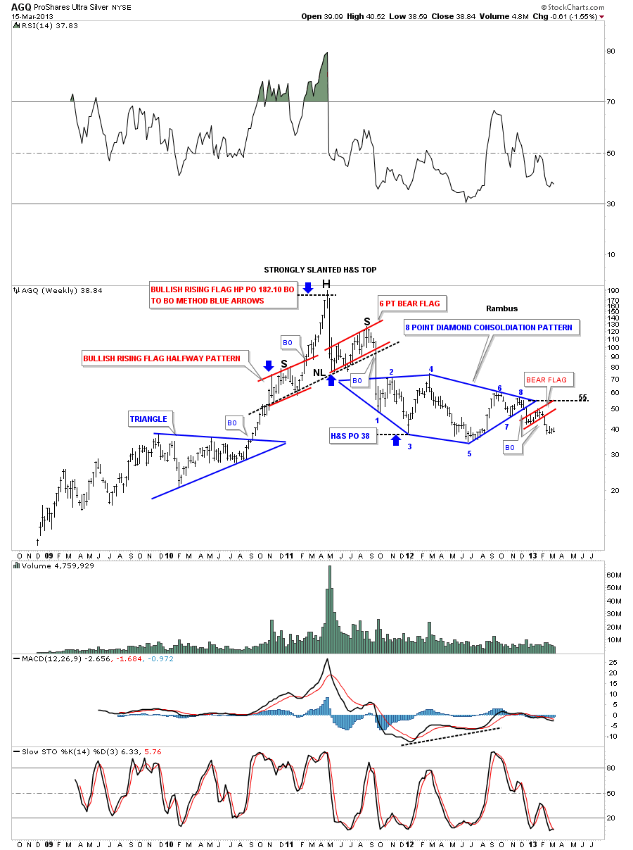
I want to show you one more chart for silver using the AGQ 2 X silver etf. This chart is not for the faint of heart as it has been telling a story, for sometime now, that the silver rally topped out in April of 2011. First, notice the strongly slanted H&S top that formed at the parabolic high. I know many chartists will not recognize this pattern as being valid. That’s OK. I’ve been following the price action since the neckline was broken with the one week massive breakout move to point #1 on the diamond consolidation pattern. The two red consolidation patterns that make up the left and right shoulders are a perfect match. The red bullish rising flag on the left side of the head was a halfway pattern between the breakout from the blue triangle to the lower blue arrow. Take that measurement and add it to the breakout of the red bullish rising flag to get your price objective up to the high at 182. Now lets measure the strongly slanted H&S top to see what its price objective is. The way I measure a H&S patterns is a little different than what the textbooks say. I have found that if you measure from the top of the head to the crotch of the neckline, blue arrow, and then take THAT measurement and add it to the breakout point you get a closer price objective on balanced. I’m basically measuring each impulse leg, one above the neckline and one at the breakout of the neckline. As you can see the strongly slanted H&S top measured down to the 38 area which is point #3 on the chart below. There was a very nice bounce from #3 to point #4 on the diamond. That move down from reversal point #4 to point #5 is a characteristic of alot of diamond formations. Usually a diamond will have one longer move within the pattern that sets up the top and bottom of the formation. This doesn’t happen all the time but when it does I always pay close attentions and watch the pattern very close as it continues to develop.
So there you have it the diamond pattern. They say a diamond is a girls best friend and I say a diamond in the stock markets is an investors best friend if one knows what to look for. Until something blows this scenario out of the water I have to believe these diamond patterns are telling us the true story of what is really taking place in the precious metals complex right now regardless of all the emanate talk of a rally blasting higher any day now. All the best…Rambus
………………………………..
Rambus Chartology is a Precious Metals Based Technical Analysis Site with a Twist
“Give a Man a Chart and he may eat for a day…Teach a Man to Chart and he will Never Starve”
Join us for more at :
http://rambus1.com/