This gallery contains 9 photos.
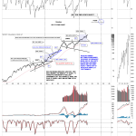
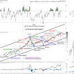
Lets start with the daily bar chart for the pm complex which has the horizontal black dashed S&R line taken from the previous high. Think of them as more of a support zone, brown shaded areas on the left side … Continue reading