The markets have a way to push you just beyond your limits to get you to do the wrong thing at the wrong time and then reverse on a dime. The bearish sentiment from just a casual observation over the last few weeks has felt like there was no way the bulls could rally the PM sector higher before there was a decent correction. In a new bull market the surprises come to the upside and not the downside.
The rally we’re currently experiencing in the PM complex right now and especially the Junior Miners is a potential once in a lifetime event for most investors. Sometimes we get lucky and experience several of these kind of bull markets over a lifetime, but generally your first experience is a learning experience if you can survive long enough to have learned something. I was lucky enough during the tech bubble in the 1990’s to have had just enough experience to play the last five years well enough to be able to retire at 50 years of age. Had I not had any experience before the tech bubble burst I would have most likely not gotten out at the top and rode the whole thing back down.
I didn’t become aware of the bull market in the PM sector until the spring of 2002. My whole focus up till then was the stock market. I still remember very clearly the first time I really looked at a chart for gold and seen a beautiful inverse H&S bottom. I didn’t even know what a junior gold stock was back then as the PM sector was so far off my radar screen. I began to study everything I could on this, way off the radar sector, knowing that the Chartology would be just as clear as the many different tech stocks I traded in the 1990’s.
It didn’t take me long to find some of the junior PM stocks with some really nice Chartology to start trading this new area for me. I felt like I had died an gone to heaven again as I thought nothing could ever beat the tech stocks.The chart patterns the PM stocks were making were just as beautiful as the many different tech stocks I traded.
So I got lucky twice in my investing career by finding two great bull markets in which to invest. Now we have entered the third great bull market of my lifetime which is the bull market that started in the precious complex in January of 2016. To be able to get in on the ground floor of a brand new bull market is only a dream for most investors but to get in at the bottom of the small cap junior PM stocks can change your life forever if you can trade accordingly, which is easier said than done as I know some of you are finding out.
It’s very easy to trade in hindsight when you look at a chart and see a top or bottom already in place but living day by day as a pattern builds out can be very challenging at times. It can take patience beyond what most have , to sit tight and let the pattern mature out , as sometimes they can morph just to throw you a curve ball. Knowing what the big trend you’re trading in, either a bull market or bear market, is the most important aspect of investing. Rule #1 is don’t short a bull market and rule #2 is rule #1. Let the bull market work for you. If you buy too early in a bull market you’ll be saved as the bull market progresses.
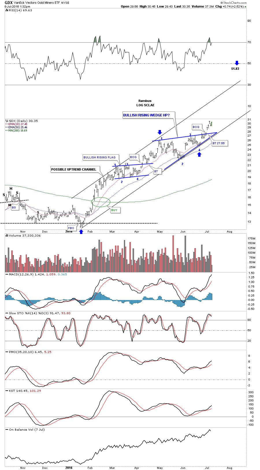
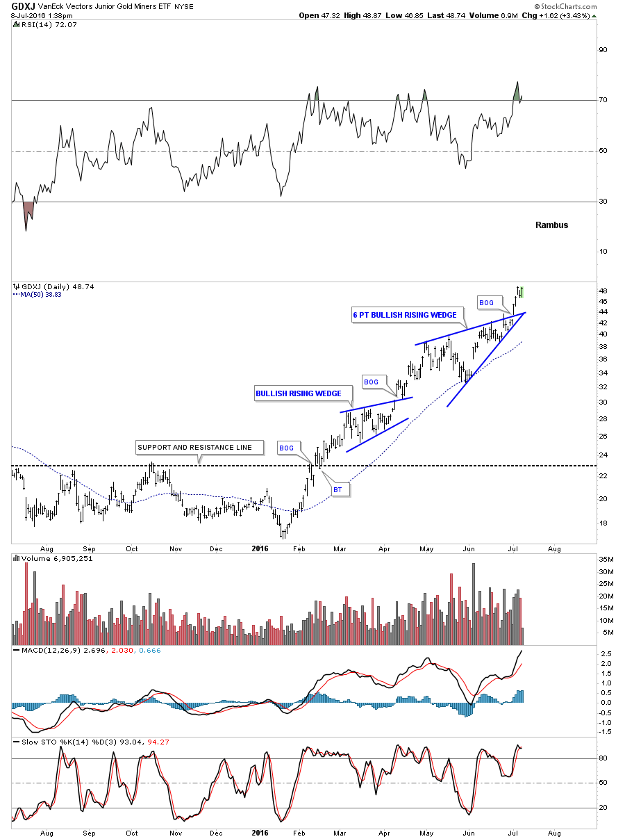
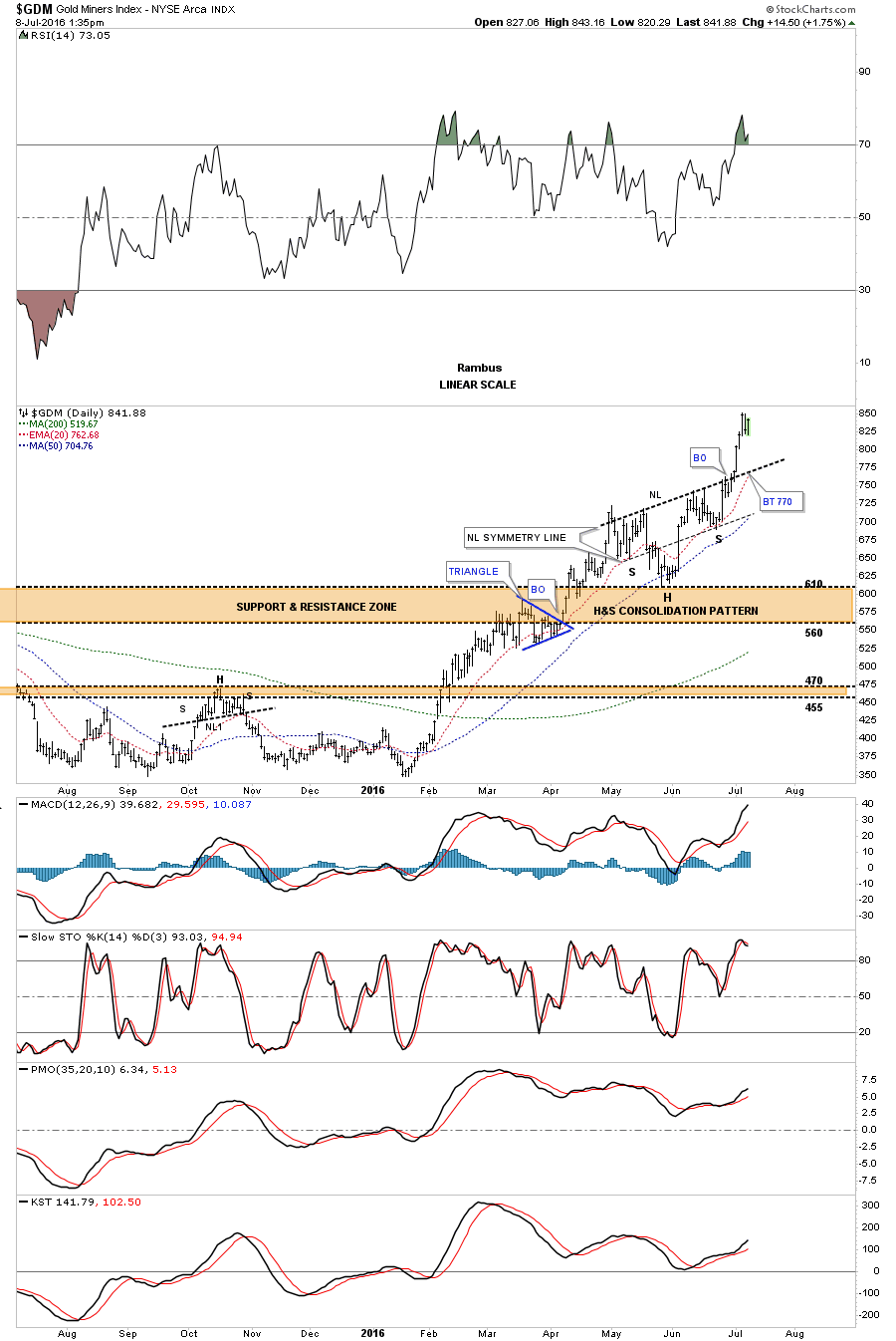
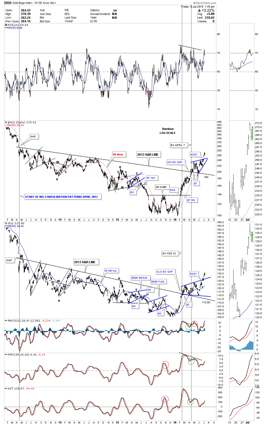
The first six months of our new bull market is now over and there is no way to get it back. Many have missed the bottom and have been waiting patiently for a pull back to get in . This strategy is not working. Many have tried to trade in and out of this new bull market and are left standing at the train station waving goodbye to the conductor as the train leaves. Personally I sold my positions a few months back and quickly realized this was a mistake and scrambled to buy them back at somewhat higher levels . This is how a new bull market works taking as few along for the ride as it can. At some point there is going to be a correction which will end up forming some type of consolidation pattern which will be needed to get the overbought condition back to normal. However predicting when and how this will occur will prove to be very challenging.
I have a ton of charts I could post tonight but I’m going to leave this Wednesday Report just the way it is. This is the first time since we opened up our doors at Rambus Chartology in which I didn’t post a chart , which is weird for me. What is most important to understand is this new bull market that is already six months old and isn’t waiting around for you to make up your mind if you want to participate or not. Only you can determine for yourself how you want to play this new bull market in the precious metals stocks. For some it will be a life changing event and for others it will be a should of or could of kind of bull market. Take what you’ve learned during the first 10 years of the PM bull market and the recently completed 5 years of PM bear market and use that experience to guide you through this next leg of the secular bull market. As always I will be right here analysing the Chartology of this most interesting and frustrating and exiting little market that we have all come to have a love / hate relationship with , The Precious Metals Junior Miners .
All the best…Rambus